library(tidyverse)
library(dplyr)
library(knitr)Visualizing Tumor Response using Waterfall Charts with R
Abstract
Visualizing Tumor Response using Waterfall Charts with R
Key points
- This monograph provides a reference resource for creating waterfall plots in R which may be useful in depicting the tumor response to treatment of each patient for example, enrolled in an oncology clinical trial.
- We provide an overview of how to create waterfall plots which may be useful for publications, and presentations using
R. - We outline the steps to presenting the patients nonrandomly, but in descending order, on the plot from the worst response to the best response for appropriately visualizing the waterfall plot.
- In oncology, a waterfall plot will present the response of each subject with the x- axis set at baseline measurements, and vertical bars added per subject either above or below the horizontal axis representing increase in tumor burden or decrease in tumor burdern respectively.
- We provide an overview of how to create waterfall plots which may be useful for publications, and presentations using
- Skill Level: Intermediate
- Assumption made by this post is that readers have some familiarity with basic
R.
- Assumption made by this post is that readers have some familiarity with basic
Let’s load the packages we will use.
Merkel Cell Carcinoma- Example Oncology Clinical Trial Data Set
- Let’s first create an “example” data set for demonstrative purposes for subjects with locally advanced or distantly metastatic Merkel Cell Carcinoma (MCC) enrolled on a clinical trial that aims to test the effects of treatment A on tumor response at two different doses.
# We will first create a data set that specifies patients with locally advanced/unresectable MCC and metastatic disease.

# Waterfall plots are displayed in descending order from the worst tumor response from baseline value on the left to the best value on the right side of the plot
## Therefore, we will create data for 55 subjects and order them in decreasing order since a positive value here represents increase in tumor size from baseline and a negative value represents a decrease in size.

# We will randomly assign the two doses, 80 mg or 150 mg, to the 56 subjects
Merkel <- data.frame(
  id=c(1:56),
  type = sample((rep(c("laMCC", "metMCC"), times =28))),
  response = c(30, sort(runif(n=53,min=-10,max=19), decreasing=TRUE),-25,-31),
  dose= sample(rep(c(80, 150), 28)))

# Let's assign Best Overall Response (BOR)
Merkel$BOR= (c("PD", rep(c("SD"), times =54),"PR"))
Let’s view the data set
kable((Merkel))| id | type | response | dose | BOR |
|---|---|---|---|---|
| 1 | laMCC | 30.0000000 | 150 | PD |
| 2 | laMCC | 18.7563667 | 150 | SD |
| 3 | metMCC | 18.2765383 | 80 | SD |
| 4 | laMCC | 17.6844494 | 150 | SD |
| 5 | laMCC | 17.0075271 | 150 | SD |
| 6 | metMCC | 16.7150357 | 80 | SD |
| 7 | laMCC | 16.2368676 | 150 | SD |
| 8 | laMCC | 14.7904273 | 80 | SD |
| 9 | metMCC | 14.3057887 | 150 | SD |
| 10 | metMCC | 14.1024327 | 80 | SD |
| 11 | laMCC | 14.0896363 | 150 | SD |
| 12 | laMCC | 13.7805769 | 80 | SD |
| 13 | metMCC | 13.0401910 | 150 | SD |
| 14 | laMCC | 13.0091003 | 80 | SD |
| 15 | metMCC | 12.7355414 | 150 | SD |
| 16 | laMCC | 12.5705367 | 80 | SD |
| 17 | laMCC | 11.4021159 | 150 | SD |
| 18 | metMCC | 11.1845503 | 80 | SD |
| 19 | laMCC | 9.7695614 | 150 | SD |
| 20 | metMCC | 9.4971918 | 80 | SD |
| 21 | metMCC | 9.4470578 | 80 | SD |
| 22 | metMCC | 8.9701755 | 80 | SD |
| 23 | metMCC | 8.8002298 | 150 | SD |
| 24 | laMCC | 8.6923195 | 80 | SD |
| 25 | laMCC | 8.2005430 | 150 | SD |
| 26 | laMCC | 7.9385936 | 80 | SD |
| 27 | metMCC | 7.0426535 | 150 | SD |
| 28 | laMCC | 6.7676051 | 80 | SD |
| 29 | laMCC | 6.5310004 | 150 | SD |
| 30 | metMCC | 6.3448264 | 150 | SD |
| 31 | laMCC | 5.5842064 | 80 | SD |
| 32 | metMCC | 5.5300945 | 80 | SD |
| 33 | laMCC | 5.4826064 | 80 | SD |
| 34 | laMCC | 5.3608580 | 80 | SD |
| 35 | metMCC | 4.9056868 | 80 | SD |
| 36 | metMCC | 4.2141766 | 80 | SD |
| 37 | metMCC | 2.8333400 | 150 | SD |
| 38 | laMCC | 2.6977406 | 150 | SD |
| 39 | metMCC | 0.7587159 | 80 | SD |
| 40 | metMCC | 0.4850728 | 150 | SD |
| 41 | laMCC | 0.3984248 | 80 | SD |
| 42 | laMCC | 0.2778293 | 80 | SD |
| 43 | metMCC | -0.5827850 | 150 | SD |
| 44 | laMCC | -0.6818098 | 150 | SD |
| 45 | metMCC | -0.9533467 | 150 | SD |
| 46 | laMCC | -1.3104243 | 150 | SD |
| 47 | metMCC | -3.8226207 | 150 | SD |
| 48 | laMCC | -4.1856408 | 80 | SD |
| 49 | metMCC | -6.4087922 | 150 | SD |
| 50 | metMCC | -7.0850612 | 150 | SD |
| 51 | metMCC | -8.4744712 | 150 | SD |
| 52 | metMCC | -9.0152615 | 80 | SD |
| 53 | metMCC | -9.1460582 | 80 | SD |
| 54 | laMCC | -9.7198343 | 150 | SD |
| 55 | laMCC | -25.0000000 | 80 | SD |
| 56 | metMCC | -31.0000000 | 80 | PR |
Let’s create the waterfall plot.
MCC<- barplot(Merkel$response,
              col="blue",
              border="blue",
              space=0.5, ylim=c(-50,50),
              main = "Waterfall plot for Target Lesion Tumor Size",
              ylab="Change from baseline (%)",
              cex.axis=1.5, cex.lab=1.5)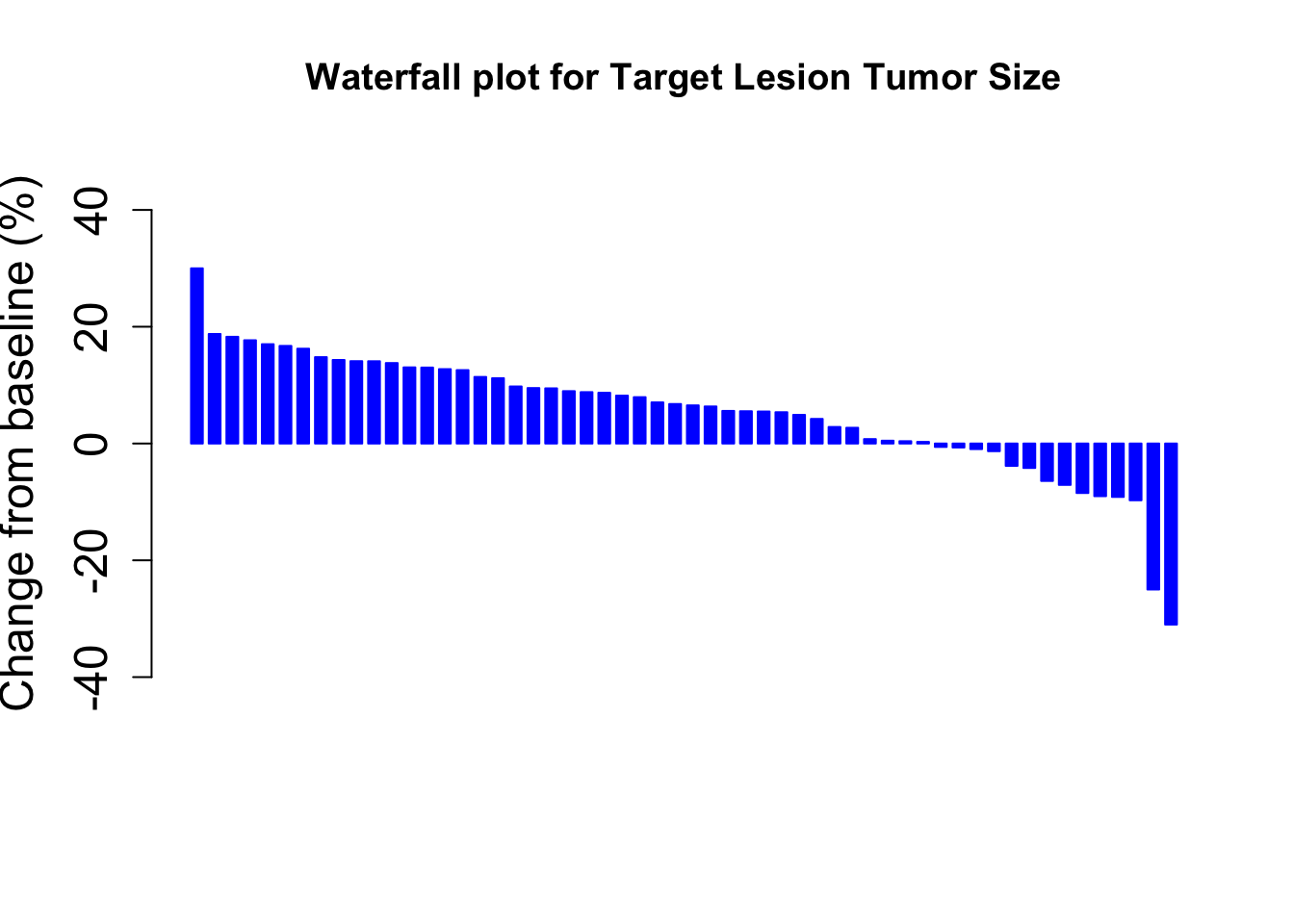
We can now add color by Dose and a legend
col <- ifelse(Merkel$dose == 80,
              "steelblue", # if dose = 80 mg, then the color will be steel blue
              "cadetblue") # if dose != 80 mg (i.e. 150 mg here), then the color will be cadet blue

MCC<- barplot(Merkel$response,
              col=col,
              border=col,
              space=0.5,
              ylim=c(-50,50),
              main = "Waterfall plot for Target Lesion Tumor Size",
              ylab="Change from baseline (%)",
              cex.axis=1.5,
              legend.text= c( "80mg", "150mg"),
              args.legend=list(title="Treatment Dose", fill=c("steelblue", "cadetblue"), border=NA, cex=0.9))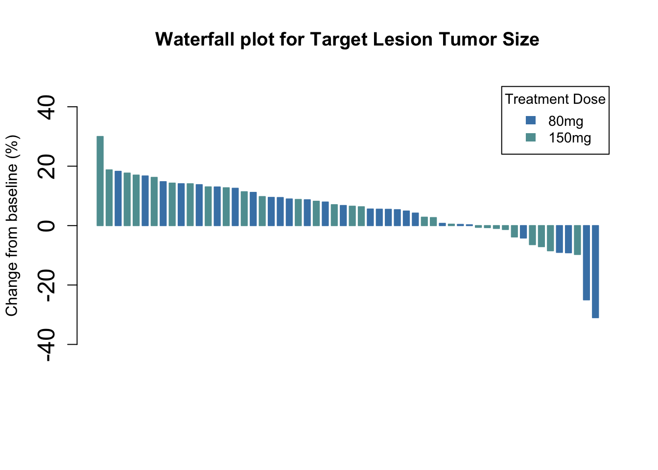
Or by disease type…
col <- ifelse(Merkel$type == "laMCC",
              "#BC5A42", # if type of disease = locally MCC, then the color will be #BC5A42 (deep red)
              "#009296") # if type of disease != locaally MCC (i.e. mMCC), then the color will be ##009296 (greenish-blue)

MCC<- barplot(Merkel$response,
              col=col,
              border=col,
              space=0.5,
              ylim=c(-50,50),
              main = "Waterfall plot for Target Lesion Tumor Size",
              ylab="Change from baseline (%)",
              cex.axis=1.5,
              legend.text= c( "locally advanced MCC", "Metastatic MCC"),
              args.legend=list(title="Disease", fill=c("#BC5A42", "#009296"), border=NA, cex=0.9))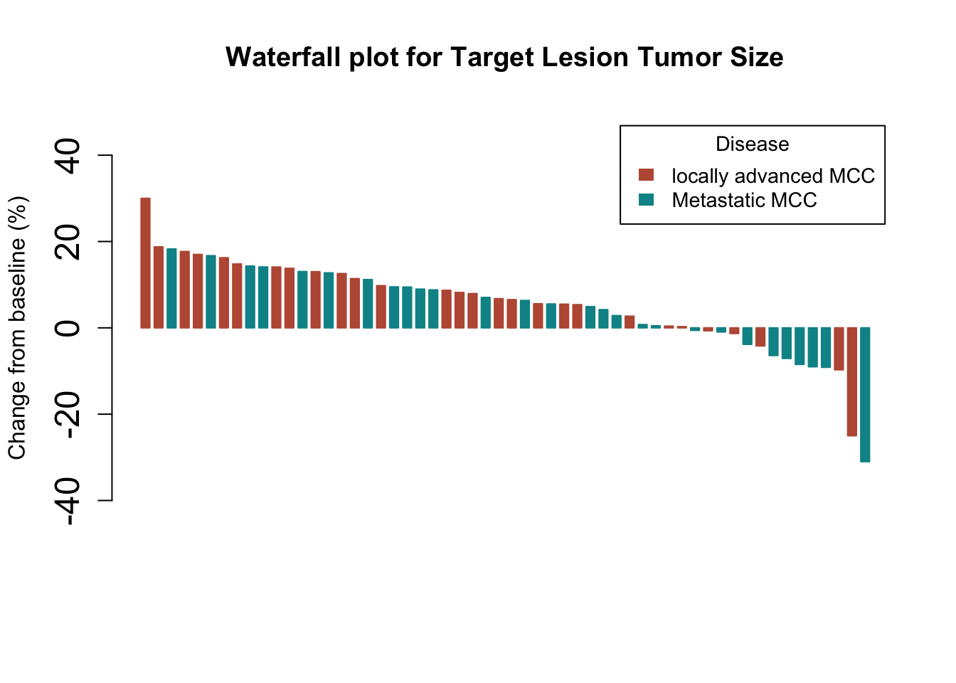
Or by Best overall response and provide a legend
col <- ifelse(Merkel$BOR == "CR",
              "green", # if a subject had a CR the bar will be green, if they did not have a CR....
              ifelse(Merkel$BOR == "PR",
                     "steelblue", # then, if a subject had a PR the bar will be steel blue, if they did not have a PR or CR....
                     ifelse(Merkel$BOR == "PD",
                            "red", # then, if a subject had a PD the bar will be red, otherwise if they did not have a PR or CR or PD....
                            ifelse(Merkel$BOR == "SD",
                                   "cadetblue", # then they must have ahd a SD, so the bar will be cadetblue, otherwise....
                                   "") # the color will be blank (which is not really an option, b/c they must have either a CR, PR, PD or SD)
                            )))


MCC<- barplot(Merkel$response,
              col=col,
              border=col,
              space=0.5,
              ylim=c(-50,50),
              main = "Waterfall plot for Target Lesion Tumor Size", ylab="Change from baseline (%)",
              cex.axis=1.5,
              legend.text= c( "CR: Complete Response", "PR: Partial Response", "SD: Stable Disease", "PD: Progressive Disease"),
              args.legend=list(title="Best Overall Response", fill=c("green","steelblue",  "cadetblue", "red"), border=NA, cex=0.9))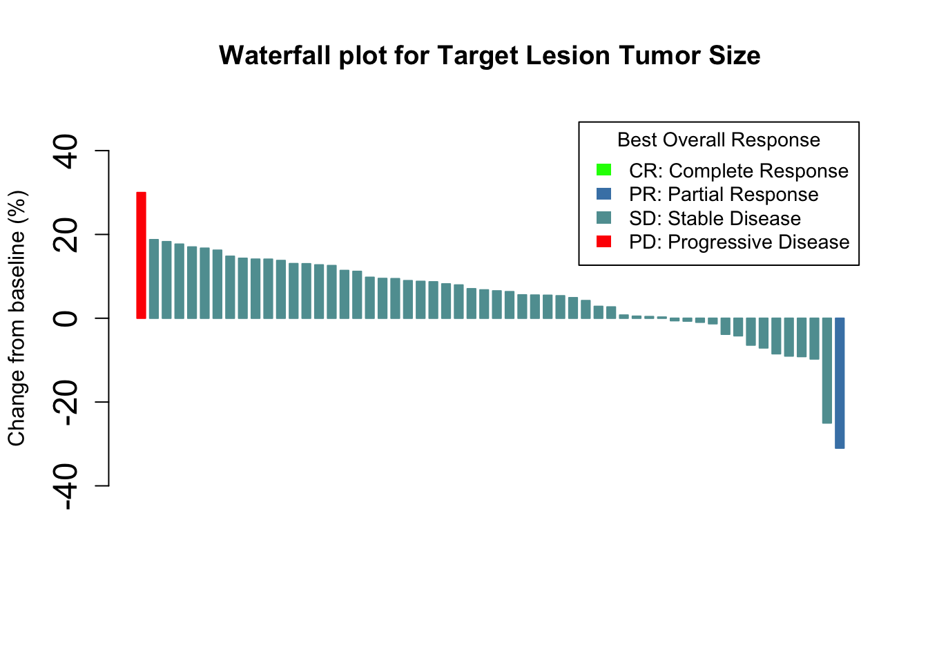
Let’s add horizontal lines at 20% and -30%
- The majority of clinical trials use the Response Evaluation Criteria in Solid Tumors (RECIST) to assess tumor responses to a therapeutic intervention
- Per RECIST, tumor responses are adjudicated based on the following observations:
- Complete Response (CR) Disappearance of all target lesions (sum of all taget lesions = 0)
- Of note, any pathological lymph nodes (whether target or non-target) must have a reduction in size to < 10 mm
- Of note, any pathological lymph nodes (whether target or non-target) must have a reduction in size to < 10 mm
- Partial Response (PR) >= 30% decrease (vs baseline) of sum of all target lesions dimension
- Progressive Disease (PD) new lesions or >= 20% increase (vs smallest sum of target lesions or nadir)
- Stable Disease (SD) when sum of all target lesions does not qualify for CR/PR/PD
- Complete Response (CR) Disappearance of all target lesions (sum of all taget lesions = 0)
- Thus, it is often useful to have lines to denote “Progressive Disease” and “Partial Response” on waterfall plots
- Those bars between the PD and PR lines denote “Stable Disease”
col <- ifelse(Merkel$BOR == "CR",
              "green",
              ifelse(Merkel$BOR == "PR",
                     "steelblue",
                     ifelse(Merkel$BOR == "PD",
                            "red",
                            ifelse(Merkel$BOR == "SD",
                                   "cadetblue", ""))))

MCC<- barplot(Merkel$response,
              col=col,
              border=col,
              space=0.5,
              ylim=c(-50,50),
              main = "Waterfall plot for Target Lesion Tumor Size",
              ylab="Change from baseline (%)",
              cex.axis=1.5,
              legend.text= c( "CR: Complete Response", "PR: Partial Response", "SD: Stable Disease", "PD: Progressive Disease"),
              args.legend=list(title="Best Overall Response", fill=c("green","steelblue",  "cadetblue", "red"), border=NA, cex=1.0))

# Use the abline() function
## The abline() function is a simple way to add lines in R
### It takes the arguments: abline(a=NULL, b=NULL, h=NULL, v=NULL, ...)
#### a, b : single values denoting the intercept and the slope of the line
#### h : the y-value(s) for horizontal line(s)
#### v : the x-value(s) for vertical line(s)

abline(h=20, col = "black", lwd=0.5) # The "PD" line
abline(h=-30, col = "black", lwd=0.5) # This "PR" line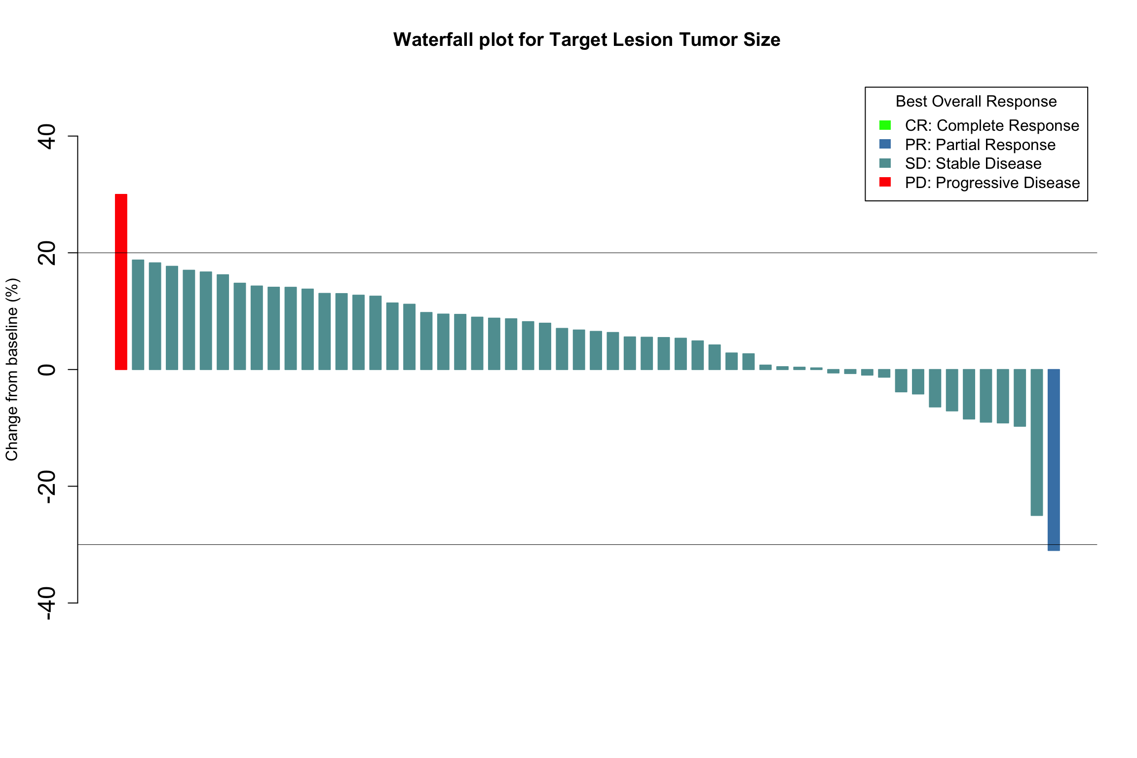
Take Home Points
- High-quality data visualization of individual patient tumor responses to a study treatment can be displayed effectively for the cohort using waterfall plots.
As always, please reach out to us with thoughts and feedback
Session Info
sessionInfo()