library(scales)
library(lubridate)
library(ggplot2)
library(tidyverse)
library(knitr)
library(timevis)Visualizing Real World Data Timelines in R
Abstract
DataViz of RWD Timelines Using R and TimeVis
Key points
- Real World Data (RWD) in clinical medicine is data obtained from diverse settings outside of traditional clinical trials (e.g. observational cohort studies in the real-world setting)
- Analytical tools to facilitate interpretation of RWD are sorely needed
- This post provides a reference resource for creating timelines in R which may be useful in depicting the clinical course of patients in the real-world setting.
- We provide an overview of how to create static timelines which may be useful for publications, case reports, and presentations. We will use
ggplot2andR. - We outline the steps to creating and visualizing interactive timelines using the timevis package created by Dean Attali and Almende B.V. Interactive timelines allow us to capture complex courses and are useful for dashboards, presentations, and comparing the overall clinical courses of patients in registries.
- We briefly describe how to stylize the timelines, handle date ranges and positioning across the timeline, as well as visualize durations of events.
- We provide an overview of how to create static timelines which may be useful for publications, case reports, and presentations. We will use
- Skill Level: Intermediate
- Assumption made by this post is that readers have some familiarity with basic
R.
- Assumption made by this post is that readers have some familiarity with basic
Let’s load the packages we will use.
Merkel Cell Carcinoma Example Patient Clinical Course Data
- Let’s first create an “example” data set for demonstrative purposes for a patient with Merkel Cell Carcinoma (MCC)
- We will create a dataframe covering the clinical course of a fictious patient diagnosed with MCC
- We can also generate random data in R but to stay true to time in between systemic therapy cycles and surveillance imaging, we will combine fictious data to keep a sensible order of and to events.
Merkel <- data.frame(
  Year = c(rep(c(2018), times =12), rep(c(2019), times =2)),
  Months = c(1,2,2,3,6,9,9,10,11,11,12,12,1,3),
  Days = c(1,2,15,2,2,8,29,20,10,27,1,23,15,10),
  Milestones = c("Diagnosed with MCC", "PET-CT (No evidence of metastatic disease)", "WLE and SLNBx", "PET-CT (No evidence of disease)", "PET-CT (No evidence of disease)", "PET-CT (Concerning for Recurrence)", "Cycle 1", "Cycle 2", "Cycle 3","PET-CT (Partial Response)","Cycle 4", "Cycle 5",  "Cycle 6","PET-CT (Complete Response)"),
  Event_type= c("Biopsy", "Imaging", "Surgery", "Imaging", "Imaging", "Imaging", "Immunotherapy", "Immunotherapy","Immunotherapy","Imaging","Immunotherapy", "Immunotherapy", "Immunotherapy", "Imaging")) #The data set was created with the year, month and day in separate columns. Let's add the complete date column now

Merkel$date <- with(Merkel, ymd(sprintf('%04d%02d%02d', Merkel$Year, Merkel$Months, Merkel$Days)))
# of note, the ymd() function transforms dates stored in character and numeric vectors to Date
## we are using the code with(df, ymd(sprintf('%04d%02d%02d', year, mon, day))) to take those three columns and merge them into one that is recognized as a date in R

Merkel <- Merkel[with(Merkel, order(date)), ]
# of note, an alternate code to arrange the df in ascending date order would have been:
## Merkel <- Merkel %>% arrange(date)
Let’s view the data
kable(head(Merkel))| Year | Months | Days | Milestones | Event_type | date |
|---|---|---|---|---|---|
| 2018 | 1 | 1 | Diagnosed with MCC | Biopsy | 2018-01-01 |
| 2018 | 2 | 2 | PET-CT (No evidence of metastatic disease) | Imaging | 2018-02-02 |
| 2018 | 2 | 15 | WLE and SLNBx | Surgery | 2018-02-15 |
| 2018 | 3 | 2 | PET-CT (No evidence of disease) | Imaging | 2018-03-02 |
| 2018 | 6 | 2 | PET-CT (No evidence of disease) | Imaging | 2018-06-02 |
| 2018 | 9 | 8 | PET-CT (Concerning for Recurrence) | Imaging | 2018-09-08 |
Additional Data Wrangling
- Set the milestones to ordinal categorical variables
- Assign colors for appropriate groupings of all the imaging, systemic therapy, and surgery of MCC disease so our events will be color coded by type of milestone.
# Add a specified order to these event type labeles
Event_type_levels <- c("Biopsy", "Surgery", "Imaging", "Immunotherapy")

# Define the colors for the event types in the specified order.
## These hashtagged codes represent the colors (blue, green, yellow, red) as hexadecimal color codes.
Event_type_colors <- c("#C00000", "#FFC000",  "#00B050", "#0070C0" )


# Make the Event_type vector a factor using the levels we defined above
Merkel$Event_type <- factor(Merkel$Event_type, levels= Event_type_levels, ordered=TRUE)
Each Milestone on the timeline will need to be positioned carefully. We will vary the height or direction on the timeline milestones to avoid overlapping or overcrowded text descriptions.
# Set the heights we will use for our milestones.
positions <- c(0.5, -0.5, 1.0, -1.0, 1.25, -1.25, 1.5, -1.5)

# Set the directions we will use for our milestone, for example above and below.
directions <- c(1, -1)


# Assign the positions & directions to each date from those set above.
line_pos <- data.frame(
    "date"=unique(Merkel$date),
    "position"=rep(positions, length.out=length(unique(Merkel$date))),
    "direction"=rep(directions, length.out=length(unique(Merkel$date))))
# Create columns with the specified positions and directions for each milestone event
Merkel <- merge(x=Merkel, y=line_pos, by="date", all = TRUE)
# Let's view the new columns.
kable(head(Merkel))| date | Year | Months | Days | Milestones | Event_type | position | direction |
|---|---|---|---|---|---|---|---|
| 2018-01-01 | 2018 | 1 | 1 | Diagnosed with MCC | Biopsy | 0.50 | 1 |
| 2018-02-02 | 2018 | 2 | 2 | PET-CT (No evidence of metastatic disease) | Imaging | -0.50 | -1 |
| 2018-02-15 | 2018 | 2 | 15 | WLE and SLNBx | Surgery | 1.00 | 1 |
| 2018-03-02 | 2018 | 3 | 2 | PET-CT (No evidence of disease) | Imaging | -1.00 | -1 |
| 2018-06-02 | 2018 | 6 | 2 | PET-CT (No evidence of disease) | Imaging | 1.25 | 1 |
| 2018-09-08 | 2018 | 9 | 8 | PET-CT (Concerning for Recurrence) | Imaging | -1.25 | -1 |
Let’s set the range for our timeline
- Let’s have each month and year appear on our timeline, not only the months with events
- We will also start the timeline one month before and one month after the beginning and end of the patient clinical course milestones
# Create a one month "buffer" at the start and end of the timeline
month_buffer <- 1

month_date_range <- seq(min(Merkel$date) - months(month_buffer), max(Merkel$date) + months(month_buffer), by='month')


# We are adding one month before and one month after the earliest and latest milestone in the clinical course.
## We want the format of the months to be in the 3 letter abbreviations of each month.
month_format <- format(month_date_range, '%b')
month_df <- data.frame(month_date_range, month_format)


year_date_range <- seq(min(Merkel$date) - months(month_buffer), max(Merkel$date) + months(month_buffer), by='year')

# We will only show the years for which we have a december to january transition.
year_date_range <- as.Date(
    intersect(
        ceiling_date(year_date_range, unit="year"),
        floor_date(year_date_range, unit="year")),
        origin = "1970-01-01")

# We want the format to be in the four digit format for years.
year_format <- format(year_date_range, '%Y')
year_df <- data.frame(year_date_range, year_format)
Plot the timeline with ggplot
- We are ready to plot our timeline now!
# Create timeline coordinates with an x and y axis
timeline_plot<-ggplot(Merkel,aes(x=date,y= position, col=Event_type, label=Merkel$Milestones))

# Add the label Milestones
timeline_plot<-timeline_plot+labs(col="Milestones")

# Print plot
timeline_plot
Warning: Use of `Merkel$Milestones` is discouraged.
ℹ Use `Milestones` instead.
# Assigning the colors and order to the milestones
timeline_plot<-timeline_plot+scale_color_manual(values=Event_type_colors, labels=Event_type_levels, drop = FALSE)

# Using the classic theme to remove background gray
timeline_plot<-timeline_plot+theme_classic()

# Plot a horizontal line at y=0 for the timeline
timeline_plot<-timeline_plot+geom_hline(yintercept=0,
                color = "black", size=0.3)
Warning: Using `size` aesthetic for lines was deprecated in ggplot2 3.4.0.
ℹ Please use `linewidth` instead.# Print plot
timeline_plot
# Plot the vertical lines for our timeline's milestone events
timeline_plot<-timeline_plot+geom_segment(data=Merkel, aes(y=Merkel$position,yend=0,xend=Merkel$date), color='black', size=0.2)
# Now let's plot the scatter points at the tips of the vertical lines and date
timeline_plot<-timeline_plot+geom_point(aes(y=Merkel$position), size=3)
# Let's remove the axis since this is a horizontal timeline and postion the legend to the bottom
timeline_plot<-timeline_plot+theme(axis.line.y=element_blank(),
axis.text.y=element_blank(),
axis.title.x=element_blank(),
axis.title.y=element_blank(),
axis.ticks.y=element_blank(),
axis.text.x =element_blank(),
axis.ticks.x =element_blank(),
axis.line.x =element_blank(),
legend.position = "bottom"
)
# Print plot
timeline_plotWarning: Use of `Merkel$position` is discouraged.
ℹ Use `position` instead.Warning: Use of `Merkel$date` is discouraged.
ℹ Use `date` instead.Warning: Use of `Merkel$Milestones` is discouraged.
ℹ Use `Milestones` instead.Warning: Use of `Merkel$position` is discouraged.
ℹ Use `position` instead.Warning: Use of `Merkel$Milestones` is discouraged.
ℹ Use `Milestones` instead.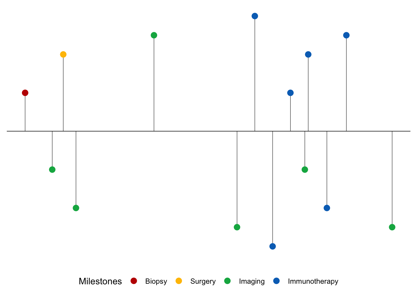
# Let's add the text for each month
timeline_plot<-timeline_plot+geom_text(data=month_df, aes(x=month_date_range,y=-0.15,label=month_format),size=3.5,vjust=0.5, color='black', angle=90)


# Let's add the years
timeline_plot<-timeline_plot+geom_text(data=year_df, aes(x=year_date_range,y=-0.25,label=year_format, fontface="bold"),size=3.5, color='black')

# Print plot
print(timeline_plot)
Warning: Use of `Merkel$position` is discouraged.
ℹ Use `position` instead.Warning: Use of `Merkel$date` is discouraged.
ℹ Use `date` instead.Warning: Use of `Merkel$Milestones` is discouraged.
ℹ Use `Milestones` instead.Warning: Use of `Merkel$position` is discouraged.
ℹ Use `position` instead.Warning: Use of `Merkel$Milestones` is discouraged.
ℹ Use `Milestones` instead.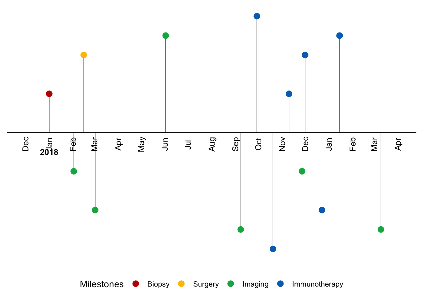
# We need to add the labels of each milestone now.
## To do this we have to define the text position. A clean timeline should have the labels situatuated a bit above the scatter points.
### Since we have the positions of the points already defined, we will place the labels 0.2 pts away from the scatter points.


# Lets offset the labels 0.2 away from scatter points
text_offset <- 0.2

# Let's use the absolute value since we want to add the text_offset and increase space away from the scatter points
absolute_value<-(abs(Merkel$position))
text_position<- absolute_value + text_offset

# Let's keep the direction above or below for the labels to match the scatter points
Merkel$text_position<- text_position * Merkel$direction

# View head of the table
kable(head(Merkel))| date | Year | Months | Days | Milestones | Event_type | position | direction | text_position |
|---|---|---|---|---|---|---|---|---|
| 2018-01-01 | 2018 | 1 | 1 | Diagnosed with MCC | Biopsy | 0.50 | 1 | 0.70 |
| 2018-02-02 | 2018 | 2 | 2 | PET-CT (No evidence of metastatic disease) | Imaging | -0.50 | -1 | -0.70 |
| 2018-02-15 | 2018 | 2 | 15 | WLE and SLNBx | Surgery | 1.00 | 1 | 1.20 |
| 2018-03-02 | 2018 | 3 | 2 | PET-CT (No evidence of disease) | Imaging | -1.00 | -1 | -1.20 |
| 2018-06-02 | 2018 | 6 | 2 | PET-CT (No evidence of disease) | Imaging | 1.25 | 1 | 1.45 |
| 2018-09-08 | 2018 | 9 | 8 | PET-CT (Concerning for Recurrence) | Imaging | -1.25 | -1 | -1.45 |
# Now we can add the labels to the timeline for our milestones.
timeline_plot<-timeline_plot+geom_text(aes(y=Merkel$text_position,label=Merkel$Milestones),size=3.5, vjust=0.6)

# Print plot
print(timeline_plot)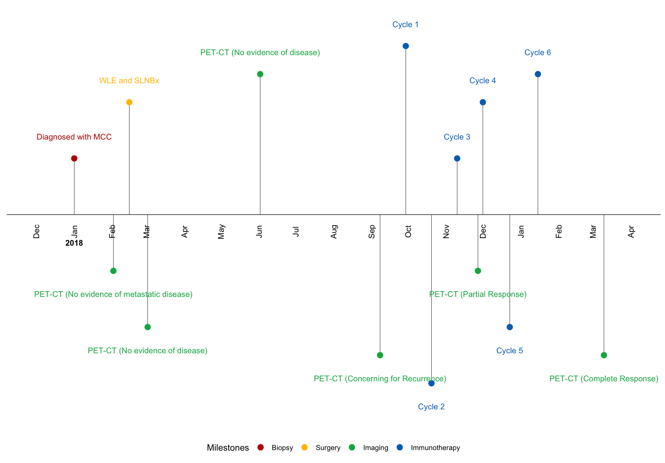
# Now we can add the labels to the timeline for our milestones.
timeline_plot<-timeline_plot+geom_text(aes(y=Merkel$text_position,label=Merkel$Milestones),size=3.5, vjust=0.6)

# Print plot
print(timeline_plot)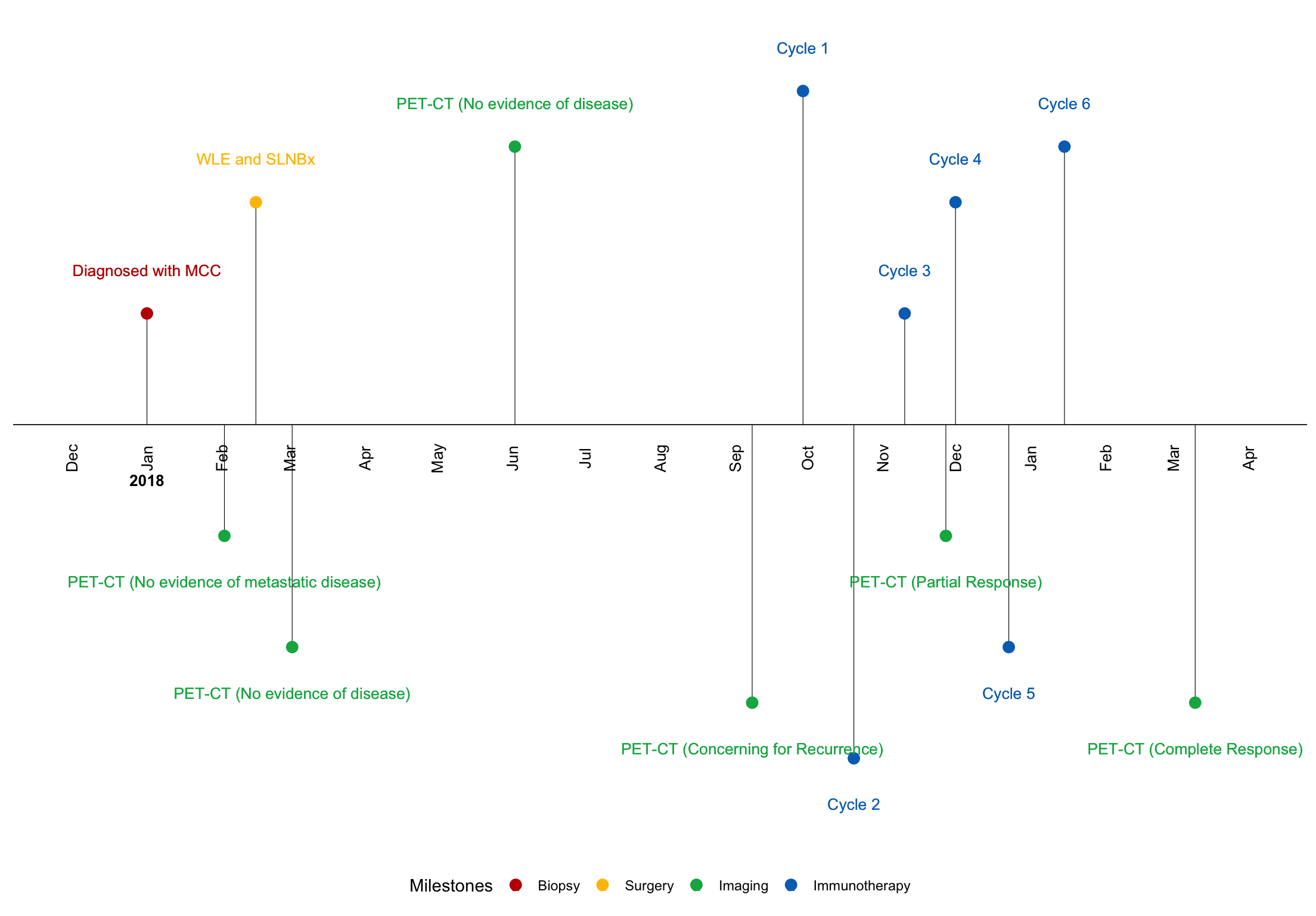
Let’s use plotly to make this static timeline interactive
ggplotlywill enable ggplots withplotlyfunctionality- This will engender hover text features as well as the ability to select certain elements of the graph to zoom in and out of
library(plotly)
ggplotly(timeline_plot)
Let’s create interactive timelines with the package timevis
- With this timeline, let’s show duration on Checkpoint Inhibior- Systemic Therapy, rather than indicate the date of each cycle of therapy
- We will add start and end dates to display durations using the data we created for the static and plotly timeline above
# Let's prepare our data so that it is compatible with quick visualization in timevis
## Each milestone will need a start date added. If it is a duration, we will also supply the end date


# Let's remove Cycles 2,3,4,5 and 6 since we will just show the patient's duration on systemic therapy and not the individual cycle dates
MCC<-  Merkel[-c(8,9,11:13),]


# The start date for each milestone is the date of the event.
## If it was a single date event and not a duration, it will not have an end date.
MCC$start <-MCC$date


# The end date will be "NA" if the event had no duration.
## Only systemic therapy will have an end date which will be the date of cycle 6.
MCC$end<-c(NA, NA, NA, NA, NA, NA,"2019-01-15", NA, NA)

#Let's replace the label "Cycle 1" with "Checkpoint Inhibitor- Systemic Therapy" using library stringr
library(stringr)

MCC$Milestones<-str_replace_all(MCC$Milestones, "Cycle 1", "Checkpoint Inhibitor- Systemic Therapy")

# Each milestone will need an ID for visualization and content for labels.
MCC$id<- 1:9
MCC$content<- MCC$Milestones
kable(head(MCC))| date | Year | Months | Days | Milestones | Event_type | position | direction | text_position | start | end | id | content |
|---|---|---|---|---|---|---|---|---|---|---|---|---|
| 2018-01-01 | 2018 | 1 | 1 | Diagnosed with MCC | Biopsy | 0.50 | 1 | 0.70 | 2018-01-01 | NA | 1 | Diagnosed with MCC |
| 2018-02-02 | 2018 | 2 | 2 | PET-CT (No evidence of metastatic disease) | Imaging | -0.50 | -1 | -0.70 | 2018-02-02 | NA | 2 | PET-CT (No evidence of metastatic disease) |
| 2018-02-15 | 2018 | 2 | 15 | WLE and SLNBx | Surgery | 1.00 | 1 | 1.20 | 2018-02-15 | NA | 3 | WLE and SLNBx |
| 2018-03-02 | 2018 | 3 | 2 | PET-CT (No evidence of disease) | Imaging | -1.00 | -1 | -1.20 | 2018-03-02 | NA | 4 | PET-CT (No evidence of disease) |
| 2018-06-02 | 2018 | 6 | 2 | PET-CT (No evidence of disease) | Imaging | 1.25 | 1 | 1.45 | 2018-06-02 | NA | 5 | PET-CT (No evidence of disease) |
| 2018-09-08 | 2018 | 9 | 8 | PET-CT (Concerning for Recurrence) | Imaging | -1.25 | -1 | -1.45 | 2018-09-08 | NA | 6 | PET-CT (Concerning for Recurrence) |
Let’s plot the timeline with timevis!
# As you can see, when we provided an end date, like with the checkpoint inhibitor duration, it is shown as a range not a single event date.

timevis(MCC)Take Home Points
- High-quality data visualizations of a patient’s journey can facilitate interpretation of clinical courses in Real World Data, potentially leading to a better understanding of best practices through analysis of data in the real-world setting
- Although no one specific package will likely meet all of your DataViz needs, R has several nice packages that can faciliate Timeline Data Visualizations of Real World Data
As always, please reach out to us with thoughts and feedback
Session Info
sessionInfo()