A REDCap-to-R Pipeline for Interactive Body Map Visualizations in Cutaneous Oncology
OVERVIEW
- Optimal Data Visualizations of patient-level data can facilitate data analysis and hypothesis generation
- Real World Data Collection efforts with an Electronic Data Capture (EDC) system like REDCap can be enhanced with well-designed pipelines using advanced data analytical software such as
R
- The objective of this post is to generate an interactive data visualization of positional data, e.g. skin cancer lesions on a body map, that is captured in REDCap and processed in R
- In this post, we will walk through the steps to generate the following Interactive Body Map
- Of note, all clinical data is simulated. Any relation to actual patients is purely coincidental
LOAD PACKAGES
- We will be making use of the following packages
library(tidyverse)
library(png)
library(kableExtra)
library(janitor)
library(plotly)
library(readxl)MAP DEVELOPMENT
Will will first import a
.pngfile of a body map
You can use which ever image you choose because we will be generating an image-specific coordinate system for our mapping
- We are using a very generic one below for the sake of simplicity
Import Body Map
- We will use the
readPNG()function from thepngpackage
- This is the image we will be using:
body_map.png <- readPNG("body_map_dmm.png")Develop Coordinate System Body Map
Overview
First we will create a coordinate system that we will map back to our Electronic Data Capture System Data Dictionary (e.g. we are using REDCap for our data collection efforts).
We will create a series of “look up” tables that correspond to both the data stored in our EDC and the x and y coordinates of our map.
For example, in our system (which you’ll see in a moment) a lesion in the right anterior medial shoulder will have the four digit combo of “1, 1, 1, 1” for the variables,
spec_loc_laterality,spec_loc_ant_post,spec_med_lat,spec_loc_ue, respectively.Thus, we can create a specific coordinate system based on that combination.
In the graph below, “1, 1, 1, 1” for those four variables will have an x and y coordinate of 14.5 and 77, respectively if we use the image above and the x and ylim of 0 to 100
- Of note, 0 to 100 is an arbitrary selection, but works well for this pipeline
We will create a coordinate system for all of the possible location of the lesions. To do so, we can then either write code or use a “look up” table to create an “x” and “y” vector in our body map data frame that links the four digit code to a two digit x and y coordinate system
To assist with the mapping, I would recommend generating a body map that has a grid of points overlaying the image of choice (you’ll see that below), and make use of the
plotlypackage to allow for interactivity with the map to ease the generation of the look up tablesBelow, I created two examples with different densities of dots that can be used to help
Create Grid
- Let’s create a canvas that is 100 x 100 in dimensions
Density: 1 x 1
- This will serve as a our map
grid <- data.frame(x = rep(1:100, each = 100),
y = rep(1:100, len = 100))Let’s overlay our body map with our grid
df.grid <- data.frame()
grid.plotly <- ggplot(df.grid) +
xlim(0, 100) +
ylim(0, 100) +
theme_bw() +
theme(panel.border = element_blank(),
panel.grid.major = element_blank(),
panel.grid.minor = element_blank(),
axis.line = element_blank()) +
theme(axis.text.x = element_blank(),
axis.text.y = element_blank(),
axis.ticks = element_blank(),
axis.title = element_blank()) +
annotation_raster(body_map.png,
ymin = 0,
xmin = 0,
xmax = 100,
ymax = 100) +
geom_point(data = grid,
aes(x = x,
y = y))
ggplotly(grid.plotly)Of note, the density of the above plot is quite thick (indeed it looks like a solid sheet of black), but if you use the functionality of plotly, you can zoom in to see where each area of the body map correlates to you x and y coordinates. To appreciate the points overlayed on the body map image, use the “+” symbol above to zoom in.
Density: 2 x 2
- This graph will be slightly less dense and may be more usable
grid.2 <- data.frame(x = rep((seq(from = 2, to = 100, by = 2)), each = 100),
y = rep((seq(from = 2, to = 100, by = 2)), len = 100))Let’s overlay our body map with our grid
df.grid <- data.frame()
grid.plotly <- ggplot(df.grid) +
xlim(0, 100) +
ylim(0, 100) +
theme_bw() +
theme(panel.border = element_blank(),
panel.grid.major = element_blank(),
panel.grid.minor = element_blank(),
axis.line = element_blank()) +
theme(axis.text.x = element_blank(),
axis.text.y = element_blank(),
axis.ticks = element_blank(),
axis.title = element_blank()) +
annotation_raster(body_map.png,
ymin = 0,
xmin = 0,
xmax = 100,
ymax = 100) +
geom_point(data = grid.2,
aes(x = x,
y = y))
ggplotly(grid.plotly)To make functional use of the above grid, e.g., you can zoom in to the left anterior knee and see that the anterior, medial left knee maps to about x = 27 and y = 27
Next we will relate the grid to our data set that has been captured in REDCap
We will use a synthetic dataset created to simulate an actual dataset since the real data may contain protected heath information. Any relation to real patients, is purely coincidental. Let’s view the data set. We will next discuss the codebooks and provide details on the the creation of “look up” tables.
Example Dataset
| record_id | sex | age | lesion_tag_path | spec_loc_laterality | spec_loc_ant_post | spec_loc_med_lat | Laterality | Anterior_Posterior | Medial_Lateral | Lesion_Location | x | y | hover |
|---|---|---|---|---|---|---|---|---|---|---|---|---|---|
| 1 | Male | 53 | Left Anterior Lateral Ear | 2 | 1 | 2 | Left | Anterior | Lateral | Ear | 37.900 | 91.0 | Record ID: 1<br>Lesion Tag: Left Anterior Lateral Ear<br>Sex: Male<br>Age: 53 |
| 4 | Male | 83 | Left Anterior Unknown Nose | 2 | 1 | 98 | Left | Anterior | Unknown | Nose | 35.800 | 90.5 | Record ID: 4<br>Lesion Tag: Left Anterior Unknown Nose<br>Sex: Male<br>Age: 83 |
| 5 | Female | 72 | Right Anterior Unknown Eyelid | 1 | 1 | 98 | Right | Anterior | Unknown | Eyelid | 34.200 | 92.5 | Record ID: 5<br>Lesion Tag: Right Anterior Unknown Eyelid<br>Sex: Female<br>Age: 72 |
| 7 | Male | 63 | Left Anterior Lateral Forehead | 2 | 1 | 2 | Left | Anterior | Lateral | Forehead | 37.000 | 95.0 | Record ID: 7<br>Lesion Tag: Left Anterior Lateral Forehead<br>Sex: Male<br>Age: 63 |
| 8 | Female | 67 | Left Anterior Medial Nose | 2 | 1 | 1 | Left | Anterior | Medial | Nose | 35.600 | 90.5 | Record ID: 8<br>Lesion Tag: Left Anterior Medial Nose<br>Sex: Female<br>Age: 67 |
| 9 | Female | 82 | Right Anterior Medial Eyebrow | 1 | 1 | 1 | Right | Anterior | Medial | Eyebrow | 34.800 | 93.2 | Record ID: 9<br>Lesion Tag: Right Anterior Medial Eyebrow<br>Sex: Female<br>Age: 82 |
| 10 | Female | 70 | Right Anterior Lateral Ear | 1 | 1 | 2 | Right | Anterior | Lateral | Ear | 32.800 | 91.0 | Record ID: 10<br>Lesion Tag: Right Anterior Lateral Ear<br>Sex: Female<br>Age: 70 |
| 11 | Female | 70 | Right Anterior Medial Eyebrow | 1 | 1 | 1 | Right | Anterior | Medial | Eyebrow | 34.800 | 93.2 | Record ID: 11<br>Lesion Tag: Right Anterior Medial Eyebrow<br>Sex: Female<br>Age: 70 |
| 12 | Female | 91 | Left Anterior Unknown Chin | 2 | 1 | 98 | Left | Anterior | Unknown | Chin | 35.800 | 87.0 | Record ID: 12<br>Lesion Tag: Left Anterior Unknown Chin<br>Sex: Female<br>Age: 91 |
| 14 | Female | 59 | Left Anterior Medial Scalp | 2 | 1 | 1 | Left | Anterior | Medial | Scalp | 36.000 | 97.0 | Record ID: 14<br>Lesion Tag: Left Anterior Medial Scalp<br>Sex: Female<br>Age: 59 |
| 15 | Male | 56 | Left Anterior Unknown Scalp | 2 | 1 | 98 | Left | Anterior | Unknown | Scalp | 36.500 | 96.0 | Record ID: 15<br>Lesion Tag: Left Anterior Unknown Scalp<br>Sex: Male<br>Age: 56 |
| 16 | Male | 58 | Left Anterior Medial Forehead | 2 | 1 | 1 | Left | Anterior | Medial | Forehead | 36.000 | 95.0 | Record ID: 16<br>Lesion Tag: Left Anterior Medial Forehead<br>Sex: Male<br>Age: 58 |
| 17 | Male | 64 | Left Anterior Medial Neck | 2 | 1 | 1 | Left | Anterior | Medial | Neck | 35.800 | 85.0 | Record ID: 17<br>Lesion Tag: Left Anterior Medial Neck<br>Sex: Male<br>Age: 64 |
| 19 | Female | 86 | Left Anterior Medial Eyebrow | 2 | 1 | 1 | Left | Anterior | Medial | Eyebrow | 36.000 | 93.2 | Record ID: 19<br>Lesion Tag: Left Anterior Medial Eyebrow<br>Sex: Female<br>Age: 86 |
| 20 | Male | 90 | Left Anterior Lateral Nose | 2 | 1 | 2 | Left | Anterior | Lateral | Nose | 36.000 | 90.5 | Record ID: 20<br>Lesion Tag: Left Anterior Lateral Nose<br>Sex: Male<br>Age: 90 |
| 21 | Male | 74 | Right Anterior Medial Nose | 1 | 1 | 1 | Right | Anterior | Medial | Nose | 35.200 | 90.5 | Record ID: 21<br>Lesion Tag: Right Anterior Medial Nose<br>Sex: Male<br>Age: 74 |
| 22 | Male | 95 | Left Anterior Midline Eyelid | 2 | 1 | 3 | Left | Anterior | Midline | Eyelid | 36.500 | 92.5 | Record ID: 22<br>Lesion Tag: Left Anterior Midline Eyelid<br>Sex: Male<br>Age: 95 |
| 23 | Male | 86 | Right Anterior Lateral Eyebrow | 1 | 1 | 2 | Right | Anterior | Lateral | Eyebrow | 34.000 | 93.2 | Record ID: 23<br>Lesion Tag: Right Anterior Lateral Eyebrow<br>Sex: Male<br>Age: 86 |
| 24 | Female | 86 | Right Anterior Medial Scalp | 1 | 1 | 1 | Right | Anterior | Medial | Scalp | 35.000 | 97.0 | Record ID: 24<br>Lesion Tag: Right Anterior Medial Scalp<br>Sex: Female<br>Age: 86 |
| 25 | Female | 83 | Right Anterior Lateral Eyelid | 1 | 1 | 2 | Right | Anterior | Lateral | Eyelid | 34.000 | 92.5 | Record ID: 25<br>Lesion Tag: Right Anterior Lateral Eyelid<br>Sex: Female<br>Age: 83 |
| 28 | Female | 93 | Right Anterior Lateral Cheek | 1 | 1 | 2 | Right | Anterior | Lateral | Cheek | 33.800 | 90.5 | Record ID: 28<br>Lesion Tag: Right Anterior Lateral Cheek<br>Sex: Female<br>Age: 93 |
| 29 | Female | 64 | Left Anterior Medial Eyelid | 2 | 1 | 1 | Left | Anterior | Medial | Eyelid | 36.000 | 92.5 | Record ID: 29<br>Lesion Tag: Left Anterior Medial Eyelid<br>Sex: Female<br>Age: 64 |
| 30 | Female | 82 | Right Anterior Lateral Eyelid | 1 | 1 | 2 | Right | Anterior | Lateral | Eyelid | 34.000 | 92.5 | Record ID: 30<br>Lesion Tag: Right Anterior Lateral Eyelid<br>Sex: Female<br>Age: 82 |
| 31 | Male | 69 | Left Anterior Medial Eyebrow | 2 | 1 | 1 | Left | Anterior | Medial | Eyebrow | 36.000 | 93.2 | Record ID: 31<br>Lesion Tag: Left Anterior Medial Eyebrow<br>Sex: Male<br>Age: 69 |
| 32 | Female | 84 | Right Anterior Medial Neck | 1 | 1 | 1 | Right | Anterior | Medial | Neck | 35.000 | 85.0 | Record ID: 32<br>Lesion Tag: Right Anterior Medial Neck<br>Sex: Female<br>Age: 84 |
| 34 | Female | 59 | Left Lateral Forehead | 2 | NA | 2 | Left | NA | Lateral | Forehead | 37.000 | 93.0 | Record ID: 34<br>Lesion Tag: Left Lateral Forehead<br>Sex: Female<br>Age: 59 |
| 35 | Female | 91 | Right Anterior Medial Eyebrow | 1 | 1 | 1 | Right | Anterior | Medial | Eyebrow | 34.800 | 93.2 | Record ID: 35<br>Lesion Tag: Right Anterior Medial Eyebrow<br>Sex: Female<br>Age: 91 |
| 36 | Male | 87 | Right Anterior Lateral Lip | 1 | 1 | 2 | Right | Anterior | Lateral | Lip | 34.600 | 88.5 | Record ID: 36<br>Lesion Tag: Right Anterior Lateral Lip<br>Sex: Male<br>Age: 87 |
| 37 | Female | 69 | Right Anterior Medial Eyebrow | 1 | 1 | 1 | Right | Anterior | Medial | Eyebrow | 34.800 | 93.2 | Record ID: 37<br>Lesion Tag: Right Anterior Medial Eyebrow<br>Sex: Female<br>Age: 69 |
| 38 | Male | 77 | Right Lateral Neck | 1 | NA | 2 | Right | NA | Lateral | Neck | 34.000 | 85.0 | Record ID: 38<br>Lesion Tag: Right Lateral Neck<br>Sex: Male<br>Age: 77 |
| 40 | Female | 93 | Left Posterior Medial Neck | 2 | 2 | 1 | Left | Posterior | Medial | Neck | 63.000 | 85.0 | Record ID: 40<br>Lesion Tag: Left Posterior Medial Neck<br>Sex: Female<br>Age: 93 |
| 41 | Male | 72 | Right Unknown Midline Eyelid | 1 | 98 | 3 | Right | Unknown | Midline | Eyelid | 34.200 | 92.5 | Record ID: 41<br>Lesion Tag: Right Unknown Midline Eyelid<br>Sex: Male<br>Age: 72 |
| 42 | Male | 55 | Right Anterior Lateral Chin | 1 | 1 | 2 | Right | Anterior | Lateral | Chin | 34.700 | 87.3 | Record ID: 42<br>Lesion Tag: Right Anterior Lateral Chin<br>Sex: Male<br>Age: 55 |
| 43 | Male | 89 | Right Anterior Lateral Eyebrow | 1 | 1 | 2 | Right | Anterior | Lateral | Eyebrow | 34.000 | 93.2 | Record ID: 43<br>Lesion Tag: Right Anterior Lateral Eyebrow<br>Sex: Male<br>Age: 89 |
| 44 | Female | 93 | Right Anterior Lateral Eyebrow | 1 | 1 | 2 | Right | Anterior | Lateral | Eyebrow | 34.000 | 93.2 | Record ID: 44<br>Lesion Tag: Right Anterior Lateral Eyebrow<br>Sex: Female<br>Age: 93 |
| 45 | Male | 74 | Right Anterior Lateral Eyebrow | 1 | 1 | 2 | Right | Anterior | Lateral | Eyebrow | 34.000 | 93.2 | Record ID: 45<br>Lesion Tag: Right Anterior Lateral Eyebrow<br>Sex: Male<br>Age: 74 |
| 47 | Female | 88 | Right Anterior Medial Forehead | 1 | 1 | 1 | Right | Anterior | Medial | Forehead | 35.000 | 95.0 | Record ID: 47<br>Lesion Tag: Right Anterior Medial Forehead<br>Sex: Female<br>Age: 88 |
| 48 | Male | 91 | Left Anterior Lateral Neck | 2 | 1 | 2 | Left | Anterior | Lateral | Neck | 36.800 | 85.0 | Record ID: 48<br>Lesion Tag: Left Anterior Lateral Neck<br>Sex: Male<br>Age: 91 |
| 49 | Male | 55 | Right Anterior Lateral Nose | 1 | 1 | 2 | Right | Anterior | Lateral | Nose | 35.000 | 90.5 | Record ID: 49<br>Lesion Tag: Right Anterior Lateral Nose<br>Sex: Male<br>Age: 55 |
| 50 | Female | 73 | Left Anterior Midline Eyebrow | 2 | 1 | 3 | Left | Anterior | Midline | Eyebrow | 36.500 | 93.2 | Record ID: 50<br>Lesion Tag: Left Anterior Midline Eyebrow<br>Sex: Female<br>Age: 73 |
| 51 | Female | 81 | Right Medial Scalp | 1 | NA | 1 | Right | NA | Medial | Scalp | 35.000 | 97.0 | Record ID: 51<br>Lesion Tag: Right Medial Scalp<br>Sex: Female<br>Age: 81 |
| 52 | Male | 63 | Left Lateral Ear | 2 | NA | 2 | Left | NA | Lateral | Ear | 37.900 | 91.0 | Record ID: 52<br>Lesion Tag: Left Lateral Ear<br>Sex: Male<br>Age: 63 |
| 53 | Female | 51 | Right Anterior Lateral Nose | 1 | 1 | 2 | Right | Anterior | Lateral | Nose | 35.000 | 90.5 | Record ID: 53<br>Lesion Tag: Right Anterior Lateral Nose<br>Sex: Female<br>Age: 51 |
| 54 | Male | 94 | Right Anterior Lateral Eyebrow | 1 | 1 | 2 | Right | Anterior | Lateral | Eyebrow | 34.000 | 93.2 | Record ID: 54<br>Lesion Tag: Right Anterior Lateral Eyebrow<br>Sex: Male<br>Age: 94 |
| 59 | Male | 50 | Left Anterior Unknown Ear | 2 | 1 | 98 | Left | Anterior | Unknown | Ear | 37.700 | 91.0 | Record ID: 59<br>Lesion Tag: Left Anterior Unknown Ear<br>Sex: Male<br>Age: 50 |
| 60 | Female | 89 | Right Anterior Midline Scalp | 1 | 1 | 3 | Right | Anterior | Midline | Scalp | 34.200 | 96.0 | Record ID: 60<br>Lesion Tag: Right Anterior Midline Scalp<br>Sex: Female<br>Age: 89 |
| 61 | Male | 55 | Right Anterior Lateral Scalp | 1 | 1 | 2 | Right | Anterior | Lateral | Scalp | 33.300 | 95.0 | Record ID: 61<br>Lesion Tag: Right Anterior Lateral Scalp<br>Sex: Male<br>Age: 55 |
| 62 | Female | 72 | Right Anterior Midline Ear | 1 | 1 | 3 | Right | Anterior | Midline | Ear | 32.900 | 91.0 | Record ID: 62<br>Lesion Tag: Right Anterior Midline Ear<br>Sex: Female<br>Age: 72 |
| 63 | Female | 93 | Left Anterior Medial Ear | 2 | 1 | 1 | Left | Anterior | Medial | Ear | 37.700 | 91.0 | Record ID: 63<br>Lesion Tag: Left Anterior Medial Ear<br>Sex: Female<br>Age: 93 |
| 66 | Male | 88 | Right Anterior Lateral Nose | 1 | 1 | 2 | Right | Anterior | Lateral | Nose | 35.000 | 90.5 | Record ID: 66<br>Lesion Tag: Right Anterior Lateral Nose<br>Sex: Male<br>Age: 88 |
| 67 | Female | 60 | Right Anterior Lateral Ear | 1 | 1 | 2 | Right | Anterior | Lateral | Ear | 32.800 | 91.0 | Record ID: 67<br>Lesion Tag: Right Anterior Lateral Ear<br>Sex: Female<br>Age: 60 |
| 68 | Male | 66 | Left Anterior Lateral Scalp | 2 | 1 | 2 | Left | Anterior | Lateral | Scalp | 37.500 | 95.0 | Record ID: 68<br>Lesion Tag: Left Anterior Lateral Scalp<br>Sex: Male<br>Age: 66 |
| 70 | Male | 62 | Right Anterior Unknown Eyebrow | 1 | 1 | 98 | Right | Anterior | Unknown | Eyebrow | 34.200 | 93.2 | Record ID: 70<br>Lesion Tag: Right Anterior Unknown Eyebrow<br>Sex: Male<br>Age: 62 |
| 71 | Male | 89 | Right Anterior Unknown Eyelid | 1 | 1 | 98 | Right | Anterior | Unknown | Eyelid | 34.200 | 92.5 | Record ID: 71<br>Lesion Tag: Right Anterior Unknown Eyelid<br>Sex: Male<br>Age: 89 |
| 72 | Female | 74 | Left Anterior Medial Nose | 2 | 1 | 1 | Left | Anterior | Medial | Nose | 35.600 | 90.5 | Record ID: 72<br>Lesion Tag: Left Anterior Medial Nose<br>Sex: Female<br>Age: 74 |
| 73 | Female | 74 | Right Anterior Lateral Eyebrow | 1 | 1 | 2 | Right | Anterior | Lateral | Eyebrow | 34.000 | 93.2 | Record ID: 73<br>Lesion Tag: Right Anterior Lateral Eyebrow<br>Sex: Female<br>Age: 74 |
| 74 | Female | 72 | Left Anterior Lateral Forehead | 2 | 1 | 2 | Left | Anterior | Lateral | Forehead | 37.000 | 95.0 | Record ID: 74<br>Lesion Tag: Left Anterior Lateral Forehead<br>Sex: Female<br>Age: 72 |
| 75 | Male | 95 | Right Anterior Lateral Eyelid | 1 | 1 | 2 | Right | Anterior | Lateral | Eyelid | 34.000 | 92.5 | Record ID: 75<br>Lesion Tag: Right Anterior Lateral Eyelid<br>Sex: Male<br>Age: 95 |
| 76 | Male | 69 | Right Anterior Medial Ear | 1 | 1 | 1 | Right | Anterior | Medial | Ear | 33.000 | 91.0 | Record ID: 76<br>Lesion Tag: Right Anterior Medial Ear<br>Sex: Male<br>Age: 69 |
| 77 | Female | 88 | Left Anterior Lateral Eyelid | 2 | 1 | 2 | Left | Anterior | Lateral | Eyelid | 36.800 | 92.5 | Record ID: 77<br>Lesion Tag: Left Anterior Lateral Eyelid<br>Sex: Female<br>Age: 88 |
| 79 | Male | 62 | Right Posterior Medial Neck | 1 | 2 | 1 | Right | Posterior | Medial | Neck | 64.000 | 85.0 | Record ID: 79<br>Lesion Tag: Right Posterior Medial Neck<br>Sex: Male<br>Age: 62 |
| 80 | Female | 71 | Right Anterior Eyebrow | 1 | 1 | NA | Right | Anterior | NA | Eyebrow | 34.200 | 93.2 | Record ID: 80<br>Lesion Tag: Right Anterior Eyebrow<br>Sex: Female<br>Age: 71 |
| 81 | Female | 78 | Right Unknown Forehead | 1 | NA | 98 | Right | NA | Unknown | Forehead | 34.200 | 95.0 | Record ID: 81<br>Lesion Tag: Right Unknown Forehead<br>Sex: Female<br>Age: 78 |
| 82 | Female | 77 | Right Anterior Medial Eyebrow | 1 | 1 | 1 | Right | Anterior | Medial | Eyebrow | 34.800 | 93.2 | Record ID: 82<br>Lesion Tag: Right Anterior Medial Eyebrow<br>Sex: Female<br>Age: 77 |
| 83 | Male | 93 | Left Anterior Lateral Eyelid | 2 | 1 | 2 | Left | Anterior | Lateral | Eyelid | 36.800 | 92.5 | Record ID: 83<br>Lesion Tag: Left Anterior Lateral Eyelid<br>Sex: Male<br>Age: 93 |
| 85 | Male | 94 | Left Unknown Lateral Eyebrow | 2 | 98 | 2 | Left | Unknown | Lateral | Eyebrow | 36.900 | 93.2 | Record ID: 85<br>Lesion Tag: Left Unknown Lateral Eyebrow<br>Sex: Male<br>Age: 94 |
| 86 | Male | 70 | Left Anterior Eyebrow | 2 | 1 | NA | Left | Anterior | NA | Eyebrow | 36.500 | 93.2 | Record ID: 86<br>Lesion Tag: Left Anterior Eyebrow<br>Sex: Male<br>Age: 70 |
| 87 | Male | 80 | Right Anterior Unknown Lip | 1 | 1 | 98 | Right | Anterior | Unknown | Lip | 34.700 | 88.5 | Record ID: 87<br>Lesion Tag: Right Anterior Unknown Lip<br>Sex: Male<br>Age: 80 |
| 88 | Male | 87 | Left Anterior Medial Eyebrow | 2 | 1 | 1 | Left | Anterior | Medial | Eyebrow | 36.000 | 93.2 | Record ID: 88<br>Lesion Tag: Left Anterior Medial Eyebrow<br>Sex: Male<br>Age: 87 |
| 89 | Female | 66 | Left Anterior Lateral Forehead | 2 | 1 | 2 | Left | Anterior | Lateral | Forehead | 37.000 | 95.0 | Record ID: 89<br>Lesion Tag: Left Anterior Lateral Forehead<br>Sex: Female<br>Age: 66 |
| 91 | Female | 88 | Right Anterior Midline Eyebrow | 1 | 1 | 3 | Right | Anterior | Midline | Eyebrow | 34.200 | 93.2 | Record ID: 91<br>Lesion Tag: Right Anterior Midline Eyebrow<br>Sex: Female<br>Age: 88 |
| 92 | Male | 72 | Left Anterior Unknown Nose | 2 | 1 | 98 | Left | Anterior | Unknown | Nose | 35.800 | 90.5 | Record ID: 92<br>Lesion Tag: Left Anterior Unknown Nose<br>Sex: Male<br>Age: 72 |
| 93 | Male | 68 | Right Anterior Medial Nose | 1 | 1 | 1 | Right | Anterior | Medial | Nose | 35.200 | 90.5 | Record ID: 93<br>Lesion Tag: Right Anterior Medial Nose<br>Sex: Male<br>Age: 68 |
| 94 | Male | 75 | Left Anterior Lateral Neck | 2 | 1 | 2 | Left | Anterior | Lateral | Neck | 36.800 | 85.0 | Record ID: 94<br>Lesion Tag: Left Anterior Lateral Neck<br>Sex: Male<br>Age: 75 |
| 95 | Female | 92 | Left Unknown Lateral Scalp | 2 | 98 | 2 | Left | Unknown | Lateral | Scalp | 37.200 | 95.0 | Record ID: 95<br>Lesion Tag: Left Unknown Lateral Scalp<br>Sex: Female<br>Age: 92 |
| 96 | Male | 79 | Right Anterior Unknown Neck | 1 | 1 | 98 | Right | Anterior | Unknown | Neck | 34.200 | 85.0 | Record ID: 96<br>Lesion Tag: Right Anterior Unknown Neck<br>Sex: Male<br>Age: 79 |
| 97 | Male | 91 | Right Anterior Unknown Neck | 1 | 1 | 98 | Right | Anterior | Unknown | Neck | 34.200 | 85.0 | Record ID: 97<br>Lesion Tag: Right Anterior Unknown Neck<br>Sex: Male<br>Age: 91 |
| 98 | Male | 81 | Left Anterior Medial Eyelid | 2 | 1 | 1 | Left | Anterior | Medial | Eyelid | 36.000 | 92.5 | Record ID: 98<br>Lesion Tag: Left Anterior Medial Eyelid<br>Sex: Male<br>Age: 81 |
| 99 | Female | 88 | Left Anterior Midline Forehead | 2 | 1 | 3 | Left | Anterior | Midline | Forehead | 36.500 | 93.0 | Record ID: 99<br>Lesion Tag: Left Anterior Midline Forehead<br>Sex: Female<br>Age: 88 |
| 100 | Female | 78 | Right Unknown Lateral Nose | 1 | 98 | 2 | Right | Unknown | Lateral | Nose | 35.000 | 90.5 | Record ID: 100<br>Lesion Tag: Right Unknown Lateral Nose<br>Sex: Female<br>Age: 78 |
| 101 | Female | 83 | Right Anterior Lateral Scalp | 1 | 1 | 2 | Right | Anterior | Lateral | Scalp | 33.300 | 95.0 | Record ID: 101<br>Lesion Tag: Right Anterior Lateral Scalp<br>Sex: Female<br>Age: 83 |
| 103 | Male | 50 | Left Anterior Lateral Eyebrow | 2 | 1 | 2 | Left | Anterior | Lateral | Eyebrow | 36.900 | 93.2 | Record ID: 103<br>Lesion Tag: Left Anterior Lateral Eyebrow<br>Sex: Male<br>Age: 50 |
| 104 | Male | 92 | Left Anterior Medial Nose | 2 | 1 | 1 | Left | Anterior | Medial | Nose | 35.600 | 90.5 | Record ID: 104<br>Lesion Tag: Left Anterior Medial Nose<br>Sex: Male<br>Age: 92 |
| 105 | Male | 75 | Right Posterior Lateral Neck | 1 | 2 | 2 | Right | Posterior | Lateral | Neck | 65.000 | 85.8 | Record ID: 105<br>Lesion Tag: Right Posterior Lateral Neck<br>Sex: Male<br>Age: 75 |
| 106 | Male | 64 | Left Anterior Medial Scalp | 2 | 1 | 1 | Left | Anterior | Medial | Scalp | 36.000 | 97.0 | Record ID: 106<br>Lesion Tag: Left Anterior Medial Scalp<br>Sex: Male<br>Age: 64 |
| 107 | Female | 78 | Right Anterior Midline Scalp | 1 | 1 | 3 | Right | Anterior | Midline | Scalp | 34.200 | 96.0 | Record ID: 107<br>Lesion Tag: Right Anterior Midline Scalp<br>Sex: Female<br>Age: 78 |
| 108 | Male | 73 | Left Anterior Medial Ear | 2 | 1 | 1 | Left | Anterior | Medial | Ear | 37.700 | 91.0 | Record ID: 108<br>Lesion Tag: Left Anterior Medial Ear<br>Sex: Male<br>Age: 73 |
| 109 | Female | 91 | Right Anterior Lateral Neck | 1 | 1 | 2 | Right | Anterior | Lateral | Neck | 34.000 | 85.0 | Record ID: 109<br>Lesion Tag: Right Anterior Lateral Neck<br>Sex: Female<br>Age: 91 |
| 110 | Female | 61 | Right Anterior Unknown Forehead | 1 | 1 | 98 | Right | Anterior | Unknown | Forehead | 34.200 | 95.0 | Record ID: 110<br>Lesion Tag: Right Anterior Unknown Forehead<br>Sex: Female<br>Age: 61 |
| 111 | Male | 88 | Left Anterior Lateral Lip | 2 | 1 | 2 | Left | Anterior | Lateral | Lip | 35.900 | 88.5 | Record ID: 111<br>Lesion Tag: Left Anterior Lateral Lip<br>Sex: Male<br>Age: 88 |
| 112 | Male | 73 | Right Anterior Midline Scalp | 1 | 1 | 3 | Right | Anterior | Midline | Scalp | 34.200 | 96.0 | Record ID: 112<br>Lesion Tag: Right Anterior Midline Scalp<br>Sex: Male<br>Age: 73 |
| 113 | Female | 77 | Right Anterior Medial Scalp | 1 | 1 | 1 | Right | Anterior | Medial | Scalp | 35.000 | 97.0 | Record ID: 113<br>Lesion Tag: Right Anterior Medial Scalp<br>Sex: Female<br>Age: 77 |
| 116 | Male | 82 | Left Anterior Lateral Cheek | 2 | 1 | 2 | Left | Anterior | Lateral | Cheek | 37.200 | 90.5 | Record ID: 116<br>Lesion Tag: Left Anterior Lateral Cheek<br>Sex: Male<br>Age: 82 |
| 117 | Female | 68 | Right Anterior Lateral Eyelid | 1 | 1 | 2 | Right | Anterior | Lateral | Eyelid | 34.000 | 92.5 | Record ID: 117<br>Lesion Tag: Right Anterior Lateral Eyelid<br>Sex: Female<br>Age: 68 |
| 118 | Female | 75 | Left Unknown Eyelid | 2 | NA | 98 | Left | NA | Unknown | Eyelid | 36.500 | 92.5 | Record ID: 118<br>Lesion Tag: Left Unknown Eyelid<br>Sex: Female<br>Age: 75 |
| 119 | Male | 84 | Left Anterior Medial Eyelid | 2 | 1 | 1 | Left | Anterior | Medial | Eyelid | 36.000 | 92.5 | Record ID: 119<br>Lesion Tag: Left Anterior Medial Eyelid<br>Sex: Male<br>Age: 84 |
| 120 | Male | 92 | Left Anterior Midline Eyebrow | 2 | 1 | 3 | Left | Anterior | Midline | Eyebrow | 36.500 | 93.2 | Record ID: 120<br>Lesion Tag: Left Anterior Midline Eyebrow<br>Sex: Male<br>Age: 92 |
| 121 | Male | 50 | Right Anterior Lateral Eyebrow | 1 | 1 | 2 | Right | Anterior | Lateral | Eyebrow | 34.000 | 93.2 | Record ID: 121<br>Lesion Tag: Right Anterior Lateral Eyebrow<br>Sex: Male<br>Age: 50 |
| 122 | Male | 78 | Left Anterior Lateral Eyelid | 2 | 1 | 2 | Left | Anterior | Lateral | Eyelid | 36.800 | 92.5 | Record ID: 122<br>Lesion Tag: Left Anterior Lateral Eyelid<br>Sex: Male<br>Age: 78 |
| 123 | Male | 63 | Left Anterior Medial Chin | 2 | 1 | 1 | Left | Anterior | Medial | Chin | 35.700 | 87.0 | Record ID: 123<br>Lesion Tag: Left Anterior Medial Chin<br>Sex: Male<br>Age: 63 |
| 124 | Male | 71 | Left Anterior Lateral Cheek | 2 | 1 | 2 | Left | Anterior | Lateral | Cheek | 37.200 | 90.5 | Record ID: 124<br>Lesion Tag: Left Anterior Lateral Cheek<br>Sex: Male<br>Age: 71 |
| 125 | Male | 55 | Left Anterior Medial Eyebrow | 2 | 1 | 1 | Left | Anterior | Medial | Eyebrow | 36.000 | 93.2 | Record ID: 125<br>Lesion Tag: Left Anterior Medial Eyebrow<br>Sex: Male<br>Age: 55 |
| 126 | Male | 77 | Left Anterior Medial Eyebrow | 2 | 1 | 1 | Left | Anterior | Medial | Eyebrow | 36.000 | 93.2 | Record ID: 126<br>Lesion Tag: Left Anterior Medial Eyebrow<br>Sex: Male<br>Age: 77 |
| 127 | Female | 90 | Right Anterior Medial Eyebrow | 1 | 1 | 1 | Right | Anterior | Medial | Eyebrow | 34.800 | 93.2 | Record ID: 127<br>Lesion Tag: Right Anterior Medial Eyebrow<br>Sex: Female<br>Age: 90 |
| 128 | Female | 86 | Right Medial Forehead | 1 | NA | 1 | Right | NA | Medial | Forehead | 35.000 | 95.0 | Record ID: 128<br>Lesion Tag: Right Medial Forehead<br>Sex: Female<br>Age: 86 |
| 129 | Female | 95 | Left Anterior Lateral Eyelid | 2 | 1 | 2 | Left | Anterior | Lateral | Eyelid | 36.800 | 92.5 | Record ID: 129<br>Lesion Tag: Left Anterior Lateral Eyelid<br>Sex: Female<br>Age: 95 |
| 130 | Female | 52 | Left Anterior Medial Eyebrow | 2 | 1 | 1 | Left | Anterior | Medial | Eyebrow | 36.000 | 93.2 | Record ID: 130<br>Lesion Tag: Left Anterior Medial Eyebrow<br>Sex: Female<br>Age: 52 |
| 131 | Male | 71 | Left Anterior Lateral Ear | 2 | 1 | 2 | Left | Anterior | Lateral | Ear | 37.900 | 91.0 | Record ID: 131<br>Lesion Tag: Left Anterior Lateral Ear<br>Sex: Male<br>Age: 71 |
| 133 | Female | 56 | Left Anterior Midline Scalp | 2 | 1 | 3 | Left | Anterior | Midline | Scalp | 36.500 | 96.0 | Record ID: 133<br>Lesion Tag: Left Anterior Midline Scalp<br>Sex: Female<br>Age: 56 |
| 134 | Female | 95 | Right Anterior Medial Scalp | 1 | 1 | 1 | Right | Anterior | Medial | Scalp | 35.000 | 97.0 | Record ID: 134<br>Lesion Tag: Right Anterior Medial Scalp<br>Sex: Female<br>Age: 95 |
| 135 | Female | 84 | Right Anterior Medial Nose | 1 | 1 | 1 | Right | Anterior | Medial | Nose | 35.200 | 90.5 | Record ID: 135<br>Lesion Tag: Right Anterior Medial Nose<br>Sex: Female<br>Age: 84 |
| 136 | Male | 93 | Left Anterior Lateral Chin | 2 | 1 | 2 | Left | Anterior | Lateral | Chin | 36.500 | 87.3 | Record ID: 136<br>Lesion Tag: Left Anterior Lateral Chin<br>Sex: Male<br>Age: 93 |
| 137 | Female | 90 | Right Anterior Medial Neck | 1 | 1 | 1 | Right | Anterior | Medial | Neck | 35.000 | 85.0 | Record ID: 137<br>Lesion Tag: Right Anterior Medial Neck<br>Sex: Female<br>Age: 90 |
| 138 | Female | 76 | Right Anterior Medial Cheek | 1 | 1 | 1 | Right | Anterior | Medial | Cheek | 34.800 | 90.5 | Record ID: 138<br>Lesion Tag: Right Anterior Medial Cheek<br>Sex: Female<br>Age: 76 |
| 139 | Male | 56 | Right Lateral Nose | 1 | NA | 2 | Right | NA | Lateral | Nose | 35.000 | 90.5 | Record ID: 139<br>Lesion Tag: Right Lateral Nose<br>Sex: Male<br>Age: 56 |
| 140 | Female | 69 | Left Anterior Unknown Nose | 2 | 1 | 98 | Left | Anterior | Unknown | Nose | 35.800 | 90.5 | Record ID: 140<br>Lesion Tag: Left Anterior Unknown Nose<br>Sex: Female<br>Age: 69 |
| 141 | Female | 73 | Right Anterior Lateral Forehead | 1 | 1 | 2 | Right | Anterior | Lateral | Forehead | 33.500 | 95.0 | Record ID: 141<br>Lesion Tag: Right Anterior Lateral Forehead<br>Sex: Female<br>Age: 73 |
| 143 | Female | 68 | Right Anterior Midline Scalp | 1 | 1 | 3 | Right | Anterior | Midline | Scalp | 34.200 | 96.0 | Record ID: 143<br>Lesion Tag: Right Anterior Midline Scalp<br>Sex: Female<br>Age: 68 |
| 145 | Female | 51 | Left Anterior Lateral Ear | 2 | 1 | 2 | Left | Anterior | Lateral | Ear | 37.900 | 91.0 | Record ID: 145<br>Lesion Tag: Left Anterior Lateral Ear<br>Sex: Female<br>Age: 51 |
| 146 | Female | 50 | Left Anterior Midline Scalp | 2 | 1 | 3 | Left | Anterior | Midline | Scalp | 36.500 | 96.0 | Record ID: 146<br>Lesion Tag: Left Anterior Midline Scalp<br>Sex: Female<br>Age: 50 |
| 147 | Male | 93 | Left Anterior Lateral Lip | 2 | 1 | 2 | Left | Anterior | Lateral | Lip | 35.900 | 88.5 | Record ID: 147<br>Lesion Tag: Left Anterior Lateral Lip<br>Sex: Male<br>Age: 93 |
| 150 | Male | 62 | Right Anterior Medial Chin | 1 | 1 | 1 | Right | Anterior | Medial | Chin | 35.100 | 87.0 | Record ID: 150<br>Lesion Tag: Right Anterior Medial Chin<br>Sex: Male<br>Age: 62 |
| 151 | Female | 75 | Right Anterior Lateral Ear | 1 | 1 | 2 | Right | Anterior | Lateral | Ear | 32.800 | 91.0 | Record ID: 151<br>Lesion Tag: Right Anterior Lateral Ear<br>Sex: Female<br>Age: 75 |
| 154 | Male | 68 | Right Forehead | 1 | NA | NA | Right | NA | NA | Forehead | 34.200 | 95.0 | Record ID: 154<br>Lesion Tag: Right Forehead<br>Sex: Male<br>Age: 68 |
| 155 | Male | 66 | Right Anterior Medial Cheek | 1 | 1 | 1 | Right | Anterior | Medial | Cheek | 34.800 | 90.5 | Record ID: 155<br>Lesion Tag: Right Anterior Medial Cheek<br>Sex: Male<br>Age: 66 |
| 156 | Female | 83 | Right Anterior Unknown Eyelid | 1 | 1 | 98 | Right | Anterior | Unknown | Eyelid | 34.200 | 92.5 | Record ID: 156<br>Lesion Tag: Right Anterior Unknown Eyelid<br>Sex: Female<br>Age: 83 |
| 157 | Male | 60 | Right Anterior Unknown Cheek | 1 | 1 | 98 | Right | Anterior | Unknown | Cheek | 34.000 | 90.5 | Record ID: 157<br>Lesion Tag: Right Anterior Unknown Cheek<br>Sex: Male<br>Age: 60 |
| 158 | Male | 80 | Right Anterior Medial Chin | 1 | 1 | 1 | Right | Anterior | Medial | Chin | 35.100 | 87.0 | Record ID: 158<br>Lesion Tag: Right Anterior Medial Chin<br>Sex: Male<br>Age: 80 |
| 159 | Female | 84 | Left Anterior Midline Lip | 2 | 1 | 3 | Left | Anterior | Midline | Lip | 36.000 | 88.5 | Record ID: 159<br>Lesion Tag: Left Anterior Midline Lip<br>Sex: Female<br>Age: 84 |
| 160 | Male | 84 | Left Anterior Midline Chin | 2 | 1 | 3 | Left | Anterior | Midline | Chin | 35.800 | 87.0 | Record ID: 160<br>Lesion Tag: Left Anterior Midline Chin<br>Sex: Male<br>Age: 84 |
| 161 | Female | 95 | Right Anterior Unknown Forehead | 1 | 1 | 98 | Right | Anterior | Unknown | Forehead | 34.200 | 95.0 | Record ID: 161<br>Lesion Tag: Right Anterior Unknown Forehead<br>Sex: Female<br>Age: 95 |
| 162 | Male | 68 | Right Anterior Midline Lip | 1 | 1 | 3 | Right | Anterior | Midline | Lip | 34.700 | 88.5 | Record ID: 162<br>Lesion Tag: Right Anterior Midline Lip<br>Sex: Male<br>Age: 68 |
| 163 | Male | 94 | Right Anterior Lateral Eyebrow | 1 | 1 | 2 | Right | Anterior | Lateral | Eyebrow | 34.000 | 93.2 | Record ID: 163<br>Lesion Tag: Right Anterior Lateral Eyebrow<br>Sex: Male<br>Age: 94 |
| 165 | Female | 65 | Right Anterior Midline Scalp | 1 | 1 | 3 | Right | Anterior | Midline | Scalp | 34.200 | 96.0 | Record ID: 165<br>Lesion Tag: Right Anterior Midline Scalp<br>Sex: Female<br>Age: 65 |
| 166 | Male | 89 | Left Posterior Lateral Scalp | 2 | 2 | 2 | Left | Posterior | Lateral | Scalp | 61.500 | 94.0 | Record ID: 166<br>Lesion Tag: Left Posterior Lateral Scalp<br>Sex: Male<br>Age: 89 |
| 168 | Female | 77 | Right Unknown Eyelid | 1 | NA | 98 | Right | NA | Unknown | Eyelid | 34.200 | 92.5 | Record ID: 168<br>Lesion Tag: Right Unknown Eyelid<br>Sex: Female<br>Age: 77 |
| 169 | Female | 73 | Right Anterior Medial Chin | 1 | 1 | 1 | Right | Anterior | Medial | Chin | 35.100 | 87.0 | Record ID: 169<br>Lesion Tag: Right Anterior Medial Chin<br>Sex: Female<br>Age: 73 |
| 173 | Female | 81 | Right Posterior Medial Ear | 1 | 2 | 1 | Right | Posterior | Medial | Ear | 66.000 | 91.0 | Record ID: 173<br>Lesion Tag: Right Posterior Medial Ear<br>Sex: Female<br>Age: 81 |
| 174 | Male | 86 | Right Anterior Medial Eyelid | 1 | 1 | 1 | Right | Anterior | Medial | Eyelid | 34.600 | 92.5 | Record ID: 174<br>Lesion Tag: Right Anterior Medial Eyelid<br>Sex: Male<br>Age: 86 |
| 175 | Male | 88 | Left Anterior Medial Cheek | 2 | 1 | 1 | Left | Anterior | Medial | Cheek | 36.000 | 90.5 | Record ID: 175<br>Lesion Tag: Left Anterior Medial Cheek<br>Sex: Male<br>Age: 88 |
| 176 | Male | 80 | Right Anterior Medial Chin | 1 | 1 | 1 | Right | Anterior | Medial | Chin | 35.100 | 87.0 | Record ID: 176<br>Lesion Tag: Right Anterior Medial Chin<br>Sex: Male<br>Age: 80 |
| 177 | Male | 86 | Left Anterior Lateral Ear | 2 | 1 | 2 | Left | Anterior | Lateral | Ear | 37.900 | 91.0 | Record ID: 177<br>Lesion Tag: Left Anterior Lateral Ear<br>Sex: Male<br>Age: 86 |
| 178 | Male | 78 | Right Anterior Medial Eyelid | 1 | 1 | 1 | Right | Anterior | Medial | Eyelid | 34.600 | 92.5 | Record ID: 178<br>Lesion Tag: Right Anterior Medial Eyelid<br>Sex: Male<br>Age: 78 |
| 179 | Female | 61 | Right Anterior Midline Neck | 1 | 1 | 3 | Right | Anterior | Midline | Neck | 34.500 | 85.0 | Record ID: 179<br>Lesion Tag: Right Anterior Midline Neck<br>Sex: Female<br>Age: 61 |
| 180 | Male | 63 | Left Anterior Medial Eyebrow | 2 | 1 | 1 | Left | Anterior | Medial | Eyebrow | 36.000 | 93.2 | Record ID: 180<br>Lesion Tag: Left Anterior Medial Eyebrow<br>Sex: Male<br>Age: 63 |
| 181 | Female | 87 | Right Scalp | 1 | NA | NA | Right | NA | NA | Scalp | 34.200 | 96.0 | Record ID: 181<br>Lesion Tag: Right Scalp<br>Sex: Female<br>Age: 87 |
| 182 | Male | 65 | Right Anterior Medial Ear | 1 | 1 | 1 | Right | Anterior | Medial | Ear | 33.000 | 91.0 | Record ID: 182<br>Lesion Tag: Right Anterior Medial Ear<br>Sex: Male<br>Age: 65 |
| 183 | Female | 64 | Right Anterior Medial Cheek | 1 | 1 | 1 | Right | Anterior | Medial | Cheek | 34.800 | 90.5 | Record ID: 183<br>Lesion Tag: Right Anterior Medial Cheek<br>Sex: Female<br>Age: 64 |
| 184 | Male | 51 | Right Anterior Lateral Nose | 1 | 1 | 2 | Right | Anterior | Lateral | Nose | 35.000 | 90.5 | Record ID: 184<br>Lesion Tag: Right Anterior Lateral Nose<br>Sex: Male<br>Age: 51 |
| 185 | Female | 50 | Left Anterior Medial Forehead | 2 | 1 | 1 | Left | Anterior | Medial | Forehead | 36.000 | 95.0 | Record ID: 185<br>Lesion Tag: Left Anterior Medial Forehead<br>Sex: Female<br>Age: 50 |
| 186 | Female | 52 | Left Anterior Medial Forehead | 2 | 1 | 1 | Left | Anterior | Medial | Forehead | 36.000 | 95.0 | Record ID: 186<br>Lesion Tag: Left Anterior Medial Forehead<br>Sex: Female<br>Age: 52 |
| 187 | Female | 58 | Midline Anterior Lip | 3 | 1 | NA | Midline | Anterior | NA | Lip | 35.400 | 88.5 | Record ID: 187<br>Lesion Tag: Midline Anterior Lip<br>Sex: Female<br>Age: 58 |
| 188 | Male | 87 | Left Anterior Forehead | 2 | 1 | NA | Left | Anterior | NA | Forehead | 36.500 | 93.0 | Record ID: 188<br>Lesion Tag: Left Anterior Forehead<br>Sex: Male<br>Age: 87 |
| 189 | Male | 66 | Right Anterior Lateral Lip | 1 | 1 | 2 | Right | Anterior | Lateral | Lip | 34.600 | 88.5 | Record ID: 189<br>Lesion Tag: Right Anterior Lateral Lip<br>Sex: Male<br>Age: 66 |
| 190 | Female | 69 | Left Anterior Medial Eyebrow | 2 | 1 | 1 | Left | Anterior | Medial | Eyebrow | 36.000 | 93.2 | Record ID: 190<br>Lesion Tag: Left Anterior Medial Eyebrow<br>Sex: Female<br>Age: 69 |
| 191 | Female | 54 | Left Anterior Unknown Scalp | 2 | 1 | 98 | Left | Anterior | Unknown | Scalp | 36.500 | 96.0 | Record ID: 191<br>Lesion Tag: Left Anterior Unknown Scalp<br>Sex: Female<br>Age: 54 |
| 192 | Female | 90 | Left Posterior Medial Neck | 2 | 2 | 1 | Left | Posterior | Medial | Neck | 63.000 | 85.0 | Record ID: 192<br>Lesion Tag: Left Posterior Medial Neck<br>Sex: Female<br>Age: 90 |
| 193 | Male | 76 | Left Anterior Lateral Eyebrow | 2 | 1 | 2 | Left | Anterior | Lateral | Eyebrow | 36.900 | 93.2 | Record ID: 193<br>Lesion Tag: Left Anterior Lateral Eyebrow<br>Sex: Male<br>Age: 76 |
| 194 | Female | 93 | Right Anterior Medial Chin | 1 | 1 | 1 | Right | Anterior | Medial | Chin | 35.100 | 87.0 | Record ID: 194<br>Lesion Tag: Right Anterior Medial Chin<br>Sex: Female<br>Age: 93 |
| 196 | Female | 57 | Right Anterior Unknown Eyebrow | 1 | 1 | 98 | Right | Anterior | Unknown | Eyebrow | 34.200 | 93.2 | Record ID: 196<br>Lesion Tag: Right Anterior Unknown Eyebrow<br>Sex: Female<br>Age: 57 |
| 197 | Female | 85 | Right Anterior Unknown Chin | 1 | 1 | 98 | Right | Anterior | Unknown | Chin | 35.500 | 87.0 | Record ID: 197<br>Lesion Tag: Right Anterior Unknown Chin<br>Sex: Female<br>Age: 85 |
| 199 | Male | 78 | Left Anterior Lateral Eyebrow | 2 | 1 | 2 | Left | Anterior | Lateral | Eyebrow | 36.900 | 93.2 | Record ID: 199<br>Lesion Tag: Left Anterior Lateral Eyebrow<br>Sex: Male<br>Age: 78 |
| 200 | Male | 70 | Left Anterior Lateral Nose | 2 | 1 | 2 | Left | Anterior | Lateral | Nose | 36.000 | 90.5 | Record ID: 200<br>Lesion Tag: Left Anterior Lateral Nose<br>Sex: Male<br>Age: 70 |
| 201 | Male | 50 | Left Anterior Medial Eyebrow | 2 | 1 | 1 | Left | Anterior | Medial | Eyebrow | 36.000 | 93.2 | Record ID: 201<br>Lesion Tag: Left Anterior Medial Eyebrow<br>Sex: Male<br>Age: 50 |
| 202 | Male | 69 | Right Anterior Medial Neck | 1 | 1 | 1 | Right | Anterior | Medial | Neck | 35.000 | 85.0 | Record ID: 202<br>Lesion Tag: Right Anterior Medial Neck<br>Sex: Male<br>Age: 69 |
| 203 | Male | 91 | Right Unknown Medial Ear | 1 | 98 | 1 | Right | Unknown | Medial | Ear | 33.000 | 91.0 | Record ID: 203<br>Lesion Tag: Right Unknown Medial Ear<br>Sex: Male<br>Age: 91 |
| 205 | Female | 91 | Left Lateral Eyebrow | 2 | NA | 2 | Left | NA | Lateral | Eyebrow | 36.900 | 93.2 | Record ID: 205<br>Lesion Tag: Left Lateral Eyebrow<br>Sex: Female<br>Age: 91 |
| 206 | Male | 73 | Right Anterior Medial Chin | 1 | 1 | 1 | Right | Anterior | Medial | Chin | 35.100 | 87.0 | Record ID: 206<br>Lesion Tag: Right Anterior Medial Chin<br>Sex: Male<br>Age: 73 |
| 207 | Female | 71 | Left Anterior Lateral Scalp | 2 | 1 | 2 | Left | Anterior | Lateral | Scalp | 37.500 | 95.0 | Record ID: 207<br>Lesion Tag: Left Anterior Lateral Scalp<br>Sex: Female<br>Age: 71 |
| 209 | Female | 65 | Right Anterior Lateral Nose | 1 | 1 | 2 | Right | Anterior | Lateral | Nose | 35.000 | 90.5 | Record ID: 209<br>Lesion Tag: Right Anterior Lateral Nose<br>Sex: Female<br>Age: 65 |
| 210 | Male | 79 | Left Anterior Lateral Cheek | 2 | 1 | 2 | Left | Anterior | Lateral | Cheek | 37.200 | 90.5 | Record ID: 210<br>Lesion Tag: Left Anterior Lateral Cheek<br>Sex: Male<br>Age: 79 |
| 212 | Female | 51 | Left Anterior Lateral Eyebrow | 2 | 1 | 2 | Left | Anterior | Lateral | Eyebrow | 36.900 | 93.2 | Record ID: 212<br>Lesion Tag: Left Anterior Lateral Eyebrow<br>Sex: Female<br>Age: 51 |
| 215 | Female | 85 | Left Anterior Lateral Scalp | 2 | 1 | 2 | Left | Anterior | Lateral | Scalp | 37.500 | 95.0 | Record ID: 215<br>Lesion Tag: Left Anterior Lateral Scalp<br>Sex: Female<br>Age: 85 |
| 216 | Female | 75 | Left Anterior Medial Eyebrow | 2 | 1 | 1 | Left | Anterior | Medial | Eyebrow | 36.000 | 93.2 | Record ID: 216<br>Lesion Tag: Left Anterior Medial Eyebrow<br>Sex: Female<br>Age: 75 |
| 217 | Female | 89 | Left Anterior Lateral Scalp | 2 | 1 | 2 | Left | Anterior | Lateral | Scalp | 37.500 | 95.0 | Record ID: 217<br>Lesion Tag: Left Anterior Lateral Scalp<br>Sex: Female<br>Age: 89 |
| 219 | Female | 57 | Right Anterior Midline Scalp | 1 | 1 | 3 | Right | Anterior | Midline | Scalp | 34.200 | 96.0 | Record ID: 219<br>Lesion Tag: Right Anterior Midline Scalp<br>Sex: Female<br>Age: 57 |
| 220 | Male | 56 | Right Anterior Lateral Chin | 1 | 1 | 2 | Right | Anterior | Lateral | Chin | 34.700 | 87.3 | Record ID: 220<br>Lesion Tag: Right Anterior Lateral Chin<br>Sex: Male<br>Age: 56 |
| 221 | Male | 85 | Right Anterior Midline Eyelid | 1 | 1 | 3 | Right | Anterior | Midline | Eyelid | 34.200 | 92.5 | Record ID: 221<br>Lesion Tag: Right Anterior Midline Eyelid<br>Sex: Male<br>Age: 85 |
| 222 | Female | 91 | Right Anterior Unknown Eyelid | 1 | 1 | 98 | Right | Anterior | Unknown | Eyelid | 34.200 | 92.5 | Record ID: 222<br>Lesion Tag: Right Anterior Unknown Eyelid<br>Sex: Female<br>Age: 91 |
| 224 | Female | 58 | Left Anterior Medial Eyebrow | 2 | 1 | 1 | Left | Anterior | Medial | Eyebrow | 36.000 | 93.2 | Record ID: 224<br>Lesion Tag: Left Anterior Medial Eyebrow<br>Sex: Female<br>Age: 58 |
| 225 | Male | 76 | Right Anterior Medial Lip | 1 | 1 | 1 | Right | Anterior | Medial | Lip | 35.100 | 88.0 | Record ID: 225<br>Lesion Tag: Right Anterior Medial Lip<br>Sex: Male<br>Age: 76 |
| 226 | Female | 90 | Left Anterior Lateral Cheek | 2 | 1 | 2 | Left | Anterior | Lateral | Cheek | 37.200 | 90.5 | Record ID: 226<br>Lesion Tag: Left Anterior Lateral Cheek<br>Sex: Female<br>Age: 90 |
| 228 | Female | 87 | Right Medial Forehead | 1 | NA | 1 | Right | NA | Medial | Forehead | 35.000 | 95.0 | Record ID: 228<br>Lesion Tag: Right Medial Forehead<br>Sex: Female<br>Age: 87 |
| 230 | Male | 53 | Right Anterior Medial Chin | 1 | 1 | 1 | Right | Anterior | Medial | Chin | 35.100 | 87.0 | Record ID: 230<br>Lesion Tag: Right Anterior Medial Chin<br>Sex: Male<br>Age: 53 |
| 232 | Female | 84 | Left Medial Eyebrow | 2 | NA | 1 | Left | NA | Medial | Eyebrow | 36.000 | 93.2 | Record ID: 232<br>Lesion Tag: Left Medial Eyebrow<br>Sex: Female<br>Age: 84 |
| 234 | Male | 90 | Right Anterior Medial Lip | 1 | 1 | 1 | Right | Anterior | Medial | Lip | 35.100 | 88.0 | Record ID: 234<br>Lesion Tag: Right Anterior Medial Lip<br>Sex: Male<br>Age: 90 |
| 235 | Female | 56 | Right Anterior Medial Chin | 1 | 1 | 1 | Right | Anterior | Medial | Chin | 35.100 | 87.0 | Record ID: 235<br>Lesion Tag: Right Anterior Medial Chin<br>Sex: Female<br>Age: 56 |
| 236 | Male | 74 | Right Anterior Medial Ear | 1 | 1 | 1 | Right | Anterior | Medial | Ear | 33.000 | 91.0 | Record ID: 236<br>Lesion Tag: Right Anterior Medial Ear<br>Sex: Male<br>Age: 74 |
| 237 | Male | 80 | Right Lateral Eyelid | 1 | NA | 2 | Right | NA | Lateral | Eyelid | 34.000 | 92.5 | Record ID: 237<br>Lesion Tag: Right Lateral Eyelid<br>Sex: Male<br>Age: 80 |
| 238 | Male | 95 | Left Anterior Medial Scalp | 2 | 1 | 1 | Left | Anterior | Medial | Scalp | 36.000 | 97.0 | Record ID: 238<br>Lesion Tag: Left Anterior Medial Scalp<br>Sex: Male<br>Age: 95 |
| 239 | Female | 86 | Right Anterior Unknown Eyelid | 1 | 1 | 98 | Right | Anterior | Unknown | Eyelid | 34.200 | 92.5 | Record ID: 239<br>Lesion Tag: Right Anterior Unknown Eyelid<br>Sex: Female<br>Age: 86 |
| 240 | Male | 77 | Left Posterior Lateral Scalp | 2 | 2 | 2 | Left | Posterior | Lateral | Scalp | 61.500 | 94.0 | Record ID: 240<br>Lesion Tag: Left Posterior Lateral Scalp<br>Sex: Male<br>Age: 77 |
| 241 | Male | 88 | Right Anterior Midline Cheek | 1 | 1 | 3 | Right | Anterior | Midline | Cheek | 34.000 | 90.5 | Record ID: 241<br>Lesion Tag: Right Anterior Midline Cheek<br>Sex: Male<br>Age: 88 |
| 242 | Female | 77 | Left Anterior Medial Ear | 2 | 1 | 1 | Left | Anterior | Medial | Ear | 37.700 | 91.0 | Record ID: 242<br>Lesion Tag: Left Anterior Medial Ear<br>Sex: Female<br>Age: 77 |
| 243 | Male | 69 | Right Unknown Unknown Eyelid | 1 | 98 | 98 | Right | Unknown | Unknown | Eyelid | 34.200 | 92.5 | Record ID: 243<br>Lesion Tag: Right Unknown Unknown Eyelid<br>Sex: Male<br>Age: 69 |
| 244 | Male | 78 | Right Anterior Lateral Forehead | 1 | 1 | 2 | Right | Anterior | Lateral | Forehead | 33.500 | 95.0 | Record ID: 244<br>Lesion Tag: Right Anterior Lateral Forehead<br>Sex: Male<br>Age: 78 |
| 246 | Female | 89 | Left Unknown Forehead | 2 | NA | 98 | Left | NA | Unknown | Forehead | 36.500 | 93.0 | Record ID: 246<br>Lesion Tag: Left Unknown Forehead<br>Sex: Female<br>Age: 89 |
| 247 | Female | 50 | Left Anterior Midline Nose | 2 | 1 | 3 | Left | Anterior | Midline | Nose | 35.800 | 90.5 | Record ID: 247<br>Lesion Tag: Left Anterior Midline Nose<br>Sex: Female<br>Age: 50 |
| 250 | Female | 80 | Right Anterior Unknown Chin | 1 | 1 | 98 | Right | Anterior | Unknown | Chin | 35.500 | 87.0 | Record ID: 250<br>Lesion Tag: Right Anterior Unknown Chin<br>Sex: Female<br>Age: 80 |
| 251 | Male | 61 | Left Anterior Lateral Eyebrow | 2 | 1 | 2 | Left | Anterior | Lateral | Eyebrow | 36.900 | 93.2 | Record ID: 251<br>Lesion Tag: Left Anterior Lateral Eyebrow<br>Sex: Male<br>Age: 61 |
| 252 | Female | 78 | Left Anterior Lateral Cheek | 2 | 1 | 2 | Left | Anterior | Lateral | Cheek | 37.200 | 90.5 | Record ID: 252<br>Lesion Tag: Left Anterior Lateral Cheek<br>Sex: Female<br>Age: 78 |
| 254 | Female | 93 | Left Anterior Medial Chin | 2 | 1 | 1 | Left | Anterior | Medial | Chin | 35.700 | 87.0 | Record ID: 254<br>Lesion Tag: Left Anterior Medial Chin<br>Sex: Female<br>Age: 93 |
| 256 | Female | 83 | Right Anterior Midline Eyebrow | 1 | 1 | 3 | Right | Anterior | Midline | Eyebrow | 34.200 | 93.2 | Record ID: 256<br>Lesion Tag: Right Anterior Midline Eyebrow<br>Sex: Female<br>Age: 83 |
| 257 | Male | 75 | Left Anterior Medial Eyebrow | 2 | 1 | 1 | Left | Anterior | Medial | Eyebrow | 36.000 | 93.2 | Record ID: 257<br>Lesion Tag: Left Anterior Medial Eyebrow<br>Sex: Male<br>Age: 75 |
| 258 | Male | 82 | Right Unknown Unknown Ear | 1 | 98 | 98 | Right | Unknown | Unknown | Ear | 32.900 | 91.0 | Record ID: 258<br>Lesion Tag: Right Unknown Unknown Ear<br>Sex: Male<br>Age: 82 |
| 259 | Female | 53 | Right Anterior Medial Ear | 1 | 1 | 1 | Right | Anterior | Medial | Ear | 33.000 | 91.0 | Record ID: 259<br>Lesion Tag: Right Anterior Medial Ear<br>Sex: Female<br>Age: 53 |
| 260 | Male | 71 | Left Anterior Lateral Neck | 2 | 1 | 2 | Left | Anterior | Lateral | Neck | 36.800 | 85.0 | Record ID: 260<br>Lesion Tag: Left Anterior Lateral Neck<br>Sex: Male<br>Age: 71 |
| 261 | Female | 74 | Left Anterior Medial Eyelid | 2 | 1 | 1 | Left | Anterior | Medial | Eyelid | 36.000 | 92.5 | Record ID: 261<br>Lesion Tag: Left Anterior Medial Eyelid<br>Sex: Female<br>Age: 74 |
| 262 | Female | 73 | Right Anterior Midline Chin | 1 | 1 | 3 | Right | Anterior | Midline | Chin | 35.000 | 87.0 | Record ID: 262<br>Lesion Tag: Right Anterior Midline Chin<br>Sex: Female<br>Age: 73 |
| 263 | Male | 86 | Right Anterior Lateral Cheek | 1 | 1 | 2 | Right | Anterior | Lateral | Cheek | 33.800 | 90.5 | Record ID: 263<br>Lesion Tag: Right Anterior Lateral Cheek<br>Sex: Male<br>Age: 86 |
| 264 | Female | 93 | Left Anterior Unknown Scalp | 2 | 1 | 98 | Left | Anterior | Unknown | Scalp | 36.500 | 96.0 | Record ID: 264<br>Lesion Tag: Left Anterior Unknown Scalp<br>Sex: Female<br>Age: 93 |
| 265 | Female | 64 | Left Anterior Medial Forehead | 2 | 1 | 1 | Left | Anterior | Medial | Forehead | 36.000 | 95.0 | Record ID: 265<br>Lesion Tag: Left Anterior Medial Forehead<br>Sex: Female<br>Age: 64 |
| 266 | Male | 63 | Right Anterior Lateral Neck | 1 | 1 | 2 | Right | Anterior | Lateral | Neck | 34.000 | 85.0 | Record ID: 266<br>Lesion Tag: Right Anterior Lateral Neck<br>Sex: Male<br>Age: 63 |
| 267 | Female | 66 | Left Eyebrow | 2 | NA | NA | Left | NA | NA | Eyebrow | 36.500 | 93.2 | Record ID: 267<br>Lesion Tag: Left Eyebrow<br>Sex: Female<br>Age: 66 |
| 268 | Male | 67 | Right Anterior Midline Nose | 1 | 1 | 3 | Right | Anterior | Midline | Nose | 35.500 | 90.5 | Record ID: 268<br>Lesion Tag: Right Anterior Midline Nose<br>Sex: Male<br>Age: 67 |
| 269 | Male | 82 | Right Anterior Medial Nose | 1 | 1 | 1 | Right | Anterior | Medial | Nose | 35.200 | 90.5 | Record ID: 269<br>Lesion Tag: Right Anterior Medial Nose<br>Sex: Male<br>Age: 82 |
| 270 | Female | 81 | Left Anterior Lateral Eyebrow | 2 | 1 | 2 | Left | Anterior | Lateral | Eyebrow | 36.900 | 93.2 | Record ID: 270<br>Lesion Tag: Left Anterior Lateral Eyebrow<br>Sex: Female<br>Age: 81 |
| 271 | Female | 57 | Right Anterior Medial Eyelid | 1 | 1 | 1 | Right | Anterior | Medial | Eyelid | 34.600 | 92.5 | Record ID: 271<br>Lesion Tag: Right Anterior Medial Eyelid<br>Sex: Female<br>Age: 57 |
| 272 | Female | 91 | Left Anterior Lateral Neck | 2 | 1 | 2 | Left | Anterior | Lateral | Neck | 36.800 | 85.0 | Record ID: 272<br>Lesion Tag: Left Anterior Lateral Neck<br>Sex: Female<br>Age: 91 |
| 273 | Female | 88 | Left Anterior Midline Nose | 2 | 1 | 3 | Left | Anterior | Midline | Nose | 35.800 | 90.5 | Record ID: 273<br>Lesion Tag: Left Anterior Midline Nose<br>Sex: Female<br>Age: 88 |
| 275 | Male | 76 | Right Anterior Medial Scalp | 1 | 1 | 1 | Right | Anterior | Medial | Scalp | 35.000 | 97.0 | Record ID: 275<br>Lesion Tag: Right Anterior Medial Scalp<br>Sex: Male<br>Age: 76 |
| 276 | Male | 92 | Right Anterior Lateral Ear | 1 | 1 | 2 | Right | Anterior | Lateral | Ear | 32.800 | 91.0 | Record ID: 276<br>Lesion Tag: Right Anterior Lateral Ear<br>Sex: Male<br>Age: 92 |
| 277 | Female | 58 | Right Anterior Lateral Scalp | 1 | 1 | 2 | Right | Anterior | Lateral | Scalp | 33.300 | 95.0 | Record ID: 277<br>Lesion Tag: Right Anterior Lateral Scalp<br>Sex: Female<br>Age: 58 |
| 278 | Female | 69 | Left Anterior Unknown Eyebrow | 2 | 1 | 98 | Left | Anterior | Unknown | Eyebrow | 36.500 | 93.2 | Record ID: 278<br>Lesion Tag: Left Anterior Unknown Eyebrow<br>Sex: Female<br>Age: 69 |
| 279 | Female | 83 | Left Anterior Lateral Neck | 2 | 1 | 2 | Left | Anterior | Lateral | Neck | 36.800 | 85.0 | Record ID: 279<br>Lesion Tag: Left Anterior Lateral Neck<br>Sex: Female<br>Age: 83 |
| 280 | Female | 86 | Right Medial Eyebrow | 1 | NA | 1 | Right | NA | Medial | Eyebrow | 34.800 | 93.2 | Record ID: 280<br>Lesion Tag: Right Medial Eyebrow<br>Sex: Female<br>Age: 86 |
| 281 | Female | 78 | Right Anterior Midline Neck | 1 | 1 | 3 | Right | Anterior | Midline | Neck | 34.500 | 85.0 | Record ID: 281<br>Lesion Tag: Right Anterior Midline Neck<br>Sex: Female<br>Age: 78 |
| 282 | Female | 60 | Left Unknown Lateral Eyebrow | 2 | 98 | 2 | Left | Unknown | Lateral | Eyebrow | 36.900 | 93.2 | Record ID: 282<br>Lesion Tag: Left Unknown Lateral Eyebrow<br>Sex: Female<br>Age: 60 |
| 283 | Female | 51 | Left Anterior Medial Neck | 2 | 1 | 1 | Left | Anterior | Medial | Neck | 35.800 | 85.0 | Record ID: 283<br>Lesion Tag: Left Anterior Medial Neck<br>Sex: Female<br>Age: 51 |
| 284 | Male | 52 | Right Anterior Lateral Neck | 1 | 1 | 2 | Right | Anterior | Lateral | Neck | 34.000 | 85.0 | Record ID: 284<br>Lesion Tag: Right Anterior Lateral Neck<br>Sex: Male<br>Age: 52 |
| 285 | Male | 87 | Right Anterior Medial Scalp | 1 | 1 | 1 | Right | Anterior | Medial | Scalp | 35.000 | 97.0 | Record ID: 285<br>Lesion Tag: Right Anterior Medial Scalp<br>Sex: Male<br>Age: 87 |
| 286 | Female | 90 | Left Anterior Medial Ear | 2 | 1 | 1 | Left | Anterior | Medial | Ear | 37.700 | 91.0 | Record ID: 286<br>Lesion Tag: Left Anterior Medial Ear<br>Sex: Female<br>Age: 90 |
| 288 | Female | 77 | Right Anterior Lateral Eyelid | 1 | 1 | 2 | Right | Anterior | Lateral | Eyelid | 34.000 | 92.5 | Record ID: 288<br>Lesion Tag: Right Anterior Lateral Eyelid<br>Sex: Female<br>Age: 77 |
| 289 | Male | 54 | Left Anterior Lateral Chin | 2 | 1 | 2 | Left | Anterior | Lateral | Chin | 36.500 | 87.3 | Record ID: 289<br>Lesion Tag: Left Anterior Lateral Chin<br>Sex: Male<br>Age: 54 |
| 291 | Male | 63 | Right Anterior Medial Chin | 1 | 1 | 1 | Right | Anterior | Medial | Chin | 35.100 | 87.0 | Record ID: 291<br>Lesion Tag: Right Anterior Medial Chin<br>Sex: Male<br>Age: 63 |
| 292 | Female | 86 | Right Anterior Lateral Eyebrow | 1 | 1 | 2 | Right | Anterior | Lateral | Eyebrow | 34.000 | 93.2 | Record ID: 292<br>Lesion Tag: Right Anterior Lateral Eyebrow<br>Sex: Female<br>Age: 86 |
| 293 | Male | 92 | Right Anterior Nose | 1 | 1 | NA | Right | Anterior | NA | Nose | 35.000 | 90.5 | Record ID: 293<br>Lesion Tag: Right Anterior Nose<br>Sex: Male<br>Age: 92 |
| 294 | Female | 92 | Right Anterior Lateral Ear | 1 | 1 | 2 | Right | Anterior | Lateral | Ear | 32.800 | 91.0 | Record ID: 294<br>Lesion Tag: Right Anterior Lateral Ear<br>Sex: Female<br>Age: 92 |
| 296 | Male | 50 | Left Anterior Medial Eyebrow | 2 | 1 | 1 | Left | Anterior | Medial | Eyebrow | 36.000 | 93.2 | Record ID: 296<br>Lesion Tag: Left Anterior Medial Eyebrow<br>Sex: Male<br>Age: 50 |
| 297 | Male | 75 | Left Posterior Lateral Ear | 2 | 2 | 2 | Left | Posterior | Lateral | Ear | 60.900 | 90.4 | Record ID: 297<br>Lesion Tag: Left Posterior Lateral Ear<br>Sex: Male<br>Age: 75 |
| 298 | Male | 94 | Left Anterior Medial Scalp | 2 | 1 | 1 | Left | Anterior | Medial | Scalp | 36.000 | 97.0 | Record ID: 298<br>Lesion Tag: Left Anterior Medial Scalp<br>Sex: Male<br>Age: 94 |
| 299 | Female | 82 | Right Anterior Lateral Lip | 1 | 1 | 2 | Right | Anterior | Lateral | Lip | 34.600 | 88.5 | Record ID: 299<br>Lesion Tag: Right Anterior Lateral Lip<br>Sex: Female<br>Age: 82 |
| 301 | Male | 75 | Right Anterior Lateral Scalp | 1 | 1 | 2 | Right | Anterior | Lateral | Scalp | 33.300 | 95.0 | Record ID: 301<br>Lesion Tag: Right Anterior Lateral Scalp<br>Sex: Male<br>Age: 75 |
| 302 | Male | 72 | Right Anterior Lateral Forehead | 1 | 1 | 2 | Right | Anterior | Lateral | Forehead | 33.500 | 95.0 | Record ID: 302<br>Lesion Tag: Right Anterior Lateral Forehead<br>Sex: Male<br>Age: 72 |
| 303 | Male | 53 | Left Anterior Unknown Nose | 2 | 1 | 98 | Left | Anterior | Unknown | Nose | 35.800 | 90.5 | Record ID: 303<br>Lesion Tag: Left Anterior Unknown Nose<br>Sex: Male<br>Age: 53 |
| 304 | Male | 65 | Left Posterior Lateral Scalp | 2 | 2 | 2 | Left | Posterior | Lateral | Scalp | 61.500 | 94.0 | Record ID: 304<br>Lesion Tag: Left Posterior Lateral Scalp<br>Sex: Male<br>Age: 65 |
| 305 | Male | 76 | Right Anterior Medial Cheek | 1 | 1 | 1 | Right | Anterior | Medial | Cheek | 34.800 | 90.5 | Record ID: 305<br>Lesion Tag: Right Anterior Medial Cheek<br>Sex: Male<br>Age: 76 |
| 306 | Male | 88 | Left Anterior Eyelid | 2 | 1 | NA | Left | Anterior | NA | Eyelid | 36.500 | 92.5 | Record ID: 306<br>Lesion Tag: Left Anterior Eyelid<br>Sex: Male<br>Age: 88 |
| 310 | Male | 78 | Left Anterior Lateral Scalp | 2 | 1 | 2 | Left | Anterior | Lateral | Scalp | 37.500 | 95.0 | Record ID: 310<br>Lesion Tag: Left Anterior Lateral Scalp<br>Sex: Male<br>Age: 78 |
| 311 | Female | 94 | Right Posterior Medial Ear | 1 | 2 | 1 | Right | Posterior | Medial | Ear | 66.000 | 91.0 | Record ID: 311<br>Lesion Tag: Right Posterior Medial Ear<br>Sex: Female<br>Age: 94 |
| 314 | Male | 55 | Left Anterior Medial Nose | 2 | 1 | 1 | Left | Anterior | Medial | Nose | 35.600 | 90.5 | Record ID: 314<br>Lesion Tag: Left Anterior Medial Nose<br>Sex: Male<br>Age: 55 |
| 315 | Male | 88 | Right Anterior Ear | 1 | 1 | NA | Right | Anterior | NA | Ear | 32.900 | 91.0 | Record ID: 315<br>Lesion Tag: Right Anterior Ear<br>Sex: Male<br>Age: 88 |
| 316 | Male | 82 | Right Anterior Medial Lip | 1 | 1 | 1 | Right | Anterior | Medial | Lip | 35.100 | 88.0 | Record ID: 316<br>Lesion Tag: Right Anterior Medial Lip<br>Sex: Male<br>Age: 82 |
| 317 | Female | 72 | Left Anterior Unknown Eyebrow | 2 | 1 | 98 | Left | Anterior | Unknown | Eyebrow | 36.500 | 93.2 | Record ID: 317<br>Lesion Tag: Left Anterior Unknown Eyebrow<br>Sex: Female<br>Age: 72 |
| 318 | Female | 82 | Left Anterior Lateral Nose | 2 | 1 | 2 | Left | Anterior | Lateral | Nose | 36.000 | 90.5 | Record ID: 318<br>Lesion Tag: Left Anterior Lateral Nose<br>Sex: Female<br>Age: 82 |
| 319 | Male | 84 | Right Anterior Lateral Neck | 1 | 1 | 2 | Right | Anterior | Lateral | Neck | 34.000 | 85.0 | Record ID: 319<br>Lesion Tag: Right Anterior Lateral Neck<br>Sex: Male<br>Age: 84 |
| 320 | Female | 60 | Left Anterior Medial Cheek | 2 | 1 | 1 | Left | Anterior | Medial | Cheek | 36.000 | 90.5 | Record ID: 320<br>Lesion Tag: Left Anterior Medial Cheek<br>Sex: Female<br>Age: 60 |
| 321 | Male | 62 | Right Anterior Lateral Forehead | 1 | 1 | 2 | Right | Anterior | Lateral | Forehead | 33.500 | 95.0 | Record ID: 321<br>Lesion Tag: Right Anterior Lateral Forehead<br>Sex: Male<br>Age: 62 |
| 322 | Female | 86 | Left Anterior Medial Eyebrow | 2 | 1 | 1 | Left | Anterior | Medial | Eyebrow | 36.000 | 93.2 | Record ID: 322<br>Lesion Tag: Left Anterior Medial Eyebrow<br>Sex: Female<br>Age: 86 |
| 324 | Female | 75 | Left Anterior Ear | 2 | 1 | NA | Left | Anterior | NA | Ear | 37.700 | 91.0 | Record ID: 324<br>Lesion Tag: Left Anterior Ear<br>Sex: Female<br>Age: 75 |
| 325 | Female | 89 | Left Anterior Medial Lip | 2 | 1 | 1 | Left | Anterior | Medial | Lip | 35.700 | 88.0 | Record ID: 325<br>Lesion Tag: Left Anterior Medial Lip<br>Sex: Female<br>Age: 89 |
| 326 | Female | 83 | Right Anterior Lateral Neck | 1 | 1 | 2 | Right | Anterior | Lateral | Neck | 34.000 | 85.0 | Record ID: 326<br>Lesion Tag: Right Anterior Lateral Neck<br>Sex: Female<br>Age: 83 |
| 327 | Female | 53 | Left Anterior Medial Forehead | 2 | 1 | 1 | Left | Anterior | Medial | Forehead | 36.000 | 95.0 | Record ID: 327<br>Lesion Tag: Left Anterior Medial Forehead<br>Sex: Female<br>Age: 53 |
| 328 | Male | 74 | Right Anterior Eyebrow | 1 | 1 | NA | Right | Anterior | NA | Eyebrow | 34.200 | 93.2 | Record ID: 328<br>Lesion Tag: Right Anterior Eyebrow<br>Sex: Male<br>Age: 74 |
| 329 | Female | 87 | Right Posterior Lateral Neck | 1 | 2 | 2 | Right | Posterior | Lateral | Neck | 65.000 | 85.8 | Record ID: 329<br>Lesion Tag: Right Posterior Lateral Neck<br>Sex: Female<br>Age: 87 |
| 330 | Male | 66 | Right Anterior Unknown Lip | 1 | 1 | 98 | Right | Anterior | Unknown | Lip | 34.700 | 88.5 | Record ID: 330<br>Lesion Tag: Right Anterior Unknown Lip<br>Sex: Male<br>Age: 66 |
| 331 | Female | 73 | Left Anterior Lateral Eyebrow | 2 | 1 | 2 | Left | Anterior | Lateral | Eyebrow | 36.900 | 93.2 | Record ID: 331<br>Lesion Tag: Left Anterior Lateral Eyebrow<br>Sex: Female<br>Age: 73 |
| 333 | Male | 94 | Left Anterior Lateral Nose | 2 | 1 | 2 | Left | Anterior | Lateral | Nose | 36.000 | 90.5 | Record ID: 333<br>Lesion Tag: Left Anterior Lateral Nose<br>Sex: Male<br>Age: 94 |
| 335 | Female | 79 | Right Anterior Lateral Eyebrow | 1 | 1 | 2 | Right | Anterior | Lateral | Eyebrow | 34.000 | 93.2 | Record ID: 335<br>Lesion Tag: Right Anterior Lateral Eyebrow<br>Sex: Female<br>Age: 79 |
| 336 | Male | 58 | Left Anterior Medial Eyelid | 2 | 1 | 1 | Left | Anterior | Medial | Eyelid | 36.000 | 92.5 | Record ID: 336<br>Lesion Tag: Left Anterior Medial Eyelid<br>Sex: Male<br>Age: 58 |
| 337 | Female | 60 | Left Anterior Lateral Scalp | 2 | 1 | 2 | Left | Anterior | Lateral | Scalp | 37.500 | 95.0 | Record ID: 337<br>Lesion Tag: Left Anterior Lateral Scalp<br>Sex: Female<br>Age: 60 |
| 339 | Male | 81 | Left Anterior Lateral Forehead | 2 | 1 | 2 | Left | Anterior | Lateral | Forehead | 37.000 | 95.0 | Record ID: 339<br>Lesion Tag: Left Anterior Lateral Forehead<br>Sex: Male<br>Age: 81 |
| 342 | Female | 68 | Right Anterior Medial Eyelid | 1 | 1 | 1 | Right | Anterior | Medial | Eyelid | 34.600 | 92.5 | Record ID: 342<br>Lesion Tag: Right Anterior Medial Eyelid<br>Sex: Female<br>Age: 68 |
| 343 | Male | 82 | Left Anterior Medial Forehead | 2 | 1 | 1 | Left | Anterior | Medial | Forehead | 36.000 | 95.0 | Record ID: 343<br>Lesion Tag: Left Anterior Medial Forehead<br>Sex: Male<br>Age: 82 |
| 344 | Male | 53 | Right Anterior Lateral Forehead | 1 | 1 | 2 | Right | Anterior | Lateral | Forehead | 33.500 | 95.0 | Record ID: 344<br>Lesion Tag: Right Anterior Lateral Forehead<br>Sex: Male<br>Age: 53 |
| 346 | Male | 50 | Right Anterior Unknown Nose | 1 | 1 | 98 | Right | Anterior | Unknown | Nose | 35.000 | 90.5 | Record ID: 346<br>Lesion Tag: Right Anterior Unknown Nose<br>Sex: Male<br>Age: 50 |
| 347 | Male | 89 | Left Anterior Lateral Forehead | 2 | 1 | 2 | Left | Anterior | Lateral | Forehead | 37.000 | 95.0 | Record ID: 347<br>Lesion Tag: Left Anterior Lateral Forehead<br>Sex: Male<br>Age: 89 |
| 348 | Female | 54 | Left Anterior Unknown Eyebrow | 2 | 1 | 98 | Left | Anterior | Unknown | Eyebrow | 36.500 | 93.2 | Record ID: 348<br>Lesion Tag: Left Anterior Unknown Eyebrow<br>Sex: Female<br>Age: 54 |
| 349 | Male | 91 | Right Unknown Cheek | 1 | NA | 98 | Right | NA | Unknown | Cheek | 34.000 | 90.5 | Record ID: 349<br>Lesion Tag: Right Unknown Cheek<br>Sex: Male<br>Age: 91 |
| 350 | Female | 93 | Left Anterior Lateral Nose | 2 | 1 | 2 | Left | Anterior | Lateral | Nose | 36.000 | 90.5 | Record ID: 350<br>Lesion Tag: Left Anterior Lateral Nose<br>Sex: Female<br>Age: 93 |
| 351 | Female | 84 | Right Anterior Midline Eyebrow | 1 | 1 | 3 | Right | Anterior | Midline | Eyebrow | 34.200 | 93.2 | Record ID: 351<br>Lesion Tag: Right Anterior Midline Eyebrow<br>Sex: Female<br>Age: 84 |
| 352 | Female | 72 | Right Anterior Lateral Nose | 1 | 1 | 2 | Right | Anterior | Lateral | Nose | 35.000 | 90.5 | Record ID: 352<br>Lesion Tag: Right Anterior Lateral Nose<br>Sex: Female<br>Age: 72 |
| 353 | Female | 78 | Right Anterior Midline Chin | 1 | 1 | 3 | Right | Anterior | Midline | Chin | 35.000 | 87.0 | Record ID: 353<br>Lesion Tag: Right Anterior Midline Chin<br>Sex: Female<br>Age: 78 |
| 355 | Male | 85 | Left Anterior Cheek | 2 | 1 | NA | Left | Anterior | NA | Cheek | 36.500 | 90.5 | Record ID: 355<br>Lesion Tag: Left Anterior Cheek<br>Sex: Male<br>Age: 85 |
| 356 | Male | 58 | Right Anterior Medial Eyebrow | 1 | 1 | 1 | Right | Anterior | Medial | Eyebrow | 34.800 | 93.2 | Record ID: 356<br>Lesion Tag: Right Anterior Medial Eyebrow<br>Sex: Male<br>Age: 58 |
| 358 | Female | 84 | Left Anterior Medial Eyelid | 2 | 1 | 1 | Left | Anterior | Medial | Eyelid | 36.000 | 92.5 | Record ID: 358<br>Lesion Tag: Left Anterior Medial Eyelid<br>Sex: Female<br>Age: 84 |
| 359 | Male | 69 | Left Anterior Eyelid | 2 | 1 | NA | Left | Anterior | NA | Eyelid | 36.500 | 92.5 | Record ID: 359<br>Lesion Tag: Left Anterior Eyelid<br>Sex: Male<br>Age: 69 |
| 360 | Male | 71 | Left Unknown Lateral Lip | 2 | 98 | 2 | Left | Unknown | Lateral | Lip | 35.900 | 88.5 | Record ID: 360<br>Lesion Tag: Left Unknown Lateral Lip<br>Sex: Male<br>Age: 71 |
| 361 | Female | 90 | Right Anterior Unknown Nose | 1 | 1 | 98 | Right | Anterior | Unknown | Nose | 35.000 | 90.5 | Record ID: 361<br>Lesion Tag: Right Anterior Unknown Nose<br>Sex: Female<br>Age: 90 |
| 362 | Male | 71 | Right Anterior Lateral Forehead | 1 | 1 | 2 | Right | Anterior | Lateral | Forehead | 33.500 | 95.0 | Record ID: 362<br>Lesion Tag: Right Anterior Lateral Forehead<br>Sex: Male<br>Age: 71 |
| 364 | Female | 93 | Right Anterior Midline Eyelid | 1 | 1 | 3 | Right | Anterior | Midline | Eyelid | 34.200 | 92.5 | Record ID: 364<br>Lesion Tag: Right Anterior Midline Eyelid<br>Sex: Female<br>Age: 93 |
| 365 | Female | 67 | Left Anterior Medial Forehead | 2 | 1 | 1 | Left | Anterior | Medial | Forehead | 36.000 | 95.0 | Record ID: 365<br>Lesion Tag: Left Anterior Medial Forehead<br>Sex: Female<br>Age: 67 |
| 366 | Male | 93 | Left Anterior Midline Forehead | 2 | 1 | 3 | Left | Anterior | Midline | Forehead | 36.500 | 93.0 | Record ID: 366<br>Lesion Tag: Left Anterior Midline Forehead<br>Sex: Male<br>Age: 93 |
| 367 | Female | 88 | Right Anterior Medial Nose | 1 | 1 | 1 | Right | Anterior | Medial | Nose | 35.200 | 90.5 | Record ID: 367<br>Lesion Tag: Right Anterior Medial Nose<br>Sex: Female<br>Age: 88 |
| 370 | Female | 85 | Left Anterior Lateral Eyebrow | 2 | 1 | 2 | Left | Anterior | Lateral | Eyebrow | 36.900 | 93.2 | Record ID: 370<br>Lesion Tag: Left Anterior Lateral Eyebrow<br>Sex: Female<br>Age: 85 |
| 371 | Female | 81 | Right Anterior Lateral Scalp | 1 | 1 | 2 | Right | Anterior | Lateral | Scalp | 33.300 | 95.0 | Record ID: 371<br>Lesion Tag: Right Anterior Lateral Scalp<br>Sex: Female<br>Age: 81 |
| 372 | Female | 80 | Left Anterior Medial Ear | 2 | 1 | 1 | Left | Anterior | Medial | Ear | 37.700 | 91.0 | Record ID: 372<br>Lesion Tag: Left Anterior Medial Ear<br>Sex: Female<br>Age: 80 |
| 374 | Female | 86 | Right Lateral Chin | 1 | NA | 2 | Right | NA | Lateral | Chin | 34.700 | 87.3 | Record ID: 374<br>Lesion Tag: Right Lateral Chin<br>Sex: Female<br>Age: 86 |
| 375 | Male | 74 | Right Anterior Eyebrow | 1 | 1 | NA | Right | Anterior | NA | Eyebrow | 34.200 | 93.2 | Record ID: 375<br>Lesion Tag: Right Anterior Eyebrow<br>Sex: Male<br>Age: 74 |
| 377 | Male | 70 | Left Anterior Ear | 2 | 1 | NA | Left | Anterior | NA | Ear | 37.700 | 91.0 | Record ID: 377<br>Lesion Tag: Left Anterior Ear<br>Sex: Male<br>Age: 70 |
| 380 | Female | 86 | Right Anterior Medial Cheek | 1 | 1 | 1 | Right | Anterior | Medial | Cheek | 34.800 | 90.5 | Record ID: 380<br>Lesion Tag: Right Anterior Medial Cheek<br>Sex: Female<br>Age: 86 |
| 381 | Male | 73 | Right Anterior Medial Nose | 1 | 1 | 1 | Right | Anterior | Medial | Nose | 35.200 | 90.5 | Record ID: 381<br>Lesion Tag: Right Anterior Medial Nose<br>Sex: Male<br>Age: 73 |
| 383 | Female | 56 | Left Anterior Medial Forehead | 2 | 1 | 1 | Left | Anterior | Medial | Forehead | 36.000 | 95.0 | Record ID: 383<br>Lesion Tag: Left Anterior Medial Forehead<br>Sex: Female<br>Age: 56 |
| 384 | Male | 76 | Left Posterior Lateral Neck | 2 | 2 | 2 | Left | Posterior | Lateral | Neck | 62.100 | 85.8 | Record ID: 384<br>Lesion Tag: Left Posterior Lateral Neck<br>Sex: Male<br>Age: 76 |
| 387 | Female | 94 | Left Unknown Scalp | 2 | NA | 98 | Left | NA | Unknown | Scalp | 36.500 | 96.0 | Record ID: 387<br>Lesion Tag: Left Unknown Scalp<br>Sex: Female<br>Age: 94 |
| 388 | Female | 64 | Right Anterior Neck | 1 | 1 | NA | Right | Anterior | NA | Neck | 34.200 | 85.0 | Record ID: 388<br>Lesion Tag: Right Anterior Neck<br>Sex: Female<br>Age: 64 |
| 389 | Female | 55 | Right Anterior Medial Ear | 1 | 1 | 1 | Right | Anterior | Medial | Ear | 33.000 | 91.0 | Record ID: 389<br>Lesion Tag: Right Anterior Medial Ear<br>Sex: Female<br>Age: 55 |
| 390 | Female | 83 | Left Anterior Lateral Ear | 2 | 1 | 2 | Left | Anterior | Lateral | Ear | 37.900 | 91.0 | Record ID: 390<br>Lesion Tag: Left Anterior Lateral Ear<br>Sex: Female<br>Age: 83 |
| 391 | Female | 70 | Left Anterior Unknown Neck | 2 | 1 | 98 | Left | Anterior | Unknown | Neck | 36.500 | 85.0 | Record ID: 391<br>Lesion Tag: Left Anterior Unknown Neck<br>Sex: Female<br>Age: 70 |
| 394 | Female | 62 | Left Anterior Medial Ear | 2 | 1 | 1 | Left | Anterior | Medial | Ear | 37.700 | 91.0 | Record ID: 394<br>Lesion Tag: Left Anterior Medial Ear<br>Sex: Female<br>Age: 62 |
| 395 | Female | 94 | Left Anterior Medial Nose | 2 | 1 | 1 | Left | Anterior | Medial | Nose | 35.600 | 90.5 | Record ID: 395<br>Lesion Tag: Left Anterior Medial Nose<br>Sex: Female<br>Age: 94 |
| 397 | Male | 89 | Left Anterior Unknown Eyebrow | 2 | 1 | 98 | Left | Anterior | Unknown | Eyebrow | 36.500 | 93.2 | Record ID: 397<br>Lesion Tag: Left Anterior Unknown Eyebrow<br>Sex: Male<br>Age: 89 |
| 398 | Male | 51 | Left Anterior Medial Ear | 2 | 1 | 1 | Left | Anterior | Medial | Ear | 37.700 | 91.0 | Record ID: 398<br>Lesion Tag: Left Anterior Medial Ear<br>Sex: Male<br>Age: 51 |
| 399 | Male | 90 | Right Eyebrow | 1 | NA | NA | Right | NA | NA | Eyebrow | 34.200 | 93.2 | Record ID: 399<br>Lesion Tag: Right Eyebrow<br>Sex: Male<br>Age: 90 |
| 400 | Male | 57 | Left Anterior Lateral Eyebrow | 2 | 1 | 2 | Left | Anterior | Lateral | Eyebrow | 36.900 | 93.2 | Record ID: 400<br>Lesion Tag: Left Anterior Lateral Eyebrow<br>Sex: Male<br>Age: 57 |
| 402 | Female | 80 | Left Anterior Lateral Chin | 2 | 1 | 2 | Left | Anterior | Lateral | Chin | 36.500 | 87.3 | Record ID: 402<br>Lesion Tag: Left Anterior Lateral Chin<br>Sex: Female<br>Age: 80 |
| 403 | Female | 69 | Left Anterior Lateral Chin | 2 | 1 | 2 | Left | Anterior | Lateral | Chin | 36.500 | 87.3 | Record ID: 403<br>Lesion Tag: Left Anterior Lateral Chin<br>Sex: Female<br>Age: 69 |
| 404 | Female | 95 | Right Anterior Lateral Ear | 1 | 1 | 2 | Right | Anterior | Lateral | Ear | 32.800 | 91.0 | Record ID: 404<br>Lesion Tag: Right Anterior Lateral Ear<br>Sex: Female<br>Age: 95 |
| 405 | Male | 69 | Right Anterior Medial Nose | 1 | 1 | 1 | Right | Anterior | Medial | Nose | 35.200 | 90.5 | Record ID: 405<br>Lesion Tag: Right Anterior Medial Nose<br>Sex: Male<br>Age: 69 |
| 406 | Male | 54 | Right Anterior Medial Scalp | 1 | 1 | 1 | Right | Anterior | Medial | Scalp | 35.000 | 97.0 | Record ID: 406<br>Lesion Tag: Right Anterior Medial Scalp<br>Sex: Male<br>Age: 54 |
| 407 | Female | 59 | Right Anterior Lateral Neck | 1 | 1 | 2 | Right | Anterior | Lateral | Neck | 34.000 | 85.0 | Record ID: 407<br>Lesion Tag: Right Anterior Lateral Neck<br>Sex: Female<br>Age: 59 |
| 408 | Male | 93 | Right Unknown Lateral Eyebrow | 1 | 98 | 2 | Right | Unknown | Lateral | Eyebrow | 34.000 | 93.2 | Record ID: 408<br>Lesion Tag: Right Unknown Lateral Eyebrow<br>Sex: Male<br>Age: 93 |
| 410 | Female | 64 | Right Anterior Medial Ear | 1 | 1 | 1 | Right | Anterior | Medial | Ear | 33.000 | 91.0 | Record ID: 410<br>Lesion Tag: Right Anterior Medial Ear<br>Sex: Female<br>Age: 64 |
| 411 | Female | 78 | Right Anterior Medial Nose | 1 | 1 | 1 | Right | Anterior | Medial | Nose | 35.200 | 90.5 | Record ID: 411<br>Lesion Tag: Right Anterior Medial Nose<br>Sex: Female<br>Age: 78 |
| 412 | Male | 51 | Right Anterior Lateral Eyebrow | 1 | 1 | 2 | Right | Anterior | Lateral | Eyebrow | 34.000 | 93.2 | Record ID: 412<br>Lesion Tag: Right Anterior Lateral Eyebrow<br>Sex: Male<br>Age: 51 |
| 413 | Female | 50 | Right Anterior Unknown Scalp | 1 | 1 | 98 | Right | Anterior | Unknown | Scalp | 34.200 | 96.0 | Record ID: 413<br>Lesion Tag: Right Anterior Unknown Scalp<br>Sex: Female<br>Age: 50 |
| 415 | Male | 74 | Left Anterior Lateral Lip | 2 | 1 | 2 | Left | Anterior | Lateral | Lip | 35.900 | 88.5 | Record ID: 415<br>Lesion Tag: Left Anterior Lateral Lip<br>Sex: Male<br>Age: 74 |
| 416 | Male | 86 | Right Medial Eyelid | 1 | NA | 1 | Right | NA | Medial | Eyelid | 34.600 | 92.5 | Record ID: 416<br>Lesion Tag: Right Medial Eyelid<br>Sex: Male<br>Age: 86 |
| 417 | Female | 81 | Left Lateral Chin | 2 | NA | 2 | Left | NA | Lateral | Chin | 36.500 | 87.3 | Record ID: 417<br>Lesion Tag: Left Lateral Chin<br>Sex: Female<br>Age: 81 |
| 418 | Female | 89 | Right Anterior Medial Nose | 1 | 1 | 1 | Right | Anterior | Medial | Nose | 35.200 | 90.5 | Record ID: 418<br>Lesion Tag: Right Anterior Medial Nose<br>Sex: Female<br>Age: 89 |
| 419 | Female | 62 | Right Anterior Unknown Neck | 1 | 1 | 98 | Right | Anterior | Unknown | Neck | 34.200 | 85.0 | Record ID: 419<br>Lesion Tag: Right Anterior Unknown Neck<br>Sex: Female<br>Age: 62 |
| 420 | Male | 74 | Right Anterior Lateral Cheek | 1 | 1 | 2 | Right | Anterior | Lateral | Cheek | 33.800 | 90.5 | Record ID: 420<br>Lesion Tag: Right Anterior Lateral Cheek<br>Sex: Male<br>Age: 74 |
| 421 | Male | 53 | Left Anterior Medial Chin | 2 | 1 | 1 | Left | Anterior | Medial | Chin | 35.700 | 87.0 | Record ID: 421<br>Lesion Tag: Left Anterior Medial Chin<br>Sex: Male<br>Age: 53 |
| 422 | Male | 91 | Left Anterior Unknown Eyebrow | 2 | 1 | 98 | Left | Anterior | Unknown | Eyebrow | 36.500 | 93.2 | Record ID: 422<br>Lesion Tag: Left Anterior Unknown Eyebrow<br>Sex: Male<br>Age: 91 |
| 425 | Female | 50 | Left Anterior Lateral Scalp | 2 | 1 | 2 | Left | Anterior | Lateral | Scalp | 37.500 | 95.0 | Record ID: 425<br>Lesion Tag: Left Anterior Lateral Scalp<br>Sex: Female<br>Age: 50 |
| 427 | Male | 95 | Left Lateral Eyebrow | 2 | NA | 2 | Left | NA | Lateral | Eyebrow | 36.900 | 93.2 | Record ID: 427<br>Lesion Tag: Left Lateral Eyebrow<br>Sex: Male<br>Age: 95 |
| 428 | Female | 62 | Right Posterior Lateral Neck | 1 | 2 | 2 | Right | Posterior | Lateral | Neck | 65.000 | 85.8 | Record ID: 428<br>Lesion Tag: Right Posterior Lateral Neck<br>Sex: Female<br>Age: 62 |
| 429 | Female | 57 | Right Anterior Medial Nose | 1 | 1 | 1 | Right | Anterior | Medial | Nose | 35.200 | 90.5 | Record ID: 429<br>Lesion Tag: Right Anterior Medial Nose<br>Sex: Female<br>Age: 57 |
| 431 | Female | 77 | Left Anterior Lateral Scalp | 2 | 1 | 2 | Left | Anterior | Lateral | Scalp | 37.500 | 95.0 | Record ID: 431<br>Lesion Tag: Left Anterior Lateral Scalp<br>Sex: Female<br>Age: 77 |
| 432 | Male | 95 | Left Anterior Lateral Eyebrow | 2 | 1 | 2 | Left | Anterior | Lateral | Eyebrow | 36.900 | 93.2 | Record ID: 432<br>Lesion Tag: Left Anterior Lateral Eyebrow<br>Sex: Male<br>Age: 95 |
| 433 | Male | 87 | Left Unknown Unknown Nose | 2 | 98 | 98 | Left | Unknown | Unknown | Nose | 35.800 | 90.5 | Record ID: 433<br>Lesion Tag: Left Unknown Unknown Nose<br>Sex: Male<br>Age: 87 |
| 434 | Male | 60 | Right Anterior Lateral Nose | 1 | 1 | 2 | Right | Anterior | Lateral | Nose | 35.000 | 90.5 | Record ID: 434<br>Lesion Tag: Right Anterior Lateral Nose<br>Sex: Male<br>Age: 60 |
| 437 | Female | 69 | Right Anterior Medial Neck | 1 | 1 | 1 | Right | Anterior | Medial | Neck | 35.000 | 85.0 | Record ID: 437<br>Lesion Tag: Right Anterior Medial Neck<br>Sex: Female<br>Age: 69 |
| 439 | Male | 51 | Right Anterior Medial Eyelid | 1 | 1 | 1 | Right | Anterior | Medial | Eyelid | 34.600 | 92.5 | Record ID: 439<br>Lesion Tag: Right Anterior Medial Eyelid<br>Sex: Male<br>Age: 51 |
| 440 | Female | 54 | Left Anterior Medial Ear | 2 | 1 | 1 | Left | Anterior | Medial | Ear | 37.700 | 91.0 | Record ID: 440<br>Lesion Tag: Left Anterior Medial Ear<br>Sex: Female<br>Age: 54 |
| 442 | Female | 52 | Right Anterior Unknown Lip | 1 | 1 | 98 | Right | Anterior | Unknown | Lip | 34.700 | 88.5 | Record ID: 442<br>Lesion Tag: Right Anterior Unknown Lip<br>Sex: Female<br>Age: 52 |
| 443 | Male | 75 | Left Anterior Medial Cheek | 2 | 1 | 1 | Left | Anterior | Medial | Cheek | 36.000 | 90.5 | Record ID: 443<br>Lesion Tag: Left Anterior Medial Cheek<br>Sex: Male<br>Age: 75 |
| 444 | Male | 63 | Right Anterior Lateral Ear | 1 | 1 | 2 | Right | Anterior | Lateral | Ear | 32.800 | 91.0 | Record ID: 444<br>Lesion Tag: Right Anterior Lateral Ear<br>Sex: Male<br>Age: 63 |
| 445 | Female | 62 | Right Anterior Unknown Chin | 1 | 1 | 98 | Right | Anterior | Unknown | Chin | 35.500 | 87.0 | Record ID: 445<br>Lesion Tag: Right Anterior Unknown Chin<br>Sex: Female<br>Age: 62 |
| 446 | Female | 80 | Left Anterior Lateral Eyelid | 2 | 1 | 2 | Left | Anterior | Lateral | Eyelid | 36.800 | 92.5 | Record ID: 446<br>Lesion Tag: Left Anterior Lateral Eyelid<br>Sex: Female<br>Age: 80 |
| 447 | Male | 83 | Right Anterior Lateral Ear | 1 | 1 | 2 | Right | Anterior | Lateral | Ear | 32.800 | 91.0 | Record ID: 447<br>Lesion Tag: Right Anterior Lateral Ear<br>Sex: Male<br>Age: 83 |
| 448 | Male | 79 | Right Lateral Ear | 1 | NA | 2 | Right | NA | Lateral | Ear | 32.800 | 91.0 | Record ID: 448<br>Lesion Tag: Right Lateral Ear<br>Sex: Male<br>Age: 79 |
| 449 | Female | 75 | Left Anterior Unknown Nose | 2 | 1 | 98 | Left | Anterior | Unknown | Nose | 35.800 | 90.5 | Record ID: 449<br>Lesion Tag: Left Anterior Unknown Nose<br>Sex: Female<br>Age: 75 |
| 450 | Male | 94 | Right Anterior Midline Ear | 1 | 1 | 3 | Right | Anterior | Midline | Ear | 32.900 | 91.0 | Record ID: 450<br>Lesion Tag: Right Anterior Midline Ear<br>Sex: Male<br>Age: 94 |
| 451 | Female | 56 | Left Posterior Lateral Scalp | 2 | 2 | 2 | Left | Posterior | Lateral | Scalp | 61.500 | 94.0 | Record ID: 451<br>Lesion Tag: Left Posterior Lateral Scalp<br>Sex: Female<br>Age: 56 |
| 452 | Male | 76 | Left Anterior Lateral Scalp | 2 | 1 | 2 | Left | Anterior | Lateral | Scalp | 37.500 | 95.0 | Record ID: 452<br>Lesion Tag: Left Anterior Lateral Scalp<br>Sex: Male<br>Age: 76 |
| 453 | Male | 92 | Left Anterior Midline Eyebrow | 2 | 1 | 3 | Left | Anterior | Midline | Eyebrow | 36.500 | 93.2 | Record ID: 453<br>Lesion Tag: Left Anterior Midline Eyebrow<br>Sex: Male<br>Age: 92 |
| 454 | Male | 58 | Right Anterior Medial Lip | 1 | 1 | 1 | Right | Anterior | Medial | Lip | 35.100 | 88.0 | Record ID: 454<br>Lesion Tag: Right Anterior Medial Lip<br>Sex: Male<br>Age: 58 |
| 455 | Female | 57 | Left Anterior Medial Chin | 2 | 1 | 1 | Left | Anterior | Medial | Chin | 35.700 | 87.0 | Record ID: 455<br>Lesion Tag: Left Anterior Medial Chin<br>Sex: Female<br>Age: 57 |
| 456 | Male | 71 | Right Anterior Scalp | 1 | 1 | NA | Right | Anterior | NA | Scalp | 34.200 | 96.0 | Record ID: 456<br>Lesion Tag: Right Anterior Scalp<br>Sex: Male<br>Age: 71 |
| 457 | Female | 94 | Left Anterior Lateral Chin | 2 | 1 | 2 | Left | Anterior | Lateral | Chin | 36.500 | 87.3 | Record ID: 457<br>Lesion Tag: Left Anterior Lateral Chin<br>Sex: Female<br>Age: 94 |
| 458 | Male | 55 | Right Anterior Lateral Lip | 1 | 1 | 2 | Right | Anterior | Lateral | Lip | 34.600 | 88.5 | Record ID: 458<br>Lesion Tag: Right Anterior Lateral Lip<br>Sex: Male<br>Age: 55 |
| 459 | Female | 76 | Left Medial Eyebrow | 2 | NA | 1 | Left | NA | Medial | Eyebrow | 36.000 | 93.2 | Record ID: 459<br>Lesion Tag: Left Medial Eyebrow<br>Sex: Female<br>Age: 76 |
| 461 | Female | 79 | Left Anterior Lateral Eyelid | 2 | 1 | 2 | Left | Anterior | Lateral | Eyelid | 36.800 | 92.5 | Record ID: 461<br>Lesion Tag: Left Anterior Lateral Eyelid<br>Sex: Female<br>Age: 79 |
| 462 | Male | 59 | Right Anterior Lateral Forehead | 1 | 1 | 2 | Right | Anterior | Lateral | Forehead | 33.500 | 95.0 | Record ID: 462<br>Lesion Tag: Right Anterior Lateral Forehead<br>Sex: Male<br>Age: 59 |
| 463 | Male | 79 | Right Anterior Unknown Lip | 1 | 1 | 98 | Right | Anterior | Unknown | Lip | 34.700 | 88.5 | Record ID: 463<br>Lesion Tag: Right Anterior Unknown Lip<br>Sex: Male<br>Age: 79 |
| 464 | Female | 50 | Right Anterior Lateral Neck | 1 | 1 | 2 | Right | Anterior | Lateral | Neck | 34.000 | 85.0 | Record ID: 464<br>Lesion Tag: Right Anterior Lateral Neck<br>Sex: Female<br>Age: 50 |
| 466 | Male | 66 | Left Anterior Medial Chin | 2 | 1 | 1 | Left | Anterior | Medial | Chin | 35.700 | 87.0 | Record ID: 466<br>Lesion Tag: Left Anterior Medial Chin<br>Sex: Male<br>Age: 66 |
| 467 | Female | 62 | Right Anterior Lateral Forehead | 1 | 1 | 2 | Right | Anterior | Lateral | Forehead | 33.500 | 95.0 | Record ID: 467<br>Lesion Tag: Right Anterior Lateral Forehead<br>Sex: Female<br>Age: 62 |
| 468 | Female | 75 | Left Anterior Lateral Eyebrow | 2 | 1 | 2 | Left | Anterior | Lateral | Eyebrow | 36.900 | 93.2 | Record ID: 468<br>Lesion Tag: Left Anterior Lateral Eyebrow<br>Sex: Female<br>Age: 75 |
| 469 | Female | 51 | Left Anterior Lateral Chin | 2 | 1 | 2 | Left | Anterior | Lateral | Chin | 36.500 | 87.3 | Record ID: 469<br>Lesion Tag: Left Anterior Lateral Chin<br>Sex: Female<br>Age: 51 |
| 470 | Female | 81 | Right Anterior Lateral Eyelid | 1 | 1 | 2 | Right | Anterior | Lateral | Eyelid | 34.000 | 92.5 | Record ID: 470<br>Lesion Tag: Right Anterior Lateral Eyelid<br>Sex: Female<br>Age: 81 |
| 471 | Male | 85 | Right Anterior Lateral Eyebrow | 1 | 1 | 2 | Right | Anterior | Lateral | Eyebrow | 34.000 | 93.2 | Record ID: 471<br>Lesion Tag: Right Anterior Lateral Eyebrow<br>Sex: Male<br>Age: 85 |
| 472 | Female | 93 | Left Lateral Eyebrow | 2 | NA | 2 | Left | NA | Lateral | Eyebrow | 36.900 | 93.2 | Record ID: 472<br>Lesion Tag: Left Lateral Eyebrow<br>Sex: Female<br>Age: 93 |
| 474 | Female | 72 | Right Anterior Lateral Chin | 1 | 1 | 2 | Right | Anterior | Lateral | Chin | 34.700 | 87.3 | Record ID: 474<br>Lesion Tag: Right Anterior Lateral Chin<br>Sex: Female<br>Age: 72 |
| 475 | Female | 87 | Left Anterior Medial Eyebrow | 2 | 1 | 1 | Left | Anterior | Medial | Eyebrow | 36.000 | 93.2 | Record ID: 475<br>Lesion Tag: Left Anterior Medial Eyebrow<br>Sex: Female<br>Age: 87 |
| 477 | Male | 77 | Right Anterior Lateral Eyebrow | 1 | 1 | 2 | Right | Anterior | Lateral | Eyebrow | 34.000 | 93.2 | Record ID: 477<br>Lesion Tag: Right Anterior Lateral Eyebrow<br>Sex: Male<br>Age: 77 |
| 478 | Female | 77 | Left Anterior Midline Forehead | 2 | 1 | 3 | Left | Anterior | Midline | Forehead | 36.500 | 93.0 | Record ID: 478<br>Lesion Tag: Left Anterior Midline Forehead<br>Sex: Female<br>Age: 77 |
| 479 | Male | 61 | Left Anterior Lateral Neck | 2 | 1 | 2 | Left | Anterior | Lateral | Neck | 36.800 | 85.0 | Record ID: 479<br>Lesion Tag: Left Anterior Lateral Neck<br>Sex: Male<br>Age: 61 |
| 480 | Female | 84 | Right Anterior Ear | 1 | 1 | NA | Right | Anterior | NA | Ear | 32.900 | 91.0 | Record ID: 480<br>Lesion Tag: Right Anterior Ear<br>Sex: Female<br>Age: 84 |
| 484 | Male | 62 | Right Anterior Medial Eyelid | 1 | 1 | 1 | Right | Anterior | Medial | Eyelid | 34.600 | 92.5 | Record ID: 484<br>Lesion Tag: Right Anterior Medial Eyelid<br>Sex: Male<br>Age: 62 |
| 485 | Male | 52 | Left Anterior Midline Neck | 2 | 1 | 3 | Left | Anterior | Midline | Neck | 36.500 | 85.0 | Record ID: 485<br>Lesion Tag: Left Anterior Midline Neck<br>Sex: Male<br>Age: 52 |
| 486 | Female | 95 | Left Anterior Lateral Neck | 2 | 1 | 2 | Left | Anterior | Lateral | Neck | 36.800 | 85.0 | Record ID: 486<br>Lesion Tag: Left Anterior Lateral Neck<br>Sex: Female<br>Age: 95 |
| 487 | Female | 64 | Right Anterior Medial Chin | 1 | 1 | 1 | Right | Anterior | Medial | Chin | 35.100 | 87.0 | Record ID: 487<br>Lesion Tag: Right Anterior Medial Chin<br>Sex: Female<br>Age: 64 |
| 489 | Female | 87 | Right Anterior Medial Forehead | 1 | 1 | 1 | Right | Anterior | Medial | Forehead | 35.000 | 95.0 | Record ID: 489<br>Lesion Tag: Right Anterior Medial Forehead<br>Sex: Female<br>Age: 87 |
| 490 | Female | 53 | Right Anterior Medial Neck | 1 | 1 | 1 | Right | Anterior | Medial | Neck | 35.000 | 85.0 | Record ID: 490<br>Lesion Tag: Right Anterior Medial Neck<br>Sex: Female<br>Age: 53 |
| 492 | Male | 70 | Left Anterior Medial Neck | 2 | 1 | 1 | Left | Anterior | Medial | Neck | 35.800 | 85.0 | Record ID: 492<br>Lesion Tag: Left Anterior Medial Neck<br>Sex: Male<br>Age: 70 |
| 493 | Female | 70 | Right Anterior Medial Eyebrow | 1 | 1 | 1 | Right | Anterior | Medial | Eyebrow | 34.800 | 93.2 | Record ID: 493<br>Lesion Tag: Right Anterior Medial Eyebrow<br>Sex: Female<br>Age: 70 |
| 494 | Female | 95 | Left Anterior Lateral Nose | 2 | 1 | 2 | Left | Anterior | Lateral | Nose | 36.000 | 90.5 | Record ID: 494<br>Lesion Tag: Left Anterior Lateral Nose<br>Sex: Female<br>Age: 95 |
| 497 | Female | 73 | Right Anterior Midline Ear | 1 | 1 | 3 | Right | Anterior | Midline | Ear | 32.900 | 91.0 | Record ID: 497<br>Lesion Tag: Right Anterior Midline Ear<br>Sex: Female<br>Age: 73 |
| 499 | Male | 52 | Right Anterior Unknown Eyebrow | 1 | 1 | 98 | Right | Anterior | Unknown | Eyebrow | 34.200 | 93.2 | Record ID: 499<br>Lesion Tag: Right Anterior Unknown Eyebrow<br>Sex: Male<br>Age: 52 |
| 1503 | Male | 50 | Right Posterior Unknown Back | 1 | 2 | 98 | Right | Posterior | Unknown | Back | 66.000 | 75.0 | Record ID: 1503<br>Lesion Tag: Right Posterior Unknown Back<br>Sex: Male<br>Age: 50 |
| 1504 | Male | 83 | Left Anterior Chest | 2 | 1 | NA | Left | Anterior | NA | Chest | 38.000 | 75.0 | Record ID: 1504<br>Lesion Tag: Left Anterior Chest<br>Sex: Male<br>Age: 83 |
| 1509 | Female | 82 | Right Posterior Lateral Back | 1 | 2 | 2 | Right | Posterior | Lateral | Back | 67.000 | 75.0 | Record ID: 1509<br>Lesion Tag: Right Posterior Lateral Back<br>Sex: Female<br>Age: 82 |
| 1511 | Female | 70 | Right Posterior Lateral Back | 1 | 2 | 2 | Right | Posterior | Lateral | Back | 67.000 | 75.0 | Record ID: 1511<br>Lesion Tag: Right Posterior Lateral Back<br>Sex: Female<br>Age: 70 |
| 1512 | Female | 91 | Left Posterior Unknown Genitalia | 2 | 2 | 98 | Left | Posterior | Unknown | Genitalia | 63.400 | 49.0 | Record ID: 1512<br>Lesion Tag: Left Posterior Unknown Genitalia<br>Sex: Female<br>Age: 91 |
| 1520 | Male | 90 | Left Anterior Medial Chest | 2 | 1 | 1 | Left | Anterior | Medial | Chest | 37.000 | 75.0 | Record ID: 1520<br>Lesion Tag: Left Anterior Medial Chest<br>Sex: Male<br>Age: 90 |
| 1520 | Male | 90 | Left Anterior Lateral Chest | 2 | 1 | 1 | Left | Anterior | Lateral | Chest | 39.000 | 75.0 | Record ID: 1520<br>Lesion Tag: Left Anterior Lateral Chest<br>Sex: Male<br>Age: 90 |
| 1521 | Male | 74 | Right Anterior Lateral Chest | 1 | 1 | 2 | Right | Anterior | Lateral | Chest | 31.500 | 75.0 | Record ID: 1521<br>Lesion Tag: Right Anterior Lateral Chest<br>Sex: Male<br>Age: 74 |
| 1522 | Male | 95 | Left Anterior Abdomen | 2 | 1 | NA | Left | Anterior | NA | Abdomen | 38.000 | 60.0 | Record ID: 1522<br>Lesion Tag: Left Anterior Abdomen<br>Sex: Male<br>Age: 95 |
| 1525 | Female | 83 | Right Anterior Medial Abdomen | 1 | 1 | 1 | Right | Anterior | Medial | Abdomen | 34.000 | 60.0 | Record ID: 1525<br>Lesion Tag: Right Anterior Medial Abdomen<br>Sex: Female<br>Age: 83 |
| 1529 | Female | 64 | Left Anterior Midline Abdomen | 2 | 1 | 3 | Left | Anterior | Midline | Abdomen | 38.000 | 60.0 | Record ID: 1529<br>Lesion Tag: Left Anterior Midline Abdomen<br>Sex: Female<br>Age: 64 |
| 1533 | Female | 55 | Left Posterior Midline Back | 2 | 2 | 3 | Left | Posterior | Midline | Back | 61.500 | 75.0 | Record ID: 1533<br>Lesion Tag: Left Posterior Midline Back<br>Sex: Female<br>Age: 55 |
| 1537 | Female | 69 | Right Anterior Midline Abdomen | 1 | 1 | 3 | Right | Anterior | Midline | Abdomen | 33.000 | 60.0 | Record ID: 1537<br>Lesion Tag: Right Anterior Midline Abdomen<br>Sex: Female<br>Age: 69 |
| 1538 | Male | 77 | Right Medial Buttocks | 1 | NA | 1 | Right | NA | Medial | Buttocks | 64.750 | 53.0 | Record ID: 1538<br>Lesion Tag: Right Medial Buttocks<br>Sex: Male<br>Age: 77 |
| 1540 | Female | 93 | Left Posterior Midline Buttocks | 2 | 2 | 3 | Left | Posterior | Midline | Buttocks | 61.500 | 53.0 | Record ID: 1540<br>Lesion Tag: Left Posterior Midline Buttocks<br>Sex: Female<br>Age: 93 |
| 1542 | Male | 55 | Right Anterior Medial Genitalia | 1 | 1 | 1 | Right | Anterior | Medial | Genitalia | 35.200 | 49.0 | Record ID: 1542<br>Lesion Tag: Right Anterior Medial Genitalia<br>Sex: Male<br>Age: 55 |
| 1543 | Male | 89 | Left Posterior Medial Back | 1 | 2 | 1 | Left | Posterior | Medial | Back | 62.500 | 75.0 | Record ID: 1543<br>Lesion Tag: Left Posterior Medial Back<br>Sex: Male<br>Age: 89 |
| 1543 | Male | 89 | Right Posterior Medial Back | 1 | 2 | 1 | Right | Posterior | Medial | Back | 64.750 | 75.0 | Record ID: 1543<br>Lesion Tag: Right Posterior Medial Back<br>Sex: Male<br>Age: 89 |
| 1550 | Female | 73 | Left Anterior Abdomen | 2 | 1 | NA | Left | Anterior | NA | Abdomen | 38.000 | 60.0 | Record ID: 1550<br>Lesion Tag: Left Anterior Abdomen<br>Sex: Female<br>Age: 73 |
| 1566 | Male | 88 | Right Anterior Medial Chest | 1 | 1 | 1 | Right | Anterior | Medial | Chest | 34.000 | 75.0 | Record ID: 1566<br>Lesion Tag: Right Anterior Medial Chest<br>Sex: Male<br>Age: 88 |
| 1570 | Male | 62 | Right Posterior Unknown Back | 1 | 2 | 98 | Right | Posterior | Unknown | Back | 66.000 | 75.0 | Record ID: 1570<br>Lesion Tag: Right Posterior Unknown Back<br>Sex: Male<br>Age: 62 |
| 1571 | Male | 89 | Right Anterior Unknown Abdomen | 1 | 1 | 98 | Right | Anterior | Unknown | Abdomen | 33.000 | 60.0 | Record ID: 1571<br>Lesion Tag: Right Anterior Unknown Abdomen<br>Sex: Male<br>Age: 89 |
| 1573 | Female | 74 | Left Posterior Medial Back | 1 | 2 | 1 | Left | Posterior | Medial | Back | 62.500 | 75.0 | Record ID: 1573<br>Lesion Tag: Left Posterior Medial Back<br>Sex: Female<br>Age: 74 |
| 1573 | Female | 74 | Right Posterior Medial Back | 1 | 2 | 1 | Right | Posterior | Medial | Back | 64.750 | 75.0 | Record ID: 1573<br>Lesion Tag: Right Posterior Medial Back<br>Sex: Female<br>Age: 74 |
| 1579 | Male | 62 | Right Posterior Lateral Buttocks | 1 | 2 | 2 | Right | Posterior | Lateral | Buttocks | 67.500 | 53.0 | Record ID: 1579<br>Lesion Tag: Right Posterior Lateral Buttocks<br>Sex: Male<br>Age: 62 |
| 1583 | Male | 93 | Left Anterior Medial Abdomen | 2 | 1 | 1 | Left | Anterior | Medial | Abdomen | 37.000 | 60.0 | Record ID: 1583<br>Lesion Tag: Left Anterior Medial Abdomen<br>Sex: Male<br>Age: 93 |
| 1583 | Male | 93 | Left Anterior Lateral Abdomen | 2 | 1 | 1 | Left | Anterior | Lateral | Abdomen | 39.000 | 60.0 | Record ID: 1583<br>Lesion Tag: Left Anterior Lateral Abdomen<br>Sex: Male<br>Age: 93 |
| 1585 | Male | 94 | Left Medial Abdomen | 2 | NA | 1 | Left | NA | Medial | Abdomen | 37.000 | 60.0 | Record ID: 1585<br>Lesion Tag: Left Medial Abdomen<br>Sex: Male<br>Age: 94 |
| 1585 | Male | 94 | Left Lateral Abdomen | 2 | NA | 1 | Left | NA | Lateral | Abdomen | 39.000 | 60.0 | Record ID: 1585<br>Lesion Tag: Left Lateral Abdomen<br>Sex: Male<br>Age: 94 |
| 1591 | Female | 88 | Right Posterior Midline Back | 1 | 2 | 3 | Right | Posterior | Midline | Back | 66.000 | 75.0 | Record ID: 1591<br>Lesion Tag: Right Posterior Midline Back<br>Sex: Female<br>Age: 88 |
| 1592 | Male | 72 | Left Anterior Unknown Chest | 2 | 1 | 98 | Left | Anterior | Unknown | Chest | 38.000 | 75.0 | Record ID: 1592<br>Lesion Tag: Left Anterior Unknown Chest<br>Sex: Male<br>Age: 72 |
| 1593 | Male | 68 | Right Anterior Lateral Chest | 1 | 1 | 2 | Right | Anterior | Lateral | Chest | 31.500 | 75.0 | Record ID: 1593<br>Lesion Tag: Right Anterior Lateral Chest<br>Sex: Male<br>Age: 68 |
| 1605 | Male | 75 | Left Posterior Medial Buttocks | 1 | 2 | 1 | Left | Posterior | Medial | Buttocks | 62.500 | 53.0 | Record ID: 1605<br>Lesion Tag: Left Posterior Medial Buttocks<br>Sex: Male<br>Age: 75 |
| 1605 | Male | 75 | Right Posterior Medial Buttocks | 1 | 2 | 1 | Right | Posterior | Medial | Buttocks | 64.750 | 53.0 | Record ID: 1605<br>Lesion Tag: Right Posterior Medial Buttocks<br>Sex: Male<br>Age: 75 |
| 1617 | Female | 68 | Right Anterior Medial Abdomen | 1 | 1 | 1 | Right | Anterior | Medial | Abdomen | 34.000 | 60.0 | Record ID: 1617<br>Lesion Tag: Right Anterior Medial Abdomen<br>Sex: Female<br>Age: 68 |
| 1618 | Female | 75 | Left Abdomen | 2 | NA | NA | Left | NA | NA | Abdomen | 38.000 | 60.0 | Record ID: 1618<br>Lesion Tag: Left Abdomen<br>Sex: Female<br>Age: 75 |
| 1621 | Male | 50 | Right Anterior Medial Abdomen | 1 | 1 | 1 | Right | Anterior | Medial | Abdomen | 34.000 | 60.0 | Record ID: 1621<br>Lesion Tag: Right Anterior Medial Abdomen<br>Sex: Male<br>Age: 50 |
| 1622 | Male | 78 | Left Anterior Medial Abdomen | 2 | 1 | 1 | Left | Anterior | Medial | Abdomen | 37.000 | 60.0 | Record ID: 1622<br>Lesion Tag: Left Anterior Medial Abdomen<br>Sex: Male<br>Age: 78 |
| 1622 | Male | 78 | Left Anterior Lateral Abdomen | 2 | 1 | 1 | Left | Anterior | Lateral | Abdomen | 39.000 | 60.0 | Record ID: 1622<br>Lesion Tag: Left Anterior Lateral Abdomen<br>Sex: Male<br>Age: 78 |
| 1623 | Male | 63 | Left Posterior Lateral Genitalia | 2 | 2 | 2 | Left | Posterior | Lateral | Genitalia | 63.300 | 49.0 | Record ID: 1623<br>Lesion Tag: Left Posterior Lateral Genitalia<br>Sex: Male<br>Age: 63 |
| 1625 | Male | 55 | Left Posterior Lateral Back | 2 | 2 | 2 | Left | Posterior | Lateral | Back | 60.000 | 75.0 | Record ID: 1625<br>Lesion Tag: Left Posterior Lateral Back<br>Sex: Male<br>Age: 55 |
| 1627 | Female | 90 | Right Posterior Lateral Back | 1 | 2 | 2 | Right | Posterior | Lateral | Back | 67.000 | 75.0 | Record ID: 1627<br>Lesion Tag: Right Posterior Lateral Back<br>Sex: Female<br>Age: 90 |
| 1628 | Female | 86 | Right Lateral Chest | 1 | NA | 2 | Right | NA | Lateral | Chest | 31.500 | 75.0 | Record ID: 1628<br>Lesion Tag: Right Lateral Chest<br>Sex: Female<br>Age: 86 |
| 1629 | Female | 95 | Left Anterior Medial Abdomen | 2 | 1 | 1 | Left | Anterior | Medial | Abdomen | 37.000 | 60.0 | Record ID: 1629<br>Lesion Tag: Left Anterior Medial Abdomen<br>Sex: Female<br>Age: 95 |
| 1629 | Female | 95 | Left Anterior Lateral Abdomen | 2 | 1 | 1 | Left | Anterior | Lateral | Abdomen | 39.000 | 60.0 | Record ID: 1629<br>Lesion Tag: Left Anterior Lateral Abdomen<br>Sex: Female<br>Age: 95 |
| 1630 | Female | 52 | Left Posterior Lateral Back | 2 | 2 | 2 | Left | Posterior | Lateral | Back | 60.000 | 75.0 | Record ID: 1630<br>Lesion Tag: Left Posterior Lateral Back<br>Sex: Female<br>Age: 52 |
| 1635 | Female | 84 | Right Anterior Lateral Chest | 1 | 1 | 2 | Right | Anterior | Lateral | Chest | 31.500 | 75.0 | Record ID: 1635<br>Lesion Tag: Right Anterior Lateral Chest<br>Sex: Female<br>Age: 84 |
| 1637 | Female | 90 | Right Posterior Lateral Buttocks | 1 | 2 | 2 | Right | Posterior | Lateral | Buttocks | 67.500 | 53.0 | Record ID: 1637<br>Lesion Tag: Right Posterior Lateral Buttocks<br>Sex: Female<br>Age: 90 |
| 1639 | Male | 56 | Right Medial Chest | 1 | NA | 1 | Right | NA | Medial | Chest | 34.000 | 75.0 | Record ID: 1639<br>Lesion Tag: Right Medial Chest<br>Sex: Male<br>Age: 56 |
| 1650 | Male | 62 | Right Anterior Lateral Genitalia | 1 | 1 | 2 | Right | Anterior | Lateral | Genitalia | 35.000 | 49.0 | Record ID: 1650<br>Lesion Tag: Right Anterior Lateral Genitalia<br>Sex: Male<br>Age: 62 |
| 1656 | Female | 83 | Right Anterior Abdomen | 1 | 1 | NA | Right | Anterior | NA | Abdomen | 33.000 | 60.0 | Record ID: 1656<br>Lesion Tag: Right Anterior Abdomen<br>Sex: Female<br>Age: 83 |
| 1658 | Male | 80 | Right Posterior Midline Genitalia | 1 | 2 | 3 | Right | Posterior | Midline | Genitalia | 63.600 | 49.0 | Record ID: 1658<br>Lesion Tag: Right Posterior Midline Genitalia<br>Sex: Male<br>Age: 80 |
| 1660 | Male | 84 | Left Anterior Midline Genitalia | 2 | 1 | 3 | Left | Anterior | Midline | Genitalia | 35.800 | 49.0 | Record ID: 1660<br>Lesion Tag: Left Anterior Midline Genitalia<br>Sex: Male<br>Age: 84 |
| 1661 | Female | 95 | Right Anterior Chest | 1 | 1 | NA | Right | Anterior | NA | Chest | 33.000 | 75.0 | Record ID: 1661<br>Lesion Tag: Right Anterior Chest<br>Sex: Female<br>Age: 95 |
| 1664 | Female | 60 | Right Posterior Back | 1 | 2 | NA | Right | Posterior | NA | Back | 66.000 | 75.0 | Record ID: 1664<br>Lesion Tag: Right Posterior Back<br>Sex: Female<br>Age: 60 |
| 1669 | Female | 73 | Right Posterior Lateral Genitalia | 1 | 2 | 2 | Right | Posterior | Lateral | Genitalia | 63.900 | 49.0 | Record ID: 1669<br>Lesion Tag: Right Posterior Lateral Genitalia<br>Sex: Female<br>Age: 73 |
| 1676 | Male | 80 | Right Anterior Midline Genitalia | 1 | 1 | 3 | Right | Anterior | Midline | Genitalia | 35.200 | 49.0 | Record ID: 1676<br>Lesion Tag: Right Anterior Midline Genitalia<br>Sex: Male<br>Age: 80 |
| 1678 | Male | 78 | Right Anterior Lateral Abdomen | 1 | 1 | 2 | Right | Anterior | Lateral | Abdomen | 32.000 | 60.0 | Record ID: 1678<br>Lesion Tag: Right Anterior Lateral Abdomen<br>Sex: Male<br>Age: 78 |
| 1679 | Female | 61 | Right Posterior Midline Buttocks | 1 | 2 | 3 | Right | Posterior | Midline | Buttocks | 66.000 | 53.0 | Record ID: 1679<br>Lesion Tag: Right Posterior Midline Buttocks<br>Sex: Female<br>Age: 61 |
| 1680 | Male | 63 | Left Posterior Midline Back | 2 | 2 | 3 | Left | Posterior | Midline | Back | 61.500 | 75.0 | Record ID: 1680<br>Lesion Tag: Left Posterior Midline Back<br>Sex: Male<br>Age: 63 |
| 1690 | Female | 69 | Left Posterior Lateral Back | 2 | 2 | 2 | Left | Posterior | Lateral | Back | 60.000 | 75.0 | Record ID: 1690<br>Lesion Tag: Left Posterior Lateral Back<br>Sex: Female<br>Age: 69 |
| 1692 | Female | 90 | Left Posterior Lateral Buttocks | 2 | 2 | 2 | Left | Posterior | Lateral | Buttocks | 59.500 | 53.0 | Record ID: 1692<br>Lesion Tag: Left Posterior Lateral Buttocks<br>Sex: Female<br>Age: 90 |
| 1694 | Female | 93 | Right Anterior Lateral Genitalia | 1 | 1 | 2 | Right | Anterior | Lateral | Genitalia | 35.000 | 49.0 | Record ID: 1694<br>Lesion Tag: Right Anterior Lateral Genitalia<br>Sex: Female<br>Age: 93 |
| 1697 | Female | 85 | Right Posterior Genitalia | 1 | 2 | NA | Right | Posterior | NA | Genitalia | 63.600 | 49.0 | Record ID: 1697<br>Lesion Tag: Right Posterior Genitalia<br>Sex: Female<br>Age: 85 |
| 1701 | Male | 50 | Left Posterior Lateral Back | 2 | 2 | 2 | Left | Posterior | Lateral | Back | 60.000 | 75.0 | Record ID: 1701<br>Lesion Tag: Left Posterior Lateral Back<br>Sex: Male<br>Age: 50 |
| 1705 | Female | 91 | Left Medial Back | 2 | NA | 1 | Left | NA | Medial | Back | 64.750 | 75.0 | Record ID: 1705<br>Lesion Tag: Left Medial Back<br>Sex: Female<br>Age: 91 |
| 1705 | Female | 91 | Left Lateral Back | 2 | NA | 1 | Left | NA | Lateral | Back | 61.500 | 75.0 | Record ID: 1705<br>Lesion Tag: Left Lateral Back<br>Sex: Female<br>Age: 91 |
| 1706 | Male | 73 | Right Posterior Lateral Genitalia | 1 | 2 | 2 | Right | Posterior | Lateral | Genitalia | 63.900 | 49.0 | Record ID: 1706<br>Lesion Tag: Right Posterior Lateral Genitalia<br>Sex: Male<br>Age: 73 |
| 1718 | Female | 86 | Right Posterior Midline Genitalia | 1 | 2 | 3 | Right | Posterior | Midline | Genitalia | 63.600 | 49.0 | Record ID: 1718<br>Lesion Tag: Right Posterior Midline Genitalia<br>Sex: Female<br>Age: 86 |
| 1720 | Male | 56 | Right Anterior Medial Genitalia | 1 | 1 | 1 | Right | Anterior | Medial | Genitalia | 35.200 | 49.0 | Record ID: 1720<br>Lesion Tag: Right Anterior Medial Genitalia<br>Sex: Male<br>Age: 56 |
| 1722 | Female | 91 | Right Anterior Abdomen | 1 | 1 | NA | Right | Anterior | NA | Abdomen | 33.000 | 60.0 | Record ID: 1722<br>Lesion Tag: Right Anterior Abdomen<br>Sex: Female<br>Age: 91 |
| 1723 | Female | 85 | Right Posterior Lateral Genitalia | 1 | 2 | 2 | Right | Posterior | Lateral | Genitalia | 63.900 | 49.0 | Record ID: 1723<br>Lesion Tag: Right Posterior Lateral Genitalia<br>Sex: Female<br>Age: 85 |
| 1730 | Male | 53 | Right Anterior Lateral Genitalia | 1 | 1 | 2 | Right | Anterior | Lateral | Genitalia | 35.000 | 49.0 | Record ID: 1730<br>Lesion Tag: Right Anterior Lateral Genitalia<br>Sex: Male<br>Age: 53 |
| 1732 | Female | 84 | Left Midline Abdomen | 2 | NA | 3 | Left | NA | Midline | Abdomen | 38.000 | 60.0 | Record ID: 1732<br>Lesion Tag: Left Midline Abdomen<br>Sex: Female<br>Age: 84 |
| 1733 | Female | 62 | Midline Posterior Unknown Buttocks | 3 | 2 | 98 | Midline | Posterior | Unknown | Buttocks | 63.600 | 53.0 | Record ID: 1733<br>Lesion Tag: Midline Posterior Unknown Buttocks<br>Sex: Female<br>Age: 62 |
| 1735 | Female | 56 | Right Anterior Lateral Genitalia | 1 | 1 | 2 | Right | Anterior | Lateral | Genitalia | 35.000 | 49.0 | Record ID: 1735<br>Lesion Tag: Right Anterior Lateral Genitalia<br>Sex: Female<br>Age: 56 |
| 1737 | Male | 80 | Right Lateral Abdomen | 1 | NA | 2 | Right | NA | Lateral | Abdomen | 32.000 | 60.0 | Record ID: 1737<br>Lesion Tag: Right Lateral Abdomen<br>Sex: Male<br>Age: 80 |
| 1739 | Female | 86 | Right Anterior Abdomen | 1 | 1 | NA | Right | Anterior | NA | Abdomen | 33.000 | 60.0 | Record ID: 1739<br>Lesion Tag: Right Anterior Abdomen<br>Sex: Female<br>Age: 86 |
| 1743 | Male | 69 | Right Unknown Abdomen | 1 | 98 | NA | Right | Unknown | NA | Abdomen | 33.500 | 60.0 | Record ID: 1743<br>Lesion Tag: Right Unknown Abdomen<br>Sex: Male<br>Age: 69 |
| 1750 | Female | 80 | Right Posterior Unknown Genitalia | 1 | 2 | 98 | Right | Posterior | Unknown | Genitalia | 63.600 | 49.0 | Record ID: 1750<br>Lesion Tag: Right Posterior Unknown Genitalia<br>Sex: Female<br>Age: 80 |
| 1753 | Male | 65 | Right Posterior Unknown Back | 1 | 2 | 98 | Right | Posterior | Unknown | Back | 66.000 | 75.0 | Record ID: 1753<br>Lesion Tag: Right Posterior Unknown Back<br>Sex: Male<br>Age: 65 |
| 1762 | Female | 73 | Right Anterior Midline Genitalia | 1 | 1 | 3 | Right | Anterior | Midline | Genitalia | 35.200 | 49.0 | Record ID: 1762<br>Lesion Tag: Right Anterior Midline Genitalia<br>Sex: Female<br>Age: 73 |
| 1768 | Male | 67 | Right Anterior Midline Chest | 1 | 1 | 3 | Right | Anterior | Midline | Chest | 33.000 | 75.0 | Record ID: 1768<br>Lesion Tag: Right Anterior Midline Chest<br>Sex: Male<br>Age: 67 |
| 1774 | Male | 56 | Right Posterior Lateral Genitalia | 1 | 2 | 2 | Right | Posterior | Lateral | Genitalia | 63.900 | 49.0 | Record ID: 1774<br>Lesion Tag: Right Posterior Lateral Genitalia<br>Sex: Male<br>Age: 56 |
| 1780 | Female | 86 | Right Lateral Back | 1 | NA | 2 | Right | NA | Lateral | Back | 67.000 | 75.0 | Record ID: 1780<br>Lesion Tag: Right Lateral Back<br>Sex: Female<br>Age: 86 |
| 1781 | Female | 78 | Right Posterior Buttocks | 1 | 2 | NA | Right | Posterior | NA | Buttocks | 66.000 | 53.0 | Record ID: 1781<br>Lesion Tag: Right Posterior Buttocks<br>Sex: Female<br>Age: 78 |
| 1788 | Female | 77 | Right Anterior Medial Abdomen | 1 | 1 | 1 | Right | Anterior | Medial | Abdomen | 34.000 | 60.0 | Record ID: 1788<br>Lesion Tag: Right Anterior Medial Abdomen<br>Sex: Female<br>Age: 77 |
| 1791 | Male | 63 | Right Anterior Lateral Genitalia | 1 | 1 | 2 | Right | Anterior | Lateral | Genitalia | 35.000 | 49.0 | Record ID: 1791<br>Lesion Tag: Right Anterior Lateral Genitalia<br>Sex: Male<br>Age: 63 |
| 1792 | Female | 86 | Right Posterior Lateral Back | 1 | 2 | 2 | Right | Posterior | Lateral | Back | 67.000 | 75.0 | Record ID: 1792<br>Lesion Tag: Right Posterior Lateral Back<br>Sex: Female<br>Age: 86 |
| 1793 | Male | 92 | Right Anterior Unknown Chest | 1 | 1 | 98 | Right | Anterior | Unknown | Chest | 33.000 | 75.0 | Record ID: 1793<br>Lesion Tag: Right Anterior Unknown Chest<br>Sex: Male<br>Age: 92 |
| 1803 | Male | 53 | Left Anterior Unknown Chest | 2 | 1 | 98 | Left | Anterior | Unknown | Chest | 38.000 | 75.0 | Record ID: 1803<br>Lesion Tag: Left Anterior Unknown Chest<br>Sex: Male<br>Age: 53 |
| 1808 | Male | 65 | Midline Anterior Unknown Abdomen | 3 | 1 | 98 | Midline | Anterior | Unknown | Abdomen | 35.400 | 60.0 | Record ID: 1808<br>Lesion Tag: Midline Anterior Unknown Abdomen<br>Sex: Male<br>Age: 65 |
| 1818 | Female | 82 | Left Anterior Medial Chest | 2 | 1 | 1 | Left | Anterior | Medial | Chest | 37.000 | 75.0 | Record ID: 1818<br>Lesion Tag: Left Anterior Medial Chest<br>Sex: Female<br>Age: 82 |
| 1818 | Female | 82 | Left Anterior Lateral Chest | 2 | 1 | 1 | Left | Anterior | Lateral | Chest | 39.000 | 75.0 | Record ID: 1818<br>Lesion Tag: Left Anterior Lateral Chest<br>Sex: Female<br>Age: 82 |
| 1819 | Male | 84 | Left Posterior Medial Buttocks | 1 | 2 | 1 | Left | Posterior | Medial | Buttocks | 62.500 | 53.0 | Record ID: 1819<br>Lesion Tag: Left Posterior Medial Buttocks<br>Sex: Male<br>Age: 84 |
| 1819 | Male | 84 | Right Posterior Medial Buttocks | 1 | 2 | 1 | Right | Posterior | Medial | Buttocks | 64.750 | 53.0 | Record ID: 1819<br>Lesion Tag: Right Posterior Medial Buttocks<br>Sex: Male<br>Age: 84 |
| 1821 | Male | 62 | Right Anterior Medial Chest | 1 | 1 | 1 | Right | Anterior | Medial | Chest | 34.000 | 75.0 | Record ID: 1821<br>Lesion Tag: Right Anterior Medial Chest<br>Sex: Male<br>Age: 62 |
| 1822 | Female | 86 | Left Posterior Lateral Back | 2 | 2 | 2 | Left | Posterior | Lateral | Back | 60.000 | 75.0 | Record ID: 1822<br>Lesion Tag: Left Posterior Lateral Back<br>Sex: Female<br>Age: 86 |
| 1829 | Female | 87 | Left Posterior Medial Buttocks | 1 | 2 | 1 | Left | Posterior | Medial | Buttocks | 62.500 | 53.0 | Record ID: 1829<br>Lesion Tag: Left Posterior Medial Buttocks<br>Sex: Female<br>Age: 87 |
| 1829 | Female | 87 | Right Posterior Medial Buttocks | 1 | 2 | 1 | Right | Posterior | Medial | Buttocks | 64.750 | 53.0 | Record ID: 1829<br>Lesion Tag: Right Posterior Medial Buttocks<br>Sex: Female<br>Age: 87 |
| 1833 | Male | 94 | Left Anterior Medial Chest | 2 | 1 | 1 | Left | Anterior | Medial | Chest | 37.000 | 75.0 | Record ID: 1833<br>Lesion Tag: Left Anterior Medial Chest<br>Sex: Male<br>Age: 94 |
| 1833 | Male | 94 | Left Anterior Lateral Chest | 2 | 1 | 1 | Left | Anterior | Lateral | Chest | 39.000 | 75.0 | Record ID: 1833<br>Lesion Tag: Left Anterior Lateral Chest<br>Sex: Male<br>Age: 94 |
| 1842 | Female | 68 | Right Anterior Lateral Abdomen | 1 | 1 | 2 | Right | Anterior | Lateral | Abdomen | 32.000 | 60.0 | Record ID: 1842<br>Lesion Tag: Right Anterior Lateral Abdomen<br>Sex: Female<br>Age: 68 |
| 1843 | Male | 82 | Left Anterior Midline Chest | 2 | 1 | 3 | Left | Anterior | Midline | Chest | 38.000 | 75.0 | Record ID: 1843<br>Lesion Tag: Left Anterior Midline Chest<br>Sex: Male<br>Age: 82 |
| 1846 | Male | 50 | Right Anterior Chest | 1 | 1 | NA | Right | Anterior | NA | Chest | 33.000 | 75.0 | Record ID: 1846<br>Lesion Tag: Right Anterior Chest<br>Sex: Male<br>Age: 50 |
| 1847 | Male | 89 | Left Anterior Medial Chest | 2 | 1 | 1 | Left | Anterior | Medial | Chest | 37.000 | 75.0 | Record ID: 1847<br>Lesion Tag: Left Anterior Medial Chest<br>Sex: Male<br>Age: 89 |
| 1847 | Male | 89 | Left Anterior Lateral Chest | 2 | 1 | 1 | Left | Anterior | Lateral | Chest | 39.000 | 75.0 | Record ID: 1847<br>Lesion Tag: Left Anterior Lateral Chest<br>Sex: Male<br>Age: 89 |
| 1848 | Female | 54 | Left Posterior Back | 2 | 2 | NA | Left | Posterior | NA | Back | 61.500 | 75.0 | Record ID: 1848<br>Lesion Tag: Left Posterior Back<br>Sex: Female<br>Age: 54 |
| 1850 | Female | 93 | Left Anterior Medial Chest | 2 | 1 | 1 | Left | Anterior | Medial | Chest | 37.000 | 75.0 | Record ID: 1850<br>Lesion Tag: Left Anterior Medial Chest<br>Sex: Female<br>Age: 93 |
| 1850 | Female | 93 | Left Anterior Lateral Chest | 2 | 1 | 1 | Left | Anterior | Lateral | Chest | 39.000 | 75.0 | Record ID: 1850<br>Lesion Tag: Left Anterior Lateral Chest<br>Sex: Female<br>Age: 93 |
| 1852 | Female | 72 | Right Anterior Medial Chest | 1 | 1 | 1 | Right | Anterior | Medial | Chest | 34.000 | 75.0 | Record ID: 1852<br>Lesion Tag: Right Anterior Medial Chest<br>Sex: Female<br>Age: 72 |
| 1853 | Female | 78 | Right Posterior Midline Genitalia | 1 | 2 | 3 | Right | Posterior | Midline | Genitalia | 63.600 | 49.0 | Record ID: 1853<br>Lesion Tag: Right Posterior Midline Genitalia<br>Sex: Female<br>Age: 78 |
| 1861 | Female | 90 | Right Anterior Chest | 1 | 1 | NA | Right | Anterior | NA | Chest | 33.000 | 75.0 | Record ID: 1861<br>Lesion Tag: Right Anterior Chest<br>Sex: Female<br>Age: 90 |
| 1864 | Female | 93 | Right Anterior Midline Abdomen | 1 | 1 | 3 | Right | Anterior | Midline | Abdomen | 33.000 | 60.0 | Record ID: 1864<br>Lesion Tag: Right Anterior Midline Abdomen<br>Sex: Female<br>Age: 93 |
| 1867 | Female | 88 | Right Anterior Lateral Chest | 1 | 1 | 2 | Right | Anterior | Lateral | Chest | 31.500 | 75.0 | Record ID: 1867<br>Lesion Tag: Right Anterior Lateral Chest<br>Sex: Female<br>Age: 88 |
| 1874 | Female | 86 | Right Medial Genitalia | 1 | NA | 1 | Right | NA | Medial | Genitalia | 35.200 | 49.0 | Record ID: 1874<br>Lesion Tag: Right Medial Genitalia<br>Sex: Female<br>Age: 86 |
| 1882 | Male | 63 | Left Posterior Lateral Back | 2 | 2 | 2 | Left | Posterior | Lateral | Back | 60.000 | 75.0 | Record ID: 1882<br>Lesion Tag: Left Posterior Lateral Back<br>Sex: Male<br>Age: 63 |
| 1888 | Female | 64 | Right Posterior Unknown Buttocks | 1 | 2 | 98 | Right | Posterior | Unknown | Buttocks | 66.000 | 53.0 | Record ID: 1888<br>Lesion Tag: Right Posterior Unknown Buttocks<br>Sex: Female<br>Age: 64 |
| 1891 | Female | 70 | Left Posterior Buttocks | 2 | 2 | NA | Left | Posterior | NA | Buttocks | 61.500 | 53.0 | Record ID: 1891<br>Lesion Tag: Left Posterior Buttocks<br>Sex: Female<br>Age: 70 |
| 1896 | Male | 75 | Left Posterior Lateral Genitalia | 2 | 2 | 2 | Left | Posterior | Lateral | Genitalia | 63.300 | 49.0 | Record ID: 1896<br>Lesion Tag: Left Posterior Lateral Genitalia<br>Sex: Male<br>Age: 75 |
| 1907 | Female | 59 | Left Posterior Medial Buttocks | 1 | 2 | 1 | Left | Posterior | Medial | Buttocks | 62.500 | 53.0 | Record ID: 1907<br>Lesion Tag: Left Posterior Medial Buttocks<br>Sex: Female<br>Age: 59 |
| 1907 | Female | 59 | Right Posterior Medial Buttocks | 1 | 2 | 1 | Right | Posterior | Medial | Buttocks | 64.750 | 53.0 | Record ID: 1907<br>Lesion Tag: Right Posterior Medial Buttocks<br>Sex: Female<br>Age: 59 |
| 1912 | Male | 51 | Left Posterior Medial Back | 1 | 2 | 1 | Left | Posterior | Medial | Back | 62.500 | 75.0 | Record ID: 1912<br>Lesion Tag: Left Posterior Medial Back<br>Sex: Male<br>Age: 51 |
| 1912 | Male | 51 | Right Posterior Medial Back | 1 | 2 | 1 | Right | Posterior | Medial | Back | 64.750 | 75.0 | Record ID: 1912<br>Lesion Tag: Right Posterior Medial Back<br>Sex: Male<br>Age: 51 |
| 1916 | Male | 86 | Right Lateral Abdomen | 1 | NA | 2 | Right | NA | Lateral | Abdomen | 32.000 | 60.0 | Record ID: 1916<br>Lesion Tag: Right Lateral Abdomen<br>Sex: Male<br>Age: 86 |
| 1917 | Female | 81 | Left Medial Genitalia | 2 | NA | 1 | Left | NA | Medial | Genitalia | 35.700 | 49.0 | Record ID: 1917<br>Lesion Tag: Left Medial Genitalia<br>Sex: Female<br>Age: 81 |
| 1917 | Female | 81 | Left Lateral Genitalia | 2 | NA | 1 | Left | NA | Lateral | Genitalia | 35.900 | 49.0 | Record ID: 1917<br>Lesion Tag: Left Lateral Genitalia<br>Sex: Female<br>Age: 81 |
| 1918 | Female | 89 | Right Anterior Lateral Chest | 1 | 1 | 2 | Right | Anterior | Lateral | Chest | 31.500 | 75.0 | Record ID: 1918<br>Lesion Tag: Right Anterior Lateral Chest<br>Sex: Female<br>Age: 89 |
| 1919 | Female | 62 | Right Posterior Unknown Buttocks | 1 | 2 | 98 | Right | Posterior | Unknown | Buttocks | 66.000 | 53.0 | Record ID: 1919<br>Lesion Tag: Right Posterior Unknown Buttocks<br>Sex: Female<br>Age: 62 |
| 1927 | Male | 95 | Left Medial Abdomen | 2 | NA | 1 | Left | NA | Medial | Abdomen | 37.000 | 60.0 | Record ID: 1927<br>Lesion Tag: Left Medial Abdomen<br>Sex: Male<br>Age: 95 |
| 1927 | Male | 95 | Left Lateral Abdomen | 2 | NA | 1 | Left | NA | Lateral | Abdomen | 39.000 | 60.0 | Record ID: 1927<br>Lesion Tag: Left Lateral Abdomen<br>Sex: Male<br>Age: 95 |
| 1928 | Female | 62 | Left Posterior Medial Buttocks | 1 | 2 | 1 | Left | Posterior | Medial | Buttocks | 62.500 | 53.0 | Record ID: 1928<br>Lesion Tag: Left Posterior Medial Buttocks<br>Sex: Female<br>Age: 62 |
| 1928 | Female | 62 | Right Posterior Medial Buttocks | 1 | 2 | 1 | Right | Posterior | Medial | Buttocks | 64.750 | 53.0 | Record ID: 1928<br>Lesion Tag: Right Posterior Medial Buttocks<br>Sex: Female<br>Age: 62 |
| 1929 | Female | 57 | Right Anterior Midline Chest | 1 | 1 | 3 | Right | Anterior | Midline | Chest | 33.000 | 75.0 | Record ID: 1929<br>Lesion Tag: Right Anterior Midline Chest<br>Sex: Female<br>Age: 57 |
| 1933 | Male | 87 | Left Unknown Unknown Chest | 2 | 98 | 98 | Left | Unknown | Unknown | Chest | 38.000 | 75.0 | Record ID: 1933<br>Lesion Tag: Left Unknown Unknown Chest<br>Sex: Male<br>Age: 87 |
| 1934 | Male | 60 | Right Anterior Medial Chest | 1 | 1 | 1 | Right | Anterior | Medial | Chest | 34.000 | 75.0 | Record ID: 1934<br>Lesion Tag: Right Anterior Medial Chest<br>Sex: Male<br>Age: 60 |
| 1939 | Male | 51 | Right Anterior Lateral Abdomen | 1 | 1 | 2 | Right | Anterior | Lateral | Abdomen | 32.000 | 60.0 | Record ID: 1939<br>Lesion Tag: Right Anterior Lateral Abdomen<br>Sex: Male<br>Age: 51 |
| 1945 | Female | 62 | Right Anterior Genitalia | 1 | 1 | NA | Right | Anterior | NA | Genitalia | 35.200 | 49.0 | Record ID: 1945<br>Lesion Tag: Right Anterior Genitalia<br>Sex: Female<br>Age: 62 |
| 1946 | Female | 80 | Left Anterior Medial Abdomen | 2 | 1 | 1 | Left | Anterior | Medial | Abdomen | 37.000 | 60.0 | Record ID: 1946<br>Lesion Tag: Left Anterior Medial Abdomen<br>Sex: Female<br>Age: 80 |
| 1946 | Female | 80 | Left Anterior Lateral Abdomen | 2 | 1 | 1 | Left | Anterior | Lateral | Abdomen | 39.000 | 60.0 | Record ID: 1946<br>Lesion Tag: Left Anterior Lateral Abdomen<br>Sex: Female<br>Age: 80 |
| 1955 | Female | 57 | Left Posterior Lateral Genitalia | 2 | 2 | 2 | Left | Posterior | Lateral | Genitalia | 63.300 | 49.0 | Record ID: 1955<br>Lesion Tag: Left Posterior Lateral Genitalia<br>Sex: Female<br>Age: 57 |
| 1961 | Female | 79 | Left Anterior Medial Abdomen | 2 | 1 | 1 | Left | Anterior | Medial | Abdomen | 37.000 | 60.0 | Record ID: 1961<br>Lesion Tag: Left Anterior Medial Abdomen<br>Sex: Female<br>Age: 79 |
| 1961 | Female | 79 | Left Anterior Lateral Abdomen | 2 | 1 | 1 | Left | Anterior | Lateral | Abdomen | 39.000 | 60.0 | Record ID: 1961<br>Lesion Tag: Left Anterior Lateral Abdomen<br>Sex: Female<br>Age: 79 |
| 1970 | Female | 81 | Right Anterior Medial Abdomen | 1 | 1 | 1 | Right | Anterior | Medial | Abdomen | 34.000 | 60.0 | Record ID: 1970<br>Lesion Tag: Right Anterior Medial Abdomen<br>Sex: Female<br>Age: 81 |
| 1971 | Male | 85 | Left Posterior Medial Back | 1 | 2 | 1 | Left | Posterior | Medial | Back | 62.500 | 75.0 | Record ID: 1971<br>Lesion Tag: Left Posterior Medial Back<br>Sex: Male<br>Age: 85 |
| 1971 | Male | 85 | Right Posterior Medial Back | 1 | 2 | 1 | Right | Posterior | Medial | Back | 64.750 | 75.0 | Record ID: 1971<br>Lesion Tag: Right Posterior Medial Back<br>Sex: Male<br>Age: 85 |
| 1972 | Female | 93 | Left Medial Back | 2 | NA | 1 | Left | NA | Medial | Back | 64.750 | 75.0 | Record ID: 1972<br>Lesion Tag: Left Medial Back<br>Sex: Female<br>Age: 93 |
| 1972 | Female | 93 | Left Lateral Back | 2 | NA | 1 | Left | NA | Lateral | Back | 61.500 | 75.0 | Record ID: 1972<br>Lesion Tag: Left Lateral Back<br>Sex: Female<br>Age: 93 |
| 1974 | Female | 72 | Right Anterior Medial Genitalia | 1 | 1 | 1 | Right | Anterior | Medial | Genitalia | 35.200 | 49.0 | Record ID: 1974<br>Lesion Tag: Right Anterior Medial Genitalia<br>Sex: Female<br>Age: 72 |
| 1975 | Female | 87 | Left Posterior Lateral Back | 2 | 2 | 2 | Left | Posterior | Lateral | Back | 60.000 | 75.0 | Record ID: 1975<br>Lesion Tag: Left Posterior Lateral Back<br>Sex: Female<br>Age: 87 |
| 1987 | Female | 64 | Right Posterior Lateral Genitalia | 1 | 2 | 2 | Right | Posterior | Lateral | Genitalia | 63.900 | 49.0 | Record ID: 1987<br>Lesion Tag: Right Posterior Lateral Genitalia<br>Sex: Female<br>Age: 64 |
| 1990 | Female | 53 | Right Posterior Lateral Buttocks | 1 | 2 | 2 | Right | Posterior | Lateral | Buttocks | 67.500 | 53.0 | Record ID: 1990<br>Lesion Tag: Right Posterior Lateral Buttocks<br>Sex: Female<br>Age: 53 |
| 1992 | Male | 70 | Left Posterior Lateral Buttocks | 2 | 2 | 2 | Left | Posterior | Lateral | Buttocks | 59.500 | 53.0 | Record ID: 1992<br>Lesion Tag: Left Posterior Lateral Buttocks<br>Sex: Male<br>Age: 70 |
| 1994 | Female | 95 | Left Anterior Medial Chest | 2 | 1 | 1 | Left | Anterior | Medial | Chest | 37.000 | 75.0 | Record ID: 1994<br>Lesion Tag: Left Anterior Medial Chest<br>Sex: Female<br>Age: 95 |
| 1994 | Female | 95 | Left Anterior Lateral Chest | 2 | 1 | 1 | Left | Anterior | Lateral | Chest | 39.000 | 75.0 | Record ID: 1994<br>Lesion Tag: Left Anterior Lateral Chest<br>Sex: Female<br>Age: 95 |
| 1999 | Male | 52 | Right Posterior Unknown Back | 1 | 2 | 98 | Right | Posterior | Unknown | Back | 66.000 | 75.0 | Record ID: 1999<br>Lesion Tag: Right Posterior Unknown Back<br>Sex: Male<br>Age: 52 |
| 501 | Male | 53 | Left Posterior Medial Elbow | 2 | 2 | 1 | Left | Posterior | Medial | Elbow | 57.000 | 64.0 | Record ID: 501<br>Lesion Tag: Left Posterior Medial Elbow<br>Sex: Male<br>Age: 53 |
| 503 | Male | 50 | Right Posterior Unknown Shoulder | 1 | 2 | 98 | Right | Posterior | Unknown | Shoulder | 68.700 | 79.0 | Record ID: 503<br>Lesion Tag: Right Posterior Unknown Shoulder<br>Sex: Male<br>Age: 50 |
| 504 | Male | 83 | Left Anterior Forearm | 2 | 1 | NA | Left | Anterior | NA | Forearm | 43.900 | 60.0 | Record ID: 504<br>Lesion Tag: Left Anterior Forearm<br>Sex: Male<br>Age: 83 |
| 505 | Female | 72 | Right Posterior Forearm | 1 | 2 | NA | Right | Posterior | NA | Forearm | 71.850 | 60.0 | Record ID: 505<br>Lesion Tag: Right Posterior Forearm<br>Sex: Female<br>Age: 72 |
| 507 | Male | 63 | Left Anterior Medial Hand and Fingers | 2 | 1 | 1 | Left | Anterior | Medial | Hand and Fingers | 46.100 | 50.0 | Record ID: 507<br>Lesion Tag: Left Anterior Medial Hand and Fingers<br>Sex: Male<br>Age: 63 |
| 508 | Female | 67 | Left Posterior Lateral Forearm | 2 | 2 | 2 | Left | Posterior | Lateral | Forearm | 54.300 | 60.0 | Record ID: 508<br>Lesion Tag: Left Posterior Lateral Forearm<br>Sex: Female<br>Age: 67 |
| 509 | Female | 82 | Right Posterior Lateral Shoulder | 1 | 2 | 2 | Right | Posterior | Lateral | Shoulder | 69.500 | 79.0 | Record ID: 509<br>Lesion Tag: Right Posterior Lateral Shoulder<br>Sex: Female<br>Age: 82 |
| 510 | Female | 70 | Right Anterior Medial Elbow | 1 | 1 | 1 | Right | Anterior | Medial | Elbow | 29.500 | 65.0 | Record ID: 510<br>Lesion Tag: Right Anterior Medial Elbow<br>Sex: Female<br>Age: 70 |
| 511 | Female | 70 | Right Posterior Lateral Shoulder | 1 | 2 | 2 | Right | Posterior | Lateral | Shoulder | 69.500 | 79.0 | Record ID: 511<br>Lesion Tag: Right Posterior Lateral Shoulder<br>Sex: Female<br>Age: 70 |
| 512 | Female | 91 | Left Posterior Unknown Upper Arm | 2 | 2 | 98 | Left | Posterior | Unknown | Upper Arm | 57.800 | 71.5 | Record ID: 512<br>Lesion Tag: Left Posterior Unknown Upper Arm<br>Sex: Female<br>Age: 91 |
| 514 | Female | 59 | Left Anterior Lateral Hand and Fingers | 2 | 1 | 2 | Left | Anterior | Lateral | Hand and Fingers | 48.000 | 50.0 | Record ID: 514<br>Lesion Tag: Left Anterior Lateral Hand and Fingers<br>Sex: Female<br>Age: 59 |
| 515 | Male | 56 | Left Anterior Unknown Hand and Fingers | 2 | 1 | 98 | Left | Anterior | Unknown | Hand and Fingers | 47.200 | 50.0 | Record ID: 515<br>Lesion Tag: Left Anterior Unknown Hand and Fingers<br>Sex: Male<br>Age: 56 |
| 516 | Male | 58 | Left Anterior Lateral Hand and Fingers | 2 | 1 | 2 | Left | Anterior | Lateral | Hand and Fingers | 48.000 | 50.0 | Record ID: 516<br>Lesion Tag: Left Anterior Lateral Hand and Fingers<br>Sex: Male<br>Age: 58 |
| 517 | Male | 64 | Left Anterior Lateral Upper Arm | 2 | 1 | 2 | Left | Anterior | Lateral | Upper Arm | 42.200 | 71.5 | Record ID: 517<br>Lesion Tag: Left Anterior Lateral Upper Arm<br>Sex: Male<br>Age: 64 |
| 519 | Female | 86 | Left Anterior Lateral Shoulder | 2 | 1 | 2 | Left | Anterior | Lateral | Shoulder | 41.400 | 79.0 | Record ID: 519<br>Lesion Tag: Left Anterior Lateral Shoulder<br>Sex: Female<br>Age: 86 |
| 520 | Male | 90 | Left Anterior Medial Forearm | 2 | 1 | 1 | Left | Anterior | Medial | Forearm | 43.000 | 60.0 | Record ID: 520<br>Lesion Tag: Left Anterior Medial Forearm<br>Sex: Male<br>Age: 90 |
| 521 | Male | 74 | Right Anterior Lateral Forearm | 1 | 1 | 2 | Right | Anterior | Lateral | Forearm | 26.000 | 60.0 | Record ID: 521<br>Lesion Tag: Right Anterior Lateral Forearm<br>Sex: Male<br>Age: 74 |
| 522 | Male | 95 | Left Anterior Forearm | 2 | 1 | NA | Left | Anterior | NA | Forearm | 43.900 | 60.0 | Record ID: 522<br>Lesion Tag: Left Anterior Forearm<br>Sex: Male<br>Age: 95 |
| 523 | Male | 86 | Right Anterior Medial Shoulder | 1 | 1 | 1 | Right | Anterior | Medial | Shoulder | 30.750 | 79.0 | Record ID: 523<br>Lesion Tag: Right Anterior Medial Shoulder<br>Sex: Male<br>Age: 86 |
| 524 | Female | 86 | Right Anterior Lateral Hand and Fingers | 1 | 1 | 2 | Right | Anterior | Lateral | Hand and Fingers | 23.000 | 50.0 | Record ID: 524<br>Lesion Tag: Right Anterior Lateral Hand and Fingers<br>Sex: Female<br>Age: 86 |
| 525 | Female | 83 | Right Anterior Medial Forearm | 1 | 1 | 1 | Right | Anterior | Medial | Forearm | 28.000 | 60.0 | Record ID: 525<br>Lesion Tag: Right Anterior Medial Forearm<br>Sex: Female<br>Age: 83 |
| 528 | Female | 93 | Right Anterior Medial Wrist | 1 | 1 | 1 | Right | Anterior | Medial | Wrist | 25.900 | 54.0 | Record ID: 528<br>Lesion Tag: Right Anterior Medial Wrist<br>Sex: Female<br>Age: 93 |
| 529 | Female | 64 | Left Anterior Midline Forearm | 2 | 1 | 3 | Left | Anterior | Midline | Forearm | 43.900 | 60.0 | Record ID: 529<br>Lesion Tag: Left Anterior Midline Forearm<br>Sex: Female<br>Age: 64 |
| 530 | Female | 82 | Right Posterior Medial Forearm | 1 | 2 | 1 | Right | Posterior | Medial | Forearm | 70.800 | 60.0 | Record ID: 530<br>Lesion Tag: Right Posterior Medial Forearm<br>Sex: Female<br>Age: 82 |
| 531 | Male | 69 | Left Posterior Lateral Shoulder | 2 | 2 | 2 | Left | Posterior | Lateral | Shoulder | 57.400 | 79.0 | Record ID: 531<br>Lesion Tag: Left Posterior Lateral Shoulder<br>Sex: Male<br>Age: 69 |
| 532 | Female | 84 | Right Anterior Lateral Upper Arm | 1 | 1 | 2 | Right | Anterior | Lateral | Upper Arm | 28.500 | 71.5 | Record ID: 532<br>Lesion Tag: Right Anterior Lateral Upper Arm<br>Sex: Female<br>Age: 84 |
| 533 | Female | 55 | Left Posterior Midline Shoulder | 2 | 2 | 3 | Left | Posterior | Midline | Shoulder | 58.200 | 79.0 | Record ID: 533<br>Lesion Tag: Left Posterior Midline Shoulder<br>Sex: Female<br>Age: 55 |
| 534 | Female | 59 | Left Medial Hand and Fingers | 2 | NA | 1 | Left | NA | Medial | Hand and Fingers | 46.100 | 50.0 | Record ID: 534<br>Lesion Tag: Left Medial Hand and Fingers<br>Sex: Female<br>Age: 59 |
| 535 | Female | 91 | Right Anterior Lateral Shoulder | 1 | 1 | 2 | Right | Anterior | Lateral | Shoulder | 29.500 | 79.0 | Record ID: 535<br>Lesion Tag: Right Anterior Lateral Shoulder<br>Sex: Female<br>Age: 91 |
| 536 | Male | 87 | Right Anterior Medial Wrist | 1 | 1 | 1 | Right | Anterior | Medial | Wrist | 25.900 | 54.0 | Record ID: 536<br>Lesion Tag: Right Anterior Medial Wrist<br>Sex: Male<br>Age: 87 |
| 537 | Female | 69 | Right Anterior Midline Shoulder | 1 | 1 | 3 | Right | Anterior | Midline | Shoulder | 30.125 | 79.0 | Record ID: 537<br>Lesion Tag: Right Anterior Midline Shoulder<br>Sex: Female<br>Age: 69 |
| 538 | Male | 77 | Right Medial Upper Arm | 1 | NA | 1 | Right | NA | Medial | Upper Arm | 30.250 | 71.5 | Record ID: 538<br>Lesion Tag: Right Medial Upper Arm<br>Sex: Male<br>Age: 77 |
| 540 | Female | 93 | Left Posterior Midline Upper Arm | 2 | 2 | 3 | Left | Posterior | Midline | Upper Arm | 57.800 | 71.5 | Record ID: 540<br>Lesion Tag: Left Posterior Midline Upper Arm<br>Sex: Female<br>Age: 93 |
| 541 | Male | 72 | Right Unknown Midline Forearm | 1 | 98 | 3 | Right | Unknown | Midline | Forearm | 27.000 | 60.0 | Record ID: 541<br>Lesion Tag: Right Unknown Midline Forearm<br>Sex: Male<br>Age: 72 |
| 542 | Male | 55 | Right Anterior Medial Upper Arm | 1 | 1 | 1 | Right | Anterior | Medial | Upper Arm | 30.250 | 71.5 | Record ID: 542<br>Lesion Tag: Right Anterior Medial Upper Arm<br>Sex: Male<br>Age: 55 |
| 543 | Male | 89 | Right Posterior Medial Shoulder | 1 | 2 | 1 | Right | Posterior | Medial | Shoulder | 68.000 | 79.0 | Record ID: 543<br>Lesion Tag: Right Posterior Medial Shoulder<br>Sex: Male<br>Age: 89 |
| 544 | Female | 93 | Right Posterior Medial Shoulder | 1 | 2 | 1 | Right | Posterior | Medial | Shoulder | 68.000 | 79.0 | Record ID: 544<br>Lesion Tag: Right Posterior Medial Shoulder<br>Sex: Female<br>Age: 93 |
| 545 | Male | 74 | Right Anterior Medial Shoulder | 1 | 1 | 1 | Right | Anterior | Medial | Shoulder | 30.750 | 79.0 | Record ID: 545<br>Lesion Tag: Right Anterior Medial Shoulder<br>Sex: Male<br>Age: 74 |
| 547 | Female | 88 | Right Posterior Lateral Hand and Fingers | 1 | 2 | 2 | Right | Posterior | Lateral | Hand and Fingers | 76.000 | 50.0 | Record ID: 547<br>Lesion Tag: Right Posterior Lateral Hand and Fingers<br>Sex: Female<br>Age: 88 |
| 548 | Male | 91 | Left Posterior Medial Upper Arm | 2 | 2 | 1 | Left | Posterior | Medial | Upper Arm | 58.800 | 71.5 | Record ID: 548<br>Lesion Tag: Left Posterior Medial Upper Arm<br>Sex: Male<br>Age: 91 |
| 549 | Male | 55 | Right Posterior Medial Forearm | 1 | 2 | 1 | Right | Posterior | Medial | Forearm | 70.800 | 60.0 | Record ID: 549<br>Lesion Tag: Right Posterior Medial Forearm<br>Sex: Male<br>Age: 55 |
| 550 | Female | 73 | Left Anterior Shoulder | 2 | 1 | NA | Left | Anterior | NA | Shoulder | 40.800 | 79.0 | Record ID: 550<br>Lesion Tag: Left Anterior Shoulder<br>Sex: Female<br>Age: 73 |
| 551 | Female | 81 | Right Lateral Hand and Fingers | 1 | NA | 2 | Right | NA | Lateral | Hand and Fingers | 23.000 | 50.0 | Record ID: 551<br>Lesion Tag: Right Lateral Hand and Fingers<br>Sex: Female<br>Age: 81 |
| 552 | Male | 63 | Left Medial Elbow | 2 | NA | 1 | Left | NA | Medial | Elbow | 41.750 | 65.0 | Record ID: 552<br>Lesion Tag: Left Medial Elbow<br>Sex: Male<br>Age: 63 |
| 553 | Female | 51 | Right Posterior Medial Forearm | 1 | 2 | 1 | Right | Posterior | Medial | Forearm | 70.800 | 60.0 | Record ID: 553<br>Lesion Tag: Right Posterior Medial Forearm<br>Sex: Female<br>Age: 51 |
| 554 | Male | 94 | Right Anterior Lateral Shoulder | 1 | 1 | 2 | Right | Anterior | Lateral | Shoulder | 29.500 | 79.0 | Record ID: 554<br>Lesion Tag: Right Anterior Lateral Shoulder<br>Sex: Male<br>Age: 94 |
| 558 | Male | 87 | Left Unknown Medial Shoulder | 2 | 98 | 1 | Left | Unknown | Medial | Shoulder | 40.200 | 79.0 | Record ID: 558<br>Lesion Tag: Left Unknown Medial Shoulder<br>Sex: Male<br>Age: 87 |
| 559 | Male | 50 | Left Anterior Elbow | 2 | 1 | NA | Left | Anterior | NA | Elbow | 42.500 | 66.5 | Record ID: 559<br>Lesion Tag: Left Anterior Elbow<br>Sex: Male<br>Age: 50 |
| 560 | Female | 89 | Right Anterior Midline Hand and Fingers | 1 | 1 | 3 | Right | Anterior | Midline | Hand and Fingers | 23.900 | 50.0 | Record ID: 560<br>Lesion Tag: Right Anterior Midline Hand and Fingers<br>Sex: Female<br>Age: 89 |
| 561 | Male | 55 | Right Posterior Medial Hand and Fingers | 1 | 2 | 1 | Right | Posterior | Medial | Hand and Fingers | 74.200 | 50.0 | Record ID: 561<br>Lesion Tag: Right Posterior Medial Hand and Fingers<br>Sex: Male<br>Age: 55 |
| 562 | Female | 72 | Right Posterior Midline Elbow | 1 | 2 | 3 | Right | Posterior | Midline | Elbow | 71.000 | 64.0 | Record ID: 562<br>Lesion Tag: Right Posterior Midline Elbow<br>Sex: Female<br>Age: 72 |
| 563 | Female | 93 | Left Posterior Lateral Elbow | 2 | 2 | 2 | Left | Posterior | Lateral | Elbow | 55.100 | 64.0 | Record ID: 563<br>Lesion Tag: Left Posterior Lateral Elbow<br>Sex: Female<br>Age: 93 |
| 565 | Female | 89 | Right Posterior Medial Hand and Fingers | 1 | 2 | 1 | Right | Posterior | Medial | Hand and Fingers | 74.200 | 50.0 | Record ID: 565<br>Lesion Tag: Right Posterior Medial Hand and Fingers<br>Sex: Female<br>Age: 89 |
| 566 | Male | 88 | Right Anterior Medial Forearm | 1 | 1 | 1 | Right | Anterior | Medial | Forearm | 28.000 | 60.0 | Record ID: 566<br>Lesion Tag: Right Anterior Medial Forearm<br>Sex: Male<br>Age: 88 |
| 567 | Female | 60 | Right Posterior Medial Elbow | 1 | 2 | 1 | Right | Posterior | Medial | Elbow | 70.000 | 64.0 | Record ID: 567<br>Lesion Tag: Right Posterior Medial Elbow<br>Sex: Female<br>Age: 60 |
| 568 | Male | 66 | Left Anterior Medial Hand and Fingers | 2 | 1 | 1 | Left | Anterior | Medial | Hand and Fingers | 46.100 | 50.0 | Record ID: 568<br>Lesion Tag: Left Anterior Medial Hand and Fingers<br>Sex: Male<br>Age: 66 |
| 570 | Male | 62 | Right Posterior Unknown Shoulder | 1 | 2 | 98 | Right | Posterior | Unknown | Shoulder | 68.700 | 79.0 | Record ID: 570<br>Lesion Tag: Right Posterior Unknown Shoulder<br>Sex: Male<br>Age: 62 |
| 571 | Male | 89 | Right Anterior Unknown Forearm | 1 | 1 | 98 | Right | Anterior | Unknown | Forearm | 27.000 | 60.0 | Record ID: 571<br>Lesion Tag: Right Anterior Unknown Forearm<br>Sex: Male<br>Age: 89 |
| 572 | Female | 74 | Left Posterior Lateral Forearm | 2 | 2 | 2 | Left | Posterior | Lateral | Forearm | 54.300 | 60.0 | Record ID: 572<br>Lesion Tag: Left Posterior Lateral Forearm<br>Sex: Female<br>Age: 74 |
| 573 | Female | 74 | Right Posterior Medial Shoulder | 1 | 2 | 1 | Right | Posterior | Medial | Shoulder | 68.000 | 79.0 | Record ID: 573<br>Lesion Tag: Right Posterior Medial Shoulder<br>Sex: Female<br>Age: 74 |
| 574 | Female | 72 | Left Posterior Medial Hand and Fingers | 2 | 2 | 1 | Left | Posterior | Medial | Hand and Fingers | 53.000 | 50.0 | Record ID: 574<br>Lesion Tag: Left Posterior Medial Hand and Fingers<br>Sex: Female<br>Age: 72 |
| 575 | Male | 95 | Right Posterior Medial Forearm | 1 | 2 | 1 | Right | Posterior | Medial | Forearm | 70.800 | 60.0 | Record ID: 575<br>Lesion Tag: Right Posterior Medial Forearm<br>Sex: Male<br>Age: 95 |
| 576 | Male | 69 | Right Posterior Lateral Elbow | 1 | 2 | 2 | Right | Posterior | Lateral | Elbow | 72.000 | 64.0 | Record ID: 576<br>Lesion Tag: Right Posterior Lateral Elbow<br>Sex: Male<br>Age: 69 |
| 577 | Female | 88 | Left Posterior Medial Forearm | 2 | 2 | 1 | Left | Posterior | Medial | Forearm | 56.000 | 60.0 | Record ID: 577<br>Lesion Tag: Left Posterior Medial Forearm<br>Sex: Female<br>Age: 88 |
| 579 | Male | 62 | Right Posterior Lateral Upper Arm | 1 | 2 | 2 | Right | Posterior | Lateral | Upper Arm | 70.500 | 71.5 | Record ID: 579<br>Lesion Tag: Right Posterior Lateral Upper Arm<br>Sex: Male<br>Age: 62 |
| 580 | Female | 71 | Right Anterior Unknown Shoulder | 1 | 1 | 98 | Right | Anterior | Unknown | Shoulder | 30.125 | 79.0 | Record ID: 580<br>Lesion Tag: Right Anterior Unknown Shoulder<br>Sex: Female<br>Age: 71 |
| 582 | Female | 77 | Right Anterior Midline Shoulder | 1 | 1 | 3 | Right | Anterior | Midline | Shoulder | 30.125 | 79.0 | Record ID: 582<br>Lesion Tag: Right Anterior Midline Shoulder<br>Sex: Female<br>Age: 77 |
| 583 | Male | 93 | Left Anterior Medial Forearm | 2 | 1 | 1 | Left | Anterior | Medial | Forearm | 43.000 | 60.0 | Record ID: 583<br>Lesion Tag: Left Anterior Medial Forearm<br>Sex: Male<br>Age: 93 |
| 585 | Male | 94 | Left Medial Shoulder | 2 | NA | 1 | Left | NA | Medial | Shoulder | 40.200 | 79.0 | Record ID: 585<br>Lesion Tag: Left Medial Shoulder<br>Sex: Male<br>Age: 94 |
| 586 | Male | 70 | Left Anterior Unknown Shoulder | 2 | 1 | 98 | Left | Anterior | Unknown | Shoulder | 40.800 | 79.0 | Record ID: 586<br>Lesion Tag: Left Anterior Unknown Shoulder<br>Sex: Male<br>Age: 70 |
| 587 | Male | 80 | Right Anterior Unknown Wrist | 1 | 1 | 98 | Right | Anterior | Unknown | Wrist | 25.400 | 54.5 | Record ID: 587<br>Lesion Tag: Right Anterior Unknown Wrist<br>Sex: Male<br>Age: 80 |
| 588 | Male | 87 | Left Anterior Lateral Shoulder | 2 | 1 | 2 | Left | Anterior | Lateral | Shoulder | 41.400 | 79.0 | Record ID: 588<br>Lesion Tag: Left Anterior Lateral Shoulder<br>Sex: Male<br>Age: 87 |
| 589 | Female | 66 | Left Posterior Medial Hand and Fingers | 2 | 2 | 1 | Left | Posterior | Medial | Hand and Fingers | 53.000 | 50.0 | Record ID: 589<br>Lesion Tag: Left Posterior Medial Hand and Fingers<br>Sex: Female<br>Age: 66 |
| 591 | Female | 88 | Right Posterior Midline Shoulder | 1 | 2 | 3 | Right | Posterior | Midline | Shoulder | 68.700 | 79.0 | Record ID: 591<br>Lesion Tag: Right Posterior Midline Shoulder<br>Sex: Female<br>Age: 88 |
| 592 | Male | 72 | Left Anterior Unknown Forearm | 2 | 1 | 98 | Left | Anterior | Unknown | Forearm | 43.900 | 60.0 | Record ID: 592<br>Lesion Tag: Left Anterior Unknown Forearm<br>Sex: Male<br>Age: 72 |
| 593 | Male | 68 | Right Anterior Lateral Forearm | 1 | 1 | 2 | Right | Anterior | Lateral | Forearm | 26.000 | 60.0 | Record ID: 593<br>Lesion Tag: Right Anterior Lateral Forearm<br>Sex: Male<br>Age: 68 |
| 594 | Male | 75 | Left Anterior Medial Upper Arm | 2 | 1 | 1 | Left | Anterior | Medial | Upper Arm | 40.750 | 71.5 | Record ID: 594<br>Lesion Tag: Left Anterior Medial Upper Arm<br>Sex: Male<br>Age: 75 |
| 595 | Female | 92 | Left Unknown Medial Hand and Fingers | 2 | 98 | 1 | Left | Unknown | Medial | Hand and Fingers | 46.100 | 50.0 | Record ID: 595<br>Lesion Tag: Left Unknown Medial Hand and Fingers<br>Sex: Female<br>Age: 92 |
| 596 | Male | 79 | Right Anterior Unknown Upper Arm | 1 | 1 | 98 | Right | Anterior | Unknown | Upper Arm | 29.500 | 71.5 | Record ID: 596<br>Lesion Tag: Right Anterior Unknown Upper Arm<br>Sex: Male<br>Age: 79 |
| 597 | Male | 91 | Right Anterior Upper Arm | 1 | 1 | NA | Right | Anterior | NA | Upper Arm | 29.500 | 71.5 | Record ID: 597<br>Lesion Tag: Right Anterior Upper Arm<br>Sex: Male<br>Age: 91 |
| 598 | Male | 81 | Left Anterior Lateral Forearm | 2 | 1 | 2 | Left | Anterior | Lateral | Forearm | 44.800 | 60.0 | Record ID: 598<br>Lesion Tag: Left Anterior Lateral Forearm<br>Sex: Male<br>Age: 81 |
| 599 | Female | 88 | Left Posterior Midline Hand and Fingers | 2 | 2 | 3 | Left | Posterior | Midline | Hand and Fingers | 52.000 | 50.0 | Record ID: 599<br>Lesion Tag: Left Posterior Midline Hand and Fingers<br>Sex: Female<br>Age: 88 |
| 600 | Female | 78 | Right Unknown Medial Forearm | 1 | 98 | 1 | Right | Unknown | Medial | Forearm | 28.000 | 60.0 | Record ID: 600<br>Lesion Tag: Right Unknown Medial Forearm<br>Sex: Female<br>Age: 78 |
| 601 | Female | 83 | Right Posterior Medial Hand and Fingers | 1 | 2 | 1 | Right | Posterior | Medial | Hand and Fingers | 74.200 | 50.0 | Record ID: 601<br>Lesion Tag: Right Posterior Medial Hand and Fingers<br>Sex: Female<br>Age: 83 |
| 603 | Male | 50 | Left Anterior Medial Shoulder | 2 | 1 | 1 | Left | Anterior | Medial | Shoulder | 40.200 | 79.0 | Record ID: 603<br>Lesion Tag: Left Anterior Medial Shoulder<br>Sex: Male<br>Age: 50 |
| 604 | Male | 92 | Left Posterior Lateral Forearm | 2 | 2 | 2 | Left | Posterior | Lateral | Forearm | 54.300 | 60.0 | Record ID: 604<br>Lesion Tag: Left Posterior Lateral Forearm<br>Sex: Male<br>Age: 92 |
| 605 | Male | 75 | Right Posterior Medial Upper Arm | 1 | 2 | 1 | Right | Posterior | Medial | Upper Arm | 68.500 | 71.5 | Record ID: 605<br>Lesion Tag: Right Posterior Medial Upper Arm<br>Sex: Male<br>Age: 75 |
| 606 | Male | 64 | Left Posterior Lateral Hand and Fingers | 2 | 2 | 2 | Left | Posterior | Lateral | Hand and Fingers | 51.000 | 50.0 | Record ID: 606<br>Lesion Tag: Left Posterior Lateral Hand and Fingers<br>Sex: Male<br>Age: 64 |
| 607 | Female | 78 | Right Anterior Midline Hand and Fingers | 1 | 1 | 3 | Right | Anterior | Midline | Hand and Fingers | 23.900 | 50.0 | Record ID: 607<br>Lesion Tag: Right Anterior Midline Hand and Fingers<br>Sex: Female<br>Age: 78 |
| 608 | Male | 73 | Left Anterior Lateral Elbow | 2 | 1 | 2 | Left | Anterior | Lateral | Elbow | 43.000 | 68.0 | Record ID: 608<br>Lesion Tag: Left Anterior Lateral Elbow<br>Sex: Male<br>Age: 73 |
| 609 | Female | 91 | Right Anterior Medial Upper Arm | 1 | 1 | 1 | Right | Anterior | Medial | Upper Arm | 30.250 | 71.5 | Record ID: 609<br>Lesion Tag: Right Anterior Medial Upper Arm<br>Sex: Female<br>Age: 91 |
| 610 | Female | 61 | Right Anterior Unknown Hand and Fingers | 1 | 1 | 98 | Right | Anterior | Unknown | Hand and Fingers | 23.900 | 50.0 | Record ID: 610<br>Lesion Tag: Right Anterior Unknown Hand and Fingers<br>Sex: Female<br>Age: 61 |
| 611 | Male | 88 | Left Anterior Medial Wrist | 2 | 1 | 1 | Left | Anterior | Medial | Wrist | 45.000 | 54.0 | Record ID: 611<br>Lesion Tag: Left Anterior Medial Wrist<br>Sex: Male<br>Age: 88 |
| 612 | Male | 73 | Right Anterior Hand and Fingers | 1 | 1 | NA | Right | Anterior | NA | Hand and Fingers | 23.900 | 50.0 | Record ID: 612<br>Lesion Tag: Right Anterior Hand and Fingers<br>Sex: Male<br>Age: 73 |
| 613 | Female | 77 | Right Posterior Lateral Hand and Fingers | 1 | 2 | 2 | Right | Posterior | Lateral | Hand and Fingers | 76.000 | 50.0 | Record ID: 613<br>Lesion Tag: Right Posterior Lateral Hand and Fingers<br>Sex: Female<br>Age: 77 |
| 616 | Male | 82 | Left Posterior Medial Wrist | 2 | 2 | 1 | Left | Posterior | Medial | Wrist | 53.800 | 53.0 | Record ID: 616<br>Lesion Tag: Left Posterior Medial Wrist<br>Sex: Male<br>Age: 82 |
| 617 | Female | 68 | Right Anterior Medial Forearm | 1 | 1 | 1 | Right | Anterior | Medial | Forearm | 28.000 | 60.0 | Record ID: 617<br>Lesion Tag: Right Anterior Medial Forearm<br>Sex: Female<br>Age: 68 |
| 619 | Male | 84 | Left Posterior Lateral Forearm | 2 | 2 | 2 | Left | Posterior | Lateral | Forearm | 54.300 | 60.0 | Record ID: 619<br>Lesion Tag: Left Posterior Lateral Forearm<br>Sex: Male<br>Age: 84 |
| 620 | Male | 92 | Left Anterior Midline Shoulder | 2 | 1 | 3 | Left | Anterior | Midline | Shoulder | 40.800 | 79.0 | Record ID: 620<br>Lesion Tag: Left Anterior Midline Shoulder<br>Sex: Male<br>Age: 92 |
| 621 | Male | 50 | Right Anterior Medial Shoulder | 1 | 1 | 1 | Right | Anterior | Medial | Shoulder | 30.750 | 79.0 | Record ID: 621<br>Lesion Tag: Right Anterior Medial Shoulder<br>Sex: Male<br>Age: 50 |
| 622 | Male | 78 | Left Anterior Medial Forearm | 2 | 1 | 1 | Left | Anterior | Medial | Forearm | 43.000 | 60.0 | Record ID: 622<br>Lesion Tag: Left Anterior Medial Forearm<br>Sex: Male<br>Age: 78 |
| 623 | Male | 63 | Left Posterior Lateral Upper Arm | 2 | 2 | 2 | Left | Posterior | Lateral | Upper Arm | 56.800 | 71.5 | Record ID: 623<br>Lesion Tag: Left Posterior Lateral Upper Arm<br>Sex: Male<br>Age: 63 |
| 624 | Male | 71 | Left Anterior Medial Wrist | 2 | 1 | 1 | Left | Anterior | Medial | Wrist | 45.000 | 54.0 | Record ID: 624<br>Lesion Tag: Left Anterior Medial Wrist<br>Sex: Male<br>Age: 71 |
| 625 | Male | 55 | Left Posterior Lateral Shoulder | 2 | 2 | 2 | Left | Posterior | Lateral | Shoulder | 57.400 | 79.0 | Record ID: 625<br>Lesion Tag: Left Posterior Lateral Shoulder<br>Sex: Male<br>Age: 55 |
| 626 | Male | 77 | Left Anterior Lateral Shoulder | 2 | 1 | 2 | Left | Anterior | Lateral | Shoulder | 41.400 | 79.0 | Record ID: 626<br>Lesion Tag: Left Anterior Lateral Shoulder<br>Sex: Male<br>Age: 77 |
| 627 | Female | 90 | Right Posterior Lateral Shoulder | 1 | 2 | 2 | Right | Posterior | Lateral | Shoulder | 69.500 | 79.0 | Record ID: 627<br>Lesion Tag: Right Posterior Lateral Shoulder<br>Sex: Female<br>Age: 90 |
| 628 | Female | 86 | Right Lateral Hand and Fingers | 1 | NA | 2 | Right | NA | Lateral | Hand and Fingers | 23.000 | 50.0 | Record ID: 628<br>Lesion Tag: Right Lateral Hand and Fingers<br>Sex: Female<br>Age: 86 |
| 629 | Female | 95 | Left Anterior Medial Forearm | 2 | 1 | 1 | Left | Anterior | Medial | Forearm | 43.000 | 60.0 | Record ID: 629<br>Lesion Tag: Left Anterior Medial Forearm<br>Sex: Female<br>Age: 95 |
| 630 | Female | 52 | Left Posterior Lateral Shoulder | 2 | 2 | 2 | Left | Posterior | Lateral | Shoulder | 57.400 | 79.0 | Record ID: 630<br>Lesion Tag: Left Posterior Lateral Shoulder<br>Sex: Female<br>Age: 52 |
| 631 | Male | 71 | Left Posterior Medial Elbow | 2 | 2 | 1 | Left | Posterior | Medial | Elbow | 57.000 | 64.0 | Record ID: 631<br>Lesion Tag: Left Posterior Medial Elbow<br>Sex: Male<br>Age: 71 |
| 632 | Female | 84 | Right Posterior Shoulder | 1 | 2 | NA | Right | Posterior | NA | Shoulder | 68.700 | 79.0 | Record ID: 632<br>Lesion Tag: Right Posterior Shoulder<br>Sex: Female<br>Age: 84 |
| 633 | Female | 56 | Left Anterior Hand and Fingers | 2 | 1 | NA | Left | Anterior | NA | Hand and Fingers | 47.200 | 50.0 | Record ID: 633<br>Lesion Tag: Left Anterior Hand and Fingers<br>Sex: Female<br>Age: 56 |
| 634 | Female | 95 | Right Posterior Lateral Hand and Fingers | 1 | 2 | 2 | Right | Posterior | Lateral | Hand and Fingers | 76.000 | 50.0 | Record ID: 634<br>Lesion Tag: Right Posterior Lateral Hand and Fingers<br>Sex: Female<br>Age: 95 |
| 635 | Female | 84 | Right Anterior Lateral Forearm | 1 | 1 | 2 | Right | Anterior | Lateral | Forearm | 26.000 | 60.0 | Record ID: 635<br>Lesion Tag: Right Anterior Lateral Forearm<br>Sex: Female<br>Age: 84 |
| 636 | Male | 93 | Left Posterior Medial Upper Arm | 2 | 2 | 1 | Left | Posterior | Medial | Upper Arm | 58.800 | 71.5 | Record ID: 636<br>Lesion Tag: Left Posterior Medial Upper Arm<br>Sex: Male<br>Age: 93 |
| 637 | Female | 90 | Right Posterior Lateral Upper Arm | 1 | 2 | 2 | Right | Posterior | Lateral | Upper Arm | 70.500 | 71.5 | Record ID: 637<br>Lesion Tag: Right Posterior Lateral Upper Arm<br>Sex: Female<br>Age: 90 |
| 638 | Female | 76 | Right Anterior Lateral Wrist | 1 | 1 | 2 | Right | Anterior | Lateral | Wrist | 24.800 | 55.0 | Record ID: 638<br>Lesion Tag: Right Anterior Lateral Wrist<br>Sex: Female<br>Age: 76 |
| 639 | Male | 56 | Right Medial Forearm | 1 | NA | 1 | Right | NA | Medial | Forearm | 28.000 | 60.0 | Record ID: 639<br>Lesion Tag: Right Medial Forearm<br>Sex: Male<br>Age: 56 |
| 640 | Female | 69 | Left Posterior Forearm | 2 | 2 | NA | Left | Posterior | NA | Forearm | 55.100 | 60.0 | Record ID: 640<br>Lesion Tag: Left Posterior Forearm<br>Sex: Female<br>Age: 69 |
| 641 | Female | 73 | Right Anterior Medial Hand and Fingers | 1 | 1 | 1 | Right | Anterior | Medial | Hand and Fingers | 24.800 | 50.0 | Record ID: 641<br>Lesion Tag: Right Anterior Medial Hand and Fingers<br>Sex: Female<br>Age: 73 |
| 643 | Female | 68 | Right Anterior Midline Hand and Fingers | 1 | 1 | 3 | Right | Anterior | Midline | Hand and Fingers | 23.900 | 50.0 | Record ID: 643<br>Lesion Tag: Right Anterior Midline Hand and Fingers<br>Sex: Female<br>Age: 68 |
| 644 | Male | 85 | Left Posterior Medial Shoulder | 2 | 2 | 1 | Left | Posterior | Medial | Shoulder | 59.000 | 79.0 | Record ID: 644<br>Lesion Tag: Left Posterior Medial Shoulder<br>Sex: Male<br>Age: 85 |
| 645 | Female | 51 | Left Posterior Medial Elbow | 2 | 2 | 1 | Left | Posterior | Medial | Elbow | 57.000 | 64.0 | Record ID: 645<br>Lesion Tag: Left Posterior Medial Elbow<br>Sex: Female<br>Age: 51 |
| 646 | Female | 50 | Left Anterior Midline Hand and Fingers | 2 | 1 | 3 | Left | Anterior | Midline | Hand and Fingers | 47.200 | 50.0 | Record ID: 646<br>Lesion Tag: Left Anterior Midline Hand and Fingers<br>Sex: Female<br>Age: 50 |
| 647 | Male | 93 | Left Posterior Medial Wrist | 2 | 2 | 1 | Left | Posterior | Medial | Wrist | 53.800 | 53.0 | Record ID: 647<br>Lesion Tag: Left Posterior Medial Wrist<br>Sex: Male<br>Age: 93 |
| 650 | Male | 62 | Right Anterior Lateral Upper Arm | 1 | 1 | 2 | Right | Anterior | Lateral | Upper Arm | 28.500 | 71.5 | Record ID: 650<br>Lesion Tag: Right Anterior Lateral Upper Arm<br>Sex: Male<br>Age: 62 |
| 651 | Female | 75 | Right Posterior Lateral Elbow | 1 | 2 | 2 | Right | Posterior | Lateral | Elbow | 72.000 | 64.0 | Record ID: 651<br>Lesion Tag: Right Posterior Lateral Elbow<br>Sex: Female<br>Age: 75 |
| 652 | Female | 83 | Right Posterior Lateral Hand and Fingers | 1 | 2 | 2 | Right | Posterior | Lateral | Hand and Fingers | 76.000 | 50.0 | Record ID: 652<br>Lesion Tag: Right Posterior Lateral Hand and Fingers<br>Sex: Female<br>Age: 83 |
| 655 | Male | 66 | Right Posterior Lateral Wrist | 1 | 2 | 2 | Right | Posterior | Lateral | Wrist | 74.500 | 54.0 | Record ID: 655<br>Lesion Tag: Right Posterior Lateral Wrist<br>Sex: Male<br>Age: 66 |
| 656 | Female | 83 | Right Anterior Forearm | 1 | 1 | NA | Right | Anterior | NA | Forearm | 27.000 | 60.0 | Record ID: 656<br>Lesion Tag: Right Anterior Forearm<br>Sex: Female<br>Age: 83 |
| 657 | Male | 60 | Right Anterior Unknown Wrist | 1 | 1 | 98 | Right | Anterior | Unknown | Wrist | 25.400 | 54.5 | Record ID: 657<br>Lesion Tag: Right Anterior Unknown Wrist<br>Sex: Male<br>Age: 60 |
| 658 | Male | 80 | Right Posterior Midline Upper Arm | 1 | 2 | 3 | Right | Posterior | Midline | Upper Arm | 69.500 | 71.5 | Record ID: 658<br>Lesion Tag: Right Posterior Midline Upper Arm<br>Sex: Male<br>Age: 80 |
| 659 | Female | 84 | Left Posterior Wrist | 2 | 2 | NA | Left | Posterior | NA | Wrist | 53.000 | 53.5 | Record ID: 659<br>Lesion Tag: Left Posterior Wrist<br>Sex: Female<br>Age: 84 |
| 660 | Male | 84 | Left Anterior Midline Upper Arm | 2 | 1 | 3 | Left | Anterior | Midline | Upper Arm | 41.500 | 71.5 | Record ID: 660<br>Lesion Tag: Left Anterior Midline Upper Arm<br>Sex: Male<br>Age: 84 |
| 661 | Female | 95 | Right Anterior Hand and Fingers | 1 | 1 | NA | Right | Anterior | NA | Hand and Fingers | 23.900 | 50.0 | Record ID: 661<br>Lesion Tag: Right Anterior Hand and Fingers<br>Sex: Female<br>Age: 95 |
| 662 | Male | 68 | Right Anterior Wrist | 1 | 1 | NA | Right | Anterior | NA | Wrist | 25.400 | 54.5 | Record ID: 662<br>Lesion Tag: Right Anterior Wrist<br>Sex: Male<br>Age: 68 |
| 663 | Male | 94 | Right Anterior Lateral Shoulder | 1 | 1 | 2 | Right | Anterior | Lateral | Shoulder | 29.500 | 79.0 | Record ID: 663<br>Lesion Tag: Right Anterior Lateral Shoulder<br>Sex: Male<br>Age: 94 |
| 664 | Female | 60 | Right Posterior Shoulder | 1 | 2 | NA | Right | Posterior | NA | Shoulder | 68.700 | 79.0 | Record ID: 664<br>Lesion Tag: Right Posterior Shoulder<br>Sex: Female<br>Age: 60 |
| 665 | Female | 65 | Right Anterior Hand and Fingers | 1 | 1 | NA | Right | Anterior | NA | Hand and Fingers | 23.900 | 50.0 | Record ID: 665<br>Lesion Tag: Right Anterior Hand and Fingers<br>Sex: Female<br>Age: 65 |
| 666 | Male | 89 | Left Posterior Medial Hand and Fingers | 2 | 2 | 1 | Left | Posterior | Medial | Hand and Fingers | 53.000 | 50.0 | Record ID: 666<br>Lesion Tag: Left Posterior Medial Hand and Fingers<br>Sex: Male<br>Age: 89 |
| 667 | Female | 58 | Left Posterior Medial Forearm | 2 | 2 | 1 | Left | Posterior | Medial | Forearm | 56.000 | 60.0 | Record ID: 667<br>Lesion Tag: Left Posterior Medial Forearm<br>Sex: Female<br>Age: 58 |
| 669 | Female | 73 | Right Posterior Lateral Upper Arm | 1 | 2 | 2 | Right | Posterior | Lateral | Upper Arm | 70.500 | 71.5 | Record ID: 669<br>Lesion Tag: Right Posterior Lateral Upper Arm<br>Sex: Female<br>Age: 73 |
| 673 | Female | 81 | Right Posterior Lateral Elbow | 1 | 2 | 2 | Right | Posterior | Lateral | Elbow | 72.000 | 64.0 | Record ID: 673<br>Lesion Tag: Right Posterior Lateral Elbow<br>Sex: Female<br>Age: 81 |
| 674 | Male | 86 | Right Posterior Lateral Forearm | 1 | 2 | 2 | Right | Posterior | Lateral | Forearm | 72.800 | 60.0 | Record ID: 674<br>Lesion Tag: Right Posterior Lateral Forearm<br>Sex: Male<br>Age: 86 |
| 675 | Male | 88 | Left Anterior Lateral Wrist | 2 | 1 | 2 | Left | Anterior | Lateral | Wrist | 46.000 | 56.0 | Record ID: 675<br>Lesion Tag: Left Anterior Lateral Wrist<br>Sex: Male<br>Age: 88 |
| 676 | Male | 80 | Right Anterior Midline Upper Arm | 1 | 1 | 3 | Right | Anterior | Midline | Upper Arm | 29.500 | 71.5 | Record ID: 676<br>Lesion Tag: Right Anterior Midline Upper Arm<br>Sex: Male<br>Age: 80 |
| 677 | Male | 86 | Left Anterior Medial Elbow | 2 | 1 | 1 | Left | Anterior | Medial | Elbow | 41.750 | 65.0 | Record ID: 677<br>Lesion Tag: Left Anterior Medial Elbow<br>Sex: Male<br>Age: 86 |
| 678 | Male | 78 | Right Anterior Lateral Forearm | 1 | 1 | 2 | Right | Anterior | Lateral | Forearm | 26.000 | 60.0 | Record ID: 678<br>Lesion Tag: Right Anterior Lateral Forearm<br>Sex: Male<br>Age: 78 |
| 679 | Female | 61 | Right Posterior Midline Upper Arm | 1 | 2 | 3 | Right | Posterior | Midline | Upper Arm | 69.500 | 71.5 | Record ID: 679<br>Lesion Tag: Right Posterior Midline Upper Arm<br>Sex: Female<br>Age: 61 |
| 680 | Male | 63 | Left Posterior Midline Shoulder | 2 | 2 | 3 | Left | Posterior | Midline | Shoulder | 58.200 | 79.0 | Record ID: 680<br>Lesion Tag: Left Posterior Midline Shoulder<br>Sex: Male<br>Age: 63 |
| 682 | Male | 65 | Right Posterior Lateral Elbow | 1 | 2 | 2 | Right | Posterior | Lateral | Elbow | 72.000 | 64.0 | Record ID: 682<br>Lesion Tag: Right Posterior Lateral Elbow<br>Sex: Male<br>Age: 65 |
| 683 | Female | 64 | Right Posterior Lateral Wrist | 1 | 2 | 2 | Right | Posterior | Lateral | Wrist | 74.500 | 54.0 | Record ID: 683<br>Lesion Tag: Right Posterior Lateral Wrist<br>Sex: Female<br>Age: 64 |
| 684 | Male | 51 | Right Posterior Medial Forearm | 1 | 2 | 1 | Right | Posterior | Medial | Forearm | 70.800 | 60.0 | Record ID: 684<br>Lesion Tag: Right Posterior Medial Forearm<br>Sex: Male<br>Age: 51 |
| 685 | Female | 50 | Left Anterior Lateral Hand and Fingers | 2 | 1 | 2 | Left | Anterior | Lateral | Hand and Fingers | 48.000 | 50.0 | Record ID: 685<br>Lesion Tag: Left Anterior Lateral Hand and Fingers<br>Sex: Female<br>Age: 50 |
| 686 | Female | 52 | Left Anterior Lateral Hand and Fingers | 2 | 1 | 2 | Left | Anterior | Lateral | Hand and Fingers | 48.000 | 50.0 | Record ID: 686<br>Lesion Tag: Left Anterior Lateral Hand and Fingers<br>Sex: Female<br>Age: 52 |
| 688 | Male | 87 | Left Anterior Unknown Hand and Fingers | 2 | 1 | 98 | Left | Anterior | Unknown | Hand and Fingers | 47.200 | 50.0 | Record ID: 688<br>Lesion Tag: Left Anterior Unknown Hand and Fingers<br>Sex: Male<br>Age: 87 |
| 689 | Male | 66 | Right Anterior Medial Wrist | 1 | 1 | 1 | Right | Anterior | Medial | Wrist | 25.900 | 54.0 | Record ID: 689<br>Lesion Tag: Right Anterior Medial Wrist<br>Sex: Male<br>Age: 66 |
| 690 | Female | 69 | Left Posterior Lateral Shoulder | 2 | 2 | 2 | Left | Posterior | Lateral | Shoulder | 57.400 | 79.0 | Record ID: 690<br>Lesion Tag: Left Posterior Lateral Shoulder<br>Sex: Female<br>Age: 69 |
| 691 | Female | 54 | Left Posterior Hand and Fingers | 2 | 2 | NA | Left | Posterior | NA | Hand and Fingers | 52.000 | 50.0 | Record ID: 691<br>Lesion Tag: Left Posterior Hand and Fingers<br>Sex: Female<br>Age: 54 |
| 692 | Female | 90 | Left Posterior Lateral Upper Arm | 2 | 2 | 2 | Left | Posterior | Lateral | Upper Arm | 56.800 | 71.5 | Record ID: 692<br>Lesion Tag: Left Posterior Lateral Upper Arm<br>Sex: Female<br>Age: 90 |
| 693 | Male | 76 | Left Posterior Medial Shoulder | 2 | 2 | 1 | Left | Posterior | Medial | Shoulder | 59.000 | 79.0 | Record ID: 693<br>Lesion Tag: Left Posterior Medial Shoulder<br>Sex: Male<br>Age: 76 |
| 694 | Female | 93 | Right Anterior Lateral Upper Arm | 1 | 1 | 2 | Right | Anterior | Lateral | Upper Arm | 28.500 | 71.5 | Record ID: 694<br>Lesion Tag: Right Anterior Lateral Upper Arm<br>Sex: Female<br>Age: 93 |
| 695 | Male | 80 | Right Posterior Medial Forearm | 1 | 2 | 1 | Right | Posterior | Medial | Forearm | 70.800 | 60.0 | Record ID: 695<br>Lesion Tag: Right Posterior Medial Forearm<br>Sex: Male<br>Age: 80 |
| 696 | Female | 57 | Right Anterior Shoulder | 1 | 1 | NA | Right | Anterior | NA | Shoulder | 30.125 | 79.0 | Record ID: 696<br>Lesion Tag: Right Anterior Shoulder<br>Sex: Female<br>Age: 57 |
| 697 | Female | 85 | Right Posterior Upper Arm | 1 | 2 | NA | Right | Posterior | NA | Upper Arm | 69.500 | 71.5 | Record ID: 697<br>Lesion Tag: Right Posterior Upper Arm<br>Sex: Female<br>Age: 85 |
| 699 | Male | 78 | Left Anterior Medial Shoulder | 2 | 1 | 1 | Left | Anterior | Medial | Shoulder | 40.200 | 79.0 | Record ID: 699<br>Lesion Tag: Left Anterior Medial Shoulder<br>Sex: Male<br>Age: 78 |
| 700 | Male | 70 | Left Anterior Lateral Forearm | 2 | 1 | 2 | Left | Anterior | Lateral | Forearm | 44.800 | 60.0 | Record ID: 700<br>Lesion Tag: Left Anterior Lateral Forearm<br>Sex: Male<br>Age: 70 |
| 701 | Male | 50 | Left Posterior Lateral Shoulder | 2 | 2 | 2 | Left | Posterior | Lateral | Shoulder | 57.400 | 79.0 | Record ID: 701<br>Lesion Tag: Left Posterior Lateral Shoulder<br>Sex: Male<br>Age: 50 |
| 702 | Male | 69 | Right Anterior Lateral Upper Arm | 1 | 1 | 2 | Right | Anterior | Lateral | Upper Arm | 28.500 | 71.5 | Record ID: 702<br>Lesion Tag: Right Anterior Lateral Upper Arm<br>Sex: Male<br>Age: 69 |
| 703 | Male | 91 | Right Unknown Lateral Elbow | 1 | 98 | 2 | Right | Unknown | Lateral | Elbow | 28.000 | 68.0 | Record ID: 703<br>Lesion Tag: Right Unknown Lateral Elbow<br>Sex: Male<br>Age: 91 |
| 705 | Female | 91 | Left Medial Shoulder | 2 | NA | 1 | Left | NA | Medial | Shoulder | 40.200 | 79.0 | Record ID: 705<br>Lesion Tag: Left Medial Shoulder<br>Sex: Female<br>Age: 91 |
| 706 | Male | 73 | Right Posterior Lateral Upper Arm | 1 | 2 | 2 | Right | Posterior | Lateral | Upper Arm | 70.500 | 71.5 | Record ID: 706<br>Lesion Tag: Right Posterior Lateral Upper Arm<br>Sex: Male<br>Age: 73 |
| 707 | Female | 71 | Left Anterior Medial Hand and Fingers | 2 | 1 | 1 | Left | Anterior | Medial | Hand and Fingers | 46.100 | 50.0 | Record ID: 707<br>Lesion Tag: Left Anterior Medial Hand and Fingers<br>Sex: Female<br>Age: 71 |
| 709 | Female | 65 | Right Posterior Medial Forearm | 1 | 2 | 1 | Right | Posterior | Medial | Forearm | 70.800 | 60.0 | Record ID: 709<br>Lesion Tag: Right Posterior Medial Forearm<br>Sex: Female<br>Age: 65 |
| 710 | Male | 79 | Left Anterior Medial Wrist | 2 | 1 | 1 | Left | Anterior | Medial | Wrist | 45.000 | 54.0 | Record ID: 710<br>Lesion Tag: Left Anterior Medial Wrist<br>Sex: Male<br>Age: 79 |
| 711 | Female | 78 | Right Posterior Medial Forearm | 1 | 2 | 1 | Right | Posterior | Medial | Forearm | 70.800 | 60.0 | Record ID: 711<br>Lesion Tag: Right Posterior Medial Forearm<br>Sex: Female<br>Age: 78 |
| 712 | Female | 51 | Left Anterior Medial Shoulder | 2 | 1 | 1 | Left | Anterior | Medial | Shoulder | 40.200 | 79.0 | Record ID: 712<br>Lesion Tag: Left Anterior Medial Shoulder<br>Sex: Female<br>Age: 51 |
| 714 | Female | 63 | Right Posterior Midline Hand and Fingers | 1 | 2 | 3 | Right | Posterior | Midline | Hand and Fingers | 75.100 | 50.0 | Record ID: 714<br>Lesion Tag: Right Posterior Midline Hand and Fingers<br>Sex: Female<br>Age: 63 |
| 715 | Female | 85 | Left Posterior Medial Hand and Fingers | 2 | 2 | 1 | Left | Posterior | Medial | Hand and Fingers | 53.000 | 50.0 | Record ID: 715<br>Lesion Tag: Left Posterior Medial Hand and Fingers<br>Sex: Female<br>Age: 85 |
| 716 | Female | 75 | Left Anterior Lateral Shoulder | 2 | 1 | 2 | Left | Anterior | Lateral | Shoulder | 41.400 | 79.0 | Record ID: 716<br>Lesion Tag: Left Anterior Lateral Shoulder<br>Sex: Female<br>Age: 75 |
| 717 | Female | 89 | Left Posterior Medial Hand and Fingers | 2 | 2 | 1 | Left | Posterior | Medial | Hand and Fingers | 53.000 | 50.0 | Record ID: 717<br>Lesion Tag: Left Posterior Medial Hand and Fingers<br>Sex: Female<br>Age: 89 |
| 718 | Female | 86 | Right Posterior Midline Upper Arm | 1 | 2 | 3 | Right | Posterior | Midline | Upper Arm | 69.500 | 71.5 | Record ID: 718<br>Lesion Tag: Right Posterior Midline Upper Arm<br>Sex: Female<br>Age: 86 |
| 719 | Female | 57 | Right Posterior Midline Hand and Fingers | 1 | 2 | 3 | Right | Posterior | Midline | Hand and Fingers | 75.100 | 50.0 | Record ID: 719<br>Lesion Tag: Right Posterior Midline Hand and Fingers<br>Sex: Female<br>Age: 57 |
| 720 | Male | 56 | Right Anterior Medial Upper Arm | 1 | 1 | 1 | Right | Anterior | Medial | Upper Arm | 30.250 | 71.5 | Record ID: 720<br>Lesion Tag: Right Anterior Medial Upper Arm<br>Sex: Male<br>Age: 56 |
| 721 | Male | 85 | Right Posterior Forearm | 1 | 2 | NA | Right | Posterior | NA | Forearm | 71.850 | 60.0 | Record ID: 721<br>Lesion Tag: Right Posterior Forearm<br>Sex: Male<br>Age: 85 |
| 722 | Female | 91 | Right Anterior Forearm | 1 | 1 | NA | Right | Anterior | NA | Forearm | 27.000 | 60.0 | Record ID: 722<br>Lesion Tag: Right Anterior Forearm<br>Sex: Female<br>Age: 91 |
| 723 | Female | 85 | Right Posterior Lateral Upper Arm | 1 | 2 | 2 | Right | Posterior | Lateral | Upper Arm | 70.500 | 71.5 | Record ID: 723<br>Lesion Tag: Right Posterior Lateral Upper Arm<br>Sex: Female<br>Age: 85 |
| 724 | Female | 58 | Left Anterior Lateral Shoulder | 2 | 1 | 2 | Left | Anterior | Lateral | Shoulder | 41.400 | 79.0 | Record ID: 724<br>Lesion Tag: Left Anterior Lateral Shoulder<br>Sex: Female<br>Age: 58 |
| 725 | Male | 76 | Right Posterior Lateral Wrist | 1 | 2 | 2 | Right | Posterior | Lateral | Wrist | 74.500 | 54.0 | Record ID: 725<br>Lesion Tag: Right Posterior Lateral Wrist<br>Sex: Male<br>Age: 76 |
| 726 | Female | 90 | Left Anterior Medial Wrist | 2 | 1 | 1 | Left | Anterior | Medial | Wrist | 45.000 | 54.0 | Record ID: 726<br>Lesion Tag: Left Anterior Medial Wrist<br>Sex: Female<br>Age: 90 |
| 728 | Female | 87 | Right Midline Hand and Fingers | 1 | NA | 3 | Right | NA | Midline | Hand and Fingers | 23.900 | 50.0 | Record ID: 728<br>Lesion Tag: Right Midline Hand and Fingers<br>Sex: Female<br>Age: 87 |
| 730 | Male | 53 | Right Anterior Lateral Upper Arm | 1 | 1 | 2 | Right | Anterior | Lateral | Upper Arm | 28.500 | 71.5 | Record ID: 730<br>Lesion Tag: Right Anterior Lateral Upper Arm<br>Sex: Male<br>Age: 53 |
| 732 | Female | 84 | Left Midline Shoulder | 2 | NA | 3 | Left | NA | Midline | Shoulder | 40.800 | 79.0 | Record ID: 732<br>Lesion Tag: Left Midline Shoulder<br>Sex: Female<br>Age: 84 |
| 734 | Male | 90 | Right Posterior Midline Wrist | 1 | 2 | 3 | Right | Posterior | Midline | Wrist | 74.100 | 53.5 | Record ID: 734<br>Lesion Tag: Right Posterior Midline Wrist<br>Sex: Male<br>Age: 90 |
| 735 | Female | 56 | Right Anterior Lateral Upper Arm | 1 | 1 | 2 | Right | Anterior | Lateral | Upper Arm | 28.500 | 71.5 | Record ID: 735<br>Lesion Tag: Right Anterior Lateral Upper Arm<br>Sex: Female<br>Age: 56 |
| 736 | Male | 74 | Right Anterior Lateral Elbow | 1 | 1 | 2 | Right | Anterior | Lateral | Elbow | 28.000 | 68.0 | Record ID: 736<br>Lesion Tag: Right Anterior Lateral Elbow<br>Sex: Male<br>Age: 74 |
| 737 | Male | 80 | Right Lateral Forearm | 1 | NA | 2 | Right | NA | Lateral | Forearm | 26.000 | 60.0 | Record ID: 737<br>Lesion Tag: Right Lateral Forearm<br>Sex: Male<br>Age: 80 |
| 738 | Male | 95 | Left Posterior Lateral Hand and Fingers | 2 | 2 | 2 | Left | Posterior | Lateral | Hand and Fingers | 51.000 | 50.0 | Record ID: 738<br>Lesion Tag: Left Posterior Lateral Hand and Fingers<br>Sex: Male<br>Age: 95 |
| 739 | Female | 86 | Right Anterior Forearm | 1 | 1 | NA | Right | Anterior | NA | Forearm | 27.000 | 60.0 | Record ID: 739<br>Lesion Tag: Right Anterior Forearm<br>Sex: Female<br>Age: 86 |
| 740 | Male | 77 | Left Posterior Medial Hand and Fingers | 2 | 2 | 1 | Left | Posterior | Medial | Hand and Fingers | 53.000 | 50.0 | Record ID: 740<br>Lesion Tag: Left Posterior Medial Hand and Fingers<br>Sex: Male<br>Age: 77 |
| 741 | Male | 88 | Right Anterior Wrist | 1 | 1 | NA | Right | Anterior | NA | Wrist | 25.400 | 54.5 | Record ID: 741<br>Lesion Tag: Right Anterior Wrist<br>Sex: Male<br>Age: 88 |
| 742 | Female | 77 | Left Anterior Lateral Elbow | 2 | 1 | 2 | Left | Anterior | Lateral | Elbow | 43.000 | 68.0 | Record ID: 742<br>Lesion Tag: Left Anterior Lateral Elbow<br>Sex: Female<br>Age: 77 |
| 743 | Male | 69 | Right Unknown Forearm | 1 | 98 | NA | Right | Unknown | NA | Forearm | 27.000 | 60.0 | Record ID: 743<br>Lesion Tag: Right Unknown Forearm<br>Sex: Male<br>Age: 69 |
| 743 | Male | 69 | Right Forearm | 1 | 98 | NA | Right | NA | NA | Forearm | 27.000 | 60.0 | Record ID: 743<br>Lesion Tag: Right Forearm<br>Sex: Male<br>Age: 69 |
| 743 | Male | 69 | Right Unknown Unknown Forearm | 1 | 98 | NA | Right | Unknown | Unknown | Forearm | 27.000 | 60.0 | Record ID: 743<br>Lesion Tag: Right Unknown Unknown Forearm<br>Sex: Male<br>Age: 69 |
| 744 | Male | 78 | Right Posterior Medial Hand and Fingers | 1 | 2 | 1 | Right | Posterior | Medial | Hand and Fingers | 74.200 | 50.0 | Record ID: 744<br>Lesion Tag: Right Posterior Medial Hand and Fingers<br>Sex: Male<br>Age: 78 |
| 747 | Female | 50 | Left Posterior Midline Forearm | 2 | 2 | 3 | Left | Posterior | Midline | Forearm | 55.100 | 60.0 | Record ID: 747<br>Lesion Tag: Left Posterior Midline Forearm<br>Sex: Female<br>Age: 50 |
| 750 | Female | 80 | Right Posterior Unknown Upper Arm | 1 | 2 | 98 | Right | Posterior | Unknown | Upper Arm | 69.500 | 71.5 | Record ID: 750<br>Lesion Tag: Right Posterior Unknown Upper Arm<br>Sex: Female<br>Age: 80 |
| 751 | Male | 61 | Left Posterior Medial Shoulder | 2 | 2 | 1 | Left | Posterior | Medial | Shoulder | 59.000 | 79.0 | Record ID: 751<br>Lesion Tag: Left Posterior Medial Shoulder<br>Sex: Male<br>Age: 61 |
| 752 | Female | 78 | Left Posterior Lateral Wrist | 2 | 2 | 2 | Left | Posterior | Lateral | Wrist | 52.500 | 54.0 | Record ID: 752<br>Lesion Tag: Left Posterior Lateral Wrist<br>Sex: Female<br>Age: 78 |
| 753 | Male | 65 | Right Posterior Unknown Shoulder | 1 | 2 | 98 | Right | Posterior | Unknown | Shoulder | 68.700 | 79.0 | Record ID: 753<br>Lesion Tag: Right Posterior Unknown Shoulder<br>Sex: Male<br>Age: 65 |
| 754 | Female | 93 | Left Anterior Lateral Upper Arm | 2 | 1 | 2 | Left | Anterior | Lateral | Upper Arm | 42.200 | 71.5 | Record ID: 754<br>Lesion Tag: Left Anterior Lateral Upper Arm<br>Sex: Female<br>Age: 93 |
| 756 | Female | 83 | Right Anterior Shoulder | 1 | 1 | NA | Right | Anterior | NA | Shoulder | 30.125 | 79.0 | Record ID: 756<br>Lesion Tag: Right Anterior Shoulder<br>Sex: Female<br>Age: 83 |
| 757 | Male | 75 | Left Anterior Lateral Shoulder | 2 | 1 | 2 | Left | Anterior | Lateral | Shoulder | 41.400 | 79.0 | Record ID: 757<br>Lesion Tag: Left Anterior Lateral Shoulder<br>Sex: Male<br>Age: 75 |
| 758 | Male | 82 | Right Unknown Elbow | 1 | 98 | NA | Right | Unknown | NA | Elbow | 71.000 | 64.0 | Record ID: 758<br>Lesion Tag: Right Unknown Elbow<br>Sex: Male<br>Age: 82 |
| 758 | Male | 82 | Right Elbow | 1 | 98 | NA | Right | NA | NA | Elbow | 71.000 | 64.0 | Record ID: 758<br>Lesion Tag: Right Elbow<br>Sex: Male<br>Age: 82 |
| 758 | Male | 82 | Right Unknown Unknown Elbow | 1 | 98 | NA | Right | Unknown | Unknown | Elbow | 71.000 | 64.0 | Record ID: 758<br>Lesion Tag: Right Unknown Unknown Elbow<br>Sex: Male<br>Age: 82 |
| 759 | Female | 53 | Right Anterior Midline Elbow | 1 | 1 | 3 | Right | Anterior | Midline | Elbow | 29.000 | 66.5 | Record ID: 759<br>Lesion Tag: Right Anterior Midline Elbow<br>Sex: Female<br>Age: 53 |
| 760 | Male | 71 | Left Anterior Medial Upper Arm | 2 | 1 | 1 | Left | Anterior | Medial | Upper Arm | 40.750 | 71.5 | Record ID: 760<br>Lesion Tag: Left Anterior Medial Upper Arm<br>Sex: Male<br>Age: 71 |
| 761 | Female | 74 | Left Anterior Lateral Forearm | 2 | 1 | 2 | Left | Anterior | Lateral | Forearm | 44.800 | 60.0 | Record ID: 761<br>Lesion Tag: Left Anterior Lateral Forearm<br>Sex: Female<br>Age: 74 |
| 762 | Female | 73 | Right Anterior Midline Upper Arm | 1 | 1 | 3 | Right | Anterior | Midline | Upper Arm | 29.500 | 71.5 | Record ID: 762<br>Lesion Tag: Right Anterior Midline Upper Arm<br>Sex: Female<br>Age: 73 |
| 763 | Male | 86 | Right Posterior Medial Wrist | 1 | 2 | 1 | Right | Posterior | Medial | Wrist | 73.500 | 53.0 | Record ID: 763<br>Lesion Tag: Right Posterior Medial Wrist<br>Sex: Male<br>Age: 86 |
| 764 | Female | 93 | Left Posterior Hand and Fingers | 2 | 2 | NA | Left | Posterior | NA | Hand and Fingers | 52.000 | 50.0 | Record ID: 764<br>Lesion Tag: Left Posterior Hand and Fingers<br>Sex: Female<br>Age: 93 |
| 765 | Female | 64 | Left Posterior Lateral Hand and Fingers | 2 | 2 | 2 | Left | Posterior | Lateral | Hand and Fingers | 51.000 | 50.0 | Record ID: 765<br>Lesion Tag: Left Posterior Lateral Hand and Fingers<br>Sex: Female<br>Age: 64 |
| 766 | Male | 63 | Right Anterior Medial Upper Arm | 1 | 1 | 1 | Right | Anterior | Medial | Upper Arm | 30.250 | 71.5 | Record ID: 766<br>Lesion Tag: Right Anterior Medial Upper Arm<br>Sex: Male<br>Age: 63 |
| 768 | Male | 67 | Right Anterior Midline Forearm | 1 | 1 | 3 | Right | Anterior | Midline | Forearm | 27.000 | 60.0 | Record ID: 768<br>Lesion Tag: Right Anterior Midline Forearm<br>Sex: Male<br>Age: 67 |
| 769 | Male | 82 | Right Posterior Lateral Forearm | 1 | 2 | 2 | Right | Posterior | Lateral | Forearm | 72.800 | 60.0 | Record ID: 769<br>Lesion Tag: Right Posterior Lateral Forearm<br>Sex: Male<br>Age: 82 |
| 770 | Female | 81 | Left Anterior Medial Shoulder | 2 | 1 | 1 | Left | Anterior | Medial | Shoulder | 40.200 | 79.0 | Record ID: 770<br>Lesion Tag: Left Anterior Medial Shoulder<br>Sex: Female<br>Age: 81 |
| 771 | Female | 57 | Right Posterior Lateral Forearm | 1 | 2 | 2 | Right | Posterior | Lateral | Forearm | 72.800 | 60.0 | Record ID: 771<br>Lesion Tag: Right Posterior Lateral Forearm<br>Sex: Female<br>Age: 57 |
| 772 | Female | 91 | Left Anterior Medial Upper Arm | 2 | 1 | 1 | Left | Anterior | Medial | Upper Arm | 40.750 | 71.5 | Record ID: 772<br>Lesion Tag: Left Anterior Medial Upper Arm<br>Sex: Female<br>Age: 91 |
| 773 | Female | 88 | Left Posterior Midline Forearm | 2 | 2 | 3 | Left | Posterior | Midline | Forearm | 55.100 | 60.0 | Record ID: 773<br>Lesion Tag: Left Posterior Midline Forearm<br>Sex: Female<br>Age: 88 |
| 774 | Male | 56 | Right Posterior Lateral Upper Arm | 1 | 2 | 2 | Right | Posterior | Lateral | Upper Arm | 70.500 | 71.5 | Record ID: 774<br>Lesion Tag: Right Posterior Lateral Upper Arm<br>Sex: Male<br>Age: 56 |
| 775 | Male | 76 | Right Anterior Lateral Hand and Fingers | 1 | 1 | 2 | Right | Anterior | Lateral | Hand and Fingers | 23.000 | 50.0 | Record ID: 775<br>Lesion Tag: Right Anterior Lateral Hand and Fingers<br>Sex: Male<br>Age: 76 |
| 776 | Male | 92 | Right Posterior Medial Elbow | 1 | 2 | 1 | Right | Posterior | Medial | Elbow | 70.000 | 64.0 | Record ID: 776<br>Lesion Tag: Right Posterior Medial Elbow<br>Sex: Male<br>Age: 92 |
| 777 | Female | 58 | Right Posterior Medial Hand and Fingers | 1 | 2 | 1 | Right | Posterior | Medial | Hand and Fingers | 74.200 | 50.0 | Record ID: 777<br>Lesion Tag: Right Posterior Medial Hand and Fingers<br>Sex: Female<br>Age: 58 |
| 778 | Female | 69 | Left Anterior Unknown Shoulder | 2 | 1 | 98 | Left | Anterior | Unknown | Shoulder | 40.800 | 79.0 | Record ID: 778<br>Lesion Tag: Left Anterior Unknown Shoulder<br>Sex: Female<br>Age: 69 |
| 779 | Female | 83 | Left Posterior Medial Upper Arm | 2 | 2 | 1 | Left | Posterior | Medial | Upper Arm | 58.800 | 71.5 | Record ID: 779<br>Lesion Tag: Left Posterior Medial Upper Arm<br>Sex: Female<br>Age: 83 |
| 780 | Female | 86 | Right Lateral Shoulder | 1 | NA | 2 | Right | NA | Lateral | Shoulder | 29.500 | 79.0 | Record ID: 780<br>Lesion Tag: Right Lateral Shoulder<br>Sex: Female<br>Age: 86 |
| 781 | Female | 78 | Right Posterior Upper Arm | 1 | 2 | NA | Right | Posterior | NA | Upper Arm | 69.500 | 71.5 | Record ID: 781<br>Lesion Tag: Right Posterior Upper Arm<br>Sex: Female<br>Age: 78 |
| 782 | Female | 60 | Left Unknown Medial Shoulder | 2 | 98 | 1 | Left | Unknown | Medial | Shoulder | 40.200 | 79.0 | Record ID: 782<br>Lesion Tag: Left Unknown Medial Shoulder<br>Sex: Female<br>Age: 60 |
| 783 | Female | 51 | Left Anterior Lateral Upper Arm | 2 | 1 | 2 | Left | Anterior | Lateral | Upper Arm | 42.200 | 71.5 | Record ID: 783<br>Lesion Tag: Left Anterior Lateral Upper Arm<br>Sex: Female<br>Age: 51 |
| 784 | Male | 52 | Right Anterior Medial Upper Arm | 1 | 1 | 1 | Right | Anterior | Medial | Upper Arm | 30.250 | 71.5 | Record ID: 784<br>Lesion Tag: Right Anterior Medial Upper Arm<br>Sex: Male<br>Age: 52 |
| 785 | Male | 87 | Right Posterior Lateral Hand and Fingers | 1 | 2 | 2 | Right | Posterior | Lateral | Hand and Fingers | 76.000 | 50.0 | Record ID: 785<br>Lesion Tag: Right Posterior Lateral Hand and Fingers<br>Sex: Male<br>Age: 87 |
| 786 | Female | 90 | Left Posterior Lateral Elbow | 2 | 2 | 2 | Left | Posterior | Lateral | Elbow | 55.100 | 64.0 | Record ID: 786<br>Lesion Tag: Left Posterior Lateral Elbow<br>Sex: Female<br>Age: 90 |
| 788 | Female | 77 | Right Anterior Medial Forearm | 1 | 1 | 1 | Right | Anterior | Medial | Forearm | 28.000 | 60.0 | Record ID: 788<br>Lesion Tag: Right Anterior Medial Forearm<br>Sex: Female<br>Age: 77 |
| 789 | Male | 54 | Left Posterior Medial Upper Arm | 2 | 2 | 1 | Left | Posterior | Medial | Upper Arm | 58.800 | 71.5 | Record ID: 789<br>Lesion Tag: Left Posterior Medial Upper Arm<br>Sex: Male<br>Age: 54 |
| 790 | Female | 77 | Left Posterior Medial Hand and Fingers | 2 | 2 | 1 | Left | Posterior | Medial | Hand and Fingers | 53.000 | 50.0 | Record ID: 790<br>Lesion Tag: Left Posterior Medial Hand and Fingers<br>Sex: Female<br>Age: 77 |
| 791 | Male | 63 | Right Anterior Lateral Upper Arm | 1 | 1 | 2 | Right | Anterior | Lateral | Upper Arm | 28.500 | 71.5 | Record ID: 791<br>Lesion Tag: Right Anterior Lateral Upper Arm<br>Sex: Male<br>Age: 63 |
| 792 | Female | 86 | Right Posterior Lateral Shoulder | 1 | 2 | 2 | Right | Posterior | Lateral | Shoulder | 69.500 | 79.0 | Record ID: 792<br>Lesion Tag: Right Posterior Lateral Shoulder<br>Sex: Female<br>Age: 86 |
| 793 | Male | 92 | Right Anterior Unknown Forearm | 1 | 1 | 98 | Right | Anterior | Unknown | Forearm | 27.000 | 60.0 | Record ID: 793<br>Lesion Tag: Right Anterior Unknown Forearm<br>Sex: Male<br>Age: 92 |
| 794 | Female | 92 | Right Anterior Medial Elbow | 1 | 1 | 1 | Right | Anterior | Medial | Elbow | 29.500 | 65.0 | Record ID: 794<br>Lesion Tag: Right Anterior Medial Elbow<br>Sex: Female<br>Age: 92 |
| 796 | Male | 50 | Left Anterior Lateral Shoulder | 2 | 1 | 2 | Left | Anterior | Lateral | Shoulder | 41.400 | 79.0 | Record ID: 796<br>Lesion Tag: Left Anterior Lateral Shoulder<br>Sex: Male<br>Age: 50 |
| 797 | Male | 75 | Left Posterior Medial Elbow | 2 | 2 | 1 | Left | Posterior | Medial | Elbow | 57.000 | 64.0 | Record ID: 797<br>Lesion Tag: Left Posterior Medial Elbow<br>Sex: Male<br>Age: 75 |
| 798 | Male | 94 | Left Posterior Lateral Hand and Fingers | 2 | 2 | 2 | Left | Posterior | Lateral | Hand and Fingers | 51.000 | 50.0 | Record ID: 798<br>Lesion Tag: Left Posterior Lateral Hand and Fingers<br>Sex: Male<br>Age: 94 |
| 799 | Female | 82 | Right Posterior Medial Wrist | 1 | 2 | 1 | Right | Posterior | Medial | Wrist | 73.500 | 53.0 | Record ID: 799<br>Lesion Tag: Right Posterior Medial Wrist<br>Sex: Female<br>Age: 82 |
| 801 | Male | 75 | Right Anterior Lateral Hand and Fingers | 1 | 1 | 2 | Right | Anterior | Lateral | Hand and Fingers | 23.000 | 50.0 | Record ID: 801<br>Lesion Tag: Right Anterior Lateral Hand and Fingers<br>Sex: Male<br>Age: 75 |
| 802 | Male | 72 | Right Anterior Medial Hand and Fingers | 1 | 1 | 1 | Right | Anterior | Medial | Hand and Fingers | 24.800 | 50.0 | Record ID: 802<br>Lesion Tag: Right Anterior Medial Hand and Fingers<br>Sex: Male<br>Age: 72 |
| 803 | Male | 53 | Left Anterior Unknown Forearm | 2 | 1 | 98 | Left | Anterior | Unknown | Forearm | 43.900 | 60.0 | Record ID: 803<br>Lesion Tag: Left Anterior Unknown Forearm<br>Sex: Male<br>Age: 53 |
| 804 | Male | 65 | Left Posterior Medial Hand and Fingers | 2 | 2 | 1 | Left | Posterior | Medial | Hand and Fingers | 53.000 | 50.0 | Record ID: 804<br>Lesion Tag: Left Posterior Medial Hand and Fingers<br>Sex: Male<br>Age: 65 |
| 805 | Male | 76 | Right Anterior Lateral Wrist | 1 | 1 | 2 | Right | Anterior | Lateral | Wrist | 24.800 | 55.0 | Record ID: 805<br>Lesion Tag: Right Anterior Lateral Wrist<br>Sex: Male<br>Age: 76 |
| 806 | Male | 88 | Left Posterior Unknown Forearm | 2 | 2 | 98 | Left | Posterior | Unknown | Forearm | 55.100 | 60.0 | Record ID: 806<br>Lesion Tag: Left Posterior Unknown Forearm<br>Sex: Male<br>Age: 88 |
| 810 | Male | 78 | Left Anterior Medial Hand and Fingers | 2 | 1 | 1 | Left | Anterior | Medial | Hand and Fingers | 46.100 | 50.0 | Record ID: 810<br>Lesion Tag: Left Anterior Medial Hand and Fingers<br>Sex: Male<br>Age: 78 |
| 811 | Female | 94 | Right Posterior Lateral Elbow | 1 | 2 | 2 | Right | Posterior | Lateral | Elbow | 72.000 | 64.0 | Record ID: 811<br>Lesion Tag: Right Posterior Lateral Elbow<br>Sex: Female<br>Age: 94 |
| 813 | Male | 59 | Right Posterior Shoulder | 1 | 2 | NA | Right | Posterior | NA | Shoulder | 68.700 | 79.0 | Record ID: 813<br>Lesion Tag: Right Posterior Shoulder<br>Sex: Male<br>Age: 59 |
| 814 | Male | 55 | Left Anterior Lateral Forearm | 2 | 1 | 2 | Left | Anterior | Lateral | Forearm | 44.800 | 60.0 | Record ID: 814<br>Lesion Tag: Left Anterior Lateral Forearm<br>Sex: Male<br>Age: 55 |
| 815 | Male | 88 | Right Anterior Unknown Elbow | 1 | 1 | 98 | Right | Anterior | Unknown | Elbow | 28.750 | 66.5 | Record ID: 815<br>Lesion Tag: Right Anterior Unknown Elbow<br>Sex: Male<br>Age: 88 |
| 816 | Male | 82 | Right Anterior Lateral Wrist | 1 | 1 | 2 | Right | Anterior | Lateral | Wrist | 24.800 | 55.0 | Record ID: 816<br>Lesion Tag: Right Anterior Lateral Wrist<br>Sex: Male<br>Age: 82 |
| 817 | Female | 72 | Left Posterior Unknown Shoulder | 2 | 2 | 98 | Left | Posterior | Unknown | Shoulder | 58.200 | 79.0 | Record ID: 817<br>Lesion Tag: Left Posterior Unknown Shoulder<br>Sex: Female<br>Age: 72 |
| 818 | Female | 82 | Left Anterior Medial Forearm | 2 | 1 | 1 | Left | Anterior | Medial | Forearm | 43.000 | 60.0 | Record ID: 818<br>Lesion Tag: Left Anterior Medial Forearm<br>Sex: Female<br>Age: 82 |
| 819 | Male | 84 | Right Posterior Medial Upper Arm | 1 | 2 | 1 | Right | Posterior | Medial | Upper Arm | 68.500 | 71.5 | Record ID: 819<br>Lesion Tag: Right Posterior Medial Upper Arm<br>Sex: Male<br>Age: 84 |
| 820 | Female | 60 | Left Posterior Lateral Wrist | 2 | 2 | 2 | Left | Posterior | Lateral | Wrist | 52.500 | 54.0 | Record ID: 820<br>Lesion Tag: Left Posterior Lateral Wrist<br>Sex: Female<br>Age: 60 |
| 821 | Male | 62 | Right Anterior Medial Hand and Fingers | 1 | 1 | 1 | Right | Anterior | Medial | Hand and Fingers | 24.800 | 50.0 | Record ID: 821<br>Lesion Tag: Right Anterior Medial Hand and Fingers<br>Sex: Male<br>Age: 62 |
| 822 | Female | 86 | Left Posterior Lateral Shoulder | 2 | 2 | 2 | Left | Posterior | Lateral | Shoulder | 57.400 | 79.0 | Record ID: 822<br>Lesion Tag: Left Posterior Lateral Shoulder<br>Sex: Female<br>Age: 86 |
| 824 | Female | 75 | Left Posterior Unknown Elbow | 2 | 2 | 98 | Left | Posterior | Unknown | Elbow | 56.000 | 64.0 | Record ID: 824<br>Lesion Tag: Left Posterior Unknown Elbow<br>Sex: Female<br>Age: 75 |
| 825 | Female | 89 | Left Anterior Lateral Wrist | 2 | 1 | 2 | Left | Anterior | Lateral | Wrist | 46.000 | 56.0 | Record ID: 825<br>Lesion Tag: Left Anterior Lateral Wrist<br>Sex: Female<br>Age: 89 |
| 826 | Female | 83 | Right Anterior Medial Upper Arm | 1 | 1 | 1 | Right | Anterior | Medial | Upper Arm | 30.250 | 71.5 | Record ID: 826<br>Lesion Tag: Right Anterior Medial Upper Arm<br>Sex: Female<br>Age: 83 |
| 827 | Female | 53 | Left Anterior Lateral Hand and Fingers | 2 | 1 | 2 | Left | Anterior | Lateral | Hand and Fingers | 48.000 | 50.0 | Record ID: 827<br>Lesion Tag: Left Anterior Lateral Hand and Fingers<br>Sex: Female<br>Age: 53 |
| 828 | Male | 74 | Right Anterior Unknown Shoulder | 1 | 1 | 98 | Right | Anterior | Unknown | Shoulder | 30.125 | 79.0 | Record ID: 828<br>Lesion Tag: Right Anterior Unknown Shoulder<br>Sex: Male<br>Age: 74 |
| 829 | Female | 87 | Right Posterior Medial Upper Arm | 1 | 2 | 1 | Right | Posterior | Medial | Upper Arm | 68.500 | 71.5 | Record ID: 829<br>Lesion Tag: Right Posterior Medial Upper Arm<br>Sex: Female<br>Age: 87 |
| 830 | Male | 66 | Right Anterior Wrist | 1 | 1 | NA | Right | Anterior | NA | Wrist | 25.400 | 54.5 | Record ID: 830<br>Lesion Tag: Right Anterior Wrist<br>Sex: Male<br>Age: 66 |
| 831 | Female | 73 | Left Anterior Medial Shoulder | 2 | 1 | 1 | Left | Anterior | Medial | Shoulder | 40.200 | 79.0 | Record ID: 831<br>Lesion Tag: Left Anterior Medial Shoulder<br>Sex: Female<br>Age: 73 |
| 833 | Male | 94 | Left Anterior Medial Forearm | 2 | 1 | 1 | Left | Anterior | Medial | Forearm | 43.000 | 60.0 | Record ID: 833<br>Lesion Tag: Left Anterior Medial Forearm<br>Sex: Male<br>Age: 94 |
| 835 | Female | 79 | Right Anterior Medial Shoulder | 1 | 1 | 1 | Right | Anterior | Medial | Shoulder | 30.750 | 79.0 | Record ID: 835<br>Lesion Tag: Right Anterior Medial Shoulder<br>Sex: Female<br>Age: 79 |
| 836 | Male | 58 | Left Posterior Lateral Forearm | 2 | 2 | 2 | Left | Posterior | Lateral | Forearm | 54.300 | 60.0 | Record ID: 836<br>Lesion Tag: Left Posterior Lateral Forearm<br>Sex: Male<br>Age: 58 |
| 837 | Female | 60 | Left Anterior Medial Hand and Fingers | 2 | 1 | 1 | Left | Anterior | Medial | Hand and Fingers | 46.100 | 50.0 | Record ID: 837<br>Lesion Tag: Left Anterior Medial Hand and Fingers<br>Sex: Female<br>Age: 60 |
| 839 | Male | 81 | Left Posterior Medial Hand and Fingers | 2 | 2 | 1 | Left | Posterior | Medial | Hand and Fingers | 53.000 | 50.0 | Record ID: 839<br>Lesion Tag: Left Posterior Medial Hand and Fingers<br>Sex: Male<br>Age: 81 |
| 842 | Female | 68 | Right Anterior Lateral Forearm | 1 | 1 | 2 | Right | Anterior | Lateral | Forearm | 26.000 | 60.0 | Record ID: 842<br>Lesion Tag: Right Anterior Lateral Forearm<br>Sex: Female<br>Age: 68 |
| 843 | Male | 82 | Left Anterior Midline Hand and Fingers | 2 | 1 | 3 | Left | Anterior | Midline | Hand and Fingers | 47.200 | 50.0 | Record ID: 843<br>Lesion Tag: Left Anterior Midline Hand and Fingers<br>Sex: Male<br>Age: 82 |
| 844 | Male | 53 | Right Posterior Medial Hand and Fingers | 1 | 2 | 1 | Right | Posterior | Medial | Hand and Fingers | 74.200 | 50.0 | Record ID: 844<br>Lesion Tag: Right Posterior Medial Hand and Fingers<br>Sex: Male<br>Age: 53 |
| 846 | Male | 50 | Right Anterior Forearm | 1 | 1 | NA | Right | Anterior | NA | Forearm | 27.000 | 60.0 | Record ID: 846<br>Lesion Tag: Right Anterior Forearm<br>Sex: Male<br>Age: 50 |
| 847 | Male | 89 | Left Anterior Medial Hand and Fingers | 2 | 1 | 1 | Left | Anterior | Medial | Hand and Fingers | 46.100 | 50.0 | Record ID: 847<br>Lesion Tag: Left Anterior Medial Hand and Fingers<br>Sex: Male<br>Age: 89 |
| 848 | Female | 54 | Left Posterior Shoulder | 2 | 2 | NA | Left | Posterior | NA | Shoulder | 58.200 | 79.0 | Record ID: 848<br>Lesion Tag: Left Posterior Shoulder<br>Sex: Female<br>Age: 54 |
| 850 | Female | 93 | Left Anterior Medial Forearm | 2 | 1 | 1 | Left | Anterior | Medial | Forearm | 43.000 | 60.0 | Record ID: 850<br>Lesion Tag: Left Anterior Medial Forearm<br>Sex: Female<br>Age: 93 |
| 851 | Female | 84 | Right Anterior Shoulder | 1 | 1 | NA | Right | Anterior | NA | Shoulder | 30.125 | 79.0 | Record ID: 851<br>Lesion Tag: Right Anterior Shoulder<br>Sex: Female<br>Age: 84 |
| 852 | Female | 72 | Right Anterior Medial Forearm | 1 | 1 | 1 | Right | Anterior | Medial | Forearm | 28.000 | 60.0 | Record ID: 852<br>Lesion Tag: Right Anterior Medial Forearm<br>Sex: Female<br>Age: 72 |
| 853 | Female | 78 | Right Posterior Midline Upper Arm | 1 | 2 | 3 | Right | Posterior | Midline | Upper Arm | 69.500 | 71.5 | Record ID: 853<br>Lesion Tag: Right Posterior Midline Upper Arm<br>Sex: Female<br>Age: 78 |
| 855 | Male | 85 | Left Posterior Unknown Wrist | 2 | 2 | 98 | Left | Posterior | Unknown | Wrist | 53.000 | 53.5 | Record ID: 855<br>Lesion Tag: Left Posterior Unknown Wrist<br>Sex: Male<br>Age: 85 |
| 856 | Male | 58 | Right Anterior Lateral Shoulder | 1 | 1 | 2 | Right | Anterior | Lateral | Shoulder | 29.500 | 79.0 | Record ID: 856<br>Lesion Tag: Right Anterior Lateral Shoulder<br>Sex: Male<br>Age: 58 |
| 858 | Female | 84 | Left Anterior Lateral Forearm | 2 | 1 | 2 | Left | Anterior | Lateral | Forearm | 44.800 | 60.0 | Record ID: 858<br>Lesion Tag: Left Anterior Lateral Forearm<br>Sex: Female<br>Age: 84 |
| 859 | Male | 69 | Left Posterior Unknown Forearm | 2 | 2 | 98 | Left | Posterior | Unknown | Forearm | 55.100 | 60.0 | Record ID: 859<br>Lesion Tag: Left Posterior Unknown Forearm<br>Sex: Male<br>Age: 69 |
| 860 | Male | 71 | Left Unknown Medial Wrist | 2 | 98 | 1 | Left | Unknown | Medial | Wrist | 45.000 | 54.0 | Record ID: 860<br>Lesion Tag: Left Unknown Medial Wrist<br>Sex: Male<br>Age: 71 |
| 861 | Female | 90 | Right Anterior Forearm | 1 | 1 | NA | Right | Anterior | NA | Forearm | 27.000 | 60.0 | Record ID: 861<br>Lesion Tag: Right Anterior Forearm<br>Sex: Female<br>Age: 90 |
| 862 | Male | 71 | Right Posterior Medial Hand and Fingers | 1 | 2 | 1 | Right | Posterior | Medial | Hand and Fingers | 74.200 | 50.0 | Record ID: 862<br>Lesion Tag: Right Posterior Medial Hand and Fingers<br>Sex: Male<br>Age: 71 |
| 864 | Female | 93 | Right Anterior Midline Forearm | 1 | 1 | 3 | Right | Anterior | Midline | Forearm | 27.000 | 60.0 | Record ID: 864<br>Lesion Tag: Right Anterior Midline Forearm<br>Sex: Female<br>Age: 93 |
| 865 | Female | 67 | Left Posterior Midline Hand and Fingers | 2 | 2 | 3 | Left | Posterior | Midline | Hand and Fingers | 52.000 | 50.0 | Record ID: 865<br>Lesion Tag: Left Posterior Midline Hand and Fingers<br>Sex: Female<br>Age: 67 |
| 866 | Male | 93 | Left Posterior Midline Hand and Fingers | 2 | 2 | 3 | Left | Posterior | Midline | Hand and Fingers | 52.000 | 50.0 | Record ID: 866<br>Lesion Tag: Left Posterior Midline Hand and Fingers<br>Sex: Male<br>Age: 93 |
| 867 | Female | 88 | Right Anterior Lateral Forearm | 1 | 1 | 2 | Right | Anterior | Lateral | Forearm | 26.000 | 60.0 | Record ID: 867<br>Lesion Tag: Right Anterior Lateral Forearm<br>Sex: Female<br>Age: 88 |
| 870 | Female | 85 | Left Anterior Medial Shoulder | 2 | 1 | 1 | Left | Anterior | Medial | Shoulder | 40.200 | 79.0 | Record ID: 870<br>Lesion Tag: Left Anterior Medial Shoulder<br>Sex: Female<br>Age: 85 |
| 871 | Female | 81 | Right Anterior Medial Hand and Fingers | 1 | 1 | 1 | Right | Anterior | Medial | Hand and Fingers | 24.800 | 50.0 | Record ID: 871<br>Lesion Tag: Right Anterior Medial Hand and Fingers<br>Sex: Female<br>Age: 81 |
| 872 | Female | 80 | Left Posterior Lateral Elbow | 2 | 2 | 2 | Left | Posterior | Lateral | Elbow | 55.100 | 64.0 | Record ID: 872<br>Lesion Tag: Left Posterior Lateral Elbow<br>Sex: Female<br>Age: 80 |
| 874 | Female | 86 | Right Medial Upper Arm | 1 | NA | 1 | Right | NA | Medial | Upper Arm | 30.250 | 71.5 | Record ID: 874<br>Lesion Tag: Right Medial Upper Arm<br>Sex: Female<br>Age: 86 |
| 875 | Male | 74 | Right Anterior Unknown Shoulder | 1 | 1 | 98 | Right | Anterior | Unknown | Shoulder | 30.125 | 79.0 | Record ID: 875<br>Lesion Tag: Right Anterior Unknown Shoulder<br>Sex: Male<br>Age: 74 |
| 877 | Male | 70 | Left Anterior Unknown Elbow | 2 | 1 | 98 | Left | Anterior | Unknown | Elbow | 42.500 | 66.5 | Record ID: 877<br>Lesion Tag: Left Anterior Unknown Elbow<br>Sex: Male<br>Age: 70 |
| 879 | Male | 64 | Left Posterior Lateral Wrist | 2 | 2 | 2 | Left | Posterior | Lateral | Wrist | 52.500 | 54.0 | Record ID: 879<br>Lesion Tag: Left Posterior Lateral Wrist<br>Sex: Male<br>Age: 64 |
| 880 | Female | 86 | Right Anterior Lateral Wrist | 1 | 1 | 2 | Right | Anterior | Lateral | Wrist | 24.800 | 55.0 | Record ID: 880<br>Lesion Tag: Right Anterior Lateral Wrist<br>Sex: Female<br>Age: 86 |
| 881 | Male | 73 | Right Posterior Lateral Forearm | 1 | 2 | 2 | Right | Posterior | Lateral | Forearm | 72.800 | 60.0 | Record ID: 881<br>Lesion Tag: Right Posterior Lateral Forearm<br>Sex: Male<br>Age: 73 |
| 882 | Male | 63 | Left Posterior Lateral Shoulder | 2 | 2 | 2 | Left | Posterior | Lateral | Shoulder | 57.400 | 79.0 | Record ID: 882<br>Lesion Tag: Left Posterior Lateral Shoulder<br>Sex: Male<br>Age: 63 |
| 883 | Female | 56 | Left Anterior Lateral Hand and Fingers | 2 | 1 | 2 | Left | Anterior | Lateral | Hand and Fingers | 48.000 | 50.0 | Record ID: 883<br>Lesion Tag: Left Anterior Lateral Hand and Fingers<br>Sex: Female<br>Age: 56 |
| 884 | Male | 76 | Left Unknown Medial Upper Arm | 2 | 98 | 1 | Left | Unknown | Medial | Upper Arm | 40.750 | 71.5 | Record ID: 884<br>Lesion Tag: Left Unknown Medial Upper Arm<br>Sex: Male<br>Age: 76 |
| 885 | Male | 75 | Left Posterior Wrist | 2 | 2 | NA | Left | Posterior | NA | Wrist | 53.000 | 53.5 | Record ID: 885<br>Lesion Tag: Left Posterior Wrist<br>Sex: Male<br>Age: 75 |
| 888 | Female | 64 | Right Posterior Unknown Upper Arm | 1 | 2 | 98 | Right | Posterior | Unknown | Upper Arm | 69.500 | 71.5 | Record ID: 888<br>Lesion Tag: Right Posterior Unknown Upper Arm<br>Sex: Female<br>Age: 64 |
| 889 | Female | 55 | Right Posterior Lateral Elbow | 1 | 2 | 2 | Right | Posterior | Lateral | Elbow | 72.000 | 64.0 | Record ID: 889<br>Lesion Tag: Right Posterior Lateral Elbow<br>Sex: Female<br>Age: 55 |
| 890 | Female | 83 | Left Anterior Medial Elbow | 2 | 1 | 1 | Left | Anterior | Medial | Elbow | 41.750 | 65.0 | Record ID: 890<br>Lesion Tag: Left Anterior Medial Elbow<br>Sex: Female<br>Age: 83 |
| 891 | Female | 70 | Left Posterior Upper Arm | 2 | 2 | NA | Left | Posterior | NA | Upper Arm | 57.800 | 71.5 | Record ID: 891<br>Lesion Tag: Left Posterior Upper Arm<br>Sex: Female<br>Age: 70 |
| 894 | Female | 62 | Left Anterior Lateral Elbow | 2 | 1 | 2 | Left | Anterior | Lateral | Elbow | 43.000 | 68.0 | Record ID: 894<br>Lesion Tag: Left Anterior Lateral Elbow<br>Sex: Female<br>Age: 62 |
| 895 | Female | 94 | Left Anterior Lateral Forearm | 2 | 1 | 2 | Left | Anterior | Lateral | Forearm | 44.800 | 60.0 | Record ID: 895<br>Lesion Tag: Left Anterior Lateral Forearm<br>Sex: Female<br>Age: 94 |
| 896 | Male | 75 | Left Posterior Lateral Upper Arm | 2 | 2 | 2 | Left | Posterior | Lateral | Upper Arm | 56.800 | 71.5 | Record ID: 896<br>Lesion Tag: Left Posterior Lateral Upper Arm<br>Sex: Male<br>Age: 75 |
| 897 | Male | 89 | Left Anterior Shoulder | 2 | 1 | NA | Left | Anterior | NA | Shoulder | 40.800 | 79.0 | Record ID: 897<br>Lesion Tag: Left Anterior Shoulder<br>Sex: Male<br>Age: 89 |
| 898 | Male | 51 | Left Posterior Lateral Elbow | 2 | 2 | 2 | Left | Posterior | Lateral | Elbow | 55.100 | 64.0 | Record ID: 898<br>Lesion Tag: Left Posterior Lateral Elbow<br>Sex: Male<br>Age: 51 |
| 900 | Male | 57 | Left Posterior Medial Shoulder | 2 | 2 | 1 | Left | Posterior | Medial | Shoulder | 59.000 | 79.0 | Record ID: 900<br>Lesion Tag: Left Posterior Medial Shoulder<br>Sex: Male<br>Age: 57 |
| 901 | Male | 74 | Right Posterior Lateral Hand and Fingers | 1 | 2 | 2 | Right | Posterior | Lateral | Hand and Fingers | 76.000 | 50.0 | Record ID: 901<br>Lesion Tag: Right Posterior Lateral Hand and Fingers<br>Sex: Male<br>Age: 74 |
| 902 | Female | 80 | Left Posterior Medial Upper Arm | 2 | 2 | 1 | Left | Posterior | Medial | Upper Arm | 58.800 | 71.5 | Record ID: 902<br>Lesion Tag: Left Posterior Medial Upper Arm<br>Sex: Female<br>Age: 80 |
| 903 | Female | 69 | Left Posterior Medial Upper Arm | 2 | 2 | 1 | Left | Posterior | Medial | Upper Arm | 58.800 | 71.5 | Record ID: 903<br>Lesion Tag: Left Posterior Medial Upper Arm<br>Sex: Female<br>Age: 69 |
| 904 | Female | 95 | Right Anterior Medial Elbow | 1 | 1 | 1 | Right | Anterior | Medial | Elbow | 29.500 | 65.0 | Record ID: 904<br>Lesion Tag: Right Anterior Medial Elbow<br>Sex: Female<br>Age: 95 |
| 905 | Male | 69 | Right Posterior Lateral Forearm | 1 | 2 | 2 | Right | Posterior | Lateral | Forearm | 72.800 | 60.0 | Record ID: 905<br>Lesion Tag: Right Posterior Lateral Forearm<br>Sex: Male<br>Age: 69 |
| 906 | Male | 54 | Right Anterior Midline Hand and Fingers | 1 | 1 | 3 | Right | Anterior | Midline | Hand and Fingers | 23.900 | 50.0 | Record ID: 906<br>Lesion Tag: Right Anterior Midline Hand and Fingers<br>Sex: Male<br>Age: 54 |
| 907 | Female | 59 | Right Posterior Medial Upper Arm | 1 | 2 | 1 | Right | Posterior | Medial | Upper Arm | 68.500 | 71.5 | Record ID: 907<br>Lesion Tag: Right Posterior Medial Upper Arm<br>Sex: Female<br>Age: 59 |
| 908 | Male | 93 | Right Unknown Medial Shoulder | 1 | 98 | 1 | Right | Unknown | Medial | Shoulder | 30.750 | 79.0 | Record ID: 908<br>Lesion Tag: Right Unknown Medial Shoulder<br>Sex: Male<br>Age: 93 |
| 910 | Female | 64 | Right Posterior Lateral Elbow | 1 | 2 | 2 | Right | Posterior | Lateral | Elbow | 72.000 | 64.0 | Record ID: 910<br>Lesion Tag: Right Posterior Lateral Elbow<br>Sex: Female<br>Age: 64 |
| 911 | Female | 78 | Right Posterior Lateral Forearm | 1 | 2 | 2 | Right | Posterior | Lateral | Forearm | 72.800 | 60.0 | Record ID: 911<br>Lesion Tag: Right Posterior Lateral Forearm<br>Sex: Female<br>Age: 78 |
| 912 | Male | 51 | Right Posterior Medial Shoulder | 1 | 2 | 1 | Right | Posterior | Medial | Shoulder | 68.000 | 79.0 | Record ID: 912<br>Lesion Tag: Right Posterior Medial Shoulder<br>Sex: Male<br>Age: 51 |
| 913 | Female | 50 | Right Posterior Unknown Hand and Fingers | 1 | 2 | 98 | Right | Posterior | Unknown | Hand and Fingers | 75.100 | 50.0 | Record ID: 913<br>Lesion Tag: Right Posterior Unknown Hand and Fingers<br>Sex: Female<br>Age: 50 |
| 915 | Male | 74 | Left Anterior Medial Wrist | 2 | 1 | 1 | Left | Anterior | Medial | Wrist | 45.000 | 54.0 | Record ID: 915<br>Lesion Tag: Left Anterior Medial Wrist<br>Sex: Male<br>Age: 74 |
| 916 | Male | 86 | Right Lateral Forearm | 1 | NA | 2 | Right | NA | Lateral | Forearm | 26.000 | 60.0 | Record ID: 916<br>Lesion Tag: Right Lateral Forearm<br>Sex: Male<br>Age: 86 |
| 917 | Female | 81 | Left Medial Upper Arm | 2 | NA | 1 | Left | NA | Medial | Upper Arm | 40.750 | 71.5 | Record ID: 917<br>Lesion Tag: Left Medial Upper Arm<br>Sex: Female<br>Age: 81 |
| 918 | Female | 89 | Right Anterior Lateral Forearm | 1 | 1 | 2 | Right | Anterior | Lateral | Forearm | 26.000 | 60.0 | Record ID: 918<br>Lesion Tag: Right Anterior Lateral Forearm<br>Sex: Female<br>Age: 89 |
| 919 | Female | 62 | Right Posterior Unknown Upper Arm | 1 | 2 | 98 | Right | Posterior | Unknown | Upper Arm | 69.500 | 71.5 | Record ID: 919<br>Lesion Tag: Right Posterior Unknown Upper Arm<br>Sex: Female<br>Age: 62 |
| 920 | Male | 74 | Right Posterior Medial Wrist | 1 | 2 | 1 | Right | Posterior | Medial | Wrist | 73.500 | 53.0 | Record ID: 920<br>Lesion Tag: Right Posterior Medial Wrist<br>Sex: Male<br>Age: 74 |
| 921 | Male | 53 | Left Anterior Lateral Upper Arm | 2 | 1 | 2 | Left | Anterior | Lateral | Upper Arm | 42.200 | 71.5 | Record ID: 921<br>Lesion Tag: Left Anterior Lateral Upper Arm<br>Sex: Male<br>Age: 53 |
| 922 | Male | 91 | Left Anterior Shoulder | 2 | 1 | NA | Left | Anterior | NA | Shoulder | 40.800 | 79.0 | Record ID: 922<br>Lesion Tag: Left Anterior Shoulder<br>Sex: Male<br>Age: 91 |
| 923 | Male | 87 | Right Posterior Medial Wrist | 1 | 2 | 1 | Right | Posterior | Medial | Wrist | 73.500 | 53.0 | Record ID: 923<br>Lesion Tag: Right Posterior Medial Wrist<br>Sex: Male<br>Age: 87 |
| 924 | Male | 54 | Left Posterior Lateral Hand and Fingers | 2 | 2 | 2 | Left | Posterior | Lateral | Hand and Fingers | 51.000 | 50.0 | Record ID: 924<br>Lesion Tag: Left Posterior Lateral Hand and Fingers<br>Sex: Male<br>Age: 54 |
| 925 | Female | 50 | Left Anterior Medial Hand and Fingers | 2 | 1 | 1 | Left | Anterior | Medial | Hand and Fingers | 46.100 | 50.0 | Record ID: 925<br>Lesion Tag: Left Anterior Medial Hand and Fingers<br>Sex: Female<br>Age: 50 |
| 927 | Male | 95 | Left Medial Shoulder | 2 | NA | 1 | Left | NA | Medial | Shoulder | 40.200 | 79.0 | Record ID: 927<br>Lesion Tag: Left Medial Shoulder<br>Sex: Male<br>Age: 95 |
| 928 | Female | 62 | Right Posterior Medial Upper Arm | 1 | 2 | 1 | Right | Posterior | Medial | Upper Arm | 68.500 | 71.5 | Record ID: 928<br>Lesion Tag: Right Posterior Medial Upper Arm<br>Sex: Female<br>Age: 62 |
| 929 | Female | 57 | Right Anterior Midline Forearm | 1 | 1 | 3 | Right | Anterior | Midline | Forearm | 27.000 | 60.0 | Record ID: 929<br>Lesion Tag: Right Anterior Midline Forearm<br>Sex: Female<br>Age: 57 |
| 931 | Female | 77 | Left Anterior Medial Hand and Fingers | 2 | 1 | 1 | Left | Anterior | Medial | Hand and Fingers | 46.100 | 50.0 | Record ID: 931<br>Lesion Tag: Left Anterior Medial Hand and Fingers<br>Sex: Female<br>Age: 77 |
| 932 | Male | 95 | Left Anterior Medial Shoulder | 2 | 1 | 1 | Left | Anterior | Medial | Shoulder | 40.200 | 79.0 | Record ID: 932<br>Lesion Tag: Left Anterior Medial Shoulder<br>Sex: Male<br>Age: 95 |
| 934 | Male | 60 | Right Anterior Medial Forearm | 1 | 1 | 1 | Right | Anterior | Medial | Forearm | 28.000 | 60.0 | Record ID: 934<br>Lesion Tag: Right Anterior Medial Forearm<br>Sex: Male<br>Age: 60 |
| 935 | Male | 57 | Left Posterior Lateral Hand and Fingers | 2 | 2 | 2 | Left | Posterior | Lateral | Hand and Fingers | 51.000 | 50.0 | Record ID: 935<br>Lesion Tag: Left Posterior Lateral Hand and Fingers<br>Sex: Male<br>Age: 57 |
| 937 | Female | 69 | Right Anterior Lateral Upper Arm | 1 | 1 | 2 | Right | Anterior | Lateral | Upper Arm | 28.500 | 71.5 | Record ID: 937<br>Lesion Tag: Right Anterior Lateral Upper Arm<br>Sex: Female<br>Age: 69 |
| 939 | Male | 51 | Right Anterior Lateral Forearm | 1 | 1 | 2 | Right | Anterior | Lateral | Forearm | 26.000 | 60.0 | Record ID: 939<br>Lesion Tag: Right Anterior Lateral Forearm<br>Sex: Male<br>Age: 51 |
| 940 | Female | 54 | Left Posterior Lateral Elbow | 2 | 2 | 2 | Left | Posterior | Lateral | Elbow | 55.100 | 64.0 | Record ID: 940<br>Lesion Tag: Left Posterior Lateral Elbow<br>Sex: Female<br>Age: 54 |
| 942 | Female | 52 | Right Posterior Unknown Wrist | 1 | 2 | 98 | Right | Posterior | Unknown | Wrist | 74.100 | 53.5 | Record ID: 942<br>Lesion Tag: Right Posterior Unknown Wrist<br>Sex: Female<br>Age: 52 |
| 943 | Male | 75 | Left Anterior Lateral Wrist | 2 | 1 | 2 | Left | Anterior | Lateral | Wrist | 46.000 | 56.0 | Record ID: 943<br>Lesion Tag: Left Anterior Lateral Wrist<br>Sex: Male<br>Age: 75 |
| 944 | Male | 63 | Right Posterior Medial Elbow | 1 | 2 | 1 | Right | Posterior | Medial | Elbow | 70.000 | 64.0 | Record ID: 944<br>Lesion Tag: Right Posterior Medial Elbow<br>Sex: Male<br>Age: 63 |
| 945 | Female | 62 | Right Anterior Upper Arm | 1 | 1 | NA | Right | Anterior | NA | Upper Arm | 29.500 | 71.5 | Record ID: 945<br>Lesion Tag: Right Anterior Upper Arm<br>Sex: Female<br>Age: 62 |
| 946 | Female | 80 | Left Anterior Medial Forearm | 2 | 1 | 1 | Left | Anterior | Medial | Forearm | 43.000 | 60.0 | Record ID: 946<br>Lesion Tag: Left Anterior Medial Forearm<br>Sex: Female<br>Age: 80 |
| 947 | Male | 83 | Right Anterior Medial Elbow | 1 | 1 | 1 | Right | Anterior | Medial | Elbow | 29.500 | 65.0 | Record ID: 947<br>Lesion Tag: Right Anterior Medial Elbow<br>Sex: Male<br>Age: 83 |
| 948 | Male | 79 | Right Medial Elbow | 1 | NA | 1 | Right | NA | Medial | Elbow | 29.500 | 65.0 | Record ID: 948<br>Lesion Tag: Right Medial Elbow<br>Sex: Male<br>Age: 79 |
| 949 | Female | 75 | Left Posterior Forearm | 2 | 2 | NA | Left | Posterior | NA | Forearm | 55.100 | 60.0 | Record ID: 949<br>Lesion Tag: Left Posterior Forearm<br>Sex: Female<br>Age: 75 |
| 950 | Male | 94 | Right Anterior Elbow | 1 | 1 | NA | Right | Anterior | NA | Elbow | 28.750 | 66.5 | Record ID: 950<br>Lesion Tag: Right Anterior Elbow<br>Sex: Male<br>Age: 94 |
| 951 | Female | 56 | Left Posterior Lateral Hand and Fingers | 2 | 2 | 2 | Left | Posterior | Lateral | Hand and Fingers | 51.000 | 50.0 | Record ID: 951<br>Lesion Tag: Left Posterior Lateral Hand and Fingers<br>Sex: Female<br>Age: 56 |
| 952 | Male | 76 | Left Anterior Medial Hand and Fingers | 2 | 1 | 1 | Left | Anterior | Medial | Hand and Fingers | 46.100 | 50.0 | Record ID: 952<br>Lesion Tag: Left Anterior Medial Hand and Fingers<br>Sex: Male<br>Age: 76 |
| 953 | Male | 92 | Left Anterior Midline Shoulder | 2 | 1 | 3 | Left | Anterior | Midline | Shoulder | 40.800 | 79.0 | Record ID: 953<br>Lesion Tag: Left Anterior Midline Shoulder<br>Sex: Male<br>Age: 92 |
| 954 | Male | 58 | Right Anterior Lateral Wrist | 1 | 1 | 2 | Right | Anterior | Lateral | Wrist | 24.800 | 55.0 | Record ID: 954<br>Lesion Tag: Right Anterior Lateral Wrist<br>Sex: Male<br>Age: 58 |
| 955 | Female | 57 | Left Posterior Lateral Upper Arm | 2 | 2 | 2 | Left | Posterior | Lateral | Upper Arm | 56.800 | 71.5 | Record ID: 955<br>Lesion Tag: Left Posterior Lateral Upper Arm<br>Sex: Female<br>Age: 57 |
| 956 | Male | 71 | Right Anterior Unknown Hand and Fingers | 1 | 1 | 98 | Right | Anterior | Unknown | Hand and Fingers | 23.900 | 50.0 | Record ID: 956<br>Lesion Tag: Right Anterior Unknown Hand and Fingers<br>Sex: Male<br>Age: 71 |
| 957 | Female | 94 | Left Posterior Medial Upper Arm | 2 | 2 | 1 | Left | Posterior | Medial | Upper Arm | 58.800 | 71.5 | Record ID: 957<br>Lesion Tag: Left Posterior Medial Upper Arm<br>Sex: Female<br>Age: 94 |
| 958 | Male | 55 | Right Anterior Medial Wrist | 1 | 1 | 1 | Right | Anterior | Medial | Wrist | 25.900 | 54.0 | Record ID: 958<br>Lesion Tag: Right Anterior Medial Wrist<br>Sex: Male<br>Age: 55 |
| 959 | Female | 76 | Left Lateral Shoulder | 2 | NA | 2 | Left | NA | Lateral | Shoulder | 41.400 | 79.0 | Record ID: 959<br>Lesion Tag: Left Lateral Shoulder<br>Sex: Female<br>Age: 76 |
| 961 | Female | 79 | Left Anterior Medial Forearm | 2 | 1 | 1 | Left | Anterior | Medial | Forearm | 43.000 | 60.0 | Record ID: 961<br>Lesion Tag: Left Anterior Medial Forearm<br>Sex: Female<br>Age: 79 |
| 962 | Male | 59 | Right Posterior Medial Hand and Fingers | 1 | 2 | 1 | Right | Posterior | Medial | Hand and Fingers | 74.200 | 50.0 | Record ID: 962<br>Lesion Tag: Right Posterior Medial Hand and Fingers<br>Sex: Male<br>Age: 59 |
| 963 | Male | 79 | Right Anterior Wrist | 1 | 1 | NA | Right | Anterior | NA | Wrist | 25.400 | 54.5 | Record ID: 963<br>Lesion Tag: Right Anterior Wrist<br>Sex: Male<br>Age: 79 |
| 964 | Female | 50 | Right Anterior Medial Upper Arm | 1 | 1 | 1 | Right | Anterior | Medial | Upper Arm | 30.250 | 71.5 | Record ID: 964<br>Lesion Tag: Right Anterior Medial Upper Arm<br>Sex: Female<br>Age: 50 |
| 966 | Male | 66 | Left Anterior Lateral Upper Arm | 2 | 1 | 2 | Left | Anterior | Lateral | Upper Arm | 42.200 | 71.5 | Record ID: 966<br>Lesion Tag: Left Anterior Lateral Upper Arm<br>Sex: Male<br>Age: 66 |
| 967 | Female | 62 | Right Posterior Medial Hand and Fingers | 1 | 2 | 1 | Right | Posterior | Medial | Hand and Fingers | 74.200 | 50.0 | Record ID: 967<br>Lesion Tag: Right Posterior Medial Hand and Fingers<br>Sex: Female<br>Age: 62 |
| 968 | Female | 75 | Left Anterior Medial Shoulder | 2 | 1 | 1 | Left | Anterior | Medial | Shoulder | 40.200 | 79.0 | Record ID: 968<br>Lesion Tag: Left Anterior Medial Shoulder<br>Sex: Female<br>Age: 75 |
| 969 | Female | 51 | Left Posterior Medial Upper Arm | 2 | 2 | 1 | Left | Posterior | Medial | Upper Arm | 58.800 | 71.5 | Record ID: 969<br>Lesion Tag: Left Posterior Medial Upper Arm<br>Sex: Female<br>Age: 51 |
| 970 | Female | 81 | Right Anterior Medial Forearm | 1 | 1 | 1 | Right | Anterior | Medial | Forearm | 28.000 | 60.0 | Record ID: 970<br>Lesion Tag: Right Anterior Medial Forearm<br>Sex: Female<br>Age: 81 |
| 971 | Male | 85 | Right Posterior Medial Shoulder | 1 | 2 | 1 | Right | Posterior | Medial | Shoulder | 68.000 | 79.0 | Record ID: 971<br>Lesion Tag: Right Posterior Medial Shoulder<br>Sex: Male<br>Age: 85 |
| 972 | Female | 93 | Left Medial Shoulder | 2 | NA | 1 | Left | NA | Medial | Shoulder | 40.200 | 79.0 | Record ID: 972<br>Lesion Tag: Left Medial Shoulder<br>Sex: Female<br>Age: 93 |
| 974 | Female | 72 | Right Anterior Medial Upper Arm | 1 | 1 | 1 | Right | Anterior | Medial | Upper Arm | 30.250 | 71.5 | Record ID: 974<br>Lesion Tag: Right Anterior Medial Upper Arm<br>Sex: Female<br>Age: 72 |
| 975 | Female | 87 | Left Posterior Lateral Shoulder | 2 | 2 | 2 | Left | Posterior | Lateral | Shoulder | 57.400 | 79.0 | Record ID: 975<br>Lesion Tag: Left Posterior Lateral Shoulder<br>Sex: Female<br>Age: 87 |
| 977 | Male | 77 | Right Posterior Medial Shoulder | 1 | 2 | 1 | Right | Posterior | Medial | Shoulder | 68.000 | 79.0 | Record ID: 977<br>Lesion Tag: Right Posterior Medial Shoulder<br>Sex: Male<br>Age: 77 |
| 978 | Female | 77 | Left Anterior Midline Hand and Fingers | 2 | 1 | 3 | Left | Anterior | Midline | Hand and Fingers | 47.200 | 50.0 | Record ID: 978<br>Lesion Tag: Left Anterior Midline Hand and Fingers<br>Sex: Female<br>Age: 77 |
| 979 | Male | 61 | Left Posterior Medial Upper Arm | 2 | 2 | 1 | Left | Posterior | Medial | Upper Arm | 58.800 | 71.5 | Record ID: 979<br>Lesion Tag: Left Posterior Medial Upper Arm<br>Sex: Male<br>Age: 61 |
| 980 | Female | 84 | Right Anterior Unknown Elbow | 1 | 1 | 98 | Right | Anterior | Unknown | Elbow | 28.750 | 66.5 | Record ID: 980<br>Lesion Tag: Right Anterior Unknown Elbow<br>Sex: Female<br>Age: 84 |
| 984 | Male | 62 | Right Posterior Lateral Forearm | 1 | 2 | 2 | Right | Posterior | Lateral | Forearm | 72.800 | 60.0 | Record ID: 984<br>Lesion Tag: Right Posterior Lateral Forearm<br>Sex: Male<br>Age: 62 |
| 985 | Male | 52 | Left Anterior Midline Upper Arm | 2 | 1 | 3 | Left | Anterior | Midline | Upper Arm | 41.500 | 71.5 | Record ID: 985<br>Lesion Tag: Left Anterior Midline Upper Arm<br>Sex: Male<br>Age: 52 |
| 986 | Female | 95 | Left Anterior Medial Upper Arm | 2 | 1 | 1 | Left | Anterior | Medial | Upper Arm | 40.750 | 71.5 | Record ID: 986<br>Lesion Tag: Left Anterior Medial Upper Arm<br>Sex: Female<br>Age: 95 |
| 987 | Female | 64 | Right Posterior Lateral Upper Arm | 1 | 2 | 2 | Right | Posterior | Lateral | Upper Arm | 70.500 | 71.5 | Record ID: 987<br>Lesion Tag: Right Posterior Lateral Upper Arm<br>Sex: Female<br>Age: 64 |
| 989 | Female | 87 | Right Posterior Lateral Hand and Fingers | 1 | 2 | 2 | Right | Posterior | Lateral | Hand and Fingers | 76.000 | 50.0 | Record ID: 989<br>Lesion Tag: Right Posterior Lateral Hand and Fingers<br>Sex: Female<br>Age: 87 |
| 990 | Female | 53 | Right Posterior Lateral Upper Arm | 1 | 2 | 2 | Right | Posterior | Lateral | Upper Arm | 70.500 | 71.5 | Record ID: 990<br>Lesion Tag: Right Posterior Lateral Upper Arm<br>Sex: Female<br>Age: 53 |
| 992 | Male | 70 | Left Posterior Lateral Upper Arm | 2 | 2 | 2 | Left | Posterior | Lateral | Upper Arm | 56.800 | 71.5 | Record ID: 992<br>Lesion Tag: Left Posterior Lateral Upper Arm<br>Sex: Male<br>Age: 70 |
| 993 | Female | 70 | Right Posterior Lateral Shoulder | 1 | 2 | 2 | Right | Posterior | Lateral | Shoulder | 69.500 | 79.0 | Record ID: 993<br>Lesion Tag: Right Posterior Lateral Shoulder<br>Sex: Female<br>Age: 70 |
| 994 | Female | 95 | Left Anterior Medial Forearm | 2 | 1 | 1 | Left | Anterior | Medial | Forearm | 43.000 | 60.0 | Record ID: 994<br>Lesion Tag: Left Anterior Medial Forearm<br>Sex: Female<br>Age: 95 |
| 997 | Female | 73 | Right Posterior Elbow | 1 | 2 | NA | Right | Posterior | NA | Elbow | 71.000 | 64.0 | Record ID: 997<br>Lesion Tag: Right Posterior Elbow<br>Sex: Female<br>Age: 73 |
| 999 | Male | 52 | Right Posterior Unknown Shoulder | 1 | 2 | 98 | Right | Posterior | Unknown | Shoulder | 68.700 | 79.0 | Record ID: 999<br>Lesion Tag: Right Posterior Unknown Shoulder<br>Sex: Male<br>Age: 52 |
| 1001 | Male | 53 | Left Posterior Medial Upper leg (Anterior and Posterior Thigh) | 2 | 2 | 1 | Left | Posterior | Medial | Upper leg (Anterior and Posterior Thigh) | 62.500 | 43.0 | Record ID: 1001<br>Lesion Tag: Left Posterior Medial Upper leg (Anterior and Posterior Thigh)<br>Sex: Male<br>Age: 53 |
| 1003 | Male | 50 | Right Posterior Unknown Knee | 1 | 2 | 98 | Right | Posterior | Unknown | Knee | 66.500 | 30.0 | Record ID: 1003<br>Lesion Tag: Right Posterior Unknown Knee<br>Sex: Male<br>Age: 50 |
| 1004 | Male | 83 | Left Anterior Lower leg (shin and calf) | 2 | 1 | NA | Left | Anterior | NA | Lower leg (shin and calf) | 38.500 | 19.0 | Record ID: 1004<br>Lesion Tag: Left Anterior Lower leg (shin and calf)<br>Sex: Male<br>Age: 83 |
| 1005 | Female | 72 | Right Posterior Lower leg (shin and calf) | 1 | 2 | NA | Right | Posterior | NA | Lower leg (shin and calf) | 66.600 | 21.0 | Record ID: 1005<br>Lesion Tag: Right Posterior Lower leg (shin and calf)<br>Sex: Female<br>Age: 72 |
| 1007 | Male | 63 | Left Anterior Medial Foot and Toes | 2 | 1 | 1 | Left | Anterior | Medial | Foot and Toes | 38.500 | 5.0 | Record ID: 1007<br>Lesion Tag: Left Anterior Medial Foot and Toes<br>Sex: Male<br>Age: 63 |
| 1008 | Female | 67 | Left Posterior Lateral Lower leg (shin and calf) | 2 | 2 | 2 | Left | Posterior | Lateral | Lower leg (shin and calf) | 59.500 | 21.0 | Record ID: 1008<br>Lesion Tag: Left Posterior Lateral Lower leg (shin and calf)<br>Sex: Female<br>Age: 67 |
| 1009 | Female | 82 | Right Posterior Lateral Knee | 1 | 2 | 2 | Right | Posterior | Lateral | Knee | 67.500 | 30.0 | Record ID: 1009<br>Lesion Tag: Right Posterior Lateral Knee<br>Sex: Female<br>Age: 82 |
| 1010 | Female | 70 | Right Anterior Medial Upper leg (Anterior and Posterior Thigh) | 1 | 1 | 1 | Right | Anterior | Medial | Upper leg (Anterior and Posterior Thigh) | 34.300 | 44.0 | Record ID: 1010<br>Lesion Tag: Right Anterior Medial Upper leg (Anterior and Posterior Thigh)<br>Sex: Female<br>Age: 70 |
| 1011 | Female | 70 | Right Posterior Lateral Knee | 1 | 2 | 2 | Right | Posterior | Lateral | Knee | 67.500 | 30.0 | Record ID: 1011<br>Lesion Tag: Right Posterior Lateral Knee<br>Sex: Female<br>Age: 70 |
| 1012 | Female | 91 | Left Posterior Unknown Ankle | 2 | 2 | 98 | Left | Posterior | Unknown | Ankle | 60.600 | 10.0 | Record ID: 1012<br>Lesion Tag: Left Posterior Unknown Ankle<br>Sex: Female<br>Age: 91 |
| 1014 | Female | 59 | Left Anterior Lateral Foot and Toes | 2 | 1 | 2 | Left | Anterior | Lateral | Foot and Toes | 40.000 | 5.0 | Record ID: 1014<br>Lesion Tag: Left Anterior Lateral Foot and Toes<br>Sex: Female<br>Age: 59 |
| 1015 | Male | 56 | Left Anterior Unknown Foot and Toes | 2 | 1 | 98 | Left | Anterior | Unknown | Foot and Toes | 39.200 | 5.0 | Record ID: 1015<br>Lesion Tag: Left Anterior Unknown Foot and Toes<br>Sex: Male<br>Age: 56 |
| 1016 | Male | 58 | Left Anterior Lateral Foot and Toes | 2 | 1 | 2 | Left | Anterior | Lateral | Foot and Toes | 40.000 | 5.0 | Record ID: 1016<br>Lesion Tag: Left Anterior Lateral Foot and Toes<br>Sex: Male<br>Age: 58 |
| 1017 | Male | 64 | Left Anterior Lateral Ankle | 2 | 1 | 2 | Left | Anterior | Lateral | Ankle | 39.300 | 10.0 | Record ID: 1017<br>Lesion Tag: Left Anterior Lateral Ankle<br>Sex: Male<br>Age: 64 |
| 1019 | Female | 86 | Left Anterior Lateral Knee | 2 | 1 | 2 | Left | Anterior | Lateral | Knee | 39.500 | 28.0 | Record ID: 1019<br>Lesion Tag: Left Anterior Lateral Knee<br>Sex: Female<br>Age: 86 |
| 1020 | Male | 90 | Left Anterior Medial Lower leg (shin and calf) | 2 | 1 | 1 | Left | Anterior | Medial | Lower leg (shin and calf) | 37.800 | 19.0 | Record ID: 1020<br>Lesion Tag: Left Anterior Medial Lower leg (shin and calf)<br>Sex: Male<br>Age: 90 |
| 1021 | Male | 74 | Right Anterior Lateral Lower leg (shin and calf) | 1 | 1 | 2 | Right | Anterior | Lateral | Lower leg (shin and calf) | 31.500 | 19.0 | Record ID: 1021<br>Lesion Tag: Right Anterior Lateral Lower leg (shin and calf)<br>Sex: Male<br>Age: 74 |
| 1022 | Male | 95 | Left Anterior Lower leg (shin and calf) | 2 | 1 | NA | Left | Anterior | NA | Lower leg (shin and calf) | 38.500 | 19.0 | Record ID: 1022<br>Lesion Tag: Left Anterior Lower leg (shin and calf)<br>Sex: Male<br>Age: 95 |
| 1023 | Male | 86 | Right Anterior Medial Knee | 1 | 1 | 1 | Right | Anterior | Medial | Knee | 33.500 | 28.0 | Record ID: 1023<br>Lesion Tag: Right Anterior Medial Knee<br>Sex: Male<br>Age: 86 |
| 1024 | Female | 86 | Right Anterior Lateral Foot and Toes | 1 | 1 | 2 | Right | Anterior | Lateral | Foot and Toes | 31.000 | 5.0 | Record ID: 1024<br>Lesion Tag: Right Anterior Lateral Foot and Toes<br>Sex: Female<br>Age: 86 |
| 1025 | Female | 83 | Right Anterior Medial Lower leg (shin and calf) | 1 | 1 | 1 | Right | Anterior | Medial | Lower leg (shin and calf) | 33.100 | 19.0 | Record ID: 1025<br>Lesion Tag: Right Anterior Medial Lower leg (shin and calf)<br>Sex: Female<br>Age: 83 |
| 1028 | Female | 93 | Right Anterior Medial Upper leg (Anterior and Posterior Thigh) | 1 | 1 | 1 | Right | Anterior | Medial | Upper leg (Anterior and Posterior Thigh) | 34.300 | 44.0 | Record ID: 1028<br>Lesion Tag: Right Anterior Medial Upper leg (Anterior and Posterior Thigh)<br>Sex: Female<br>Age: 93 |
| 1029 | Female | 64 | Left Anterior Midline Lower leg (shin and calf) | 2 | 1 | 3 | Left | Anterior | Midline | Lower leg (shin and calf) | 38.500 | 19.0 | Record ID: 1029<br>Lesion Tag: Left Anterior Midline Lower leg (shin and calf)<br>Sex: Female<br>Age: 64 |
| 1030 | Female | 82 | Right Posterior Medial Lower leg (shin and calf) | 1 | 2 | 1 | Right | Posterior | Medial | Lower leg (shin and calf) | 65.800 | 21.0 | Record ID: 1030<br>Lesion Tag: Right Posterior Medial Lower leg (shin and calf)<br>Sex: Female<br>Age: 82 |
| 1031 | Male | 69 | Left Posterior Lateral Knee | 2 | 2 | 2 | Left | Posterior | Lateral | Knee | 59.500 | 30.0 | Record ID: 1031<br>Lesion Tag: Left Posterior Lateral Knee<br>Sex: Male<br>Age: 69 |
| 1032 | Female | 84 | Right Anterior Lateral Ankle | 1 | 1 | 2 | Right | Anterior | Lateral | Ankle | 31.600 | 10.0 | Record ID: 1032<br>Lesion Tag: Right Anterior Lateral Ankle<br>Sex: Female<br>Age: 84 |
| 1033 | Female | 55 | Left Posterior Midline Knee | 2 | 2 | 3 | Left | Posterior | Midline | Knee | 60.600 | 30.0 | Record ID: 1033<br>Lesion Tag: Left Posterior Midline Knee<br>Sex: Female<br>Age: 55 |
| 1034 | Female | 59 | Left Medial Foot and Toes | 2 | NA | 1 | Left | NA | Medial | Foot and Toes | 38.500 | 5.0 | Record ID: 1034<br>Lesion Tag: Left Medial Foot and Toes<br>Sex: Female<br>Age: 59 |
| 1035 | Female | 91 | Right Anterior Lateral Knee | 1 | 1 | 2 | Right | Anterior | Lateral | Knee | 31.300 | 28.0 | Record ID: 1035<br>Lesion Tag: Right Anterior Lateral Knee<br>Sex: Female<br>Age: 91 |
| 1036 | Male | 87 | Right Anterior Medial Upper leg (Anterior and Posterior Thigh) | 1 | 1 | 1 | Right | Anterior | Medial | Upper leg (Anterior and Posterior Thigh) | 34.300 | 44.0 | Record ID: 1036<br>Lesion Tag: Right Anterior Medial Upper leg (Anterior and Posterior Thigh)<br>Sex: Male<br>Age: 87 |
| 1037 | Female | 69 | Right Anterior Midline Knee | 1 | 1 | 3 | Right | Anterior | Midline | Knee | 32.500 | 28.0 | Record ID: 1037<br>Lesion Tag: Right Anterior Midline Knee<br>Sex: Female<br>Age: 69 |
| 1038 | Male | 77 | Right Medial Ankle | 1 | NA | 1 | Right | NA | Medial | Ankle | 33.000 | 10.0 | Record ID: 1038<br>Lesion Tag: Right Medial Ankle<br>Sex: Male<br>Age: 77 |
| 1040 | Female | 93 | Left Posterior Midline Ankle | 2 | 2 | 3 | Left | Posterior | Midline | Ankle | 60.600 | 10.0 | Record ID: 1040<br>Lesion Tag: Left Posterior Midline Ankle<br>Sex: Female<br>Age: 93 |
| 1042 | Male | 55 | Right Anterior Medial Ankle | 1 | 1 | 1 | Right | Anterior | Medial | Ankle | 33.000 | 10.0 | Record ID: 1042<br>Lesion Tag: Right Anterior Medial Ankle<br>Sex: Male<br>Age: 55 |
| 1043 | Male | 89 | Right Posterior Medial Knee | 1 | 2 | 1 | Right | Posterior | Medial | Knee | 65.500 | 30.0 | Record ID: 1043<br>Lesion Tag: Right Posterior Medial Knee<br>Sex: Male<br>Age: 89 |
| 1044 | Female | 93 | Right Posterior Medial Knee | 1 | 2 | 1 | Right | Posterior | Medial | Knee | 65.500 | 30.0 | Record ID: 1044<br>Lesion Tag: Right Posterior Medial Knee<br>Sex: Female<br>Age: 93 |
| 1045 | Male | 74 | Right Anterior Medial Knee | 1 | 1 | 1 | Right | Anterior | Medial | Knee | 33.500 | 28.0 | Record ID: 1045<br>Lesion Tag: Right Anterior Medial Knee<br>Sex: Male<br>Age: 74 |
| 1047 | Female | 88 | Right Posterior Lateral Foot and Toes | 1 | 2 | 2 | Right | Posterior | Lateral | Foot and Toes | 68.500 | 9.5 | Record ID: 1047<br>Lesion Tag: Right Posterior Lateral Foot and Toes<br>Sex: Female<br>Age: 88 |
| 1048 | Male | 91 | Left Posterior Medial Ankle | 2 | 2 | 1 | Left | Posterior | Medial | Ankle | 61.500 | 10.0 | Record ID: 1048<br>Lesion Tag: Left Posterior Medial Ankle<br>Sex: Male<br>Age: 91 |
| 1049 | Male | 55 | Right Posterior Medial Lower leg (shin and calf) | 1 | 2 | 1 | Right | Posterior | Medial | Lower leg (shin and calf) | 65.800 | 21.0 | Record ID: 1049<br>Lesion Tag: Right Posterior Medial Lower leg (shin and calf)<br>Sex: Male<br>Age: 55 |
| 1050 | Female | 73 | Left Anterior Knee | 2 | 1 | NA | Left | Anterior | NA | Knee | 38.500 | 28.0 | Record ID: 1050<br>Lesion Tag: Left Anterior Knee<br>Sex: Female<br>Age: 73 |
| 1051 | Female | 81 | Right Lateral Foot and Toes | 1 | NA | 2 | Right | NA | Lateral | Foot and Toes | 31.000 | 5.0 | Record ID: 1051<br>Lesion Tag: Right Lateral Foot and Toes<br>Sex: Female<br>Age: 81 |
| 1052 | Male | 63 | Left Medial Upper leg (Anterior and Posterior Thigh) | 2 | NA | 1 | Left | NA | Medial | Upper leg (Anterior and Posterior Thigh) | 36.500 | 44.0 | Record ID: 1052<br>Lesion Tag: Left Medial Upper leg (Anterior and Posterior Thigh)<br>Sex: Male<br>Age: 63 |
| 1053 | Female | 51 | Right Posterior Medial Lower leg (shin and calf) | 1 | 2 | 1 | Right | Posterior | Medial | Lower leg (shin and calf) | 65.800 | 21.0 | Record ID: 1053<br>Lesion Tag: Right Posterior Medial Lower leg (shin and calf)<br>Sex: Female<br>Age: 51 |
| 1054 | Male | 94 | Right Anterior Lateral Knee | 1 | 1 | 2 | Right | Anterior | Lateral | Knee | 31.300 | 28.0 | Record ID: 1054<br>Lesion Tag: Right Anterior Lateral Knee<br>Sex: Male<br>Age: 94 |
| 1058 | Male | 87 | Left Unknown Medial Knee | 2 | 98 | 1 | Left | Unknown | Medial | Knee | 37.300 | 28.0 | Record ID: 1058<br>Lesion Tag: Left Unknown Medial Knee<br>Sex: Male<br>Age: 87 |
| 1059 | Male | 50 | Left Anterior Upper leg (Anterior and Posterior Thigh) | 2 | 1 | NA | Left | Anterior | NA | Upper leg (Anterior and Posterior Thigh) | 38.300 | 44.0 | Record ID: 1059<br>Lesion Tag: Left Anterior Upper leg (Anterior and Posterior Thigh)<br>Sex: Male<br>Age: 50 |
| 1060 | Female | 89 | Right Anterior Midline Foot and Toes | 1 | 1 | 3 | Right | Anterior | Midline | Foot and Toes | 31.800 | 5.0 | Record ID: 1060<br>Lesion Tag: Right Anterior Midline Foot and Toes<br>Sex: Female<br>Age: 89 |
| 1062 | Female | 72 | Right Posterior Midline Upper leg (Anterior and Posterior Thigh) | 1 | 2 | 3 | Right | Posterior | Midline | Upper leg (Anterior and Posterior Thigh) | 66.500 | 43.0 | Record ID: 1062<br>Lesion Tag: Right Posterior Midline Upper leg (Anterior and Posterior Thigh)<br>Sex: Female<br>Age: 72 |
| 1063 | Female | 93 | Left Posterior Lateral Upper leg (Anterior and Posterior Thigh) | 2 | 2 | 2 | Left | Posterior | Lateral | Upper leg (Anterior and Posterior Thigh) | 59.000 | 43.0 | Record ID: 1063<br>Lesion Tag: Left Posterior Lateral Upper leg (Anterior and Posterior Thigh)<br>Sex: Female<br>Age: 93 |
| 1066 | Male | 88 | Right Anterior Medial Lower leg (shin and calf) | 1 | 1 | 1 | Right | Anterior | Medial | Lower leg (shin and calf) | 33.100 | 19.0 | Record ID: 1066<br>Lesion Tag: Right Anterior Medial Lower leg (shin and calf)<br>Sex: Male<br>Age: 88 |
| 1067 | Female | 60 | Right Posterior Medial Upper leg (Anterior and Posterior Thigh) | 1 | 2 | 1 | Right | Posterior | Medial | Upper leg (Anterior and Posterior Thigh) | 64.500 | 43.0 | Record ID: 1067<br>Lesion Tag: Right Posterior Medial Upper leg (Anterior and Posterior Thigh)<br>Sex: Female<br>Age: 60 |
| 1068 | Male | 66 | Left Anterior Medial Foot and Toes | 2 | 1 | 1 | Left | Anterior | Medial | Foot and Toes | 38.500 | 5.0 | Record ID: 1068<br>Lesion Tag: Left Anterior Medial Foot and Toes<br>Sex: Male<br>Age: 66 |
| 1070 | Male | 62 | Right Posterior Unknown Knee | 1 | 2 | 98 | Right | Posterior | Unknown | Knee | 66.500 | 30.0 | Record ID: 1070<br>Lesion Tag: Right Posterior Unknown Knee<br>Sex: Male<br>Age: 62 |
| 1071 | Male | 89 | Right Anterior Unknown Lower leg (shin and calf) | 1 | 1 | 98 | Right | Anterior | Unknown | Lower leg (shin and calf) | 32.500 | 19.0 | Record ID: 1071<br>Lesion Tag: Right Anterior Unknown Lower leg (shin and calf)<br>Sex: Male<br>Age: 89 |
| 1072 | Female | 74 | Left Posterior Lateral Lower leg (shin and calf) | 2 | 2 | 2 | Left | Posterior | Lateral | Lower leg (shin and calf) | 59.500 | 21.0 | Record ID: 1072<br>Lesion Tag: Left Posterior Lateral Lower leg (shin and calf)<br>Sex: Female<br>Age: 74 |
| 1073 | Female | 74 | Right Posterior Medial Knee | 1 | 2 | 1 | Right | Posterior | Medial | Knee | 65.500 | 30.0 | Record ID: 1073<br>Lesion Tag: Right Posterior Medial Knee<br>Sex: Female<br>Age: 74 |
| 1075 | Male | 95 | Right Posterior Medial Lower leg (shin and calf) | 1 | 2 | 1 | Right | Posterior | Medial | Lower leg (shin and calf) | 65.800 | 21.0 | Record ID: 1075<br>Lesion Tag: Right Posterior Medial Lower leg (shin and calf)<br>Sex: Male<br>Age: 95 |
| 1076 | Male | 69 | Right Posterior Lateral Upper leg (Anterior and Posterior Thigh) | 1 | 2 | 2 | Right | Posterior | Lateral | Upper leg (Anterior and Posterior Thigh) | 68.000 | 43.0 | Record ID: 1076<br>Lesion Tag: Right Posterior Lateral Upper leg (Anterior and Posterior Thigh)<br>Sex: Male<br>Age: 69 |
| 1077 | Female | 88 | Left Posterior Medial Lower leg (shin and calf) | 2 | 2 | 1 | Left | Posterior | Medial | Lower leg (shin and calf) | 61.500 | 21.0 | Record ID: 1077<br>Lesion Tag: Left Posterior Medial Lower leg (shin and calf)<br>Sex: Female<br>Age: 88 |
| 1079 | Male | 62 | Right Posterior Lateral Ankle | 1 | 2 | 2 | Right | Posterior | Lateral | Ankle | 67.500 | 10.0 | Record ID: 1079<br>Lesion Tag: Right Posterior Lateral Ankle<br>Sex: Male<br>Age: 62 |
| 1080 | Female | 71 | Right Anterior Unknown Knee | 1 | 1 | 98 | Right | Anterior | Unknown | Knee | 32.500 | 28.0 | Record ID: 1080<br>Lesion Tag: Right Anterior Unknown Knee<br>Sex: Female<br>Age: 71 |
| 1081 | Female | 78 | Right Foot and Toes | 1 | NA | NA | Right | NA | NA | Foot and Toes | 31.800 | 5.0 | Record ID: 1081<br>Lesion Tag: Right Foot and Toes<br>Sex: Female<br>Age: 78 |
| 1082 | Female | 77 | Right Anterior Midline Knee | 1 | 1 | 3 | Right | Anterior | Midline | Knee | 32.500 | 28.0 | Record ID: 1082<br>Lesion Tag: Right Anterior Midline Knee<br>Sex: Female<br>Age: 77 |
| 1083 | Male | 93 | Left Anterior Medial Lower leg (shin and calf) | 2 | 1 | 1 | Left | Anterior | Medial | Lower leg (shin and calf) | 37.800 | 19.0 | Record ID: 1083<br>Lesion Tag: Left Anterior Medial Lower leg (shin and calf)<br>Sex: Male<br>Age: 93 |
| 1085 | Male | 94 | Left Medial Knee | 2 | NA | 1 | Left | NA | Medial | Knee | 37.300 | 28.0 | Record ID: 1085<br>Lesion Tag: Left Medial Knee<br>Sex: Male<br>Age: 94 |
| 1086 | Male | 70 | Left Anterior Unknown Knee | 2 | 1 | 98 | Left | Anterior | Unknown | Knee | 38.500 | 28.0 | Record ID: 1086<br>Lesion Tag: Left Anterior Unknown Knee<br>Sex: Male<br>Age: 70 |
| 1087 | Male | 80 | Right Anterior Unknown Upper leg (Anterior and Posterior Thigh) | 1 | 1 | 98 | Right | Anterior | Unknown | Upper leg (Anterior and Posterior Thigh) | 32.500 | 44.0 | Record ID: 1087<br>Lesion Tag: Right Anterior Unknown Upper leg (Anterior and Posterior Thigh)<br>Sex: Male<br>Age: 80 |
| 1088 | Male | 87 | Left Anterior Lateral Knee | 2 | 1 | 2 | Left | Anterior | Lateral | Knee | 39.500 | 28.0 | Record ID: 1088<br>Lesion Tag: Left Anterior Lateral Knee<br>Sex: Male<br>Age: 87 |
| 1091 | Female | 88 | Right Posterior Midline Knee | 1 | 2 | 3 | Right | Posterior | Midline | Knee | 66.500 | 30.0 | Record ID: 1091<br>Lesion Tag: Right Posterior Midline Knee<br>Sex: Female<br>Age: 88 |
| 1092 | Male | 72 | Left Anterior Unknown Lower leg (shin and calf) | 2 | 1 | 98 | Left | Anterior | Unknown | Lower leg (shin and calf) | 38.500 | 19.0 | Record ID: 1092<br>Lesion Tag: Left Anterior Unknown Lower leg (shin and calf)<br>Sex: Male<br>Age: 72 |
| 1093 | Male | 68 | Right Anterior Lateral Lower leg (shin and calf) | 1 | 1 | 2 | Right | Anterior | Lateral | Lower leg (shin and calf) | 31.500 | 19.0 | Record ID: 1093<br>Lesion Tag: Right Anterior Lateral Lower leg (shin and calf)<br>Sex: Male<br>Age: 68 |
| 1094 | Male | 75 | Left Anterior Medial Ankle | 2 | 1 | 1 | Left | Anterior | Medial | Ankle | 37.800 | 10.0 | Record ID: 1094<br>Lesion Tag: Left Anterior Medial Ankle<br>Sex: Male<br>Age: 75 |
| 1095 | Female | 92 | Left Unknown Medial Foot and Toes | 2 | 98 | 1 | Left | Unknown | Medial | Foot and Toes | 38.500 | 5.0 | Record ID: 1095<br>Lesion Tag: Left Unknown Medial Foot and Toes<br>Sex: Female<br>Age: 92 |
| 1096 | Male | 79 | Right Anterior Unknown Ankle | 1 | 1 | 98 | Right | Anterior | Unknown | Ankle | 32.300 | 10.0 | Record ID: 1096<br>Lesion Tag: Right Anterior Unknown Ankle<br>Sex: Male<br>Age: 79 |
| 1097 | Male | 91 | Right Anterior Ankle | 1 | 1 | NA | Right | Anterior | NA | Ankle | 32.300 | 10.0 | Record ID: 1097<br>Lesion Tag: Right Anterior Ankle<br>Sex: Male<br>Age: 91 |
| 1098 | Male | 81 | Left Anterior Lateral Lower leg (shin and calf) | 2 | 1 | 2 | Left | Anterior | Lateral | Lower leg (shin and calf) | 39.400 | 19.0 | Record ID: 1098<br>Lesion Tag: Left Anterior Lateral Lower leg (shin and calf)<br>Sex: Male<br>Age: 81 |
| 1099 | Female | 88 | Left Posterior Midline Foot and Toes | 2 | 2 | 3 | Left | Posterior | Midline | Foot and Toes | 59.300 | 10.3 | Record ID: 1099<br>Lesion Tag: Left Posterior Midline Foot and Toes<br>Sex: Female<br>Age: 88 |
| 1100 | Female | 78 | Right Unknown Medial Lower leg (shin and calf) | 1 | 98 | 1 | Right | Unknown | Medial | Lower leg (shin and calf) | 33.100 | 19.0 | Record ID: 1100<br>Lesion Tag: Right Unknown Medial Lower leg (shin and calf)<br>Sex: Female<br>Age: 78 |
| 1103 | Male | 50 | Left Anterior Medial Knee | 2 | 1 | 1 | Left | Anterior | Medial | Knee | 37.300 | 28.0 | Record ID: 1103<br>Lesion Tag: Left Anterior Medial Knee<br>Sex: Male<br>Age: 50 |
| 1104 | Male | 92 | Left Posterior Lateral Lower leg (shin and calf) | 2 | 2 | 2 | Left | Posterior | Lateral | Lower leg (shin and calf) | 59.500 | 21.0 | Record ID: 1104<br>Lesion Tag: Left Posterior Lateral Lower leg (shin and calf)<br>Sex: Male<br>Age: 92 |
| 1105 | Male | 75 | Right Posterior Medial Ankle | 1 | 2 | 1 | Right | Posterior | Medial | Ankle | 66.000 | 10.0 | Record ID: 1105<br>Lesion Tag: Right Posterior Medial Ankle<br>Sex: Male<br>Age: 75 |
| 1106 | Male | 64 | Left Posterior Lateral Foot and Toes | 2 | 2 | 2 | Left | Posterior | Lateral | Foot and Toes | 58.800 | 9.0 | Record ID: 1106<br>Lesion Tag: Left Posterior Lateral Foot and Toes<br>Sex: Male<br>Age: 64 |
| 1107 | Female | 78 | Right Anterior Midline Foot and Toes | 1 | 1 | 3 | Right | Anterior | Midline | Foot and Toes | 31.800 | 5.0 | Record ID: 1107<br>Lesion Tag: Right Anterior Midline Foot and Toes<br>Sex: Female<br>Age: 78 |
| 1108 | Male | 73 | Left Anterior Lateral Upper leg (Anterior and Posterior Thigh) | 2 | 1 | 2 | Left | Anterior | Lateral | Upper leg (Anterior and Posterior Thigh) | 40.000 | 44.0 | Record ID: 1108<br>Lesion Tag: Left Anterior Lateral Upper leg (Anterior and Posterior Thigh)<br>Sex: Male<br>Age: 73 |
| 1109 | Female | 91 | Right Anterior Medial Ankle | 1 | 1 | 1 | Right | Anterior | Medial | Ankle | 33.000 | 10.0 | Record ID: 1109<br>Lesion Tag: Right Anterior Medial Ankle<br>Sex: Female<br>Age: 91 |
| 1110 | Female | 61 | Right Anterior Unknown Foot and Toes | 1 | 1 | 98 | Right | Anterior | Unknown | Foot and Toes | 31.800 | 5.0 | Record ID: 1110<br>Lesion Tag: Right Anterior Unknown Foot and Toes<br>Sex: Female<br>Age: 61 |
| 1111 | Male | 88 | Left Anterior Medial Upper leg (Anterior and Posterior Thigh) | 2 | 1 | 1 | Left | Anterior | Medial | Upper leg (Anterior and Posterior Thigh) | 36.500 | 44.0 | Record ID: 1111<br>Lesion Tag: Left Anterior Medial Upper leg (Anterior and Posterior Thigh)<br>Sex: Male<br>Age: 88 |
| 1112 | Male | 73 | Right Anterior Foot and Toes | 1 | 1 | NA | Right | Anterior | NA | Foot and Toes | 31.800 | 5.0 | Record ID: 1112<br>Lesion Tag: Right Anterior Foot and Toes<br>Sex: Male<br>Age: 73 |
| 1113 | Female | 77 | Right Posterior Lateral Foot and Toes | 1 | 2 | 2 | Right | Posterior | Lateral | Foot and Toes | 68.500 | 9.5 | Record ID: 1113<br>Lesion Tag: Right Posterior Lateral Foot and Toes<br>Sex: Female<br>Age: 77 |
| 1116 | Male | 82 | Left Posterior Medial Upper leg (Anterior and Posterior Thigh) | 2 | 2 | 1 | Left | Posterior | Medial | Upper leg (Anterior and Posterior Thigh) | 62.500 | 43.0 | Record ID: 1116<br>Lesion Tag: Left Posterior Medial Upper leg (Anterior and Posterior Thigh)<br>Sex: Male<br>Age: 82 |
| 1117 | Female | 68 | Right Anterior Medial Lower leg (shin and calf) | 1 | 1 | 1 | Right | Anterior | Medial | Lower leg (shin and calf) | 33.100 | 19.0 | Record ID: 1117<br>Lesion Tag: Right Anterior Medial Lower leg (shin and calf)<br>Sex: Female<br>Age: 68 |
| 1118 | Female | 75 | Left Lower leg (shin and calf) | 2 | NA | NA | Left | NA | NA | Lower leg (shin and calf) | 38.500 | 19.0 | Record ID: 1118<br>Lesion Tag: Left Lower leg (shin and calf)<br>Sex: Female<br>Age: 75 |
| 1119 | Male | 84 | Left Posterior Lateral Lower leg (shin and calf) | 2 | 2 | 2 | Left | Posterior | Lateral | Lower leg (shin and calf) | 59.500 | 21.0 | Record ID: 1119<br>Lesion Tag: Left Posterior Lateral Lower leg (shin and calf)<br>Sex: Male<br>Age: 84 |
| 1120 | Male | 92 | Left Anterior Midline Knee | 2 | 1 | 3 | Left | Anterior | Midline | Knee | 38.500 | 28.0 | Record ID: 1120<br>Lesion Tag: Left Anterior Midline Knee<br>Sex: Male<br>Age: 92 |
| 1121 | Male | 50 | Right Anterior Medial Knee | 1 | 1 | 1 | Right | Anterior | Medial | Knee | 33.500 | 28.0 | Record ID: 1121<br>Lesion Tag: Right Anterior Medial Knee<br>Sex: Male<br>Age: 50 |
| 1122 | Male | 78 | Left Anterior Medial Lower leg (shin and calf) | 2 | 1 | 1 | Left | Anterior | Medial | Lower leg (shin and calf) | 37.800 | 19.0 | Record ID: 1122<br>Lesion Tag: Left Anterior Medial Lower leg (shin and calf)<br>Sex: Male<br>Age: 78 |
| 1123 | Male | 63 | Left Posterior Lateral Ankle | 2 | 2 | 2 | Left | Posterior | Lateral | Ankle | 59.500 | 10.0 | Record ID: 1123<br>Lesion Tag: Left Posterior Lateral Ankle<br>Sex: Male<br>Age: 63 |
| 1124 | Male | 71 | Left Anterior Medial Upper leg (Anterior and Posterior Thigh) | 2 | 1 | 1 | Left | Anterior | Medial | Upper leg (Anterior and Posterior Thigh) | 36.500 | 44.0 | Record ID: 1124<br>Lesion Tag: Left Anterior Medial Upper leg (Anterior and Posterior Thigh)<br>Sex: Male<br>Age: 71 |
| 1125 | Male | 55 | Left Posterior Lateral Knee | 2 | 2 | 2 | Left | Posterior | Lateral | Knee | 59.500 | 30.0 | Record ID: 1125<br>Lesion Tag: Left Posterior Lateral Knee<br>Sex: Male<br>Age: 55 |
| 1126 | Male | 77 | Left Anterior Lateral Knee | 2 | 1 | 2 | Left | Anterior | Lateral | Knee | 39.500 | 28.0 | Record ID: 1126<br>Lesion Tag: Left Anterior Lateral Knee<br>Sex: Male<br>Age: 77 |
| 1127 | Female | 90 | Right Posterior Lateral Knee | 1 | 2 | 2 | Right | Posterior | Lateral | Knee | 67.500 | 30.0 | Record ID: 1127<br>Lesion Tag: Right Posterior Lateral Knee<br>Sex: Female<br>Age: 90 |
| 1128 | Female | 86 | Right Lateral Foot and Toes | 1 | NA | 2 | Right | NA | Lateral | Foot and Toes | 31.000 | 5.0 | Record ID: 1128<br>Lesion Tag: Right Lateral Foot and Toes<br>Sex: Female<br>Age: 86 |
| 1129 | Female | 95 | Left Anterior Medial Lower leg (shin and calf) | 2 | 1 | 1 | Left | Anterior | Medial | Lower leg (shin and calf) | 37.800 | 19.0 | Record ID: 1129<br>Lesion Tag: Left Anterior Medial Lower leg (shin and calf)<br>Sex: Female<br>Age: 95 |
| 1130 | Female | 52 | Left Posterior Lateral Knee | 2 | 2 | 2 | Left | Posterior | Lateral | Knee | 59.500 | 30.0 | Record ID: 1130<br>Lesion Tag: Left Posterior Lateral Knee<br>Sex: Female<br>Age: 52 |
| 1131 | Male | 71 | Left Posterior Medial Upper leg (Anterior and Posterior Thigh) | 2 | 2 | 1 | Left | Posterior | Medial | Upper leg (Anterior and Posterior Thigh) | 62.500 | 43.0 | Record ID: 1131<br>Lesion Tag: Left Posterior Medial Upper leg (Anterior and Posterior Thigh)<br>Sex: Male<br>Age: 71 |
| 1132 | Female | 84 | Right Posterior Knee | 1 | 2 | NA | Right | Posterior | NA | Knee | 66.500 | 30.0 | Record ID: 1132<br>Lesion Tag: Right Posterior Knee<br>Sex: Female<br>Age: 84 |
| 1133 | Female | 56 | Left Anterior Foot and Toes | 2 | 1 | NA | Left | Anterior | NA | Foot and Toes | 39.200 | 5.0 | Record ID: 1133<br>Lesion Tag: Left Anterior Foot and Toes<br>Sex: Female<br>Age: 56 |
| 1134 | Female | 95 | Right Posterior Lateral Foot and Toes | 1 | 2 | 2 | Right | Posterior | Lateral | Foot and Toes | 68.500 | 9.5 | Record ID: 1134<br>Lesion Tag: Right Posterior Lateral Foot and Toes<br>Sex: Female<br>Age: 95 |
| 1135 | Female | 84 | Right Anterior Lateral Lower leg (shin and calf) | 1 | 1 | 2 | Right | Anterior | Lateral | Lower leg (shin and calf) | 31.500 | 19.0 | Record ID: 1135<br>Lesion Tag: Right Anterior Lateral Lower leg (shin and calf)<br>Sex: Female<br>Age: 84 |
| 1136 | Male | 93 | Left Posterior Medial Ankle | 2 | 2 | 1 | Left | Posterior | Medial | Ankle | 61.500 | 10.0 | Record ID: 1136<br>Lesion Tag: Left Posterior Medial Ankle<br>Sex: Male<br>Age: 93 |
| 1137 | Female | 90 | Right Posterior Lateral Ankle | 1 | 2 | 2 | Right | Posterior | Lateral | Ankle | 67.500 | 10.0 | Record ID: 1137<br>Lesion Tag: Right Posterior Lateral Ankle<br>Sex: Female<br>Age: 90 |
| 1138 | Female | 76 | Right Anterior Lateral Upper leg (Anterior and Posterior Thigh) | 1 | 1 | 2 | Right | Anterior | Lateral | Upper leg (Anterior and Posterior Thigh) | 30.700 | 44.0 | Record ID: 1138<br>Lesion Tag: Right Anterior Lateral Upper leg (Anterior and Posterior Thigh)<br>Sex: Female<br>Age: 76 |
| 1139 | Male | 56 | Right Medial Lower leg (shin and calf) | 1 | NA | 1 | Right | NA | Medial | Lower leg (shin and calf) | 33.100 | 19.0 | Record ID: 1139<br>Lesion Tag: Right Medial Lower leg (shin and calf)<br>Sex: Male<br>Age: 56 |
| 1140 | Female | 69 | Left Posterior Lower leg (shin and calf) | 2 | 2 | NA | Left | Posterior | NA | Lower leg (shin and calf) | 60.500 | 21.0 | Record ID: 1140<br>Lesion Tag: Left Posterior Lower leg (shin and calf)<br>Sex: Female<br>Age: 69 |
| 1141 | Female | 73 | Right Anterior Medial Foot and Toes | 1 | 1 | 1 | Right | Anterior | Medial | Foot and Toes | 32.500 | 5.0 | Record ID: 1141<br>Lesion Tag: Right Anterior Medial Foot and Toes<br>Sex: Female<br>Age: 73 |
| 1143 | Female | 68 | Right Anterior Midline Foot and Toes | 1 | 1 | 3 | Right | Anterior | Midline | Foot and Toes | 31.800 | 5.0 | Record ID: 1143<br>Lesion Tag: Right Anterior Midline Foot and Toes<br>Sex: Female<br>Age: 68 |
| 1144 | Male | 85 | Left Posterior Medial Knee | 2 | 2 | 1 | Left | Posterior | Medial | Knee | 61.600 | 30.0 | Record ID: 1144<br>Lesion Tag: Left Posterior Medial Knee<br>Sex: Male<br>Age: 85 |
| 1145 | Female | 51 | Left Posterior Medial Upper leg (Anterior and Posterior Thigh) | 2 | 2 | 1 | Left | Posterior | Medial | Upper leg (Anterior and Posterior Thigh) | 62.500 | 43.0 | Record ID: 1145<br>Lesion Tag: Left Posterior Medial Upper leg (Anterior and Posterior Thigh)<br>Sex: Female<br>Age: 51 |
| 1146 | Female | 50 | Left Anterior Midline Foot and Toes | 2 | 1 | 3 | Left | Anterior | Midline | Foot and Toes | 39.200 | 5.0 | Record ID: 1146<br>Lesion Tag: Left Anterior Midline Foot and Toes<br>Sex: Female<br>Age: 50 |
| 1147 | Male | 93 | Left Posterior Medial Upper leg (Anterior and Posterior Thigh) | 2 | 2 | 1 | Left | Posterior | Medial | Upper leg (Anterior and Posterior Thigh) | 62.500 | 43.0 | Record ID: 1147<br>Lesion Tag: Left Posterior Medial Upper leg (Anterior and Posterior Thigh)<br>Sex: Male<br>Age: 93 |
| 1150 | Male | 62 | Right Anterior Lateral Ankle | 1 | 1 | 2 | Right | Anterior | Lateral | Ankle | 31.600 | 10.0 | Record ID: 1150<br>Lesion Tag: Right Anterior Lateral Ankle<br>Sex: Male<br>Age: 62 |
| 1151 | Female | 75 | Right Posterior Lateral Upper leg (Anterior and Posterior Thigh) | 1 | 2 | 2 | Right | Posterior | Lateral | Upper leg (Anterior and Posterior Thigh) | 68.000 | 43.0 | Record ID: 1151<br>Lesion Tag: Right Posterior Lateral Upper leg (Anterior and Posterior Thigh)<br>Sex: Female<br>Age: 75 |
| 1152 | Female | 83 | Right Posterior Lateral Foot and Toes | 1 | 2 | 2 | Right | Posterior | Lateral | Foot and Toes | 68.500 | 9.5 | Record ID: 1152<br>Lesion Tag: Right Posterior Lateral Foot and Toes<br>Sex: Female<br>Age: 83 |
| 1155 | Male | 66 | Right Posterior Lateral Upper leg (Anterior and Posterior Thigh) | 1 | 2 | 2 | Right | Posterior | Lateral | Upper leg (Anterior and Posterior Thigh) | 68.000 | 43.0 | Record ID: 1155<br>Lesion Tag: Right Posterior Lateral Upper leg (Anterior and Posterior Thigh)<br>Sex: Male<br>Age: 66 |
| 1156 | Female | 83 | Right Anterior Lower leg (shin and calf) | 1 | 1 | NA | Right | Anterior | NA | Lower leg (shin and calf) | 32.500 | 19.0 | Record ID: 1156<br>Lesion Tag: Right Anterior Lower leg (shin and calf)<br>Sex: Female<br>Age: 83 |
| 1157 | Male | 60 | Right Anterior Unknown Upper leg (Anterior and Posterior Thigh) | 1 | 1 | 98 | Right | Anterior | Unknown | Upper leg (Anterior and Posterior Thigh) | 32.500 | 44.0 | Record ID: 1157<br>Lesion Tag: Right Anterior Unknown Upper leg (Anterior and Posterior Thigh)<br>Sex: Male<br>Age: 60 |
| 1158 | Male | 80 | Right Posterior Midline Ankle | 1 | 2 | 3 | Right | Posterior | Midline | Ankle | 66.600 | 10.0 | Record ID: 1158<br>Lesion Tag: Right Posterior Midline Ankle<br>Sex: Male<br>Age: 80 |
| 1159 | Female | 84 | Left Posterior Upper leg (Anterior and Posterior Thigh) | 2 | 2 | NA | Left | Posterior | NA | Upper leg (Anterior and Posterior Thigh) | 60.600 | 43.0 | Record ID: 1159<br>Lesion Tag: Left Posterior Upper leg (Anterior and Posterior Thigh)<br>Sex: Female<br>Age: 84 |
| 1160 | Male | 84 | Left Anterior Midline Ankle | 2 | 1 | 3 | Left | Anterior | Midline | Ankle | 38.500 | 10.0 | Record ID: 1160<br>Lesion Tag: Left Anterior Midline Ankle<br>Sex: Male<br>Age: 84 |
| 1161 | Female | 95 | Right Anterior Foot and Toes | 1 | 1 | NA | Right | Anterior | NA | Foot and Toes | 31.800 | 5.0 | Record ID: 1161<br>Lesion Tag: Right Anterior Foot and Toes<br>Sex: Female<br>Age: 95 |
| 1162 | Male | 68 | Right Anterior Upper leg (Anterior and Posterior Thigh) | 1 | 1 | NA | Right | Anterior | NA | Upper leg (Anterior and Posterior Thigh) | 32.500 | 44.0 | Record ID: 1162<br>Lesion Tag: Right Anterior Upper leg (Anterior and Posterior Thigh)<br>Sex: Male<br>Age: 68 |
| 1163 | Male | 94 | Right Anterior Lateral Knee | 1 | 1 | 2 | Right | Anterior | Lateral | Knee | 31.300 | 28.0 | Record ID: 1163<br>Lesion Tag: Right Anterior Lateral Knee<br>Sex: Male<br>Age: 94 |
| 1164 | Female | 60 | Right Posterior Knee | 1 | 2 | NA | Right | Posterior | NA | Knee | 66.500 | 30.0 | Record ID: 1164<br>Lesion Tag: Right Posterior Knee<br>Sex: Female<br>Age: 60 |
| 1165 | Female | 65 | Right Anterior Foot and Toes | 1 | 1 | NA | Right | Anterior | NA | Foot and Toes | 31.800 | 5.0 | Record ID: 1165<br>Lesion Tag: Right Anterior Foot and Toes<br>Sex: Female<br>Age: 65 |
| 1167 | Female | 58 | Left Posterior Medial Lower leg (shin and calf) | 2 | 2 | 1 | Left | Posterior | Medial | Lower leg (shin and calf) | 61.500 | 21.0 | Record ID: 1167<br>Lesion Tag: Left Posterior Medial Lower leg (shin and calf)<br>Sex: Female<br>Age: 58 |
| 1169 | Female | 73 | Right Posterior Lateral Ankle | 1 | 2 | 2 | Right | Posterior | Lateral | Ankle | 67.500 | 10.0 | Record ID: 1169<br>Lesion Tag: Right Posterior Lateral Ankle<br>Sex: Female<br>Age: 73 |
| 1173 | Female | 81 | Right Posterior Lateral Upper leg (Anterior and Posterior Thigh) | 1 | 2 | 2 | Right | Posterior | Lateral | Upper leg (Anterior and Posterior Thigh) | 68.000 | 43.0 | Record ID: 1173<br>Lesion Tag: Right Posterior Lateral Upper leg (Anterior and Posterior Thigh)<br>Sex: Female<br>Age: 81 |
| 1174 | Male | 86 | Right Posterior Lateral Lower leg (shin and calf) | 1 | 2 | 2 | Right | Posterior | Lateral | Lower leg (shin and calf) | 67.500 | 21.0 | Record ID: 1174<br>Lesion Tag: Right Posterior Lateral Lower leg (shin and calf)<br>Sex: Male<br>Age: 86 |
| 1175 | Male | 88 | Left Anterior Lateral Upper leg (Anterior and Posterior Thigh) | 2 | 1 | 2 | Left | Anterior | Lateral | Upper leg (Anterior and Posterior Thigh) | 40.000 | 44.0 | Record ID: 1175<br>Lesion Tag: Left Anterior Lateral Upper leg (Anterior and Posterior Thigh)<br>Sex: Male<br>Age: 88 |
| 1176 | Male | 80 | Right Anterior Midline Ankle | 1 | 1 | 3 | Right | Anterior | Midline | Ankle | 32.300 | 10.0 | Record ID: 1176<br>Lesion Tag: Right Anterior Midline Ankle<br>Sex: Male<br>Age: 80 |
| 1177 | Male | 86 | Left Anterior Medial Upper leg (Anterior and Posterior Thigh) | 2 | 1 | 1 | Left | Anterior | Medial | Upper leg (Anterior and Posterior Thigh) | 36.500 | 44.0 | Record ID: 1177<br>Lesion Tag: Left Anterior Medial Upper leg (Anterior and Posterior Thigh)<br>Sex: Male<br>Age: 86 |
| 1178 | Male | 78 | Right Anterior Lateral Lower leg (shin and calf) | 1 | 1 | 2 | Right | Anterior | Lateral | Lower leg (shin and calf) | 31.500 | 19.0 | Record ID: 1178<br>Lesion Tag: Right Anterior Lateral Lower leg (shin and calf)<br>Sex: Male<br>Age: 78 |
| 1179 | Female | 61 | Right Posterior Midline Ankle | 1 | 2 | 3 | Right | Posterior | Midline | Ankle | 66.600 | 10.0 | Record ID: 1179<br>Lesion Tag: Right Posterior Midline Ankle<br>Sex: Female<br>Age: 61 |
| 1180 | Male | 63 | Left Posterior Midline Knee | 2 | 2 | 3 | Left | Posterior | Midline | Knee | 60.600 | 30.0 | Record ID: 1180<br>Lesion Tag: Left Posterior Midline Knee<br>Sex: Male<br>Age: 63 |
| 1182 | Male | 65 | Right Posterior Lateral Upper leg (Anterior and Posterior Thigh) | 1 | 2 | 2 | Right | Posterior | Lateral | Upper leg (Anterior and Posterior Thigh) | 68.000 | 43.0 | Record ID: 1182<br>Lesion Tag: Right Posterior Lateral Upper leg (Anterior and Posterior Thigh)<br>Sex: Male<br>Age: 65 |
| 1183 | Female | 64 | Right Posterior Lateral Upper leg (Anterior and Posterior Thigh) | 1 | 2 | 2 | Right | Posterior | Lateral | Upper leg (Anterior and Posterior Thigh) | 68.000 | 43.0 | Record ID: 1183<br>Lesion Tag: Right Posterior Lateral Upper leg (Anterior and Posterior Thigh)<br>Sex: Female<br>Age: 64 |
| 1184 | Male | 51 | Right Posterior Medial Lower leg (shin and calf) | 1 | 2 | 1 | Right | Posterior | Medial | Lower leg (shin and calf) | 65.800 | 21.0 | Record ID: 1184<br>Lesion Tag: Right Posterior Medial Lower leg (shin and calf)<br>Sex: Male<br>Age: 51 |
| 1185 | Female | 50 | Left Anterior Lateral Foot and Toes | 2 | 1 | 2 | Left | Anterior | Lateral | Foot and Toes | 40.000 | 5.0 | Record ID: 1185<br>Lesion Tag: Left Anterior Lateral Foot and Toes<br>Sex: Female<br>Age: 50 |
| 1186 | Female | 52 | Left Anterior Lateral Foot and Toes | 2 | 1 | 2 | Left | Anterior | Lateral | Foot and Toes | 40.000 | 5.0 | Record ID: 1186<br>Lesion Tag: Left Anterior Lateral Foot and Toes<br>Sex: Female<br>Age: 52 |
| 1188 | Male | 87 | Left Anterior Unknown Foot and Toes | 2 | 1 | 98 | Left | Anterior | Unknown | Foot and Toes | 39.200 | 5.0 | Record ID: 1188<br>Lesion Tag: Left Anterior Unknown Foot and Toes<br>Sex: Male<br>Age: 87 |
| 1189 | Male | 66 | Right Anterior Medial Upper leg (Anterior and Posterior Thigh) | 1 | 1 | 1 | Right | Anterior | Medial | Upper leg (Anterior and Posterior Thigh) | 34.300 | 44.0 | Record ID: 1189<br>Lesion Tag: Right Anterior Medial Upper leg (Anterior and Posterior Thigh)<br>Sex: Male<br>Age: 66 |
| 1190 | Female | 69 | Left Posterior Lateral Knee | 2 | 2 | 2 | Left | Posterior | Lateral | Knee | 59.500 | 30.0 | Record ID: 1190<br>Lesion Tag: Left Posterior Lateral Knee<br>Sex: Female<br>Age: 69 |
| 1191 | Female | 54 | Left Posterior Foot and Toes | 2 | 2 | NA | Left | Posterior | NA | Foot and Toes | 59.300 | 10.3 | Record ID: 1191<br>Lesion Tag: Left Posterior Foot and Toes<br>Sex: Female<br>Age: 54 |
| 1192 | Female | 90 | Left Posterior Lateral Ankle | 2 | 2 | 2 | Left | Posterior | Lateral | Ankle | 59.500 | 10.0 | Record ID: 1192<br>Lesion Tag: Left Posterior Lateral Ankle<br>Sex: Female<br>Age: 90 |
| 1193 | Male | 76 | Left Posterior Medial Knee | 2 | 2 | 1 | Left | Posterior | Medial | Knee | 61.600 | 30.0 | Record ID: 1193<br>Lesion Tag: Left Posterior Medial Knee<br>Sex: Male<br>Age: 76 |
| 1194 | Female | 93 | Right Anterior Lateral Ankle | 1 | 1 | 2 | Right | Anterior | Lateral | Ankle | 31.600 | 10.0 | Record ID: 1194<br>Lesion Tag: Right Anterior Lateral Ankle<br>Sex: Female<br>Age: 93 |
| 1195 | Male | 80 | Right Posterior Medial Lower leg (shin and calf) | 1 | 2 | 1 | Right | Posterior | Medial | Lower leg (shin and calf) | 65.800 | 21.0 | Record ID: 1195<br>Lesion Tag: Right Posterior Medial Lower leg (shin and calf)<br>Sex: Male<br>Age: 80 |
| 1196 | Female | 57 | Right Anterior Knee | 1 | 1 | NA | Right | Anterior | NA | Knee | 32.500 | 28.0 | Record ID: 1196<br>Lesion Tag: Right Anterior Knee<br>Sex: Female<br>Age: 57 |
| 1197 | Female | 85 | Right Posterior Ankle | 1 | 2 | NA | Right | Posterior | NA | Ankle | 66.600 | 10.0 | Record ID: 1197<br>Lesion Tag: Right Posterior Ankle<br>Sex: Female<br>Age: 85 |
| 1199 | Male | 78 | Left Anterior Medial Knee | 2 | 1 | 1 | Left | Anterior | Medial | Knee | 37.300 | 28.0 | Record ID: 1199<br>Lesion Tag: Left Anterior Medial Knee<br>Sex: Male<br>Age: 78 |
| 1200 | Male | 70 | Left Anterior Lateral Lower leg (shin and calf) | 2 | 1 | 2 | Left | Anterior | Lateral | Lower leg (shin and calf) | 39.400 | 19.0 | Record ID: 1200<br>Lesion Tag: Left Anterior Lateral Lower leg (shin and calf)<br>Sex: Male<br>Age: 70 |
| 1201 | Male | 50 | Left Posterior Lateral Knee | 2 | 2 | 2 | Left | Posterior | Lateral | Knee | 59.500 | 30.0 | Record ID: 1201<br>Lesion Tag: Left Posterior Lateral Knee<br>Sex: Male<br>Age: 50 |
| 1202 | Male | 69 | Right Anterior Lateral Ankle | 1 | 1 | 2 | Right | Anterior | Lateral | Ankle | 31.600 | 10.0 | Record ID: 1202<br>Lesion Tag: Right Anterior Lateral Ankle<br>Sex: Male<br>Age: 69 |
| 1203 | Male | 91 | Right Unknown Lateral Upper leg (Anterior and Posterior Thigh) | 1 | 98 | 2 | Right | Unknown | Lateral | Upper leg (Anterior and Posterior Thigh) | 30.700 | 44.0 | Record ID: 1203<br>Lesion Tag: Right Unknown Lateral Upper leg (Anterior and Posterior Thigh)<br>Sex: Male<br>Age: 91 |
| 1205 | Female | 91 | Left Medial Knee | 2 | NA | 1 | Left | NA | Medial | Knee | 37.300 | 28.0 | Record ID: 1205<br>Lesion Tag: Left Medial Knee<br>Sex: Female<br>Age: 91 |
| 1206 | Male | 73 | Right Posterior Lateral Ankle | 1 | 2 | 2 | Right | Posterior | Lateral | Ankle | 67.500 | 10.0 | Record ID: 1206<br>Lesion Tag: Right Posterior Lateral Ankle<br>Sex: Male<br>Age: 73 |
| 1207 | Female | 71 | Left Anterior Medial Foot and Toes | 2 | 1 | 1 | Left | Anterior | Medial | Foot and Toes | 38.500 | 5.0 | Record ID: 1207<br>Lesion Tag: Left Anterior Medial Foot and Toes<br>Sex: Female<br>Age: 71 |
| 1209 | Female | 65 | Right Posterior Medial Lower leg (shin and calf) | 1 | 2 | 1 | Right | Posterior | Medial | Lower leg (shin and calf) | 65.800 | 21.0 | Record ID: 1209<br>Lesion Tag: Right Posterior Medial Lower leg (shin and calf)<br>Sex: Female<br>Age: 65 |
| 1210 | Male | 79 | Left Anterior Medial Upper leg (Anterior and Posterior Thigh) | 2 | 1 | 1 | Left | Anterior | Medial | Upper leg (Anterior and Posterior Thigh) | 36.500 | 44.0 | Record ID: 1210<br>Lesion Tag: Left Anterior Medial Upper leg (Anterior and Posterior Thigh)<br>Sex: Male<br>Age: 79 |
| 1211 | Female | 78 | Right Posterior Medial Lower leg (shin and calf) | 1 | 2 | 1 | Right | Posterior | Medial | Lower leg (shin and calf) | 65.800 | 21.0 | Record ID: 1211<br>Lesion Tag: Right Posterior Medial Lower leg (shin and calf)<br>Sex: Female<br>Age: 78 |
| 1212 | Female | 51 | Left Anterior Medial Knee | 2 | 1 | 1 | Left | Anterior | Medial | Knee | 37.300 | 28.0 | Record ID: 1212<br>Lesion Tag: Left Anterior Medial Knee<br>Sex: Female<br>Age: 51 |
| 1214 | Female | 63 | Right Posterior Midline Foot and Toes | 1 | 2 | 3 | Right | Posterior | Midline | Foot and Toes | 68.000 | 10.0 | Record ID: 1214<br>Lesion Tag: Right Posterior Midline Foot and Toes<br>Sex: Female<br>Age: 63 |
| 1216 | Female | 75 | Left Anterior Lateral Knee | 2 | 1 | 2 | Left | Anterior | Lateral | Knee | 39.500 | 28.0 | Record ID: 1216<br>Lesion Tag: Left Anterior Lateral Knee<br>Sex: Female<br>Age: 75 |
| 1218 | Female | 86 | Right Posterior Midline Ankle | 1 | 2 | 3 | Right | Posterior | Midline | Ankle | 66.600 | 10.0 | Record ID: 1218<br>Lesion Tag: Right Posterior Midline Ankle<br>Sex: Female<br>Age: 86 |
| 1219 | Female | 57 | Right Posterior Midline Foot and Toes | 1 | 2 | 3 | Right | Posterior | Midline | Foot and Toes | 68.000 | 10.0 | Record ID: 1219<br>Lesion Tag: Right Posterior Midline Foot and Toes<br>Sex: Female<br>Age: 57 |
| 1220 | Male | 56 | Right Anterior Medial Ankle | 1 | 1 | 1 | Right | Anterior | Medial | Ankle | 33.000 | 10.0 | Record ID: 1220<br>Lesion Tag: Right Anterior Medial Ankle<br>Sex: Male<br>Age: 56 |
| 1221 | Male | 85 | Right Posterior Lower leg (shin and calf) | 1 | 2 | NA | Right | Posterior | NA | Lower leg (shin and calf) | 66.600 | 21.0 | Record ID: 1221<br>Lesion Tag: Right Posterior Lower leg (shin and calf)<br>Sex: Male<br>Age: 85 |
| 1222 | Female | 91 | Right Anterior Lower leg (shin and calf) | 1 | 1 | NA | Right | Anterior | NA | Lower leg (shin and calf) | 32.500 | 19.0 | Record ID: 1222<br>Lesion Tag: Right Anterior Lower leg (shin and calf)<br>Sex: Female<br>Age: 91 |
| 1223 | Female | 85 | Right Posterior Lateral Ankle | 1 | 2 | 2 | Right | Posterior | Lateral | Ankle | 67.500 | 10.0 | Record ID: 1223<br>Lesion Tag: Right Posterior Lateral Ankle<br>Sex: Female<br>Age: 85 |
| 1224 | Female | 58 | Left Anterior Lateral Knee | 2 | 1 | 2 | Left | Anterior | Lateral | Knee | 39.500 | 28.0 | Record ID: 1224<br>Lesion Tag: Left Anterior Lateral Knee<br>Sex: Female<br>Age: 58 |
| 1225 | Male | 76 | Right Posterior Lateral Upper leg (Anterior and Posterior Thigh) | 1 | 2 | 2 | Right | Posterior | Lateral | Upper leg (Anterior and Posterior Thigh) | 68.000 | 43.0 | Record ID: 1225<br>Lesion Tag: Right Posterior Lateral Upper leg (Anterior and Posterior Thigh)<br>Sex: Male<br>Age: 76 |
| 1226 | Female | 90 | Left Anterior Medial Upper leg (Anterior and Posterior Thigh) | 2 | 1 | 1 | Left | Anterior | Medial | Upper leg (Anterior and Posterior Thigh) | 36.500 | 44.0 | Record ID: 1226<br>Lesion Tag: Left Anterior Medial Upper leg (Anterior and Posterior Thigh)<br>Sex: Female<br>Age: 90 |
| 1228 | Female | 87 | Right Midline Foot and Toes | 1 | NA | 3 | Right | NA | Midline | Foot and Toes | 31.800 | 5.0 | Record ID: 1228<br>Lesion Tag: Right Midline Foot and Toes<br>Sex: Female<br>Age: 87 |
| 1230 | Male | 53 | Right Anterior Lateral Ankle | 1 | 1 | 2 | Right | Anterior | Lateral | Ankle | 31.600 | 10.0 | Record ID: 1230<br>Lesion Tag: Right Anterior Lateral Ankle<br>Sex: Male<br>Age: 53 |
| 1232 | Female | 84 | Left Midline Knee | 2 | NA | 3 | Left | NA | Midline | Knee | 38.500 | 28.0 | Record ID: 1232<br>Lesion Tag: Left Midline Knee<br>Sex: Female<br>Age: 84 |
| 1234 | Male | 90 | Right Posterior Midline Upper leg (Anterior and Posterior Thigh) | 1 | 2 | 3 | Right | Posterior | Midline | Upper leg (Anterior and Posterior Thigh) | 66.500 | 43.0 | Record ID: 1234<br>Lesion Tag: Right Posterior Midline Upper leg (Anterior and Posterior Thigh)<br>Sex: Male<br>Age: 90 |
| 1235 | Female | 56 | Right Anterior Lateral Ankle | 1 | 1 | 2 | Right | Anterior | Lateral | Ankle | 31.600 | 10.0 | Record ID: 1235<br>Lesion Tag: Right Anterior Lateral Ankle<br>Sex: Female<br>Age: 56 |
| 1236 | Male | 74 | Right Anterior Lateral Upper leg (Anterior and Posterior Thigh) | 1 | 1 | 2 | Right | Anterior | Lateral | Upper leg (Anterior and Posterior Thigh) | 30.700 | 44.0 | Record ID: 1236<br>Lesion Tag: Right Anterior Lateral Upper leg (Anterior and Posterior Thigh)<br>Sex: Male<br>Age: 74 |
| 1237 | Male | 80 | Right Lateral Lower leg (shin and calf) | 1 | NA | 2 | Right | NA | Lateral | Lower leg (shin and calf) | 31.500 | 19.0 | Record ID: 1237<br>Lesion Tag: Right Lateral Lower leg (shin and calf)<br>Sex: Male<br>Age: 80 |
| 1238 | Male | 95 | Left Posterior Lateral Foot and Toes | 2 | 2 | 2 | Left | Posterior | Lateral | Foot and Toes | 58.800 | 9.0 | Record ID: 1238<br>Lesion Tag: Left Posterior Lateral Foot and Toes<br>Sex: Male<br>Age: 95 |
| 1239 | Female | 86 | Right Anterior Lower leg (shin and calf) | 1 | 1 | NA | Right | Anterior | NA | Lower leg (shin and calf) | 32.500 | 19.0 | Record ID: 1239<br>Lesion Tag: Right Anterior Lower leg (shin and calf)<br>Sex: Female<br>Age: 86 |
| 1241 | Male | 88 | Right Anterior Upper leg (Anterior and Posterior Thigh) | 1 | 1 | NA | Right | Anterior | NA | Upper leg (Anterior and Posterior Thigh) | 32.500 | 44.0 | Record ID: 1241<br>Lesion Tag: Right Anterior Upper leg (Anterior and Posterior Thigh)<br>Sex: Male<br>Age: 88 |
| 1242 | Female | 77 | Left Anterior Lateral Upper leg (Anterior and Posterior Thigh) | 2 | 1 | 2 | Left | Anterior | Lateral | Upper leg (Anterior and Posterior Thigh) | 40.000 | 44.0 | Record ID: 1242<br>Lesion Tag: Left Anterior Lateral Upper leg (Anterior and Posterior Thigh)<br>Sex: Female<br>Age: 77 |
| 1243 | Male | 69 | Right Unknown Lower leg (shin and calf) | 1 | 98 | NA | Right | Unknown | NA | Lower leg (shin and calf) | 32.500 | 19.0 | Record ID: 1243<br>Lesion Tag: Right Unknown Lower leg (shin and calf)<br>Sex: Male<br>Age: 69 |
| 1247 | Female | 50 | Left Posterior Midline Lower leg (shin and calf) | 2 | 2 | 3 | Left | Posterior | Midline | Lower leg (shin and calf) | 60.500 | 21.0 | Record ID: 1247<br>Lesion Tag: Left Posterior Midline Lower leg (shin and calf)<br>Sex: Female<br>Age: 50 |
| 1250 | Female | 80 | Right Posterior Unknown Ankle | 1 | 2 | 98 | Right | Posterior | Unknown | Ankle | 66.600 | 10.0 | Record ID: 1250<br>Lesion Tag: Right Posterior Unknown Ankle<br>Sex: Female<br>Age: 80 |
| 1251 | Male | 61 | Left Posterior Medial Knee | 2 | 2 | 1 | Left | Posterior | Medial | Knee | 61.600 | 30.0 | Record ID: 1251<br>Lesion Tag: Left Posterior Medial Knee<br>Sex: Male<br>Age: 61 |
| 1252 | Female | 78 | Left Posterior Lateral Upper leg (Anterior and Posterior Thigh) | 2 | 2 | 2 | Left | Posterior | Lateral | Upper leg (Anterior and Posterior Thigh) | 59.000 | 43.0 | Record ID: 1252<br>Lesion Tag: Left Posterior Lateral Upper leg (Anterior and Posterior Thigh)<br>Sex: Female<br>Age: 78 |
| 1253 | Male | 65 | Right Posterior Unknown Knee | 1 | 2 | 98 | Right | Posterior | Unknown | Knee | 66.500 | 30.0 | Record ID: 1253<br>Lesion Tag: Right Posterior Unknown Knee<br>Sex: Male<br>Age: 65 |
| 1254 | Female | 93 | Left Anterior Lateral Ankle | 2 | 1 | 2 | Left | Anterior | Lateral | Ankle | 39.300 | 10.0 | Record ID: 1254<br>Lesion Tag: Left Anterior Lateral Ankle<br>Sex: Female<br>Age: 93 |
| 1256 | Female | 83 | Right Anterior Knee | 1 | 1 | NA | Right | Anterior | NA | Knee | 32.500 | 28.0 | Record ID: 1256<br>Lesion Tag: Right Anterior Knee<br>Sex: Female<br>Age: 83 |
| 1257 | Male | 75 | Left Anterior Lateral Knee | 2 | 1 | 2 | Left | Anterior | Lateral | Knee | 39.500 | 28.0 | Record ID: 1257<br>Lesion Tag: Left Anterior Lateral Knee<br>Sex: Male<br>Age: 75 |
| 1258 | Male | 82 | Right Unknown Upper leg (Anterior and Posterior Thigh) | 1 | 98 | NA | Right | Unknown | NA | Upper leg (Anterior and Posterior Thigh) | 32.500 | 44.0 | Record ID: 1258<br>Lesion Tag: Right Unknown Upper leg (Anterior and Posterior Thigh)<br>Sex: Male<br>Age: 82 |
| 1259 | Female | 53 | Right Anterior Midline Upper leg (Anterior and Posterior Thigh) | 1 | 1 | 3 | Right | Anterior | Midline | Upper leg (Anterior and Posterior Thigh) | 32.500 | 44.0 | Record ID: 1259<br>Lesion Tag: Right Anterior Midline Upper leg (Anterior and Posterior Thigh)<br>Sex: Female<br>Age: 53 |
| 1260 | Male | 71 | Left Anterior Medial Ankle | 2 | 1 | 1 | Left | Anterior | Medial | Ankle | 37.800 | 10.0 | Record ID: 1260<br>Lesion Tag: Left Anterior Medial Ankle<br>Sex: Male<br>Age: 71 |
| 1261 | Female | 74 | Left Anterior Lateral Lower leg (shin and calf) | 2 | 1 | 2 | Left | Anterior | Lateral | Lower leg (shin and calf) | 39.400 | 19.0 | Record ID: 1261<br>Lesion Tag: Left Anterior Lateral Lower leg (shin and calf)<br>Sex: Female<br>Age: 74 |
| 1262 | Female | 73 | Right Anterior Midline Ankle | 1 | 1 | 3 | Right | Anterior | Midline | Ankle | 32.300 | 10.0 | Record ID: 1262<br>Lesion Tag: Right Anterior Midline Ankle<br>Sex: Female<br>Age: 73 |
| 1263 | Male | 86 | Right Posterior Medial Upper leg (Anterior and Posterior Thigh) | 1 | 2 | 1 | Right | Posterior | Medial | Upper leg (Anterior and Posterior Thigh) | 64.500 | 43.0 | Record ID: 1263<br>Lesion Tag: Right Posterior Medial Upper leg (Anterior and Posterior Thigh)<br>Sex: Male<br>Age: 86 |
| 1264 | Female | 93 | Left Posterior Foot and Toes | 2 | 2 | NA | Left | Posterior | NA | Foot and Toes | 59.300 | 10.3 | Record ID: 1264<br>Lesion Tag: Left Posterior Foot and Toes<br>Sex: Female<br>Age: 93 |
| 1265 | Female | 64 | Left Posterior Lateral Foot and Toes | 2 | 2 | 2 | Left | Posterior | Lateral | Foot and Toes | 58.800 | 9.0 | Record ID: 1265<br>Lesion Tag: Left Posterior Lateral Foot and Toes<br>Sex: Female<br>Age: 64 |
| 1266 | Male | 63 | Right Anterior Medial Ankle | 1 | 1 | 1 | Right | Anterior | Medial | Ankle | 33.000 | 10.0 | Record ID: 1266<br>Lesion Tag: Right Anterior Medial Ankle<br>Sex: Male<br>Age: 63 |
| 1268 | Male | 67 | Right Anterior Midline Lower leg (shin and calf) | 1 | 1 | 3 | Right | Anterior | Midline | Lower leg (shin and calf) | 32.500 | 19.0 | Record ID: 1268<br>Lesion Tag: Right Anterior Midline Lower leg (shin and calf)<br>Sex: Male<br>Age: 67 |
| 1269 | Male | 82 | Right Posterior Lateral Lower leg (shin and calf) | 1 | 2 | 2 | Right | Posterior | Lateral | Lower leg (shin and calf) | 67.500 | 21.0 | Record ID: 1269<br>Lesion Tag: Right Posterior Lateral Lower leg (shin and calf)<br>Sex: Male<br>Age: 82 |
| 1270 | Female | 81 | Left Anterior Medial Knee | 2 | 1 | 1 | Left | Anterior | Medial | Knee | 37.300 | 28.0 | Record ID: 1270<br>Lesion Tag: Left Anterior Medial Knee<br>Sex: Female<br>Age: 81 |
| 1271 | Female | 57 | Right Posterior Lateral Lower leg (shin and calf) | 1 | 2 | 2 | Right | Posterior | Lateral | Lower leg (shin and calf) | 67.500 | 21.0 | Record ID: 1271<br>Lesion Tag: Right Posterior Lateral Lower leg (shin and calf)<br>Sex: Female<br>Age: 57 |
| 1272 | Female | 91 | Left Anterior Medial Ankle | 2 | 1 | 1 | Left | Anterior | Medial | Ankle | 37.800 | 10.0 | Record ID: 1272<br>Lesion Tag: Left Anterior Medial Ankle<br>Sex: Female<br>Age: 91 |
| 1273 | Female | 88 | Left Posterior Midline Lower leg (shin and calf) | 2 | 2 | 3 | Left | Posterior | Midline | Lower leg (shin and calf) | 60.500 | 21.0 | Record ID: 1273<br>Lesion Tag: Left Posterior Midline Lower leg (shin and calf)<br>Sex: Female<br>Age: 88 |
| 1274 | Male | 56 | Right Posterior Lateral Ankle | 1 | 2 | 2 | Right | Posterior | Lateral | Ankle | 67.500 | 10.0 | Record ID: 1274<br>Lesion Tag: Right Posterior Lateral Ankle<br>Sex: Male<br>Age: 56 |
| 1275 | Male | 76 | Right Anterior Lateral Foot and Toes | 1 | 1 | 2 | Right | Anterior | Lateral | Foot and Toes | 31.000 | 5.0 | Record ID: 1275<br>Lesion Tag: Right Anterior Lateral Foot and Toes<br>Sex: Male<br>Age: 76 |
| 1276 | Male | 92 | Right Posterior Medial Upper leg (Anterior and Posterior Thigh) | 1 | 2 | 1 | Right | Posterior | Medial | Upper leg (Anterior and Posterior Thigh) | 64.500 | 43.0 | Record ID: 1276<br>Lesion Tag: Right Posterior Medial Upper leg (Anterior and Posterior Thigh)<br>Sex: Male<br>Age: 92 |
| 1278 | Female | 69 | Left Anterior Unknown Knee | 2 | 1 | 98 | Left | Anterior | Unknown | Knee | 38.500 | 28.0 | Record ID: 1278<br>Lesion Tag: Left Anterior Unknown Knee<br>Sex: Female<br>Age: 69 |
| 1279 | Female | 83 | Left Posterior Medial Ankle | 2 | 2 | 1 | Left | Posterior | Medial | Ankle | 61.500 | 10.0 | Record ID: 1279<br>Lesion Tag: Left Posterior Medial Ankle<br>Sex: Female<br>Age: 83 |
| 1280 | Female | 86 | Right Lateral Knee | 1 | NA | 2 | Right | NA | Lateral | Knee | 31.300 | 28.0 | Record ID: 1280<br>Lesion Tag: Right Lateral Knee<br>Sex: Female<br>Age: 86 |
| 1281 | Female | 78 | Right Posterior Ankle | 1 | 2 | NA | Right | Posterior | NA | Ankle | 66.600 | 10.0 | Record ID: 1281<br>Lesion Tag: Right Posterior Ankle<br>Sex: Female<br>Age: 78 |
| 1282 | Female | 60 | Left Unknown Medial Knee | 2 | 98 | 1 | Left | Unknown | Medial | Knee | 37.300 | 28.0 | Record ID: 1282<br>Lesion Tag: Left Unknown Medial Knee<br>Sex: Female<br>Age: 60 |
| 1283 | Female | 51 | Left Anterior Lateral Ankle | 2 | 1 | 2 | Left | Anterior | Lateral | Ankle | 39.300 | 10.0 | Record ID: 1283<br>Lesion Tag: Left Anterior Lateral Ankle<br>Sex: Female<br>Age: 51 |
| 1284 | Male | 52 | Right Anterior Medial Ankle | 1 | 1 | 1 | Right | Anterior | Medial | Ankle | 33.000 | 10.0 | Record ID: 1284<br>Lesion Tag: Right Anterior Medial Ankle<br>Sex: Male<br>Age: 52 |
| 1285 | Male | 87 | Right Posterior Lateral Foot and Toes | 1 | 2 | 2 | Right | Posterior | Lateral | Foot and Toes | 68.500 | 9.5 | Record ID: 1285<br>Lesion Tag: Right Posterior Lateral Foot and Toes<br>Sex: Male<br>Age: 87 |
| 1286 | Female | 90 | Left Posterior Lateral Upper leg (Anterior and Posterior Thigh) | 2 | 2 | 2 | Left | Posterior | Lateral | Upper leg (Anterior and Posterior Thigh) | 59.000 | 43.0 | Record ID: 1286<br>Lesion Tag: Left Posterior Lateral Upper leg (Anterior and Posterior Thigh)<br>Sex: Female<br>Age: 90 |
| 1288 | Female | 77 | Right Anterior Medial Lower leg (shin and calf) | 1 | 1 | 1 | Right | Anterior | Medial | Lower leg (shin and calf) | 33.100 | 19.0 | Record ID: 1288<br>Lesion Tag: Right Anterior Medial Lower leg (shin and calf)<br>Sex: Female<br>Age: 77 |
| 1289 | Male | 54 | Left Posterior Medial Ankle | 2 | 2 | 1 | Left | Posterior | Medial | Ankle | 61.500 | 10.0 | Record ID: 1289<br>Lesion Tag: Left Posterior Medial Ankle<br>Sex: Male<br>Age: 54 |
| 1291 | Male | 63 | Right Anterior Lateral Ankle | 1 | 1 | 2 | Right | Anterior | Lateral | Ankle | 31.600 | 10.0 | Record ID: 1291<br>Lesion Tag: Right Anterior Lateral Ankle<br>Sex: Male<br>Age: 63 |
| 1292 | Female | 86 | Right Posterior Lateral Knee | 1 | 2 | 2 | Right | Posterior | Lateral | Knee | 67.500 | 30.0 | Record ID: 1292<br>Lesion Tag: Right Posterior Lateral Knee<br>Sex: Female<br>Age: 86 |
| 1293 | Male | 92 | Right Anterior Unknown Lower leg (shin and calf) | 1 | 1 | 98 | Right | Anterior | Unknown | Lower leg (shin and calf) | 32.500 | 19.0 | Record ID: 1293<br>Lesion Tag: Right Anterior Unknown Lower leg (shin and calf)<br>Sex: Male<br>Age: 92 |
| 1294 | Female | 92 | Right Anterior Medial Upper leg (Anterior and Posterior Thigh) | 1 | 1 | 1 | Right | Anterior | Medial | Upper leg (Anterior and Posterior Thigh) | 34.300 | 44.0 | Record ID: 1294<br>Lesion Tag: Right Anterior Medial Upper leg (Anterior and Posterior Thigh)<br>Sex: Female<br>Age: 92 |
| 1296 | Male | 50 | Left Anterior Lateral Knee | 2 | 1 | 2 | Left | Anterior | Lateral | Knee | 39.500 | 28.0 | Record ID: 1296<br>Lesion Tag: Left Anterior Lateral Knee<br>Sex: Male<br>Age: 50 |
| 1297 | Male | 75 | Left Posterior Medial Upper leg (Anterior and Posterior Thigh) | 2 | 2 | 1 | Left | Posterior | Medial | Upper leg (Anterior and Posterior Thigh) | 62.500 | 43.0 | Record ID: 1297<br>Lesion Tag: Left Posterior Medial Upper leg (Anterior and Posterior Thigh)<br>Sex: Male<br>Age: 75 |
| 1298 | Male | 94 | Left Posterior Lateral Foot and Toes | 2 | 2 | 2 | Left | Posterior | Lateral | Foot and Toes | 58.800 | 9.0 | Record ID: 1298<br>Lesion Tag: Left Posterior Lateral Foot and Toes<br>Sex: Male<br>Age: 94 |
| 1299 | Female | 82 | Right Posterior Medial Upper leg (Anterior and Posterior Thigh) | 1 | 2 | 1 | Right | Posterior | Medial | Upper leg (Anterior and Posterior Thigh) | 64.500 | 43.0 | Record ID: 1299<br>Lesion Tag: Right Posterior Medial Upper leg (Anterior and Posterior Thigh)<br>Sex: Female<br>Age: 82 |
| 1301 | Male | 75 | Right Anterior Lateral Foot and Toes | 1 | 1 | 2 | Right | Anterior | Lateral | Foot and Toes | 31.000 | 5.0 | Record ID: 1301<br>Lesion Tag: Right Anterior Lateral Foot and Toes<br>Sex: Male<br>Age: 75 |
| 1302 | Male | 72 | Right Anterior Medial Foot and Toes | 1 | 1 | 1 | Right | Anterior | Medial | Foot and Toes | 32.500 | 5.0 | Record ID: 1302<br>Lesion Tag: Right Anterior Medial Foot and Toes<br>Sex: Male<br>Age: 72 |
| 1303 | Male | 53 | Left Anterior Unknown Lower leg (shin and calf) | 2 | 1 | 98 | Left | Anterior | Unknown | Lower leg (shin and calf) | 38.500 | 19.0 | Record ID: 1303<br>Lesion Tag: Left Anterior Unknown Lower leg (shin and calf)<br>Sex: Male<br>Age: 53 |
| 1305 | Male | 76 | Right Anterior Lateral Upper leg (Anterior and Posterior Thigh) | 1 | 1 | 2 | Right | Anterior | Lateral | Upper leg (Anterior and Posterior Thigh) | 30.700 | 44.0 | Record ID: 1305<br>Lesion Tag: Right Anterior Lateral Upper leg (Anterior and Posterior Thigh)<br>Sex: Male<br>Age: 76 |
| 1306 | Male | 88 | Left Posterior Unknown Lower leg (shin and calf) | 2 | 2 | 98 | Left | Posterior | Unknown | Lower leg (shin and calf) | 60.500 | 21.0 | Record ID: 1306<br>Lesion Tag: Left Posterior Unknown Lower leg (shin and calf)<br>Sex: Male<br>Age: 88 |
| 1310 | Male | 78 | Left Anterior Medial Foot and Toes | 2 | 1 | 1 | Left | Anterior | Medial | Foot and Toes | 38.500 | 5.0 | Record ID: 1310<br>Lesion Tag: Left Anterior Medial Foot and Toes<br>Sex: Male<br>Age: 78 |
| 1311 | Female | 94 | Right Posterior Lateral Upper leg (Anterior and Posterior Thigh) | 1 | 2 | 2 | Right | Posterior | Lateral | Upper leg (Anterior and Posterior Thigh) | 68.000 | 43.0 | Record ID: 1311<br>Lesion Tag: Right Posterior Lateral Upper leg (Anterior and Posterior Thigh)<br>Sex: Female<br>Age: 94 |
| 1313 | Male | 59 | Right Posterior Knee | 1 | 2 | NA | Right | Posterior | NA | Knee | 66.500 | 30.0 | Record ID: 1313<br>Lesion Tag: Right Posterior Knee<br>Sex: Male<br>Age: 59 |
| 1314 | Male | 55 | Left Anterior Lateral Lower leg (shin and calf) | 2 | 1 | 2 | Left | Anterior | Lateral | Lower leg (shin and calf) | 39.400 | 19.0 | Record ID: 1314<br>Lesion Tag: Left Anterior Lateral Lower leg (shin and calf)<br>Sex: Male<br>Age: 55 |
| 1315 | Male | 88 | Right Anterior Unknown Upper leg (Anterior and Posterior Thigh) | 1 | 1 | 98 | Right | Anterior | Unknown | Upper leg (Anterior and Posterior Thigh) | 32.500 | 44.0 | Record ID: 1315<br>Lesion Tag: Right Anterior Unknown Upper leg (Anterior and Posterior Thigh)<br>Sex: Male<br>Age: 88 |
| 1316 | Male | 82 | Right Anterior Lateral Upper leg (Anterior and Posterior Thigh) | 1 | 1 | 2 | Right | Anterior | Lateral | Upper leg (Anterior and Posterior Thigh) | 30.700 | 44.0 | Record ID: 1316<br>Lesion Tag: Right Anterior Lateral Upper leg (Anterior and Posterior Thigh)<br>Sex: Male<br>Age: 82 |
| 1317 | Female | 72 | Left Posterior Unknown Knee | 2 | 2 | 98 | Left | Posterior | Unknown | Knee | 60.600 | 30.0 | Record ID: 1317<br>Lesion Tag: Left Posterior Unknown Knee<br>Sex: Female<br>Age: 72 |
| 1318 | Female | 82 | Left Anterior Medial Lower leg (shin and calf) | 2 | 1 | 1 | Left | Anterior | Medial | Lower leg (shin and calf) | 37.800 | 19.0 | Record ID: 1318<br>Lesion Tag: Left Anterior Medial Lower leg (shin and calf)<br>Sex: Female<br>Age: 82 |
| 1319 | Male | 84 | Right Posterior Medial Ankle | 1 | 2 | 1 | Right | Posterior | Medial | Ankle | 66.000 | 10.0 | Record ID: 1319<br>Lesion Tag: Right Posterior Medial Ankle<br>Sex: Male<br>Age: 84 |
| 1320 | Female | 60 | Left Posterior Lateral Upper leg (Anterior and Posterior Thigh) | 2 | 2 | 2 | Left | Posterior | Lateral | Upper leg (Anterior and Posterior Thigh) | 59.000 | 43.0 | Record ID: 1320<br>Lesion Tag: Left Posterior Lateral Upper leg (Anterior and Posterior Thigh)<br>Sex: Female<br>Age: 60 |
| 1321 | Male | 62 | Right Anterior Medial Foot and Toes | 1 | 1 | 1 | Right | Anterior | Medial | Foot and Toes | 32.500 | 5.0 | Record ID: 1321<br>Lesion Tag: Right Anterior Medial Foot and Toes<br>Sex: Male<br>Age: 62 |
| 1322 | Female | 86 | Left Posterior Lateral Knee | 2 | 2 | 2 | Left | Posterior | Lateral | Knee | 59.500 | 30.0 | Record ID: 1322<br>Lesion Tag: Left Posterior Lateral Knee<br>Sex: Female<br>Age: 86 |
| 1324 | Female | 75 | Left Posterior Unknown Upper leg (Anterior and Posterior Thigh) | 2 | 2 | 98 | Left | Posterior | Unknown | Upper leg (Anterior and Posterior Thigh) | 60.600 | 43.0 | Record ID: 1324<br>Lesion Tag: Left Posterior Unknown Upper leg (Anterior and Posterior Thigh)<br>Sex: Female<br>Age: 75 |
| 1325 | Female | 89 | Left Anterior Lateral Upper leg (Anterior and Posterior Thigh) | 2 | 1 | 2 | Left | Anterior | Lateral | Upper leg (Anterior and Posterior Thigh) | 40.000 | 44.0 | Record ID: 1325<br>Lesion Tag: Left Anterior Lateral Upper leg (Anterior and Posterior Thigh)<br>Sex: Female<br>Age: 89 |
| 1326 | Female | 83 | Right Anterior Medial Ankle | 1 | 1 | 1 | Right | Anterior | Medial | Ankle | 33.000 | 10.0 | Record ID: 1326<br>Lesion Tag: Right Anterior Medial Ankle<br>Sex: Female<br>Age: 83 |
| 1327 | Female | 53 | Left Anterior Lateral Foot and Toes | 2 | 1 | 2 | Left | Anterior | Lateral | Foot and Toes | 40.000 | 5.0 | Record ID: 1327<br>Lesion Tag: Left Anterior Lateral Foot and Toes<br>Sex: Female<br>Age: 53 |
| 1328 | Male | 74 | Right Anterior Unknown Knee | 1 | 1 | 98 | Right | Anterior | Unknown | Knee | 32.500 | 28.0 | Record ID: 1328<br>Lesion Tag: Right Anterior Unknown Knee<br>Sex: Male<br>Age: 74 |
| 1329 | Female | 87 | Right Posterior Medial Ankle | 1 | 2 | 1 | Right | Posterior | Medial | Ankle | 66.000 | 10.0 | Record ID: 1329<br>Lesion Tag: Right Posterior Medial Ankle<br>Sex: Female<br>Age: 87 |
| 1330 | Male | 66 | Right Anterior Upper leg (Anterior and Posterior Thigh) | 1 | 1 | NA | Right | Anterior | NA | Upper leg (Anterior and Posterior Thigh) | 32.500 | 44.0 | Record ID: 1330<br>Lesion Tag: Right Anterior Upper leg (Anterior and Posterior Thigh)<br>Sex: Male<br>Age: 66 |
| 1331 | Female | 73 | Left Anterior Medial Knee | 2 | 1 | 1 | Left | Anterior | Medial | Knee | 37.300 | 28.0 | Record ID: 1331<br>Lesion Tag: Left Anterior Medial Knee<br>Sex: Female<br>Age: 73 |
| 1333 | Male | 94 | Left Anterior Medial Lower leg (shin and calf) | 2 | 1 | 1 | Left | Anterior | Medial | Lower leg (shin and calf) | 37.800 | 19.0 | Record ID: 1333<br>Lesion Tag: Left Anterior Medial Lower leg (shin and calf)<br>Sex: Male<br>Age: 94 |
| 1335 | Female | 79 | Right Anterior Medial Knee | 1 | 1 | 1 | Right | Anterior | Medial | Knee | 33.500 | 28.0 | Record ID: 1335<br>Lesion Tag: Right Anterior Medial Knee<br>Sex: Female<br>Age: 79 |
| 1336 | Male | 58 | Left Posterior Lateral Lower leg (shin and calf) | 2 | 2 | 2 | Left | Posterior | Lateral | Lower leg (shin and calf) | 59.500 | 21.0 | Record ID: 1336<br>Lesion Tag: Left Posterior Lateral Lower leg (shin and calf)<br>Sex: Male<br>Age: 58 |
| 1337 | Female | 60 | Left Anterior Medial Foot and Toes | 2 | 1 | 1 | Left | Anterior | Medial | Foot and Toes | 38.500 | 5.0 | Record ID: 1337<br>Lesion Tag: Left Anterior Medial Foot and Toes<br>Sex: Female<br>Age: 60 |
| 1342 | Female | 68 | Right Anterior Lateral Lower leg (shin and calf) | 1 | 1 | 2 | Right | Anterior | Lateral | Lower leg (shin and calf) | 31.500 | 19.0 | Record ID: 1342<br>Lesion Tag: Right Anterior Lateral Lower leg (shin and calf)<br>Sex: Female<br>Age: 68 |
| 1343 | Male | 82 | Left Anterior Midline Foot and Toes | 2 | 1 | 3 | Left | Anterior | Midline | Foot and Toes | 39.200 | 5.0 | Record ID: 1343<br>Lesion Tag: Left Anterior Midline Foot and Toes<br>Sex: Male<br>Age: 82 |
| 1346 | Male | 50 | Right Anterior Lower leg (shin and calf) | 1 | 1 | NA | Right | Anterior | NA | Lower leg (shin and calf) | 32.500 | 19.0 | Record ID: 1346<br>Lesion Tag: Right Anterior Lower leg (shin and calf)<br>Sex: Male<br>Age: 50 |
| 1347 | Male | 89 | Left Anterior Medial Foot and Toes | 2 | 1 | 1 | Left | Anterior | Medial | Foot and Toes | 38.500 | 5.0 | Record ID: 1347<br>Lesion Tag: Left Anterior Medial Foot and Toes<br>Sex: Male<br>Age: 89 |
| 1348 | Female | 54 | Left Posterior Knee | 2 | 2 | NA | Left | Posterior | NA | Knee | 60.600 | 30.0 | Record ID: 1348<br>Lesion Tag: Left Posterior Knee<br>Sex: Female<br>Age: 54 |
| 1350 | Female | 93 | Left Anterior Medial Lower leg (shin and calf) | 2 | 1 | 1 | Left | Anterior | Medial | Lower leg (shin and calf) | 37.800 | 19.0 | Record ID: 1350<br>Lesion Tag: Left Anterior Medial Lower leg (shin and calf)<br>Sex: Female<br>Age: 93 |
| 1351 | Female | 84 | Right Anterior Knee | 1 | 1 | NA | Right | Anterior | NA | Knee | 32.500 | 28.0 | Record ID: 1351<br>Lesion Tag: Right Anterior Knee<br>Sex: Female<br>Age: 84 |
| 1352 | Female | 72 | Right Anterior Medial Lower leg (shin and calf) | 1 | 1 | 1 | Right | Anterior | Medial | Lower leg (shin and calf) | 33.100 | 19.0 | Record ID: 1352<br>Lesion Tag: Right Anterior Medial Lower leg (shin and calf)<br>Sex: Female<br>Age: 72 |
| 1353 | Female | 78 | Right Posterior Midline Ankle | 1 | 2 | 3 | Right | Posterior | Midline | Ankle | 66.600 | 10.0 | Record ID: 1353<br>Lesion Tag: Right Posterior Midline Ankle<br>Sex: Female<br>Age: 78 |
| 1355 | Male | 85 | Left Posterior Unknown Upper leg (Anterior and Posterior Thigh) | 2 | 2 | 98 | Left | Posterior | Unknown | Upper leg (Anterior and Posterior Thigh) | 60.600 | 43.0 | Record ID: 1355<br>Lesion Tag: Left Posterior Unknown Upper leg (Anterior and Posterior Thigh)<br>Sex: Male<br>Age: 85 |
| 1356 | Male | 58 | Right Anterior Lateral Knee | 1 | 1 | 2 | Right | Anterior | Lateral | Knee | 31.300 | 28.0 | Record ID: 1356<br>Lesion Tag: Right Anterior Lateral Knee<br>Sex: Male<br>Age: 58 |
| 1358 | Female | 84 | Left Anterior Lateral Lower leg (shin and calf) | 2 | 1 | 2 | Left | Anterior | Lateral | Lower leg (shin and calf) | 39.400 | 19.0 | Record ID: 1358<br>Lesion Tag: Left Anterior Lateral Lower leg (shin and calf)<br>Sex: Female<br>Age: 84 |
| 1359 | Male | 69 | Left Posterior Unknown Lower leg (shin and calf) | 2 | 2 | 98 | Left | Posterior | Unknown | Lower leg (shin and calf) | 60.500 | 21.0 | Record ID: 1359<br>Lesion Tag: Left Posterior Unknown Lower leg (shin and calf)<br>Sex: Male<br>Age: 69 |
| 1360 | Male | 71 | Left Unknown Medial Upper leg (Anterior and Posterior Thigh) | 2 | 98 | 1 | Left | Unknown | Medial | Upper leg (Anterior and Posterior Thigh) | 36.500 | 44.0 | Record ID: 1360<br>Lesion Tag: Left Unknown Medial Upper leg (Anterior and Posterior Thigh)<br>Sex: Male<br>Age: 71 |
| 1361 | Female | 90 | Right Anterior Lower leg (shin and calf) | 1 | 1 | NA | Right | Anterior | NA | Lower leg (shin and calf) | 32.500 | 19.0 | Record ID: 1361<br>Lesion Tag: Right Anterior Lower leg (shin and calf)<br>Sex: Female<br>Age: 90 |
| 1364 | Female | 93 | Right Anterior Midline Lower leg (shin and calf) | 1 | 1 | 3 | Right | Anterior | Midline | Lower leg (shin and calf) | 32.500 | 19.0 | Record ID: 1364<br>Lesion Tag: Right Anterior Midline Lower leg (shin and calf)<br>Sex: Female<br>Age: 93 |
| 1365 | Female | 67 | Left Posterior Midline Foot and Toes | 2 | 2 | 3 | Left | Posterior | Midline | Foot and Toes | 59.300 | 10.3 | Record ID: 1365<br>Lesion Tag: Left Posterior Midline Foot and Toes<br>Sex: Female<br>Age: 67 |
| 1366 | Male | 93 | Left Posterior Midline Foot and Toes | 2 | 2 | 3 | Left | Posterior | Midline | Foot and Toes | 59.300 | 10.3 | Record ID: 1366<br>Lesion Tag: Left Posterior Midline Foot and Toes<br>Sex: Male<br>Age: 93 |
| 1367 | Female | 88 | Right Anterior Lateral Lower leg (shin and calf) | 1 | 1 | 2 | Right | Anterior | Lateral | Lower leg (shin and calf) | 31.500 | 19.0 | Record ID: 1367<br>Lesion Tag: Right Anterior Lateral Lower leg (shin and calf)<br>Sex: Female<br>Age: 88 |
| 1370 | Female | 85 | Left Anterior Medial Knee | 2 | 1 | 1 | Left | Anterior | Medial | Knee | 37.300 | 28.0 | Record ID: 1370<br>Lesion Tag: Left Anterior Medial Knee<br>Sex: Female<br>Age: 85 |
| 1371 | Female | 81 | Right Anterior Medial Foot and Toes | 1 | 1 | 1 | Right | Anterior | Medial | Foot and Toes | 32.500 | 5.0 | Record ID: 1371<br>Lesion Tag: Right Anterior Medial Foot and Toes<br>Sex: Female<br>Age: 81 |
| 1372 | Female | 80 | Left Posterior Lateral Upper leg (Anterior and Posterior Thigh) | 2 | 2 | 2 | Left | Posterior | Lateral | Upper leg (Anterior and Posterior Thigh) | 59.000 | 43.0 | Record ID: 1372<br>Lesion Tag: Left Posterior Lateral Upper leg (Anterior and Posterior Thigh)<br>Sex: Female<br>Age: 80 |
| 1374 | Female | 86 | Right Medial Ankle | 1 | NA | 1 | Right | NA | Medial | Ankle | 33.000 | 10.0 | Record ID: 1374<br>Lesion Tag: Right Medial Ankle<br>Sex: Female<br>Age: 86 |
| 1375 | Male | 74 | Right Anterior Unknown Knee | 1 | 1 | 98 | Right | Anterior | Unknown | Knee | 32.500 | 28.0 | Record ID: 1375<br>Lesion Tag: Right Anterior Unknown Knee<br>Sex: Male<br>Age: 74 |
| 1377 | Male | 70 | Left Anterior Unknown Upper leg (Anterior and Posterior Thigh) | 2 | 1 | 98 | Left | Anterior | Unknown | Upper leg (Anterior and Posterior Thigh) | 38.300 | 44.0 | Record ID: 1377<br>Lesion Tag: Left Anterior Unknown Upper leg (Anterior and Posterior Thigh)<br>Sex: Male<br>Age: 70 |
| 1379 | Male | 64 | Left Posterior Lateral Upper leg (Anterior and Posterior Thigh) | 2 | 2 | 2 | Left | Posterior | Lateral | Upper leg (Anterior and Posterior Thigh) | 59.000 | 43.0 | Record ID: 1379<br>Lesion Tag: Left Posterior Lateral Upper leg (Anterior and Posterior Thigh)<br>Sex: Male<br>Age: 64 |
| 1380 | Female | 86 | Right Anterior Lateral Upper leg (Anterior and Posterior Thigh) | 1 | 1 | 2 | Right | Anterior | Lateral | Upper leg (Anterior and Posterior Thigh) | 30.700 | 44.0 | Record ID: 1380<br>Lesion Tag: Right Anterior Lateral Upper leg (Anterior and Posterior Thigh)<br>Sex: Female<br>Age: 86 |
| 1381 | Male | 73 | Right Posterior Lateral Lower leg (shin and calf) | 1 | 2 | 2 | Right | Posterior | Lateral | Lower leg (shin and calf) | 67.500 | 21.0 | Record ID: 1381<br>Lesion Tag: Right Posterior Lateral Lower leg (shin and calf)<br>Sex: Male<br>Age: 73 |
| 1382 | Male | 63 | Left Posterior Lateral Knee | 2 | 2 | 2 | Left | Posterior | Lateral | Knee | 59.500 | 30.0 | Record ID: 1382<br>Lesion Tag: Left Posterior Lateral Knee<br>Sex: Male<br>Age: 63 |
| 1383 | Female | 56 | Left Anterior Lateral Foot and Toes | 2 | 1 | 2 | Left | Anterior | Lateral | Foot and Toes | 40.000 | 5.0 | Record ID: 1383<br>Lesion Tag: Left Anterior Lateral Foot and Toes<br>Sex: Female<br>Age: 56 |
| 1384 | Male | 76 | Left Unknown Medial Ankle | 2 | 98 | 1 | Left | Unknown | Medial | Ankle | 37.800 | 10.0 | Record ID: 1384<br>Lesion Tag: Left Unknown Medial Ankle<br>Sex: Male<br>Age: 76 |
| 1385 | Male | 75 | Left Posterior Upper leg (Anterior and Posterior Thigh) | 2 | 2 | NA | Left | Posterior | NA | Upper leg (Anterior and Posterior Thigh) | 60.600 | 43.0 | Record ID: 1385<br>Lesion Tag: Left Posterior Upper leg (Anterior and Posterior Thigh)<br>Sex: Male<br>Age: 75 |
| 1388 | Female | 64 | Right Posterior Unknown Ankle | 1 | 2 | 98 | Right | Posterior | Unknown | Ankle | 66.600 | 10.0 | Record ID: 1388<br>Lesion Tag: Right Posterior Unknown Ankle<br>Sex: Female<br>Age: 64 |
| 1389 | Female | 55 | Right Posterior Lateral Upper leg (Anterior and Posterior Thigh) | 1 | 2 | 2 | Right | Posterior | Lateral | Upper leg (Anterior and Posterior Thigh) | 68.000 | 43.0 | Record ID: 1389<br>Lesion Tag: Right Posterior Lateral Upper leg (Anterior and Posterior Thigh)<br>Sex: Female<br>Age: 55 |
| 1390 | Female | 83 | Left Anterior Medial Upper leg (Anterior and Posterior Thigh) | 2 | 1 | 1 | Left | Anterior | Medial | Upper leg (Anterior and Posterior Thigh) | 36.500 | 44.0 | Record ID: 1390<br>Lesion Tag: Left Anterior Medial Upper leg (Anterior and Posterior Thigh)<br>Sex: Female<br>Age: 83 |
| 1391 | Female | 70 | Left Posterior Ankle | 2 | 2 | NA | Left | Posterior | NA | Ankle | 60.600 | 10.0 | Record ID: 1391<br>Lesion Tag: Left Posterior Ankle<br>Sex: Female<br>Age: 70 |
| 1394 | Female | 62 | Left Anterior Lateral Upper leg (Anterior and Posterior Thigh) | 2 | 1 | 2 | Left | Anterior | Lateral | Upper leg (Anterior and Posterior Thigh) | 40.000 | 44.0 | Record ID: 1394<br>Lesion Tag: Left Anterior Lateral Upper leg (Anterior and Posterior Thigh)<br>Sex: Female<br>Age: 62 |
| 1395 | Female | 94 | Left Anterior Lateral Lower leg (shin and calf) | 2 | 1 | 2 | Left | Anterior | Lateral | Lower leg (shin and calf) | 39.400 | 19.0 | Record ID: 1395<br>Lesion Tag: Left Anterior Lateral Lower leg (shin and calf)<br>Sex: Female<br>Age: 94 |
| 1396 | Male | 75 | Left Posterior Lateral Ankle | 2 | 2 | 2 | Left | Posterior | Lateral | Ankle | 59.500 | 10.0 | Record ID: 1396<br>Lesion Tag: Left Posterior Lateral Ankle<br>Sex: Male<br>Age: 75 |
| 1397 | Male | 89 | Left Anterior Knee | 2 | 1 | NA | Left | Anterior | NA | Knee | 38.500 | 28.0 | Record ID: 1397<br>Lesion Tag: Left Anterior Knee<br>Sex: Male<br>Age: 89 |
| 1398 | Male | 51 | Left Posterior Lateral Upper leg (Anterior and Posterior Thigh) | 2 | 2 | 2 | Left | Posterior | Lateral | Upper leg (Anterior and Posterior Thigh) | 59.000 | 43.0 | Record ID: 1398<br>Lesion Tag: Left Posterior Lateral Upper leg (Anterior and Posterior Thigh)<br>Sex: Male<br>Age: 51 |
| 1400 | Male | 57 | Left Posterior Medial Knee | 2 | 2 | 1 | Left | Posterior | Medial | Knee | 61.600 | 30.0 | Record ID: 1400<br>Lesion Tag: Left Posterior Medial Knee<br>Sex: Male<br>Age: 57 |
| 1401 | Male | 74 | Right Posterior Lateral Foot and Toes | 1 | 2 | 2 | Right | Posterior | Lateral | Foot and Toes | 68.500 | 9.5 | Record ID: 1401<br>Lesion Tag: Right Posterior Lateral Foot and Toes<br>Sex: Male<br>Age: 74 |
| 1402 | Female | 80 | Left Posterior Medial Ankle | 2 | 2 | 1 | Left | Posterior | Medial | Ankle | 61.500 | 10.0 | Record ID: 1402<br>Lesion Tag: Left Posterior Medial Ankle<br>Sex: Female<br>Age: 80 |
| 1403 | Female | 69 | Left Posterior Medial Ankle | 2 | 2 | 1 | Left | Posterior | Medial | Ankle | 61.500 | 10.0 | Record ID: 1403<br>Lesion Tag: Left Posterior Medial Ankle<br>Sex: Female<br>Age: 69 |
| 1404 | Female | 95 | Right Anterior Medial Upper leg (Anterior and Posterior Thigh) | 1 | 1 | 1 | Right | Anterior | Medial | Upper leg (Anterior and Posterior Thigh) | 34.300 | 44.0 | Record ID: 1404<br>Lesion Tag: Right Anterior Medial Upper leg (Anterior and Posterior Thigh)<br>Sex: Female<br>Age: 95 |
| 1405 | Male | 69 | Right Posterior Lateral Lower leg (shin and calf) | 1 | 2 | 2 | Right | Posterior | Lateral | Lower leg (shin and calf) | 67.500 | 21.0 | Record ID: 1405<br>Lesion Tag: Right Posterior Lateral Lower leg (shin and calf)<br>Sex: Male<br>Age: 69 |
| 1406 | Male | 54 | Right Anterior Midline Foot and Toes | 1 | 1 | 3 | Right | Anterior | Midline | Foot and Toes | 31.800 | 5.0 | Record ID: 1406<br>Lesion Tag: Right Anterior Midline Foot and Toes<br>Sex: Male<br>Age: 54 |
| 1407 | Female | 59 | Right Posterior Medial Ankle | 1 | 2 | 1 | Right | Posterior | Medial | Ankle | 66.000 | 10.0 | Record ID: 1407<br>Lesion Tag: Right Posterior Medial Ankle<br>Sex: Female<br>Age: 59 |
| 1408 | Male | 93 | Right Unknown Medial Knee | 1 | 98 | 1 | Right | Unknown | Medial | Knee | 33.500 | 28.0 | Record ID: 1408<br>Lesion Tag: Right Unknown Medial Knee<br>Sex: Male<br>Age: 93 |
| 1410 | Female | 64 | Right Posterior Lateral Upper leg (Anterior and Posterior Thigh) | 1 | 2 | 2 | Right | Posterior | Lateral | Upper leg (Anterior and Posterior Thigh) | 68.000 | 43.0 | Record ID: 1410<br>Lesion Tag: Right Posterior Lateral Upper leg (Anterior and Posterior Thigh)<br>Sex: Female<br>Age: 64 |
| 1411 | Female | 78 | Right Posterior Lateral Lower leg (shin and calf) | 1 | 2 | 2 | Right | Posterior | Lateral | Lower leg (shin and calf) | 67.500 | 21.0 | Record ID: 1411<br>Lesion Tag: Right Posterior Lateral Lower leg (shin and calf)<br>Sex: Female<br>Age: 78 |
| 1412 | Male | 51 | Right Posterior Medial Knee | 1 | 2 | 1 | Right | Posterior | Medial | Knee | 65.500 | 30.0 | Record ID: 1412<br>Lesion Tag: Right Posterior Medial Knee<br>Sex: Male<br>Age: 51 |
| 1413 | Female | 50 | Right Posterior Unknown Foot and Toes | 1 | 2 | 98 | Right | Posterior | Unknown | Foot and Toes | 68.000 | 10.0 | Record ID: 1413<br>Lesion Tag: Right Posterior Unknown Foot and Toes<br>Sex: Female<br>Age: 50 |
| 1415 | Male | 74 | Left Anterior Medial Upper leg (Anterior and Posterior Thigh) | 2 | 1 | 1 | Left | Anterior | Medial | Upper leg (Anterior and Posterior Thigh) | 36.500 | 44.0 | Record ID: 1415<br>Lesion Tag: Left Anterior Medial Upper leg (Anterior and Posterior Thigh)<br>Sex: Male<br>Age: 74 |
| 1416 | Male | 86 | Right Lateral Lower leg (shin and calf) | 1 | NA | 2 | Right | NA | Lateral | Lower leg (shin and calf) | 31.500 | 19.0 | Record ID: 1416<br>Lesion Tag: Right Lateral Lower leg (shin and calf)<br>Sex: Male<br>Age: 86 |
| 1417 | Female | 81 | Left Medial Ankle | 2 | NA | 1 | Left | NA | Medial | Ankle | 37.800 | 10.0 | Record ID: 1417<br>Lesion Tag: Left Medial Ankle<br>Sex: Female<br>Age: 81 |
| 1418 | Female | 89 | Right Anterior Lateral Lower leg (shin and calf) | 1 | 1 | 2 | Right | Anterior | Lateral | Lower leg (shin and calf) | 31.500 | 19.0 | Record ID: 1418<br>Lesion Tag: Right Anterior Lateral Lower leg (shin and calf)<br>Sex: Female<br>Age: 89 |
| 1419 | Female | 62 | Right Posterior Unknown Ankle | 1 | 2 | 98 | Right | Posterior | Unknown | Ankle | 66.600 | 10.0 | Record ID: 1419<br>Lesion Tag: Right Posterior Unknown Ankle<br>Sex: Female<br>Age: 62 |
| 1420 | Male | 74 | Right Posterior Medial Upper leg (Anterior and Posterior Thigh) | 1 | 2 | 1 | Right | Posterior | Medial | Upper leg (Anterior and Posterior Thigh) | 64.500 | 43.0 | Record ID: 1420<br>Lesion Tag: Right Posterior Medial Upper leg (Anterior and Posterior Thigh)<br>Sex: Male<br>Age: 74 |
| 1421 | Male | 53 | Left Anterior Lateral Ankle | 2 | 1 | 2 | Left | Anterior | Lateral | Ankle | 39.300 | 10.0 | Record ID: 1421<br>Lesion Tag: Left Anterior Lateral Ankle<br>Sex: Male<br>Age: 53 |
| 1422 | Male | 91 | Left Anterior Knee | 2 | 1 | NA | Left | Anterior | NA | Knee | 38.500 | 28.0 | Record ID: 1422<br>Lesion Tag: Left Anterior Knee<br>Sex: Male<br>Age: 91 |
| 1423 | Male | 87 | Right Posterior Medial Upper leg (Anterior and Posterior Thigh) | 1 | 2 | 1 | Right | Posterior | Medial | Upper leg (Anterior and Posterior Thigh) | 64.500 | 43.0 | Record ID: 1423<br>Lesion Tag: Right Posterior Medial Upper leg (Anterior and Posterior Thigh)<br>Sex: Male<br>Age: 87 |
| 1424 | Male | 54 | Left Posterior Lateral Foot and Toes | 2 | 2 | 2 | Left | Posterior | Lateral | Foot and Toes | 58.800 | 9.0 | Record ID: 1424<br>Lesion Tag: Left Posterior Lateral Foot and Toes<br>Sex: Male<br>Age: 54 |
| 1425 | Female | 50 | Left Anterior Medial Foot and Toes | 2 | 1 | 1 | Left | Anterior | Medial | Foot and Toes | 38.500 | 5.0 | Record ID: 1425<br>Lesion Tag: Left Anterior Medial Foot and Toes<br>Sex: Female<br>Age: 50 |
| 1427 | Male | 95 | Left Medial Knee | 2 | NA | 1 | Left | NA | Medial | Knee | 37.300 | 28.0 | Record ID: 1427<br>Lesion Tag: Left Medial Knee<br>Sex: Male<br>Age: 95 |
| 1428 | Female | 62 | Right Posterior Medial Ankle | 1 | 2 | 1 | Right | Posterior | Medial | Ankle | 66.000 | 10.0 | Record ID: 1428<br>Lesion Tag: Right Posterior Medial Ankle<br>Sex: Female<br>Age: 62 |
| 1429 | Female | 57 | Right Anterior Midline Lower leg (shin and calf) | 1 | 1 | 3 | Right | Anterior | Midline | Lower leg (shin and calf) | 32.500 | 19.0 | Record ID: 1429<br>Lesion Tag: Right Anterior Midline Lower leg (shin and calf)<br>Sex: Female<br>Age: 57 |
| 1431 | Female | 77 | Left Anterior Medial Foot and Toes | 2 | 1 | 1 | Left | Anterior | Medial | Foot and Toes | 38.500 | 5.0 | Record ID: 1431<br>Lesion Tag: Left Anterior Medial Foot and Toes<br>Sex: Female<br>Age: 77 |
| 1432 | Male | 95 | Left Anterior Medial Knee | 2 | 1 | 1 | Left | Anterior | Medial | Knee | 37.300 | 28.0 | Record ID: 1432<br>Lesion Tag: Left Anterior Medial Knee<br>Sex: Male<br>Age: 95 |
| 1434 | Male | 60 | Right Anterior Medial Lower leg (shin and calf) | 1 | 1 | 1 | Right | Anterior | Medial | Lower leg (shin and calf) | 33.100 | 19.0 | Record ID: 1434<br>Lesion Tag: Right Anterior Medial Lower leg (shin and calf)<br>Sex: Male<br>Age: 60 |
| 1435 | Male | 57 | Left Posterior Lateral Foot and Toes | 2 | 2 | 2 | Left | Posterior | Lateral | Foot and Toes | 58.800 | 9.0 | Record ID: 1435<br>Lesion Tag: Left Posterior Lateral Foot and Toes<br>Sex: Male<br>Age: 57 |
| 1437 | Female | 69 | Right Anterior Lateral Ankle | 1 | 1 | 2 | Right | Anterior | Lateral | Ankle | 31.600 | 10.0 | Record ID: 1437<br>Lesion Tag: Right Anterior Lateral Ankle<br>Sex: Female<br>Age: 69 |
| 1439 | Male | 51 | Right Anterior Lateral Lower leg (shin and calf) | 1 | 1 | 2 | Right | Anterior | Lateral | Lower leg (shin and calf) | 31.500 | 19.0 | Record ID: 1439<br>Lesion Tag: Right Anterior Lateral Lower leg (shin and calf)<br>Sex: Male<br>Age: 51 |
| 1440 | Female | 54 | Left Posterior Lateral Upper leg (Anterior and Posterior Thigh) | 2 | 2 | 2 | Left | Posterior | Lateral | Upper leg (Anterior and Posterior Thigh) | 59.000 | 43.0 | Record ID: 1440<br>Lesion Tag: Left Posterior Lateral Upper leg (Anterior and Posterior Thigh)<br>Sex: Female<br>Age: 54 |
| 1442 | Female | 52 | Right Posterior Unknown Upper leg (Anterior and Posterior Thigh) | 1 | 2 | 98 | Right | Posterior | Unknown | Upper leg (Anterior and Posterior Thigh) | 66.500 | 43.0 | Record ID: 1442<br>Lesion Tag: Right Posterior Unknown Upper leg (Anterior and Posterior Thigh)<br>Sex: Female<br>Age: 52 |
| 1443 | Male | 75 | Left Anterior Lateral Upper leg (Anterior and Posterior Thigh) | 2 | 1 | 2 | Left | Anterior | Lateral | Upper leg (Anterior and Posterior Thigh) | 40.000 | 44.0 | Record ID: 1443<br>Lesion Tag: Left Anterior Lateral Upper leg (Anterior and Posterior Thigh)<br>Sex: Male<br>Age: 75 |
| 1444 | Male | 63 | Right Posterior Medial Upper leg (Anterior and Posterior Thigh) | 1 | 2 | 1 | Right | Posterior | Medial | Upper leg (Anterior and Posterior Thigh) | 64.500 | 43.0 | Record ID: 1444<br>Lesion Tag: Right Posterior Medial Upper leg (Anterior and Posterior Thigh)<br>Sex: Male<br>Age: 63 |
| 1445 | Female | 62 | Right Anterior Ankle | 1 | 1 | NA | Right | Anterior | NA | Ankle | 32.300 | 10.0 | Record ID: 1445<br>Lesion Tag: Right Anterior Ankle<br>Sex: Female<br>Age: 62 |
| 1446 | Female | 80 | Left Anterior Medial Lower leg (shin and calf) | 2 | 1 | 1 | Left | Anterior | Medial | Lower leg (shin and calf) | 37.800 | 19.0 | Record ID: 1446<br>Lesion Tag: Left Anterior Medial Lower leg (shin and calf)<br>Sex: Female<br>Age: 80 |
| 1447 | Male | 83 | Right Anterior Medial Upper leg (Anterior and Posterior Thigh) | 1 | 1 | 1 | Right | Anterior | Medial | Upper leg (Anterior and Posterior Thigh) | 34.300 | 44.0 | Record ID: 1447<br>Lesion Tag: Right Anterior Medial Upper leg (Anterior and Posterior Thigh)<br>Sex: Male<br>Age: 83 |
| 1448 | Male | 79 | Right Medial Upper leg (Anterior and Posterior Thigh) | 1 | NA | 1 | Right | NA | Medial | Upper leg (Anterior and Posterior Thigh) | 34.300 | 44.0 | Record ID: 1448<br>Lesion Tag: Right Medial Upper leg (Anterior and Posterior Thigh)<br>Sex: Male<br>Age: 79 |
| 1449 | Female | 75 | Left Posterior Lower leg (shin and calf) | 2 | 2 | NA | Left | Posterior | NA | Lower leg (shin and calf) | 60.500 | 21.0 | Record ID: 1449<br>Lesion Tag: Left Posterior Lower leg (shin and calf)<br>Sex: Female<br>Age: 75 |
| 1450 | Male | 94 | Right Anterior Upper leg (Anterior and Posterior Thigh) | 1 | 1 | NA | Right | Anterior | NA | Upper leg (Anterior and Posterior Thigh) | 32.500 | 44.0 | Record ID: 1450<br>Lesion Tag: Right Anterior Upper leg (Anterior and Posterior Thigh)<br>Sex: Male<br>Age: 94 |
| 1451 | Female | 56 | Left Posterior Lateral Foot and Toes | 2 | 2 | 2 | Left | Posterior | Lateral | Foot and Toes | 58.800 | 9.0 | Record ID: 1451<br>Lesion Tag: Left Posterior Lateral Foot and Toes<br>Sex: Female<br>Age: 56 |
| 1452 | Male | 76 | Left Anterior Medial Foot and Toes | 2 | 1 | 1 | Left | Anterior | Medial | Foot and Toes | 38.500 | 5.0 | Record ID: 1452<br>Lesion Tag: Left Anterior Medial Foot and Toes<br>Sex: Male<br>Age: 76 |
| 1453 | Male | 92 | Left Anterior Midline Knee | 2 | 1 | 3 | Left | Anterior | Midline | Knee | 38.500 | 28.0 | Record ID: 1453<br>Lesion Tag: Left Anterior Midline Knee<br>Sex: Male<br>Age: 92 |
| 1454 | Male | 58 | Right Anterior Lateral Upper leg (Anterior and Posterior Thigh) | 1 | 1 | 2 | Right | Anterior | Lateral | Upper leg (Anterior and Posterior Thigh) | 30.700 | 44.0 | Record ID: 1454<br>Lesion Tag: Right Anterior Lateral Upper leg (Anterior and Posterior Thigh)<br>Sex: Male<br>Age: 58 |
| 1455 | Female | 57 | Left Posterior Lateral Ankle | 2 | 2 | 2 | Left | Posterior | Lateral | Ankle | 59.500 | 10.0 | Record ID: 1455<br>Lesion Tag: Left Posterior Lateral Ankle<br>Sex: Female<br>Age: 57 |
| 1456 | Male | 71 | Right Anterior Unknown Foot and Toes | 1 | 1 | 98 | Right | Anterior | Unknown | Foot and Toes | 31.800 | 5.0 | Record ID: 1456<br>Lesion Tag: Right Anterior Unknown Foot and Toes<br>Sex: Male<br>Age: 71 |
| 1457 | Female | 94 | Left Posterior Medial Ankle | 2 | 2 | 1 | Left | Posterior | Medial | Ankle | 61.500 | 10.0 | Record ID: 1457<br>Lesion Tag: Left Posterior Medial Ankle<br>Sex: Female<br>Age: 94 |
| 1458 | Male | 55 | Right Anterior Medial Upper leg (Anterior and Posterior Thigh) | 1 | 1 | 1 | Right | Anterior | Medial | Upper leg (Anterior and Posterior Thigh) | 34.300 | 44.0 | Record ID: 1458<br>Lesion Tag: Right Anterior Medial Upper leg (Anterior and Posterior Thigh)<br>Sex: Male<br>Age: 55 |
| 1459 | Female | 76 | Left Lateral Knee | 2 | NA | 2 | Left | NA | Lateral | Knee | 39.500 | 28.0 | Record ID: 1459<br>Lesion Tag: Left Lateral Knee<br>Sex: Female<br>Age: 76 |
| 1461 | Female | 79 | Left Anterior Medial Lower leg (shin and calf) | 2 | 1 | 1 | Left | Anterior | Medial | Lower leg (shin and calf) | 37.800 | 19.0 | Record ID: 1461<br>Lesion Tag: Left Anterior Medial Lower leg (shin and calf)<br>Sex: Female<br>Age: 79 |
| 1463 | Male | 79 | Right Anterior Upper leg (Anterior and Posterior Thigh) | 1 | 1 | NA | Right | Anterior | NA | Upper leg (Anterior and Posterior Thigh) | 32.500 | 44.0 | Record ID: 1463<br>Lesion Tag: Right Anterior Upper leg (Anterior and Posterior Thigh)<br>Sex: Male<br>Age: 79 |
| 1464 | Female | 50 | Right Anterior Medial Ankle | 1 | 1 | 1 | Right | Anterior | Medial | Ankle | 33.000 | 10.0 | Record ID: 1464<br>Lesion Tag: Right Anterior Medial Ankle<br>Sex: Female<br>Age: 50 |
| 1466 | Male | 66 | Left Anterior Lateral Ankle | 2 | 1 | 2 | Left | Anterior | Lateral | Ankle | 39.300 | 10.0 | Record ID: 1466<br>Lesion Tag: Left Anterior Lateral Ankle<br>Sex: Male<br>Age: 66 |
| 1468 | Female | 75 | Left Anterior Medial Knee | 2 | 1 | 1 | Left | Anterior | Medial | Knee | 37.300 | 28.0 | Record ID: 1468<br>Lesion Tag: Left Anterior Medial Knee<br>Sex: Female<br>Age: 75 |
| 1469 | Female | 51 | Left Posterior Medial Ankle | 2 | 2 | 1 | Left | Posterior | Medial | Ankle | 61.500 | 10.0 | Record ID: 1469<br>Lesion Tag: Left Posterior Medial Ankle<br>Sex: Female<br>Age: 51 |
| 1470 | Female | 81 | Right Anterior Medial Lower leg (shin and calf) | 1 | 1 | 1 | Right | Anterior | Medial | Lower leg (shin and calf) | 33.100 | 19.0 | Record ID: 1470<br>Lesion Tag: Right Anterior Medial Lower leg (shin and calf)<br>Sex: Female<br>Age: 81 |
| 1471 | Male | 85 | Right Posterior Medial Knee | 1 | 2 | 1 | Right | Posterior | Medial | Knee | 65.500 | 30.0 | Record ID: 1471<br>Lesion Tag: Right Posterior Medial Knee<br>Sex: Male<br>Age: 85 |
| 1472 | Female | 93 | Left Medial Knee | 2 | NA | 1 | Left | NA | Medial | Knee | 37.300 | 28.0 | Record ID: 1472<br>Lesion Tag: Left Medial Knee<br>Sex: Female<br>Age: 93 |
| 1474 | Female | 72 | Right Anterior Medial Ankle | 1 | 1 | 1 | Right | Anterior | Medial | Ankle | 33.000 | 10.0 | Record ID: 1474<br>Lesion Tag: Right Anterior Medial Ankle<br>Sex: Female<br>Age: 72 |
| 1475 | Female | 87 | Left Posterior Lateral Knee | 2 | 2 | 2 | Left | Posterior | Lateral | Knee | 59.500 | 30.0 | Record ID: 1475<br>Lesion Tag: Left Posterior Lateral Knee<br>Sex: Female<br>Age: 87 |
| 1477 | Male | 77 | Right Posterior Medial Knee | 1 | 2 | 1 | Right | Posterior | Medial | Knee | 65.500 | 30.0 | Record ID: 1477<br>Lesion Tag: Right Posterior Medial Knee<br>Sex: Male<br>Age: 77 |
| 1478 | Female | 77 | Left Anterior Midline Foot and Toes | 2 | 1 | 3 | Left | Anterior | Midline | Foot and Toes | 39.200 | 5.0 | Record ID: 1478<br>Lesion Tag: Left Anterior Midline Foot and Toes<br>Sex: Female<br>Age: 77 |
| 1479 | Male | 61 | Left Posterior Medial Ankle | 2 | 2 | 1 | Left | Posterior | Medial | Ankle | 61.500 | 10.0 | Record ID: 1479<br>Lesion Tag: Left Posterior Medial Ankle<br>Sex: Male<br>Age: 61 |
| 1480 | Female | 84 | Right Anterior Unknown Upper leg (Anterior and Posterior Thigh) | 1 | 1 | 98 | Right | Anterior | Unknown | Upper leg (Anterior and Posterior Thigh) | 32.500 | 44.0 | Record ID: 1480<br>Lesion Tag: Right Anterior Unknown Upper leg (Anterior and Posterior Thigh)<br>Sex: Female<br>Age: 84 |
| 1484 | Male | 62 | Right Posterior Lateral Lower leg (shin and calf) | 1 | 2 | 2 | Right | Posterior | Lateral | Lower leg (shin and calf) | 67.500 | 21.0 | Record ID: 1484<br>Lesion Tag: Right Posterior Lateral Lower leg (shin and calf)<br>Sex: Male<br>Age: 62 |
| 1485 | Male | 52 | Left Anterior Midline Ankle | 2 | 1 | 3 | Left | Anterior | Midline | Ankle | 38.500 | 10.0 | Record ID: 1485<br>Lesion Tag: Left Anterior Midline Ankle<br>Sex: Male<br>Age: 52 |
| 1486 | Female | 95 | Left Anterior Medial Ankle | 2 | 1 | 1 | Left | Anterior | Medial | Ankle | 37.800 | 10.0 | Record ID: 1486<br>Lesion Tag: Left Anterior Medial Ankle<br>Sex: Female<br>Age: 95 |
| 1487 | Female | 64 | Right Posterior Lateral Ankle | 1 | 2 | 2 | Right | Posterior | Lateral | Ankle | 67.500 | 10.0 | Record ID: 1487<br>Lesion Tag: Right Posterior Lateral Ankle<br>Sex: Female<br>Age: 64 |
| 1489 | Female | 87 | Right Posterior Lateral Foot and Toes | 1 | 2 | 2 | Right | Posterior | Lateral | Foot and Toes | 68.500 | 9.5 | Record ID: 1489<br>Lesion Tag: Right Posterior Lateral Foot and Toes<br>Sex: Female<br>Age: 87 |
| 1490 | Female | 53 | Right Posterior Lateral Ankle | 1 | 2 | 2 | Right | Posterior | Lateral | Ankle | 67.500 | 10.0 | Record ID: 1490<br>Lesion Tag: Right Posterior Lateral Ankle<br>Sex: Female<br>Age: 53 |
| 1492 | Male | 70 | Left Posterior Lateral Ankle | 2 | 2 | 2 | Left | Posterior | Lateral | Ankle | 59.500 | 10.0 | Record ID: 1492<br>Lesion Tag: Left Posterior Lateral Ankle<br>Sex: Male<br>Age: 70 |
| 1493 | Female | 70 | Right Posterior Lateral Knee | 1 | 2 | 2 | Right | Posterior | Lateral | Knee | 67.500 | 30.0 | Record ID: 1493<br>Lesion Tag: Right Posterior Lateral Knee<br>Sex: Female<br>Age: 70 |
| 1494 | Female | 95 | Left Anterior Medial Lower leg (shin and calf) | 2 | 1 | 1 | Left | Anterior | Medial | Lower leg (shin and calf) | 37.800 | 19.0 | Record ID: 1494<br>Lesion Tag: Left Anterior Medial Lower leg (shin and calf)<br>Sex: Female<br>Age: 95 |
| 1497 | Female | 73 | Right Posterior Upper leg (Anterior and Posterior Thigh) | 1 | 2 | NA | Right | Posterior | NA | Upper leg (Anterior and Posterior Thigh) | 66.500 | 43.0 | Record ID: 1497<br>Lesion Tag: Right Posterior Upper leg (Anterior and Posterior Thigh)<br>Sex: Female<br>Age: 73 |
| 1499 | Male | 52 | Right Posterior Unknown Knee | 1 | 2 | 98 | Right | Posterior | Unknown | Knee | 66.500 | 30.0 | Record ID: 1499<br>Lesion Tag: Right Posterior Unknown Knee<br>Sex: Male<br>Age: 52 |
This is an example of what our final table might look like; however, this table is not a direct output of our EDC. It contains the positional data that will be used to create the interactive body map but required the generation of a series of intermediate tables to yield this final table. Through the course of this post, we will guide you through the generation of our final table.
Next though, Let’s next take a closer look at the variables of this table
View Variables
glimpse(mcc_dataset)Rows: 1,344
Columns: 14
$ record_id <int> 1, 4, 5, 7, 8, 9, 10, 11, 12, 14, 15, 16, 17, 19, …
$ sex <chr> "Male", "Male", "Female", "Male", "Female", "Femal…
$ age <int> 53, 83, 72, 63, 67, 82, 70, 70, 91, 59, 56, 58, 64…
$ lesion_tag_path <chr> "Left Anterior Lateral Ear", "Left Anterior Unknow…
$ spec_loc_laterality <dbl> 2, 2, 1, 2, 2, 1, 1, 1, 2, 2, 2, 2, 2, 2, 2, 1, 2,…
$ spec_loc_ant_post <dbl> 1, 1, 1, 1, 1, 1, 1, 1, 1, 1, 1, 1, 1, 1, 1, 1, 1,…
$ spec_loc_med_lat <dbl> 2, 98, 98, 2, 1, 1, 2, 1, 98, 1, 98, 1, 1, 1, 2, 1…
$ Laterality <chr> "Left", "Left", "Right", "Left", "Left", "Right", …
$ Anterior_Posterior <chr> "Anterior", "Anterior", "Anterior", "Anterior", "A…
$ Medial_Lateral <chr> "Lateral", "Unknown", "Unknown", "Lateral", "Media…
$ Lesion_Location <chr> "Ear", "Nose", "Eyelid", "Forehead", "Nose", "Eyeb…
$ x <dbl> 37.9, 35.8, 34.2, 37.0, 35.6, 34.8, 32.8, 34.8, 35…
$ y <dbl> 91.0, 90.5, 92.5, 95.0, 90.5, 93.2, 91.0, 93.2, 87…
$ hover <chr> "Record ID: 1<br>Lesion Tag: Left Anterior Lateral…We see that there are 14 variables in the above data frame. We must reference the codebook of the relevant variables to understand how they relate to the body map coordinate system.
Let’s take a look at those relevant variable names, one by one.
Codebook for Laterality
| spec_loc_laterality | Laterality |
|---|---|
| 1 | Right |
| 2 | Left |
| 3 | Midline |
| 98 | Unknown/Not Reported |
| 99 | Other |
Codebook for Anterior-Posterior Position
| spec_loc_ant_post | Anterior_Posterior |
|---|---|
| 1 | Anterior |
| 2 | Posterior |
| 98 | Unknown/Not Reported |
| 99 | Other |
Codebook for Medial Lateral Position
| spec_loc_med_lat | Medial_Lateral |
|---|---|
| 1 | Medial |
| 2 | Lateral |
| 3 | Midline/Center/Middle |
| 98 | Unknown/Not Reported |
| 99 | Other |
Codebook for Head/Neck Location
| spec_loc_head | Lesion_Location |
|---|---|
| 1 | Scalp |
| 2 | Forehead |
| 3 | Eyelid |
| 4 | Nose |
| 5 | Cheek |
| 6 | Lip |
| 7 | Chin |
| 8 | Neck |
| 9 | Ear |
| 10 | Eyebrow |
| 98 | Unknown/Not Reported |
| 99 | Other |
Codebook for Upper Extremity Location
| spec_loc_ue | Lesion_Location |
|---|---|
| 1 | Shoulder |
| 2 | Upper Arm |
| 3 | Forearm |
| 4 | Hand/Fingers |
| 5 | Wrist |
| 6 | Elbow |
| 98 | Unknown/Not Reported |
| 99 | Other |
Codebook for Lower Extremity Location
| spec_loc_le | Lesion_Location |
|---|---|
| 1 | Upper Leg |
| 2 | Knee |
| 3 | Lower Leg |
| 4 | Foot and Toes |
| 5 | Ankle |
| 98 | Unknown/Not Reported |
| 99 | Other |
Codebook for Trunk Location
| spec_loc_skin | Lesion_Location |
|---|---|
| 1 | Head/Neck |
| 2 | Chest |
| 3 | Abdomen |
| 4 | Back |
| 5 | Upper Extremity |
| 6 | Genitalia |
| 7 | Buttocks |
| 8 | Lower Extremity |
| 98 | Unknown/Not Reported |
| 99 | Other |
View Intermediary Tables
- As we stated above, our final table used for body mapping relied on a series of intermediary tables
- The tables below will simulate what those tables looked like after they were exported out of an EDC
Create synthetic Data set
Next we are going to generate the synthetic dataset that was used above, but are going to do in sections, to simulate how we would be wrangling the data
- First, pulling the data out of REDCap (that’s essentially the synthetic data)
- Second, linking the data with the region-appropriate look up table
- First, pulling the data out of REDCap (that’s essentially the synthetic data)
Generate Vectors that will be used to create random tables
spec_loc_laterality_vector <- c(1, 2, 3, NA)
spec_loc_ant_post_vector <- c(1, 2, 98, NA)
spec_loc_med_lat_vector <- c(1, 2, 3, 98, NA)
spec_loc_head_vector <- c(1, 2, 3, 4, 5, 6, 7, 8, 9, 10)
spec_loc_ue_vector <- c(1, 2, 3, 4, 5, 6)
spec_loc_le_vector <- c(1, 2, 3, 4, 5)
spec_loc_skin_vector <- c(1, 2, 3, 4, 5, 6, 7, 8)Of note, the above vectors are the same length as the variables in the above codebook
Head and Neck Mapping System
Generate a Data Frame of Head/Neck Lesions
set.seed(1)
dt_head <- data.frame(record_id = 1:500,
age = sample(50:95, size = 500, replace = TRUE),
sex = sample(1:2, size = 500, replace = TRUE),
spec_loc_laterality = sample(spec_loc_laterality_vector, size = 500, replace = TRUE, prob = c(0.425, 0.425, 0.1, 0.05)),
spec_loc_ant_post = sample(spec_loc_ant_post_vector, size = 500, replace = TRUE, prob = c(0.8, 0.1, 0.05, 0.05)),
spec_loc_med_lat = sample(spec_loc_med_lat_vector, size = 500, replace = TRUE, prob = c(0.375, 0.375, 0.1, 0.1, 0.05)),
spec_loc_head = sample(spec_loc_head_vector, size = 500, replace = TRUE, prob = c(0.1, 0.1, 0.1, 0.1, 0.05, 0.05, 0.1, 0.1, 0.1, 0.2)))
dt_head %>%
kbl(align = "c") %>%
kable_styling(
bootstrap_options = "striped",
full_width = F,
font_size = 16,
fixed_thead = T
) %>%
scroll_box(
height = "500px"
)| record_id | age | sex | spec_loc_laterality | spec_loc_ant_post | spec_loc_med_lat | spec_loc_head |
|---|---|---|---|---|---|---|
| 1 | 53 | 1 | 2 | 1 | 2 | 9 |
| 2 | 88 | 2 | 3 | 1 | 98 | 1 |
| 3 | 50 | 1 | 1 | 2 | NA | 10 |
| 4 | 83 | 1 | 2 | 1 | 98 | 4 |
| 5 | 72 | 2 | 1 | 1 | 98 | 3 |
| 6 | 92 | 1 | NA | 1 | 2 | 9 |
| 7 | 63 | 1 | 2 | 1 | 2 | 2 |
| 8 | 67 | 2 | 2 | 1 | 1 | 4 |
| 9 | 82 | 2 | 1 | 1 | 1 | 10 |
| 10 | 70 | 2 | 1 | 1 | 2 | 9 |
| 11 | 70 | 2 | 1 | 1 | 1 | 10 |
| 12 | 91 | 2 | 2 | 1 | 98 | 7 |
| 13 | 95 | 2 | 3 | 1 | 2 | 8 |
| 14 | 59 | 2 | 2 | 1 | 1 | 1 |
| 15 | 56 | 1 | 2 | 1 | 98 | 1 |
| 16 | 58 | 1 | 2 | 1 | 1 | 2 |
| 17 | 64 | 1 | 2 | 1 | 1 | 8 |
| 18 | 70 | 1 | 3 | 1 | 2 | 9 |
| 19 | 86 | 2 | 2 | 1 | 1 | 10 |
| 20 | 90 | 1 | 2 | 1 | 2 | 4 |
| 21 | 74 | 1 | 1 | 1 | 1 | 4 |
| 22 | 95 | 1 | 2 | 1 | 3 | 3 |
| 23 | 86 | 1 | 1 | 1 | 2 | 10 |
| 24 | 86 | 2 | 1 | 1 | 1 | 1 |
| 25 | 83 | 2 | 1 | 1 | 2 | 3 |
| 26 | 91 | 2 | 3 | 98 | 1 | 1 |
| 27 | 74 | 1 | NA | 1 | 1 | 1 |
| 28 | 93 | 2 | 1 | 1 | 2 | 5 |
| 29 | 64 | 2 | 2 | 1 | 1 | 3 |
| 30 | 82 | 2 | 1 | 1 | 2 | 3 |
| 31 | 69 | 1 | 2 | 1 | 1 | 10 |
| 32 | 84 | 2 | 1 | 1 | 1 | 8 |
| 33 | 55 | 2 | 2 | 2 | 3 | 10 |
| 34 | 59 | 2 | 2 | NA | 2 | 2 |
| 35 | 91 | 2 | 1 | 1 | 1 | 10 |
| 36 | 87 | 1 | 1 | 1 | 2 | 6 |
| 37 | 69 | 2 | 1 | 1 | 1 | 10 |
| 38 | 77 | 1 | 1 | NA | 2 | 8 |
| 39 | 69 | 1 | NA | 1 | 2 | 5 |
| 40 | 93 | 2 | 2 | 2 | 1 | 8 |
| 41 | 72 | 1 | 1 | 98 | 3 | 3 |
| 42 | 55 | 1 | 1 | 1 | 2 | 7 |
| 43 | 89 | 1 | 1 | 1 | 2 | 10 |
| 44 | 93 | 2 | 1 | 1 | 2 | 10 |
| 45 | 74 | 1 | 1 | 1 | 2 | 10 |
| 46 | 55 | 2 | 3 | 1 | 1 | 3 |
| 47 | 88 | 2 | 1 | 1 | 1 | 2 |
| 48 | 91 | 1 | 2 | 1 | 2 | 8 |
| 49 | 55 | 1 | 1 | 1 | 2 | 4 |
| 50 | 73 | 2 | 2 | 1 | 3 | 10 |
| 51 | 81 | 2 | 1 | NA | 1 | 1 |
| 52 | 63 | 1 | 2 | NA | 2 | 9 |
| 53 | 51 | 2 | 1 | 1 | 2 | 4 |
| 54 | 94 | 1 | 1 | 1 | 2 | 10 |
| 55 | 67 | 1 | NA | 1 | 2 | 9 |
| 56 | 71 | 1 | 3 | 1 | 2 | 10 |
| 57 | 63 | 2 | NA | 1 | 2 | 8 |
| 58 | 87 | 1 | 2 | 2 | 2 | 10 |
| 59 | 50 | 1 | 2 | 1 | 98 | 9 |
| 60 | 89 | 2 | 1 | 1 | 3 | 1 |
| 61 | 55 | 1 | 1 | 1 | 2 | 1 |
| 62 | 72 | 2 | 1 | 1 | 3 | 9 |
| 63 | 93 | 2 | 2 | 1 | 1 | 9 |
| 64 | 55 | 2 | 3 | 1 | 2 | 10 |
| 65 | 89 | 2 | 1 | 2 | 2 | 2 |
| 66 | 88 | 1 | 1 | 1 | 2 | 4 |
| 67 | 60 | 2 | 1 | 1 | 2 | 9 |
| 68 | 66 | 1 | 2 | 1 | 2 | 1 |
| 69 | 85 | 1 | 3 | 1 | 2 | 2 |
| 70 | 62 | 1 | 1 | 1 | 98 | 10 |
| 71 | 89 | 1 | 1 | 1 | 98 | 3 |
| 72 | 74 | 2 | 2 | 1 | 1 | 4 |
| 73 | 74 | 2 | 1 | 1 | 2 | 10 |
| 74 | 72 | 2 | 2 | 1 | 2 | 2 |
| 75 | 95 | 1 | 1 | 1 | 2 | 3 |
| 76 | 69 | 1 | 1 | 1 | 1 | 9 |
| 77 | 88 | 2 | 2 | 1 | 2 | 3 |
| 78 | 78 | 1 | 3 | 1 | 3 | 8 |
| 79 | 62 | 1 | 1 | 2 | 1 | 8 |
| 80 | 71 | 2 | 1 | 1 | NA | 10 |
| 81 | 78 | 2 | 1 | NA | 98 | 2 |
| 82 | 77 | 2 | 1 | 1 | 1 | 10 |
| 83 | 93 | 1 | 2 | 1 | 2 | 3 |
| 84 | 82 | 2 | 3 | 1 | 2 | 3 |
| 85 | 94 | 1 | 2 | 98 | 2 | 10 |
| 86 | 70 | 1 | 2 | 1 | NA | 10 |
| 87 | 80 | 1 | 1 | 1 | 98 | 6 |
| 88 | 87 | 1 | 2 | 1 | 1 | 10 |
| 89 | 66 | 2 | 2 | 1 | 2 | 2 |
| 90 | 58 | 1 | 3 | 1 | 98 | 8 |
| 91 | 88 | 2 | 1 | 1 | 3 | 10 |
| 92 | 72 | 1 | 2 | 1 | 98 | 4 |
| 93 | 68 | 1 | 1 | 1 | 1 | 4 |
| 94 | 75 | 1 | 2 | 1 | 2 | 8 |
| 95 | 92 | 2 | 2 | 98 | 2 | 1 |
| 96 | 79 | 1 | 1 | 1 | 98 | 8 |
| 97 | 91 | 1 | 1 | 1 | 98 | 8 |
| 98 | 81 | 1 | 2 | 1 | 1 | 3 |
| 99 | 88 | 2 | 2 | 1 | 3 | 2 |
| 100 | 78 | 2 | 1 | 98 | 2 | 4 |
| 101 | 83 | 2 | 1 | 1 | 2 | 1 |
| 102 | 59 | 1 | 3 | 1 | 1 | 5 |
| 103 | 50 | 1 | 2 | 1 | 2 | 10 |
| 104 | 92 | 1 | 2 | 1 | 1 | 4 |
| 105 | 75 | 1 | 1 | 2 | 2 | 8 |
| 106 | 64 | 1 | 2 | 1 | 1 | 1 |
| 107 | 78 | 2 | 1 | 1 | 3 | 1 |
| 108 | 73 | 1 | 2 | 1 | 1 | 9 |
| 109 | 91 | 2 | 1 | 1 | 2 | 8 |
| 110 | 61 | 2 | 1 | 1 | 98 | 2 |
| 111 | 88 | 1 | 2 | 1 | 2 | 6 |
| 112 | 73 | 1 | 1 | 1 | 3 | 1 |
| 113 | 77 | 2 | 1 | 1 | 1 | 1 |
| 114 | 71 | 2 | NA | 1 | 1 | 10 |
| 115 | 89 | 1 | NA | 1 | 3 | 4 |
| 116 | 82 | 1 | 2 | 1 | 2 | 5 |
| 117 | 68 | 2 | 1 | 1 | 2 | 3 |
| 118 | 75 | 2 | 2 | NA | 98 | 3 |
| 119 | 84 | 1 | 2 | 1 | 1 | 3 |
| 120 | 92 | 1 | 2 | 1 | 3 | 10 |
| 121 | 50 | 1 | 1 | 1 | 2 | 10 |
| 122 | 78 | 1 | 2 | 1 | 2 | 3 |
| 123 | 63 | 1 | 2 | 1 | 1 | 7 |
| 124 | 71 | 1 | 2 | 1 | 2 | 5 |
| 125 | 55 | 1 | 2 | 1 | 1 | 10 |
| 126 | 77 | 1 | 2 | 1 | 1 | 10 |
| 127 | 90 | 2 | 1 | 1 | 1 | 10 |
| 128 | 86 | 2 | 1 | NA | 1 | 2 |
| 129 | 95 | 2 | 2 | 1 | 2 | 3 |
| 130 | 52 | 2 | 2 | 1 | 1 | 10 |
| 131 | 71 | 1 | 2 | 1 | 2 | 9 |
| 132 | 84 | 2 | 1 | 2 | 3 | 10 |
| 133 | 56 | 2 | 2 | 1 | 3 | 1 |
| 134 | 95 | 2 | 1 | 1 | 1 | 1 |
| 135 | 84 | 2 | 1 | 1 | 1 | 4 |
| 136 | 93 | 1 | 2 | 1 | 2 | 7 |
| 137 | 90 | 2 | 1 | 1 | 1 | 8 |
| 138 | 76 | 2 | 1 | 1 | 1 | 5 |
| 139 | 56 | 1 | 1 | NA | 2 | 4 |
| 140 | 69 | 2 | 2 | 1 | 98 | 4 |
| 141 | 73 | 2 | 1 | 1 | 2 | 2 |
| 142 | 65 | 2 | 3 | 98 | 2 | 7 |
| 143 | 68 | 2 | 1 | 1 | 3 | 1 |
| 144 | 85 | 1 | 2 | 2 | 2 | 10 |
| 145 | 51 | 2 | 2 | 1 | 2 | 9 |
| 146 | 50 | 2 | 2 | 1 | 3 | 1 |
| 147 | 93 | 1 | 2 | 1 | 2 | 6 |
| 148 | 88 | 2 | 3 | 1 | 2 | 5 |
| 149 | 90 | 2 | NA | NA | 2 | 6 |
| 150 | 62 | 1 | 1 | 1 | 1 | 7 |
| 151 | 75 | 2 | 1 | 1 | 2 | 9 |
| 152 | 83 | 2 | 1 | 2 | 1 | 2 |
| 153 | 51 | 2 | 3 | NA | 2 | 7 |
| 154 | 68 | 1 | 1 | NA | NA | 2 |
| 155 | 66 | 1 | 1 | 1 | 1 | 5 |
| 156 | 83 | 2 | 1 | 1 | 98 | 3 |
| 157 | 60 | 1 | 1 | 1 | 98 | 5 |
| 158 | 80 | 1 | 1 | 1 | 1 | 7 |
| 159 | 84 | 2 | 2 | 1 | 3 | 6 |
| 160 | 84 | 1 | 2 | 1 | 3 | 7 |
| 161 | 95 | 2 | 1 | 1 | 98 | 2 |
| 162 | 68 | 1 | 1 | 1 | 3 | 6 |
| 163 | 94 | 1 | 1 | 1 | 2 | 10 |
| 164 | 60 | 2 | 1 | 2 | 98 | 10 |
| 165 | 65 | 2 | 1 | 1 | 3 | 1 |
| 166 | 89 | 1 | 2 | 2 | 2 | 1 |
| 167 | 58 | 2 | 2 | 2 | 2 | 3 |
| 168 | 77 | 2 | 1 | NA | 98 | 3 |
| 169 | 73 | 2 | 1 | 1 | 1 | 7 |
| 170 | 59 | 2 | 3 | 1 | 2 | 4 |
| 171 | 64 | 2 | 3 | 1 | NA | 3 |
| 172 | 86 | 1 | 3 | 1 | 2 | 4 |
| 173 | 81 | 2 | 1 | 2 | 1 | 9 |
| 174 | 86 | 1 | 1 | 1 | 1 | 3 |
| 175 | 88 | 1 | 2 | 1 | 1 | 5 |
| 176 | 80 | 1 | 1 | 1 | 1 | 7 |
| 177 | 86 | 1 | 2 | 1 | 2 | 9 |
| 178 | 78 | 1 | 1 | 1 | 1 | 3 |
| 179 | 61 | 2 | 1 | 1 | 3 | 8 |
| 180 | 63 | 1 | 2 | 1 | 1 | 10 |
| 181 | 87 | 2 | 1 | NA | NA | 1 |
| 182 | 65 | 1 | 1 | 1 | 1 | 9 |
| 183 | 64 | 2 | 1 | 1 | 1 | 5 |
| 184 | 51 | 1 | 1 | 1 | 2 | 4 |
| 185 | 50 | 2 | 2 | 1 | 1 | 2 |
| 186 | 52 | 2 | 2 | 1 | 1 | 2 |
| 187 | 58 | 2 | 3 | 1 | NA | 6 |
| 188 | 87 | 1 | 2 | 1 | NA | 2 |
| 189 | 66 | 1 | 1 | 1 | 2 | 6 |
| 190 | 69 | 2 | 2 | 1 | 1 | 10 |
| 191 | 54 | 2 | 2 | 1 | 98 | 1 |
| 192 | 90 | 2 | 2 | 2 | 1 | 8 |
| 193 | 76 | 1 | 2 | 1 | 2 | 10 |
| 194 | 93 | 2 | 1 | 1 | 1 | 7 |
| 195 | 80 | 1 | 1 | 2 | 2 | 4 |
| 196 | 57 | 2 | 1 | 1 | 98 | 10 |
| 197 | 85 | 2 | 1 | 1 | 98 | 7 |
| 198 | 90 | 1 | 3 | 1 | 2 | 7 |
| 199 | 78 | 1 | 2 | 1 | 2 | 10 |
| 200 | 70 | 1 | 2 | 1 | 2 | 4 |
| 201 | 50 | 1 | 2 | 1 | 1 | 10 |
| 202 | 69 | 1 | 1 | 1 | 1 | 8 |
| 203 | 91 | 1 | 1 | 98 | 1 | 9 |
| 204 | 95 | 2 | 3 | 1 | 2 | 2 |
| 205 | 91 | 2 | 2 | NA | 2 | 10 |
| 206 | 73 | 1 | 1 | 1 | 1 | 7 |
| 207 | 71 | 2 | 2 | 1 | 2 | 1 |
| 208 | 87 | 2 | 3 | 1 | 1 | 6 |
| 209 | 65 | 2 | 1 | 1 | 2 | 4 |
| 210 | 79 | 1 | 2 | 1 | 2 | 5 |
| 211 | 78 | 2 | 1 | 2 | 2 | 3 |
| 212 | 51 | 2 | 2 | 1 | 2 | 10 |
| 213 | 57 | 1 | NA | 1 | NA | 1 |
| 214 | 63 | 2 | 1 | 2 | 3 | 2 |
| 215 | 85 | 2 | 2 | 1 | 2 | 1 |
| 216 | 75 | 2 | 2 | 1 | 1 | 10 |
| 217 | 89 | 2 | 2 | 1 | 2 | 1 |
| 218 | 86 | 2 | 1 | 2 | 3 | 7 |
| 219 | 57 | 2 | 1 | 1 | 3 | 1 |
| 220 | 56 | 1 | 1 | 1 | 2 | 7 |
| 221 | 85 | 1 | 1 | 1 | 3 | 3 |
| 222 | 91 | 2 | 1 | 1 | 98 | 3 |
| 223 | 85 | 2 | 1 | 2 | 1 | 7 |
| 224 | 58 | 2 | 2 | 1 | 1 | 10 |
| 225 | 76 | 1 | 1 | 1 | 1 | 6 |
| 226 | 90 | 2 | 2 | 1 | 2 | 5 |
| 227 | 64 | 1 | 3 | 1 | 3 | 8 |
| 228 | 87 | 2 | 1 | NA | 1 | 2 |
| 229 | 55 | 2 | NA | 1 | 98 | 6 |
| 230 | 53 | 1 | 1 | 1 | 1 | 7 |
| 231 | 84 | 1 | 3 | 1 | 2 | 4 |
| 232 | 84 | 2 | 2 | NA | 1 | 10 |
| 233 | 62 | 2 | 3 | 1 | 98 | 8 |
| 234 | 90 | 1 | 1 | 1 | 1 | 6 |
| 235 | 56 | 2 | 1 | 1 | 1 | 7 |
| 236 | 74 | 1 | 1 | 1 | 1 | 9 |
| 237 | 80 | 1 | 1 | NA | 2 | 3 |
| 238 | 95 | 1 | 2 | 1 | 1 | 1 |
| 239 | 86 | 2 | 1 | 1 | 98 | 3 |
| 240 | 77 | 1 | 2 | 2 | 2 | 1 |
| 241 | 88 | 1 | 1 | 1 | 3 | 5 |
| 242 | 77 | 2 | 2 | 1 | 1 | 9 |
| 243 | 69 | 1 | 1 | 98 | 98 | 3 |
| 244 | 78 | 1 | 1 | 1 | 2 | 2 |
| 245 | 91 | 2 | NA | 1 | 1 | 9 |
| 246 | 89 | 2 | 2 | NA | 98 | 2 |
| 247 | 50 | 2 | 2 | 1 | 3 | 4 |
| 248 | 77 | 2 | 3 | 1 | 1 | 10 |
| 249 | 63 | 1 | 3 | 1 | 1 | 10 |
| 250 | 80 | 2 | 1 | 1 | 98 | 7 |
| 251 | 61 | 1 | 2 | 1 | 2 | 10 |
| 252 | 78 | 2 | 2 | 1 | 2 | 5 |
| 253 | 65 | 1 | 1 | 2 | NA | 10 |
| 254 | 93 | 2 | 2 | 1 | 1 | 7 |
| 255 | 59 | 1 | NA | 1 | 1 | 10 |
| 256 | 83 | 2 | 1 | 1 | 3 | 10 |
| 257 | 75 | 1 | 2 | 1 | 1 | 10 |
| 258 | 82 | 1 | 1 | 98 | 98 | 9 |
| 259 | 53 | 2 | 1 | 1 | 1 | 9 |
| 260 | 71 | 1 | 2 | 1 | 2 | 8 |
| 261 | 74 | 2 | 2 | 1 | 1 | 3 |
| 262 | 73 | 2 | 1 | 1 | 3 | 7 |
| 263 | 86 | 1 | 1 | 1 | 2 | 5 |
| 264 | 93 | 2 | 2 | 1 | 98 | 1 |
| 265 | 64 | 2 | 2 | 1 | 1 | 2 |
| 266 | 63 | 1 | 1 | 1 | 2 | 8 |
| 267 | 66 | 2 | 2 | NA | NA | 10 |
| 268 | 67 | 1 | 1 | 1 | 3 | 4 |
| 269 | 82 | 1 | 1 | 1 | 1 | 4 |
| 270 | 81 | 2 | 2 | 1 | 2 | 10 |
| 271 | 57 | 2 | 1 | 1 | 1 | 3 |
| 272 | 91 | 2 | 2 | 1 | 2 | 8 |
| 273 | 88 | 2 | 2 | 1 | 3 | 4 |
| 274 | 56 | 1 | 1 | 2 | 1 | 7 |
| 275 | 76 | 1 | 1 | 1 | 1 | 1 |
| 276 | 92 | 1 | 1 | 1 | 2 | 9 |
| 277 | 58 | 2 | 1 | 1 | 2 | 1 |
| 278 | 69 | 2 | 2 | 1 | 98 | 10 |
| 279 | 83 | 2 | 2 | 1 | 2 | 8 |
| 280 | 86 | 2 | 1 | NA | 1 | 10 |
| 281 | 78 | 2 | 1 | 1 | 3 | 8 |
| 282 | 60 | 2 | 2 | 98 | 2 | 10 |
| 283 | 51 | 2 | 2 | 1 | 1 | 8 |
| 284 | 52 | 1 | 1 | 1 | 2 | 8 |
| 285 | 87 | 1 | 1 | 1 | 1 | 1 |
| 286 | 90 | 2 | 2 | 1 | 1 | 9 |
| 287 | 64 | 2 | 3 | 1 | 1 | 3 |
| 288 | 77 | 2 | 1 | 1 | 2 | 3 |
| 289 | 54 | 1 | 2 | 1 | 2 | 7 |
| 290 | 77 | 2 | 2 | 2 | 2 | 2 |
| 291 | 63 | 1 | 1 | 1 | 1 | 7 |
| 292 | 86 | 2 | 1 | 1 | 2 | 10 |
| 293 | 92 | 1 | 1 | 1 | NA | 4 |
| 294 | 92 | 2 | 1 | 1 | 2 | 9 |
| 295 | 66 | 1 | 3 | 1 | 2 | 4 |
| 296 | 50 | 1 | 2 | 1 | 1 | 10 |
| 297 | 75 | 1 | 2 | 2 | 2 | 9 |
| 298 | 94 | 1 | 2 | 1 | 1 | 1 |
| 299 | 82 | 2 | 1 | 1 | 2 | 6 |
| 300 | 68 | 1 | 3 | 2 | 1 | 8 |
| 301 | 75 | 1 | 1 | 1 | 2 | 1 |
| 302 | 72 | 1 | 1 | 1 | 2 | 2 |
| 303 | 53 | 1 | 2 | 1 | 98 | 4 |
| 304 | 65 | 1 | 2 | 2 | 2 | 1 |
| 305 | 76 | 1 | 1 | 1 | 1 | 5 |
| 306 | 88 | 1 | 2 | 1 | NA | 3 |
| 307 | 87 | 2 | NA | 1 | 1 | 10 |
| 308 | 65 | 1 | 3 | 1 | 98 | 3 |
| 309 | 83 | 1 | NA | 1 | 2 | 10 |
| 310 | 78 | 1 | 2 | 1 | 2 | 1 |
| 311 | 94 | 2 | 1 | 2 | 1 | 9 |
| 312 | 84 | 2 | 3 | NA | 2 | 2 |
| 313 | 59 | 1 | 1 | 2 | 3 | 10 |
| 314 | 55 | 1 | 2 | 1 | 1 | 4 |
| 315 | 88 | 1 | 1 | 1 | NA | 9 |
| 316 | 82 | 1 | 1 | 1 | 1 | 6 |
| 317 | 72 | 2 | 2 | 1 | 98 | 10 |
| 318 | 82 | 2 | 2 | 1 | 2 | 4 |
| 319 | 84 | 1 | 1 | 1 | 2 | 8 |
| 320 | 60 | 2 | 2 | 1 | 1 | 5 |
| 321 | 62 | 1 | 1 | 1 | 2 | 2 |
| 322 | 86 | 2 | 2 | 1 | 1 | 10 |
| 323 | 75 | 2 | NA | 1 | 1 | 9 |
| 324 | 75 | 2 | 2 | 1 | NA | 9 |
| 325 | 89 | 2 | 2 | 1 | 1 | 6 |
| 326 | 83 | 2 | 1 | 1 | 2 | 8 |
| 327 | 53 | 2 | 2 | 1 | 1 | 2 |
| 328 | 74 | 1 | 1 | 1 | NA | 10 |
| 329 | 87 | 2 | 1 | 2 | 2 | 8 |
| 330 | 66 | 1 | 1 | 1 | 98 | 6 |
| 331 | 73 | 2 | 2 | 1 | 2 | 10 |
| 332 | 58 | 2 | 3 | 2 | 1 | 10 |
| 333 | 94 | 1 | 2 | 1 | 2 | 4 |
| 334 | 95 | 1 | NA | 1 | 2 | 10 |
| 335 | 79 | 2 | 1 | 1 | 2 | 10 |
| 336 | 58 | 1 | 2 | 1 | 1 | 3 |
| 337 | 60 | 2 | 2 | 1 | 2 | 1 |
| 338 | 71 | 1 | 3 | 1 | 98 | 10 |
| 339 | 81 | 1 | 2 | 1 | 2 | 2 |
| 340 | 89 | 2 | NA | 1 | 98 | 4 |
| 341 | 52 | 1 | NA | 1 | 1 | 2 |
| 342 | 68 | 2 | 1 | 1 | 1 | 3 |
| 343 | 82 | 1 | 2 | 1 | 1 | 2 |
| 344 | 53 | 1 | 1 | 1 | 2 | 2 |
| 345 | 62 | 2 | 3 | 1 | 2 | 9 |
| 346 | 50 | 1 | 1 | 1 | 98 | 4 |
| 347 | 89 | 1 | 2 | 1 | 2 | 2 |
| 348 | 54 | 2 | 2 | 1 | 98 | 10 |
| 349 | 91 | 1 | 1 | NA | 98 | 5 |
| 350 | 93 | 2 | 2 | 1 | 2 | 4 |
| 351 | 84 | 2 | 1 | 1 | 3 | 10 |
| 352 | 72 | 2 | 1 | 1 | 2 | 4 |
| 353 | 78 | 2 | 1 | 1 | 3 | 7 |
| 354 | 84 | 2 | 3 | 1 | 1 | 3 |
| 355 | 85 | 1 | 2 | 1 | NA | 5 |
| 356 | 58 | 1 | 1 | 1 | 1 | 10 |
| 357 | 84 | 2 | 3 | 1 | 2 | 10 |
| 358 | 84 | 2 | 2 | 1 | 1 | 3 |
| 359 | 69 | 1 | 2 | 1 | NA | 3 |
| 360 | 71 | 1 | 2 | 98 | 2 | 6 |
| 361 | 90 | 2 | 1 | 1 | 98 | 4 |
| 362 | 71 | 1 | 1 | 1 | 2 | 2 |
| 363 | 68 | 1 | 3 | 1 | 1 | 1 |
| 364 | 93 | 2 | 1 | 1 | 3 | 3 |
| 365 | 67 | 2 | 2 | 1 | 1 | 2 |
| 366 | 93 | 1 | 2 | 1 | 3 | 2 |
| 367 | 88 | 2 | 1 | 1 | 1 | 4 |
| 368 | 78 | 1 | NA | 1 | 1 | 10 |
| 369 | 76 | 1 | 3 | 1 | 1 | 5 |
| 370 | 85 | 2 | 2 | 1 | 2 | 10 |
| 371 | 81 | 2 | 1 | 1 | 2 | 1 |
| 372 | 80 | 2 | 2 | 1 | 1 | 9 |
| 373 | 66 | 2 | 3 | 1 | 3 | 9 |
| 374 | 86 | 2 | 1 | NA | 2 | 7 |
| 375 | 74 | 1 | 1 | 1 | NA | 10 |
| 376 | 58 | 1 | 3 | 1 | 3 | 4 |
| 377 | 70 | 1 | 2 | 1 | NA | 9 |
| 378 | 70 | 2 | 3 | 1 | 2 | 1 |
| 379 | 64 | 1 | 2 | 2 | 1 | 6 |
| 380 | 86 | 2 | 1 | 1 | 1 | 5 |
| 381 | 73 | 1 | 1 | 1 | 1 | 4 |
| 382 | 63 | 1 | 2 | 2 | 1 | 10 |
| 383 | 56 | 2 | 2 | 1 | 1 | 2 |
| 384 | 76 | 1 | 2 | 2 | 2 | 8 |
| 385 | 75 | 1 | 2 | 2 | 98 | 5 |
| 386 | 79 | 2 | NA | 1 | NA | 8 |
| 387 | 94 | 2 | 2 | NA | 98 | 1 |
| 388 | 64 | 2 | 1 | 1 | NA | 8 |
| 389 | 55 | 2 | 1 | 1 | 1 | 9 |
| 390 | 83 | 2 | 2 | 1 | 2 | 9 |
| 391 | 70 | 2 | 2 | 1 | 98 | 8 |
| 392 | 50 | 2 | 3 | 1 | 1 | 2 |
| 393 | 66 | 2 | 3 | 1 | 1 | 2 |
| 394 | 62 | 2 | 2 | 1 | 1 | 9 |
| 395 | 94 | 2 | 2 | 1 | 1 | 4 |
| 396 | 75 | 1 | 2 | 2 | 1 | 7 |
| 397 | 89 | 1 | 2 | 1 | 98 | 10 |
| 398 | 51 | 1 | 2 | 1 | 1 | 9 |
| 399 | 90 | 1 | 1 | NA | NA | 10 |
| 400 | 57 | 1 | 2 | 1 | 2 | 10 |
| 401 | 74 | 1 | 1 | 2 | 1 | 2 |
| 402 | 80 | 2 | 2 | 1 | 2 | 7 |
| 403 | 69 | 2 | 2 | 1 | 2 | 7 |
| 404 | 95 | 2 | 1 | 1 | 2 | 9 |
| 405 | 69 | 1 | 1 | 1 | 1 | 4 |
| 406 | 54 | 1 | 1 | 1 | 1 | 1 |
| 407 | 59 | 2 | 1 | 1 | 2 | 8 |
| 408 | 93 | 1 | 1 | 98 | 2 | 10 |
| 409 | 69 | 2 | 3 | 1 | 1 | 7 |
| 410 | 64 | 2 | 1 | 1 | 1 | 9 |
| 411 | 78 | 2 | 1 | 1 | 1 | 4 |
| 412 | 51 | 1 | 1 | 1 | 2 | 10 |
| 413 | 50 | 2 | 1 | 1 | 98 | 1 |
| 414 | 54 | 2 | 3 | 1 | 1 | 10 |
| 415 | 74 | 1 | 2 | 1 | 2 | 6 |
| 416 | 86 | 1 | 1 | NA | 1 | 3 |
| 417 | 81 | 2 | 2 | NA | 2 | 7 |
| 418 | 89 | 2 | 1 | 1 | 1 | 4 |
| 419 | 62 | 2 | 1 | 1 | 98 | 8 |
| 420 | 74 | 1 | 1 | 1 | 2 | 5 |
| 421 | 53 | 1 | 2 | 1 | 1 | 7 |
| 422 | 91 | 1 | 2 | 1 | 98 | 10 |
| 423 | 87 | 1 | 1 | 2 | 2 | 5 |
| 424 | 54 | 1 | 2 | 2 | 1 | 2 |
| 425 | 50 | 2 | 2 | 1 | 2 | 1 |
| 426 | 87 | 2 | 3 | 1 | 2 | 10 |
| 427 | 95 | 1 | 2 | NA | 2 | 10 |
| 428 | 62 | 2 | 1 | 2 | 2 | 8 |
| 429 | 57 | 2 | 1 | 1 | 1 | 4 |
| 430 | 68 | 2 | 3 | 2 | 1 | 7 |
| 431 | 77 | 2 | 2 | 1 | 2 | 1 |
| 432 | 95 | 1 | 2 | 1 | 2 | 10 |
| 433 | 87 | 1 | 2 | 98 | 98 | 4 |
| 434 | 60 | 1 | 1 | 1 | 2 | 4 |
| 435 | 57 | 1 | 2 | 2 | 1 | 2 |
| 436 | 72 | 2 | 3 | 1 | 2 | 4 |
| 437 | 69 | 2 | 1 | 1 | 1 | 8 |
| 438 | 54 | 1 | 3 | 1 | 1 | 5 |
| 439 | 51 | 1 | 1 | 1 | 1 | 3 |
| 440 | 54 | 2 | 2 | 1 | 1 | 9 |
| 441 | 61 | 1 | NA | 1 | 1 | 10 |
| 442 | 52 | 2 | 1 | 1 | 98 | 6 |
| 443 | 75 | 1 | 2 | 1 | 1 | 5 |
| 444 | 63 | 1 | 1 | 1 | 2 | 9 |
| 445 | 62 | 2 | 1 | 1 | 98 | 7 |
| 446 | 80 | 2 | 2 | 1 | 2 | 3 |
| 447 | 83 | 1 | 1 | 1 | 2 | 9 |
| 448 | 79 | 1 | 1 | NA | 2 | 9 |
| 449 | 75 | 2 | 2 | 1 | 98 | 4 |
| 450 | 94 | 1 | 1 | 1 | 3 | 9 |
| 451 | 56 | 2 | 2 | 2 | 2 | 1 |
| 452 | 76 | 1 | 2 | 1 | 2 | 1 |
| 453 | 92 | 1 | 2 | 1 | 3 | 10 |
| 454 | 58 | 1 | 1 | 1 | 1 | 6 |
| 455 | 57 | 2 | 2 | 1 | 1 | 7 |
| 456 | 71 | 1 | 1 | 1 | NA | 1 |
| 457 | 94 | 2 | 2 | 1 | 2 | 7 |
| 458 | 55 | 1 | 1 | 1 | 2 | 6 |
| 459 | 76 | 2 | 2 | NA | 1 | 10 |
| 460 | 93 | 2 | 3 | 1 | 2 | 2 |
| 461 | 79 | 2 | 2 | 1 | 2 | 3 |
| 462 | 59 | 1 | 1 | 1 | 2 | 2 |
| 463 | 79 | 1 | 1 | 1 | 98 | 6 |
| 464 | 50 | 2 | 1 | 1 | 2 | 8 |
| 465 | 55 | 1 | NA | 1 | 2 | 7 |
| 466 | 66 | 1 | 2 | 1 | 1 | 7 |
| 467 | 62 | 2 | 1 | 1 | 2 | 2 |
| 468 | 75 | 2 | 2 | 1 | 2 | 10 |
| 469 | 51 | 2 | 2 | 1 | 2 | 7 |
| 470 | 81 | 2 | 1 | 1 | 2 | 3 |
| 471 | 85 | 1 | 1 | 1 | 2 | 10 |
| 472 | 93 | 2 | 2 | NA | 2 | 10 |
| 473 | 54 | 2 | NA | 1 | 2 | 9 |
| 474 | 72 | 2 | 1 | 1 | 2 | 7 |
| 475 | 87 | 2 | 2 | 1 | 1 | 10 |
| 476 | 69 | 1 | NA | 1 | 98 | 10 |
| 477 | 77 | 1 | 1 | 1 | 2 | 10 |
| 478 | 77 | 2 | 2 | 1 | 3 | 2 |
| 479 | 61 | 1 | 2 | 1 | 2 | 8 |
| 480 | 84 | 2 | 1 | 1 | NA | 9 |
| 481 | 53 | 2 | 3 | 1 | 1 | 9 |
| 482 | 95 | 1 | 3 | 1 | 3 | 10 |
| 483 | 75 | 2 | NA | 2 | 2 | 10 |
| 484 | 62 | 1 | 1 | 1 | 1 | 3 |
| 485 | 52 | 1 | 2 | 1 | 3 | 8 |
| 486 | 95 | 2 | 2 | 1 | 2 | 8 |
| 487 | 64 | 2 | 1 | 1 | 1 | 7 |
| 488 | 83 | 2 | 3 | 1 | 1 | 10 |
| 489 | 87 | 2 | 1 | 1 | 1 | 2 |
| 490 | 53 | 2 | 1 | 1 | 1 | 8 |
| 491 | 75 | 1 | NA | NA | 2 | 3 |
| 492 | 70 | 1 | 2 | 1 | 1 | 8 |
| 493 | 70 | 2 | 1 | 1 | 1 | 10 |
| 494 | 95 | 2 | 2 | 1 | 2 | 4 |
| 495 | 65 | 1 | NA | 1 | 2 | 1 |
| 496 | 86 | 1 | 3 | 98 | 3 | 2 |
| 497 | 73 | 2 | 1 | 1 | 3 | 9 |
| 498 | 70 | 1 | 3 | 1 | 2 | 1 |
| 499 | 52 | 1 | 1 | 1 | 98 | 10 |
| 500 | 75 | 1 | NA | 1 | 2 | 10 |
- Thus, in the above table, the first row corresponds to a subject who had a lesion on the Left (
spec\_loc\_laterally == 2), Anterior (spec\_loc\_ant\_post == 1), Lateral (spec\_loc\_med\_lat == 2), Ear (spec\_loc\_head == 9).
- Next, we need to find a way to give this location an x and y coordinate on our Body Map.
- Therefore, we can go back to our body map with overlaid grid and see that the Left Anterior Lateral Ear correlates with
x = 30.5 and y = 90.
- If we do this for every location in our capture system, we can map out these points on our grid.
Here is an example of that map and coordinate system
Head and Neck Coordinates
- The utility of the following graph is to identify areas on the Body Map image that correlate to the anatomical areas that you capture in your Electronic Data Capture System.
- If you go back to our Codebook for Head/Neck Lesions, you’ll see that we need to identify x and y coordinates for the Scalp, Forehead, Eyelid, Nose, Cheek, Lip, Chin, Neck, Ear and Eyebrow. In addition we need coordinates for those areas in right/left laterality, anterior and posterior positions, and medial/lateral/midline positions.
- The following graph is used to confirm that the x and y points actually correspond to the desired anatomical location; the data for these coordinates are operationally incorporated in Look Up Tables, which we discuss in detail, later in the post
df.head <- data.frame() # First generate an empty data frame for ggplot, as we not using a DF, but rather manual points
df.head <- data.frame()
df.head.plotly <- ggplot(df.head) +
xlim(0, 100) +
ylim(0, 100) +
theme_bw() +
theme(panel.border = element_blank(),
panel.grid.major = element_blank(),
panel.grid.minor = element_blank(),
axis.line = element_blank()) +
theme(axis.text.x = element_blank(),
axis.text.y = element_blank(),
axis.ticks = element_blank(),
axis.title = element_blank()) +
annotation_raster(body_map.png,
ymin = 0,
xmin = 0,
xmax = 100,
ymax = 100) +
############ Right Anterior Lateral Head/Neck############
geom_point(aes(x = 21, # Right Anterior Lateral Scalp (1, 1, 2, 1)
y = 95),
size = 1.5,
color = "grey") +
geom_point(aes(x = 21, # Right Anterior Lateral Forehead (1, 1, 2, 2)
y = 93),
size = 1.5,
color= "grey") +
geom_point(aes(x = 22, # Right Anterior Lateral Eyelid (1, 1, 2, 3)
y = 91),
size = 1.5,
color = "grey") +
geom_point(aes(x = 24, # Right Anterior Lateral Nose (1, 1, 2, 4)
y = 89),
size = 1.5,
color = "grey") +
geom_point(aes(x = 21, # Right Anterior Lateral Cheek (1, 1, 2, 5)
y = 89),
size = 1.5,
color = "grey") +
geom_point(aes(x = 23, # Right Anterior Lateral Lip (1, 1, 2, 6)
y = 87),
size = 1.5,
color = "grey") +
geom_point(aes(x = 22, # Right Anterior Lateral Chin (1, 1, 2, 7)
y = 85),
size = 1.5,
color = "grey") +
geom_point(aes(x = 21, # Right Anterior Lateral Neck (1, 1, 2, 8)
y = 82),
size = 1.5,
color = "grey") +
geom_point(aes(x = 19.5, # Right Anterior Lateral Ear (1, 1, 2, 9)
y = 90),
size = 1.5,
color = "grey") +
geom_point(aes(x = 22, # Right Anterior Lateral Eyebrow (1, 1, 2, 10)
y = 91.5),
size = 1.5,
color = "grey") +
############ Right Anterior Midline Head/Neck ############
geom_point(aes(x = 23, # Right Anterior Midline Scalp (1, 1, 3, 1)
y = 97),
size = 1.5,
color = "purple") +
geom_point(aes(x = 23, # Right Anterior Midline Forehead (1, 1, 3, 2)
y = 94),
size = 1.5,
color= "purple") +
geom_point(aes(x = 23, # Right Anterior Midline Eyelid (1, 1, 3, 3)
y = 91),
size = 1.5,
color = "purple") +
geom_point(aes(x = 25, # Right Anterior Midline Nose (1, 1, 3, 4)
y = 89),
size = 1.5,
color = "purple") +
geom_point(aes(x = 22, # Right Anterior Midline Cheek (1, 1, 3, 5)
y = 89),
size = 1.5,
color = "purple") +
geom_point(aes(x = 24, # Right Anterior Midline Lip (1, 1, 3, 6)
y = 87),
size = 1.5,
color = "purple") +
geom_point(aes(x = 25, # Right Anterior Midline Chin (1, 1, 3, 7)
y = 85),
size = 1.5,
color = "purple") +
geom_point(aes(x = 23, # Right Anterior Midline Neck (1, 1, 3, 8)
y = 82),
size = 1.5,
color = "purple") +
geom_point(aes(x = 20, # Right Anterior Midline Ear (1, 1, 3, 9)
y = 91),
size = 1.5,
color = "purple") +
geom_point(aes(x = 23, # Right Anterior Midline Eyelid (1, 1, 3, 10)
y = 91.5),
size = 1.5,
color = "purple") +
############ Right Anterior Medial Head/Neck ############
geom_point(aes(x = 24, # Right Anterior Medial Scalp (1, 1, 1, 1)
y = 97),
size = 1.5,
color = "red") +
geom_point(aes(x = 24, # Right Anterior Medial Forehead (1, 1, 1, 2)
y = 94),
size = 1.5,
color= "red") +
geom_point(aes(x = 24, # Right Anterior Medial Eyelid (1, 1, 1, 3)
y = 91),
size = 1.5,
color = "red") +
geom_point(aes(x = 24.9, # Right Anterior Medial Nose (1, 1, 1, 4)
y = 89),
size = 1.5,
color = "red") +
geom_point(aes(x = 23, # Right Anterior Medial Cheek (1, 1, 1, 5)
y = 89),
size = 1.5,
color = "red") +
geom_point(aes(x = 24.7, # Right Anterior Medial Lip (1, 1, 1, 6)
y = 87),
size = 1.5,
color = "red") +
geom_point(aes(x = 24.7, # Right Anterior Medial Chin (1, 1, 1, 7)
y = 85),
size = 1.5,
color = "red") +
geom_point(aes(x = 25, # Right Anterior Medial Neck (1, 1, 1, 8)
y = 82),
size = 1.5,
color = "red") +
geom_point(aes(x = 20, # Right Anterior Medial Ear (1, 1, 1, 9)
y = 91),
size = 1.5,
color = "red") +
geom_point(aes(x = 24, # Right Anterior Medial Eyebrow (1, 1, 1, 10)
y = 91.5),
size = 1.5,
color = "red") +
####### Midline #########
geom_point(aes(x = 25, # Midline Anterior Scalp (3, 1, 1)
y = 97),
size = 1.5,
color = "gold") +
geom_point(aes(x = 25, # Midline Forehead (3, 1, 2)
y = 94),
size = 1.5,
color= "gold") +
geom_point(aes(x = 25, # Midline Anterior Nose (3, 1, 4)
y = 89),
size = 1.5,
color = "gold") +
geom_point(aes(x = 25, # Midline Anterior Lip (3, 1, 6)
y = 87),
size = 1.5,
color = "gold") +
geom_point(aes(x = 25, # Midline Anterior Chin (3, 1, 7)
y = 85),
size = 1.5,
color = "gold") +
geom_point(aes(x = 25, # Midline Anterior Neck (3, 1, 8)
y = 82),
size = 1.5,
color = "gold") +
############ Left Anterior Medial Head/Neck ############
geom_point(aes(x = 25.5, # Left Anterior Medial Scalp (2, 1, 1, 1)
y = 97),
size = 1.5,
color = "black") +
geom_point(aes(x = 25.5, # Left Anterior Medial Forehead (2, 1, 1, 2)
y = 94),
size = 1.5,
color = "black") +
geom_point(aes(x = 25.5, # Left Anterior Medial Eyelid (2, 1, 1, 3)
y = 91),
size = 1.5,
color = "black") +
geom_point(aes(x = 25, # Left Anterior Medial Nose (2, 1, 1, 4)
y = 89),
size = 1.5,
color = "black") +
geom_point(aes(x = 26.5, # Left Anterior Medial Cheek (2, 1, 1, 5)
y = 89),
size = 1.5,
color = "black") +
geom_point(aes(x = 26.5, # Left Anterior Medial Lip (2, 1, 1, 6)
y = 87),
size = 1.5,
color = "black") +
geom_point(aes(x = 26.5, # Left Anterior Medial Chin (2, 1, 1, 7)
y = 85),
size = 1.5,
color = "black") +
geom_point(aes(x = 25.5, # Left Anterior Medial Neck (2, 1, 1, 8)
y = 82),
size = 1.5,
color = "black") +
geom_point(aes(x = 30.5, # Left Anterior Medial Ear (2, 1, 1, 9)
y = 91),
size = 1.5,
color = "black") +
geom_point(aes(x = 25.5, # Left Anterior Medial Eyebrow (2, 1, 1, 10)
y = 91.5),
size = 1.5,
color = "black") +
############ Left Anterior Midline Head/Neck ############
geom_point(aes(x = 26.5, # Left Anterior Midline Scalp (2, 1, 3, 1)
y = 97),
size = 1.5,
color = "green") +
geom_point(aes(x = 26.5, # Left Anterior Midline Forehead (2, 1, 3, 2)
y = 94),
size = 1.5,
color = "green") +
geom_point(aes(x = 26.5, # Left Anterior Midline Eyelid (2, 1, 3, 3)
y = 91),
size = 1.5,
color = "green") +
geom_point(aes(x = 25.5, # Left Anterior Midline Nose (2, 1, 3, 4)
y = 89),
size = 1.5,
color = "green") +
geom_point(aes(x = 27.5, # Left Anterior Midline Cheek (2, 1, 3, 5)
y = 89),
size = 1.5,
color = "green") +
geom_point(aes(x = 25.5, # Left Anterior Midline Lip (2, 1, 3, 6)
y = 87),
size = 1.5,
color = "green") +
geom_point(aes(x = 25.5, # Left Anterior Midline Chin (2, 1, 3, 7)
y = 85),
size = 1.5,
color = "green") +
geom_point(aes(x = 26.5, # Left Anterior Midline Neck (2, 1, 3, 8)
y = 82),
size = 1.5,
color = "green") +
geom_point(aes(x = 30.5, # Left Anterior Midline Ear (2, 1, 3, 9)
y = 91),
size = 1.5,
color = "green") +
geom_point(aes(x = 26.5, # Left Anterior Midline Eyebrow (2, 1, 3, 10)
y = 91.5),
size = 1.5,
color = "green") +
############ Left Anterior Lateral Head/Neck ############
geom_point(aes(x = 28.5, # Left Anterior Lateral Scalp (2, 1, 2, 1)
y = 96),
size = 1.5,
color = "yellow") +
geom_point(aes(x = 28.5, # Left Anterior Lateral Forehead (2, 1, 2, 2)
y = 94),
size = 1.5,
color = "yellow") +
geom_point(aes(x = 27.5, # Left Anterior Lateral Eyelid (2, 1, 2, 3)
y = 91),
size = 1.5,
color = "yellow") +
geom_point(aes(x = 25.5, # Left Anterior Lateral Nose (2, 1, 2, 4)
y = 89),
size = 1.5,
color = "yellow") +
geom_point(aes(x = 28.5, # Left Anterior Lateral Cheek (2, 1, 2, 5)
y = 89),
size = 1.5,
color = "yellow") +
geom_point(aes(x = 26.5, # Left Anterior Lateral Lip (2, 1, 2, 6)
y = 87),
size = 1.5,
color = "yellow") +
geom_point(aes(x = 26.5, # Left Anterior Lateral Chin (2, 1, 2, 7)
y = 85),
size = 1.5,
color = "yellow") +
geom_point(aes(x = 28.5, # Left Anterior Lateral Neck (2, 1, 2, 8)
y = 82),
size = 1.5,
color = "yellow") +
geom_point(aes(x = 30.5, # Left Anterior Lateral Ear (2, 1, 2, 9)
y = 90),
size = 1.5,
color = "yellow") +
geom_point(aes(x = 27.5, # Left Anterior Lateral Eyebrow (2, 1, 2, 10)
y = 91.5),
size = 1.5,
color = "yellow") +
######## Left Posterior Lateral Head/Neck #########
geom_point(aes(x = 70, # Left Posterior Lateral Scalp (2, 2, 2, 1)
y = 94),
size = 1.5,
color = "#008080") +
geom_point(aes(x = 71, # Left Posterior Lateral Neck (2, 2, 2, 8)
y = 85),
size = 1.5,
color = "#008080") +
geom_point(aes(x = 69, # Left Posterior Lateral Ear (2, 2, 2, 9)
y = 88.5),
size = 1.5,
color = "#008080") +
######## Left Posterior Midline Head/Neck #########
geom_point(aes(x = 71.5, # Left Posterior Midline Scalp (2, 2, 3, 1)
y = 94),
size = 1.5,
color = "orange") +
geom_point(aes(x = 72, # Left Posterior Midline Neck (2, 2, 3, 8)
y = 85),
size = 1.5,
color = "orange") +
geom_point(aes(x = 69.5, # Left Posterior Midline Ear (2, 2, 3, 9)
y = 88.5),
size = 1.5,
color = "orange") +
######## Left Posterior Medial Head/Neck #########
geom_point(aes(x = 73, # Left Posterior Medial Scalp (2, 2, 1, 1)
y = 94),
size = 1.5,
color = "#B7410E") +
geom_point(aes(x = 73, # Left Posterior Medial Neck (2, 2, 1, 8)
y = 85),
size = 1.5,
color = "#B7410E") +
geom_point(aes(x = 69.6, # Left Posterior Medial Ear (2, 2, 1, 9)
y = 88.5),
size = 1.5,
color = "#B7410E") +
######## Midline Posterior Head/Neck #########
geom_point(aes(x = 74.5, # Midline Posterior Scalp (3, 2, 1)
y = 94),
size = 1.5,
color = "#f5ea74") +
geom_point(aes(x = 74.5, # Midline Posterior Neck (3, 2, 8)
y = 85),
size = 1.5,
color = "#f5ea74") +
######## Right Posterior Medial Head/Neck #########
geom_point(aes(x = 76, # Right Posterior Medial Scalp (1, 2, 1, 1)
y = 94),
size = 1.5,
color = "#B78628") +
geom_point(aes(x = 76, # Right Posterior Medial Neck (1, 2, 1, 8)
y = 85),
size = 1.5,
color = "#B78628") +
geom_point(aes(x = 79.8, # Right Posterior Medial Ear (1, 2, 1, 9)
y = 88.5),
size = 1.5,
color = "#B78628") +
######## Right Posterior Midline Head/Neck #########
geom_point(aes(x = 77.5, # Right Posterior Midline Scalp (1, 2, 3, 1)
y = 94),
size = 1.5,
color = "blue") +
geom_point(aes(x = 77, # Right Posterior Midline Neck (1, 2, 3, 8)
y = 85),
size = 1.5,
color = "blue") +
geom_point(aes(x = 80.25, # Right Posterior Midline Ear (1, 2, 3, 9)
y = 88.5),
size = 1.5,
color = "blue") +
######## Right Posterior Lateral Head/Neck #########
geom_point(aes(x = 79, # Right Posterior Lateral Scalp (1, 2, 2, 1)
y = 94),
size = 1.5,
color = "blue") +
geom_point(aes(x = 78, # Right Posterior Lateral Neck (1, 2, 2, 8)
y = 85),
size = 1.5,
color = "blue") +
geom_point(aes(x = 80.5, # Right Posterior Lateral Ear (1, 2, 2, 9)
y = 88.5),
size = 1.5,
color = "blue")
ggplotly(df.head.plotly)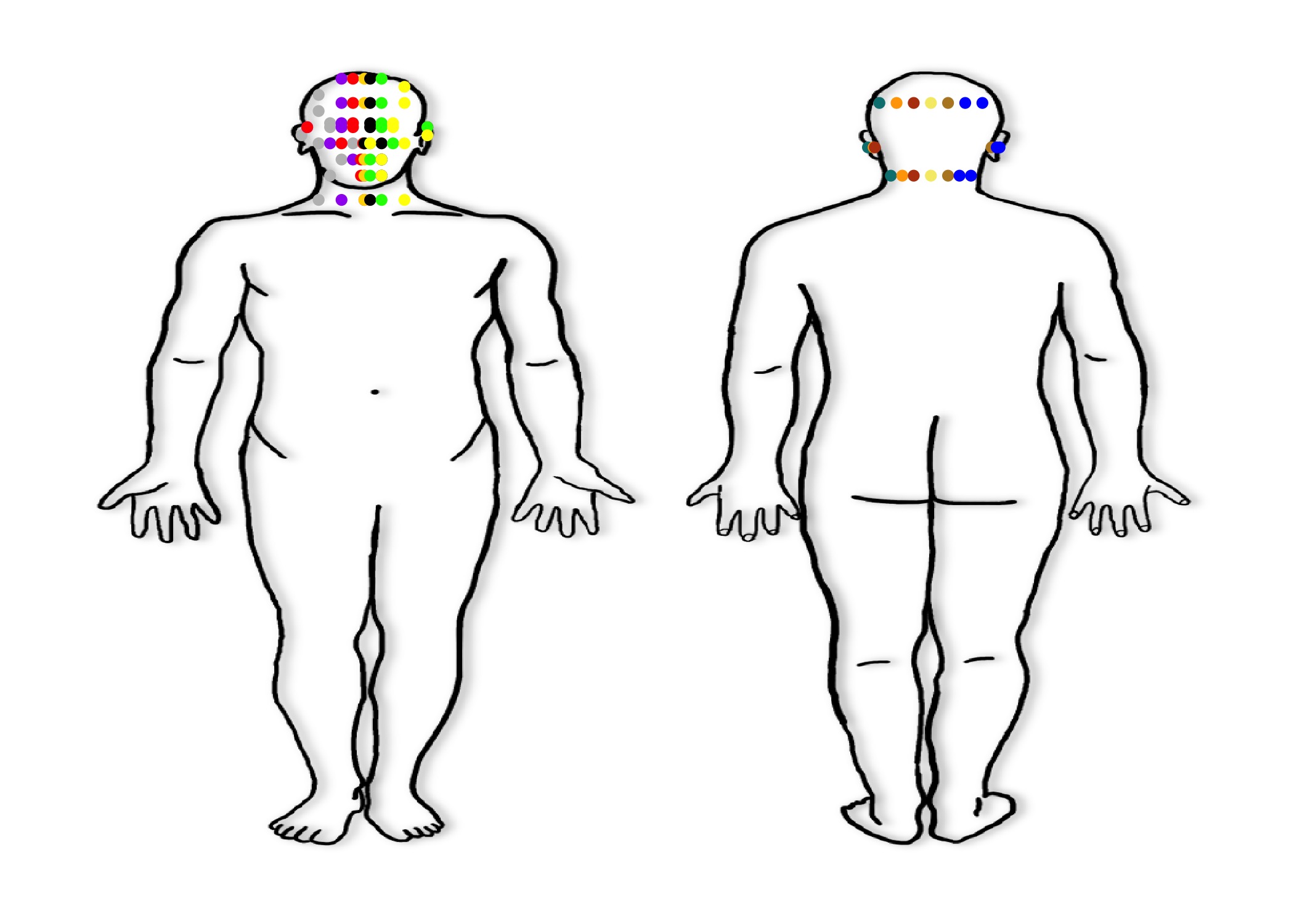
Head and Neck Look Up Table
- We can then take those points and generate a “look up” table for our Head/Neck lesions
- Of note, these look up tables are created by hand, based on the coordinates above
- One can make them in Excel, for example, and import them into
R, or generate them inR
- These will be used later by merging with the exported data sets to give the data set the appropriate coordinate system
- Of note, color coding the points can be helpful to keep track of the lesions as you put them on the map, but it’s not necessary
| Laterality | Anterior_Posterior | Medial_Lateral | Lesion_Location | spec_loc_laterality | spec_loc_ant_post | spec_loc_med_lat | spec_loc_head | x | y |
|---|---|---|---|---|---|---|---|---|---|
| Right | Anterior | Lateral | Scalp | 1 | 1 | 2 | 1 | 33.3 | 95.0 |
| Right | Anterior | Lateral | Forehead | 1 | 1 | 2 | 2 | 33.5 | 95.0 |
| Right | Anterior | Lateral | Eyelid | 1 | 1 | 2 | 3 | 34.0 | 92.5 |
| Right | Anterior | Lateral | Nose | 1 | 1 | 2 | 4 | 35.0 | 90.5 |
| Right | Anterior | Lateral | Cheek | 1 | 1 | 2 | 5 | 33.8 | 90.5 |
| Right | Anterior | Lateral | Lip | 1 | 1 | 2 | 6 | 34.6 | 88.5 |
| Right | Anterior | Lateral | Chin | 1 | 1 | 2 | 7 | 34.7 | 87.3 |
| Right | Anterior | Lateral | Neck | 1 | 1 | 2 | 8 | 34.0 | 85.0 |
| Right | Anterior | Lateral | Ear | 1 | 1 | 2 | 9 | 32.8 | 91.0 |
| Right | Anterior | Lateral | Eyebrow | 1 | 1 | 2 | 10 | 34.0 | 93.2 |
| Right | NA | Lateral | Scalp | 1 | NA | 2 | 1 | 33.3 | 95.0 |
| Right | NA | Lateral | Forehead | 1 | NA | 2 | 2 | 33.5 | 93.0 |
| Right | NA | Lateral | Eyelid | 1 | NA | 2 | 3 | 34.0 | 92.5 |
| Right | NA | Lateral | Nose | 1 | NA | 2 | 4 | 35.0 | 90.5 |
| Right | NA | Lateral | Cheek | 1 | NA | 2 | 5 | 33.8 | 90.5 |
| Right | NA | Lateral | Lip | 1 | NA | 2 | 6 | 34.6 | 88.5 |
| Right | NA | Lateral | Chin | 1 | NA | 2 | 7 | 34.7 | 87.3 |
| Right | NA | Lateral | Neck | 1 | NA | 2 | 8 | 34.0 | 85.0 |
| Right | NA | Lateral | Ear | 1 | NA | 2 | 9 | 32.8 | 91.0 |
| Right | NA | Lateral | Eyebrow | 1 | NA | 2 | 10 | 34.0 | 93.2 |
| Right | Unknown | Lateral | Scalp | 1 | 98 | 2 | 1 | 33.3 | 95.0 |
| Right | Unknown | Lateral | Forehead | 1 | 98 | 2 | 2 | 33.5 | 93.0 |
| Right | Unknown | Lateral | Eyelid | 1 | 98 | 2 | 3 | 34.0 | 92.5 |
| Right | Unknown | Lateral | Nose | 1 | 98 | 2 | 4 | 35.0 | 90.5 |
| Right | Unknown | Lateral | Cheek | 1 | 98 | 2 | 5 | 33.8 | 90.5 |
| Right | Unknown | Lateral | Lip | 1 | 98 | 2 | 6 | 34.6 | 88.5 |
| Right | Unknown | Lateral | Chin | 1 | 98 | 2 | 7 | 34.7 | 87.3 |
| Right | Unknown | Lateral | Neck | 1 | 98 | 2 | 8 | 34.0 | 85.0 |
| Right | Unknown | Lateral | Ear | 1 | 98 | 2 | 9 | 32.8 | 91.0 |
| Right | Unknown | Lateral | Eyebrow | 1 | 98 | 2 | 10 | 34.0 | 93.2 |
| Right | Anterior | Midline | Scalp | 1 | 1 | 3 | 1 | 34.2 | 96.0 |
| Right | Anterior | Midline | Forehead | 1 | 1 | 3 | 2 | 34.2 | 95.0 |
| Right | Anterior | Midline | Eyelid | 1 | 1 | 3 | 3 | 34.2 | 92.5 |
| Right | Anterior | Midline | Nose | 1 | 1 | 3 | 4 | 35.5 | 90.5 |
| Right | Anterior | Midline | Cheek | 1 | 1 | 3 | 5 | 34.0 | 90.5 |
| Right | Anterior | Midline | Lip | 1 | 1 | 3 | 6 | 34.7 | 88.5 |
| Right | Anterior | Midline | Chin | 1 | 1 | 3 | 7 | 35.0 | 87.0 |
| Right | Anterior | Midline | Neck | 1 | 1 | 3 | 8 | 34.5 | 85.0 |
| Right | Anterior | Midline | Ear | 1 | 1 | 3 | 9 | 32.9 | 91.0 |
| Right | Anterior | Midline | Eyebrow | 1 | 1 | 3 | 10 | 34.2 | 93.2 |
| Right | Anterior | NA | Scalp | 1 | 1 | NA | 1 | 34.2 | 96.0 |
| Right | Anterior | NA | Forehead | 1 | 1 | NA | 2 | 34.2 | 95.0 |
| Right | Anterior | NA | Eyelid | 1 | 1 | NA | 3 | 34.2 | 92.5 |
| Right | Anterior | NA | Nose | 1 | 1 | NA | 4 | 35.0 | 90.5 |
| Right | Anterior | NA | Cheek | 1 | 1 | NA | 5 | 34.0 | 90.5 |
| Right | Anterior | NA | Lip | 1 | 1 | NA | 6 | 34.7 | 88.5 |
| Right | Anterior | NA | Chin | 1 | 1 | NA | 7 | 35.5 | 87.0 |
| Right | Anterior | NA | Neck | 1 | 1 | NA | 8 | 34.2 | 85.0 |
| Right | Anterior | NA | Ear | 1 | 1 | NA | 9 | 32.9 | 91.0 |
| Right | Anterior | NA | Eyebrow | 1 | 1 | NA | 10 | 34.2 | 93.2 |
| Right | Anterior | Unknown | Scalp | 1 | 1 | 98 | 1 | 34.2 | 96.0 |
| Right | Anterior | Unknown | Forehead | 1 | 1 | 98 | 2 | 34.2 | 95.0 |
| Right | Anterior | Unknown | Eyelid | 1 | 1 | 98 | 3 | 34.2 | 92.5 |
| Right | Anterior | Unknown | Nose | 1 | 1 | 98 | 4 | 35.0 | 90.5 |
| Right | Anterior | Unknown | Cheek | 1 | 1 | 98 | 5 | 34.0 | 90.5 |
| Right | Anterior | Unknown | Lip | 1 | 1 | 98 | 6 | 34.7 | 88.5 |
| Right | Anterior | Unknown | Chin | 1 | 1 | 98 | 7 | 35.5 | 87.0 |
| Right | Anterior | Unknown | Neck | 1 | 1 | 98 | 8 | 34.2 | 85.0 |
| Right | Anterior | Unknown | Ear | 1 | 1 | 98 | 9 | 32.9 | 91.0 |
| Right | Anterior | Unknown | Eyebrow | 1 | 1 | 98 | 10 | 34.2 | 93.2 |
| Right | NA | Midline | Scalp | 1 | NA | 3 | 1 | 34.2 | 96.0 |
| Right | NA | Midline | Forehead | 1 | NA | 3 | 2 | 34.2 | 95.0 |
| Right | NA | Midline | Eyelid | 1 | NA | 3 | 3 | 34.2 | 92.5 |
| Right | NA | Midline | Nose | 1 | NA | 3 | 4 | 35.5 | 90.5 |
| Right | NA | Midline | Cheek | 1 | NA | 3 | 5 | 34.0 | 90.5 |
| Right | NA | Midline | Lip | 1 | NA | 3 | 6 | 34.7 | 88.5 |
| Right | NA | Midline | Chin | 1 | NA | 3 | 7 | 35.5 | 87.0 |
| Right | NA | Midline | Neck | 1 | NA | 3 | 8 | 34.2 | 85.0 |
| Right | NA | Midline | Ear | 1 | NA | 3 | 9 | 32.9 | 91.0 |
| Right | NA | Midline | Eyebrow | 1 | NA | 3 | 10 | 34.2 | 93.2 |
| Right | Unknown | Midline | Scalp | 1 | 98 | 3 | 1 | 34.2 | 96.0 |
| Right | Unknown | Midline | Forehead | 1 | 98 | 3 | 2 | 34.2 | 95.0 |
| Right | Unknown | Midline | Eyelid | 1 | 98 | 3 | 3 | 34.2 | 92.5 |
| Right | Unknown | Midline | Nose | 1 | 98 | 3 | 4 | 35.0 | 90.5 |
| Right | Unknown | Midline | Cheek | 1 | 98 | 3 | 5 | 34.0 | 90.5 |
| Right | Unknown | Midline | Lip | 1 | 98 | 3 | 6 | 34.7 | 88.5 |
| Right | Unknown | Midline | Chin | 1 | 98 | 3 | 7 | 35.5 | 87.0 |
| Right | Unknown | Midline | Neck | 1 | 98 | 3 | 8 | 34.2 | 85.0 |
| Right | Unknown | Midline | Ear | 1 | 98 | 3 | 9 | 32.9 | 91.0 |
| Right | Unknown | Midline | Eyebrow | 1 | 98 | 3 | 10 | 34.2 | 93.2 |
| Right | NA | NA | Scalp | 1 | NA | NA | 1 | 34.2 | 96.0 |
| Right | NA | NA | Forehead | 1 | NA | NA | 2 | 34.2 | 95.0 |
| Right | NA | NA | Eyelid | 1 | NA | NA | 3 | 34.2 | 92.5 |
| Right | NA | NA | Nose | 1 | NA | NA | 4 | 35.5 | 90.5 |
| Right | NA | NA | Cheek | 1 | NA | NA | 5 | 34.0 | 90.5 |
| Right | NA | NA | Lip | 1 | NA | NA | 6 | 34.7 | 88.5 |
| Right | NA | NA | Chin | 1 | NA | NA | 7 | 35.5 | 87.0 |
| Right | NA | NA | Neck | 1 | NA | NA | 8 | 34.2 | 85.0 |
| Right | NA | NA | Ear | 1 | NA | NA | 9 | 32.9 | 91.0 |
| Right | NA | NA | Eyebrow | 1 | NA | NA | 10 | 34.2 | 93.2 |
| Right | Unknown | NA | Scalp | 1 | 98 | NA | 1 | 34.2 | 96.0 |
| Right | Unknown | NA | Forehead | 1 | 98 | NA | 2 | 34.2 | 95.0 |
| Right | Unknown | NA | Eyelid | 1 | 98 | NA | 3 | 34.2 | 92.5 |
| Right | Unknown | NA | Nose | 1 | 98 | NA | 4 | 35.0 | 90.5 |
| Right | Unknown | NA | Cheek | 1 | 98 | NA | 5 | 34.0 | 90.5 |
| Right | Unknown | NA | Lip | 1 | 98 | NA | 6 | 34.7 | 88.5 |
| Right | Unknown | NA | Chin | 1 | 98 | NA | 7 | 35.5 | 87.0 |
| Right | Unknown | NA | Neck | 1 | 98 | NA | 8 | 34.2 | 85.0 |
| Right | Unknown | NA | Ear | 1 | 98 | NA | 9 | 32.9 | 91.0 |
| Right | Unknown | NA | Eyebrow | 1 | 98 | NA | 10 | 34.2 | 93.2 |
| Right | Unknown | Unknown | Scalp | 1 | 98 | 98 | 1 | 34.2 | 96.0 |
| Right | Unknown | Unknown | Forehead | 1 | 98 | 98 | 2 | 34.2 | 95.0 |
| Right | Unknown | Unknown | Eyelid | 1 | 98 | 98 | 3 | 34.2 | 92.5 |
| Right | Unknown | Unknown | Nose | 1 | 98 | 98 | 4 | 35.0 | 90.5 |
| Right | Unknown | Unknown | Cheek | 1 | 98 | 98 | 5 | 34.0 | 90.5 |
| Right | Unknown | Unknown | Lip | 1 | 98 | 98 | 6 | 34.7 | 88.5 |
| Right | Unknown | Unknown | Chin | 1 | 98 | 98 | 7 | 35.5 | 87.0 |
| Right | Unknown | Unknown | Neck | 1 | 98 | 98 | 8 | 34.2 | 85.0 |
| Right | Unknown | Unknown | Ear | 1 | 98 | 98 | 9 | 32.9 | 91.0 |
| Right | Unknown | Unknown | Eyebrow | 1 | 98 | 98 | 10 | 34.2 | 93.2 |
| Right | NA | Unknown | Scalp | 1 | NA | 98 | 1 | 34.2 | 96.0 |
| Right | NA | Unknown | Forehead | 1 | NA | 98 | 2 | 34.2 | 95.0 |
| Right | NA | Unknown | Eyelid | 1 | NA | 98 | 3 | 34.2 | 92.5 |
| Right | NA | Unknown | Nose | 1 | NA | 98 | 4 | 35.0 | 90.5 |
| Right | NA | Unknown | Cheek | 1 | NA | 98 | 5 | 34.0 | 90.5 |
| Right | NA | Unknown | Lip | 1 | NA | 98 | 6 | 34.7 | 88.5 |
| Right | NA | Unknown | Chin | 1 | NA | 98 | 7 | 35.5 | 87.0 |
| Right | NA | Unknown | Neck | 1 | NA | 98 | 8 | 34.2 | 85.0 |
| Right | NA | Unknown | Ear | 1 | NA | 98 | 9 | 32.9 | 91.0 |
| Right | NA | Unknown | Eyebrow | 1 | NA | 98 | 10 | 34.2 | 93.2 |
| Right | Anterior | Medial | Scalp | 1 | 1 | 1 | 1 | 35.0 | 97.0 |
| Right | Anterior | Medial | Forehead | 1 | 1 | 1 | 2 | 35.0 | 95.0 |
| Right | Anterior | Medial | Eyelid | 1 | 1 | 1 | 3 | 34.6 | 92.5 |
| Right | Anterior | Medial | Nose | 1 | 1 | 1 | 4 | 35.2 | 90.5 |
| Right | Anterior | Medial | Cheek | 1 | 1 | 1 | 5 | 34.8 | 90.5 |
| Right | Anterior | Medial | Lip | 1 | 1 | 1 | 6 | 35.1 | 88.0 |
| Right | Anterior | Medial | Chin | 1 | 1 | 1 | 7 | 35.1 | 87.0 |
| Right | Anterior | Medial | Neck | 1 | 1 | 1 | 8 | 35.0 | 85.0 |
| Right | Anterior | Medial | Ear | 1 | 1 | 1 | 9 | 33.0 | 91.0 |
| Right | Anterior | Medial | Eyebrow | 1 | 1 | 1 | 10 | 34.8 | 93.2 |
| Right | NA | Medial | Scalp | 1 | NA | 1 | 1 | 35.0 | 97.0 |
| Right | NA | Medial | Forehead | 1 | NA | 1 | 2 | 35.0 | 95.0 |
| Right | NA | Medial | Eyelid | 1 | NA | 1 | 3 | 34.6 | 92.5 |
| Right | NA | Medial | Nose | 1 | NA | 1 | 4 | 35.2 | 90.5 |
| Right | NA | Medial | Cheek | 1 | NA | 1 | 5 | 34.8 | 90.5 |
| Right | NA | Medial | Lip | 1 | NA | 1 | 6 | 35.1 | 88.0 |
| Right | NA | Medial | Chin | 1 | NA | 1 | 7 | 35.1 | 87.0 |
| Right | NA | Medial | Neck | 1 | NA | 1 | 8 | 35.0 | 85.0 |
| Right | NA | Medial | Ear | 1 | NA | 1 | 9 | 33.0 | 91.0 |
| Right | NA | Medial | Eyebrow | 1 | NA | 1 | 10 | 34.8 | 93.2 |
| Right | Unknown | Medial | Scalp | 1 | 98 | 1 | 1 | 35.0 | 97.0 |
| Right | Unknown | Medial | Forehead | 1 | 98 | 1 | 2 | 35.0 | 95.0 |
| Right | Unknown | Medial | Eyelid | 1 | 98 | 1 | 3 | 34.6 | 92.5 |
| Right | Unknown | Medial | Nose | 1 | 98 | 1 | 4 | 35.2 | 90.5 |
| Right | Unknown | Medial | Cheek | 1 | 98 | 1 | 5 | 34.8 | 90.5 |
| Right | Unknown | Medial | Lip | 1 | 98 | 1 | 6 | 35.1 | 88.0 |
| Right | Unknown | Medial | Chin | 1 | 98 | 1 | 7 | 35.1 | 87.0 |
| Right | Unknown | Medial | Neck | 1 | 98 | 1 | 8 | 35.0 | 85.0 |
| Right | Unknown | Medial | Ear | 1 | 98 | 1 | 9 | 33.0 | 91.0 |
| Right | Unknown | Medial | Eyebrow | 1 | 98 | 1 | 10 | 34.8 | 93.2 |
| Midline | Anterior | NA | Scalp | 3 | 1 | NA | 1 | 35.4 | 97.0 |
| Midline | Anterior | NA | Forehead | 3 | 1 | NA | 2 | 35.4 | 95.0 |
| Midline | Anterior | NA | Eyelid | 3 | 1 | NA | 3 | NA | NA |
| Midline | Anterior | NA | Nose | 3 | 1 | NA | 4 | 35.4 | 90.5 |
| Midline | Anterior | NA | Cheek | 3 | 1 | NA | 5 | NA | NA |
| Midline | Anterior | NA | Lip | 3 | 1 | NA | 6 | 35.4 | 88.5 |
| Midline | Anterior | NA | Chin | 3 | 1 | NA | 7 | 35.4 | 87.0 |
| Midline | Anterior | NA | Neck | 3 | 1 | NA | 8 | 35.4 | 84.0 |
| Midline | Anterior | NA | Ear | 3 | 1 | NA | 9 | NA | NA |
| Midline | Anterior | NA | Eyebrow | 3 | 1 | NA | 10 | NA | NA |
| Midline | Unknown | NA | Scalp | 3 | 98 | NA | 1 | 35.4 | 97.0 |
| Midline | Unknown | NA | Forehead | 3 | 98 | NA | 2 | 35.4 | 95.0 |
| Midline | Unknown | NA | Eyelid | 3 | 98 | NA | 3 | NA | NA |
| Midline | Unknown | NA | Nose | 3 | 98 | NA | 4 | 35.4 | 90.5 |
| Midline | Unknown | NA | Cheek | 3 | 98 | NA | 5 | NA | NA |
| Midline | Unknown | NA | Lip | 3 | 98 | NA | 6 | 35.4 | 88.5 |
| Midline | Unknown | NA | Chin | 3 | 98 | NA | 7 | 35.4 | 87.0 |
| Midline | Unknown | NA | Neck | 3 | 98 | NA | 8 | 35.4 | 84.0 |
| Midline | Unknown | NA | Ear | 3 | 98 | NA | 9 | NA | NA |
| Midline | Unknown | NA | Eyebrow | 3 | 98 | NA | 10 | NA | NA |
| Midline | Unknown | Unknown | Scalp | 3 | 98 | 98 | 1 | 35.4 | 97.0 |
| Midline | Unknown | Unknown | Forehead | 3 | 98 | 98 | 2 | 35.4 | 95.0 |
| Midline | Unknown | Unknown | Eyelid | 3 | 98 | 98 | 3 | NA | NA |
| Midline | Unknown | Unknown | Nose | 3 | 98 | 98 | 4 | 35.4 | 90.5 |
| Midline | Unknown | Unknown | Cheek | 3 | 98 | 98 | 5 | NA | NA |
| Midline | Unknown | Unknown | Lip | 3 | 98 | 98 | 6 | 35.4 | 88.5 |
| Midline | Unknown | Unknown | Chin | 3 | 98 | 98 | 7 | 35.4 | 87.0 |
| Midline | Unknown | Unknown | Neck | 3 | 98 | 98 | 8 | 35.4 | 84.0 |
| Midline | Unknown | Unknown | Ear | 3 | 98 | 98 | 9 | NA | NA |
| Midline | Unknown | Unknown | Eyebrow | 3 | 98 | 98 | 10 | NA | NA |
| Midline | NA | NA | Scalp | 3 | NA | NA | 1 | 35.4 | 97.0 |
| Midline | NA | NA | Forehead | 3 | NA | NA | 2 | 35.4 | 95.0 |
| Midline | NA | NA | Eyelid | 3 | NA | NA | 3 | NA | NA |
| Midline | NA | NA | Nose | 3 | NA | NA | 4 | 35.4 | 90.5 |
| Midline | NA | NA | Cheek | 3 | NA | NA | 5 | NA | NA |
| Midline | NA | NA | Lip | 3 | NA | NA | 6 | 35.4 | 88.5 |
| Midline | NA | NA | Chin | 3 | NA | NA | 7 | 35.4 | 87.0 |
| Midline | NA | NA | Neck | 3 | NA | NA | 8 | 35.4 | 84.0 |
| Midline | NA | NA | Ear | 3 | NA | NA | 9 | NA | NA |
| Midline | NA | NA | Eyebrow | 3 | NA | NA | 10 | NA | NA |
| NA | NA | NA | Scalp | NA | NA | NA | 1 | 35.4 | 97.0 |
| NA | NA | NA | Forehead | NA | NA | NA | 2 | 35.4 | 95.0 |
| NA | NA | NA | Eyelid | NA | NA | NA | 3 | NA | NA |
| NA | NA | NA | Nose | NA | NA | NA | 4 | 35.4 | 90.5 |
| NA | NA | NA | Cheek | NA | NA | NA | 5 | NA | NA |
| NA | NA | NA | Lip | NA | NA | NA | 6 | 35.4 | 88.5 |
| NA | NA | NA | Chin | NA | NA | NA | 7 | 35.4 | 87.0 |
| NA | NA | NA | Neck | NA | NA | NA | 8 | 35.4 | 84.0 |
| NA | NA | NA | Ear | NA | NA | NA | 9 | NA | NA |
| NA | NA | NA | Eyebrow | NA | NA | NA | 10 | NA | NA |
| Left | Anterior | Medial | Scalp | 2 | 1 | 1 | 1 | 36.0 | 97.0 |
| Left | Anterior | Medial | Forehead | 2 | 1 | 1 | 2 | 36.0 | 95.0 |
| Left | Anterior | Medial | Eyelid | 2 | 1 | 1 | 3 | 36.0 | 92.5 |
| Left | Anterior | Medial | Nose | 2 | 1 | 1 | 4 | 35.6 | 90.5 |
| Left | Anterior | Medial | Cheek | 2 | 1 | 1 | 5 | 36.0 | 90.5 |
| Left | Anterior | Medial | Lip | 2 | 1 | 1 | 6 | 35.7 | 88.0 |
| Left | Anterior | Medial | Chin | 2 | 1 | 1 | 7 | 35.7 | 87.0 |
| Left | Anterior | Medial | Neck | 2 | 1 | 1 | 8 | 35.8 | 85.0 |
| Left | Anterior | Medial | Ear | 2 | 1 | 1 | 9 | 37.7 | 91.0 |
| Left | Anterior | Medial | Eyebrow | 2 | 1 | 1 | 10 | 36.0 | 93.2 |
| Left | NA | Medial | Scalp | 2 | NA | 1 | 1 | 36.0 | 97.0 |
| Left | NA | Medial | Forehead | 2 | NA | 1 | 2 | 36.0 | 95.0 |
| Left | NA | Medial | Eyelid | 2 | NA | 1 | 3 | 36.0 | 92.5 |
| Left | NA | Medial | Nose | 2 | NA | 1 | 4 | 35.6 | 90.5 |
| Left | NA | Medial | Cheek | 2 | NA | 1 | 5 | 36.0 | 90.5 |
| Left | NA | Medial | Lip | 2 | NA | 1 | 6 | 35.7 | 88.0 |
| Left | NA | Medial | Chin | 2 | NA | 1 | 7 | 35.7 | 87.0 |
| Left | NA | Medial | Neck | 2 | NA | 1 | 8 | 35.8 | 85.0 |
| Left | NA | Medial | Ear | 2 | NA | 1 | 9 | 37.7 | 91.0 |
| Left | NA | Medial | Eyebrow | 2 | NA | 1 | 10 | 36.0 | 93.2 |
| Left | Unknown | Medial | Scalp | 2 | 98 | 1 | 1 | 36.0 | 97.0 |
| Left | Unknown | Medial | Forehead | 2 | 98 | 1 | 2 | 36.0 | 95.0 |
| Left | Unknown | Medial | Eyelid | 2 | 98 | 1 | 3 | 36.0 | 92.5 |
| Left | Unknown | Medial | Nose | 2 | 98 | 1 | 4 | 35.6 | 90.5 |
| Left | Unknown | Medial | Cheek | 2 | 98 | 1 | 5 | 36.0 | 90.5 |
| Left | Unknown | Medial | Lip | 2 | 98 | 1 | 6 | 35.7 | 88.0 |
| Left | Unknown | Medial | Chin | 2 | 98 | 1 | 7 | 35.7 | 87.0 |
| Left | Unknown | Medial | Neck | 2 | 98 | 1 | 8 | 35.8 | 85.0 |
| Left | Unknown | Medial | Ear | 2 | 98 | 1 | 9 | 37.7 | 91.0 |
| Left | Unknown | Medial | Eyebrow | 2 | 98 | 1 | 10 | 36.0 | 93.2 |
| Left | Anterior | Midline | Scalp | 2 | 1 | 3 | 1 | 36.5 | 96.0 |
| Left | Anterior | Midline | Forehead | 2 | 1 | 3 | 2 | 36.5 | 93.0 |
| Left | Anterior | Midline | Eyelid | 2 | 1 | 3 | 3 | 36.5 | 92.5 |
| Left | Anterior | Midline | Nose | 2 | 1 | 3 | 4 | 35.8 | 90.5 |
| Left | Anterior | Midline | Cheek | 2 | 1 | 3 | 5 | 36.5 | 90.5 |
| Left | Anterior | Midline | Lip | 2 | 1 | 3 | 6 | 36.0 | 88.5 |
| Left | Anterior | Midline | Chin | 2 | 1 | 3 | 7 | 35.8 | 87.0 |
| Left | Anterior | Midline | Neck | 2 | 1 | 3 | 8 | 36.5 | 85.0 |
| Left | Anterior | Midline | Ear | 2 | 1 | 3 | 9 | 37.7 | 91.0 |
| Left | Anterior | Midline | Eyebrow | 2 | 1 | 3 | 10 | 36.5 | 93.2 |
| Left | Anterior | NA | Scalp | 2 | 1 | NA | 1 | 36.5 | 96.0 |
| Left | Anterior | NA | Forehead | 2 | 1 | NA | 2 | 36.5 | 93.0 |
| Left | Anterior | NA | Eyelid | 2 | 1 | NA | 3 | 36.5 | 92.5 |
| Left | Anterior | NA | Nose | 2 | 1 | NA | 4 | 35.8 | 90.5 |
| Left | Anterior | NA | Cheek | 2 | 1 | NA | 5 | 36.5 | 90.5 |
| Left | Anterior | NA | Lip | 2 | 1 | NA | 6 | 36.0 | 88.5 |
| Left | Anterior | NA | Chin | 2 | 1 | NA | 7 | 35.8 | 87.0 |
| Left | Anterior | NA | Neck | 2 | 1 | NA | 8 | 36.5 | 85.0 |
| Left | Anterior | NA | Ear | 2 | 1 | NA | 9 | 37.7 | 91.0 |
| Left | Anterior | NA | Eyebrow | 2 | 1 | NA | 10 | 36.5 | 93.2 |
| Left | Anterior | Unknown | Scalp | 2 | 1 | 98 | 1 | 36.5 | 96.0 |
| Left | Anterior | Unknown | Forehead | 2 | 1 | 98 | 2 | 36.5 | 93.0 |
| Left | Anterior | Unknown | Eyelid | 2 | 1 | 98 | 3 | 36.5 | 92.5 |
| Left | Anterior | Unknown | Nose | 2 | 1 | 98 | 4 | 35.8 | 90.5 |
| Left | Anterior | Unknown | Cheek | 2 | 1 | 98 | 5 | 36.5 | 90.5 |
| Left | Anterior | Unknown | Lip | 2 | 1 | 98 | 6 | 36.0 | 88.5 |
| Left | Anterior | Unknown | Chin | 2 | 1 | 98 | 7 | 35.8 | 87.0 |
| Left | Anterior | Unknown | Neck | 2 | 1 | 98 | 8 | 36.5 | 85.0 |
| Left | Anterior | Unknown | Ear | 2 | 1 | 98 | 9 | 37.7 | 91.0 |
| Left | Anterior | Unknown | Eyebrow | 2 | 1 | 98 | 10 | 36.5 | 93.2 |
| Left | NA | Midline | Scalp | 2 | NA | 3 | 1 | 36.5 | 96.0 |
| Left | NA | Midline | Forehead | 2 | NA | 3 | 2 | 36.5 | 93.0 |
| Left | NA | Midline | Eyelid | 2 | NA | 3 | 3 | 36.5 | 92.5 |
| Left | NA | Midline | Nose | 2 | NA | 3 | 4 | 35.8 | 90.5 |
| Left | NA | Midline | Cheek | 2 | NA | 3 | 5 | 36.5 | 90.5 |
| Left | NA | Midline | Lip | 2 | NA | 3 | 6 | 36.0 | 88.5 |
| Left | NA | Midline | Chin | 2 | NA | 3 | 7 | 35.8 | 87.0 |
| Left | NA | Midline | Neck | 2 | NA | 3 | 8 | 36.5 | 85.0 |
| Left | NA | Midline | Ear | 2 | NA | 3 | 9 | 37.7 | 91.0 |
| Left | NA | Midline | Eyebrow | 2 | NA | 3 | 10 | 36.5 | 93.2 |
| Left | Unknown | Midline | Scalp | 2 | 98 | 3 | 1 | 36.5 | 96.0 |
| Left | Unknown | Midline | Forehead | 2 | 98 | 3 | 2 | 36.5 | 93.0 |
| Left | Unknown | Midline | Eyelid | 2 | 98 | 3 | 3 | 36.5 | 92.5 |
| Left | Unknown | Midline | Nose | 2 | 98 | 3 | 4 | 35.8 | 90.5 |
| Left | Unknown | Midline | Cheek | 2 | 98 | 3 | 5 | 36.5 | 90.5 |
| Left | Unknown | Midline | Lip | 2 | 98 | 3 | 6 | 36.0 | 88.5 |
| Left | Unknown | Midline | Chin | 2 | 98 | 3 | 7 | 35.8 | 87.0 |
| Left | Unknown | Midline | Neck | 2 | 98 | 3 | 8 | 36.5 | 85.0 |
| Left | Unknown | Midline | Ear | 2 | 98 | 3 | 9 | 37.7 | 91.0 |
| Left | Unknown | Midline | Eyebrow | 2 | 98 | 3 | 10 | 36.5 | 93.2 |
| Left | NA | NA | Scalp | 2 | NA | NA | 1 | 36.5 | 96.0 |
| Left | NA | NA | Forehead | 2 | NA | NA | 2 | 36.5 | 93.0 |
| Left | NA | NA | Eyelid | 2 | NA | NA | 3 | 36.5 | 92.5 |
| Left | NA | NA | Nose | 2 | NA | NA | 4 | 35.8 | 90.5 |
| Left | NA | NA | Cheek | 2 | NA | NA | 5 | 36.5 | 90.5 |
| Left | NA | NA | Lip | 2 | NA | NA | 6 | 36.0 | 88.5 |
| Left | NA | NA | Chin | 2 | NA | NA | 7 | 35.8 | 87.0 |
| Left | NA | NA | Neck | 2 | NA | NA | 8 | 36.5 | 85.0 |
| Left | NA | NA | Ear | 2 | NA | NA | 9 | 37.7 | 91.0 |
| Left | NA | NA | Eyebrow | 2 | NA | NA | 10 | 36.5 | 93.2 |
| Left | Unknown | NA | Scalp | 2 | 98 | NA | 1 | 36.5 | 96.0 |
| Left | Unknown | NA | Forehead | 2 | 98 | NA | 2 | 36.5 | 93.0 |
| Left | Unknown | NA | Eyelid | 2 | 98 | NA | 3 | 36.5 | 92.5 |
| Left | Unknown | NA | Nose | 2 | 98 | NA | 4 | 35.8 | 90.5 |
| Left | Unknown | NA | Cheek | 2 | 98 | NA | 5 | 36.5 | 90.5 |
| Left | Unknown | NA | Lip | 2 | 98 | NA | 6 | 36.0 | 88.5 |
| Left | Unknown | NA | Chin | 2 | 98 | NA | 7 | 35.8 | 87.0 |
| Left | Unknown | NA | Neck | 2 | 98 | NA | 8 | 36.5 | 85.0 |
| Left | Unknown | NA | Ear | 2 | 98 | NA | 9 | 37.7 | 91.0 |
| Left | Unknown | NA | Eyebrow | 2 | 98 | NA | 10 | 36.5 | 93.2 |
| Left | Unknown | Unknown | Scalp | 2 | 98 | 98 | 1 | 36.5 | 96.0 |
| Left | Unknown | Unknown | Forehead | 2 | 98 | 98 | 2 | 36.5 | 93.0 |
| Left | Unknown | Unknown | Eyelid | 2 | 98 | 98 | 3 | 36.5 | 92.5 |
| Left | Unknown | Unknown | Nose | 2 | 98 | 98 | 4 | 35.8 | 90.5 |
| Left | Unknown | Unknown | Cheek | 2 | 98 | 98 | 5 | 36.5 | 90.5 |
| Left | Unknown | Unknown | Lip | 2 | 98 | 98 | 6 | 36.0 | 88.5 |
| Left | Unknown | Unknown | Chin | 2 | 98 | 98 | 7 | 35.8 | 87.0 |
| Left | Unknown | Unknown | Neck | 2 | 98 | 98 | 8 | 36.5 | 85.0 |
| Left | Unknown | Unknown | Ear | 2 | 98 | 98 | 9 | 37.7 | 91.0 |
| Left | Unknown | Unknown | Eyebrow | 2 | 98 | 98 | 10 | 36.5 | 93.2 |
| Left | NA | Unknown | Scalp | 2 | NA | 98 | 1 | 36.5 | 96.0 |
| Left | NA | Unknown | Forehead | 2 | NA | 98 | 2 | 36.5 | 93.0 |
| Left | NA | Unknown | Eyelid | 2 | NA | 98 | 3 | 36.5 | 92.5 |
| Left | NA | Unknown | Nose | 2 | NA | 98 | 4 | 35.8 | 90.5 |
| Left | NA | Unknown | Cheek | 2 | NA | 98 | 5 | 36.5 | 90.5 |
| Left | NA | Unknown | Lip | 2 | NA | 98 | 6 | 36.0 | 88.5 |
| Left | NA | Unknown | Chin | 2 | NA | 98 | 7 | 35.8 | 87.0 |
| Left | NA | Unknown | Neck | 2 | NA | 98 | 8 | 36.5 | 85.0 |
| Left | NA | Unknown | Ear | 2 | NA | 98 | 9 | 37.7 | 91.0 |
| Left | NA | Unknown | Eyebrow | 2 | NA | 98 | 10 | 36.5 | 93.2 |
| Left | Anterior | Lateral | Scalp | 2 | 1 | 2 | 1 | 37.5 | 95.0 |
| Left | Anterior | Lateral | Forehead | 2 | 1 | 2 | 2 | 37.0 | 95.0 |
| Left | Anterior | Lateral | Eyelid | 2 | 1 | 2 | 3 | 36.8 | 92.5 |
| Left | Anterior | Lateral | Nose | 2 | 1 | 2 | 4 | 36.0 | 90.5 |
| Left | Anterior | Lateral | Cheek | 2 | 1 | 2 | 5 | 37.2 | 90.5 |
| Left | Anterior | Lateral | Lip | 2 | 1 | 2 | 6 | 35.9 | 88.5 |
| Left | Anterior | Lateral | Chin | 2 | 1 | 2 | 7 | 36.5 | 87.3 |
| Left | Anterior | Lateral | Neck | 2 | 1 | 2 | 8 | 36.8 | 85.0 |
| Left | Anterior | Lateral | Ear | 2 | 1 | 2 | 9 | 37.9 | 91.0 |
| Left | Anterior | Lateral | Eyebrow | 2 | 1 | 2 | 10 | 36.9 | 93.2 |
| Left | NA | Lateral | Scalp | 2 | NA | 2 | 1 | 37.5 | 95.0 |
| Left | NA | Lateral | Forehead | 2 | NA | 2 | 2 | 37.0 | 93.0 |
| Left | NA | Lateral | Eyelid | 2 | NA | 2 | 3 | 36.8 | 92.5 |
| Left | NA | Lateral | Nose | 2 | NA | 2 | 4 | 36.0 | 90.5 |
| Left | NA | Lateral | Cheek | 2 | NA | 2 | 5 | 37.2 | 90.5 |
| Left | NA | Lateral | Lip | 2 | NA | 2 | 6 | 35.9 | 88.5 |
| Left | NA | Lateral | Chin | 2 | NA | 2 | 7 | 36.5 | 87.3 |
| Left | NA | Lateral | Neck | 2 | NA | 2 | 8 | 36.8 | 85.0 |
| Left | NA | Lateral | Ear | 2 | NA | 2 | 9 | 37.9 | 91.0 |
| Left | NA | Lateral | Eyebrow | 2 | NA | 2 | 10 | 36.9 | 93.2 |
| Left | Unknown | Lateral | Scalp | 2 | 98 | 2 | 1 | 37.2 | 95.0 |
| Left | Unknown | Lateral | Forehead | 2 | 98 | 2 | 2 | 37.0 | 93.0 |
| Left | Unknown | Lateral | Eyelid | 2 | 98 | 2 | 3 | 36.8 | 92.5 |
| Left | Unknown | Lateral | Nose | 2 | 98 | 2 | 4 | 36.0 | 90.5 |
| Left | Unknown | Lateral | Cheek | 2 | 98 | 2 | 5 | 37.2 | 90.5 |
| Left | Unknown | Lateral | Lip | 2 | 98 | 2 | 6 | 35.9 | 88.5 |
| Left | Unknown | Lateral | Chin | 2 | 98 | 2 | 7 | 36.5 | 87.3 |
| Left | Unknown | Lateral | Neck | 2 | 98 | 2 | 8 | 36.8 | 85.0 |
| Left | Unknown | Lateral | Ear | 2 | 98 | 2 | 9 | 37.9 | 91.0 |
| Left | Unknown | Lateral | Eyebrow | 2 | 98 | 2 | 10 | 36.9 | 93.2 |
| Left | Posterior | Lateral | Scalp | 2 | 2 | 2 | 1 | 61.5 | 94.0 |
| Left | Posterior | Lateral | Forehead | 2 | 2 | 2 | 2 | NA | NA |
| Left | Posterior | Lateral | Eyelid | 2 | 2 | 2 | 3 | NA | NA |
| Left | Posterior | Lateral | Nose | 2 | 2 | 2 | 4 | NA | NA |
| Left | Posterior | Lateral | Cheek | 2 | 2 | 2 | 5 | NA | NA |
| Left | Posterior | Lateral | Lip | 2 | 2 | 2 | 6 | NA | NA |
| Left | Posterior | Lateral | Chin | 2 | 2 | 2 | 7 | NA | NA |
| Left | Posterior | Lateral | Neck | 2 | 2 | 2 | 8 | 62.1 | 85.8 |
| Left | Posterior | Lateral | Ear | 2 | 2 | 2 | 9 | 60.9 | 90.4 |
| Left | Posterior | Lateral | Eyebrow | 2 | 2 | 2 | 10 | NA | NA |
| Left | Posterior | Midline | Scalp | 2 | 2 | 3 | 1 | 63.6 | 94.0 |
| Left | Posterior | Midline | Forehead | 2 | 2 | 3 | 2 | NA | NA |
| Left | Posterior | Midline | Eyelid | 2 | 2 | 3 | 3 | NA | NA |
| Left | Posterior | Midline | Nose | 2 | 2 | 3 | 4 | NA | NA |
| Left | Posterior | Midline | Cheek | 2 | 2 | 3 | 5 | NA | NA |
| Left | Posterior | Midline | Lip | 2 | 2 | 3 | 6 | NA | NA |
| Left | Posterior | Midline | Chin | 2 | 2 | 3 | 7 | NA | NA |
| Left | Posterior | Midline | Neck | 2 | 2 | 3 | 8 | 62.8 | 85.0 |
| Left | Posterior | Midline | Ear | 2 | 2 | 3 | 9 | 61.6 | 90.5 |
| Left | Posterior | Midline | Eyebrow | 2 | 2 | 3 | 10 | NA | NA |
| Left | Posterior | NA | Scalp | 2 | 2 | NA | 1 | 63.6 | 94.0 |
| Left | Posterior | NA | Forehead | 2 | 2 | NA | 2 | NA | NA |
| Left | Posterior | NA | Eyelid | 2 | 2 | NA | 3 | NA | NA |
| Left | Posterior | NA | Nose | 2 | 2 | NA | 4 | NA | NA |
| Left | Posterior | NA | Cheek | 2 | 2 | NA | 5 | NA | NA |
| Left | Posterior | NA | Lip | 2 | 2 | NA | 6 | NA | NA |
| Left | Posterior | NA | Chin | 2 | 2 | NA | 7 | NA | NA |
| Left | Posterior | NA | Neck | 2 | 2 | NA | 8 | 62.8 | 85.0 |
| Left | Posterior | NA | Ear | 2 | 2 | NA | 9 | 61.6 | 90.5 |
| Left | Posterior | NA | Eyebrow | 2 | 2 | NA | 10 | NA | NA |
| Left | Posterior | Unknown | Scalp | 2 | 2 | 98 | 1 | 63.6 | 94.0 |
| Left | Posterior | Unknown | Forehead | 2 | 2 | 98 | 2 | NA | NA |
| Left | Posterior | Unknown | Eyelid | 2 | 2 | 98 | 3 | NA | NA |
| Left | Posterior | Unknown | Nose | 2 | 2 | 98 | 4 | NA | NA |
| Left | Posterior | Unknown | Cheek | 2 | 2 | 98 | 5 | NA | NA |
| Left | Posterior | Unknown | Lip | 2 | 2 | 98 | 6 | NA | NA |
| Left | Posterior | Unknown | Chin | 2 | 2 | 98 | 7 | NA | NA |
| Left | Posterior | Unknown | Neck | 2 | 2 | 98 | 8 | 62.8 | 85.0 |
| Left | Posterior | Unknown | Ear | 2 | 2 | 98 | 9 | 61.6 | 90.5 |
| Left | Posterior | Unknown | Eyebrow | 2 | 2 | 98 | 10 | NA | NA |
| Left | Posterior | Medial | Scalp | 2 | 2 | 1 | 1 | 63.0 | 94.0 |
| Left | Posterior | Medial | Forehead | 2 | 2 | 1 | 2 | NA | NA |
| Left | Posterior | Medial | Eyelid | 2 | 2 | 1 | 3 | NA | NA |
| Left | Posterior | Medial | Nose | 2 | 2 | 1 | 4 | NA | NA |
| Left | Posterior | Medial | Cheek | 2 | 2 | 1 | 5 | NA | NA |
| Left | Posterior | Medial | Lip | 2 | 2 | 1 | 6 | NA | NA |
| Left | Posterior | Medial | Chin | 2 | 2 | 1 | 7 | NA | NA |
| Left | Posterior | Medial | Neck | 2 | 2 | 1 | 8 | 63.0 | 85.0 |
| Left | Posterior | Medial | Ear | 2 | 2 | 1 | 9 | 60.8 | 91.0 |
| Left | Posterior | Medial | Eyebrow | 2 | 2 | 1 | 10 | NA | NA |
| Midline | Posterior | NA | Scalp | 3 | 2 | NA | 1 | 63.6 | 94.0 |
| Midline | Posterior | NA | Forehead | 3 | 2 | NA | 2 | NA | NA |
| Midline | Posterior | NA | Eyelid | 3 | 2 | NA | 3 | NA | NA |
| Midline | Posterior | NA | Nose | 3 | 2 | NA | 4 | NA | NA |
| Midline | Posterior | NA | Cheek | 3 | 2 | NA | 5 | NA | NA |
| Midline | Posterior | NA | Lip | 3 | 2 | NA | 6 | NA | NA |
| Midline | Posterior | NA | Chin | 3 | 2 | NA | 7 | NA | NA |
| Midline | Posterior | NA | Neck | 3 | 2 | NA | 8 | 63.6 | 85.0 |
| Midline | Posterior | NA | Ear | 3 | 2 | NA | 9 | NA | NA |
| Midline | Posterior | NA | Eyebrow | 3 | 2 | NA | 10 | NA | NA |
| NA | Posterior | NA | Scalp | NA | 2 | NA | 1 | 63.6 | 94.0 |
| NA | Posterior | NA | Forehead | NA | 2 | NA | 2 | NA | NA |
| NA | Posterior | NA | Eyelid | NA | 2 | NA | 3 | NA | NA |
| NA | Posterior | NA | Nose | NA | 2 | NA | 4 | NA | NA |
| NA | Posterior | NA | Cheek | NA | 2 | NA | 5 | NA | NA |
| NA | Posterior | NA | Lip | NA | 2 | NA | 6 | NA | NA |
| NA | Posterior | NA | Chin | NA | 2 | NA | 7 | NA | NA |
| NA | Posterior | NA | Neck | NA | 2 | NA | 8 | 63.6 | 85.0 |
| NA | Posterior | NA | Ear | NA | 2 | NA | 9 | NA | NA |
| NA | Posterior | NA | Eyebrow | NA | 2 | NA | 10 | NA | NA |
| Right | Posterior | Medial | Scalp | 1 | 2 | 1 | 1 | 64.0 | 94.0 |
| Right | Posterior | Medial | Forehead | 1 | 2 | 1 | 2 | NA | NA |
| Right | Posterior | Medial | Eyelid | 1 | 2 | 1 | 3 | NA | NA |
| Right | Posterior | Medial | Nose | 1 | 2 | 1 | 4 | NA | NA |
| Right | Posterior | Medial | Cheek | 1 | 2 | 1 | 5 | NA | NA |
| Right | Posterior | Medial | Lip | 1 | 2 | 1 | 6 | NA | NA |
| Right | Posterior | Medial | Chin | 1 | 2 | 1 | 7 | NA | NA |
| Right | Posterior | Medial | Neck | 1 | 2 | 1 | 8 | 64.0 | 85.0 |
| Right | Posterior | Medial | Ear | 1 | 2 | 1 | 9 | 66.0 | 91.0 |
| Right | Posterior | Medial | Eyebrow | 1 | 2 | 1 | 10 | NA | NA |
| Right | Posterior | Midline | Scalp | 1 | 2 | 3 | 1 | 65.0 | 94.0 |
| Right | Posterior | Midline | Forehead | 1 | 2 | 3 | 2 | NA | NA |
| Right | Posterior | Midline | Eyelid | 1 | 2 | 3 | 3 | NA | NA |
| Right | Posterior | Midline | Nose | 1 | 2 | 3 | 4 | NA | NA |
| Right | Posterior | Midline | Cheek | 1 | 2 | 3 | 5 | NA | NA |
| Right | Posterior | Midline | Lip | 1 | 2 | 3 | 6 | NA | NA |
| Right | Posterior | Midline | Chin | 1 | 2 | 3 | 7 | NA | NA |
| Right | Posterior | Midline | Neck | 1 | 2 | 3 | 8 | 64.5 | 85.0 |
| Right | Posterior | Midline | Ear | 1 | 2 | 3 | 9 | 66.0 | 91.0 |
| Right | Posterior | Midline | Eyebrow | 1 | 2 | 3 | 10 | NA | NA |
| Right | Posterior | NA | Scalp | 1 | 2 | NA | 1 | 65.0 | 94.0 |
| Right | Posterior | NA | Forehead | 1 | 2 | NA | 2 | NA | NA |
| Right | Posterior | NA | Eyelid | 1 | 2 | NA | 3 | NA | NA |
| Right | Posterior | NA | Nose | 1 | 2 | NA | 4 | NA | NA |
| Right | Posterior | NA | Cheek | 1 | 2 | NA | 5 | NA | NA |
| Right | Posterior | NA | Lip | 1 | 2 | NA | 6 | NA | NA |
| Right | Posterior | NA | Chin | 1 | 2 | NA | 7 | NA | NA |
| Right | Posterior | NA | Neck | 1 | 2 | NA | 8 | 64.5 | 85.0 |
| Right | Posterior | NA | Ear | 1 | 2 | NA | 9 | 66.0 | 91.0 |
| Right | Posterior | NA | Eyebrow | 1 | 2 | NA | 10 | NA | NA |
| Right | Posterior | Unknown | Scalp | 1 | 2 | 98 | 1 | 65.0 | 94.0 |
| Right | Posterior | Unknown | Forehead | 1 | 2 | 98 | 2 | NA | NA |
| Right | Posterior | Unknown | Eyelid | 1 | 2 | 98 | 3 | NA | NA |
| Right | Posterior | Unknown | Nose | 1 | 2 | 98 | 4 | NA | NA |
| Right | Posterior | Unknown | Cheek | 1 | 2 | 98 | 5 | NA | NA |
| Right | Posterior | Unknown | Lip | 1 | 2 | 98 | 6 | NA | NA |
| Right | Posterior | Unknown | Chin | 1 | 2 | 98 | 7 | NA | NA |
| Right | Posterior | Unknown | Neck | 1 | 2 | 98 | 8 | 64.5 | 85.0 |
| Right | Posterior | Unknown | Ear | 1 | 2 | 98 | 9 | 66.0 | 91.0 |
| Right | Posterior | Unknown | Eyebrow | 1 | 2 | 98 | 10 | NA | NA |
| Right | Posterior | Lateral | Scalp | 1 | 2 | 2 | 1 | 65.8 | 94.0 |
| Right | Posterior | Lateral | Forehead | 1 | 2 | 2 | 2 | NA | NA |
| Right | Posterior | Lateral | Eyelid | 1 | 2 | 2 | 3 | NA | NA |
| Right | Posterior | Lateral | Nose | 1 | 2 | 2 | 4 | NA | NA |
| Right | Posterior | Lateral | Cheek | 1 | 2 | 2 | 5 | NA | NA |
| Right | Posterior | Lateral | Lip | 1 | 2 | 2 | 6 | NA | NA |
| Right | Posterior | Lateral | Chin | 1 | 2 | 2 | 7 | NA | NA |
| Right | Posterior | Lateral | Neck | 1 | 2 | 2 | 8 | 65.0 | 85.8 |
| Right | Posterior | Lateral | Ear | 1 | 2 | 2 | 9 | 66.1 | 91.0 |
| Right | Posterior | Lateral | Eyebrow | 1 | 2 | 2 | 10 | NA | NA |
We can do the same thing with all other anatomical regions
Upper Extremity Mapping System
Upper Extremity Coordinates
- Next we will map all Upper Extremity lesions
df.ue <- data.frame()
df.ue.plotly <- ggplot(df.ue) +
xlim(0, 100) +
ylim(0, 100) +
theme_bw() +
theme(panel.border = element_blank(),
panel.grid.major = element_blank(),
panel.grid.minor = element_blank(),
axis.line = element_blank()) +
theme(axis.text.x = element_blank(),
axis.text.y = element_blank(),
axis.ticks = element_blank(),
axis.title = element_blank()) +
annotation_raster(body_map.png,
ymin = 0,
xmin = 0,
xmax = 100,
ymax = 100) +
############ Right Anterior Lateral Arm ############
geom_point(aes(x = 10, # Right Anterior Lateral Shoulder (1, 1, 2, 1)
y = 77),
size = 1.5,
color = "red") +
geom_point(aes(x = 8.5, # Right Anterior Lateral Upper Arm (1, 1, 2, 2)
y = 69),
size = 1.5,
color = "red") +
geom_point(aes(x = 7, # Right Anterior Lateral Forearm (1, 1, 2, 3)
y = 56),
size = 1.5,
color = "red") +
geom_point(aes(x = 4.7, # Right Anterior Lateral Hands/Fingers (1, 1, 2, 4)
y = 47),
size = 1.5,
color = "red") +
geom_point(aes(x = 6.6, # Right Anterior Lateral Wrist (1, 1, 2, 5)
y = 50),
size = 1.5,
color = "red") +
geom_point(aes(x = 7, # Right Anterior Lateral Elbow (1, 1, 2, 6)
y = 62),
size = 1.5,
color = "red") +
############ Right Anterior Midline Arm ############
geom_point(aes(x = 12.5, # Right Anterior Midline Shoulder (1, 1, 3, 1)
y = 77),
size = 1.5,
color = "green") +
geom_point(aes(x = 11, # Right Anterior Midline Upper Arm (1, 1, 3, 2)
y = 69),
size = 1.5,
color = "green") +
geom_point(aes(x = 9, # Right Anterior Midline Forearm (1, 1, 3, 3)
y = 56),
size = 1.5,
color = "green") +
geom_point(aes(x = 8, # Right Anterior Midline Hand/Fingers (1, 1, 3, 4)
y = 45),
size = 1.5,
color = "green") +
geom_point(aes(x = 8.5, # Right Anterior Midline Wrist (1, 1, 3, 5)
y = 50),
size = 1.5,
color = "green") +
geom_point(aes(x = 9.5, # Right Anterior Midline Elbow (1, 1, 3, 6)
y = 62),
size = 1.5,
color = "green") +
############ Right Anterior Medial Arm ############
geom_point(aes(x = 14.5, # Right Anterior Medial Shoulder (1, 3, 1)
y = 77),
size = 1.5,
color = "brown") +
geom_point(aes(x = 13.5, # Right Anterior Medial Upper Arm (1, 3, 2)
y = 69),
size = 1.5,
color = "brown") +
geom_point(aes(x = 11, # Right Anterior Medial Forearm (1, 3, 3)
y = 56),
size = 1.5,
color = "brown") +
geom_point(aes(x = 10, # Right Anterior Medial Wrist (1, 3, 5)
y = 50),
size = 1.5,
color = "brown") +
geom_point(aes(x = 11, # Right Anterior Medial Hands/Fingers (1, 3, 4)
y = 45),
size = 1.5,
color = "brown") +
geom_point(aes(x = 12.5, # Right Anterior Medial Elbow (1, 1, 1, 6)
y = 62),
size = 1.5,
color = "brown") +
##### Left Anterior Medial Arm ######
geom_point(aes(x = 37, # Left Anterior Medial Shoulder (2, 1, 1, 1)
y = 77),
size = 1.5,
color = "blue") +
geom_point(aes(x = 37, # Left Anterior Medial Upper Arm (2, 1, 1, 2)
y = 69),
size = 1.5,
color = "blue") +
geom_point(aes(x = 39, # Left Anterior Medial Forearm (2, 1, 1, 3)
y = 56),
size = 1.5,
color = "blue") +
geom_point(aes(x = 39.5, # Left Medial Anterior Hands/Fingers (2, 1, 1, 4)
y = 45),
size = 1.5,
color = "blue") +
geom_point(aes(x = 40.5, # Left Anterior Medial Wrist (2, 1, 1, 5)
y = 50),
size = 1.5,
color = "blue") +
geom_point(aes(x = 38.5, # Left Medial Anterior Elbow (2, 1, 1, 6)
y = 62),
size = 1.5,
color = "blue") +
####### Left Anterior Midline Arm ###########
geom_point(aes(x = 38.5, # Left Anterior Midline Shoulder (2, 1, 3, 1)
y = 77),
size = 1.5,
color = "black") +
geom_point(aes(x = 39, # Left Anterior Midline Upper Arm (2, 1, 3, 2)
y = 69),
size = 1.5,
color = "black") +
geom_point(aes(x = 41, # Left Anterior Midline Forearm (2, 1, 3, 3)
y = 56),
size = 1.5,
color = "black") +
geom_point(aes(x = 42, # Left Anterior Midline Hand/Finger (2, 1, 3, 4)
y = 45),
size = 1.5,
color = "black") +
geom_point(aes(x = 42, # Left Anterior Midline Wrist (2, 1, 3, 5)
y = 50),
size = 1.5,
color = "black") +
geom_point(aes(x = 40.5, # Left Anterior Midline Elbow (2, 1, 3, 6)
y = 62),
size = 1.5,
color = "black") +
############ Left Anterior Lateral Arm ############
geom_point(aes(x = 40, # Left Anterior Lateral Shoulder (2, 4, 2, 1)
y = 77),
size = 1.5,
color = "yellow") +
geom_point(aes(x = 41, # Left Anterior Lateral Upper Arm (2, 4, 2, 2)
y = 69),
size = 1.5,
color = "yellow") +
geom_point(aes(x = 43, # Left Anterior Lateral Forearm (2, 4, 2, 3)
y = 56),
size = 1.5,
color = "yellow") +
geom_point(aes(x = 45, # Left Anterior Lateral Hands/Fingers (2, 4, 2, 4)
y = 47),
size = 1.5,
color = "yellow") +
geom_point(aes(x = 43.5, # Left Anterior Lateral Wrist (2, 4, 2, 5)
y = 50),
size = 1.5,
color = "yellow") +
geom_point(aes(x = 42.5, # Left Anterior Lateral Elbow (2, 4, 2, 6)
y = 62),
size = 1.5,
color = "yellow") +
############ Left Posterior Lateral Arm ############
geom_point(aes(x = 59, # Left Posterior Lateral Shoulder (2, 2, 2, 1)
y = 77),
size = 1.5,
color = "Navy") +
geom_point(aes(x = 58, # Left Posterior Lateral Upper Arm (2, 2, 2, 2)
y = 69),
size = 1.5,
color = "Navy") +
geom_point(aes(x = 57, # Left Posterior Lateral Forearm (2, 2, 2, 3)
y = 56),
size = 1.5,
color = "Navy") +
geom_point(aes(x = 54, # Left Posterior Lateral Hands/Fingers (2, 2, 2, 4)
y = 45),
size = 1.5,
color = "Navy") +
geom_point(aes(x = 57, # Left Posterior Lateral Wrist (2, 2, 2, 5)
y = 50),
size = 1.5,
color = "Navy") +
geom_point(aes(x = 57, # Left Posterior Lateral Elbow (2, 2, 2, 6)
y = 62),
size = 1.5,
color = "Navy") +
############ Left Posterior Midline Arm ############
geom_point(aes(x = 61.5, # Left Posterior Midline Shoulder (2, 2, 3, 1)
y = 77),
size = 1.5,
color = "grey") +
geom_point(aes(x = 60.5, # Left Posterior Midline Upper Arm (2, 2, 3, 2)
y = 69),
size = 1.5,
color = "grey") +
geom_point(aes(x = 59.5, # Left Posterior Midline Forearm (2, 2, 3, 3)
y = 56),
size = 1.5,
color = "grey") +
geom_point(aes(x = 59, # Left Posterior Midline Hands/Fingers (2, 2, 3, 4)
y = 45),
size = 1.5,
color = "grey") +
geom_point(aes(x = 59, # Left Posterior Midline Wrist (2, 2, 3, 5)
y = 50),
size = 1.5,
color = "grey") +
geom_point(aes(x = 60, # Left Posterior Midline Elbow (2, 2, 3, 6)
y = 62),
size = 1.5,
color = "grey") +
############ Left Posterior Medial Arm ############
geom_point(aes(x = 64, # Left Posterior Medial Shoulder (2, 2, 1, 1)
y = 77),
size = 1.5,
color = "orange") +
geom_point(aes(x = 63.5, # Left Posterior Medial Upper Arm (2, 2, 1, 2)
y = 69),
size = 1.5,
color = "orange") +
geom_point(aes(x = 62, # Left Posterior Medial Forearm (2, 2, 1, 3)
y = 56),
size = 1.5,
color = "orange") +
geom_point(aes(x = 62, # Left Posterior Medial Hands/Fingers (2, 2, 1, 4)
y = 45),
size = 1.5,
color = "orange") +
geom_point(aes(x = 61, # Left Posterior Medial Wrist (2, 2, 1, 5)
y = 50),
size = 1.5,
color = "orange") +
geom_point(aes(x = 62.5, # Left Posterior Medial Elbow (2, 2, 1, 6)
y = 62),
size = 1.5,
color = "orange") +
############ Right Posterior Medial Arm ############
geom_point(aes(x = 85, # Right Posterior Medial Shoulder (1, 2, 1, 1)
y = 77),
size = 1.5,
color = "pink") +
geom_point(aes(x = 86.5, # Right Posterior Medial Upper Arm (1, 2, 1, 2)
y = 69),
size = 1.5,
color = "pink") +
geom_point(aes(x = 88.5, # Right Posterior Medial Forearm (1, 2, 1, 3)
y = 56),
size = 1.5,
color = "pink") +
geom_point(aes(x = 88, # Right Posterior Medial Hands/Fingers (1, 2, 1, 4)
y = 45),
size = 1.5,
color = "pink") +
geom_point(aes(x = 89, # Right Posterior Medial Wrist (1, 2, 1, 5)
y = 50),
size = 1.5,
color = "pink") +
geom_point(aes(x = 87.5, # Right Posterior Medial Elbow (1, 2, 1, 6)
y = 62),
size = 1.5,
color = "pink") +
############ Right Posterior Midline Arm ############
geom_point(aes(x = 87, # Right Posterior Midline Shoulder (1, 2, 3, 1)
y = 77),
size = 1.5,
color = "purple") +
geom_point(aes(x = 88.5, # Right Posterior Midline Upper Arm (1, 2, 3, 2)
y = 69),
size = 1.5,
color = "purple") +
geom_point(aes(x = 90.5, # Right Posterior Midline Forearm (1, 2, 3, 3)
y = 56),
size = 1.5,
color = "purple") +
geom_point(aes(x = 91, # Right Posterior Midline Hands/Fingers (1, 2, 3, 4)
y = 45),
size = 1.5,
color = "purple") +
geom_point(aes(x = 91, # Right Posterior Midline Wrist (1, 2, 3, 5)
y = 50),
size = 1.5,
color = "purple") +
geom_point(aes(x = 89.5, # Right Posterior Midline Elbow (1, 2, 3, 6)
y = 62),
size = 1.5,
color = "purple") +
############ Right Posterior Lateral Arm ############
geom_point(aes(x = 89, # Right Posterior Lateral Shoulder (1, 2, 2, 1)
y = 77),
size = 1.5,
color = "steelblue4") +
geom_point(aes(x = 90.5, # Right Posterior Lateral Upper Arm (1, 2, 2, 2)
y = 69),
size = 1.5,
color = "steelblue4") +
geom_point(aes(x = 92, # Right Posterior Lateral Forearm (1, 2, 2, 3)
y = 56),
size = 1.5,
color = "steelblue4") +
geom_point(aes(x = 94, # Right Posterior Lateral Hands/Fingers (1, 2, 2, 4)
y = 47),
size = 1.5,
color = "steelblue4") +
geom_point(aes(x = 92.5, # Right Posterior Lateral Wrist (1, 2, 2, 5)
y = 50),
size = 1.5,
color = "steelblue4") +
geom_point(aes(x = 92, # Right Posterior Lateral Elbow (1, 2, 2, 6)
y = 62),
size = 1.5,
color = "steelblue4")
ggplotly(df.ue.plotly) 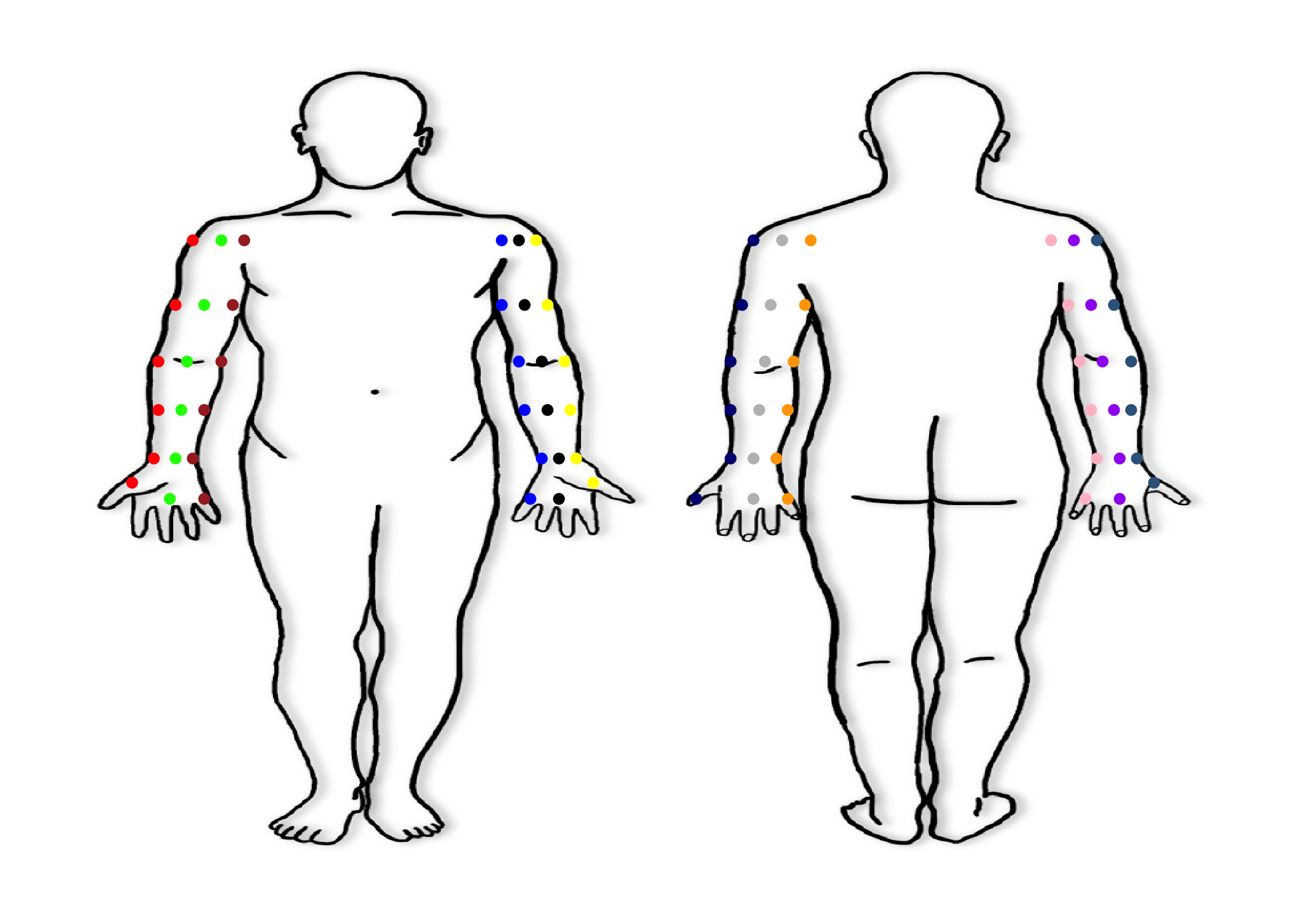
Upper Extremity Look Up Table
look_up_table_UE %>%
kbl(align = "c") %>%
kable_styling(
bootstrap_options = "striped",
full_width = F,
font_size = 16,
fixed_thead = T
) %>%
scroll_box(
height = "500px"
)| Laterality | Anterior_Posterior | Medial_Lateral | Lesion_Location | spec_loc_laterality | spec_loc_ant_post | spec_loc_med_lat | spec_loc_ue | x | y |
|---|---|---|---|---|---|---|---|---|---|
| Right | Anterior | Lateral | Shoulder | 1 | 1 | 2 | 1 | 29.500 | 79.0 |
| Right | Anterior | Lateral | Upper Arm | 1 | 1 | 2 | 2 | 28.500 | 71.5 |
| Right | Anterior | Lateral | Forearm | 1 | 1 | 2 | 3 | 26.000 | 60.0 |
| Right | Anterior | Lateral | Hand and Fingers | 1 | 1 | 2 | 4 | 23.000 | 50.0 |
| Right | Anterior | Lateral | Wrist | 1 | 1 | 2 | 5 | 24.800 | 55.0 |
| Right | Anterior | Lateral | Elbow | 1 | 1 | 2 | 6 | 28.000 | 68.0 |
| Right | NA | Lateral | Shoulder | 1 | NA | 2 | 1 | 29.500 | 79.0 |
| Right | NA | Lateral | Upper Arm | 1 | NA | 2 | 2 | 28.500 | 71.5 |
| Right | NA | Lateral | Forearm | 1 | NA | 2 | 3 | 26.000 | 60.0 |
| Right | NA | Lateral | Hand and Fingers | 1 | NA | 2 | 4 | 23.000 | 50.0 |
| Right | NA | Lateral | Wrist | 1 | NA | 2 | 5 | 24.800 | 55.0 |
| Right | NA | Lateral | Elbow | 1 | NA | 2 | 6 | 28.000 | 68.0 |
| Right | Unknown | Lateral | Shoulder | 1 | 98 | 2 | 1 | 29.500 | 79.0 |
| Right | Unknown | Lateral | Upper Arm | 1 | 98 | 2 | 2 | 28.400 | 71.5 |
| Right | Unknown | Lateral | Forearm | 1 | 98 | 2 | 3 | 26.000 | 60.0 |
| Right | Unknown | Lateral | Hand and Fingers | 1 | 98 | 2 | 4 | 23.000 | 50.0 |
| Right | Unknown | Lateral | Wrist | 1 | 98 | 2 | 5 | 24.800 | 55.0 |
| Right | Unknown | Lateral | Elbow | 1 | 98 | 2 | 6 | 28.000 | 68.0 |
| Right | Anterior | Midline | Shoulder | 1 | 1 | 3 | 1 | 30.125 | 79.0 |
| Right | Anterior | Midline | Upper Arm | 1 | 1 | 3 | 2 | 29.500 | 71.5 |
| Right | Anterior | Midline | Forearm | 1 | 1 | 3 | 3 | 27.000 | 60.0 |
| Right | Anterior | Midline | Hand and Fingers | 1 | 1 | 3 | 4 | 23.900 | 50.0 |
| Right | Anterior | Midline | Wrist | 1 | 1 | 3 | 5 | 25.400 | 54.5 |
| Right | Anterior | Midline | Elbow | 1 | 1 | 3 | 6 | 29.000 | 66.5 |
| Right | Anterior | NA | Shoulder | 1 | 1 | NA | 1 | 30.125 | 79.0 |
| Right | Anterior | NA | Upper Arm | 1 | 1 | NA | 2 | 29.500 | 71.5 |
| Right | Anterior | NA | Forearm | 1 | 1 | NA | 3 | 27.000 | 60.0 |
| Right | Anterior | NA | Hand and Fingers | 1 | 1 | NA | 4 | 23.900 | 50.0 |
| Right | Anterior | NA | Wrist | 1 | 1 | NA | 5 | 25.400 | 54.5 |
| Right | Anterior | NA | Elbow | 1 | 1 | NA | 6 | 28.750 | 66.5 |
| Right | Anterior | Unknown | Shoulder | 1 | 1 | 98 | 1 | 30.125 | 79.0 |
| Right | Anterior | Unknown | Upper Arm | 1 | 1 | 98 | 2 | 29.500 | 71.5 |
| Right | Anterior | Unknown | Forearm | 1 | 1 | 98 | 3 | 27.000 | 60.0 |
| Right | Anterior | Unknown | Hand and Fingers | 1 | 1 | 98 | 4 | 23.900 | 50.0 |
| Right | Anterior | Unknown | Wrist | 1 | 1 | 98 | 5 | 25.400 | 54.5 |
| Right | Anterior | Unknown | Elbow | 1 | 1 | 98 | 6 | 28.750 | 66.5 |
| Right | NA | Midline | Shoulder | 1 | NA | 3 | 1 | 30.125 | 79.0 |
| Right | NA | Midline | Upper Arm | 1 | NA | 3 | 2 | 29.500 | 71.5 |
| Right | NA | Midline | Forearm | 1 | NA | 3 | 3 | 27.000 | 60.0 |
| Right | NA | Midline | Hand and Fingers | 1 | NA | 3 | 4 | 23.900 | 50.0 |
| Right | NA | Midline | Wrist | 1 | NA | 3 | 5 | 25.400 | 54.5 |
| Right | NA | Midline | Elbow | 1 | NA | 3 | 6 | 28.750 | 66.5 |
| Right | Unknown | Midline | Shoulder | 1 | 98 | 3 | 1 | 30.125 | 79.0 |
| Right | Unknown | Midline | Upper Arm | 1 | 98 | 3 | 2 | 29.500 | 71.5 |
| Right | Unknown | Midline | Forearm | 1 | 98 | 3 | 3 | 27.000 | 60.0 |
| Right | Unknown | Midline | Hand and Fingers | 1 | 98 | 3 | 4 | 23.900 | 50.0 |
| Right | Unknown | Midline | Wrist | 1 | 98 | 3 | 5 | 25.400 | 54.5 |
| Right | Unknown | Midline | Elbow | 1 | 98 | 3 | 6 | 28.750 | 66.5 |
| Right | Anterior | Medial | Shoulder | 1 | 1 | 1 | 1 | 30.750 | 79.0 |
| Right | Anterior | Medial | Upper Arm | 1 | 1 | 1 | 2 | 30.250 | 71.5 |
| Right | Anterior | Medial | Forearm | 1 | 1 | 1 | 3 | 28.000 | 60.0 |
| Right | Anterior | Medial | Hand and Fingers | 1 | 1 | 1 | 4 | 24.800 | 50.0 |
| Right | Anterior | Medial | Wrist | 1 | 1 | 1 | 5 | 25.900 | 54.0 |
| Right | Anterior | Medial | Elbow | 1 | 1 | 1 | 6 | 29.500 | 65.0 |
| Right | NA | Medial | Shoulder | 1 | NA | 1 | 1 | 30.750 | 79.0 |
| Right | NA | Medial | Upper Arm | 1 | NA | 1 | 2 | 30.250 | 71.5 |
| Right | NA | Medial | Forearm | 1 | NA | 1 | 3 | 28.000 | 60.0 |
| Right | NA | Medial | Hand and Fingers | 1 | NA | 1 | 4 | 24.800 | 50.0 |
| Right | NA | Medial | Wrist | 1 | NA | 1 | 5 | 25.900 | 54.0 |
| Right | NA | Medial | Elbow | 1 | NA | 1 | 6 | 29.500 | 65.0 |
| Right | Unknown | Medial | Shoulder | 1 | 98 | 1 | 1 | 30.750 | 79.0 |
| Right | Unknown | Medial | Upper Arm | 1 | 98 | 1 | 2 | 30.250 | 71.5 |
| Right | Unknown | Medial | Forearm | 1 | 98 | 1 | 3 | 28.000 | 60.0 |
| Right | Unknown | Medial | Hand and Fingers | 1 | 98 | 1 | 4 | 24.800 | 50.0 |
| Right | Unknown | Medial | Wrist | 1 | 98 | 1 | 5 | 25.900 | 54.0 |
| Right | Unknown | Medial | Elbow | 1 | 98 | 1 | 6 | 29.500 | 65.0 |
| Left | Anterior | Medial | Shoulder | 2 | 1 | 1 | 1 | 40.200 | 79.0 |
| Left | Anterior | Medial | Upper Arm | 2 | 1 | 1 | 2 | 40.750 | 71.5 |
| Left | Anterior | Medial | Forearm | 2 | 1 | 1 | 3 | 43.000 | 60.0 |
| Left | Anterior | Medial | Hand and Fingers | 2 | 1 | 1 | 4 | 46.100 | 50.0 |
| Left | Anterior | Medial | Wrist | 2 | 1 | 1 | 5 | 45.000 | 54.0 |
| Left | Anterior | Medial | Elbow | 2 | 1 | 1 | 6 | 41.750 | 65.0 |
| Left | NA | Medial | Shoulder | 2 | NA | 1 | 1 | 40.200 | 79.0 |
| Left | NA | Medial | Upper Arm | 2 | NA | 1 | 2 | 40.750 | 71.5 |
| Left | NA | Medial | Forearm | 2 | NA | 1 | 3 | 43.000 | 60.0 |
| Left | NA | Medial | Hand and Fingers | 2 | NA | 1 | 4 | 46.100 | 50.0 |
| Left | NA | Medial | Wrist | 2 | NA | 1 | 5 | 45.000 | 54.0 |
| Left | NA | Medial | Elbow | 2 | NA | 1 | 6 | 41.750 | 65.0 |
| Left | Unknown | Medial | Shoulder | 2 | 98 | 1 | 1 | 40.200 | 79.0 |
| Left | Unknown | Medial | Upper Arm | 2 | 98 | 1 | 2 | 40.750 | 71.5 |
| Left | Unknown | Medial | Forearm | 2 | 98 | 1 | 3 | 43.000 | 60.0 |
| Left | Unknown | Medial | Hand and Fingers | 2 | 98 | 1 | 4 | 46.100 | 50.0 |
| Left | Unknown | Medial | Wrist | 2 | 98 | 1 | 5 | 45.000 | 54.0 |
| Left | Unknown | Medial | Elbow | 2 | 98 | 1 | 6 | 41.750 | 65.0 |
| Left | Anterior | Midline | Shoulder | 2 | 1 | 3 | 1 | 40.800 | 79.0 |
| Left | Anterior | Midline | Upper Arm | 2 | 1 | 3 | 2 | 41.500 | 71.5 |
| Left | Anterior | Midline | Forearm | 2 | 1 | 3 | 3 | 43.900 | 60.0 |
| Left | Anterior | Midline | Hand and Fingers | 2 | 1 | 3 | 4 | 47.200 | 50.0 |
| Left | Anterior | Midline | Wrist | 2 | 1 | 3 | 5 | 45.500 | 55.0 |
| Left | Anterior | Midline | Elbow | 2 | 1 | 3 | 6 | 42.500 | 66.5 |
| Left | Anterior | NA | Shoulder | 2 | 1 | NA | 1 | 40.800 | 79.0 |
| Left | Anterior | NA | Upper Arm | 2 | 1 | NA | 2 | 41.500 | 71.5 |
| Left | Anterior | NA | Forearm | 2 | 1 | NA | 3 | 43.900 | 60.0 |
| Left | Anterior | NA | Hand and Fingers | 2 | 1 | NA | 4 | 47.200 | 50.0 |
| Left | Anterior | NA | Wrist | 2 | 1 | NA | 5 | 45.500 | 54.8 |
| Left | Anterior | NA | Elbow | 2 | 1 | NA | 6 | 42.500 | 66.5 |
| Left | Anterior | Unknown | Shoulder | 2 | 1 | 98 | 1 | 40.800 | 79.0 |
| Left | Anterior | Unknown | Upper Arm | 2 | 1 | 98 | 2 | 41.500 | 71.5 |
| Left | Anterior | Unknown | Forearm | 2 | 1 | 98 | 3 | 43.900 | 60.0 |
| Left | Anterior | Unknown | Hand and Fingers | 2 | 1 | 98 | 4 | 47.200 | 50.0 |
| Left | Anterior | Unknown | Wrist | 2 | 1 | 98 | 5 | 45.500 | 54.8 |
| Left | Anterior | Unknown | Elbow | 2 | 1 | 98 | 6 | 42.500 | 66.5 |
| Left | NA | Midline | Shoulder | 2 | NA | 3 | 1 | 40.800 | 79.0 |
| Left | NA | Midline | Upper Arm | 2 | NA | 3 | 2 | 41.500 | 71.5 |
| Left | NA | Midline | Forearm | 2 | NA | 3 | 3 | 43.900 | 60.0 |
| Left | NA | Midline | Hand and Fingers | 2 | NA | 3 | 4 | 47.200 | 50.0 |
| Left | NA | Midline | Wrist | 2 | NA | 3 | 5 | 45.500 | 54.8 |
| Left | NA | Midline | Elbow | 2 | NA | 3 | 6 | 42.500 | 66.5 |
| Left | Unknown | Midline | Shoulder | 2 | 98 | 3 | 1 | 40.800 | 79.0 |
| Left | Unknown | Midline | Upper Arm | 2 | 98 | 3 | 2 | 41.500 | 71.5 |
| Left | Unknown | Midline | Forearm | 2 | 98 | 3 | 3 | 43.900 | 60.0 |
| Left | Unknown | Midline | Hand and Fingers | 2 | 98 | 3 | 4 | 47.200 | 50.0 |
| Left | Unknown | Midline | Wrist | 2 | 98 | 3 | 5 | 45.500 | 54.8 |
| Left | Unknown | Midline | Elbow | 2 | 98 | 3 | 6 | 42.500 | 66.5 |
| Left | Anterior | Lateral | Shoulder | 2 | 1 | 2 | 1 | 41.400 | 79.0 |
| Left | Anterior | Lateral | Upper Arm | 2 | 1 | 2 | 2 | 42.200 | 71.5 |
| Left | Anterior | Lateral | Forearm | 2 | 1 | 2 | 3 | 44.800 | 60.0 |
| Left | Anterior | Lateral | Hand and Fingers | 2 | 1 | 2 | 4 | 48.000 | 50.0 |
| Left | Anterior | Lateral | Wrist | 2 | 1 | 2 | 5 | 46.000 | 56.0 |
| Left | Anterior | Lateral | Elbow | 2 | 1 | 2 | 6 | 43.000 | 68.0 |
| Left | NA | Lateral | Shoulder | 2 | NA | 2 | 1 | 41.400 | 79.0 |
| Left | NA | Lateral | Upper Arm | 2 | NA | 2 | 2 | 42.200 | 71.5 |
| Left | NA | Lateral | Forearm | 2 | NA | 2 | 3 | 44.800 | 60.0 |
| Left | NA | Lateral | Hand and Fingers | 2 | NA | 2 | 4 | 48.000 | 50.0 |
| Left | NA | Lateral | Wrist | 2 | NA | 2 | 5 | 46.000 | 56.0 |
| Left | NA | Lateral | Elbow | 2 | NA | 2 | 6 | 43.000 | 68.0 |
| Left | Unknown | Lateral | Shoulder | 2 | 98 | 2 | 1 | 41.400 | 79.0 |
| Left | Unknown | Lateral | Upper Arm | 2 | 98 | 2 | 2 | 42.200 | 71.5 |
| Left | Unknown | Lateral | Forearm | 2 | 98 | 2 | 3 | 44.800 | 60.0 |
| Left | Unknown | Lateral | Hand and Fingers | 2 | 98 | 2 | 4 | 48.000 | 50.0 |
| Left | Unknown | Lateral | Wrist | 2 | 98 | 2 | 5 | 46.000 | 56.0 |
| Left | Unknown | Lateral | Elbow | 2 | 98 | 2 | 6 | 43.000 | 68.0 |
| Left | Posterior | Lateral | Shoulder | 2 | 2 | 2 | 1 | 57.400 | 79.0 |
| Left | Posterior | Lateral | Upper Arm | 2 | 2 | 2 | 2 | 56.800 | 71.5 |
| Left | Posterior | Lateral | Forearm | 2 | 2 | 2 | 3 | 54.300 | 60.0 |
| Left | Posterior | Lateral | Hand and Fingers | 2 | 2 | 2 | 4 | 51.000 | 50.0 |
| Left | Posterior | Lateral | Wrist | 2 | 2 | 2 | 5 | 52.500 | 54.0 |
| Left | Posterior | Lateral | Elbow | 2 | 2 | 2 | 6 | 55.100 | 64.0 |
| Left | Posterior | Midline | Shoulder | 2 | 2 | 3 | 1 | 58.200 | 79.0 |
| Left | Posterior | Midline | Upper Arm | 2 | 2 | 3 | 2 | 57.800 | 71.5 |
| Left | Posterior | Midline | Forearm | 2 | 2 | 3 | 3 | 55.100 | 60.0 |
| Left | Posterior | Midline | Hand and Fingers | 2 | 2 | 3 | 4 | 52.000 | 50.0 |
| Left | Posterior | Midline | Wrist | 2 | 2 | 3 | 5 | 53.000 | 53.5 |
| Left | Posterior | Midline | Elbow | 2 | 2 | 3 | 6 | 56.000 | 64.0 |
| Left | Posterior | NA | Shoulder | 2 | 2 | NA | 1 | 58.200 | 79.0 |
| Left | Posterior | NA | Upper Arm | 2 | 2 | NA | 2 | 57.800 | 71.5 |
| Left | Posterior | NA | Forearm | 2 | 2 | NA | 3 | 55.100 | 60.0 |
| Left | Posterior | NA | Hand and Fingers | 2 | 2 | NA | 4 | 52.000 | 50.0 |
| Left | Posterior | NA | Wrist | 2 | 2 | NA | 5 | 53.000 | 53.5 |
| Left | Posterior | NA | Elbow | 2 | 2 | NA | 6 | 56.000 | 64.0 |
| Left | Posterior | Unknown | Shoulder | 2 | 2 | 98 | 1 | 58.200 | 79.0 |
| Left | Posterior | Unknown | Upper Arm | 2 | 2 | 98 | 2 | 57.800 | 71.5 |
| Left | Posterior | Unknown | Forearm | 2 | 2 | 98 | 3 | 55.100 | 60.0 |
| Left | Posterior | Unknown | Hand and Fingers | 2 | 2 | 98 | 4 | 52.000 | 50.0 |
| Left | Posterior | Unknown | Wrist | 2 | 2 | 98 | 5 | 53.000 | 53.5 |
| Left | Posterior | Unknown | Elbow | 2 | 2 | 98 | 6 | 56.000 | 64.0 |
| Left | Posterior | Medial | Shoulder | 2 | 2 | 1 | 1 | 59.000 | 79.0 |
| Left | Posterior | Medial | Upper Arm | 2 | 2 | 1 | 2 | 58.800 | 71.5 |
| Left | Posterior | Medial | Forearm | 2 | 2 | 1 | 3 | 56.000 | 60.0 |
| Left | Posterior | Medial | Hand and Fingers | 2 | 2 | 1 | 4 | 53.000 | 50.0 |
| Left | Posterior | Medial | Wrist | 2 | 2 | 1 | 5 | 53.800 | 53.0 |
| Left | Posterior | Medial | Elbow | 2 | 2 | 1 | 6 | 57.000 | 64.0 |
| Right | Posterior | Medial | Shoulder | 1 | 2 | 1 | 1 | 68.000 | 79.0 |
| Right | Posterior | Medial | Upper Arm | 1 | 2 | 1 | 2 | 68.500 | 71.5 |
| Right | Posterior | Medial | Forearm | 1 | 2 | 1 | 3 | 70.800 | 60.0 |
| Right | Posterior | Medial | Hand and Fingers | 1 | 2 | 1 | 4 | 74.200 | 50.0 |
| Right | Posterior | Medial | Wrist | 1 | 2 | 1 | 5 | 73.500 | 53.0 |
| Right | Posterior | Medial | Elbow | 1 | 2 | 1 | 6 | 70.000 | 64.0 |
| Right | Posterior | Midline | Shoulder | 1 | 2 | 3 | 1 | 68.700 | 79.0 |
| Right | Posterior | Midline | Upper Arm | 1 | 2 | 3 | 2 | 69.500 | 71.5 |
| Right | Posterior | Midline | Forearm | 1 | 2 | 3 | 3 | 71.850 | 60.0 |
| Right | Posterior | Midline | Hand and Fingers | 1 | 2 | 3 | 4 | 75.100 | 50.0 |
| Right | Posterior | Midline | Wrist | 1 | 2 | 3 | 5 | 74.100 | 53.5 |
| Right | Posterior | Midline | Elbow | 1 | 2 | 3 | 6 | 71.000 | 64.0 |
| Right | Posterior | NA | Shoulder | 1 | 2 | NA | 1 | 68.700 | 79.0 |
| Right | Posterior | NA | Upper Arm | 1 | 2 | NA | 2 | 69.500 | 71.5 |
| Right | Posterior | NA | Forearm | 1 | 2 | NA | 3 | 71.850 | 60.0 |
| Right | Posterior | NA | Hand and Fingers | 1 | 2 | NA | 4 | 75.100 | 50.0 |
| Right | Posterior | NA | Wrist | 1 | 2 | NA | 5 | 74.100 | 53.5 |
| Right | Posterior | NA | Elbow | 1 | 2 | NA | 6 | 71.000 | 64.0 |
| Right | Posterior | Unknown | Shoulder | 1 | 2 | 98 | 1 | 68.700 | 79.0 |
| Right | Posterior | Unknown | Upper Arm | 1 | 2 | 98 | 2 | 69.500 | 71.5 |
| Right | Posterior | Unknown | Forearm | 1 | 2 | 98 | 3 | 71.850 | 60.0 |
| Right | Posterior | Unknown | Hand and Fingers | 1 | 2 | 98 | 4 | 75.100 | 50.0 |
| Right | Posterior | Unknown | Wrist | 1 | 2 | 98 | 5 | 74.100 | 53.5 |
| Right | Posterior | Unknown | Elbow | 1 | 2 | 98 | 6 | 71.000 | 64.0 |
| Right | Posterior | Lateral | Shoulder | 1 | 2 | 2 | 1 | 69.500 | 79.0 |
| Right | Posterior | Lateral | Upper Arm | 1 | 2 | 2 | 2 | 70.500 | 71.5 |
| Right | Posterior | Lateral | Forearm | 1 | 2 | 2 | 3 | 72.800 | 60.0 |
| Right | Posterior | Lateral | Hand and Fingers | 1 | 2 | 2 | 4 | 76.000 | 50.0 |
| Right | Posterior | Lateral | Wrist | 1 | 2 | 2 | 5 | 74.500 | 54.0 |
| Right | Posterior | Lateral | Elbow | 1 | 2 | 2 | 6 | 72.000 | 64.0 |
| Right | Unknown | NA | Shoulder | 1 | 98 | NA | 1 | 30.125 | 79.0 |
| Right | Unknown | NA | Upper Arm | 1 | 98 | NA | 2 | 28.200 | 71.5 |
| Right | Unknown | NA | Forearm | 1 | 98 | NA | 3 | 27.000 | 60.0 |
| Right | Unknown | NA | Hand and Fingers | 1 | 98 | NA | 4 | 23.900 | 50.0 |
| Right | Unknown | NA | Wrist | 1 | 98 | NA | 5 | 25.400 | 54.5 |
| Right | Unknown | NA | Elbow | 1 | 98 | NA | 6 | 71.000 | 64.0 |
| Left | Unknown | NA | Shoulder | 2 | 98 | NA | 1 | 40.800 | 79.0 |
| Left | Unknown | NA | Upper Arm | 2 | 98 | NA | 2 | 41.500 | 71.5 |
| Left | Unknown | NA | Forearm | 2 | 98 | NA | 3 | 43.900 | 60.0 |
| Left | Unknown | NA | Hand and Fingers | 2 | 98 | NA | 4 | 47.200 | 50.0 |
| Left | Unknown | NA | Wrist | 2 | 98 | NA | 5 | 45.800 | 54.8 |
| Left | Unknown | NA | Elbow | 2 | 98 | NA | 6 | 56.000 | 64.0 |
| Right | NA | NA | Shoulder | 1 | 98 | NA | 1 | 30.125 | 79.0 |
| Right | NA | NA | Upper Arm | 1 | 98 | NA | 2 | 28.200 | 71.5 |
| Right | NA | NA | Forearm | 1 | 98 | NA | 3 | 27.000 | 60.0 |
| Right | NA | NA | Hand and Fingers | 1 | 98 | NA | 4 | 23.900 | 50.0 |
| Right | NA | NA | Wrist | 1 | 98 | NA | 5 | 25.400 | 54.5 |
| Right | NA | NA | Elbow | 1 | 98 | NA | 6 | 71.000 | 64.0 |
| Left | NA | NA | Shoulder | 2 | 98 | NA | 1 | 40.800 | 79.0 |
| Left | NA | NA | Upper Arm | 2 | 98 | NA | 2 | 41.500 | 71.5 |
| Left | NA | NA | Forearm | 2 | 98 | NA | 3 | 43.900 | 60.0 |
| Left | NA | NA | Hand and Fingers | 2 | 98 | NA | 4 | 47.200 | 50.0 |
| Left | NA | NA | Wrist | 2 | 98 | NA | 5 | 45.800 | 54.8 |
| Left | NA | NA | Elbow | 2 | 98 | NA | 6 | 56.000 | 64.0 |
| Right | Unknown | Unknown | Shoulder | 1 | 98 | NA | 1 | 30.125 | 79.0 |
| Right | Unknown | Unknown | Upper Arm | 1 | 98 | NA | 2 | 28.200 | 71.5 |
| Right | Unknown | Unknown | Forearm | 1 | 98 | NA | 3 | 27.000 | 60.0 |
| Right | Unknown | Unknown | Hand and Fingers | 1 | 98 | NA | 4 | 23.900 | 50.0 |
| Right | Unknown | Unknown | Wrist | 1 | 98 | NA | 5 | 25.400 | 54.5 |
| Right | Unknown | Unknown | Elbow | 1 | 98 | NA | 6 | 71.000 | 64.0 |
| Left | Unknown | Unknown | Shoulder | 2 | 98 | NA | 1 | 40.800 | 79.0 |
| Left | Unknown | Unknown | Upper Arm | 2 | 98 | NA | 2 | 41.500 | 71.5 |
| Left | Unknown | Unknown | Forearm | 2 | 98 | NA | 3 | 43.900 | 60.0 |
| Left | Unknown | Unknown | Hand and Fingers | 2 | 98 | NA | 4 | 47.200 | 50.0 |
| Left | Unknown | Unknown | Wrist | 2 | 98 | NA | 5 | 45.800 | 54.8 |
| Left | Unknown | Unknown | Elbow | 2 | 98 | NA | 6 | 56.000 | 64.0 |
Lower Extremity Mapping System
Lower Extremity Coordinates
- Next we will map all Lower Extremity lesions
df.le <- data.frame()
df.le.plotly <- ggplot(df.le) +
xlim(0, 100) +
ylim(0, 100) +
theme_bw() +
theme(panel.border = element_blank(),
panel.grid.major = element_blank(),
panel.grid.minor = element_blank(),
axis.line = element_blank()) +
theme(axis.text.x = element_blank(),
axis.text.y = element_blank(),
axis.ticks = element_blank(),
axis.title = element_blank()) +
annotation_raster(body_map.png,
ymin = 0,
xmin = 0,
xmax = 100,
ymax = 100) +
######## Right Anterior Lateral Leg ########
geom_point(aes(x = 17, # Right Anterior Lateral Upper Leg (1, 1, 1, 1)
y = 37),
size = 1.5,
color = "purple") +
geom_point(aes(x = 18.5, # Right Anterior Lateral Knee (1, 1, 1, 2)
y = 28),
size = 1.5,
color= "purple") +
geom_point(aes(x = 18.5, # Right Anterior Lateral Lower Leg (1, 1, 1, 3)
y = 19),
size = 1.5,
color = "purple") +
geom_point(aes(x = 19, # Right Anterior Lateral Foot and Toes (1, 1, 1, 4)
y = 5),
size = 1.5,
color = "purple") +
geom_point(aes(x = 21, # Right Anterior Lateral Ankle (1, 1, 1, 5)
y = 10),
size = 1.5,
color = "purple") +
############ Right Anterior Midline Leg ############
geom_point(aes(x = 21, # Right Anterior Midline Upper Leg (1, 1, 3, 1)
y = 37),
size = 1.5,
color = "black") +
geom_point(aes(x = 21, # Right Anterior Midline Knee (1, 1, 3, 2)
y = 28),
size = 1.5,
color= "black") +
geom_point(aes(x = 21.5, # Right Anterior Midline Lower Leg (1, 1, 3, 3)
y = 19),
size = 1.5,
color = "black") +
geom_point(aes(x = 21, # Right Anterior Midline Foot and Toes (1, 1, 3, 4)
y = 5),
size = 1.5,
color = "black") +
geom_point(aes(x = 22.5, # Right Anterior Midline Ankle (1, 1, 3, 5)
y = 10),
size = 1.5,
color = "black") +
############ Right Anterior Medial Leg ############
geom_point(aes(x = 24.5, # Right Anterior Medial Upper Leg (1, 1, 1, 1)
y = 37),
size = 1.5,
color = "brown") +
geom_point(aes(x = 23.5, # Right Anterior Medial Knee (1, 1, 1, 2)
y = 28),
size = 1.5,
color= "brown") +
geom_point(aes(x = 24, # Right Anterior Medial Lower Leg (1, 1, 1, 3)
y = 19),
size = 1.5,
color = "brown") +
geom_point(aes(x = 22.5, # Right Anterior Medial Foot and Toes (1, 1, 1, 4)
y = 5),
size = 1.5,
color = "brown") +
geom_point(aes(x = 24, # Right Anterior Medial Ankle (1, 1, 1, 5)
y = 10),
size = 1.5,
color = "brown") +
############ Left Anterior Medial Leg ############
geom_point(aes(x = 26.5, # Left Anterior Medial Upper Leg (2, 1, 1, 1)
y = 37),
size = 1.5,
color = "blue") +
geom_point(aes(x = 27, # Left Anterior Medial Knee (2, 1, 1, 2)
y = 28),
size = 1.5,
color = "blue") +
geom_point(aes(x = 26.5, # Left Anterior Medial Lower Leg (2, 1, 1, 3)
y = 19),
size = 1.5,
color = "blue") +
geom_point(aes(x = 26, # Left Anterior Medial Foot and Toes (2, 1, 1, 4)
y = 5),
size = 1.5,
color = "blue") +
geom_point(aes(x = 26.5, # Left Anterior Medial Ankle (2, 1, 1, 5)
y = 10),
size = 1.5,
color = "blue") +
############ Left Anterior Midline Leg ############
geom_point(aes(x = 30, # Left Anterior Midline Upper Leg (2, 1, 3, 1)
y = 37),
size = 1.5,
color = "green") +
geom_point(aes(x = 30, # Left Anterior Midline Knee (2, 1, 3, 2)
y = 28),
size = 1.5,
color = "green") +
geom_point(aes(x = 29.5, # Left Anterior Midline Lower Leg (2, 1, 3, 3)
y = 19),
size = 1.5,
color = "green") +
geom_point(aes(x = 28, # Left Anterior Midline Foot and Toes (2, 1, 3, 4)
y = 5),
size = 1.5,
color = "green") +
geom_point(aes(x = 27.9, # Left Anterior Midline Ankle (2, 1, 3, 5)
y = 10),
size = 1.5,
color = "green") +
######## Left Anterior Lateral Leg ########
geom_point(aes(x = 34, # Left Anterior Lateral Upper Leg (2, 1, 2, 1)
y = 37),
size = 1.5,
color = "red") +
geom_point(aes(x = 32.5, # Left Anterior Lateral Knee (2, 1, 2, 2)
y = 28),
size = 1.5,
color = "red") +
geom_point(aes(x = 32, # Left Anterior Lateral Lower Leg (2, 1, 2, 3)
y = 19),
size = 1.5,
color = "red") +
geom_point(aes(x = 30, # Left Anterior Lateral Foot and Toes (2, 1, 2, 4)
y = 5),
size = 1.5,
color = "red") +
geom_point(aes(x = 29, # Left Anterior Lateral Ankle (2, 1, 2, 5)
y = 10),
size = 1.5,
color = "red") +
############ Left Posterior Lateral Leg ############
geom_point(aes(x = 65.5, # Left Posterior Lateral Upper Leg (2, 2, 2, 1)
y = 38),
size = 1.5,
color = "yellow") +
geom_point(aes(x = 67, # Left Posterior Lateral Knee (2, 2, 2, 2)
y = 25),
size = 1.5,
color = "yellow") +
geom_point(aes(x = 67.5, # Left Posterior Lateral Lower Leg (2, 2, 2, 3)
y = 17),
size = 1.5,
color = "yellow") +
geom_point(aes(x = 67.5, # Left Posterior Lateral Foot and Toes (2, 2, 2, 4)
y = 5),
size = 1.5,
color = "yellow") +
geom_point(aes(x = 70, # Left Posterior Lateral Ankle (2, 2, 2, 5)
y = 6),
size = 1.5,
color = "yellow") +
############ Left Posterior Midline Leg ############
geom_point(aes(x = 69.5, # Left Posterior Midline Upper Leg (2, 2, 3, 1)
y = 37),
size = 1.5,
color = "orange") +
geom_point(aes(x = 69.5, # Left Posterior Midline Knee (2, 2, 3, 2)
y = 25),
size = 1.5,
color = "orange") +
geom_point(aes(x = 70.5
, # Left Posterior Midline Lower Leg (2, 2, 3, 3)
y = 17),
size = 1.5,
color = "orange") +
geom_point(aes(x = 69.5, # Left Posterior Midline Foot and Toes (2, 2, 3, 4)
y = 4),
size = 1.5,
color = "orange") +
geom_point(aes(x = 71.5, # Left Posterior Midline Ankle (2, 2, 3, 5)
y = 6),
size = 1.5,
color = "orange") +
############ Left Posterior Medial Leg ############
geom_point(aes(x = 73.5, # Left Posterior Medial Upper Leg (2, 2, 1, 1)
y = 37),
size = 1.5,
color = "navy") +
geom_point(aes(x = 72.5, # Left Posterior Medial Knee (2, 2, 1, 2)
y = 25),
size = 1.5,
color= "navy") +
geom_point(aes(x = 73, # Left Posterior Medial Lower Leg (2, 2, 1, 3)
y = 17),
size = 1.5,
color = "navy") +
geom_point(aes(x = 74.5, # Left Posterior Medial Foot and Toes (2, 2, 1, 4)
y = 3),
size = 1.5,
color = "navy") +
geom_point(aes(x = 73.5, # Left Posterior Medial Ankle (2, 2, 1, 5)
y = 7.5),
size = 1.5,
color = "navy") +
############ Right Posterior Medial Leg ############
geom_point(aes(x = 76, # Right Posterior Medial Upper Leg (1, 2, 1, 1)
y = 37),
size = 1.5,
color = "grey") +
geom_point(aes(x = 76.5, # Right Posterior Medial Knee (1, 2, 1, 2)
y = 25),
size = 1.5,
color= "grey") +
geom_point(aes(x = 75.5, # Right Posterior Medial Lower Leg (1, 2, 1, 3)
y = 17),
size = 1.5,
color = "grey") +
geom_point(aes(x = 75.5, # Right Posterior Medial Foot and Toes (1, 2, 1, 4)
y = 3),
size = 1.5,
color = "grey") +
geom_point(aes(x = 76, # Right Posterior Medial Ankle (1, 2, 1, 5)
y = 7),
size = 1.5,
color = "grey") +
############ Right Posterior Midline Leg ############
geom_point(aes(x = 79.5, # Right Posterior Midline Upper Leg (1, 2, 3, 1)
y = 37),
size = 1.5,
color = "steelblue4") +
geom_point(aes(x = 79.5, # Right Posterior Midline Knee (1, 2, 3, 2)
y = 25),
size = 1.5,
color= "steelblue4") +
geom_point(aes(x = 78.5, # Right Posterior Midline Lower Leg (1, 2, 3, 3)
y = 17),
size = 1.5,
color = "steelblue4") +
geom_point(aes(x = 79.5, # Right Posterior Midline Foot and Toes (1, 2, 3, 4)
y = 4),
size = 1.5,
color = "steelblue4") +
geom_point(aes(x = 77.5, # Right Posterior Midline Ankle (1, 2, 3, 5)
y = 6),
size = 1.5,
color = "steelblue4") +
############ Right Posterior Lateral Leg ############
geom_point(aes(x = 83.5, # Right Posterior Lateral Upper Leg (1, 2, 3, 1)
y = 38),
size = 1.5,
color = "#008080") +
geom_point(aes(x = 82, # Right Posterior Lateral Knee (1, 2, 3, 2)
y = 25),
size = 1.5,
color= "#008080") +
geom_point(aes(x = 81, # Right Posterior Lateral Lower Leg (1, 2, 3, 3)
y = 17),
size = 1.5,
color = "#008080") +
geom_point(aes(x = 81.5, # Right Posterior Lateral Foot and Toes (1, 2, 3, 4)
y = 5),
size = 1.5,
color = "#008080") +
geom_point(aes(x = 79.5, # Right Posterior Lateral Ankle (1, 2, 3, 5)
y = 7),
size = 1.5,
color = "#008080")
ggplotly(df.le.plotly)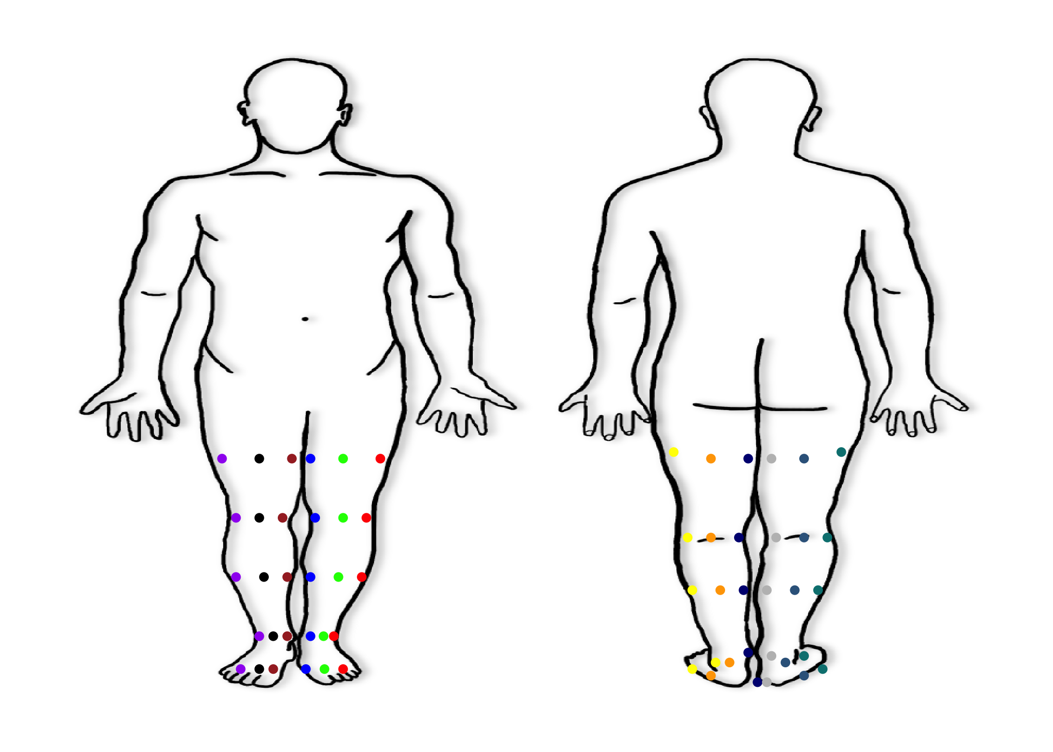
Lower Extremity Look Up Table
look_up_table_LE %>%
kbl(align = "c") %>%
kable_styling(
bootstrap_options = "striped",
full_width = F,
font_size = 16
) %>%
scroll_box(
height = "500px"
)| Laterality | Anterior_Posterior | Medial_Lateral | Lesion_Location | spec_loc_laterality | spec_loc_ant_post | spec_loc_med_lat | spec_loc_le | x | y |
|---|---|---|---|---|---|---|---|---|---|
| Right | Anterior | Lateral | Upper leg (Anterior and Posterior Thigh) | 1 | 1 | 2 | 1 | 30.7 | 44.0 |
| Right | Anterior | Lateral | Knee | 1 | 1 | 2 | 2 | 31.3 | 28.0 |
| Right | Anterior | Lateral | Lower leg (shin and calf) | 1 | 1 | 2 | 3 | 31.5 | 19.0 |
| Right | Anterior | Lateral | Foot and Toes | 1 | 1 | 2 | 4 | 31.0 | 5.0 |
| Right | Anterior | Lateral | Ankle | 1 | 1 | 2 | 5 | 31.6 | 10.0 |
| Right | NA | Lateral | Upper leg (Anterior and Posterior Thigh) | 1 | NA | 2 | 1 | 30.7 | 44.0 |
| Right | NA | Lateral | Knee | 1 | NA | 2 | 2 | 31.3 | 28.0 |
| Right | NA | Lateral | Lower leg (shin and calf) | 1 | NA | 2 | 3 | 31.5 | 19.0 |
| Right | NA | Lateral | Foot and Toes | 1 | NA | 2 | 4 | 31.0 | 5.0 |
| Right | NA | Lateral | Ankle | 1 | NA | 2 | 5 | 31.6 | 10.0 |
| Right | Unknown | Lateral | Upper leg (Anterior and Posterior Thigh) | 1 | 98 | 2 | 1 | 30.7 | 44.0 |
| Right | Unknown | Lateral | Knee | 1 | 98 | 2 | 2 | 31.3 | 28.0 |
| Right | Unknown | Lateral | Lower leg (shin and calf) | 1 | 98 | 2 | 3 | 31.5 | 19.0 |
| Right | Unknown | Lateral | Foot and Toes | 1 | 98 | 2 | 4 | 31.0 | 5.0 |
| Right | Unknown | Lateral | Ankle | 1 | 98 | 2 | 5 | 31.6 | 10.0 |
| Right | Anterior | Midline | Upper leg (Anterior and Posterior Thigh) | 1 | 1 | 3 | 1 | 32.5 | 44.0 |
| Right | Anterior | Midline | Knee | 1 | 1 | 3 | 2 | 32.5 | 28.0 |
| Right | Anterior | Midline | Lower leg (shin and calf) | 1 | 1 | 3 | 3 | 32.5 | 19.0 |
| Right | Anterior | Midline | Foot and Toes | 1 | 1 | 3 | 4 | 31.8 | 5.0 |
| Right | Anterior | Midline | Ankle | 1 | 1 | 3 | 5 | 32.3 | 10.0 |
| Right | NA | Midline | Upper leg (Anterior and Posterior Thigh) | 1 | NA | 3 | 1 | 32.5 | 44.0 |
| Right | NA | Midline | Knee | 1 | NA | 3 | 2 | 32.5 | 28.0 |
| Right | NA | Midline | Lower leg (shin and calf) | 1 | NA | 3 | 3 | 32.5 | 19.0 |
| Right | NA | Midline | Foot and Toes | 1 | NA | 3 | 4 | 31.8 | 5.0 |
| Right | NA | Midline | Ankle | 1 | NA | 3 | 5 | 32.3 | 10.0 |
| Right | Anterior | NA | Upper leg (Anterior and Posterior Thigh) | 1 | 1 | NA | 1 | 32.5 | 44.0 |
| Right | Anterior | NA | Knee | 1 | 1 | NA | 2 | 32.5 | 28.0 |
| Right | Anterior | NA | Lower leg (shin and calf) | 1 | 1 | NA | 3 | 32.5 | 19.0 |
| Right | Anterior | NA | Foot and Toes | 1 | 1 | NA | 4 | 31.8 | 5.0 |
| Right | Anterior | NA | Ankle | 1 | 1 | NA | 5 | 32.3 | 10.0 |
| Right | Anterior | Unknown | Upper leg (Anterior and Posterior Thigh) | 1 | 1 | 98 | 1 | 32.5 | 44.0 |
| Right | Anterior | Unknown | Knee | 1 | 1 | 98 | 2 | 32.5 | 28.0 |
| Right | Anterior | Unknown | Lower leg (shin and calf) | 1 | 1 | 98 | 3 | 32.5 | 19.0 |
| Right | Anterior | Unknown | Foot and Toes | 1 | 1 | 98 | 4 | 31.8 | 5.0 |
| Right | Anterior | Unknown | Ankle | 1 | 1 | 98 | 5 | 32.3 | 10.0 |
| Right | NA | NA | Upper leg (Anterior and Posterior Thigh) | 1 | NA | NA | 1 | 32.5 | 44.0 |
| Right | NA | NA | Knee | 1 | NA | NA | 2 | 32.5 | 28.0 |
| Right | NA | NA | Lower leg (shin and calf) | 1 | NA | NA | 3 | 32.5 | 19.0 |
| Right | NA | NA | Foot and Toes | 1 | NA | NA | 4 | 31.8 | 5.0 |
| Right | NA | NA | Ankle | 1 | NA | NA | 5 | 32.3 | 10.0 |
| Right | Unknown | NA | Upper leg (Anterior and Posterior Thigh) | 1 | 98 | NA | 1 | 32.5 | 44.0 |
| Right | Unknown | NA | Knee | 1 | 98 | NA | 2 | 32.5 | 28.0 |
| Right | Unknown | NA | Lower leg (shin and calf) | 1 | 98 | NA | 3 | 32.5 | 19.0 |
| Right | Unknown | NA | Foot and Toes | 1 | 98 | NA | 4 | 31.8 | 5.0 |
| Right | Unknown | NA | Ankle | 1 | 98 | NA | 5 | 32.3 | 10.0 |
| Right | Unknown | Unknown | Upper leg (Anterior and Posterior Thigh) | 1 | 98 | 98 | 1 | 32.5 | 44.0 |
| Right | Unknown | Unknown | Knee | 1 | 98 | 98 | 2 | 32.5 | 28.0 |
| Right | Unknown | Unknown | Lower leg (shin and calf) | 1 | 98 | 98 | 3 | 32.5 | 19.0 |
| Right | Unknown | Unknown | Foot and Toes | 1 | 98 | 98 | 4 | 31.8 | 5.0 |
| Right | Unknown | Unknown | Ankle | 1 | 98 | 98 | 5 | 32.3 | 10.0 |
| Right | Anterior | Medial | Upper leg (Anterior and Posterior Thigh) | 1 | 1 | 1 | 1 | 34.3 | 44.0 |
| Right | Anterior | Medial | Knee | 1 | 1 | 1 | 2 | 33.5 | 28.0 |
| Right | Anterior | Medial | Lower leg (shin and calf) | 1 | 1 | 1 | 3 | 33.1 | 19.0 |
| Right | Anterior | Medial | Foot and Toes | 1 | 1 | 1 | 4 | 32.5 | 5.0 |
| Right | Anterior | Medial | Ankle | 1 | 1 | 1 | 5 | 33.0 | 10.0 |
| Right | NA | Medial | Upper leg (Anterior and Posterior Thigh) | 1 | NA | 1 | 1 | 34.3 | 44.0 |
| Right | NA | Medial | Knee | 1 | NA | 1 | 2 | 33.5 | 28.0 |
| Right | NA | Medial | Lower leg (shin and calf) | 1 | NA | 1 | 3 | 33.1 | 19.0 |
| Right | NA | Medial | Foot and Toes | 1 | NA | 1 | 4 | 32.5 | 5.0 |
| Right | NA | Medial | Ankle | 1 | NA | 1 | 5 | 33.0 | 10.0 |
| Right | Unknown | Medial | Upper leg (Anterior and Posterior Thigh) | 1 | 98 | 1 | 1 | 34.3 | 44.0 |
| Right | Unknown | Medial | Knee | 1 | 98 | 1 | 2 | 33.5 | 28.0 |
| Right | Unknown | Medial | Lower leg (shin and calf) | 1 | 98 | 1 | 3 | 33.1 | 19.0 |
| Right | Unknown | Medial | Foot and Toes | 1 | 98 | 1 | 4 | 32.5 | 5.0 |
| Right | Unknown | Medial | Ankle | 1 | 98 | 1 | 5 | 33.0 | 10.0 |
| Left | Anterior | Medial | Upper leg (Anterior and Posterior Thigh) | 2 | 1 | 1 | 1 | 36.5 | 44.0 |
| Left | Anterior | Medial | Knee | 2 | 1 | 1 | 2 | 37.3 | 28.0 |
| Left | Anterior | Medial | Lower leg (shin and calf) | 2 | 1 | 1 | 3 | 37.8 | 19.0 |
| Left | Anterior | Medial | Foot and Toes | 2 | 1 | 1 | 4 | 38.5 | 5.0 |
| Left | Anterior | Medial | Ankle | 2 | 1 | 1 | 5 | 37.8 | 10.0 |
| Left | NA | Medial | Upper leg (Anterior and Posterior Thigh) | 2 | NA | 1 | 1 | 36.5 | 44.0 |
| Left | NA | Medial | Knee | 2 | NA | 1 | 2 | 37.3 | 28.0 |
| Left | NA | Medial | Lower leg (shin and calf) | 2 | NA | 1 | 3 | 37.8 | 19.0 |
| Left | NA | Medial | Foot and Toes | 2 | NA | 1 | 4 | 38.5 | 5.0 |
| Left | NA | Medial | Ankle | 2 | NA | 1 | 5 | 37.8 | 10.0 |
| Left | Unknown | Medial | Upper leg (Anterior and Posterior Thigh) | 2 | 98 | 1 | 1 | 36.5 | 44.0 |
| Left | Unknown | Medial | Knee | 2 | 98 | 1 | 2 | 37.3 | 28.0 |
| Left | Unknown | Medial | Lower leg (shin and calf) | 2 | 98 | 1 | 3 | 37.8 | 19.0 |
| Left | Unknown | Medial | Foot and Toes | 2 | 98 | 1 | 4 | 38.5 | 5.0 |
| Left | Unknown | Medial | Ankle | 2 | 98 | 1 | 5 | 37.8 | 10.0 |
| Left | Anterior | Midline | Upper leg (Anterior and Posterior Thigh) | 2 | 1 | 3 | 1 | 38.3 | 44.0 |
| Left | Anterior | Midline | Knee | 2 | 1 | 3 | 2 | 38.5 | 28.0 |
| Left | Anterior | Midline | Lower leg (shin and calf) | 2 | 1 | 3 | 3 | 38.5 | 19.0 |
| Left | Anterior | Midline | Foot and Toes | 2 | 1 | 3 | 4 | 39.2 | 5.0 |
| Left | Anterior | Midline | Ankle | 2 | 1 | 3 | 5 | 38.5 | 10.0 |
| Left | NA | Midline | Upper leg (Anterior and Posterior Thigh) | 2 | NA | 3 | 1 | 38.3 | 44.0 |
| Left | NA | Midline | Knee | 2 | NA | 3 | 2 | 38.5 | 28.0 |
| Left | NA | Midline | Lower leg (shin and calf) | 2 | NA | 3 | 3 | 38.5 | 19.0 |
| Left | NA | Midline | Foot and Toes | 2 | NA | 3 | 4 | 39.2 | 5.0 |
| Left | NA | Midline | Ankle | 2 | NA | 3 | 5 | 38.5 | 10.0 |
| Left | Anterior | NA | Upper leg (Anterior and Posterior Thigh) | 2 | 1 | NA | 1 | 38.3 | 44.0 |
| Left | Anterior | NA | Knee | 2 | 1 | NA | 2 | 38.5 | 28.0 |
| Left | Anterior | NA | Lower leg (shin and calf) | 2 | 1 | NA | 3 | 38.5 | 19.0 |
| Left | Anterior | NA | Foot and Toes | 2 | 1 | NA | 4 | 39.2 | 5.0 |
| Left | Anterior | NA | Ankle | 2 | 1 | NA | 5 | 38.5 | 10.0 |
| Left | Anterior | Unknown | Upper leg (Anterior and Posterior Thigh) | 2 | 1 | 98 | 1 | 38.3 | 44.0 |
| Left | Anterior | Unknown | Knee | 2 | 1 | 98 | 2 | 38.5 | 28.0 |
| Left | Anterior | Unknown | Lower leg (shin and calf) | 2 | 1 | 98 | 3 | 38.5 | 19.0 |
| Left | Anterior | Unknown | Foot and Toes | 2 | 1 | 98 | 4 | 39.2 | 5.0 |
| Left | Anterior | Unknown | Ankle | 2 | 1 | 98 | 5 | 38.5 | 10.0 |
| Left | NA | NA | Upper leg (Anterior and Posterior Thigh) | 2 | NA | NA | 1 | 38.3 | 44.0 |
| Left | NA | NA | Knee | 2 | NA | NA | 2 | 38.5 | 28.0 |
| Left | NA | NA | Lower leg (shin and calf) | 2 | NA | NA | 3 | 38.5 | 19.0 |
| Left | NA | NA | Foot and Toes | 2 | NA | NA | 4 | 39.2 | 5.0 |
| Left | NA | NA | Ankle | 2 | NA | NA | 5 | 38.5 | 10.0 |
| Left | Unknown | NA | Upper leg (Anterior and Posterior Thigh) | 2 | 98 | NA | 1 | 38.3 | 44.0 |
| Left | Unknown | NA | Knee | 2 | 98 | NA | 2 | 38.5 | 28.0 |
| Left | Unknown | NA | Lower leg (shin and calf) | 2 | 98 | NA | 3 | 38.5 | 19.0 |
| Left | Unknown | NA | Foot and Toes | 2 | 98 | NA | 4 | 39.2 | 5.0 |
| Left | Unknown | NA | Ankle | 2 | 98 | NA | 5 | 38.5 | 10.0 |
| Left | Anterior | Lateral | Upper leg (Anterior and Posterior Thigh) | 2 | 1 | 2 | 1 | 40.0 | 44.0 |
| Left | Anterior | Lateral | Knee | 2 | 1 | 2 | 2 | 39.5 | 28.0 |
| Left | Anterior | Lateral | Lower leg (shin and calf) | 2 | 1 | 2 | 3 | 39.4 | 19.0 |
| Left | Anterior | Lateral | Foot and Toes | 2 | 1 | 2 | 4 | 40.0 | 5.0 |
| Left | Anterior | Lateral | Ankle | 2 | 1 | 2 | 5 | 39.3 | 10.0 |
| Left | NA | Lateral | Upper leg (Anterior and Posterior Thigh) | 2 | NA | 2 | 1 | 40.0 | 44.0 |
| Left | NA | Lateral | Knee | 2 | NA | 2 | 2 | 39.5 | 28.0 |
| Left | NA | Lateral | Lower leg (shin and calf) | 2 | NA | 2 | 3 | 39.4 | 19.0 |
| Left | NA | Lateral | Foot and Toes | 2 | NA | 2 | 4 | 40.0 | 5.0 |
| Left | NA | Lateral | Ankle | 2 | NA | 2 | 5 | 39.3 | 10.0 |
| Left | Posterior | Lateral | Upper leg (Anterior and Posterior Thigh) | 2 | 2 | 2 | 1 | 59.0 | 43.0 |
| Left | Posterior | Lateral | Knee | 2 | 2 | 2 | 2 | 59.5 | 30.0 |
| Left | Posterior | Lateral | Lower leg (shin and calf) | 2 | 2 | 2 | 3 | 59.5 | 21.0 |
| Left | Posterior | Lateral | Foot and Toes | 2 | 2 | 2 | 4 | 58.8 | 9.0 |
| Left | Posterior | Lateral | Ankle | 2 | 2 | 2 | 5 | 59.5 | 10.0 |
| Left | Posterior | Midline | Upper leg (Anterior and Posterior Thigh) | 2 | 2 | 3 | 1 | 60.6 | 43.0 |
| Left | Posterior | Midline | Knee | 2 | 2 | 3 | 2 | 60.6 | 30.0 |
| Left | Posterior | Midline | Lower leg (shin and calf) | 2 | 2 | 3 | 3 | 60.5 | 21.0 |
| Left | Posterior | Midline | Foot and Toes | 2 | 2 | 3 | 4 | 59.3 | 10.3 |
| Left | Posterior | Midline | Ankle | 2 | 2 | 3 | 5 | 60.6 | 10.0 |
| Left | Posterior | NA | Upper leg (Anterior and Posterior Thigh) | 2 | 2 | NA | 1 | 60.6 | 43.0 |
| Left | Posterior | NA | Knee | 2 | 2 | NA | 2 | 60.6 | 30.0 |
| Left | Posterior | NA | Lower leg (shin and calf) | 2 | 2 | NA | 3 | 60.5 | 21.0 |
| Left | Posterior | NA | Foot and Toes | 2 | 2 | NA | 4 | 59.3 | 10.3 |
| Left | Posterior | NA | Ankle | 2 | 2 | NA | 5 | 60.6 | 10.0 |
| Left | Posterior | Unknown | Upper leg (Anterior and Posterior Thigh) | 2 | 2 | 98 | 1 | 60.6 | 43.0 |
| Left | Posterior | Unknown | Knee | 2 | 2 | 98 | 2 | 60.6 | 30.0 |
| Left | Posterior | Unknown | Lower leg (shin and calf) | 2 | 2 | 98 | 3 | 60.5 | 21.0 |
| Left | Posterior | Unknown | Foot and Toes | 2 | 2 | 98 | 4 | 59.3 | 10.3 |
| Left | Posterior | Unknown | Ankle | 2 | 2 | 98 | 5 | 60.6 | 10.0 |
| Left | Posterior | Medial | Upper leg (Anterior and Posterior Thigh) | 2 | 2 | 1 | 1 | 62.5 | 43.0 |
| Left | Posterior | Medial | Knee | 2 | 2 | 1 | 2 | 61.6 | 30.0 |
| Left | Posterior | Medial | Lower leg (shin and calf) | 2 | 2 | 1 | 3 | 61.5 | 21.0 |
| Left | Posterior | Medial | Foot and Toes | 2 | 2 | 1 | 4 | NA | NA |
| Left | Posterior | Medial | Ankle | 2 | 2 | 1 | 5 | 61.5 | 10.0 |
| Right | Posterior | Medial | Upper leg (Anterior and Posterior Thigh) | 1 | 2 | 1 | 1 | 64.5 | 43.0 |
| Right | Posterior | Medial | Knee | 1 | 2 | 1 | 2 | 65.5 | 30.0 |
| Right | Posterior | Medial | Lower leg (shin and calf) | 1 | 2 | 1 | 3 | 65.8 | 21.0 |
| Right | Posterior | Medial | Foot and Toes | 1 | 2 | 1 | 4 | NA | NA |
| Right | Posterior | Medial | Ankle | 1 | 2 | 1 | 5 | 66.0 | 10.0 |
| Right | Posterior | Midline | Upper leg (Anterior and Posterior Thigh) | 1 | 2 | 3 | 1 | 66.5 | 43.0 |
| Right | Posterior | Midline | Knee | 1 | 2 | 3 | 2 | 66.5 | 30.0 |
| Right | Posterior | Midline | Lower leg (shin and calf) | 1 | 2 | 3 | 3 | 66.6 | 21.0 |
| Right | Posterior | Midline | Foot and Toes | 1 | 2 | 3 | 4 | 68.0 | 10.0 |
| Right | Posterior | Midline | Ankle | 1 | 2 | 3 | 5 | 66.6 | 10.0 |
| Right | Posterior | NA | Upper leg (Anterior and Posterior Thigh) | 1 | 2 | NA | 1 | 66.5 | 43.0 |
| Right | Posterior | NA | Knee | 1 | 2 | NA | 2 | 66.5 | 30.0 |
| Right | Posterior | NA | Lower leg (shin and calf) | 1 | 2 | NA | 3 | 66.6 | 21.0 |
| Right | Posterior | NA | Foot and Toes | 1 | 2 | NA | 4 | 68.0 | 10.0 |
| Right | Posterior | NA | Ankle | 1 | 2 | NA | 5 | 66.6 | 10.0 |
| Right | Posterior | Unknown | Upper leg (Anterior and Posterior Thigh) | 1 | 2 | 98 | 1 | 66.5 | 43.0 |
| Right | Posterior | Unknown | Knee | 1 | 2 | 98 | 2 | 66.5 | 30.0 |
| Right | Posterior | Unknown | Lower leg (shin and calf) | 1 | 2 | 98 | 3 | 66.6 | 21.0 |
| Right | Posterior | Unknown | Foot and Toes | 1 | 2 | 98 | 4 | 68.0 | 10.0 |
| Right | Posterior | Unknown | Ankle | 1 | 2 | 98 | 5 | 66.6 | 10.0 |
| Right | Posterior | Lateral | Upper leg (Anterior and Posterior Thigh) | 1 | 2 | 2 | 1 | 68.0 | 43.0 |
| Right | Posterior | Lateral | Knee | 1 | 2 | 2 | 2 | 67.5 | 30.0 |
| Right | Posterior | Lateral | Lower leg (shin and calf) | 1 | 2 | 2 | 3 | 67.5 | 21.0 |
| Right | Posterior | Lateral | Foot and Toes | 1 | 2 | 2 | 4 | 68.5 | 9.5 |
| Right | Posterior | Lateral | Ankle | 1 | 2 | 2 | 5 | 67.5 | 10.0 |
Trunk Mapping System
Trunk Coordinates - Abdomen, Back, Genitalia, Buttocks
- Next we will map all Trunk lesions
df.trunk <- data.frame()
df.trunk.plotly <- ggplot(df.trunk) +
xlim(0, 100) +
ylim(0, 100) +
theme_bw() +
theme(panel.border = element_blank(),
panel.grid.major = element_blank(),
panel.grid.minor = element_blank(),
axis.line = element_blank()) +
theme(axis.text.x = element_blank(),
axis.text.y = element_blank(),
axis.ticks = element_blank(),
axis.title = element_blank()) +
annotation_raster(body_map.png,
ymin = 0,
xmin = 0,
xmax = 100,
ymax = 100) +
############ Right Anterior Lateral Trunk ############
geom_point(aes(x = 16, # Right Anterior Lateral Chest (1, 1, 2, 2)
y = 75),
size = 1.5,
color= "red") +
geom_point(aes(x = 18, # Right Anterior Lateral Abdomen (1, 1, 2, 3)
y = 60),
size = 1.5,
color = "red") +
geom_point(aes(x = 84, # Right Posterior Lateral Back (1, 1, 2, 4)
y = 70),
size = 1.5,
color = "red") +
geom_point(aes(x = 25, # Right Anterior Lateral Genitalia (1, 1, 2, 6)
y = 45),
size = 1.5,
color = "red") +
geom_point(aes(x = 85, # Right Anterior Lateral Buttocks (1, 1, 2, 7)
y = 50),
size = 1.5,
color = "red") +
############ Right Anterior Midline Trunk ############
geom_point(aes(x = 20.5, # Right Anterior Midline Chest (1, 1, 3, 2)
y = 75),
size = 1.5,
color= "purple") +
geom_point(aes(x = 21, # Right Anterior Midline Abdomen (1, 1, 3, 3)
y = 60),
size = 1.5,
color = "purple") +
geom_point(aes(x = 25, # Right Anterior Midline Genitalia (1, 1, 3, 6)
y = 45),
size = 1.5,
color = "purple") +
############ Right Anterior Medial Trunk ############
geom_point(aes(x = 24.5, # Right Anterior Medial Chest (1, 1, 1, 2)
y = 75),
size = 1.5,
color= "brown") +
geom_point(aes(x = 24.5, # Right Anterior Medial Abdomen (1, 1, 1, 3)
y = 60),
size = 1.5,
color = "brown") +
geom_point(aes(x = 77, # Right Posterior Medial Back (1, 1, 1, 4)
y = 70),
size = 1.5,
color = "brown") +
geom_point(aes(x = 25.5, # Right Anterior Medial Genitalia (1, 1, 1, 6)
y = 45),
size = 1.5,
color = "brown") +
geom_point(aes(x = 77, # Right Posterior Medial Buttocks (1, 1, 1, 7)
y = 50),
size = 1.5,
color = "brown") +
############ Midline ############
geom_point(aes(x = 26, # Midline Anterior Chest (1, 4, 2)
y = 75),
size = 1.5,
color= "grey") +
geom_point(aes(x = 26, # Midline Anterior Abdomen (1, 4, 3)
y = 60),
size = 1.5,
color = "grey") +
geom_point(aes(x = 26, # Midline Anterior Genitalia (1, 4, 6)
y = 45),
size = 1.5,
color = "grey") +
geom_point(aes(x = 75, # Midline Posterior Back (3, 2, 4)
y = 70),
size = 1.5,
color= "pink") +
geom_point(aes(x = 75, # Midline Posterior Genitalia (3, 2, 6)
y = 45),
size = 1.5,
color = "pink") +
geom_point(aes(x = 75, # Midline Posterior Buttocks (3, 2, 7)
y = 50),
size = 1.5,
color = "pink") +
############ Left Anterior Medial Turnk ############
geom_point(aes(x = 27.5, # Left Anterior Medial Chest (2, 1, 1, 2)
y = 75),
size = 1.5,
color = "black") +
geom_point(aes(x = 27.5, # Left Anterior Medial Abdomen (2, 1, 1, 3)
y = 60),
size = 1.5,
color = "black") +
geom_point(aes(x = 73, # Left Anterior Medial Back (2, 1, 1, 4)
y = 70),
size = 1.5,
color = "black") +
geom_point(aes(x = 27, # Left Anterior Medial Genitalia (2, 1, 1, 6)
y = 45),
size = 1.5,
color = "black") +
geom_point(aes(x = 73, # Left Anterior Medial Buttocks (2, 1, 1, 7)
y = 50),
size = 1.5,
color = "black") +
############ Left Anterior Midline Trunk ############
geom_point(aes(x = 30, # Left Anterior Midline Chest (2, 1, 3, 2)
y = 75),
size = 1.5,
color = "green") +
geom_point(aes(x = 30, # Left Anterior Midline Abdomen (2, 1, 3, 3)
y = 60),
size = 1.5,
color = "green") +
geom_point(aes(x = 27.5, # Left Anterior Midline Genitalia (2, 1, 3, 6)
y = 45),
size = 1.5,
color = "green") +
############ Left Anterior Lateral Chest ############
geom_point(aes(x = 34, # Left Anterior Lateral Chest (2, 1, 2, 2)
y = 75),
size = 1.5,
color = "yellow") +
geom_point(aes(x = 33, # Left Anterior Lateral Abdomen (2, 1, 2, 3)
y = 60),
size = 1.5,
color = "yellow") +
geom_point(aes(x = 67, # Left Anterior Lateral Back (2, 1, 2, 4)
y = 70),
size = 1.5,
color = "yellow") +
geom_point(aes(x = 28, # Left Anterior Lateral Genitalia (2, 1, 2, 6)
y = 45),
size = 1.5,
color = "yellow") +
geom_point(aes(x = 66, # Left Anterior Lateral Buttocks (2, 1, 2, 7)
y = 50),
size = 1.5,
color = "yellow") +
######### Right and Left Posterior Midline ########
geom_point(aes(x = 80, # Right Posterior Midline Back (1, 2, 3, 4)
y = 70),
size = 1.5,
color= "gold") +
geom_point(aes(x = 70, # Left Posterior Midline Back (2, 2, 3, 4)
y = 70),
size = 1.5,
color = "blue") +
geom_point(aes(x = 75, # Right Posterior Midline Genitalia (1, 2, 3, 6)
y = 45),
size = 1.5,
color = "gold") +
geom_point(aes(x = 74, # Left Posterior Midline Genitalia (2, 2, 3, 6)
y = 45),
size = 1.5,
color = "blue") +
geom_point(aes(x = 80, # Right Posterior Midline Buttocks (1, 2, 3, 7)
y = 50),
size = 1.5,
color = "gold") +
geom_point(aes(x = 70, # Left Posterior Midline Buttocks (2, 2, 3, 7)
y = 50),
size = 1.5,
color = "blue")
ggplotly(df.trunk.plotly)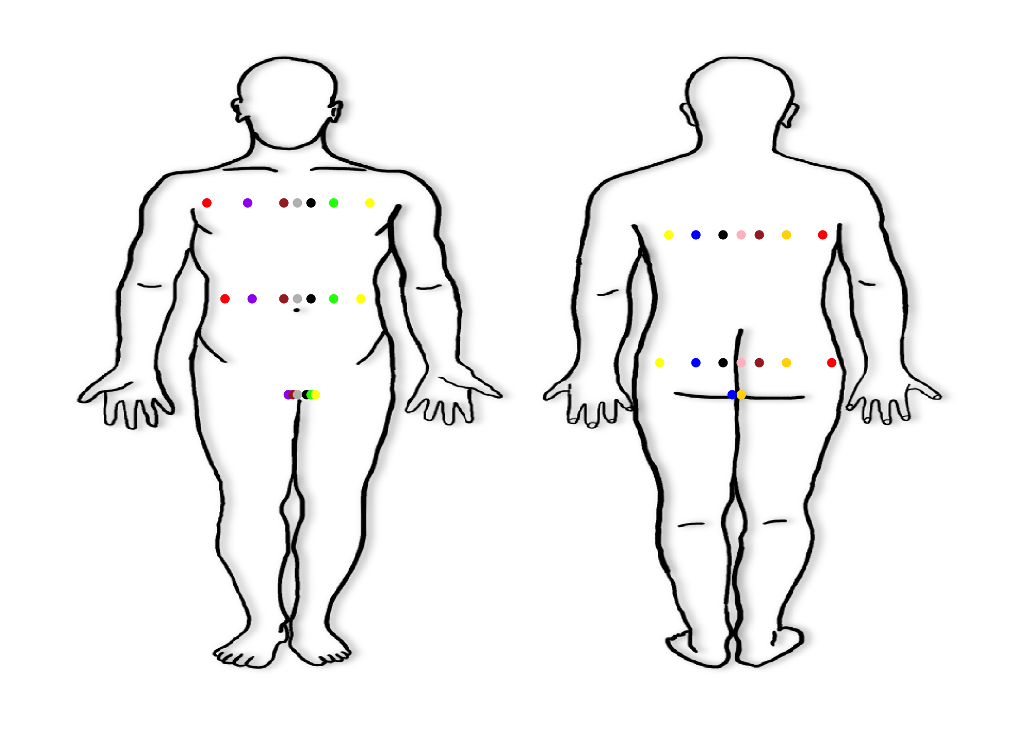
Trunk Look Up Table
look_up_table_trunk %>%
kbl(align = "c") %>%
kable_styling(
bootstrap_options = "striped",
full_width = F,
font_size = 16
) %>%
scroll_box(
height = "500px"
)| Laterality | Anterior_Posterior | Medial_Lateral | Lesion_Location | spec_loc_laterality | spec_loc_ant_post | spec_loc_med_lat | spec_loc_skin | x | y |
|---|---|---|---|---|---|---|---|---|---|
| Right | Anterior | Lateral | Head/Neck | 1 | 1 | 2 | 1 | NA | NA |
| Right | Anterior | Lateral | Chest | 1 | 1 | 2 | 2 | 31.50 | 75 |
| Right | Anterior | Lateral | Abdomen | 1 | 1 | 2 | 3 | 32.00 | 60 |
| Right | Anterior | Lateral | Back | 1 | 1 | 2 | 4 | NA | NA |
| Right | Anterior | Lateral | Upper Extremity | 1 | 1 | 2 | 5 | NA | NA |
| Right | Anterior | Lateral | Genitalia | 1 | 1 | 2 | 6 | 35.00 | 49 |
| Right | Anterior | Lateral | Buttocks | 1 | 1 | 2 | 7 | NA | NA |
| Right | Anterior | Lateral | Lower Extremity | 1 | 1 | 2 | 8 | NA | NA |
| Right | NA | Lateral | Head/Neck | 1 | NA | 2 | 1 | NA | NA |
| Right | NA | Lateral | Chest | 1 | NA | 2 | 2 | 31.50 | 75 |
| Right | NA | Lateral | Abdomen | 1 | NA | 2 | 3 | 32.00 | 60 |
| Right | NA | Lateral | Back | 1 | NA | 2 | 4 | 67.00 | 75 |
| Right | NA | Lateral | Upper Extremity | 1 | NA | 2 | 5 | NA | NA |
| Right | NA | Lateral | Genitalia | 1 | NA | 2 | 6 | 35.00 | 49 |
| Right | NA | Lateral | Buttocks | 1 | NA | 2 | 7 | NA | NA |
| Right | NA | Lateral | Lower Extremity | 1 | NA | 2 | 8 | NA | NA |
| Right | Anterior | Midline | Head/Neck | 1 | 1 | 3 | 1 | NA | NA |
| Right | Anterior | Midline | Chest | 1 | 1 | 3 | 2 | 33.00 | 75 |
| Right | Anterior | Midline | Abdomen | 1 | 1 | 3 | 3 | 33.00 | 60 |
| Right | Anterior | Midline | Back | 1 | 1 | 3 | 4 | NA | NA |
| Right | Anterior | Midline | Upper Extremity | 1 | 1 | 3 | 5 | NA | NA |
| Right | Anterior | Midline | Genitalia | 1 | 1 | 3 | 6 | 35.20 | 49 |
| Right | Anterior | Midline | Buttocks | 1 | 1 | 3 | 7 | NA | NA |
| Right | Anterior | Midline | Lower Extremity | 1 | 1 | 3 | 8 | NA | NA |
| Right | Anterior | NA | Head/Neck | 1 | 1 | NA | 1 | NA | NA |
| Right | Anterior | NA | Chest | 1 | 1 | NA | 2 | 33.00 | 75 |
| Right | Anterior | NA | Abdomen | 1 | 1 | NA | 3 | 33.00 | 60 |
| Right | Anterior | NA | Back | 1 | 1 | NA | 4 | NA | NA |
| Right | Anterior | NA | Upper Extremity | 1 | 1 | NA | 5 | NA | NA |
| Right | Anterior | NA | Genitalia | 1 | 1 | NA | 6 | 35.20 | 49 |
| Right | Anterior | NA | Buttocks | 1 | 1 | NA | 7 | NA | NA |
| Right | Anterior | NA | Lower Extremity | 1 | 1 | NA | 8 | NA | NA |
| Right | Anterior | Unknown | Head/Neck | 1 | 1 | 98 | 1 | NA | NA |
| Right | Anterior | Unknown | Chest | 1 | 1 | 98 | 2 | 33.00 | 75 |
| Right | Anterior | Unknown | Abdomen | 1 | 1 | 98 | 3 | 33.00 | 60 |
| Right | Anterior | Unknown | Back | 1 | 1 | 98 | 4 | NA | NA |
| Right | Anterior | Unknown | Upper Extremity | 1 | 1 | 98 | 5 | NA | NA |
| Right | Anterior | Unknown | Genitalia | 1 | 1 | 98 | 6 | 35.20 | 49 |
| Right | Anterior | Unknown | Buttocks | 1 | 1 | 98 | 7 | NA | NA |
| Right | Anterior | Unknown | Lower Extremity | 1 | 1 | 98 | 8 | NA | NA |
| Right | NA | Midline | Head/Neck | 1 | NA | 3 | 1 | NA | NA |
| Right | NA | Midline | Chest | 1 | NA | 3 | 2 | 33.00 | 75 |
| Right | NA | Midline | Abdomen | 1 | NA | 3 | 3 | 33.00 | 60 |
| Right | NA | Midline | Back | 1 | NA | 3 | 4 | 66.00 | 75 |
| Right | NA | Midline | Upper Extremity | 1 | NA | 3 | 5 | NA | NA |
| Right | NA | Midline | Genitalia | 1 | NA | 3 | 6 | 35.10 | 49 |
| Right | NA | Midline | Buttocks | 1 | NA | 3 | 7 | 66.00 | 53 |
| Right | NA | Midline | Lower Extremity | 1 | NA | NA | 8 | NA | NA |
| Right | NA | NA | Head/Neck | 1 | NA | NA | 1 | NA | NA |
| Right | NA | NA | Chest | 1 | NA | NA | 2 | 33.00 | 75 |
| Right | NA | NA | Abdomen | 1 | NA | NA | 3 | 33.50 | 60 |
| Right | NA | NA | Back | 1 | NA | NA | 4 | 66.00 | 75 |
| Right | NA | NA | Upper Extremity | 1 | NA | NA | 5 | NA | NA |
| Right | NA | NA | Genitalia | 1 | NA | NA | 6 | 35.10 | 49 |
| Right | NA | NA | Buttocks | 1 | NA | NA | 7 | 66.00 | 53 |
| Right | NA | NA | Lower Extremity | 1 | NA | NA | 8 | NA | NA |
| Right | Anterior | Medial | Head/Neck | 1 | 1 | 1 | 1 | NA | NA |
| Right | Anterior | Medial | Chest | 1 | 1 | 1 | 2 | 34.00 | 75 |
| Right | Anterior | Medial | Abdomen | 1 | 1 | 1 | 3 | 34.00 | 60 |
| Right | Anterior | Medial | Back | 1 | 1 | 1 | 4 | NA | NA |
| Right | Anterior | Medial | Upper Extremity | 1 | 1 | 1 | 5 | NA | NA |
| Right | Anterior | Medial | Genitalia | 1 | 1 | 1 | 6 | 35.20 | 49 |
| Right | Anterior | Medial | Buttocks | 1 | 1 | 1 | 7 | NA | NA |
| Right | Anterior | Medial | Lower Extremity | 1 | 1 | 1 | 8 | NA | NA |
| Right | NA | Medial | Head/Neck | 1 | NA | 1 | 1 | NA | NA |
| Right | NA | Medial | Chest | 1 | NA | 1 | 2 | 34.00 | 75 |
| Right | NA | Medial | Abdomen | 1 | NA | 1 | 3 | 34.00 | 60 |
| Right | NA | Medial | Back | 1 | NA | 1 | 4 | 64.75 | 75 |
| Right | NA | Medial | Upper Extremity | 1 | NA | 1 | 5 | NA | NA |
| Right | NA | Medial | Genitalia | 1 | NA | 1 | 6 | 35.20 | 49 |
| Right | NA | Medial | Buttocks | 1 | NA | 1 | 7 | 64.75 | 53 |
| Right | NA | Medial | Lower Extremity | 1 | NA | 1 | 8 | NA | NA |
| Left | Anterior | Medial | Head/Neck | 2 | 1 | 1 | 1 | NA | NA |
| Left | Anterior | Medial | Chest | 2 | 1 | 1 | 2 | 37.00 | 75 |
| Left | Anterior | Medial | Abdomen | 2 | 1 | 1 | 3 | 37.00 | 60 |
| Left | Anterior | Medial | Back | 2 | 1 | 1 | 4 | NA | NA |
| Left | Anterior | Medial | Upper Extremity | 2 | 1 | 1 | 5 | NA | NA |
| Left | Anterior | Medial | Genitalia | 2 | 1 | 1 | 6 | 35.70 | 49 |
| Left | Anterior | Medial | Buttocks | 2 | 1 | 1 | 7 | NA | NA |
| Left | Anterior | Medial | Lower Extremity | 2 | 1 | 1 | 8 | NA | NA |
| Left | NA | Medial | Head/Neck | 2 | NA | 1 | 1 | NA | NA |
| Left | NA | Medial | Chest | 2 | NA | 1 | 2 | 37.00 | 75 |
| Left | NA | Medial | Abdomen | 2 | NA | 1 | 3 | 37.00 | 60 |
| Left | NA | Medial | Back | 2 | NA | 1 | 4 | 64.75 | 75 |
| Left | NA | Medial | Upper Extremity | 2 | NA | 1 | 5 | NA | NA |
| Left | NA | Medial | Genitalia | 2 | NA | 1 | 6 | 35.70 | 49 |
| Left | NA | Medial | Buttocks | 2 | NA | 1 | 7 | 64.75 | 53 |
| Left | NA | Medial | Lower Extremity | 2 | NA | 1 | 8 | NA | NA |
| Left | Anterior | Midline | Head/Neck | 2 | 1 | 3 | 1 | NA | NA |
| Left | Anterior | Midline | Chest | 2 | 1 | 3 | 2 | 38.00 | 75 |
| Left | Anterior | Midline | Abdomen | 2 | 1 | 3 | 3 | 38.00 | 60 |
| Left | Anterior | Midline | Back | 2 | 1 | 3 | 4 | NA | NA |
| Left | Anterior | Midline | Upper Extremity | 2 | 1 | 3 | 5 | NA | NA |
| Left | Anterior | Midline | Genitalia | 2 | 1 | 3 | 6 | 35.80 | 49 |
| Left | Anterior | Midline | Buttocks | 2 | 1 | 3 | 7 | NA | NA |
| Left | Anterior | Midline | Lower Extremity | 2 | 1 | 3 | 8 | NA | NA |
| Left | Anterior | NA | Head/Neck | 2 | 1 | NA | 1 | NA | NA |
| Left | Anterior | NA | Chest | 2 | 1 | NA | 2 | 38.00 | 75 |
| Left | Anterior | NA | Abdomen | 2 | 1 | NA | 3 | 38.00 | 60 |
| Left | Anterior | NA | Back | 2 | 1 | NA | 4 | NA | NA |
| Left | Anterior | NA | Upper Extremity | 2 | 1 | NA | 5 | NA | NA |
| Left | Anterior | NA | Genitalia | 2 | 1 | NA | 6 | 35.80 | 49 |
| Left | Anterior | NA | Buttocks | 2 | 1 | NA | 7 | NA | NA |
| Left | Anterior | NA | Lower Extremity | 2 | 1 | NA | 8 | NA | NA |
| Left | Anterior | Unknown | Head/Neck | 2 | 1 | 98 | 1 | NA | NA |
| Left | Anterior | Unknown | Chest | 2 | 1 | 98 | 2 | 38.00 | 75 |
| Left | Anterior | Unknown | Abdomen | 2 | 1 | 98 | 3 | 38.00 | 60 |
| Left | Anterior | Unknown | Back | 2 | 1 | 98 | 4 | NA | NA |
| Left | Anterior | Unknown | Upper Extremity | 2 | 1 | 98 | 5 | NA | NA |
| Left | Anterior | Unknown | Genitalia | 2 | 1 | 98 | 6 | 35.80 | 49 |
| Left | Anterior | Unknown | Buttocks | 2 | 1 | 98 | 7 | NA | NA |
| Left | Anterior | Unknown | Lower Extremity | 2 | 1 | 98 | 8 | NA | NA |
| Left | NA | Midline | Head/Neck | 2 | NA | 3 | 1 | NA | NA |
| Left | NA | Midline | Chest | 2 | NA | 3 | 2 | 38.00 | 75 |
| Left | NA | Midline | Abdomen | 2 | NA | 3 | 3 | 38.00 | 60 |
| Left | NA | Midline | Back | 2 | NA | 3 | 4 | 61.50 | 75 |
| Left | NA | Midline | Upper Extremity | 2 | NA | 3 | 5 | NA | NA |
| Left | NA | Midline | Genitalia | 2 | NA | 3 | 6 | 35.90 | 49 |
| Left | NA | Midline | Buttocks | 2 | NA | 3 | 7 | 61.50 | 53 |
| Left | NA | Midline | Lower Extremity | 2 | NA | 3 | 8 | NA | NA |
| Left | NA | NA | Head/Neck | 2 | NA | NA | 1 | NA | NA |
| Left | NA | NA | Chest | 2 | NA | NA | 2 | 38.00 | 75 |
| Left | NA | NA | Abdomen | 2 | NA | NA | 3 | 38.00 | 60 |
| Left | NA | NA | Back | 2 | NA | NA | 4 | 61.50 | 75 |
| Left | NA | NA | Upper Extremity | 2 | NA | NA | 5 | NA | NA |
| Left | NA | NA | Genitalia | 2 | NA | NA | 6 | 35.90 | 49 |
| Left | NA | NA | Buttocks | 2 | NA | NA | 7 | 63.00 | 53 |
| Left | NA | NA | Lower Extremity | 2 | NA | NA | 8 | NA | NA |
| Left | Anterior | Lateral | Head/Neck | 2 | 1 | 1 | 1 | NA | NA |
| Left | Anterior | Lateral | Chest | 2 | 1 | 1 | 2 | 39.00 | 75 |
| Left | Anterior | Lateral | Abdomen | 2 | 1 | 1 | 3 | 39.00 | 60 |
| Left | Anterior | Lateral | Back | 2 | 1 | 1 | 4 | NA | NA |
| Left | Anterior | Lateral | Upper Extremity | 2 | 1 | 1 | 5 | NA | NA |
| Left | Anterior | Lateral | Genitalia | 2 | 1 | 1 | 6 | 35.90 | 49 |
| Left | Anterior | Lateral | Buttocks | 2 | 1 | 1 | 7 | NA | NA |
| Left | Anterior | Lateral | Lower Extremity | 2 | 1 | 1 | 8 | NA | NA |
| Left | NA | Lateral | Head/Neck | 2 | NA | 1 | 1 | NA | NA |
| Left | NA | Lateral | Chest | 2 | NA | 1 | 2 | 39.00 | 75 |
| Left | NA | Lateral | Abdomen | 2 | NA | 1 | 3 | 39.00 | 60 |
| Left | NA | Lateral | Back | 2 | NA | 1 | 4 | 61.50 | 75 |
| Left | NA | Lateral | Upper Extremity | 2 | NA | 1 | 5 | NA | NA |
| Left | NA | Lateral | Genitalia | 2 | NA | 1 | 6 | 35.90 | 49 |
| Left | NA | Lateral | Buttocks | 2 | NA | 1 | 7 | 61.50 | 53 |
| Left | NA | Lateral | Lower Extremity | 2 | NA | 1 | 8 | NA | NA |
| Midline | Anterior | NA | Head/Neck | 3 | 1 | NA | 1 | NA | NA |
| Midline | Anterior | NA | Chest | 3 | 1 | NA | 2 | 35.40 | 75 |
| Midline | Anterior | NA | Abdomen | 3 | 1 | NA | 3 | 35.40 | 60 |
| Midline | Anterior | NA | Back | 3 | 1 | NA | 4 | NA | NA |
| Midline | Anterior | NA | Upper Extremity | 3 | 1 | NA | 5 | NA | NA |
| Midline | Anterior | NA | Genitalia | 3 | 1 | NA | 6 | 35.40 | 49 |
| Midline | Anterior | NA | Buttocks | 3 | 1 | NA | 7 | NA | NA |
| Midline | Anterior | NA | Lower Extremity | 3 | 1 | NA | 8 | NA | NA |
| Midline | Anterior | Unknown | Head/Neck | 3 | 1 | 98 | 1 | NA | NA |
| Midline | Anterior | Unknown | Chest | 3 | 1 | 98 | 2 | 35.40 | 75 |
| Midline | Anterior | Unknown | Abdomen | 3 | 1 | 98 | 3 | 35.40 | 60 |
| Midline | Anterior | Unknown | Back | 3 | 1 | 98 | 4 | NA | NA |
| Midline | Anterior | Unknown | Upper Extremity | 3 | 1 | 98 | 5 | NA | NA |
| Midline | Anterior | Unknown | Genitalia | 3 | 1 | 98 | 6 | 35.40 | 49 |
| Midline | Anterior | Unknown | Buttocks | 3 | 1 | 98 | 7 | NA | NA |
| Midline | Anterior | Unknown | Lower Extremity | 3 | 1 | 98 | 8 | NA | NA |
| Midline | Posterior | NA | Head/Neck | 3 | 2 | NA | 1 | NA | NA |
| Midline | Posterior | NA | Chest | 3 | 2 | NA | 2 | NA | NA |
| Midline | Posterior | NA | Abdomen | 3 | 2 | NA | 3 | NA | NA |
| Midline | Posterior | NA | Back | 3 | 2 | NA | 4 | 63.60 | 75 |
| Midline | Posterior | NA | Upper Extremity | 3 | 2 | NA | 5 | NA | NA |
| Midline | Posterior | NA | Genitalia | 3 | 2 | NA | 6 | 63.60 | 49 |
| Midline | Posterior | NA | Buttocks | 3 | 2 | NA | 7 | 63.60 | 53 |
| Midline | Posterior | NA | Lower Extremity | 3 | 2 | NA | 8 | NA | NA |
| Midline | Posterior | Unknown | Head/Neck | 3 | 2 | 98 | 1 | NA | NA |
| Midline | Posterior | Unknown | Chest | 3 | 2 | 98 | 2 | NA | NA |
| Midline | Posterior | Unknown | Abdomen | 3 | 2 | 98 | 3 | NA | NA |
| Midline | Posterior | Unknown | Back | 3 | 2 | 98 | 4 | 63.60 | 75 |
| Midline | Posterior | Unknown | Upper Extremity | 3 | 2 | 98 | 5 | NA | NA |
| Midline | Posterior | Unknown | Genitalia | 3 | 2 | 98 | 6 | 63.60 | 49 |
| Midline | Posterior | Unknown | Buttocks | 3 | 2 | 98 | 7 | 63.60 | 53 |
| Midline | Posterior | Unknown | Lower Extremity | 3 | 2 | 98 | 8 | NA | NA |
| Midline | Unknown | NA | Head/Neck | 3 | 98 | NA | 1 | NA | NA |
| Midline | Unknown | NA | Chest | 3 | 98 | NA | 2 | 35.40 | 75 |
| Midline | Unknown | NA | Abdomen | 3 | 98 | NA | 3 | 35.40 | 60 |
| Midline | Unknown | NA | Back | 3 | 98 | NA | 4 | 63.60 | 75 |
| Midline | Unknown | NA | Upper Extremity | 3 | 98 | NA | 5 | NA | NA |
| Midline | Unknown | NA | Genitalia | 3 | 98 | NA | 6 | 35.40 | 49 |
| Midline | Unknown | NA | Buttocks | 3 | 98 | NA | 7 | 63.60 | 53 |
| Midline | Unknown | NA | Lower Extremity | 3 | 98 | NA | 8 | NA | NA |
| Midline | Unknown | Unknown | Head/Neck | 3 | 98 | 98 | 1 | NA | NA |
| Midline | Unknown | Unknown | Chest | 3 | 98 | 98 | 2 | 35.40 | 75 |
| Midline | Unknown | Unknown | Abdomen | 3 | 98 | 98 | 3 | 35.40 | 60 |
| Midline | Unknown | Unknown | Back | 3 | 98 | 98 | 4 | 63.60 | 75 |
| Midline | Unknown | Unknown | Upper Extremity | 3 | 98 | 98 | 5 | NA | NA |
| Midline | Unknown | Unknown | Genitalia | 3 | 98 | 98 | 6 | 35.40 | 49 |
| Midline | Unknown | Unknown | Buttocks | 3 | 98 | 98 | 7 | 63.60 | 53 |
| Midline | Unknown | Unknown | Lower Extremity | 3 | 98 | 98 | 8 | NA | NA |
| Midline | NA | NA | Head/Neck | 3 | NA | NA | 1 | NA | NA |
| Midline | NA | NA | Chest | 3 | NA | NA | 2 | 35.40 | 75 |
| Midline | NA | NA | Abdomen | 3 | NA | NA | 3 | 35.40 | 60 |
| Midline | NA | NA | Back | 3 | NA | NA | 4 | 63.60 | 75 |
| Midline | NA | NA | Upper Extremity | 3 | NA | NA | 5 | NA | NA |
| Midline | NA | NA | Genitalia | 3 | NA | NA | 6 | 35.40 | 49 |
| Midline | NA | NA | Buttocks | 3 | NA | NA | 7 | 63.60 | 53 |
| Midline | NA | NA | Lower Extremity | 3 | NA | NA | 8 | NA | NA |
| NA | NA | NA | Head/Neck | NA | NA | NA | 1 | NA | NA |
| NA | NA | NA | Chest | NA | NA | NA | 2 | 35.40 | 75 |
| NA | NA | NA | Abdomen | NA | NA | NA | 3 | 35.40 | 60 |
| NA | NA | NA | Back | NA | NA | NA | 4 | 63.60 | 75 |
| NA | NA | NA | Upper Extremity | NA | NA | NA | 5 | NA | NA |
| NA | NA | NA | Genitalia | NA | NA | NA | 6 | 35.40 | 49 |
| NA | NA | NA | Buttocks | NA | NA | NA | 7 | 63.60 | 53 |
| NA | NA | NA | Lower Extremity | NA | NA | NA | 8 | NA | NA |
| Unknown | NA | NA | Head/Neck | 98 | NA | NA | 1 | NA | NA |
| Unknown | NA | NA | Chest | 98 | NA | NA | 2 | 35.40 | 75 |
| Unknown | NA | NA | Abdomen | 98 | NA | NA | 3 | 35.40 | 60 |
| Unknown | NA | NA | Back | 98 | NA | NA | 4 | 63.60 | 75 |
| Unknown | NA | NA | Upper Extremity | 98 | NA | NA | 5 | NA | NA |
| Unknown | NA | NA | Genitalia | 98 | NA | NA | 6 | 35.40 | 49 |
| Unknown | NA | NA | Buttocks | 98 | NA | NA | 7 | 63.60 | 53 |
| Unknown | NA | NA | Lower Extremity | 98 | NA | NA | 8 | NA | NA |
| Unknown | Anterior | NA | Head/Neck | 98 | 1 | NA | 1 | NA | NA |
| Unknown | Anterior | NA | Chest | 98 | 1 | NA | 2 | 35.40 | 75 |
| Unknown | Anterior | NA | Abdomen | 98 | 1 | NA | 3 | 35.40 | 60 |
| Unknown | Anterior | NA | Back | 98 | 1 | NA | 4 | 63.60 | 75 |
| Unknown | Anterior | NA | Upper Extremity | 98 | 1 | NA | 5 | NA | NA |
| Unknown | Anterior | NA | Genitalia | 98 | 1 | NA | 6 | 35.40 | 49 |
| Unknown | Anterior | NA | Buttocks | 98 | 1 | NA | 7 | 63.60 | 53 |
| Unknown | Anterior | NA | Lower Extremity | 98 | 1 | NA | 8 | NA | NA |
| Unknown | Posterior | NA | Head/Neck | 98 | 2 | NA | 1 | NA | NA |
| Unknown | Posterior | NA | Chest | 98 | 2 | NA | 2 | 35.40 | 75 |
| Unknown | Posterior | NA | Abdomen | 98 | 2 | NA | 3 | 35.40 | 60 |
| Unknown | Posterior | NA | Back | 98 | 2 | NA | 4 | 63.60 | 75 |
| Unknown | Posterior | NA | Upper Extremity | 98 | 2 | NA | 5 | NA | NA |
| Unknown | Posterior | NA | Genitalia | 98 | 2 | NA | 6 | 63.60 | 49 |
| Unknown | Posterior | NA | Buttocks | 98 | 2 | NA | 7 | 63.60 | 53 |
| Unknown | Posterior | NA | Lower Extremity | 98 | 2 | NA | 8 | NA | NA |
| Unknown | Posterior | Midline | Head/Neck | 98 | 2 | 3 | 1 | NA | NA |
| Unknown | Posterior | Midline | Chest | 98 | 2 | 3 | 2 | 35.40 | 75 |
| Unknown | Posterior | Midline | Abdomen | 98 | 2 | 3 | 3 | 35.40 | 60 |
| Unknown | Posterior | Midline | Back | 98 | 2 | 3 | 4 | 63.60 | 75 |
| Unknown | Posterior | Midline | Upper Extremity | 98 | 2 | 3 | 5 | NA | NA |
| Unknown | Posterior | Midline | Genitalia | 98 | 2 | 3 | 6 | 63.60 | 49 |
| Unknown | Posterior | Midline | Buttocks | 98 | 2 | 3 | 7 | 63.60 | 53 |
| Unknown | Posterior | Midline | Lower Extremity | 98 | 2 | 3 | 8 | NA | NA |
| Right | Unknown | NA | Head/Neck | 1 | 98 | NA | 1 | NA | NA |
| Right | Unknown | NA | Chest | 1 | 98 | NA | 2 | 33.00 | 75 |
| Right | Unknown | NA | Abdomen | 1 | 98 | NA | 3 | 33.50 | 60 |
| Right | Unknown | NA | Back | 1 | 98 | NA | 4 | 63.50 | 75 |
| Right | Unknown | NA | Upper Extremity | 1 | 98 | NA | 5 | NA | NA |
| Right | Unknown | NA | Genitalia | 1 | 98 | NA | 6 | 35.10 | 49 |
| Right | Unknown | NA | Buttocks | 1 | 98 | NA | 7 | 63.50 | 53 |
| Right | Unknown | NA | Lower Extremity | 1 | 98 | NA | 8 | NA | NA |
| Right | Unknown | Unknown | Head/Neck | 1 | 98 | 98 | 1 | NA | NA |
| Right | Unknown | Unknown | Chest | 1 | 98 | 98 | 2 | 33.00 | 75 |
| Right | Unknown | Unknown | Abdomen | 1 | 98 | 98 | 3 | 33.50 | 60 |
| Right | Unknown | Unknown | Back | 1 | 98 | 98 | 4 | 63.50 | 75 |
| Right | Unknown | Unknown | Upper Extremity | 1 | 98 | 98 | 5 | NA | NA |
| Right | Unknown | Unknown | Genitalia | 1 | 98 | 98 | 6 | 35.10 | 49 |
| Right | Unknown | Unknown | Buttocks | 1 | 98 | 98 | 7 | 63.50 | 53 |
| Right | Unknown | Unknown | Lower Extremity | 1 | 98 | 98 | 8 | NA | NA |
| Left | Unknown | NA | Head/Neck | 2 | 98 | NA | 1 | NA | NA |
| Left | Unknown | NA | Chest | 2 | 98 | NA | 2 | 38.00 | 75 |
| Left | Unknown | NA | Abdomen | 2 | 98 | NA | 3 | 38.00 | 60 |
| Left | Unknown | NA | Back | 2 | 98 | NA | 4 | 61.50 | 75 |
| Left | Unknown | NA | Upper Extremity | 2 | 98 | NA | 5 | NA | NA |
| Left | Unknown | NA | Genitalia | 2 | 98 | NA | 6 | 35.80 | 49 |
| Left | Unknown | NA | Buttocks | 2 | 98 | NA | 7 | 61.50 | 53 |
| Left | Unknown | NA | Lower Extremity | 2 | 98 | NA | 8 | NA | NA |
| Left | Unknown | Unknown | Head/Neck | 2 | 98 | 98 | 1 | NA | NA |
| Left | Unknown | Unknown | Chest | 2 | 98 | 98 | 2 | 38.00 | 75 |
| Left | Unknown | Unknown | Abdomen | 2 | 98 | 98 | 3 | 38.00 | 60 |
| Left | Unknown | Unknown | Back | 2 | 98 | 98 | 4 | 61.50 | 75 |
| Left | Unknown | Unknown | Upper Extremity | 2 | 98 | 98 | 5 | NA | NA |
| Left | Unknown | Unknown | Genitalia | 2 | 98 | 98 | 6 | 35.80 | 49 |
| Left | Unknown | Unknown | Buttocks | 2 | 98 | 98 | 7 | 61.50 | 53 |
| Left | Unknown | Unknown | Lower Extremity | 2 | 98 | 98 | 8 | NA | NA |
| Right | Posterior | Midline | Head/Neck | 1 | 2 | 3 | 1 | NA | NA |
| Right | Posterior | Midline | Chest | 1 | 2 | 3 | 2 | NA | NA |
| Right | Posterior | Midline | Abdomen | 1 | 2 | 3 | 3 | NA | NA |
| Right | Posterior | Midline | Back | 1 | 2 | 3 | 4 | 66.00 | 75 |
| Right | Posterior | Midline | Upper Extremity | 1 | 2 | 3 | 5 | NA | NA |
| Right | Posterior | Midline | Genitalia | 1 | 2 | 3 | 6 | 63.60 | 49 |
| Right | Posterior | Midline | Buttocks | 1 | 2 | 3 | 7 | 66.00 | 53 |
| Right | Posterior | Midline | Lower Extremity | 1 | 2 | 3 | 8 | NA | NA |
| Right | Posterior | NA | Head/Neck | 1 | 2 | NA | 1 | NA | NA |
| Right | Posterior | NA | Chest | 1 | 2 | NA | 2 | NA | NA |
| Right | Posterior | NA | Abdomen | 1 | 2 | NA | 3 | NA | NA |
| Right | Posterior | NA | Back | 1 | 2 | NA | 4 | 66.00 | 75 |
| Right | Posterior | NA | Upper Extremity | 1 | 2 | NA | 5 | NA | NA |
| Right | Posterior | NA | Genitalia | 1 | 2 | NA | 6 | 63.60 | 49 |
| Right | Posterior | NA | Buttocks | 1 | 2 | NA | 7 | 66.00 | 53 |
| Right | Posterior | NA | Lower Extremity | 1 | 2 | NA | 8 | NA | NA |
| Right | Posterior | Unknown | Head/Neck | 1 | 2 | 98 | 1 | NA | NA |
| Right | Posterior | Unknown | Chest | 1 | 2 | 98 | 2 | NA | NA |
| Right | Posterior | Unknown | Abdomen | 1 | 2 | 98 | 3 | NA | NA |
| Right | Posterior | Unknown | Back | 1 | 2 | 98 | 4 | 66.00 | 75 |
| Right | Posterior | Unknown | Upper Extremity | 1 | 2 | 98 | 5 | NA | NA |
| Right | Posterior | Unknown | Genitalia | 1 | 2 | 98 | 6 | 63.60 | 49 |
| Right | Posterior | Unknown | Buttocks | 1 | 2 | 98 | 7 | 66.00 | 53 |
| Right | Posterior | Unknown | Lower Extremity | 1 | 2 | 98 | 8 | NA | NA |
| Left | Posterior | Midline | Head/Neck | 2 | 2 | 3 | 1 | NA | NA |
| Left | Posterior | Midline | Chest | 2 | 2 | 3 | 2 | NA | NA |
| Left | Posterior | Midline | Abdomen | 2 | 2 | 3 | 3 | NA | NA |
| Left | Posterior | Midline | Back | 2 | 2 | 3 | 4 | 61.50 | 75 |
| Left | Posterior | Midline | Upper Extremity | 2 | 2 | 3 | 5 | NA | NA |
| Left | Posterior | Midline | Genitalia | 2 | 2 | 3 | 6 | 63.40 | 49 |
| Left | Posterior | Midline | Buttocks | 2 | 2 | 3 | 7 | 61.50 | 53 |
| Left | Posterior | Midline | Lower Extremity | 2 | 2 | 3 | 8 | NA | NA |
| Left | Posterior | NA | Head/Neck | 2 | 2 | NA | 1 | NA | NA |
| Left | Posterior | NA | Chest | 2 | 2 | NA | 2 | NA | NA |
| Left | Posterior | NA | Abdomen | 2 | 2 | NA | 3 | NA | NA |
| Left | Posterior | NA | Back | 2 | 2 | NA | 4 | 61.50 | 75 |
| Left | Posterior | NA | Upper Extremity | 2 | 2 | NA | 5 | NA | NA |
| Left | Posterior | NA | Genitalia | 2 | 2 | NA | 6 | 63.40 | 49 |
| Left | Posterior | NA | Buttocks | 2 | 2 | NA | 7 | 61.50 | 53 |
| Left | Posterior | NA | Lower Extremity | 2 | 2 | NA | 8 | NA | NA |
| Left | Posterior | Unknown | Head/Neck | 2 | 2 | 98 | 1 | NA | NA |
| Left | Posterior | Unknown | Chest | 2 | 2 | 98 | 2 | NA | NA |
| Left | Posterior | Unknown | Abdomen | 2 | 2 | 98 | 3 | NA | NA |
| Left | Posterior | Unknown | Back | 2 | 2 | 98 | 4 | 61.50 | 75 |
| Left | Posterior | Unknown | Upper Extremity | 2 | 2 | 98 | 5 | NA | NA |
| Left | Posterior | Unknown | Genitalia | 2 | 2 | 98 | 6 | 63.40 | 49 |
| Left | Posterior | Unknown | Buttocks | 2 | 2 | 98 | 7 | 61.50 | 53 |
| Left | Posterior | Unknown | Lower Extremity | 2 | 2 | 98 | 8 | NA | NA |
| Left | Posterior | Medial | Head/Neck | 1 | 2 | 1 | 1 | NA | NA |
| Left | Posterior | Medial | Chest | 1 | 2 | 1 | 2 | NA | NA |
| Left | Posterior | Medial | Abdomen | 1 | 2 | 1 | 3 | NA | NA |
| Left | Posterior | Medial | Back | 1 | 2 | 1 | 4 | 62.50 | 75 |
| Left | Posterior | Medial | Upper Extremity | 1 | 2 | 1 | 5 | NA | NA |
| Left | Posterior | Medial | Genitalia | 1 | 2 | 1 | 6 | 63.50 | 49 |
| Left | Posterior | Medial | Buttocks | 1 | 2 | 1 | 7 | 62.50 | 53 |
| Left | Posterior | Medial | Lower Extremity | 1 | 2 | 1 | 8 | NA | NA |
| Right | Posterior | Medial | Head/Neck | 1 | 2 | 1 | 1 | NA | NA |
| Right | Posterior | Medial | Chest | 1 | 2 | 1 | 2 | NA | NA |
| Right | Posterior | Medial | Abdomen | 1 | 2 | 1 | 3 | NA | NA |
| Right | Posterior | Medial | Back | 1 | 2 | 1 | 4 | 64.75 | 75 |
| Right | Posterior | Medial | Upper Extremity | 1 | 2 | 1 | 5 | NA | NA |
| Right | Posterior | Medial | Genitalia | 1 | 2 | 1 | 6 | 63.80 | 49 |
| Right | Posterior | Medial | Buttocks | 1 | 2 | 1 | 7 | 64.75 | 53 |
| Right | Posterior | Medial | Lower Extremity | 1 | 2 | 1 | 8 | NA | NA |
| Right | Posterior | Lateral | Head/Neck | 1 | 2 | 2 | 1 | NA | NA |
| Right | Posterior | Lateral | Chest | 1 | 2 | 2 | 2 | NA | NA |
| Right | Posterior | Lateral | Abdomen | 1 | 2 | 2 | 3 | NA | NA |
| Right | Posterior | Lateral | Back | 1 | 2 | 2 | 4 | 67.00 | 75 |
| Right | Posterior | Lateral | Upper Extremity | 1 | 2 | 2 | 5 | NA | NA |
| Right | Posterior | Lateral | Genitalia | 1 | 2 | 2 | 6 | 63.90 | 49 |
| Right | Posterior | Lateral | Buttocks | 1 | 2 | 2 | 7 | 67.50 | 53 |
| Right | Posterior | Lateral | Lower Extremity | 1 | 2 | 2 | 8 | NA | NA |
| Left | Posterior | Lateral | Head/Neck | 2 | 2 | 2 | 1 | NA | NA |
| Left | Posterior | Lateral | Chest | 2 | 2 | 2 | 2 | NA | NA |
| Left | Posterior | Lateral | Abdomen | 2 | 2 | 2 | 3 | NA | NA |
| Left | Posterior | Lateral | Back | 2 | 2 | 2 | 4 | 60.00 | 75 |
| Left | Posterior | Lateral | Upper Extremity | 2 | 2 | 2 | 5 | NA | NA |
| Left | Posterior | Lateral | Genitalia | 2 | 2 | 2 | 6 | 63.30 | 49 |
| Left | Posterior | Lateral | Buttocks | 2 | 2 | 2 | 7 | 59.50 | 53 |
| Left | Posterior | Lateral | Lower Extremity | 2 | 2 | 2 | 8 | NA | NA |
LINK DATA WITH LOOK UP TABLES
Overview
- Now that we created anatomical region-specific look up tables, we can link them up with the dataset that we generated above
- We saw the Head/Neck Data Table we created earlier, but we still need data for the Upper Extremities, Lower Extremities and Trunk
- So, we’ll create these simulated data tables and then link them with the above Look Up Tables
Head/Neck
dt_head_lookup <- left_join(dt_head,
look_up_table_head_neck,
by = c("spec_loc_laterality",
"spec_loc_ant_post",
"spec_loc_med_lat",
"spec_loc_head")) %>%
drop_na(x) # Dropping na for x b/c some of these lesions didn't make sense (e.g. midline ear) since it was generated via a random number generator
dt_head_lookup %>% table_dmm()| record_id | age | sex | spec_loc_laterality | spec_loc_ant_post | spec_loc_med_lat | spec_loc_head | Laterality | Anterior_Posterior | Medial_Lateral | Lesion_Location | x | y |
|---|---|---|---|---|---|---|---|---|---|---|---|---|
| 1 | 53 | 1 | 2 | 1 | 2 | 9 | Left | Anterior | Lateral | Ear | 37.9 | 91.0 |
| 4 | 83 | 1 | 2 | 1 | 98 | 4 | Left | Anterior | Unknown | Nose | 35.8 | 90.5 |
| 5 | 72 | 2 | 1 | 1 | 98 | 3 | Right | Anterior | Unknown | Eyelid | 34.2 | 92.5 |
| 7 | 63 | 1 | 2 | 1 | 2 | 2 | Left | Anterior | Lateral | Forehead | 37.0 | 95.0 |
| 8 | 67 | 2 | 2 | 1 | 1 | 4 | Left | Anterior | Medial | Nose | 35.6 | 90.5 |
| 9 | 82 | 2 | 1 | 1 | 1 | 10 | Right | Anterior | Medial | Eyebrow | 34.8 | 93.2 |
| 10 | 70 | 2 | 1 | 1 | 2 | 9 | Right | Anterior | Lateral | Ear | 32.8 | 91.0 |
| 11 | 70 | 2 | 1 | 1 | 1 | 10 | Right | Anterior | Medial | Eyebrow | 34.8 | 93.2 |
| 12 | 91 | 2 | 2 | 1 | 98 | 7 | Left | Anterior | Unknown | Chin | 35.8 | 87.0 |
| 14 | 59 | 2 | 2 | 1 | 1 | 1 | Left | Anterior | Medial | Scalp | 36.0 | 97.0 |
| 15 | 56 | 1 | 2 | 1 | 98 | 1 | Left | Anterior | Unknown | Scalp | 36.5 | 96.0 |
| 16 | 58 | 1 | 2 | 1 | 1 | 2 | Left | Anterior | Medial | Forehead | 36.0 | 95.0 |
| 17 | 64 | 1 | 2 | 1 | 1 | 8 | Left | Anterior | Medial | Neck | 35.8 | 85.0 |
| 19 | 86 | 2 | 2 | 1 | 1 | 10 | Left | Anterior | Medial | Eyebrow | 36.0 | 93.2 |
| 20 | 90 | 1 | 2 | 1 | 2 | 4 | Left | Anterior | Lateral | Nose | 36.0 | 90.5 |
| 21 | 74 | 1 | 1 | 1 | 1 | 4 | Right | Anterior | Medial | Nose | 35.2 | 90.5 |
| 22 | 95 | 1 | 2 | 1 | 3 | 3 | Left | Anterior | Midline | Eyelid | 36.5 | 92.5 |
| 23 | 86 | 1 | 1 | 1 | 2 | 10 | Right | Anterior | Lateral | Eyebrow | 34.0 | 93.2 |
| 24 | 86 | 2 | 1 | 1 | 1 | 1 | Right | Anterior | Medial | Scalp | 35.0 | 97.0 |
| 25 | 83 | 2 | 1 | 1 | 2 | 3 | Right | Anterior | Lateral | Eyelid | 34.0 | 92.5 |
| 28 | 93 | 2 | 1 | 1 | 2 | 5 | Right | Anterior | Lateral | Cheek | 33.8 | 90.5 |
| 29 | 64 | 2 | 2 | 1 | 1 | 3 | Left | Anterior | Medial | Eyelid | 36.0 | 92.5 |
| 30 | 82 | 2 | 1 | 1 | 2 | 3 | Right | Anterior | Lateral | Eyelid | 34.0 | 92.5 |
| 31 | 69 | 1 | 2 | 1 | 1 | 10 | Left | Anterior | Medial | Eyebrow | 36.0 | 93.2 |
| 32 | 84 | 2 | 1 | 1 | 1 | 8 | Right | Anterior | Medial | Neck | 35.0 | 85.0 |
| 34 | 59 | 2 | 2 | NA | 2 | 2 | Left | NA | Lateral | Forehead | 37.0 | 93.0 |
| 35 | 91 | 2 | 1 | 1 | 1 | 10 | Right | Anterior | Medial | Eyebrow | 34.8 | 93.2 |
| 36 | 87 | 1 | 1 | 1 | 2 | 6 | Right | Anterior | Lateral | Lip | 34.6 | 88.5 |
| 37 | 69 | 2 | 1 | 1 | 1 | 10 | Right | Anterior | Medial | Eyebrow | 34.8 | 93.2 |
| 38 | 77 | 1 | 1 | NA | 2 | 8 | Right | NA | Lateral | Neck | 34.0 | 85.0 |
| 40 | 93 | 2 | 2 | 2 | 1 | 8 | Left | Posterior | Medial | Neck | 63.0 | 85.0 |
| 41 | 72 | 1 | 1 | 98 | 3 | 3 | Right | Unknown | Midline | Eyelid | 34.2 | 92.5 |
| 42 | 55 | 1 | 1 | 1 | 2 | 7 | Right | Anterior | Lateral | Chin | 34.7 | 87.3 |
| 43 | 89 | 1 | 1 | 1 | 2 | 10 | Right | Anterior | Lateral | Eyebrow | 34.0 | 93.2 |
| 44 | 93 | 2 | 1 | 1 | 2 | 10 | Right | Anterior | Lateral | Eyebrow | 34.0 | 93.2 |
| 45 | 74 | 1 | 1 | 1 | 2 | 10 | Right | Anterior | Lateral | Eyebrow | 34.0 | 93.2 |
| 47 | 88 | 2 | 1 | 1 | 1 | 2 | Right | Anterior | Medial | Forehead | 35.0 | 95.0 |
| 48 | 91 | 1 | 2 | 1 | 2 | 8 | Left | Anterior | Lateral | Neck | 36.8 | 85.0 |
| 49 | 55 | 1 | 1 | 1 | 2 | 4 | Right | Anterior | Lateral | Nose | 35.0 | 90.5 |
| 50 | 73 | 2 | 2 | 1 | 3 | 10 | Left | Anterior | Midline | Eyebrow | 36.5 | 93.2 |
| 51 | 81 | 2 | 1 | NA | 1 | 1 | Right | NA | Medial | Scalp | 35.0 | 97.0 |
| 52 | 63 | 1 | 2 | NA | 2 | 9 | Left | NA | Lateral | Ear | 37.9 | 91.0 |
| 53 | 51 | 2 | 1 | 1 | 2 | 4 | Right | Anterior | Lateral | Nose | 35.0 | 90.5 |
| 54 | 94 | 1 | 1 | 1 | 2 | 10 | Right | Anterior | Lateral | Eyebrow | 34.0 | 93.2 |
| 59 | 50 | 1 | 2 | 1 | 98 | 9 | Left | Anterior | Unknown | Ear | 37.7 | 91.0 |
| 60 | 89 | 2 | 1 | 1 | 3 | 1 | Right | Anterior | Midline | Scalp | 34.2 | 96.0 |
| 61 | 55 | 1 | 1 | 1 | 2 | 1 | Right | Anterior | Lateral | Scalp | 33.3 | 95.0 |
| 62 | 72 | 2 | 1 | 1 | 3 | 9 | Right | Anterior | Midline | Ear | 32.9 | 91.0 |
| 63 | 93 | 2 | 2 | 1 | 1 | 9 | Left | Anterior | Medial | Ear | 37.7 | 91.0 |
| 66 | 88 | 1 | 1 | 1 | 2 | 4 | Right | Anterior | Lateral | Nose | 35.0 | 90.5 |
| 67 | 60 | 2 | 1 | 1 | 2 | 9 | Right | Anterior | Lateral | Ear | 32.8 | 91.0 |
| 68 | 66 | 1 | 2 | 1 | 2 | 1 | Left | Anterior | Lateral | Scalp | 37.5 | 95.0 |
| 70 | 62 | 1 | 1 | 1 | 98 | 10 | Right | Anterior | Unknown | Eyebrow | 34.2 | 93.2 |
| 71 | 89 | 1 | 1 | 1 | 98 | 3 | Right | Anterior | Unknown | Eyelid | 34.2 | 92.5 |
| 72 | 74 | 2 | 2 | 1 | 1 | 4 | Left | Anterior | Medial | Nose | 35.6 | 90.5 |
| 73 | 74 | 2 | 1 | 1 | 2 | 10 | Right | Anterior | Lateral | Eyebrow | 34.0 | 93.2 |
| 74 | 72 | 2 | 2 | 1 | 2 | 2 | Left | Anterior | Lateral | Forehead | 37.0 | 95.0 |
| 75 | 95 | 1 | 1 | 1 | 2 | 3 | Right | Anterior | Lateral | Eyelid | 34.0 | 92.5 |
| 76 | 69 | 1 | 1 | 1 | 1 | 9 | Right | Anterior | Medial | Ear | 33.0 | 91.0 |
| 77 | 88 | 2 | 2 | 1 | 2 | 3 | Left | Anterior | Lateral | Eyelid | 36.8 | 92.5 |
| 79 | 62 | 1 | 1 | 2 | 1 | 8 | Right | Posterior | Medial | Neck | 64.0 | 85.0 |
| 80 | 71 | 2 | 1 | 1 | NA | 10 | Right | Anterior | NA | Eyebrow | 34.2 | 93.2 |
| 81 | 78 | 2 | 1 | NA | 98 | 2 | Right | NA | Unknown | Forehead | 34.2 | 95.0 |
| 82 | 77 | 2 | 1 | 1 | 1 | 10 | Right | Anterior | Medial | Eyebrow | 34.8 | 93.2 |
| 83 | 93 | 1 | 2 | 1 | 2 | 3 | Left | Anterior | Lateral | Eyelid | 36.8 | 92.5 |
| 85 | 94 | 1 | 2 | 98 | 2 | 10 | Left | Unknown | Lateral | Eyebrow | 36.9 | 93.2 |
| 86 | 70 | 1 | 2 | 1 | NA | 10 | Left | Anterior | NA | Eyebrow | 36.5 | 93.2 |
| 87 | 80 | 1 | 1 | 1 | 98 | 6 | Right | Anterior | Unknown | Lip | 34.7 | 88.5 |
| 88 | 87 | 1 | 2 | 1 | 1 | 10 | Left | Anterior | Medial | Eyebrow | 36.0 | 93.2 |
| 89 | 66 | 2 | 2 | 1 | 2 | 2 | Left | Anterior | Lateral | Forehead | 37.0 | 95.0 |
| 91 | 88 | 2 | 1 | 1 | 3 | 10 | Right | Anterior | Midline | Eyebrow | 34.2 | 93.2 |
| 92 | 72 | 1 | 2 | 1 | 98 | 4 | Left | Anterior | Unknown | Nose | 35.8 | 90.5 |
| 93 | 68 | 1 | 1 | 1 | 1 | 4 | Right | Anterior | Medial | Nose | 35.2 | 90.5 |
| 94 | 75 | 1 | 2 | 1 | 2 | 8 | Left | Anterior | Lateral | Neck | 36.8 | 85.0 |
| 95 | 92 | 2 | 2 | 98 | 2 | 1 | Left | Unknown | Lateral | Scalp | 37.2 | 95.0 |
| 96 | 79 | 1 | 1 | 1 | 98 | 8 | Right | Anterior | Unknown | Neck | 34.2 | 85.0 |
| 97 | 91 | 1 | 1 | 1 | 98 | 8 | Right | Anterior | Unknown | Neck | 34.2 | 85.0 |
| 98 | 81 | 1 | 2 | 1 | 1 | 3 | Left | Anterior | Medial | Eyelid | 36.0 | 92.5 |
| 99 | 88 | 2 | 2 | 1 | 3 | 2 | Left | Anterior | Midline | Forehead | 36.5 | 93.0 |
| 100 | 78 | 2 | 1 | 98 | 2 | 4 | Right | Unknown | Lateral | Nose | 35.0 | 90.5 |
| 101 | 83 | 2 | 1 | 1 | 2 | 1 | Right | Anterior | Lateral | Scalp | 33.3 | 95.0 |
| 103 | 50 | 1 | 2 | 1 | 2 | 10 | Left | Anterior | Lateral | Eyebrow | 36.9 | 93.2 |
| 104 | 92 | 1 | 2 | 1 | 1 | 4 | Left | Anterior | Medial | Nose | 35.6 | 90.5 |
| 105 | 75 | 1 | 1 | 2 | 2 | 8 | Right | Posterior | Lateral | Neck | 65.0 | 85.8 |
| 106 | 64 | 1 | 2 | 1 | 1 | 1 | Left | Anterior | Medial | Scalp | 36.0 | 97.0 |
| 107 | 78 | 2 | 1 | 1 | 3 | 1 | Right | Anterior | Midline | Scalp | 34.2 | 96.0 |
| 108 | 73 | 1 | 2 | 1 | 1 | 9 | Left | Anterior | Medial | Ear | 37.7 | 91.0 |
| 109 | 91 | 2 | 1 | 1 | 2 | 8 | Right | Anterior | Lateral | Neck | 34.0 | 85.0 |
| 110 | 61 | 2 | 1 | 1 | 98 | 2 | Right | Anterior | Unknown | Forehead | 34.2 | 95.0 |
| 111 | 88 | 1 | 2 | 1 | 2 | 6 | Left | Anterior | Lateral | Lip | 35.9 | 88.5 |
| 112 | 73 | 1 | 1 | 1 | 3 | 1 | Right | Anterior | Midline | Scalp | 34.2 | 96.0 |
| 113 | 77 | 2 | 1 | 1 | 1 | 1 | Right | Anterior | Medial | Scalp | 35.0 | 97.0 |
| 116 | 82 | 1 | 2 | 1 | 2 | 5 | Left | Anterior | Lateral | Cheek | 37.2 | 90.5 |
| 117 | 68 | 2 | 1 | 1 | 2 | 3 | Right | Anterior | Lateral | Eyelid | 34.0 | 92.5 |
| 118 | 75 | 2 | 2 | NA | 98 | 3 | Left | NA | Unknown | Eyelid | 36.5 | 92.5 |
| 119 | 84 | 1 | 2 | 1 | 1 | 3 | Left | Anterior | Medial | Eyelid | 36.0 | 92.5 |
| 120 | 92 | 1 | 2 | 1 | 3 | 10 | Left | Anterior | Midline | Eyebrow | 36.5 | 93.2 |
| 121 | 50 | 1 | 1 | 1 | 2 | 10 | Right | Anterior | Lateral | Eyebrow | 34.0 | 93.2 |
| 122 | 78 | 1 | 2 | 1 | 2 | 3 | Left | Anterior | Lateral | Eyelid | 36.8 | 92.5 |
| 123 | 63 | 1 | 2 | 1 | 1 | 7 | Left | Anterior | Medial | Chin | 35.7 | 87.0 |
| 124 | 71 | 1 | 2 | 1 | 2 | 5 | Left | Anterior | Lateral | Cheek | 37.2 | 90.5 |
| 125 | 55 | 1 | 2 | 1 | 1 | 10 | Left | Anterior | Medial | Eyebrow | 36.0 | 93.2 |
| 126 | 77 | 1 | 2 | 1 | 1 | 10 | Left | Anterior | Medial | Eyebrow | 36.0 | 93.2 |
| 127 | 90 | 2 | 1 | 1 | 1 | 10 | Right | Anterior | Medial | Eyebrow | 34.8 | 93.2 |
| 128 | 86 | 2 | 1 | NA | 1 | 2 | Right | NA | Medial | Forehead | 35.0 | 95.0 |
| 129 | 95 | 2 | 2 | 1 | 2 | 3 | Left | Anterior | Lateral | Eyelid | 36.8 | 92.5 |
| 130 | 52 | 2 | 2 | 1 | 1 | 10 | Left | Anterior | Medial | Eyebrow | 36.0 | 93.2 |
| 131 | 71 | 1 | 2 | 1 | 2 | 9 | Left | Anterior | Lateral | Ear | 37.9 | 91.0 |
| 133 | 56 | 2 | 2 | 1 | 3 | 1 | Left | Anterior | Midline | Scalp | 36.5 | 96.0 |
| 134 | 95 | 2 | 1 | 1 | 1 | 1 | Right | Anterior | Medial | Scalp | 35.0 | 97.0 |
| 135 | 84 | 2 | 1 | 1 | 1 | 4 | Right | Anterior | Medial | Nose | 35.2 | 90.5 |
| 136 | 93 | 1 | 2 | 1 | 2 | 7 | Left | Anterior | Lateral | Chin | 36.5 | 87.3 |
| 137 | 90 | 2 | 1 | 1 | 1 | 8 | Right | Anterior | Medial | Neck | 35.0 | 85.0 |
| 138 | 76 | 2 | 1 | 1 | 1 | 5 | Right | Anterior | Medial | Cheek | 34.8 | 90.5 |
| 139 | 56 | 1 | 1 | NA | 2 | 4 | Right | NA | Lateral | Nose | 35.0 | 90.5 |
| 140 | 69 | 2 | 2 | 1 | 98 | 4 | Left | Anterior | Unknown | Nose | 35.8 | 90.5 |
| 141 | 73 | 2 | 1 | 1 | 2 | 2 | Right | Anterior | Lateral | Forehead | 33.5 | 95.0 |
| 143 | 68 | 2 | 1 | 1 | 3 | 1 | Right | Anterior | Midline | Scalp | 34.2 | 96.0 |
| 145 | 51 | 2 | 2 | 1 | 2 | 9 | Left | Anterior | Lateral | Ear | 37.9 | 91.0 |
| 146 | 50 | 2 | 2 | 1 | 3 | 1 | Left | Anterior | Midline | Scalp | 36.5 | 96.0 |
| 147 | 93 | 1 | 2 | 1 | 2 | 6 | Left | Anterior | Lateral | Lip | 35.9 | 88.5 |
| 150 | 62 | 1 | 1 | 1 | 1 | 7 | Right | Anterior | Medial | Chin | 35.1 | 87.0 |
| 151 | 75 | 2 | 1 | 1 | 2 | 9 | Right | Anterior | Lateral | Ear | 32.8 | 91.0 |
| 154 | 68 | 1 | 1 | NA | NA | 2 | Right | NA | NA | Forehead | 34.2 | 95.0 |
| 155 | 66 | 1 | 1 | 1 | 1 | 5 | Right | Anterior | Medial | Cheek | 34.8 | 90.5 |
| 156 | 83 | 2 | 1 | 1 | 98 | 3 | Right | Anterior | Unknown | Eyelid | 34.2 | 92.5 |
| 157 | 60 | 1 | 1 | 1 | 98 | 5 | Right | Anterior | Unknown | Cheek | 34.0 | 90.5 |
| 158 | 80 | 1 | 1 | 1 | 1 | 7 | Right | Anterior | Medial | Chin | 35.1 | 87.0 |
| 159 | 84 | 2 | 2 | 1 | 3 | 6 | Left | Anterior | Midline | Lip | 36.0 | 88.5 |
| 160 | 84 | 1 | 2 | 1 | 3 | 7 | Left | Anterior | Midline | Chin | 35.8 | 87.0 |
| 161 | 95 | 2 | 1 | 1 | 98 | 2 | Right | Anterior | Unknown | Forehead | 34.2 | 95.0 |
| 162 | 68 | 1 | 1 | 1 | 3 | 6 | Right | Anterior | Midline | Lip | 34.7 | 88.5 |
| 163 | 94 | 1 | 1 | 1 | 2 | 10 | Right | Anterior | Lateral | Eyebrow | 34.0 | 93.2 |
| 165 | 65 | 2 | 1 | 1 | 3 | 1 | Right | Anterior | Midline | Scalp | 34.2 | 96.0 |
| 166 | 89 | 1 | 2 | 2 | 2 | 1 | Left | Posterior | Lateral | Scalp | 61.5 | 94.0 |
| 168 | 77 | 2 | 1 | NA | 98 | 3 | Right | NA | Unknown | Eyelid | 34.2 | 92.5 |
| 169 | 73 | 2 | 1 | 1 | 1 | 7 | Right | Anterior | Medial | Chin | 35.1 | 87.0 |
| 173 | 81 | 2 | 1 | 2 | 1 | 9 | Right | Posterior | Medial | Ear | 66.0 | 91.0 |
| 174 | 86 | 1 | 1 | 1 | 1 | 3 | Right | Anterior | Medial | Eyelid | 34.6 | 92.5 |
| 175 | 88 | 1 | 2 | 1 | 1 | 5 | Left | Anterior | Medial | Cheek | 36.0 | 90.5 |
| 176 | 80 | 1 | 1 | 1 | 1 | 7 | Right | Anterior | Medial | Chin | 35.1 | 87.0 |
| 177 | 86 | 1 | 2 | 1 | 2 | 9 | Left | Anterior | Lateral | Ear | 37.9 | 91.0 |
| 178 | 78 | 1 | 1 | 1 | 1 | 3 | Right | Anterior | Medial | Eyelid | 34.6 | 92.5 |
| 179 | 61 | 2 | 1 | 1 | 3 | 8 | Right | Anterior | Midline | Neck | 34.5 | 85.0 |
| 180 | 63 | 1 | 2 | 1 | 1 | 10 | Left | Anterior | Medial | Eyebrow | 36.0 | 93.2 |
| 181 | 87 | 2 | 1 | NA | NA | 1 | Right | NA | NA | Scalp | 34.2 | 96.0 |
| 182 | 65 | 1 | 1 | 1 | 1 | 9 | Right | Anterior | Medial | Ear | 33.0 | 91.0 |
| 183 | 64 | 2 | 1 | 1 | 1 | 5 | Right | Anterior | Medial | Cheek | 34.8 | 90.5 |
| 184 | 51 | 1 | 1 | 1 | 2 | 4 | Right | Anterior | Lateral | Nose | 35.0 | 90.5 |
| 185 | 50 | 2 | 2 | 1 | 1 | 2 | Left | Anterior | Medial | Forehead | 36.0 | 95.0 |
| 186 | 52 | 2 | 2 | 1 | 1 | 2 | Left | Anterior | Medial | Forehead | 36.0 | 95.0 |
| 187 | 58 | 2 | 3 | 1 | NA | 6 | Midline | Anterior | NA | Lip | 35.4 | 88.5 |
| 188 | 87 | 1 | 2 | 1 | NA | 2 | Left | Anterior | NA | Forehead | 36.5 | 93.0 |
| 189 | 66 | 1 | 1 | 1 | 2 | 6 | Right | Anterior | Lateral | Lip | 34.6 | 88.5 |
| 190 | 69 | 2 | 2 | 1 | 1 | 10 | Left | Anterior | Medial | Eyebrow | 36.0 | 93.2 |
| 191 | 54 | 2 | 2 | 1 | 98 | 1 | Left | Anterior | Unknown | Scalp | 36.5 | 96.0 |
| 192 | 90 | 2 | 2 | 2 | 1 | 8 | Left | Posterior | Medial | Neck | 63.0 | 85.0 |
| 193 | 76 | 1 | 2 | 1 | 2 | 10 | Left | Anterior | Lateral | Eyebrow | 36.9 | 93.2 |
| 194 | 93 | 2 | 1 | 1 | 1 | 7 | Right | Anterior | Medial | Chin | 35.1 | 87.0 |
| 196 | 57 | 2 | 1 | 1 | 98 | 10 | Right | Anterior | Unknown | Eyebrow | 34.2 | 93.2 |
| 197 | 85 | 2 | 1 | 1 | 98 | 7 | Right | Anterior | Unknown | Chin | 35.5 | 87.0 |
| 199 | 78 | 1 | 2 | 1 | 2 | 10 | Left | Anterior | Lateral | Eyebrow | 36.9 | 93.2 |
| 200 | 70 | 1 | 2 | 1 | 2 | 4 | Left | Anterior | Lateral | Nose | 36.0 | 90.5 |
| 201 | 50 | 1 | 2 | 1 | 1 | 10 | Left | Anterior | Medial | Eyebrow | 36.0 | 93.2 |
| 202 | 69 | 1 | 1 | 1 | 1 | 8 | Right | Anterior | Medial | Neck | 35.0 | 85.0 |
| 203 | 91 | 1 | 1 | 98 | 1 | 9 | Right | Unknown | Medial | Ear | 33.0 | 91.0 |
| 205 | 91 | 2 | 2 | NA | 2 | 10 | Left | NA | Lateral | Eyebrow | 36.9 | 93.2 |
| 206 | 73 | 1 | 1 | 1 | 1 | 7 | Right | Anterior | Medial | Chin | 35.1 | 87.0 |
| 207 | 71 | 2 | 2 | 1 | 2 | 1 | Left | Anterior | Lateral | Scalp | 37.5 | 95.0 |
| 209 | 65 | 2 | 1 | 1 | 2 | 4 | Right | Anterior | Lateral | Nose | 35.0 | 90.5 |
| 210 | 79 | 1 | 2 | 1 | 2 | 5 | Left | Anterior | Lateral | Cheek | 37.2 | 90.5 |
| 212 | 51 | 2 | 2 | 1 | 2 | 10 | Left | Anterior | Lateral | Eyebrow | 36.9 | 93.2 |
| 215 | 85 | 2 | 2 | 1 | 2 | 1 | Left | Anterior | Lateral | Scalp | 37.5 | 95.0 |
| 216 | 75 | 2 | 2 | 1 | 1 | 10 | Left | Anterior | Medial | Eyebrow | 36.0 | 93.2 |
| 217 | 89 | 2 | 2 | 1 | 2 | 1 | Left | Anterior | Lateral | Scalp | 37.5 | 95.0 |
| 219 | 57 | 2 | 1 | 1 | 3 | 1 | Right | Anterior | Midline | Scalp | 34.2 | 96.0 |
| 220 | 56 | 1 | 1 | 1 | 2 | 7 | Right | Anterior | Lateral | Chin | 34.7 | 87.3 |
| 221 | 85 | 1 | 1 | 1 | 3 | 3 | Right | Anterior | Midline | Eyelid | 34.2 | 92.5 |
| 222 | 91 | 2 | 1 | 1 | 98 | 3 | Right | Anterior | Unknown | Eyelid | 34.2 | 92.5 |
| 224 | 58 | 2 | 2 | 1 | 1 | 10 | Left | Anterior | Medial | Eyebrow | 36.0 | 93.2 |
| 225 | 76 | 1 | 1 | 1 | 1 | 6 | Right | Anterior | Medial | Lip | 35.1 | 88.0 |
| 226 | 90 | 2 | 2 | 1 | 2 | 5 | Left | Anterior | Lateral | Cheek | 37.2 | 90.5 |
| 228 | 87 | 2 | 1 | NA | 1 | 2 | Right | NA | Medial | Forehead | 35.0 | 95.0 |
| 230 | 53 | 1 | 1 | 1 | 1 | 7 | Right | Anterior | Medial | Chin | 35.1 | 87.0 |
| 232 | 84 | 2 | 2 | NA | 1 | 10 | Left | NA | Medial | Eyebrow | 36.0 | 93.2 |
| 234 | 90 | 1 | 1 | 1 | 1 | 6 | Right | Anterior | Medial | Lip | 35.1 | 88.0 |
| 235 | 56 | 2 | 1 | 1 | 1 | 7 | Right | Anterior | Medial | Chin | 35.1 | 87.0 |
| 236 | 74 | 1 | 1 | 1 | 1 | 9 | Right | Anterior | Medial | Ear | 33.0 | 91.0 |
| 237 | 80 | 1 | 1 | NA | 2 | 3 | Right | NA | Lateral | Eyelid | 34.0 | 92.5 |
| 238 | 95 | 1 | 2 | 1 | 1 | 1 | Left | Anterior | Medial | Scalp | 36.0 | 97.0 |
| 239 | 86 | 2 | 1 | 1 | 98 | 3 | Right | Anterior | Unknown | Eyelid | 34.2 | 92.5 |
| 240 | 77 | 1 | 2 | 2 | 2 | 1 | Left | Posterior | Lateral | Scalp | 61.5 | 94.0 |
| 241 | 88 | 1 | 1 | 1 | 3 | 5 | Right | Anterior | Midline | Cheek | 34.0 | 90.5 |
| 242 | 77 | 2 | 2 | 1 | 1 | 9 | Left | Anterior | Medial | Ear | 37.7 | 91.0 |
| 243 | 69 | 1 | 1 | 98 | 98 | 3 | Right | Unknown | Unknown | Eyelid | 34.2 | 92.5 |
| 244 | 78 | 1 | 1 | 1 | 2 | 2 | Right | Anterior | Lateral | Forehead | 33.5 | 95.0 |
| 246 | 89 | 2 | 2 | NA | 98 | 2 | Left | NA | Unknown | Forehead | 36.5 | 93.0 |
| 247 | 50 | 2 | 2 | 1 | 3 | 4 | Left | Anterior | Midline | Nose | 35.8 | 90.5 |
| 250 | 80 | 2 | 1 | 1 | 98 | 7 | Right | Anterior | Unknown | Chin | 35.5 | 87.0 |
| 251 | 61 | 1 | 2 | 1 | 2 | 10 | Left | Anterior | Lateral | Eyebrow | 36.9 | 93.2 |
| 252 | 78 | 2 | 2 | 1 | 2 | 5 | Left | Anterior | Lateral | Cheek | 37.2 | 90.5 |
| 254 | 93 | 2 | 2 | 1 | 1 | 7 | Left | Anterior | Medial | Chin | 35.7 | 87.0 |
| 256 | 83 | 2 | 1 | 1 | 3 | 10 | Right | Anterior | Midline | Eyebrow | 34.2 | 93.2 |
| 257 | 75 | 1 | 2 | 1 | 1 | 10 | Left | Anterior | Medial | Eyebrow | 36.0 | 93.2 |
| 258 | 82 | 1 | 1 | 98 | 98 | 9 | Right | Unknown | Unknown | Ear | 32.9 | 91.0 |
| 259 | 53 | 2 | 1 | 1 | 1 | 9 | Right | Anterior | Medial | Ear | 33.0 | 91.0 |
| 260 | 71 | 1 | 2 | 1 | 2 | 8 | Left | Anterior | Lateral | Neck | 36.8 | 85.0 |
| 261 | 74 | 2 | 2 | 1 | 1 | 3 | Left | Anterior | Medial | Eyelid | 36.0 | 92.5 |
| 262 | 73 | 2 | 1 | 1 | 3 | 7 | Right | Anterior | Midline | Chin | 35.0 | 87.0 |
| 263 | 86 | 1 | 1 | 1 | 2 | 5 | Right | Anterior | Lateral | Cheek | 33.8 | 90.5 |
| 264 | 93 | 2 | 2 | 1 | 98 | 1 | Left | Anterior | Unknown | Scalp | 36.5 | 96.0 |
| 265 | 64 | 2 | 2 | 1 | 1 | 2 | Left | Anterior | Medial | Forehead | 36.0 | 95.0 |
| 266 | 63 | 1 | 1 | 1 | 2 | 8 | Right | Anterior | Lateral | Neck | 34.0 | 85.0 |
| 267 | 66 | 2 | 2 | NA | NA | 10 | Left | NA | NA | Eyebrow | 36.5 | 93.2 |
| 268 | 67 | 1 | 1 | 1 | 3 | 4 | Right | Anterior | Midline | Nose | 35.5 | 90.5 |
| 269 | 82 | 1 | 1 | 1 | 1 | 4 | Right | Anterior | Medial | Nose | 35.2 | 90.5 |
| 270 | 81 | 2 | 2 | 1 | 2 | 10 | Left | Anterior | Lateral | Eyebrow | 36.9 | 93.2 |
| 271 | 57 | 2 | 1 | 1 | 1 | 3 | Right | Anterior | Medial | Eyelid | 34.6 | 92.5 |
| 272 | 91 | 2 | 2 | 1 | 2 | 8 | Left | Anterior | Lateral | Neck | 36.8 | 85.0 |
| 273 | 88 | 2 | 2 | 1 | 3 | 4 | Left | Anterior | Midline | Nose | 35.8 | 90.5 |
| 275 | 76 | 1 | 1 | 1 | 1 | 1 | Right | Anterior | Medial | Scalp | 35.0 | 97.0 |
| 276 | 92 | 1 | 1 | 1 | 2 | 9 | Right | Anterior | Lateral | Ear | 32.8 | 91.0 |
| 277 | 58 | 2 | 1 | 1 | 2 | 1 | Right | Anterior | Lateral | Scalp | 33.3 | 95.0 |
| 278 | 69 | 2 | 2 | 1 | 98 | 10 | Left | Anterior | Unknown | Eyebrow | 36.5 | 93.2 |
| 279 | 83 | 2 | 2 | 1 | 2 | 8 | Left | Anterior | Lateral | Neck | 36.8 | 85.0 |
| 280 | 86 | 2 | 1 | NA | 1 | 10 | Right | NA | Medial | Eyebrow | 34.8 | 93.2 |
| 281 | 78 | 2 | 1 | 1 | 3 | 8 | Right | Anterior | Midline | Neck | 34.5 | 85.0 |
| 282 | 60 | 2 | 2 | 98 | 2 | 10 | Left | Unknown | Lateral | Eyebrow | 36.9 | 93.2 |
| 283 | 51 | 2 | 2 | 1 | 1 | 8 | Left | Anterior | Medial | Neck | 35.8 | 85.0 |
| 284 | 52 | 1 | 1 | 1 | 2 | 8 | Right | Anterior | Lateral | Neck | 34.0 | 85.0 |
| 285 | 87 | 1 | 1 | 1 | 1 | 1 | Right | Anterior | Medial | Scalp | 35.0 | 97.0 |
| 286 | 90 | 2 | 2 | 1 | 1 | 9 | Left | Anterior | Medial | Ear | 37.7 | 91.0 |
| 288 | 77 | 2 | 1 | 1 | 2 | 3 | Right | Anterior | Lateral | Eyelid | 34.0 | 92.5 |
| 289 | 54 | 1 | 2 | 1 | 2 | 7 | Left | Anterior | Lateral | Chin | 36.5 | 87.3 |
| 291 | 63 | 1 | 1 | 1 | 1 | 7 | Right | Anterior | Medial | Chin | 35.1 | 87.0 |
| 292 | 86 | 2 | 1 | 1 | 2 | 10 | Right | Anterior | Lateral | Eyebrow | 34.0 | 93.2 |
| 293 | 92 | 1 | 1 | 1 | NA | 4 | Right | Anterior | NA | Nose | 35.0 | 90.5 |
| 294 | 92 | 2 | 1 | 1 | 2 | 9 | Right | Anterior | Lateral | Ear | 32.8 | 91.0 |
| 296 | 50 | 1 | 2 | 1 | 1 | 10 | Left | Anterior | Medial | Eyebrow | 36.0 | 93.2 |
| 297 | 75 | 1 | 2 | 2 | 2 | 9 | Left | Posterior | Lateral | Ear | 60.9 | 90.4 |
| 298 | 94 | 1 | 2 | 1 | 1 | 1 | Left | Anterior | Medial | Scalp | 36.0 | 97.0 |
| 299 | 82 | 2 | 1 | 1 | 2 | 6 | Right | Anterior | Lateral | Lip | 34.6 | 88.5 |
| 301 | 75 | 1 | 1 | 1 | 2 | 1 | Right | Anterior | Lateral | Scalp | 33.3 | 95.0 |
| 302 | 72 | 1 | 1 | 1 | 2 | 2 | Right | Anterior | Lateral | Forehead | 33.5 | 95.0 |
| 303 | 53 | 1 | 2 | 1 | 98 | 4 | Left | Anterior | Unknown | Nose | 35.8 | 90.5 |
| 304 | 65 | 1 | 2 | 2 | 2 | 1 | Left | Posterior | Lateral | Scalp | 61.5 | 94.0 |
| 305 | 76 | 1 | 1 | 1 | 1 | 5 | Right | Anterior | Medial | Cheek | 34.8 | 90.5 |
| 306 | 88 | 1 | 2 | 1 | NA | 3 | Left | Anterior | NA | Eyelid | 36.5 | 92.5 |
| 310 | 78 | 1 | 2 | 1 | 2 | 1 | Left | Anterior | Lateral | Scalp | 37.5 | 95.0 |
| 311 | 94 | 2 | 1 | 2 | 1 | 9 | Right | Posterior | Medial | Ear | 66.0 | 91.0 |
| 314 | 55 | 1 | 2 | 1 | 1 | 4 | Left | Anterior | Medial | Nose | 35.6 | 90.5 |
| 315 | 88 | 1 | 1 | 1 | NA | 9 | Right | Anterior | NA | Ear | 32.9 | 91.0 |
| 316 | 82 | 1 | 1 | 1 | 1 | 6 | Right | Anterior | Medial | Lip | 35.1 | 88.0 |
| 317 | 72 | 2 | 2 | 1 | 98 | 10 | Left | Anterior | Unknown | Eyebrow | 36.5 | 93.2 |
| 318 | 82 | 2 | 2 | 1 | 2 | 4 | Left | Anterior | Lateral | Nose | 36.0 | 90.5 |
| 319 | 84 | 1 | 1 | 1 | 2 | 8 | Right | Anterior | Lateral | Neck | 34.0 | 85.0 |
| 320 | 60 | 2 | 2 | 1 | 1 | 5 | Left | Anterior | Medial | Cheek | 36.0 | 90.5 |
| 321 | 62 | 1 | 1 | 1 | 2 | 2 | Right | Anterior | Lateral | Forehead | 33.5 | 95.0 |
| 322 | 86 | 2 | 2 | 1 | 1 | 10 | Left | Anterior | Medial | Eyebrow | 36.0 | 93.2 |
| 324 | 75 | 2 | 2 | 1 | NA | 9 | Left | Anterior | NA | Ear | 37.7 | 91.0 |
| 325 | 89 | 2 | 2 | 1 | 1 | 6 | Left | Anterior | Medial | Lip | 35.7 | 88.0 |
| 326 | 83 | 2 | 1 | 1 | 2 | 8 | Right | Anterior | Lateral | Neck | 34.0 | 85.0 |
| 327 | 53 | 2 | 2 | 1 | 1 | 2 | Left | Anterior | Medial | Forehead | 36.0 | 95.0 |
| 328 | 74 | 1 | 1 | 1 | NA | 10 | Right | Anterior | NA | Eyebrow | 34.2 | 93.2 |
| 329 | 87 | 2 | 1 | 2 | 2 | 8 | Right | Posterior | Lateral | Neck | 65.0 | 85.8 |
| 330 | 66 | 1 | 1 | 1 | 98 | 6 | Right | Anterior | Unknown | Lip | 34.7 | 88.5 |
| 331 | 73 | 2 | 2 | 1 | 2 | 10 | Left | Anterior | Lateral | Eyebrow | 36.9 | 93.2 |
| 333 | 94 | 1 | 2 | 1 | 2 | 4 | Left | Anterior | Lateral | Nose | 36.0 | 90.5 |
| 335 | 79 | 2 | 1 | 1 | 2 | 10 | Right | Anterior | Lateral | Eyebrow | 34.0 | 93.2 |
| 336 | 58 | 1 | 2 | 1 | 1 | 3 | Left | Anterior | Medial | Eyelid | 36.0 | 92.5 |
| 337 | 60 | 2 | 2 | 1 | 2 | 1 | Left | Anterior | Lateral | Scalp | 37.5 | 95.0 |
| 339 | 81 | 1 | 2 | 1 | 2 | 2 | Left | Anterior | Lateral | Forehead | 37.0 | 95.0 |
| 342 | 68 | 2 | 1 | 1 | 1 | 3 | Right | Anterior | Medial | Eyelid | 34.6 | 92.5 |
| 343 | 82 | 1 | 2 | 1 | 1 | 2 | Left | Anterior | Medial | Forehead | 36.0 | 95.0 |
| 344 | 53 | 1 | 1 | 1 | 2 | 2 | Right | Anterior | Lateral | Forehead | 33.5 | 95.0 |
| 346 | 50 | 1 | 1 | 1 | 98 | 4 | Right | Anterior | Unknown | Nose | 35.0 | 90.5 |
| 347 | 89 | 1 | 2 | 1 | 2 | 2 | Left | Anterior | Lateral | Forehead | 37.0 | 95.0 |
| 348 | 54 | 2 | 2 | 1 | 98 | 10 | Left | Anterior | Unknown | Eyebrow | 36.5 | 93.2 |
| 349 | 91 | 1 | 1 | NA | 98 | 5 | Right | NA | Unknown | Cheek | 34.0 | 90.5 |
| 350 | 93 | 2 | 2 | 1 | 2 | 4 | Left | Anterior | Lateral | Nose | 36.0 | 90.5 |
| 351 | 84 | 2 | 1 | 1 | 3 | 10 | Right | Anterior | Midline | Eyebrow | 34.2 | 93.2 |
| 352 | 72 | 2 | 1 | 1 | 2 | 4 | Right | Anterior | Lateral | Nose | 35.0 | 90.5 |
| 353 | 78 | 2 | 1 | 1 | 3 | 7 | Right | Anterior | Midline | Chin | 35.0 | 87.0 |
| 355 | 85 | 1 | 2 | 1 | NA | 5 | Left | Anterior | NA | Cheek | 36.5 | 90.5 |
| 356 | 58 | 1 | 1 | 1 | 1 | 10 | Right | Anterior | Medial | Eyebrow | 34.8 | 93.2 |
| 358 | 84 | 2 | 2 | 1 | 1 | 3 | Left | Anterior | Medial | Eyelid | 36.0 | 92.5 |
| 359 | 69 | 1 | 2 | 1 | NA | 3 | Left | Anterior | NA | Eyelid | 36.5 | 92.5 |
| 360 | 71 | 1 | 2 | 98 | 2 | 6 | Left | Unknown | Lateral | Lip | 35.9 | 88.5 |
| 361 | 90 | 2 | 1 | 1 | 98 | 4 | Right | Anterior | Unknown | Nose | 35.0 | 90.5 |
| 362 | 71 | 1 | 1 | 1 | 2 | 2 | Right | Anterior | Lateral | Forehead | 33.5 | 95.0 |
| 364 | 93 | 2 | 1 | 1 | 3 | 3 | Right | Anterior | Midline | Eyelid | 34.2 | 92.5 |
| 365 | 67 | 2 | 2 | 1 | 1 | 2 | Left | Anterior | Medial | Forehead | 36.0 | 95.0 |
| 366 | 93 | 1 | 2 | 1 | 3 | 2 | Left | Anterior | Midline | Forehead | 36.5 | 93.0 |
| 367 | 88 | 2 | 1 | 1 | 1 | 4 | Right | Anterior | Medial | Nose | 35.2 | 90.5 |
| 370 | 85 | 2 | 2 | 1 | 2 | 10 | Left | Anterior | Lateral | Eyebrow | 36.9 | 93.2 |
| 371 | 81 | 2 | 1 | 1 | 2 | 1 | Right | Anterior | Lateral | Scalp | 33.3 | 95.0 |
| 372 | 80 | 2 | 2 | 1 | 1 | 9 | Left | Anterior | Medial | Ear | 37.7 | 91.0 |
| 374 | 86 | 2 | 1 | NA | 2 | 7 | Right | NA | Lateral | Chin | 34.7 | 87.3 |
| 375 | 74 | 1 | 1 | 1 | NA | 10 | Right | Anterior | NA | Eyebrow | 34.2 | 93.2 |
| 377 | 70 | 1 | 2 | 1 | NA | 9 | Left | Anterior | NA | Ear | 37.7 | 91.0 |
| 380 | 86 | 2 | 1 | 1 | 1 | 5 | Right | Anterior | Medial | Cheek | 34.8 | 90.5 |
| 381 | 73 | 1 | 1 | 1 | 1 | 4 | Right | Anterior | Medial | Nose | 35.2 | 90.5 |
| 383 | 56 | 2 | 2 | 1 | 1 | 2 | Left | Anterior | Medial | Forehead | 36.0 | 95.0 |
| 384 | 76 | 1 | 2 | 2 | 2 | 8 | Left | Posterior | Lateral | Neck | 62.1 | 85.8 |
| 387 | 94 | 2 | 2 | NA | 98 | 1 | Left | NA | Unknown | Scalp | 36.5 | 96.0 |
| 388 | 64 | 2 | 1 | 1 | NA | 8 | Right | Anterior | NA | Neck | 34.2 | 85.0 |
| 389 | 55 | 2 | 1 | 1 | 1 | 9 | Right | Anterior | Medial | Ear | 33.0 | 91.0 |
| 390 | 83 | 2 | 2 | 1 | 2 | 9 | Left | Anterior | Lateral | Ear | 37.9 | 91.0 |
| 391 | 70 | 2 | 2 | 1 | 98 | 8 | Left | Anterior | Unknown | Neck | 36.5 | 85.0 |
| 394 | 62 | 2 | 2 | 1 | 1 | 9 | Left | Anterior | Medial | Ear | 37.7 | 91.0 |
| 395 | 94 | 2 | 2 | 1 | 1 | 4 | Left | Anterior | Medial | Nose | 35.6 | 90.5 |
| 397 | 89 | 1 | 2 | 1 | 98 | 10 | Left | Anterior | Unknown | Eyebrow | 36.5 | 93.2 |
| 398 | 51 | 1 | 2 | 1 | 1 | 9 | Left | Anterior | Medial | Ear | 37.7 | 91.0 |
| 399 | 90 | 1 | 1 | NA | NA | 10 | Right | NA | NA | Eyebrow | 34.2 | 93.2 |
| 400 | 57 | 1 | 2 | 1 | 2 | 10 | Left | Anterior | Lateral | Eyebrow | 36.9 | 93.2 |
| 402 | 80 | 2 | 2 | 1 | 2 | 7 | Left | Anterior | Lateral | Chin | 36.5 | 87.3 |
| 403 | 69 | 2 | 2 | 1 | 2 | 7 | Left | Anterior | Lateral | Chin | 36.5 | 87.3 |
| 404 | 95 | 2 | 1 | 1 | 2 | 9 | Right | Anterior | Lateral | Ear | 32.8 | 91.0 |
| 405 | 69 | 1 | 1 | 1 | 1 | 4 | Right | Anterior | Medial | Nose | 35.2 | 90.5 |
| 406 | 54 | 1 | 1 | 1 | 1 | 1 | Right | Anterior | Medial | Scalp | 35.0 | 97.0 |
| 407 | 59 | 2 | 1 | 1 | 2 | 8 | Right | Anterior | Lateral | Neck | 34.0 | 85.0 |
| 408 | 93 | 1 | 1 | 98 | 2 | 10 | Right | Unknown | Lateral | Eyebrow | 34.0 | 93.2 |
| 410 | 64 | 2 | 1 | 1 | 1 | 9 | Right | Anterior | Medial | Ear | 33.0 | 91.0 |
| 411 | 78 | 2 | 1 | 1 | 1 | 4 | Right | Anterior | Medial | Nose | 35.2 | 90.5 |
| 412 | 51 | 1 | 1 | 1 | 2 | 10 | Right | Anterior | Lateral | Eyebrow | 34.0 | 93.2 |
| 413 | 50 | 2 | 1 | 1 | 98 | 1 | Right | Anterior | Unknown | Scalp | 34.2 | 96.0 |
| 415 | 74 | 1 | 2 | 1 | 2 | 6 | Left | Anterior | Lateral | Lip | 35.9 | 88.5 |
| 416 | 86 | 1 | 1 | NA | 1 | 3 | Right | NA | Medial | Eyelid | 34.6 | 92.5 |
| 417 | 81 | 2 | 2 | NA | 2 | 7 | Left | NA | Lateral | Chin | 36.5 | 87.3 |
| 418 | 89 | 2 | 1 | 1 | 1 | 4 | Right | Anterior | Medial | Nose | 35.2 | 90.5 |
| 419 | 62 | 2 | 1 | 1 | 98 | 8 | Right | Anterior | Unknown | Neck | 34.2 | 85.0 |
| 420 | 74 | 1 | 1 | 1 | 2 | 5 | Right | Anterior | Lateral | Cheek | 33.8 | 90.5 |
| 421 | 53 | 1 | 2 | 1 | 1 | 7 | Left | Anterior | Medial | Chin | 35.7 | 87.0 |
| 422 | 91 | 1 | 2 | 1 | 98 | 10 | Left | Anterior | Unknown | Eyebrow | 36.5 | 93.2 |
| 425 | 50 | 2 | 2 | 1 | 2 | 1 | Left | Anterior | Lateral | Scalp | 37.5 | 95.0 |
| 427 | 95 | 1 | 2 | NA | 2 | 10 | Left | NA | Lateral | Eyebrow | 36.9 | 93.2 |
| 428 | 62 | 2 | 1 | 2 | 2 | 8 | Right | Posterior | Lateral | Neck | 65.0 | 85.8 |
| 429 | 57 | 2 | 1 | 1 | 1 | 4 | Right | Anterior | Medial | Nose | 35.2 | 90.5 |
| 431 | 77 | 2 | 2 | 1 | 2 | 1 | Left | Anterior | Lateral | Scalp | 37.5 | 95.0 |
| 432 | 95 | 1 | 2 | 1 | 2 | 10 | Left | Anterior | Lateral | Eyebrow | 36.9 | 93.2 |
| 433 | 87 | 1 | 2 | 98 | 98 | 4 | Left | Unknown | Unknown | Nose | 35.8 | 90.5 |
| 434 | 60 | 1 | 1 | 1 | 2 | 4 | Right | Anterior | Lateral | Nose | 35.0 | 90.5 |
| 437 | 69 | 2 | 1 | 1 | 1 | 8 | Right | Anterior | Medial | Neck | 35.0 | 85.0 |
| 439 | 51 | 1 | 1 | 1 | 1 | 3 | Right | Anterior | Medial | Eyelid | 34.6 | 92.5 |
| 440 | 54 | 2 | 2 | 1 | 1 | 9 | Left | Anterior | Medial | Ear | 37.7 | 91.0 |
| 442 | 52 | 2 | 1 | 1 | 98 | 6 | Right | Anterior | Unknown | Lip | 34.7 | 88.5 |
| 443 | 75 | 1 | 2 | 1 | 1 | 5 | Left | Anterior | Medial | Cheek | 36.0 | 90.5 |
| 444 | 63 | 1 | 1 | 1 | 2 | 9 | Right | Anterior | Lateral | Ear | 32.8 | 91.0 |
| 445 | 62 | 2 | 1 | 1 | 98 | 7 | Right | Anterior | Unknown | Chin | 35.5 | 87.0 |
| 446 | 80 | 2 | 2 | 1 | 2 | 3 | Left | Anterior | Lateral | Eyelid | 36.8 | 92.5 |
| 447 | 83 | 1 | 1 | 1 | 2 | 9 | Right | Anterior | Lateral | Ear | 32.8 | 91.0 |
| 448 | 79 | 1 | 1 | NA | 2 | 9 | Right | NA | Lateral | Ear | 32.8 | 91.0 |
| 449 | 75 | 2 | 2 | 1 | 98 | 4 | Left | Anterior | Unknown | Nose | 35.8 | 90.5 |
| 450 | 94 | 1 | 1 | 1 | 3 | 9 | Right | Anterior | Midline | Ear | 32.9 | 91.0 |
| 451 | 56 | 2 | 2 | 2 | 2 | 1 | Left | Posterior | Lateral | Scalp | 61.5 | 94.0 |
| 452 | 76 | 1 | 2 | 1 | 2 | 1 | Left | Anterior | Lateral | Scalp | 37.5 | 95.0 |
| 453 | 92 | 1 | 2 | 1 | 3 | 10 | Left | Anterior | Midline | Eyebrow | 36.5 | 93.2 |
| 454 | 58 | 1 | 1 | 1 | 1 | 6 | Right | Anterior | Medial | Lip | 35.1 | 88.0 |
| 455 | 57 | 2 | 2 | 1 | 1 | 7 | Left | Anterior | Medial | Chin | 35.7 | 87.0 |
| 456 | 71 | 1 | 1 | 1 | NA | 1 | Right | Anterior | NA | Scalp | 34.2 | 96.0 |
| 457 | 94 | 2 | 2 | 1 | 2 | 7 | Left | Anterior | Lateral | Chin | 36.5 | 87.3 |
| 458 | 55 | 1 | 1 | 1 | 2 | 6 | Right | Anterior | Lateral | Lip | 34.6 | 88.5 |
| 459 | 76 | 2 | 2 | NA | 1 | 10 | Left | NA | Medial | Eyebrow | 36.0 | 93.2 |
| 461 | 79 | 2 | 2 | 1 | 2 | 3 | Left | Anterior | Lateral | Eyelid | 36.8 | 92.5 |
| 462 | 59 | 1 | 1 | 1 | 2 | 2 | Right | Anterior | Lateral | Forehead | 33.5 | 95.0 |
| 463 | 79 | 1 | 1 | 1 | 98 | 6 | Right | Anterior | Unknown | Lip | 34.7 | 88.5 |
| 464 | 50 | 2 | 1 | 1 | 2 | 8 | Right | Anterior | Lateral | Neck | 34.0 | 85.0 |
| 466 | 66 | 1 | 2 | 1 | 1 | 7 | Left | Anterior | Medial | Chin | 35.7 | 87.0 |
| 467 | 62 | 2 | 1 | 1 | 2 | 2 | Right | Anterior | Lateral | Forehead | 33.5 | 95.0 |
| 468 | 75 | 2 | 2 | 1 | 2 | 10 | Left | Anterior | Lateral | Eyebrow | 36.9 | 93.2 |
| 469 | 51 | 2 | 2 | 1 | 2 | 7 | Left | Anterior | Lateral | Chin | 36.5 | 87.3 |
| 470 | 81 | 2 | 1 | 1 | 2 | 3 | Right | Anterior | Lateral | Eyelid | 34.0 | 92.5 |
| 471 | 85 | 1 | 1 | 1 | 2 | 10 | Right | Anterior | Lateral | Eyebrow | 34.0 | 93.2 |
| 472 | 93 | 2 | 2 | NA | 2 | 10 | Left | NA | Lateral | Eyebrow | 36.9 | 93.2 |
| 474 | 72 | 2 | 1 | 1 | 2 | 7 | Right | Anterior | Lateral | Chin | 34.7 | 87.3 |
| 475 | 87 | 2 | 2 | 1 | 1 | 10 | Left | Anterior | Medial | Eyebrow | 36.0 | 93.2 |
| 477 | 77 | 1 | 1 | 1 | 2 | 10 | Right | Anterior | Lateral | Eyebrow | 34.0 | 93.2 |
| 478 | 77 | 2 | 2 | 1 | 3 | 2 | Left | Anterior | Midline | Forehead | 36.5 | 93.0 |
| 479 | 61 | 1 | 2 | 1 | 2 | 8 | Left | Anterior | Lateral | Neck | 36.8 | 85.0 |
| 480 | 84 | 2 | 1 | 1 | NA | 9 | Right | Anterior | NA | Ear | 32.9 | 91.0 |
| 484 | 62 | 1 | 1 | 1 | 1 | 3 | Right | Anterior | Medial | Eyelid | 34.6 | 92.5 |
| 485 | 52 | 1 | 2 | 1 | 3 | 8 | Left | Anterior | Midline | Neck | 36.5 | 85.0 |
| 486 | 95 | 2 | 2 | 1 | 2 | 8 | Left | Anterior | Lateral | Neck | 36.8 | 85.0 |
| 487 | 64 | 2 | 1 | 1 | 1 | 7 | Right | Anterior | Medial | Chin | 35.1 | 87.0 |
| 489 | 87 | 2 | 1 | 1 | 1 | 2 | Right | Anterior | Medial | Forehead | 35.0 | 95.0 |
| 490 | 53 | 2 | 1 | 1 | 1 | 8 | Right | Anterior | Medial | Neck | 35.0 | 85.0 |
| 492 | 70 | 1 | 2 | 1 | 1 | 8 | Left | Anterior | Medial | Neck | 35.8 | 85.0 |
| 493 | 70 | 2 | 1 | 1 | 1 | 10 | Right | Anterior | Medial | Eyebrow | 34.8 | 93.2 |
| 494 | 95 | 2 | 2 | 1 | 2 | 4 | Left | Anterior | Lateral | Nose | 36.0 | 90.5 |
| 497 | 73 | 2 | 1 | 1 | 3 | 9 | Right | Anterior | Midline | Ear | 32.9 | 91.0 |
| 499 | 52 | 1 | 1 | 1 | 98 | 10 | Right | Anterior | Unknown | Eyebrow | 34.2 | 93.2 |
dt_head_lookup %>% nrow()[1] 391Summary of above
- Originally the df
dt_headfrom above only had the variablesspec_loc_laterality,spec_loc_ant_post,spec_med_lat,spec_loc_head. We can now see these are linked to the descriptors of those variables and most importantly, the x and y coordinates for the map
Upper Extremity
Generate a Data Frame of Upper Extremity Lesions
set.seed(1)
dt_ue <- data.frame(record_id = 501:1000,
age = sample(50:95, size = 500, replace = TRUE),
sex = sample(1:2, size = 500, replace = TRUE),
spec_loc_laterality = sample(spec_loc_laterality_vector, size = 500, replace = TRUE, prob = c(0.425, 0.425, 0.1, 0.05)),
spec_loc_ant_post = sample(spec_loc_ant_post_vector, size = 500, replace = TRUE, prob = c(0.4, 0.4, 0.05, 0.05)),
spec_loc_med_lat = sample(spec_loc_med_lat_vector, size = 500, replace = TRUE, prob = c(0.35, 0.35, 0.1, 0.1, 0.1)),
spec_loc_ue = sample(spec_loc_ue_vector, size = 500, replace = TRUE, prob = c(0.2, 0.2, 0.2, 0.2, 0.1, 0.1)))
dt_ue %>%
kbl(align = "c") %>%
kable_styling(
bootstrap_options = "striped",
full_width = F,
font_size = 16
) %>%
scroll_box(
height = "500px"
)| record_id | age | sex | spec_loc_laterality | spec_loc_ant_post | spec_loc_med_lat | spec_loc_ue |
|---|---|---|---|---|---|---|
| 501 | 53 | 1 | 2 | 2 | 1 | 6 |
| 502 | 88 | 2 | 3 | 2 | NA | 4 |
| 503 | 50 | 1 | 1 | 2 | 98 | 1 |
| 504 | 83 | 1 | 2 | 1 | NA | 3 |
| 505 | 72 | 2 | 1 | 2 | NA | 3 |
| 506 | 92 | 1 | NA | 1 | 1 | 6 |
| 507 | 63 | 1 | 2 | 1 | 1 | 4 |
| 508 | 67 | 2 | 2 | 2 | 2 | 3 |
| 509 | 82 | 2 | 1 | 2 | 2 | 1 |
| 510 | 70 | 2 | 1 | 1 | 1 | 6 |
| 511 | 70 | 2 | 1 | 2 | 2 | 1 |
| 512 | 91 | 2 | 2 | 2 | 98 | 2 |
| 513 | 95 | 2 | 3 | 2 | 1 | 2 |
| 514 | 59 | 2 | 2 | 1 | 2 | 4 |
| 515 | 56 | 1 | 2 | 1 | 98 | 4 |
| 516 | 58 | 1 | 2 | 1 | 2 | 4 |
| 517 | 64 | 1 | 2 | 1 | 2 | 2 |
| 518 | 70 | 1 | 3 | 2 | 2 | 6 |
| 519 | 86 | 2 | 2 | 1 | 2 | 1 |
| 520 | 90 | 1 | 2 | 1 | 1 | 3 |
| 521 | 74 | 1 | 1 | 1 | 2 | 3 |
| 522 | 95 | 1 | 2 | 1 | NA | 3 |
| 523 | 86 | 1 | 1 | 1 | 1 | 1 |
| 524 | 86 | 2 | 1 | 1 | 2 | 4 |
| 525 | 83 | 2 | 1 | 1 | 1 | 3 |
| 526 | 91 | 2 | 3 | 98 | 2 | 4 |
| 527 | 74 | 1 | NA | 1 | 2 | 4 |
| 528 | 93 | 2 | 1 | 1 | 1 | 5 |
| 529 | 64 | 2 | 2 | 1 | 3 | 3 |
| 530 | 82 | 2 | 1 | 2 | 1 | 3 |
| 531 | 69 | 1 | 2 | 2 | 2 | 1 |
| 532 | 84 | 2 | 1 | 1 | 2 | 2 |
| 533 | 55 | 2 | 2 | 2 | 3 | 1 |
| 534 | 59 | 2 | 2 | NA | 1 | 4 |
| 535 | 91 | 2 | 1 | 1 | 2 | 1 |
| 536 | 87 | 1 | 1 | 1 | 1 | 5 |
| 537 | 69 | 2 | 1 | 1 | 3 | 1 |
| 538 | 77 | 1 | 1 | NA | 1 | 2 |
| 539 | 69 | 1 | NA | 2 | 1 | 5 |
| 540 | 93 | 2 | 2 | 2 | 3 | 2 |
| 541 | 72 | 1 | 1 | 98 | 3 | 3 |
| 542 | 55 | 1 | 1 | 1 | 1 | 2 |
| 543 | 89 | 1 | 1 | 2 | 1 | 1 |
| 544 | 93 | 2 | 1 | 2 | 1 | 1 |
| 545 | 74 | 1 | 1 | 1 | 1 | 1 |
| 546 | 55 | 2 | 3 | 2 | 2 | 3 |
| 547 | 88 | 2 | 1 | 2 | 2 | 4 |
| 548 | 91 | 1 | 2 | 2 | 1 | 2 |
| 549 | 55 | 1 | 1 | 2 | 1 | 3 |
| 550 | 73 | 2 | 2 | 1 | NA | 1 |
| 551 | 81 | 2 | 1 | NA | 2 | 4 |
| 552 | 63 | 1 | 2 | NA | 1 | 6 |
| 553 | 51 | 2 | 1 | 2 | 1 | 3 |
| 554 | 94 | 1 | 1 | 1 | 2 | 1 |
| 555 | 67 | 1 | NA | 1 | 1 | 6 |
| 556 | 71 | 1 | 3 | 1 | 1 | 1 |
| 557 | 63 | 2 | NA | 1 | 1 | 2 |
| 558 | 87 | 1 | 2 | 98 | 1 | 1 |
| 559 | 50 | 1 | 2 | 1 | NA | 6 |
| 560 | 89 | 2 | 1 | 1 | 3 | 4 |
| 561 | 55 | 1 | 1 | 2 | 1 | 4 |
| 562 | 72 | 2 | 1 | 2 | 3 | 6 |
| 563 | 93 | 2 | 2 | 2 | 2 | 6 |
| 564 | 55 | 2 | 3 | 1 | 1 | 1 |
| 565 | 89 | 2 | 1 | 2 | 1 | 4 |
| 566 | 88 | 1 | 1 | 1 | 1 | 3 |
| 567 | 60 | 2 | 1 | 2 | 1 | 6 |
| 568 | 66 | 1 | 2 | 1 | 1 | 4 |
| 569 | 85 | 1 | 3 | 1 | 1 | 4 |
| 570 | 62 | 1 | 1 | 2 | 98 | 1 |
| 571 | 89 | 1 | 1 | 1 | 98 | 3 |
| 572 | 74 | 2 | 2 | 2 | 2 | 3 |
| 573 | 74 | 2 | 1 | 2 | 1 | 1 |
| 574 | 72 | 2 | 2 | 2 | 1 | 4 |
| 575 | 95 | 1 | 1 | 2 | 1 | 3 |
| 576 | 69 | 1 | 1 | 2 | 2 | 6 |
| 577 | 88 | 2 | 2 | 2 | 1 | 3 |
| 578 | 78 | 1 | 3 | 2 | 3 | 2 |
| 579 | 62 | 1 | 1 | 2 | 2 | 2 |
| 580 | 71 | 2 | 1 | 1 | 98 | 1 |
| 581 | 78 | 2 | 1 | NA | NA | 4 |
| 582 | 77 | 2 | 1 | 1 | 3 | 1 |
| 583 | 93 | 1 | 2 | 1 | 1 | 3 |
| 584 | 82 | 2 | 3 | 1 | 1 | 3 |
| 585 | 94 | 1 | 2 | NA | 1 | 1 |
| 586 | 70 | 1 | 2 | 1 | 98 | 1 |
| 587 | 80 | 1 | 1 | 1 | 98 | 5 |
| 588 | 87 | 1 | 2 | 1 | 2 | 1 |
| 589 | 66 | 2 | 2 | 2 | 1 | 4 |
| 590 | 58 | 1 | 3 | 1 | 98 | 2 |
| 591 | 88 | 2 | 1 | 2 | 3 | 1 |
| 592 | 72 | 1 | 2 | 1 | 98 | 3 |
| 593 | 68 | 1 | 1 | 1 | 2 | 3 |
| 594 | 75 | 1 | 2 | 1 | 1 | 2 |
| 595 | 92 | 2 | 2 | 98 | 1 | 4 |
| 596 | 79 | 1 | 1 | 1 | 98 | 2 |
| 597 | 91 | 1 | 1 | 1 | NA | 2 |
| 598 | 81 | 1 | 2 | 1 | 2 | 3 |
| 599 | 88 | 2 | 2 | 2 | 3 | 4 |
| 600 | 78 | 2 | 1 | 98 | 1 | 3 |
| 601 | 83 | 2 | 1 | 2 | 1 | 4 |
| 602 | 59 | 1 | 3 | 2 | 2 | 5 |
| 603 | 50 | 1 | 2 | 1 | 1 | 1 |
| 604 | 92 | 1 | 2 | 2 | 2 | 3 |
| 605 | 75 | 1 | 1 | 2 | 1 | 2 |
| 606 | 64 | 1 | 2 | 2 | 2 | 4 |
| 607 | 78 | 2 | 1 | 1 | 3 | 4 |
| 608 | 73 | 1 | 2 | 1 | 2 | 6 |
| 609 | 91 | 2 | 1 | 1 | 1 | 2 |
| 610 | 61 | 2 | 1 | 1 | 98 | 4 |
| 611 | 88 | 1 | 2 | 1 | 1 | 5 |
| 612 | 73 | 1 | 1 | 1 | NA | 4 |
| 613 | 77 | 2 | 1 | 2 | 2 | 4 |
| 614 | 71 | 2 | NA | 2 | 2 | 1 |
| 615 | 89 | 1 | NA | 2 | 3 | 3 |
| 616 | 82 | 1 | 2 | 2 | 1 | 5 |
| 617 | 68 | 2 | 1 | 1 | 1 | 3 |
| 618 | 75 | 2 | 2 | NA | NA | 3 |
| 619 | 84 | 1 | 2 | 2 | 2 | 3 |
| 620 | 92 | 1 | 2 | 1 | 3 | 1 |
| 621 | 50 | 1 | 1 | 1 | 1 | 1 |
| 622 | 78 | 1 | 2 | 1 | 1 | 3 |
| 623 | 63 | 1 | 2 | 2 | 2 | 2 |
| 624 | 71 | 1 | 2 | 1 | 1 | 5 |
| 625 | 55 | 1 | 2 | 2 | 2 | 1 |
| 626 | 77 | 1 | 2 | 1 | 2 | 1 |
| 627 | 90 | 2 | 1 | 2 | 2 | 1 |
| 628 | 86 | 2 | 1 | NA | 2 | 4 |
| 629 | 95 | 2 | 2 | 1 | 1 | 3 |
| 630 | 52 | 2 | 2 | 2 | 2 | 1 |
| 631 | 71 | 1 | 2 | 2 | 1 | 6 |
| 632 | 84 | 2 | 1 | 2 | NA | 1 |
| 633 | 56 | 2 | 2 | 1 | NA | 4 |
| 634 | 95 | 2 | 1 | 2 | 2 | 4 |
| 635 | 84 | 2 | 1 | 1 | 2 | 3 |
| 636 | 93 | 1 | 2 | 2 | 1 | 2 |
| 637 | 90 | 2 | 1 | 2 | 2 | 2 |
| 638 | 76 | 2 | 1 | 1 | 2 | 5 |
| 639 | 56 | 1 | 1 | NA | 1 | 3 |
| 640 | 69 | 2 | 2 | 2 | NA | 3 |
| 641 | 73 | 2 | 1 | 1 | 1 | 4 |
| 642 | 65 | 2 | 3 | 98 | 1 | 2 |
| 643 | 68 | 2 | 1 | 1 | 3 | 4 |
| 644 | 85 | 1 | 2 | 2 | 1 | 1 |
| 645 | 51 | 2 | 2 | 2 | 1 | 6 |
| 646 | 50 | 2 | 2 | 1 | 3 | 4 |
| 647 | 93 | 1 | 2 | 2 | 1 | 5 |
| 648 | 88 | 2 | 3 | 2 | 2 | 5 |
| 649 | 90 | 2 | NA | NA | 1 | 5 |
| 650 | 62 | 1 | 1 | 1 | 2 | 2 |
| 651 | 75 | 2 | 1 | 2 | 2 | 6 |
| 652 | 83 | 2 | 1 | 2 | 2 | 4 |
| 653 | 51 | 2 | 3 | NA | 1 | 2 |
| 654 | 68 | 1 | 1 | NA | 98 | 4 |
| 655 | 66 | 1 | 1 | 2 | 2 | 5 |
| 656 | 83 | 2 | 1 | 1 | NA | 3 |
| 657 | 60 | 1 | 1 | 1 | 98 | 5 |
| 658 | 80 | 1 | 1 | 2 | 3 | 2 |
| 659 | 84 | 2 | 2 | 2 | NA | 5 |
| 660 | 84 | 1 | 2 | 1 | 3 | 2 |
| 661 | 95 | 2 | 1 | 1 | NA | 4 |
| 662 | 68 | 1 | 1 | 1 | NA | 5 |
| 663 | 94 | 1 | 1 | 1 | 2 | 1 |
| 664 | 60 | 2 | 1 | 2 | NA | 1 |
| 665 | 65 | 2 | 1 | 1 | NA | 4 |
| 666 | 89 | 1 | 2 | 2 | 1 | 4 |
| 667 | 58 | 2 | 2 | 2 | 1 | 3 |
| 668 | 77 | 2 | 1 | NA | 98 | 3 |
| 669 | 73 | 2 | 1 | 2 | 2 | 2 |
| 670 | 59 | 2 | 3 | 2 | 1 | 3 |
| 671 | 64 | 2 | 3 | 2 | 98 | 3 |
| 672 | 86 | 1 | 3 | 1 | 1 | 3 |
| 673 | 81 | 2 | 1 | 2 | 2 | 6 |
| 674 | 86 | 1 | 1 | 2 | 2 | 3 |
| 675 | 88 | 1 | 2 | 1 | 2 | 5 |
| 676 | 80 | 1 | 1 | 1 | 3 | 2 |
| 677 | 86 | 1 | 2 | 1 | 1 | 6 |
| 678 | 78 | 1 | 1 | 1 | 2 | 3 |
| 679 | 61 | 2 | 1 | 2 | 3 | 2 |
| 680 | 63 | 1 | 2 | 2 | 3 | 1 |
| 681 | 87 | 2 | 1 | NA | 98 | 4 |
| 682 | 65 | 1 | 1 | 2 | 2 | 6 |
| 683 | 64 | 2 | 1 | 2 | 2 | 5 |
| 684 | 51 | 1 | 1 | 2 | 1 | 3 |
| 685 | 50 | 2 | 2 | 1 | 2 | 4 |
| 686 | 52 | 2 | 2 | 1 | 2 | 4 |
| 687 | 58 | 2 | 3 | 1 | 98 | 5 |
| 688 | 87 | 1 | 2 | 1 | 98 | 4 |
| 689 | 66 | 1 | 1 | 1 | 1 | 5 |
| 690 | 69 | 2 | 2 | 2 | 2 | 1 |
| 691 | 54 | 2 | 2 | 2 | NA | 4 |
| 692 | 90 | 2 | 2 | 2 | 2 | 2 |
| 693 | 76 | 1 | 2 | 2 | 1 | 1 |
| 694 | 93 | 2 | 1 | 1 | 2 | 2 |
| 695 | 80 | 1 | 1 | 2 | 1 | 3 |
| 696 | 57 | 2 | 1 | 1 | NA | 1 |
| 697 | 85 | 2 | 1 | 2 | NA | 2 |
| 698 | 90 | 1 | 3 | 1 | 1 | 2 |
| 699 | 78 | 1 | 2 | 1 | 1 | 1 |
| 700 | 70 | 1 | 2 | 1 | 2 | 3 |
| 701 | 50 | 1 | 2 | 2 | 2 | 1 |
| 702 | 69 | 1 | 1 | 1 | 2 | 2 |
| 703 | 91 | 1 | 1 | 98 | 2 | 6 |
| 704 | 95 | 2 | 3 | 1 | 1 | 4 |
| 705 | 91 | 2 | 2 | NA | 1 | 1 |
| 706 | 73 | 1 | 1 | 2 | 2 | 2 |
| 707 | 71 | 2 | 2 | 1 | 1 | 4 |
| 708 | 87 | 2 | 3 | 1 | 2 | 5 |
| 709 | 65 | 2 | 1 | 2 | 1 | 3 |
| 710 | 79 | 1 | 2 | 1 | 1 | 5 |
| 711 | 78 | 2 | 1 | 2 | 1 | 3 |
| 712 | 51 | 2 | 2 | 1 | 1 | 1 |
| 713 | 57 | 1 | NA | 2 | 98 | 4 |
| 714 | 63 | 2 | 1 | 2 | 3 | 4 |
| 715 | 85 | 2 | 2 | 2 | 1 | 4 |
| 716 | 75 | 2 | 2 | 1 | 2 | 1 |
| 717 | 89 | 2 | 2 | 2 | 1 | 4 |
| 718 | 86 | 2 | 1 | 2 | 3 | 2 |
| 719 | 57 | 2 | 1 | 2 | 3 | 4 |
| 720 | 56 | 1 | 1 | 1 | 1 | 2 |
| 721 | 85 | 1 | 1 | 2 | NA | 3 |
| 722 | 91 | 2 | 1 | 1 | NA | 3 |
| 723 | 85 | 2 | 1 | 2 | 2 | 2 |
| 724 | 58 | 2 | 2 | 1 | 2 | 1 |
| 725 | 76 | 1 | 1 | 2 | 2 | 5 |
| 726 | 90 | 2 | 2 | 1 | 1 | 5 |
| 727 | 64 | 1 | 3 | 1 | 3 | 2 |
| 728 | 87 | 2 | 1 | NA | 3 | 4 |
| 729 | 55 | 2 | NA | 1 | 98 | 5 |
| 730 | 53 | 1 | 1 | 1 | 2 | 2 |
| 731 | 84 | 1 | 3 | 1 | 1 | 3 |
| 732 | 84 | 2 | 2 | NA | 3 | 1 |
| 733 | 62 | 2 | 3 | 2 | 98 | 2 |
| 734 | 90 | 1 | 1 | 2 | 3 | 5 |
| 735 | 56 | 2 | 1 | 1 | 2 | 2 |
| 736 | 74 | 1 | 1 | 1 | 2 | 6 |
| 737 | 80 | 1 | 1 | NA | 2 | 3 |
| 738 | 95 | 1 | 2 | 2 | 2 | 4 |
| 739 | 86 | 2 | 1 | 1 | NA | 3 |
| 740 | 77 | 1 | 2 | 2 | 1 | 4 |
| 741 | 88 | 1 | 1 | 1 | NA | 5 |
| 742 | 77 | 2 | 2 | 1 | 2 | 6 |
| 743 | 69 | 1 | 1 | 98 | NA | 3 |
| 744 | 78 | 1 | 1 | 2 | 1 | 4 |
| 745 | 91 | 2 | NA | 1 | 2 | 6 |
| 746 | 89 | 2 | 2 | NA | 98 | 4 |
| 747 | 50 | 2 | 2 | 2 | 3 | 3 |
| 748 | 77 | 2 | 3 | 1 | 2 | 1 |
| 749 | 63 | 1 | 3 | 1 | 2 | 1 |
| 750 | 80 | 2 | 1 | 2 | 98 | 2 |
| 751 | 61 | 1 | 2 | 2 | 1 | 1 |
| 752 | 78 | 2 | 2 | 2 | 2 | 5 |
| 753 | 65 | 1 | 1 | 2 | 98 | 1 |
| 754 | 93 | 2 | 2 | 1 | 2 | 2 |
| 755 | 59 | 1 | NA | 1 | 2 | 1 |
| 756 | 83 | 2 | 1 | 1 | NA | 1 |
| 757 | 75 | 1 | 2 | 1 | 2 | 1 |
| 758 | 82 | 1 | 1 | 98 | NA | 6 |
| 759 | 53 | 2 | 1 | 1 | 3 | 6 |
| 760 | 71 | 1 | 2 | 1 | 1 | 2 |
| 761 | 74 | 2 | 2 | 1 | 2 | 3 |
| 762 | 73 | 2 | 1 | 1 | 3 | 2 |
| 763 | 86 | 1 | 1 | 2 | 1 | 5 |
| 764 | 93 | 2 | 2 | 2 | NA | 4 |
| 765 | 64 | 2 | 2 | 2 | 2 | 4 |
| 766 | 63 | 1 | 1 | 1 | 1 | 2 |
| 767 | 66 | 2 | 2 | NA | 98 | 1 |
| 768 | 67 | 1 | 1 | 1 | 3 | 3 |
| 769 | 82 | 1 | 1 | 2 | 2 | 3 |
| 770 | 81 | 2 | 2 | 1 | 1 | 1 |
| 771 | 57 | 2 | 1 | 2 | 2 | 3 |
| 772 | 91 | 2 | 2 | 1 | 1 | 2 |
| 773 | 88 | 2 | 2 | 2 | 3 | 3 |
| 774 | 56 | 1 | 1 | 2 | 2 | 2 |
| 775 | 76 | 1 | 1 | 1 | 2 | 4 |
| 776 | 92 | 1 | 1 | 2 | 1 | 6 |
| 777 | 58 | 2 | 1 | 2 | 1 | 4 |
| 778 | 69 | 2 | 2 | 1 | 98 | 1 |
| 779 | 83 | 2 | 2 | 2 | 1 | 2 |
| 780 | 86 | 2 | 1 | NA | 2 | 1 |
| 781 | 78 | 2 | 1 | 2 | NA | 2 |
| 782 | 60 | 2 | 2 | 98 | 1 | 1 |
| 783 | 51 | 2 | 2 | 1 | 2 | 2 |
| 784 | 52 | 1 | 1 | 1 | 1 | 2 |
| 785 | 87 | 1 | 1 | 2 | 2 | 4 |
| 786 | 90 | 2 | 2 | 2 | 2 | 6 |
| 787 | 64 | 2 | 3 | 2 | 2 | 3 |
| 788 | 77 | 2 | 1 | 1 | 1 | 3 |
| 789 | 54 | 1 | 2 | 2 | 1 | 2 |
| 790 | 77 | 2 | 2 | 2 | 1 | 4 |
| 791 | 63 | 1 | 1 | 1 | 2 | 2 |
| 792 | 86 | 2 | 1 | 2 | 2 | 1 |
| 793 | 92 | 1 | 1 | 1 | 98 | 3 |
| 794 | 92 | 2 | 1 | 1 | 1 | 6 |
| 795 | 66 | 1 | 3 | 2 | 1 | 3 |
| 796 | 50 | 1 | 2 | 1 | 2 | 1 |
| 797 | 75 | 1 | 2 | 2 | 1 | 6 |
| 798 | 94 | 1 | 2 | 2 | 2 | 4 |
| 799 | 82 | 2 | 1 | 2 | 1 | 5 |
| 800 | 68 | 1 | 3 | 2 | 2 | 2 |
| 801 | 75 | 1 | 1 | 1 | 2 | 4 |
| 802 | 72 | 1 | 1 | 1 | 1 | 4 |
| 803 | 53 | 1 | 2 | 1 | 98 | 3 |
| 804 | 65 | 1 | 2 | 2 | 1 | 4 |
| 805 | 76 | 1 | 1 | 1 | 2 | 5 |
| 806 | 88 | 1 | 2 | 2 | 98 | 3 |
| 807 | 87 | 2 | NA | 1 | 2 | 1 |
| 808 | 65 | 1 | 3 | 1 | 98 | 3 |
| 809 | 83 | 1 | NA | 1 | 1 | 1 |
| 810 | 78 | 1 | 2 | 1 | 1 | 4 |
| 811 | 94 | 2 | 1 | 2 | 2 | 6 |
| 812 | 84 | 2 | 3 | NA | 1 | 4 |
| 813 | 59 | 1 | 1 | 2 | NA | 1 |
| 814 | 55 | 1 | 2 | 1 | 2 | 3 |
| 815 | 88 | 1 | 1 | 1 | 98 | 6 |
| 816 | 82 | 1 | 1 | 1 | 2 | 5 |
| 817 | 72 | 2 | 2 | 2 | 98 | 1 |
| 818 | 82 | 2 | 2 | 1 | 1 | 3 |
| 819 | 84 | 1 | 1 | 2 | 1 | 2 |
| 820 | 60 | 2 | 2 | 2 | 2 | 5 |
| 821 | 62 | 1 | 1 | 1 | 1 | 4 |
| 822 | 86 | 2 | 2 | 2 | 2 | 1 |
| 823 | 75 | 2 | NA | 2 | 3 | 6 |
| 824 | 75 | 2 | 2 | 2 | 98 | 6 |
| 825 | 89 | 2 | 2 | 1 | 2 | 5 |
| 826 | 83 | 2 | 1 | 1 | 1 | 2 |
| 827 | 53 | 2 | 2 | 1 | 2 | 4 |
| 828 | 74 | 1 | 1 | 1 | 98 | 1 |
| 829 | 87 | 2 | 1 | 2 | 1 | 2 |
| 830 | 66 | 1 | 1 | 1 | NA | 5 |
| 831 | 73 | 2 | 2 | 1 | 1 | 1 |
| 832 | 58 | 2 | 3 | 2 | 2 | 1 |
| 833 | 94 | 1 | 2 | 1 | 1 | 3 |
| 834 | 95 | 1 | NA | 1 | 2 | 1 |
| 835 | 79 | 2 | 1 | 1 | 1 | 1 |
| 836 | 58 | 1 | 2 | 2 | 2 | 3 |
| 837 | 60 | 2 | 2 | 1 | 1 | 4 |
| 838 | 71 | 1 | 3 | 1 | NA | 1 |
| 839 | 81 | 1 | 2 | 2 | 1 | 4 |
| 840 | 89 | 2 | NA | 1 | 98 | 3 |
| 841 | 52 | 1 | NA | 1 | 2 | 4 |
| 842 | 68 | 2 | 1 | 1 | 2 | 3 |
| 843 | 82 | 1 | 2 | 1 | 3 | 4 |
| 844 | 53 | 1 | 1 | 2 | 1 | 4 |
| 845 | 62 | 2 | 3 | 1 | 1 | 6 |
| 846 | 50 | 1 | 1 | 1 | NA | 3 |
| 847 | 89 | 1 | 2 | 1 | 1 | 4 |
| 848 | 54 | 2 | 2 | 2 | NA | 1 |
| 849 | 91 | 1 | 1 | NA | 98 | 5 |
| 850 | 93 | 2 | 2 | 1 | 1 | 3 |
| 851 | 84 | 2 | 1 | 1 | NA | 1 |
| 852 | 72 | 2 | 1 | 1 | 1 | 3 |
| 853 | 78 | 2 | 1 | 2 | 3 | 2 |
| 854 | 84 | 2 | 3 | 1 | 2 | 3 |
| 855 | 85 | 1 | 2 | 2 | 98 | 5 |
| 856 | 58 | 1 | 1 | 1 | 2 | 1 |
| 857 | 84 | 2 | 3 | 2 | 1 | 1 |
| 858 | 84 | 2 | 2 | 1 | 2 | 3 |
| 859 | 69 | 1 | 2 | 2 | 98 | 3 |
| 860 | 71 | 1 | 2 | 98 | 1 | 5 |
| 861 | 90 | 2 | 1 | 1 | NA | 3 |
| 862 | 71 | 1 | 1 | 2 | 1 | 4 |
| 863 | 68 | 1 | 3 | 1 | 2 | 4 |
| 864 | 93 | 2 | 1 | 1 | 3 | 3 |
| 865 | 67 | 2 | 2 | 2 | 3 | 4 |
| 866 | 93 | 1 | 2 | 2 | 3 | 4 |
| 867 | 88 | 2 | 1 | 1 | 2 | 3 |
| 868 | 78 | 1 | NA | 1 | 2 | 1 |
| 869 | 76 | 1 | 3 | 2 | 2 | 5 |
| 870 | 85 | 2 | 2 | 1 | 1 | 1 |
| 871 | 81 | 2 | 1 | 1 | 1 | 4 |
| 872 | 80 | 2 | 2 | 2 | 2 | 6 |
| 873 | 66 | 2 | 3 | 1 | 3 | 6 |
| 874 | 86 | 2 | 1 | NA | 1 | 2 |
| 875 | 74 | 1 | 1 | 1 | 98 | 1 |
| 876 | 58 | 1 | 3 | 2 | NA | 3 |
| 877 | 70 | 1 | 2 | 1 | 98 | 6 |
| 878 | 70 | 2 | 3 | 2 | 1 | 4 |
| 879 | 64 | 1 | 2 | 2 | 2 | 5 |
| 880 | 86 | 2 | 1 | 1 | 2 | 5 |
| 881 | 73 | 1 | 1 | 2 | 2 | 3 |
| 882 | 63 | 1 | 2 | 2 | 2 | 1 |
| 883 | 56 | 2 | 2 | 1 | 2 | 4 |
| 884 | 76 | 1 | 2 | 98 | 1 | 2 |
| 885 | 75 | 1 | 2 | 2 | NA | 5 |
| 886 | 79 | 2 | NA | 1 | 98 | 2 |
| 887 | 94 | 2 | 2 | NA | 98 | 4 |
| 888 | 64 | 2 | 1 | 2 | 98 | 2 |
| 889 | 55 | 2 | 1 | 2 | 2 | 6 |
| 890 | 83 | 2 | 2 | 1 | 1 | 6 |
| 891 | 70 | 2 | 2 | 2 | NA | 2 |
| 892 | 50 | 2 | 3 | 2 | 2 | 4 |
| 893 | 66 | 2 | 3 | 2 | 2 | 4 |
| 894 | 62 | 2 | 2 | 1 | 2 | 6 |
| 895 | 94 | 2 | 2 | 1 | 2 | 3 |
| 896 | 75 | 1 | 2 | 2 | 2 | 2 |
| 897 | 89 | 1 | 2 | 1 | NA | 1 |
| 898 | 51 | 1 | 2 | 2 | 2 | 6 |
| 899 | 90 | 1 | 1 | NA | 98 | 1 |
| 900 | 57 | 1 | 2 | 2 | 1 | 1 |
| 901 | 74 | 1 | 1 | 2 | 2 | 4 |
| 902 | 80 | 2 | 2 | 2 | 1 | 2 |
| 903 | 69 | 2 | 2 | 2 | 1 | 2 |
| 904 | 95 | 2 | 1 | 1 | 1 | 6 |
| 905 | 69 | 1 | 1 | 2 | 2 | 3 |
| 906 | 54 | 1 | 1 | 1 | 3 | 4 |
| 907 | 59 | 2 | 1 | 2 | 1 | 2 |
| 908 | 93 | 1 | 1 | 98 | 1 | 1 |
| 909 | 69 | 2 | 3 | 2 | 3 | 2 |
| 910 | 64 | 2 | 1 | 2 | 2 | 6 |
| 911 | 78 | 2 | 1 | 2 | 2 | 3 |
| 912 | 51 | 1 | 1 | 2 | 1 | 1 |
| 913 | 50 | 2 | 1 | 2 | 98 | 4 |
| 914 | 54 | 2 | 3 | 1 | 2 | 1 |
| 915 | 74 | 1 | 2 | 1 | 1 | 5 |
| 916 | 86 | 1 | 1 | NA | 2 | 3 |
| 917 | 81 | 2 | 2 | NA | 1 | 2 |
| 918 | 89 | 2 | 1 | 1 | 2 | 3 |
| 919 | 62 | 2 | 1 | 2 | 98 | 2 |
| 920 | 74 | 1 | 1 | 2 | 1 | 5 |
| 921 | 53 | 1 | 2 | 1 | 2 | 2 |
| 922 | 91 | 1 | 2 | 1 | NA | 1 |
| 923 | 87 | 1 | 1 | 2 | 1 | 5 |
| 924 | 54 | 1 | 2 | 2 | 2 | 4 |
| 925 | 50 | 2 | 2 | 1 | 1 | 4 |
| 926 | 87 | 2 | 3 | 1 | 1 | 1 |
| 927 | 95 | 1 | 2 | NA | 1 | 1 |
| 928 | 62 | 2 | 1 | 2 | 1 | 2 |
| 929 | 57 | 2 | 1 | 1 | 3 | 3 |
| 930 | 68 | 2 | 3 | 2 | 2 | 2 |
| 931 | 77 | 2 | 2 | 1 | 1 | 4 |
| 932 | 95 | 1 | 2 | 1 | 1 | 1 |
| 933 | 87 | 1 | 2 | 98 | 98 | 3 |
| 934 | 60 | 1 | 1 | 1 | 1 | 3 |
| 935 | 57 | 1 | 2 | 2 | 2 | 4 |
| 936 | 72 | 2 | 3 | 2 | 1 | 3 |
| 937 | 69 | 2 | 1 | 1 | 2 | 2 |
| 938 | 54 | 1 | 3 | 1 | 2 | 5 |
| 939 | 51 | 1 | 1 | 1 | 2 | 3 |
| 940 | 54 | 2 | 2 | 2 | 2 | 6 |
| 941 | 61 | 1 | NA | 1 | 2 | 1 |
| 942 | 52 | 2 | 1 | 2 | 98 | 5 |
| 943 | 75 | 1 | 2 | 1 | 2 | 5 |
| 944 | 63 | 1 | 1 | 2 | 1 | 6 |
| 945 | 62 | 2 | 1 | 1 | NA | 2 |
| 946 | 80 | 2 | 2 | 1 | 1 | 3 |
| 947 | 83 | 1 | 1 | 1 | 1 | 6 |
| 948 | 79 | 1 | 1 | NA | 1 | 6 |
| 949 | 75 | 2 | 2 | 2 | NA | 3 |
| 950 | 94 | 1 | 1 | 1 | NA | 6 |
| 951 | 56 | 2 | 2 | 2 | 2 | 4 |
| 952 | 76 | 1 | 2 | 1 | 1 | 4 |
| 953 | 92 | 1 | 2 | 1 | 3 | 1 |
| 954 | 58 | 1 | 1 | 1 | 2 | 5 |
| 955 | 57 | 2 | 2 | 2 | 2 | 2 |
| 956 | 71 | 1 | 1 | 1 | 98 | 4 |
| 957 | 94 | 2 | 2 | 2 | 1 | 2 |
| 958 | 55 | 1 | 1 | 1 | 1 | 5 |
| 959 | 76 | 2 | 2 | NA | 2 | 1 |
| 960 | 93 | 2 | 3 | 2 | 1 | 4 |
| 961 | 79 | 2 | 2 | 1 | 1 | 3 |
| 962 | 59 | 1 | 1 | 2 | 1 | 4 |
| 963 | 79 | 1 | 1 | 1 | NA | 5 |
| 964 | 50 | 2 | 1 | 1 | 1 | 2 |
| 965 | 55 | 1 | NA | 1 | 1 | 2 |
| 966 | 66 | 1 | 2 | 1 | 2 | 2 |
| 967 | 62 | 2 | 1 | 2 | 1 | 4 |
| 968 | 75 | 2 | 2 | 1 | 1 | 1 |
| 969 | 51 | 2 | 2 | 2 | 1 | 2 |
| 970 | 81 | 2 | 1 | 1 | 1 | 3 |
| 971 | 85 | 1 | 1 | 2 | 1 | 1 |
| 972 | 93 | 2 | 2 | NA | 1 | 1 |
| 973 | 54 | 2 | NA | 1 | 1 | 6 |
| 974 | 72 | 2 | 1 | 1 | 1 | 2 |
| 975 | 87 | 2 | 2 | 2 | 2 | 1 |
| 976 | 69 | 1 | NA | 2 | NA | 1 |
| 977 | 77 | 1 | 1 | 2 | 1 | 1 |
| 978 | 77 | 2 | 2 | 1 | 3 | 4 |
| 979 | 61 | 1 | 2 | 2 | 1 | 2 |
| 980 | 84 | 2 | 1 | 1 | 98 | 6 |
| 981 | 53 | 2 | 3 | 1 | 2 | 6 |
| 982 | 95 | 1 | 3 | 1 | NA | 1 |
| 983 | 75 | 2 | NA | 98 | 1 | 1 |
| 984 | 62 | 1 | 1 | 2 | 2 | 3 |
| 985 | 52 | 1 | 2 | 1 | 3 | 2 |
| 986 | 95 | 2 | 2 | 1 | 1 | 2 |
| 987 | 64 | 2 | 1 | 2 | 2 | 2 |
| 988 | 83 | 2 | 3 | 2 | 2 | 1 |
| 989 | 87 | 2 | 1 | 2 | 2 | 4 |
| 990 | 53 | 2 | 1 | 2 | 2 | 2 |
| 991 | 75 | 1 | NA | NA | 1 | 3 |
| 992 | 70 | 1 | 2 | 2 | 2 | 2 |
| 993 | 70 | 2 | 1 | 2 | 2 | 1 |
| 994 | 95 | 2 | 2 | 1 | 1 | 3 |
| 995 | 65 | 1 | NA | 1 | 1 | 4 |
| 996 | 86 | 1 | 3 | 98 | 3 | 4 |
| 997 | 73 | 2 | 1 | 2 | NA | 6 |
| 998 | 70 | 1 | 3 | 1 | 1 | 4 |
| 999 | 52 | 1 | 1 | 2 | 98 | 1 |
| 1000 | 75 | 1 | NA | 1 | 1 | 1 |
Link that Data Table with the Look Up Table for Upper Extremity Lesions
dt_ue_lookup <- left_join(dt_ue, look_up_table_UE,
by = c("spec_loc_laterality", "spec_loc_ant_post", "spec_loc_med_lat", "spec_loc_ue")) %>%
drop_na(x) # Dropping na for x for reasons stated above
dt_ue_lookup %>% table_dmm()| record_id | age | sex | spec_loc_laterality | spec_loc_ant_post | spec_loc_med_lat | spec_loc_ue | Laterality | Anterior_Posterior | Medial_Lateral | Lesion_Location | x | y |
|---|---|---|---|---|---|---|---|---|---|---|---|---|
| 501 | 53 | 1 | 2 | 2 | 1 | 6 | Left | Posterior | Medial | Elbow | 57.000 | 64.0 |
| 503 | 50 | 1 | 1 | 2 | 98 | 1 | Right | Posterior | Unknown | Shoulder | 68.700 | 79.0 |
| 504 | 83 | 1 | 2 | 1 | NA | 3 | Left | Anterior | NA | Forearm | 43.900 | 60.0 |
| 505 | 72 | 2 | 1 | 2 | NA | 3 | Right | Posterior | NA | Forearm | 71.850 | 60.0 |
| 507 | 63 | 1 | 2 | 1 | 1 | 4 | Left | Anterior | Medial | Hand and Fingers | 46.100 | 50.0 |
| 508 | 67 | 2 | 2 | 2 | 2 | 3 | Left | Posterior | Lateral | Forearm | 54.300 | 60.0 |
| 509 | 82 | 2 | 1 | 2 | 2 | 1 | Right | Posterior | Lateral | Shoulder | 69.500 | 79.0 |
| 510 | 70 | 2 | 1 | 1 | 1 | 6 | Right | Anterior | Medial | Elbow | 29.500 | 65.0 |
| 511 | 70 | 2 | 1 | 2 | 2 | 1 | Right | Posterior | Lateral | Shoulder | 69.500 | 79.0 |
| 512 | 91 | 2 | 2 | 2 | 98 | 2 | Left | Posterior | Unknown | Upper Arm | 57.800 | 71.5 |
| 514 | 59 | 2 | 2 | 1 | 2 | 4 | Left | Anterior | Lateral | Hand and Fingers | 48.000 | 50.0 |
| 515 | 56 | 1 | 2 | 1 | 98 | 4 | Left | Anterior | Unknown | Hand and Fingers | 47.200 | 50.0 |
| 516 | 58 | 1 | 2 | 1 | 2 | 4 | Left | Anterior | Lateral | Hand and Fingers | 48.000 | 50.0 |
| 517 | 64 | 1 | 2 | 1 | 2 | 2 | Left | Anterior | Lateral | Upper Arm | 42.200 | 71.5 |
| 519 | 86 | 2 | 2 | 1 | 2 | 1 | Left | Anterior | Lateral | Shoulder | 41.400 | 79.0 |
| 520 | 90 | 1 | 2 | 1 | 1 | 3 | Left | Anterior | Medial | Forearm | 43.000 | 60.0 |
| 521 | 74 | 1 | 1 | 1 | 2 | 3 | Right | Anterior | Lateral | Forearm | 26.000 | 60.0 |
| 522 | 95 | 1 | 2 | 1 | NA | 3 | Left | Anterior | NA | Forearm | 43.900 | 60.0 |
| 523 | 86 | 1 | 1 | 1 | 1 | 1 | Right | Anterior | Medial | Shoulder | 30.750 | 79.0 |
| 524 | 86 | 2 | 1 | 1 | 2 | 4 | Right | Anterior | Lateral | Hand and Fingers | 23.000 | 50.0 |
| 525 | 83 | 2 | 1 | 1 | 1 | 3 | Right | Anterior | Medial | Forearm | 28.000 | 60.0 |
| 528 | 93 | 2 | 1 | 1 | 1 | 5 | Right | Anterior | Medial | Wrist | 25.900 | 54.0 |
| 529 | 64 | 2 | 2 | 1 | 3 | 3 | Left | Anterior | Midline | Forearm | 43.900 | 60.0 |
| 530 | 82 | 2 | 1 | 2 | 1 | 3 | Right | Posterior | Medial | Forearm | 70.800 | 60.0 |
| 531 | 69 | 1 | 2 | 2 | 2 | 1 | Left | Posterior | Lateral | Shoulder | 57.400 | 79.0 |
| 532 | 84 | 2 | 1 | 1 | 2 | 2 | Right | Anterior | Lateral | Upper Arm | 28.500 | 71.5 |
| 533 | 55 | 2 | 2 | 2 | 3 | 1 | Left | Posterior | Midline | Shoulder | 58.200 | 79.0 |
| 534 | 59 | 2 | 2 | NA | 1 | 4 | Left | NA | Medial | Hand and Fingers | 46.100 | 50.0 |
| 535 | 91 | 2 | 1 | 1 | 2 | 1 | Right | Anterior | Lateral | Shoulder | 29.500 | 79.0 |
| 536 | 87 | 1 | 1 | 1 | 1 | 5 | Right | Anterior | Medial | Wrist | 25.900 | 54.0 |
| 537 | 69 | 2 | 1 | 1 | 3 | 1 | Right | Anterior | Midline | Shoulder | 30.125 | 79.0 |
| 538 | 77 | 1 | 1 | NA | 1 | 2 | Right | NA | Medial | Upper Arm | 30.250 | 71.5 |
| 540 | 93 | 2 | 2 | 2 | 3 | 2 | Left | Posterior | Midline | Upper Arm | 57.800 | 71.5 |
| 541 | 72 | 1 | 1 | 98 | 3 | 3 | Right | Unknown | Midline | Forearm | 27.000 | 60.0 |
| 542 | 55 | 1 | 1 | 1 | 1 | 2 | Right | Anterior | Medial | Upper Arm | 30.250 | 71.5 |
| 543 | 89 | 1 | 1 | 2 | 1 | 1 | Right | Posterior | Medial | Shoulder | 68.000 | 79.0 |
| 544 | 93 | 2 | 1 | 2 | 1 | 1 | Right | Posterior | Medial | Shoulder | 68.000 | 79.0 |
| 545 | 74 | 1 | 1 | 1 | 1 | 1 | Right | Anterior | Medial | Shoulder | 30.750 | 79.0 |
| 547 | 88 | 2 | 1 | 2 | 2 | 4 | Right | Posterior | Lateral | Hand and Fingers | 76.000 | 50.0 |
| 548 | 91 | 1 | 2 | 2 | 1 | 2 | Left | Posterior | Medial | Upper Arm | 58.800 | 71.5 |
| 549 | 55 | 1 | 1 | 2 | 1 | 3 | Right | Posterior | Medial | Forearm | 70.800 | 60.0 |
| 550 | 73 | 2 | 2 | 1 | NA | 1 | Left | Anterior | NA | Shoulder | 40.800 | 79.0 |
| 551 | 81 | 2 | 1 | NA | 2 | 4 | Right | NA | Lateral | Hand and Fingers | 23.000 | 50.0 |
| 552 | 63 | 1 | 2 | NA | 1 | 6 | Left | NA | Medial | Elbow | 41.750 | 65.0 |
| 553 | 51 | 2 | 1 | 2 | 1 | 3 | Right | Posterior | Medial | Forearm | 70.800 | 60.0 |
| 554 | 94 | 1 | 1 | 1 | 2 | 1 | Right | Anterior | Lateral | Shoulder | 29.500 | 79.0 |
| 558 | 87 | 1 | 2 | 98 | 1 | 1 | Left | Unknown | Medial | Shoulder | 40.200 | 79.0 |
| 559 | 50 | 1 | 2 | 1 | NA | 6 | Left | Anterior | NA | Elbow | 42.500 | 66.5 |
| 560 | 89 | 2 | 1 | 1 | 3 | 4 | Right | Anterior | Midline | Hand and Fingers | 23.900 | 50.0 |
| 561 | 55 | 1 | 1 | 2 | 1 | 4 | Right | Posterior | Medial | Hand and Fingers | 74.200 | 50.0 |
| 562 | 72 | 2 | 1 | 2 | 3 | 6 | Right | Posterior | Midline | Elbow | 71.000 | 64.0 |
| 563 | 93 | 2 | 2 | 2 | 2 | 6 | Left | Posterior | Lateral | Elbow | 55.100 | 64.0 |
| 565 | 89 | 2 | 1 | 2 | 1 | 4 | Right | Posterior | Medial | Hand and Fingers | 74.200 | 50.0 |
| 566 | 88 | 1 | 1 | 1 | 1 | 3 | Right | Anterior | Medial | Forearm | 28.000 | 60.0 |
| 567 | 60 | 2 | 1 | 2 | 1 | 6 | Right | Posterior | Medial | Elbow | 70.000 | 64.0 |
| 568 | 66 | 1 | 2 | 1 | 1 | 4 | Left | Anterior | Medial | Hand and Fingers | 46.100 | 50.0 |
| 570 | 62 | 1 | 1 | 2 | 98 | 1 | Right | Posterior | Unknown | Shoulder | 68.700 | 79.0 |
| 571 | 89 | 1 | 1 | 1 | 98 | 3 | Right | Anterior | Unknown | Forearm | 27.000 | 60.0 |
| 572 | 74 | 2 | 2 | 2 | 2 | 3 | Left | Posterior | Lateral | Forearm | 54.300 | 60.0 |
| 573 | 74 | 2 | 1 | 2 | 1 | 1 | Right | Posterior | Medial | Shoulder | 68.000 | 79.0 |
| 574 | 72 | 2 | 2 | 2 | 1 | 4 | Left | Posterior | Medial | Hand and Fingers | 53.000 | 50.0 |
| 575 | 95 | 1 | 1 | 2 | 1 | 3 | Right | Posterior | Medial | Forearm | 70.800 | 60.0 |
| 576 | 69 | 1 | 1 | 2 | 2 | 6 | Right | Posterior | Lateral | Elbow | 72.000 | 64.0 |
| 577 | 88 | 2 | 2 | 2 | 1 | 3 | Left | Posterior | Medial | Forearm | 56.000 | 60.0 |
| 579 | 62 | 1 | 1 | 2 | 2 | 2 | Right | Posterior | Lateral | Upper Arm | 70.500 | 71.5 |
| 580 | 71 | 2 | 1 | 1 | 98 | 1 | Right | Anterior | Unknown | Shoulder | 30.125 | 79.0 |
| 582 | 77 | 2 | 1 | 1 | 3 | 1 | Right | Anterior | Midline | Shoulder | 30.125 | 79.0 |
| 583 | 93 | 1 | 2 | 1 | 1 | 3 | Left | Anterior | Medial | Forearm | 43.000 | 60.0 |
| 585 | 94 | 1 | 2 | NA | 1 | 1 | Left | NA | Medial | Shoulder | 40.200 | 79.0 |
| 586 | 70 | 1 | 2 | 1 | 98 | 1 | Left | Anterior | Unknown | Shoulder | 40.800 | 79.0 |
| 587 | 80 | 1 | 1 | 1 | 98 | 5 | Right | Anterior | Unknown | Wrist | 25.400 | 54.5 |
| 588 | 87 | 1 | 2 | 1 | 2 | 1 | Left | Anterior | Lateral | Shoulder | 41.400 | 79.0 |
| 589 | 66 | 2 | 2 | 2 | 1 | 4 | Left | Posterior | Medial | Hand and Fingers | 53.000 | 50.0 |
| 591 | 88 | 2 | 1 | 2 | 3 | 1 | Right | Posterior | Midline | Shoulder | 68.700 | 79.0 |
| 592 | 72 | 1 | 2 | 1 | 98 | 3 | Left | Anterior | Unknown | Forearm | 43.900 | 60.0 |
| 593 | 68 | 1 | 1 | 1 | 2 | 3 | Right | Anterior | Lateral | Forearm | 26.000 | 60.0 |
| 594 | 75 | 1 | 2 | 1 | 1 | 2 | Left | Anterior | Medial | Upper Arm | 40.750 | 71.5 |
| 595 | 92 | 2 | 2 | 98 | 1 | 4 | Left | Unknown | Medial | Hand and Fingers | 46.100 | 50.0 |
| 596 | 79 | 1 | 1 | 1 | 98 | 2 | Right | Anterior | Unknown | Upper Arm | 29.500 | 71.5 |
| 597 | 91 | 1 | 1 | 1 | NA | 2 | Right | Anterior | NA | Upper Arm | 29.500 | 71.5 |
| 598 | 81 | 1 | 2 | 1 | 2 | 3 | Left | Anterior | Lateral | Forearm | 44.800 | 60.0 |
| 599 | 88 | 2 | 2 | 2 | 3 | 4 | Left | Posterior | Midline | Hand and Fingers | 52.000 | 50.0 |
| 600 | 78 | 2 | 1 | 98 | 1 | 3 | Right | Unknown | Medial | Forearm | 28.000 | 60.0 |
| 601 | 83 | 2 | 1 | 2 | 1 | 4 | Right | Posterior | Medial | Hand and Fingers | 74.200 | 50.0 |
| 603 | 50 | 1 | 2 | 1 | 1 | 1 | Left | Anterior | Medial | Shoulder | 40.200 | 79.0 |
| 604 | 92 | 1 | 2 | 2 | 2 | 3 | Left | Posterior | Lateral | Forearm | 54.300 | 60.0 |
| 605 | 75 | 1 | 1 | 2 | 1 | 2 | Right | Posterior | Medial | Upper Arm | 68.500 | 71.5 |
| 606 | 64 | 1 | 2 | 2 | 2 | 4 | Left | Posterior | Lateral | Hand and Fingers | 51.000 | 50.0 |
| 607 | 78 | 2 | 1 | 1 | 3 | 4 | Right | Anterior | Midline | Hand and Fingers | 23.900 | 50.0 |
| 608 | 73 | 1 | 2 | 1 | 2 | 6 | Left | Anterior | Lateral | Elbow | 43.000 | 68.0 |
| 609 | 91 | 2 | 1 | 1 | 1 | 2 | Right | Anterior | Medial | Upper Arm | 30.250 | 71.5 |
| 610 | 61 | 2 | 1 | 1 | 98 | 4 | Right | Anterior | Unknown | Hand and Fingers | 23.900 | 50.0 |
| 611 | 88 | 1 | 2 | 1 | 1 | 5 | Left | Anterior | Medial | Wrist | 45.000 | 54.0 |
| 612 | 73 | 1 | 1 | 1 | NA | 4 | Right | Anterior | NA | Hand and Fingers | 23.900 | 50.0 |
| 613 | 77 | 2 | 1 | 2 | 2 | 4 | Right | Posterior | Lateral | Hand and Fingers | 76.000 | 50.0 |
| 616 | 82 | 1 | 2 | 2 | 1 | 5 | Left | Posterior | Medial | Wrist | 53.800 | 53.0 |
| 617 | 68 | 2 | 1 | 1 | 1 | 3 | Right | Anterior | Medial | Forearm | 28.000 | 60.0 |
| 619 | 84 | 1 | 2 | 2 | 2 | 3 | Left | Posterior | Lateral | Forearm | 54.300 | 60.0 |
| 620 | 92 | 1 | 2 | 1 | 3 | 1 | Left | Anterior | Midline | Shoulder | 40.800 | 79.0 |
| 621 | 50 | 1 | 1 | 1 | 1 | 1 | Right | Anterior | Medial | Shoulder | 30.750 | 79.0 |
| 622 | 78 | 1 | 2 | 1 | 1 | 3 | Left | Anterior | Medial | Forearm | 43.000 | 60.0 |
| 623 | 63 | 1 | 2 | 2 | 2 | 2 | Left | Posterior | Lateral | Upper Arm | 56.800 | 71.5 |
| 624 | 71 | 1 | 2 | 1 | 1 | 5 | Left | Anterior | Medial | Wrist | 45.000 | 54.0 |
| 625 | 55 | 1 | 2 | 2 | 2 | 1 | Left | Posterior | Lateral | Shoulder | 57.400 | 79.0 |
| 626 | 77 | 1 | 2 | 1 | 2 | 1 | Left | Anterior | Lateral | Shoulder | 41.400 | 79.0 |
| 627 | 90 | 2 | 1 | 2 | 2 | 1 | Right | Posterior | Lateral | Shoulder | 69.500 | 79.0 |
| 628 | 86 | 2 | 1 | NA | 2 | 4 | Right | NA | Lateral | Hand and Fingers | 23.000 | 50.0 |
| 629 | 95 | 2 | 2 | 1 | 1 | 3 | Left | Anterior | Medial | Forearm | 43.000 | 60.0 |
| 630 | 52 | 2 | 2 | 2 | 2 | 1 | Left | Posterior | Lateral | Shoulder | 57.400 | 79.0 |
| 631 | 71 | 1 | 2 | 2 | 1 | 6 | Left | Posterior | Medial | Elbow | 57.000 | 64.0 |
| 632 | 84 | 2 | 1 | 2 | NA | 1 | Right | Posterior | NA | Shoulder | 68.700 | 79.0 |
| 633 | 56 | 2 | 2 | 1 | NA | 4 | Left | Anterior | NA | Hand and Fingers | 47.200 | 50.0 |
| 634 | 95 | 2 | 1 | 2 | 2 | 4 | Right | Posterior | Lateral | Hand and Fingers | 76.000 | 50.0 |
| 635 | 84 | 2 | 1 | 1 | 2 | 3 | Right | Anterior | Lateral | Forearm | 26.000 | 60.0 |
| 636 | 93 | 1 | 2 | 2 | 1 | 2 | Left | Posterior | Medial | Upper Arm | 58.800 | 71.5 |
| 637 | 90 | 2 | 1 | 2 | 2 | 2 | Right | Posterior | Lateral | Upper Arm | 70.500 | 71.5 |
| 638 | 76 | 2 | 1 | 1 | 2 | 5 | Right | Anterior | Lateral | Wrist | 24.800 | 55.0 |
| 639 | 56 | 1 | 1 | NA | 1 | 3 | Right | NA | Medial | Forearm | 28.000 | 60.0 |
| 640 | 69 | 2 | 2 | 2 | NA | 3 | Left | Posterior | NA | Forearm | 55.100 | 60.0 |
| 641 | 73 | 2 | 1 | 1 | 1 | 4 | Right | Anterior | Medial | Hand and Fingers | 24.800 | 50.0 |
| 643 | 68 | 2 | 1 | 1 | 3 | 4 | Right | Anterior | Midline | Hand and Fingers | 23.900 | 50.0 |
| 644 | 85 | 1 | 2 | 2 | 1 | 1 | Left | Posterior | Medial | Shoulder | 59.000 | 79.0 |
| 645 | 51 | 2 | 2 | 2 | 1 | 6 | Left | Posterior | Medial | Elbow | 57.000 | 64.0 |
| 646 | 50 | 2 | 2 | 1 | 3 | 4 | Left | Anterior | Midline | Hand and Fingers | 47.200 | 50.0 |
| 647 | 93 | 1 | 2 | 2 | 1 | 5 | Left | Posterior | Medial | Wrist | 53.800 | 53.0 |
| 650 | 62 | 1 | 1 | 1 | 2 | 2 | Right | Anterior | Lateral | Upper Arm | 28.500 | 71.5 |
| 651 | 75 | 2 | 1 | 2 | 2 | 6 | Right | Posterior | Lateral | Elbow | 72.000 | 64.0 |
| 652 | 83 | 2 | 1 | 2 | 2 | 4 | Right | Posterior | Lateral | Hand and Fingers | 76.000 | 50.0 |
| 655 | 66 | 1 | 1 | 2 | 2 | 5 | Right | Posterior | Lateral | Wrist | 74.500 | 54.0 |
| 656 | 83 | 2 | 1 | 1 | NA | 3 | Right | Anterior | NA | Forearm | 27.000 | 60.0 |
| 657 | 60 | 1 | 1 | 1 | 98 | 5 | Right | Anterior | Unknown | Wrist | 25.400 | 54.5 |
| 658 | 80 | 1 | 1 | 2 | 3 | 2 | Right | Posterior | Midline | Upper Arm | 69.500 | 71.5 |
| 659 | 84 | 2 | 2 | 2 | NA | 5 | Left | Posterior | NA | Wrist | 53.000 | 53.5 |
| 660 | 84 | 1 | 2 | 1 | 3 | 2 | Left | Anterior | Midline | Upper Arm | 41.500 | 71.5 |
| 661 | 95 | 2 | 1 | 1 | NA | 4 | Right | Anterior | NA | Hand and Fingers | 23.900 | 50.0 |
| 662 | 68 | 1 | 1 | 1 | NA | 5 | Right | Anterior | NA | Wrist | 25.400 | 54.5 |
| 663 | 94 | 1 | 1 | 1 | 2 | 1 | Right | Anterior | Lateral | Shoulder | 29.500 | 79.0 |
| 664 | 60 | 2 | 1 | 2 | NA | 1 | Right | Posterior | NA | Shoulder | 68.700 | 79.0 |
| 665 | 65 | 2 | 1 | 1 | NA | 4 | Right | Anterior | NA | Hand and Fingers | 23.900 | 50.0 |
| 666 | 89 | 1 | 2 | 2 | 1 | 4 | Left | Posterior | Medial | Hand and Fingers | 53.000 | 50.0 |
| 667 | 58 | 2 | 2 | 2 | 1 | 3 | Left | Posterior | Medial | Forearm | 56.000 | 60.0 |
| 669 | 73 | 2 | 1 | 2 | 2 | 2 | Right | Posterior | Lateral | Upper Arm | 70.500 | 71.5 |
| 673 | 81 | 2 | 1 | 2 | 2 | 6 | Right | Posterior | Lateral | Elbow | 72.000 | 64.0 |
| 674 | 86 | 1 | 1 | 2 | 2 | 3 | Right | Posterior | Lateral | Forearm | 72.800 | 60.0 |
| 675 | 88 | 1 | 2 | 1 | 2 | 5 | Left | Anterior | Lateral | Wrist | 46.000 | 56.0 |
| 676 | 80 | 1 | 1 | 1 | 3 | 2 | Right | Anterior | Midline | Upper Arm | 29.500 | 71.5 |
| 677 | 86 | 1 | 2 | 1 | 1 | 6 | Left | Anterior | Medial | Elbow | 41.750 | 65.0 |
| 678 | 78 | 1 | 1 | 1 | 2 | 3 | Right | Anterior | Lateral | Forearm | 26.000 | 60.0 |
| 679 | 61 | 2 | 1 | 2 | 3 | 2 | Right | Posterior | Midline | Upper Arm | 69.500 | 71.5 |
| 680 | 63 | 1 | 2 | 2 | 3 | 1 | Left | Posterior | Midline | Shoulder | 58.200 | 79.0 |
| 682 | 65 | 1 | 1 | 2 | 2 | 6 | Right | Posterior | Lateral | Elbow | 72.000 | 64.0 |
| 683 | 64 | 2 | 1 | 2 | 2 | 5 | Right | Posterior | Lateral | Wrist | 74.500 | 54.0 |
| 684 | 51 | 1 | 1 | 2 | 1 | 3 | Right | Posterior | Medial | Forearm | 70.800 | 60.0 |
| 685 | 50 | 2 | 2 | 1 | 2 | 4 | Left | Anterior | Lateral | Hand and Fingers | 48.000 | 50.0 |
| 686 | 52 | 2 | 2 | 1 | 2 | 4 | Left | Anterior | Lateral | Hand and Fingers | 48.000 | 50.0 |
| 688 | 87 | 1 | 2 | 1 | 98 | 4 | Left | Anterior | Unknown | Hand and Fingers | 47.200 | 50.0 |
| 689 | 66 | 1 | 1 | 1 | 1 | 5 | Right | Anterior | Medial | Wrist | 25.900 | 54.0 |
| 690 | 69 | 2 | 2 | 2 | 2 | 1 | Left | Posterior | Lateral | Shoulder | 57.400 | 79.0 |
| 691 | 54 | 2 | 2 | 2 | NA | 4 | Left | Posterior | NA | Hand and Fingers | 52.000 | 50.0 |
| 692 | 90 | 2 | 2 | 2 | 2 | 2 | Left | Posterior | Lateral | Upper Arm | 56.800 | 71.5 |
| 693 | 76 | 1 | 2 | 2 | 1 | 1 | Left | Posterior | Medial | Shoulder | 59.000 | 79.0 |
| 694 | 93 | 2 | 1 | 1 | 2 | 2 | Right | Anterior | Lateral | Upper Arm | 28.500 | 71.5 |
| 695 | 80 | 1 | 1 | 2 | 1 | 3 | Right | Posterior | Medial | Forearm | 70.800 | 60.0 |
| 696 | 57 | 2 | 1 | 1 | NA | 1 | Right | Anterior | NA | Shoulder | 30.125 | 79.0 |
| 697 | 85 | 2 | 1 | 2 | NA | 2 | Right | Posterior | NA | Upper Arm | 69.500 | 71.5 |
| 699 | 78 | 1 | 2 | 1 | 1 | 1 | Left | Anterior | Medial | Shoulder | 40.200 | 79.0 |
| 700 | 70 | 1 | 2 | 1 | 2 | 3 | Left | Anterior | Lateral | Forearm | 44.800 | 60.0 |
| 701 | 50 | 1 | 2 | 2 | 2 | 1 | Left | Posterior | Lateral | Shoulder | 57.400 | 79.0 |
| 702 | 69 | 1 | 1 | 1 | 2 | 2 | Right | Anterior | Lateral | Upper Arm | 28.500 | 71.5 |
| 703 | 91 | 1 | 1 | 98 | 2 | 6 | Right | Unknown | Lateral | Elbow | 28.000 | 68.0 |
| 705 | 91 | 2 | 2 | NA | 1 | 1 | Left | NA | Medial | Shoulder | 40.200 | 79.0 |
| 706 | 73 | 1 | 1 | 2 | 2 | 2 | Right | Posterior | Lateral | Upper Arm | 70.500 | 71.5 |
| 707 | 71 | 2 | 2 | 1 | 1 | 4 | Left | Anterior | Medial | Hand and Fingers | 46.100 | 50.0 |
| 709 | 65 | 2 | 1 | 2 | 1 | 3 | Right | Posterior | Medial | Forearm | 70.800 | 60.0 |
| 710 | 79 | 1 | 2 | 1 | 1 | 5 | Left | Anterior | Medial | Wrist | 45.000 | 54.0 |
| 711 | 78 | 2 | 1 | 2 | 1 | 3 | Right | Posterior | Medial | Forearm | 70.800 | 60.0 |
| 712 | 51 | 2 | 2 | 1 | 1 | 1 | Left | Anterior | Medial | Shoulder | 40.200 | 79.0 |
| 714 | 63 | 2 | 1 | 2 | 3 | 4 | Right | Posterior | Midline | Hand and Fingers | 75.100 | 50.0 |
| 715 | 85 | 2 | 2 | 2 | 1 | 4 | Left | Posterior | Medial | Hand and Fingers | 53.000 | 50.0 |
| 716 | 75 | 2 | 2 | 1 | 2 | 1 | Left | Anterior | Lateral | Shoulder | 41.400 | 79.0 |
| 717 | 89 | 2 | 2 | 2 | 1 | 4 | Left | Posterior | Medial | Hand and Fingers | 53.000 | 50.0 |
| 718 | 86 | 2 | 1 | 2 | 3 | 2 | Right | Posterior | Midline | Upper Arm | 69.500 | 71.5 |
| 719 | 57 | 2 | 1 | 2 | 3 | 4 | Right | Posterior | Midline | Hand and Fingers | 75.100 | 50.0 |
| 720 | 56 | 1 | 1 | 1 | 1 | 2 | Right | Anterior | Medial | Upper Arm | 30.250 | 71.5 |
| 721 | 85 | 1 | 1 | 2 | NA | 3 | Right | Posterior | NA | Forearm | 71.850 | 60.0 |
| 722 | 91 | 2 | 1 | 1 | NA | 3 | Right | Anterior | NA | Forearm | 27.000 | 60.0 |
| 723 | 85 | 2 | 1 | 2 | 2 | 2 | Right | Posterior | Lateral | Upper Arm | 70.500 | 71.5 |
| 724 | 58 | 2 | 2 | 1 | 2 | 1 | Left | Anterior | Lateral | Shoulder | 41.400 | 79.0 |
| 725 | 76 | 1 | 1 | 2 | 2 | 5 | Right | Posterior | Lateral | Wrist | 74.500 | 54.0 |
| 726 | 90 | 2 | 2 | 1 | 1 | 5 | Left | Anterior | Medial | Wrist | 45.000 | 54.0 |
| 728 | 87 | 2 | 1 | NA | 3 | 4 | Right | NA | Midline | Hand and Fingers | 23.900 | 50.0 |
| 730 | 53 | 1 | 1 | 1 | 2 | 2 | Right | Anterior | Lateral | Upper Arm | 28.500 | 71.5 |
| 732 | 84 | 2 | 2 | NA | 3 | 1 | Left | NA | Midline | Shoulder | 40.800 | 79.0 |
| 734 | 90 | 1 | 1 | 2 | 3 | 5 | Right | Posterior | Midline | Wrist | 74.100 | 53.5 |
| 735 | 56 | 2 | 1 | 1 | 2 | 2 | Right | Anterior | Lateral | Upper Arm | 28.500 | 71.5 |
| 736 | 74 | 1 | 1 | 1 | 2 | 6 | Right | Anterior | Lateral | Elbow | 28.000 | 68.0 |
| 737 | 80 | 1 | 1 | NA | 2 | 3 | Right | NA | Lateral | Forearm | 26.000 | 60.0 |
| 738 | 95 | 1 | 2 | 2 | 2 | 4 | Left | Posterior | Lateral | Hand and Fingers | 51.000 | 50.0 |
| 739 | 86 | 2 | 1 | 1 | NA | 3 | Right | Anterior | NA | Forearm | 27.000 | 60.0 |
| 740 | 77 | 1 | 2 | 2 | 1 | 4 | Left | Posterior | Medial | Hand and Fingers | 53.000 | 50.0 |
| 741 | 88 | 1 | 1 | 1 | NA | 5 | Right | Anterior | NA | Wrist | 25.400 | 54.5 |
| 742 | 77 | 2 | 2 | 1 | 2 | 6 | Left | Anterior | Lateral | Elbow | 43.000 | 68.0 |
| 743 | 69 | 1 | 1 | 98 | NA | 3 | Right | Unknown | NA | Forearm | 27.000 | 60.0 |
| 743 | 69 | 1 | 1 | 98 | NA | 3 | Right | NA | NA | Forearm | 27.000 | 60.0 |
| 743 | 69 | 1 | 1 | 98 | NA | 3 | Right | Unknown | Unknown | Forearm | 27.000 | 60.0 |
| 744 | 78 | 1 | 1 | 2 | 1 | 4 | Right | Posterior | Medial | Hand and Fingers | 74.200 | 50.0 |
| 747 | 50 | 2 | 2 | 2 | 3 | 3 | Left | Posterior | Midline | Forearm | 55.100 | 60.0 |
| 750 | 80 | 2 | 1 | 2 | 98 | 2 | Right | Posterior | Unknown | Upper Arm | 69.500 | 71.5 |
| 751 | 61 | 1 | 2 | 2 | 1 | 1 | Left | Posterior | Medial | Shoulder | 59.000 | 79.0 |
| 752 | 78 | 2 | 2 | 2 | 2 | 5 | Left | Posterior | Lateral | Wrist | 52.500 | 54.0 |
| 753 | 65 | 1 | 1 | 2 | 98 | 1 | Right | Posterior | Unknown | Shoulder | 68.700 | 79.0 |
| 754 | 93 | 2 | 2 | 1 | 2 | 2 | Left | Anterior | Lateral | Upper Arm | 42.200 | 71.5 |
| 756 | 83 | 2 | 1 | 1 | NA | 1 | Right | Anterior | NA | Shoulder | 30.125 | 79.0 |
| 757 | 75 | 1 | 2 | 1 | 2 | 1 | Left | Anterior | Lateral | Shoulder | 41.400 | 79.0 |
| 758 | 82 | 1 | 1 | 98 | NA | 6 | Right | Unknown | NA | Elbow | 71.000 | 64.0 |
| 758 | 82 | 1 | 1 | 98 | NA | 6 | Right | NA | NA | Elbow | 71.000 | 64.0 |
| 758 | 82 | 1 | 1 | 98 | NA | 6 | Right | Unknown | Unknown | Elbow | 71.000 | 64.0 |
| 759 | 53 | 2 | 1 | 1 | 3 | 6 | Right | Anterior | Midline | Elbow | 29.000 | 66.5 |
| 760 | 71 | 1 | 2 | 1 | 1 | 2 | Left | Anterior | Medial | Upper Arm | 40.750 | 71.5 |
| 761 | 74 | 2 | 2 | 1 | 2 | 3 | Left | Anterior | Lateral | Forearm | 44.800 | 60.0 |
| 762 | 73 | 2 | 1 | 1 | 3 | 2 | Right | Anterior | Midline | Upper Arm | 29.500 | 71.5 |
| 763 | 86 | 1 | 1 | 2 | 1 | 5 | Right | Posterior | Medial | Wrist | 73.500 | 53.0 |
| 764 | 93 | 2 | 2 | 2 | NA | 4 | Left | Posterior | NA | Hand and Fingers | 52.000 | 50.0 |
| 765 | 64 | 2 | 2 | 2 | 2 | 4 | Left | Posterior | Lateral | Hand and Fingers | 51.000 | 50.0 |
| 766 | 63 | 1 | 1 | 1 | 1 | 2 | Right | Anterior | Medial | Upper Arm | 30.250 | 71.5 |
| 768 | 67 | 1 | 1 | 1 | 3 | 3 | Right | Anterior | Midline | Forearm | 27.000 | 60.0 |
| 769 | 82 | 1 | 1 | 2 | 2 | 3 | Right | Posterior | Lateral | Forearm | 72.800 | 60.0 |
| 770 | 81 | 2 | 2 | 1 | 1 | 1 | Left | Anterior | Medial | Shoulder | 40.200 | 79.0 |
| 771 | 57 | 2 | 1 | 2 | 2 | 3 | Right | Posterior | Lateral | Forearm | 72.800 | 60.0 |
| 772 | 91 | 2 | 2 | 1 | 1 | 2 | Left | Anterior | Medial | Upper Arm | 40.750 | 71.5 |
| 773 | 88 | 2 | 2 | 2 | 3 | 3 | Left | Posterior | Midline | Forearm | 55.100 | 60.0 |
| 774 | 56 | 1 | 1 | 2 | 2 | 2 | Right | Posterior | Lateral | Upper Arm | 70.500 | 71.5 |
| 775 | 76 | 1 | 1 | 1 | 2 | 4 | Right | Anterior | Lateral | Hand and Fingers | 23.000 | 50.0 |
| 776 | 92 | 1 | 1 | 2 | 1 | 6 | Right | Posterior | Medial | Elbow | 70.000 | 64.0 |
| 777 | 58 | 2 | 1 | 2 | 1 | 4 | Right | Posterior | Medial | Hand and Fingers | 74.200 | 50.0 |
| 778 | 69 | 2 | 2 | 1 | 98 | 1 | Left | Anterior | Unknown | Shoulder | 40.800 | 79.0 |
| 779 | 83 | 2 | 2 | 2 | 1 | 2 | Left | Posterior | Medial | Upper Arm | 58.800 | 71.5 |
| 780 | 86 | 2 | 1 | NA | 2 | 1 | Right | NA | Lateral | Shoulder | 29.500 | 79.0 |
| 781 | 78 | 2 | 1 | 2 | NA | 2 | Right | Posterior | NA | Upper Arm | 69.500 | 71.5 |
| 782 | 60 | 2 | 2 | 98 | 1 | 1 | Left | Unknown | Medial | Shoulder | 40.200 | 79.0 |
| 783 | 51 | 2 | 2 | 1 | 2 | 2 | Left | Anterior | Lateral | Upper Arm | 42.200 | 71.5 |
| 784 | 52 | 1 | 1 | 1 | 1 | 2 | Right | Anterior | Medial | Upper Arm | 30.250 | 71.5 |
| 785 | 87 | 1 | 1 | 2 | 2 | 4 | Right | Posterior | Lateral | Hand and Fingers | 76.000 | 50.0 |
| 786 | 90 | 2 | 2 | 2 | 2 | 6 | Left | Posterior | Lateral | Elbow | 55.100 | 64.0 |
| 788 | 77 | 2 | 1 | 1 | 1 | 3 | Right | Anterior | Medial | Forearm | 28.000 | 60.0 |
| 789 | 54 | 1 | 2 | 2 | 1 | 2 | Left | Posterior | Medial | Upper Arm | 58.800 | 71.5 |
| 790 | 77 | 2 | 2 | 2 | 1 | 4 | Left | Posterior | Medial | Hand and Fingers | 53.000 | 50.0 |
| 791 | 63 | 1 | 1 | 1 | 2 | 2 | Right | Anterior | Lateral | Upper Arm | 28.500 | 71.5 |
| 792 | 86 | 2 | 1 | 2 | 2 | 1 | Right | Posterior | Lateral | Shoulder | 69.500 | 79.0 |
| 793 | 92 | 1 | 1 | 1 | 98 | 3 | Right | Anterior | Unknown | Forearm | 27.000 | 60.0 |
| 794 | 92 | 2 | 1 | 1 | 1 | 6 | Right | Anterior | Medial | Elbow | 29.500 | 65.0 |
| 796 | 50 | 1 | 2 | 1 | 2 | 1 | Left | Anterior | Lateral | Shoulder | 41.400 | 79.0 |
| 797 | 75 | 1 | 2 | 2 | 1 | 6 | Left | Posterior | Medial | Elbow | 57.000 | 64.0 |
| 798 | 94 | 1 | 2 | 2 | 2 | 4 | Left | Posterior | Lateral | Hand and Fingers | 51.000 | 50.0 |
| 799 | 82 | 2 | 1 | 2 | 1 | 5 | Right | Posterior | Medial | Wrist | 73.500 | 53.0 |
| 801 | 75 | 1 | 1 | 1 | 2 | 4 | Right | Anterior | Lateral | Hand and Fingers | 23.000 | 50.0 |
| 802 | 72 | 1 | 1 | 1 | 1 | 4 | Right | Anterior | Medial | Hand and Fingers | 24.800 | 50.0 |
| 803 | 53 | 1 | 2 | 1 | 98 | 3 | Left | Anterior | Unknown | Forearm | 43.900 | 60.0 |
| 804 | 65 | 1 | 2 | 2 | 1 | 4 | Left | Posterior | Medial | Hand and Fingers | 53.000 | 50.0 |
| 805 | 76 | 1 | 1 | 1 | 2 | 5 | Right | Anterior | Lateral | Wrist | 24.800 | 55.0 |
| 806 | 88 | 1 | 2 | 2 | 98 | 3 | Left | Posterior | Unknown | Forearm | 55.100 | 60.0 |
| 810 | 78 | 1 | 2 | 1 | 1 | 4 | Left | Anterior | Medial | Hand and Fingers | 46.100 | 50.0 |
| 811 | 94 | 2 | 1 | 2 | 2 | 6 | Right | Posterior | Lateral | Elbow | 72.000 | 64.0 |
| 813 | 59 | 1 | 1 | 2 | NA | 1 | Right | Posterior | NA | Shoulder | 68.700 | 79.0 |
| 814 | 55 | 1 | 2 | 1 | 2 | 3 | Left | Anterior | Lateral | Forearm | 44.800 | 60.0 |
| 815 | 88 | 1 | 1 | 1 | 98 | 6 | Right | Anterior | Unknown | Elbow | 28.750 | 66.5 |
| 816 | 82 | 1 | 1 | 1 | 2 | 5 | Right | Anterior | Lateral | Wrist | 24.800 | 55.0 |
| 817 | 72 | 2 | 2 | 2 | 98 | 1 | Left | Posterior | Unknown | Shoulder | 58.200 | 79.0 |
| 818 | 82 | 2 | 2 | 1 | 1 | 3 | Left | Anterior | Medial | Forearm | 43.000 | 60.0 |
| 819 | 84 | 1 | 1 | 2 | 1 | 2 | Right | Posterior | Medial | Upper Arm | 68.500 | 71.5 |
| 820 | 60 | 2 | 2 | 2 | 2 | 5 | Left | Posterior | Lateral | Wrist | 52.500 | 54.0 |
| 821 | 62 | 1 | 1 | 1 | 1 | 4 | Right | Anterior | Medial | Hand and Fingers | 24.800 | 50.0 |
| 822 | 86 | 2 | 2 | 2 | 2 | 1 | Left | Posterior | Lateral | Shoulder | 57.400 | 79.0 |
| 824 | 75 | 2 | 2 | 2 | 98 | 6 | Left | Posterior | Unknown | Elbow | 56.000 | 64.0 |
| 825 | 89 | 2 | 2 | 1 | 2 | 5 | Left | Anterior | Lateral | Wrist | 46.000 | 56.0 |
| 826 | 83 | 2 | 1 | 1 | 1 | 2 | Right | Anterior | Medial | Upper Arm | 30.250 | 71.5 |
| 827 | 53 | 2 | 2 | 1 | 2 | 4 | Left | Anterior | Lateral | Hand and Fingers | 48.000 | 50.0 |
| 828 | 74 | 1 | 1 | 1 | 98 | 1 | Right | Anterior | Unknown | Shoulder | 30.125 | 79.0 |
| 829 | 87 | 2 | 1 | 2 | 1 | 2 | Right | Posterior | Medial | Upper Arm | 68.500 | 71.5 |
| 830 | 66 | 1 | 1 | 1 | NA | 5 | Right | Anterior | NA | Wrist | 25.400 | 54.5 |
| 831 | 73 | 2 | 2 | 1 | 1 | 1 | Left | Anterior | Medial | Shoulder | 40.200 | 79.0 |
| 833 | 94 | 1 | 2 | 1 | 1 | 3 | Left | Anterior | Medial | Forearm | 43.000 | 60.0 |
| 835 | 79 | 2 | 1 | 1 | 1 | 1 | Right | Anterior | Medial | Shoulder | 30.750 | 79.0 |
| 836 | 58 | 1 | 2 | 2 | 2 | 3 | Left | Posterior | Lateral | Forearm | 54.300 | 60.0 |
| 837 | 60 | 2 | 2 | 1 | 1 | 4 | Left | Anterior | Medial | Hand and Fingers | 46.100 | 50.0 |
| 839 | 81 | 1 | 2 | 2 | 1 | 4 | Left | Posterior | Medial | Hand and Fingers | 53.000 | 50.0 |
| 842 | 68 | 2 | 1 | 1 | 2 | 3 | Right | Anterior | Lateral | Forearm | 26.000 | 60.0 |
| 843 | 82 | 1 | 2 | 1 | 3 | 4 | Left | Anterior | Midline | Hand and Fingers | 47.200 | 50.0 |
| 844 | 53 | 1 | 1 | 2 | 1 | 4 | Right | Posterior | Medial | Hand and Fingers | 74.200 | 50.0 |
| 846 | 50 | 1 | 1 | 1 | NA | 3 | Right | Anterior | NA | Forearm | 27.000 | 60.0 |
| 847 | 89 | 1 | 2 | 1 | 1 | 4 | Left | Anterior | Medial | Hand and Fingers | 46.100 | 50.0 |
| 848 | 54 | 2 | 2 | 2 | NA | 1 | Left | Posterior | NA | Shoulder | 58.200 | 79.0 |
| 850 | 93 | 2 | 2 | 1 | 1 | 3 | Left | Anterior | Medial | Forearm | 43.000 | 60.0 |
| 851 | 84 | 2 | 1 | 1 | NA | 1 | Right | Anterior | NA | Shoulder | 30.125 | 79.0 |
| 852 | 72 | 2 | 1 | 1 | 1 | 3 | Right | Anterior | Medial | Forearm | 28.000 | 60.0 |
| 853 | 78 | 2 | 1 | 2 | 3 | 2 | Right | Posterior | Midline | Upper Arm | 69.500 | 71.5 |
| 855 | 85 | 1 | 2 | 2 | 98 | 5 | Left | Posterior | Unknown | Wrist | 53.000 | 53.5 |
| 856 | 58 | 1 | 1 | 1 | 2 | 1 | Right | Anterior | Lateral | Shoulder | 29.500 | 79.0 |
| 858 | 84 | 2 | 2 | 1 | 2 | 3 | Left | Anterior | Lateral | Forearm | 44.800 | 60.0 |
| 859 | 69 | 1 | 2 | 2 | 98 | 3 | Left | Posterior | Unknown | Forearm | 55.100 | 60.0 |
| 860 | 71 | 1 | 2 | 98 | 1 | 5 | Left | Unknown | Medial | Wrist | 45.000 | 54.0 |
| 861 | 90 | 2 | 1 | 1 | NA | 3 | Right | Anterior | NA | Forearm | 27.000 | 60.0 |
| 862 | 71 | 1 | 1 | 2 | 1 | 4 | Right | Posterior | Medial | Hand and Fingers | 74.200 | 50.0 |
| 864 | 93 | 2 | 1 | 1 | 3 | 3 | Right | Anterior | Midline | Forearm | 27.000 | 60.0 |
| 865 | 67 | 2 | 2 | 2 | 3 | 4 | Left | Posterior | Midline | Hand and Fingers | 52.000 | 50.0 |
| 866 | 93 | 1 | 2 | 2 | 3 | 4 | Left | Posterior | Midline | Hand and Fingers | 52.000 | 50.0 |
| 867 | 88 | 2 | 1 | 1 | 2 | 3 | Right | Anterior | Lateral | Forearm | 26.000 | 60.0 |
| 870 | 85 | 2 | 2 | 1 | 1 | 1 | Left | Anterior | Medial | Shoulder | 40.200 | 79.0 |
| 871 | 81 | 2 | 1 | 1 | 1 | 4 | Right | Anterior | Medial | Hand and Fingers | 24.800 | 50.0 |
| 872 | 80 | 2 | 2 | 2 | 2 | 6 | Left | Posterior | Lateral | Elbow | 55.100 | 64.0 |
| 874 | 86 | 2 | 1 | NA | 1 | 2 | Right | NA | Medial | Upper Arm | 30.250 | 71.5 |
| 875 | 74 | 1 | 1 | 1 | 98 | 1 | Right | Anterior | Unknown | Shoulder | 30.125 | 79.0 |
| 877 | 70 | 1 | 2 | 1 | 98 | 6 | Left | Anterior | Unknown | Elbow | 42.500 | 66.5 |
| 879 | 64 | 1 | 2 | 2 | 2 | 5 | Left | Posterior | Lateral | Wrist | 52.500 | 54.0 |
| 880 | 86 | 2 | 1 | 1 | 2 | 5 | Right | Anterior | Lateral | Wrist | 24.800 | 55.0 |
| 881 | 73 | 1 | 1 | 2 | 2 | 3 | Right | Posterior | Lateral | Forearm | 72.800 | 60.0 |
| 882 | 63 | 1 | 2 | 2 | 2 | 1 | Left | Posterior | Lateral | Shoulder | 57.400 | 79.0 |
| 883 | 56 | 2 | 2 | 1 | 2 | 4 | Left | Anterior | Lateral | Hand and Fingers | 48.000 | 50.0 |
| 884 | 76 | 1 | 2 | 98 | 1 | 2 | Left | Unknown | Medial | Upper Arm | 40.750 | 71.5 |
| 885 | 75 | 1 | 2 | 2 | NA | 5 | Left | Posterior | NA | Wrist | 53.000 | 53.5 |
| 888 | 64 | 2 | 1 | 2 | 98 | 2 | Right | Posterior | Unknown | Upper Arm | 69.500 | 71.5 |
| 889 | 55 | 2 | 1 | 2 | 2 | 6 | Right | Posterior | Lateral | Elbow | 72.000 | 64.0 |
| 890 | 83 | 2 | 2 | 1 | 1 | 6 | Left | Anterior | Medial | Elbow | 41.750 | 65.0 |
| 891 | 70 | 2 | 2 | 2 | NA | 2 | Left | Posterior | NA | Upper Arm | 57.800 | 71.5 |
| 894 | 62 | 2 | 2 | 1 | 2 | 6 | Left | Anterior | Lateral | Elbow | 43.000 | 68.0 |
| 895 | 94 | 2 | 2 | 1 | 2 | 3 | Left | Anterior | Lateral | Forearm | 44.800 | 60.0 |
| 896 | 75 | 1 | 2 | 2 | 2 | 2 | Left | Posterior | Lateral | Upper Arm | 56.800 | 71.5 |
| 897 | 89 | 1 | 2 | 1 | NA | 1 | Left | Anterior | NA | Shoulder | 40.800 | 79.0 |
| 898 | 51 | 1 | 2 | 2 | 2 | 6 | Left | Posterior | Lateral | Elbow | 55.100 | 64.0 |
| 900 | 57 | 1 | 2 | 2 | 1 | 1 | Left | Posterior | Medial | Shoulder | 59.000 | 79.0 |
| 901 | 74 | 1 | 1 | 2 | 2 | 4 | Right | Posterior | Lateral | Hand and Fingers | 76.000 | 50.0 |
| 902 | 80 | 2 | 2 | 2 | 1 | 2 | Left | Posterior | Medial | Upper Arm | 58.800 | 71.5 |
| 903 | 69 | 2 | 2 | 2 | 1 | 2 | Left | Posterior | Medial | Upper Arm | 58.800 | 71.5 |
| 904 | 95 | 2 | 1 | 1 | 1 | 6 | Right | Anterior | Medial | Elbow | 29.500 | 65.0 |
| 905 | 69 | 1 | 1 | 2 | 2 | 3 | Right | Posterior | Lateral | Forearm | 72.800 | 60.0 |
| 906 | 54 | 1 | 1 | 1 | 3 | 4 | Right | Anterior | Midline | Hand and Fingers | 23.900 | 50.0 |
| 907 | 59 | 2 | 1 | 2 | 1 | 2 | Right | Posterior | Medial | Upper Arm | 68.500 | 71.5 |
| 908 | 93 | 1 | 1 | 98 | 1 | 1 | Right | Unknown | Medial | Shoulder | 30.750 | 79.0 |
| 910 | 64 | 2 | 1 | 2 | 2 | 6 | Right | Posterior | Lateral | Elbow | 72.000 | 64.0 |
| 911 | 78 | 2 | 1 | 2 | 2 | 3 | Right | Posterior | Lateral | Forearm | 72.800 | 60.0 |
| 912 | 51 | 1 | 1 | 2 | 1 | 1 | Right | Posterior | Medial | Shoulder | 68.000 | 79.0 |
| 913 | 50 | 2 | 1 | 2 | 98 | 4 | Right | Posterior | Unknown | Hand and Fingers | 75.100 | 50.0 |
| 915 | 74 | 1 | 2 | 1 | 1 | 5 | Left | Anterior | Medial | Wrist | 45.000 | 54.0 |
| 916 | 86 | 1 | 1 | NA | 2 | 3 | Right | NA | Lateral | Forearm | 26.000 | 60.0 |
| 917 | 81 | 2 | 2 | NA | 1 | 2 | Left | NA | Medial | Upper Arm | 40.750 | 71.5 |
| 918 | 89 | 2 | 1 | 1 | 2 | 3 | Right | Anterior | Lateral | Forearm | 26.000 | 60.0 |
| 919 | 62 | 2 | 1 | 2 | 98 | 2 | Right | Posterior | Unknown | Upper Arm | 69.500 | 71.5 |
| 920 | 74 | 1 | 1 | 2 | 1 | 5 | Right | Posterior | Medial | Wrist | 73.500 | 53.0 |
| 921 | 53 | 1 | 2 | 1 | 2 | 2 | Left | Anterior | Lateral | Upper Arm | 42.200 | 71.5 |
| 922 | 91 | 1 | 2 | 1 | NA | 1 | Left | Anterior | NA | Shoulder | 40.800 | 79.0 |
| 923 | 87 | 1 | 1 | 2 | 1 | 5 | Right | Posterior | Medial | Wrist | 73.500 | 53.0 |
| 924 | 54 | 1 | 2 | 2 | 2 | 4 | Left | Posterior | Lateral | Hand and Fingers | 51.000 | 50.0 |
| 925 | 50 | 2 | 2 | 1 | 1 | 4 | Left | Anterior | Medial | Hand and Fingers | 46.100 | 50.0 |
| 927 | 95 | 1 | 2 | NA | 1 | 1 | Left | NA | Medial | Shoulder | 40.200 | 79.0 |
| 928 | 62 | 2 | 1 | 2 | 1 | 2 | Right | Posterior | Medial | Upper Arm | 68.500 | 71.5 |
| 929 | 57 | 2 | 1 | 1 | 3 | 3 | Right | Anterior | Midline | Forearm | 27.000 | 60.0 |
| 931 | 77 | 2 | 2 | 1 | 1 | 4 | Left | Anterior | Medial | Hand and Fingers | 46.100 | 50.0 |
| 932 | 95 | 1 | 2 | 1 | 1 | 1 | Left | Anterior | Medial | Shoulder | 40.200 | 79.0 |
| 934 | 60 | 1 | 1 | 1 | 1 | 3 | Right | Anterior | Medial | Forearm | 28.000 | 60.0 |
| 935 | 57 | 1 | 2 | 2 | 2 | 4 | Left | Posterior | Lateral | Hand and Fingers | 51.000 | 50.0 |
| 937 | 69 | 2 | 1 | 1 | 2 | 2 | Right | Anterior | Lateral | Upper Arm | 28.500 | 71.5 |
| 939 | 51 | 1 | 1 | 1 | 2 | 3 | Right | Anterior | Lateral | Forearm | 26.000 | 60.0 |
| 940 | 54 | 2 | 2 | 2 | 2 | 6 | Left | Posterior | Lateral | Elbow | 55.100 | 64.0 |
| 942 | 52 | 2 | 1 | 2 | 98 | 5 | Right | Posterior | Unknown | Wrist | 74.100 | 53.5 |
| 943 | 75 | 1 | 2 | 1 | 2 | 5 | Left | Anterior | Lateral | Wrist | 46.000 | 56.0 |
| 944 | 63 | 1 | 1 | 2 | 1 | 6 | Right | Posterior | Medial | Elbow | 70.000 | 64.0 |
| 945 | 62 | 2 | 1 | 1 | NA | 2 | Right | Anterior | NA | Upper Arm | 29.500 | 71.5 |
| 946 | 80 | 2 | 2 | 1 | 1 | 3 | Left | Anterior | Medial | Forearm | 43.000 | 60.0 |
| 947 | 83 | 1 | 1 | 1 | 1 | 6 | Right | Anterior | Medial | Elbow | 29.500 | 65.0 |
| 948 | 79 | 1 | 1 | NA | 1 | 6 | Right | NA | Medial | Elbow | 29.500 | 65.0 |
| 949 | 75 | 2 | 2 | 2 | NA | 3 | Left | Posterior | NA | Forearm | 55.100 | 60.0 |
| 950 | 94 | 1 | 1 | 1 | NA | 6 | Right | Anterior | NA | Elbow | 28.750 | 66.5 |
| 951 | 56 | 2 | 2 | 2 | 2 | 4 | Left | Posterior | Lateral | Hand and Fingers | 51.000 | 50.0 |
| 952 | 76 | 1 | 2 | 1 | 1 | 4 | Left | Anterior | Medial | Hand and Fingers | 46.100 | 50.0 |
| 953 | 92 | 1 | 2 | 1 | 3 | 1 | Left | Anterior | Midline | Shoulder | 40.800 | 79.0 |
| 954 | 58 | 1 | 1 | 1 | 2 | 5 | Right | Anterior | Lateral | Wrist | 24.800 | 55.0 |
| 955 | 57 | 2 | 2 | 2 | 2 | 2 | Left | Posterior | Lateral | Upper Arm | 56.800 | 71.5 |
| 956 | 71 | 1 | 1 | 1 | 98 | 4 | Right | Anterior | Unknown | Hand and Fingers | 23.900 | 50.0 |
| 957 | 94 | 2 | 2 | 2 | 1 | 2 | Left | Posterior | Medial | Upper Arm | 58.800 | 71.5 |
| 958 | 55 | 1 | 1 | 1 | 1 | 5 | Right | Anterior | Medial | Wrist | 25.900 | 54.0 |
| 959 | 76 | 2 | 2 | NA | 2 | 1 | Left | NA | Lateral | Shoulder | 41.400 | 79.0 |
| 961 | 79 | 2 | 2 | 1 | 1 | 3 | Left | Anterior | Medial | Forearm | 43.000 | 60.0 |
| 962 | 59 | 1 | 1 | 2 | 1 | 4 | Right | Posterior | Medial | Hand and Fingers | 74.200 | 50.0 |
| 963 | 79 | 1 | 1 | 1 | NA | 5 | Right | Anterior | NA | Wrist | 25.400 | 54.5 |
| 964 | 50 | 2 | 1 | 1 | 1 | 2 | Right | Anterior | Medial | Upper Arm | 30.250 | 71.5 |
| 966 | 66 | 1 | 2 | 1 | 2 | 2 | Left | Anterior | Lateral | Upper Arm | 42.200 | 71.5 |
| 967 | 62 | 2 | 1 | 2 | 1 | 4 | Right | Posterior | Medial | Hand and Fingers | 74.200 | 50.0 |
| 968 | 75 | 2 | 2 | 1 | 1 | 1 | Left | Anterior | Medial | Shoulder | 40.200 | 79.0 |
| 969 | 51 | 2 | 2 | 2 | 1 | 2 | Left | Posterior | Medial | Upper Arm | 58.800 | 71.5 |
| 970 | 81 | 2 | 1 | 1 | 1 | 3 | Right | Anterior | Medial | Forearm | 28.000 | 60.0 |
| 971 | 85 | 1 | 1 | 2 | 1 | 1 | Right | Posterior | Medial | Shoulder | 68.000 | 79.0 |
| 972 | 93 | 2 | 2 | NA | 1 | 1 | Left | NA | Medial | Shoulder | 40.200 | 79.0 |
| 974 | 72 | 2 | 1 | 1 | 1 | 2 | Right | Anterior | Medial | Upper Arm | 30.250 | 71.5 |
| 975 | 87 | 2 | 2 | 2 | 2 | 1 | Left | Posterior | Lateral | Shoulder | 57.400 | 79.0 |
| 977 | 77 | 1 | 1 | 2 | 1 | 1 | Right | Posterior | Medial | Shoulder | 68.000 | 79.0 |
| 978 | 77 | 2 | 2 | 1 | 3 | 4 | Left | Anterior | Midline | Hand and Fingers | 47.200 | 50.0 |
| 979 | 61 | 1 | 2 | 2 | 1 | 2 | Left | Posterior | Medial | Upper Arm | 58.800 | 71.5 |
| 980 | 84 | 2 | 1 | 1 | 98 | 6 | Right | Anterior | Unknown | Elbow | 28.750 | 66.5 |
| 984 | 62 | 1 | 1 | 2 | 2 | 3 | Right | Posterior | Lateral | Forearm | 72.800 | 60.0 |
| 985 | 52 | 1 | 2 | 1 | 3 | 2 | Left | Anterior | Midline | Upper Arm | 41.500 | 71.5 |
| 986 | 95 | 2 | 2 | 1 | 1 | 2 | Left | Anterior | Medial | Upper Arm | 40.750 | 71.5 |
| 987 | 64 | 2 | 1 | 2 | 2 | 2 | Right | Posterior | Lateral | Upper Arm | 70.500 | 71.5 |
| 989 | 87 | 2 | 1 | 2 | 2 | 4 | Right | Posterior | Lateral | Hand and Fingers | 76.000 | 50.0 |
| 990 | 53 | 2 | 1 | 2 | 2 | 2 | Right | Posterior | Lateral | Upper Arm | 70.500 | 71.5 |
| 992 | 70 | 1 | 2 | 2 | 2 | 2 | Left | Posterior | Lateral | Upper Arm | 56.800 | 71.5 |
| 993 | 70 | 2 | 1 | 2 | 2 | 1 | Right | Posterior | Lateral | Shoulder | 69.500 | 79.0 |
| 994 | 95 | 2 | 2 | 1 | 1 | 3 | Left | Anterior | Medial | Forearm | 43.000 | 60.0 |
| 997 | 73 | 2 | 1 | 2 | NA | 6 | Right | Posterior | NA | Elbow | 71.000 | 64.0 |
| 999 | 52 | 1 | 1 | 2 | 98 | 1 | Right | Posterior | Unknown | Shoulder | 68.700 | 79.0 |
dt_ue_lookup %>% nrow()[1] 409Lower Extremity
Generate a Data Frame of Lower Extremity Lesions
set.seed(1)
dt_le <- data.frame(record_id = 1001:1500,
age = sample(50:95, size = 500, replace = TRUE),
sex = sample(1:2, size = 500, replace = TRUE),
spec_loc_laterality = sample(spec_loc_laterality_vector, size = 500, replace = TRUE, prob = c(0.425, 0.425, 0.1, 0.05)),
spec_loc_ant_post = sample(spec_loc_ant_post_vector, size = 500, replace = TRUE, prob = c(0.4, 0.4, 0.05, 0.05)),
spec_loc_med_lat = sample(spec_loc_med_lat_vector, size = 500, replace = TRUE, prob = c(0.35, 0.35, 0.1, 0.1, 0.1)),
spec_loc_le = sample(spec_loc_le_vector, size = 500, replace = TRUE, prob = c(0.2, 0.2, 0.2, 0.2, 0.2)))
dt_le %>%
kbl(align = "c") %>%
kable_styling(
bootstrap_options = "striped",
full_width = F,
font_size = 16
) %>%
scroll_box(
height = "500px"
)| record_id | age | sex | spec_loc_laterality | spec_loc_ant_post | spec_loc_med_lat | spec_loc_le |
|---|---|---|---|---|---|---|
| 1001 | 53 | 1 | 2 | 2 | 1 | 1 |
| 1002 | 88 | 2 | 3 | 2 | NA | 4 |
| 1003 | 50 | 1 | 1 | 2 | 98 | 2 |
| 1004 | 83 | 1 | 2 | 1 | NA | 3 |
| 1005 | 72 | 2 | 1 | 2 | NA | 3 |
| 1006 | 92 | 1 | NA | 1 | 1 | 1 |
| 1007 | 63 | 1 | 2 | 1 | 1 | 4 |
| 1008 | 67 | 2 | 2 | 2 | 2 | 3 |
| 1009 | 82 | 2 | 1 | 2 | 2 | 2 |
| 1010 | 70 | 2 | 1 | 1 | 1 | 1 |
| 1011 | 70 | 2 | 1 | 2 | 2 | 2 |
| 1012 | 91 | 2 | 2 | 2 | 98 | 5 |
| 1013 | 95 | 2 | 3 | 2 | 1 | 5 |
| 1014 | 59 | 2 | 2 | 1 | 2 | 4 |
| 1015 | 56 | 1 | 2 | 1 | 98 | 4 |
| 1016 | 58 | 1 | 2 | 1 | 2 | 4 |
| 1017 | 64 | 1 | 2 | 1 | 2 | 5 |
| 1018 | 70 | 1 | 3 | 2 | 2 | 1 |
| 1019 | 86 | 2 | 2 | 1 | 2 | 2 |
| 1020 | 90 | 1 | 2 | 1 | 1 | 3 |
| 1021 | 74 | 1 | 1 | 1 | 2 | 3 |
| 1022 | 95 | 1 | 2 | 1 | NA | 3 |
| 1023 | 86 | 1 | 1 | 1 | 1 | 2 |
| 1024 | 86 | 2 | 1 | 1 | 2 | 4 |
| 1025 | 83 | 2 | 1 | 1 | 1 | 3 |
| 1026 | 91 | 2 | 3 | 98 | 2 | 4 |
| 1027 | 74 | 1 | NA | 1 | 2 | 4 |
| 1028 | 93 | 2 | 1 | 1 | 1 | 1 |
| 1029 | 64 | 2 | 2 | 1 | 3 | 3 |
| 1030 | 82 | 2 | 1 | 2 | 1 | 3 |
| 1031 | 69 | 1 | 2 | 2 | 2 | 2 |
| 1032 | 84 | 2 | 1 | 1 | 2 | 5 |
| 1033 | 55 | 2 | 2 | 2 | 3 | 2 |
| 1034 | 59 | 2 | 2 | NA | 1 | 4 |
| 1035 | 91 | 2 | 1 | 1 | 2 | 2 |
| 1036 | 87 | 1 | 1 | 1 | 1 | 1 |
| 1037 | 69 | 2 | 1 | 1 | 3 | 2 |
| 1038 | 77 | 1 | 1 | NA | 1 | 5 |
| 1039 | 69 | 1 | NA | 2 | 1 | 1 |
| 1040 | 93 | 2 | 2 | 2 | 3 | 5 |
| 1041 | 72 | 1 | 1 | 98 | 3 | 3 |
| 1042 | 55 | 1 | 1 | 1 | 1 | 5 |
| 1043 | 89 | 1 | 1 | 2 | 1 | 2 |
| 1044 | 93 | 2 | 1 | 2 | 1 | 2 |
| 1045 | 74 | 1 | 1 | 1 | 1 | 2 |
| 1046 | 55 | 2 | 3 | 2 | 2 | 3 |
| 1047 | 88 | 2 | 1 | 2 | 2 | 4 |
| 1048 | 91 | 1 | 2 | 2 | 1 | 5 |
| 1049 | 55 | 1 | 1 | 2 | 1 | 3 |
| 1050 | 73 | 2 | 2 | 1 | NA | 2 |
| 1051 | 81 | 2 | 1 | NA | 2 | 4 |
| 1052 | 63 | 1 | 2 | NA | 1 | 1 |
| 1053 | 51 | 2 | 1 | 2 | 1 | 3 |
| 1054 | 94 | 1 | 1 | 1 | 2 | 2 |
| 1055 | 67 | 1 | NA | 1 | 1 | 1 |
| 1056 | 71 | 1 | 3 | 1 | 1 | 2 |
| 1057 | 63 | 2 | NA | 1 | 1 | 5 |
| 1058 | 87 | 1 | 2 | 98 | 1 | 2 |
| 1059 | 50 | 1 | 2 | 1 | NA | 1 |
| 1060 | 89 | 2 | 1 | 1 | 3 | 4 |
| 1061 | 55 | 1 | 1 | 2 | 1 | 4 |
| 1062 | 72 | 2 | 1 | 2 | 3 | 1 |
| 1063 | 93 | 2 | 2 | 2 | 2 | 1 |
| 1064 | 55 | 2 | 3 | 1 | 1 | 2 |
| 1065 | 89 | 2 | 1 | 2 | 1 | 4 |
| 1066 | 88 | 1 | 1 | 1 | 1 | 3 |
| 1067 | 60 | 2 | 1 | 2 | 1 | 1 |
| 1068 | 66 | 1 | 2 | 1 | 1 | 4 |
| 1069 | 85 | 1 | 3 | 1 | 1 | 4 |
| 1070 | 62 | 1 | 1 | 2 | 98 | 2 |
| 1071 | 89 | 1 | 1 | 1 | 98 | 3 |
| 1072 | 74 | 2 | 2 | 2 | 2 | 3 |
| 1073 | 74 | 2 | 1 | 2 | 1 | 2 |
| 1074 | 72 | 2 | 2 | 2 | 1 | 4 |
| 1075 | 95 | 1 | 1 | 2 | 1 | 3 |
| 1076 | 69 | 1 | 1 | 2 | 2 | 1 |
| 1077 | 88 | 2 | 2 | 2 | 1 | 3 |
| 1078 | 78 | 1 | 3 | 2 | 3 | 5 |
| 1079 | 62 | 1 | 1 | 2 | 2 | 5 |
| 1080 | 71 | 2 | 1 | 1 | 98 | 2 |
| 1081 | 78 | 2 | 1 | NA | NA | 4 |
| 1082 | 77 | 2 | 1 | 1 | 3 | 2 |
| 1083 | 93 | 1 | 2 | 1 | 1 | 3 |
| 1084 | 82 | 2 | 3 | 1 | 1 | 3 |
| 1085 | 94 | 1 | 2 | NA | 1 | 2 |
| 1086 | 70 | 1 | 2 | 1 | 98 | 2 |
| 1087 | 80 | 1 | 1 | 1 | 98 | 1 |
| 1088 | 87 | 1 | 2 | 1 | 2 | 2 |
| 1089 | 66 | 2 | 2 | 2 | 1 | 4 |
| 1090 | 58 | 1 | 3 | 1 | 98 | 5 |
| 1091 | 88 | 2 | 1 | 2 | 3 | 2 |
| 1092 | 72 | 1 | 2 | 1 | 98 | 3 |
| 1093 | 68 | 1 | 1 | 1 | 2 | 3 |
| 1094 | 75 | 1 | 2 | 1 | 1 | 5 |
| 1095 | 92 | 2 | 2 | 98 | 1 | 4 |
| 1096 | 79 | 1 | 1 | 1 | 98 | 5 |
| 1097 | 91 | 1 | 1 | 1 | NA | 5 |
| 1098 | 81 | 1 | 2 | 1 | 2 | 3 |
| 1099 | 88 | 2 | 2 | 2 | 3 | 4 |
| 1100 | 78 | 2 | 1 | 98 | 1 | 3 |
| 1101 | 83 | 2 | 1 | 2 | 1 | 4 |
| 1102 | 59 | 1 | 3 | 2 | 2 | 1 |
| 1103 | 50 | 1 | 2 | 1 | 1 | 2 |
| 1104 | 92 | 1 | 2 | 2 | 2 | 3 |
| 1105 | 75 | 1 | 1 | 2 | 1 | 5 |
| 1106 | 64 | 1 | 2 | 2 | 2 | 4 |
| 1107 | 78 | 2 | 1 | 1 | 3 | 4 |
| 1108 | 73 | 1 | 2 | 1 | 2 | 1 |
| 1109 | 91 | 2 | 1 | 1 | 1 | 5 |
| 1110 | 61 | 2 | 1 | 1 | 98 | 4 |
| 1111 | 88 | 1 | 2 | 1 | 1 | 1 |
| 1112 | 73 | 1 | 1 | 1 | NA | 4 |
| 1113 | 77 | 2 | 1 | 2 | 2 | 4 |
| 1114 | 71 | 2 | NA | 2 | 2 | 2 |
| 1115 | 89 | 1 | NA | 2 | 3 | 3 |
| 1116 | 82 | 1 | 2 | 2 | 1 | 1 |
| 1117 | 68 | 2 | 1 | 1 | 1 | 3 |
| 1118 | 75 | 2 | 2 | NA | NA | 3 |
| 1119 | 84 | 1 | 2 | 2 | 2 | 3 |
| 1120 | 92 | 1 | 2 | 1 | 3 | 2 |
| 1121 | 50 | 1 | 1 | 1 | 1 | 2 |
| 1122 | 78 | 1 | 2 | 1 | 1 | 3 |
| 1123 | 63 | 1 | 2 | 2 | 2 | 5 |
| 1124 | 71 | 1 | 2 | 1 | 1 | 1 |
| 1125 | 55 | 1 | 2 | 2 | 2 | 2 |
| 1126 | 77 | 1 | 2 | 1 | 2 | 2 |
| 1127 | 90 | 2 | 1 | 2 | 2 | 2 |
| 1128 | 86 | 2 | 1 | NA | 2 | 4 |
| 1129 | 95 | 2 | 2 | 1 | 1 | 3 |
| 1130 | 52 | 2 | 2 | 2 | 2 | 2 |
| 1131 | 71 | 1 | 2 | 2 | 1 | 1 |
| 1132 | 84 | 2 | 1 | 2 | NA | 2 |
| 1133 | 56 | 2 | 2 | 1 | NA | 4 |
| 1134 | 95 | 2 | 1 | 2 | 2 | 4 |
| 1135 | 84 | 2 | 1 | 1 | 2 | 3 |
| 1136 | 93 | 1 | 2 | 2 | 1 | 5 |
| 1137 | 90 | 2 | 1 | 2 | 2 | 5 |
| 1138 | 76 | 2 | 1 | 1 | 2 | 1 |
| 1139 | 56 | 1 | 1 | NA | 1 | 3 |
| 1140 | 69 | 2 | 2 | 2 | NA | 3 |
| 1141 | 73 | 2 | 1 | 1 | 1 | 4 |
| 1142 | 65 | 2 | 3 | 98 | 1 | 5 |
| 1143 | 68 | 2 | 1 | 1 | 3 | 4 |
| 1144 | 85 | 1 | 2 | 2 | 1 | 2 |
| 1145 | 51 | 2 | 2 | 2 | 1 | 1 |
| 1146 | 50 | 2 | 2 | 1 | 3 | 4 |
| 1147 | 93 | 1 | 2 | 2 | 1 | 1 |
| 1148 | 88 | 2 | 3 | 2 | 2 | 1 |
| 1149 | 90 | 2 | NA | NA | 1 | 1 |
| 1150 | 62 | 1 | 1 | 1 | 2 | 5 |
| 1151 | 75 | 2 | 1 | 2 | 2 | 1 |
| 1152 | 83 | 2 | 1 | 2 | 2 | 4 |
| 1153 | 51 | 2 | 3 | NA | 1 | 5 |
| 1154 | 68 | 1 | 1 | NA | 98 | 4 |
| 1155 | 66 | 1 | 1 | 2 | 2 | 1 |
| 1156 | 83 | 2 | 1 | 1 | NA | 3 |
| 1157 | 60 | 1 | 1 | 1 | 98 | 1 |
| 1158 | 80 | 1 | 1 | 2 | 3 | 5 |
| 1159 | 84 | 2 | 2 | 2 | NA | 1 |
| 1160 | 84 | 1 | 2 | 1 | 3 | 5 |
| 1161 | 95 | 2 | 1 | 1 | NA | 4 |
| 1162 | 68 | 1 | 1 | 1 | NA | 1 |
| 1163 | 94 | 1 | 1 | 1 | 2 | 2 |
| 1164 | 60 | 2 | 1 | 2 | NA | 2 |
| 1165 | 65 | 2 | 1 | 1 | NA | 4 |
| 1166 | 89 | 1 | 2 | 2 | 1 | 4 |
| 1167 | 58 | 2 | 2 | 2 | 1 | 3 |
| 1168 | 77 | 2 | 1 | NA | 98 | 3 |
| 1169 | 73 | 2 | 1 | 2 | 2 | 5 |
| 1170 | 59 | 2 | 3 | 2 | 1 | 3 |
| 1171 | 64 | 2 | 3 | 2 | 98 | 3 |
| 1172 | 86 | 1 | 3 | 1 | 1 | 3 |
| 1173 | 81 | 2 | 1 | 2 | 2 | 1 |
| 1174 | 86 | 1 | 1 | 2 | 2 | 3 |
| 1175 | 88 | 1 | 2 | 1 | 2 | 1 |
| 1176 | 80 | 1 | 1 | 1 | 3 | 5 |
| 1177 | 86 | 1 | 2 | 1 | 1 | 1 |
| 1178 | 78 | 1 | 1 | 1 | 2 | 3 |
| 1179 | 61 | 2 | 1 | 2 | 3 | 5 |
| 1180 | 63 | 1 | 2 | 2 | 3 | 2 |
| 1181 | 87 | 2 | 1 | NA | 98 | 4 |
| 1182 | 65 | 1 | 1 | 2 | 2 | 1 |
| 1183 | 64 | 2 | 1 | 2 | 2 | 1 |
| 1184 | 51 | 1 | 1 | 2 | 1 | 3 |
| 1185 | 50 | 2 | 2 | 1 | 2 | 4 |
| 1186 | 52 | 2 | 2 | 1 | 2 | 4 |
| 1187 | 58 | 2 | 3 | 1 | 98 | 1 |
| 1188 | 87 | 1 | 2 | 1 | 98 | 4 |
| 1189 | 66 | 1 | 1 | 1 | 1 | 1 |
| 1190 | 69 | 2 | 2 | 2 | 2 | 2 |
| 1191 | 54 | 2 | 2 | 2 | NA | 4 |
| 1192 | 90 | 2 | 2 | 2 | 2 | 5 |
| 1193 | 76 | 1 | 2 | 2 | 1 | 2 |
| 1194 | 93 | 2 | 1 | 1 | 2 | 5 |
| 1195 | 80 | 1 | 1 | 2 | 1 | 3 |
| 1196 | 57 | 2 | 1 | 1 | NA | 2 |
| 1197 | 85 | 2 | 1 | 2 | NA | 5 |
| 1198 | 90 | 1 | 3 | 1 | 1 | 5 |
| 1199 | 78 | 1 | 2 | 1 | 1 | 2 |
| 1200 | 70 | 1 | 2 | 1 | 2 | 3 |
| 1201 | 50 | 1 | 2 | 2 | 2 | 2 |
| 1202 | 69 | 1 | 1 | 1 | 2 | 5 |
| 1203 | 91 | 1 | 1 | 98 | 2 | 1 |
| 1204 | 95 | 2 | 3 | 1 | 1 | 4 |
| 1205 | 91 | 2 | 2 | NA | 1 | 2 |
| 1206 | 73 | 1 | 1 | 2 | 2 | 5 |
| 1207 | 71 | 2 | 2 | 1 | 1 | 4 |
| 1208 | 87 | 2 | 3 | 1 | 2 | 1 |
| 1209 | 65 | 2 | 1 | 2 | 1 | 3 |
| 1210 | 79 | 1 | 2 | 1 | 1 | 1 |
| 1211 | 78 | 2 | 1 | 2 | 1 | 3 |
| 1212 | 51 | 2 | 2 | 1 | 1 | 2 |
| 1213 | 57 | 1 | NA | 2 | 98 | 4 |
| 1214 | 63 | 2 | 1 | 2 | 3 | 4 |
| 1215 | 85 | 2 | 2 | 2 | 1 | 4 |
| 1216 | 75 | 2 | 2 | 1 | 2 | 2 |
| 1217 | 89 | 2 | 2 | 2 | 1 | 4 |
| 1218 | 86 | 2 | 1 | 2 | 3 | 5 |
| 1219 | 57 | 2 | 1 | 2 | 3 | 4 |
| 1220 | 56 | 1 | 1 | 1 | 1 | 5 |
| 1221 | 85 | 1 | 1 | 2 | NA | 3 |
| 1222 | 91 | 2 | 1 | 1 | NA | 3 |
| 1223 | 85 | 2 | 1 | 2 | 2 | 5 |
| 1224 | 58 | 2 | 2 | 1 | 2 | 2 |
| 1225 | 76 | 1 | 1 | 2 | 2 | 1 |
| 1226 | 90 | 2 | 2 | 1 | 1 | 1 |
| 1227 | 64 | 1 | 3 | 1 | 3 | 5 |
| 1228 | 87 | 2 | 1 | NA | 3 | 4 |
| 1229 | 55 | 2 | NA | 1 | 98 | 1 |
| 1230 | 53 | 1 | 1 | 1 | 2 | 5 |
| 1231 | 84 | 1 | 3 | 1 | 1 | 3 |
| 1232 | 84 | 2 | 2 | NA | 3 | 2 |
| 1233 | 62 | 2 | 3 | 2 | 98 | 5 |
| 1234 | 90 | 1 | 1 | 2 | 3 | 1 |
| 1235 | 56 | 2 | 1 | 1 | 2 | 5 |
| 1236 | 74 | 1 | 1 | 1 | 2 | 1 |
| 1237 | 80 | 1 | 1 | NA | 2 | 3 |
| 1238 | 95 | 1 | 2 | 2 | 2 | 4 |
| 1239 | 86 | 2 | 1 | 1 | NA | 3 |
| 1240 | 77 | 1 | 2 | 2 | 1 | 4 |
| 1241 | 88 | 1 | 1 | 1 | NA | 1 |
| 1242 | 77 | 2 | 2 | 1 | 2 | 1 |
| 1243 | 69 | 1 | 1 | 98 | NA | 3 |
| 1244 | 78 | 1 | 1 | 2 | 1 | 4 |
| 1245 | 91 | 2 | NA | 1 | 2 | 1 |
| 1246 | 89 | 2 | 2 | NA | 98 | 4 |
| 1247 | 50 | 2 | 2 | 2 | 3 | 3 |
| 1248 | 77 | 2 | 3 | 1 | 2 | 2 |
| 1249 | 63 | 1 | 3 | 1 | 2 | 2 |
| 1250 | 80 | 2 | 1 | 2 | 98 | 5 |
| 1251 | 61 | 1 | 2 | 2 | 1 | 2 |
| 1252 | 78 | 2 | 2 | 2 | 2 | 1 |
| 1253 | 65 | 1 | 1 | 2 | 98 | 2 |
| 1254 | 93 | 2 | 2 | 1 | 2 | 5 |
| 1255 | 59 | 1 | NA | 1 | 2 | 2 |
| 1256 | 83 | 2 | 1 | 1 | NA | 2 |
| 1257 | 75 | 1 | 2 | 1 | 2 | 2 |
| 1258 | 82 | 1 | 1 | 98 | NA | 1 |
| 1259 | 53 | 2 | 1 | 1 | 3 | 1 |
| 1260 | 71 | 1 | 2 | 1 | 1 | 5 |
| 1261 | 74 | 2 | 2 | 1 | 2 | 3 |
| 1262 | 73 | 2 | 1 | 1 | 3 | 5 |
| 1263 | 86 | 1 | 1 | 2 | 1 | 1 |
| 1264 | 93 | 2 | 2 | 2 | NA | 4 |
| 1265 | 64 | 2 | 2 | 2 | 2 | 4 |
| 1266 | 63 | 1 | 1 | 1 | 1 | 5 |
| 1267 | 66 | 2 | 2 | NA | 98 | 2 |
| 1268 | 67 | 1 | 1 | 1 | 3 | 3 |
| 1269 | 82 | 1 | 1 | 2 | 2 | 3 |
| 1270 | 81 | 2 | 2 | 1 | 1 | 2 |
| 1271 | 57 | 2 | 1 | 2 | 2 | 3 |
| 1272 | 91 | 2 | 2 | 1 | 1 | 5 |
| 1273 | 88 | 2 | 2 | 2 | 3 | 3 |
| 1274 | 56 | 1 | 1 | 2 | 2 | 5 |
| 1275 | 76 | 1 | 1 | 1 | 2 | 4 |
| 1276 | 92 | 1 | 1 | 2 | 1 | 1 |
| 1277 | 58 | 2 | 1 | 2 | 1 | 4 |
| 1278 | 69 | 2 | 2 | 1 | 98 | 2 |
| 1279 | 83 | 2 | 2 | 2 | 1 | 5 |
| 1280 | 86 | 2 | 1 | NA | 2 | 2 |
| 1281 | 78 | 2 | 1 | 2 | NA | 5 |
| 1282 | 60 | 2 | 2 | 98 | 1 | 2 |
| 1283 | 51 | 2 | 2 | 1 | 2 | 5 |
| 1284 | 52 | 1 | 1 | 1 | 1 | 5 |
| 1285 | 87 | 1 | 1 | 2 | 2 | 4 |
| 1286 | 90 | 2 | 2 | 2 | 2 | 1 |
| 1287 | 64 | 2 | 3 | 2 | 2 | 3 |
| 1288 | 77 | 2 | 1 | 1 | 1 | 3 |
| 1289 | 54 | 1 | 2 | 2 | 1 | 5 |
| 1290 | 77 | 2 | 2 | 2 | 1 | 4 |
| 1291 | 63 | 1 | 1 | 1 | 2 | 5 |
| 1292 | 86 | 2 | 1 | 2 | 2 | 2 |
| 1293 | 92 | 1 | 1 | 1 | 98 | 3 |
| 1294 | 92 | 2 | 1 | 1 | 1 | 1 |
| 1295 | 66 | 1 | 3 | 2 | 1 | 3 |
| 1296 | 50 | 1 | 2 | 1 | 2 | 2 |
| 1297 | 75 | 1 | 2 | 2 | 1 | 1 |
| 1298 | 94 | 1 | 2 | 2 | 2 | 4 |
| 1299 | 82 | 2 | 1 | 2 | 1 | 1 |
| 1300 | 68 | 1 | 3 | 2 | 2 | 5 |
| 1301 | 75 | 1 | 1 | 1 | 2 | 4 |
| 1302 | 72 | 1 | 1 | 1 | 1 | 4 |
| 1303 | 53 | 1 | 2 | 1 | 98 | 3 |
| 1304 | 65 | 1 | 2 | 2 | 1 | 4 |
| 1305 | 76 | 1 | 1 | 1 | 2 | 1 |
| 1306 | 88 | 1 | 2 | 2 | 98 | 3 |
| 1307 | 87 | 2 | NA | 1 | 2 | 2 |
| 1308 | 65 | 1 | 3 | 1 | 98 | 3 |
| 1309 | 83 | 1 | NA | 1 | 1 | 2 |
| 1310 | 78 | 1 | 2 | 1 | 1 | 4 |
| 1311 | 94 | 2 | 1 | 2 | 2 | 1 |
| 1312 | 84 | 2 | 3 | NA | 1 | 4 |
| 1313 | 59 | 1 | 1 | 2 | NA | 2 |
| 1314 | 55 | 1 | 2 | 1 | 2 | 3 |
| 1315 | 88 | 1 | 1 | 1 | 98 | 1 |
| 1316 | 82 | 1 | 1 | 1 | 2 | 1 |
| 1317 | 72 | 2 | 2 | 2 | 98 | 2 |
| 1318 | 82 | 2 | 2 | 1 | 1 | 3 |
| 1319 | 84 | 1 | 1 | 2 | 1 | 5 |
| 1320 | 60 | 2 | 2 | 2 | 2 | 1 |
| 1321 | 62 | 1 | 1 | 1 | 1 | 4 |
| 1322 | 86 | 2 | 2 | 2 | 2 | 2 |
| 1323 | 75 | 2 | NA | 2 | 3 | 1 |
| 1324 | 75 | 2 | 2 | 2 | 98 | 1 |
| 1325 | 89 | 2 | 2 | 1 | 2 | 1 |
| 1326 | 83 | 2 | 1 | 1 | 1 | 5 |
| 1327 | 53 | 2 | 2 | 1 | 2 | 4 |
| 1328 | 74 | 1 | 1 | 1 | 98 | 2 |
| 1329 | 87 | 2 | 1 | 2 | 1 | 5 |
| 1330 | 66 | 1 | 1 | 1 | NA | 1 |
| 1331 | 73 | 2 | 2 | 1 | 1 | 2 |
| 1332 | 58 | 2 | 3 | 2 | 2 | 2 |
| 1333 | 94 | 1 | 2 | 1 | 1 | 3 |
| 1334 | 95 | 1 | NA | 1 | 2 | 2 |
| 1335 | 79 | 2 | 1 | 1 | 1 | 2 |
| 1336 | 58 | 1 | 2 | 2 | 2 | 3 |
| 1337 | 60 | 2 | 2 | 1 | 1 | 4 |
| 1338 | 71 | 1 | 3 | 1 | NA | 2 |
| 1339 | 81 | 1 | 2 | 2 | 1 | 4 |
| 1340 | 89 | 2 | NA | 1 | 98 | 3 |
| 1341 | 52 | 1 | NA | 1 | 2 | 4 |
| 1342 | 68 | 2 | 1 | 1 | 2 | 3 |
| 1343 | 82 | 1 | 2 | 1 | 3 | 4 |
| 1344 | 53 | 1 | 1 | 2 | 1 | 4 |
| 1345 | 62 | 2 | 3 | 1 | 1 | 1 |
| 1346 | 50 | 1 | 1 | 1 | NA | 3 |
| 1347 | 89 | 1 | 2 | 1 | 1 | 4 |
| 1348 | 54 | 2 | 2 | 2 | NA | 2 |
| 1349 | 91 | 1 | 1 | NA | 98 | 1 |
| 1350 | 93 | 2 | 2 | 1 | 1 | 3 |
| 1351 | 84 | 2 | 1 | 1 | NA | 2 |
| 1352 | 72 | 2 | 1 | 1 | 1 | 3 |
| 1353 | 78 | 2 | 1 | 2 | 3 | 5 |
| 1354 | 84 | 2 | 3 | 1 | 2 | 3 |
| 1355 | 85 | 1 | 2 | 2 | 98 | 1 |
| 1356 | 58 | 1 | 1 | 1 | 2 | 2 |
| 1357 | 84 | 2 | 3 | 2 | 1 | 2 |
| 1358 | 84 | 2 | 2 | 1 | 2 | 3 |
| 1359 | 69 | 1 | 2 | 2 | 98 | 3 |
| 1360 | 71 | 1 | 2 | 98 | 1 | 1 |
| 1361 | 90 | 2 | 1 | 1 | NA | 3 |
| 1362 | 71 | 1 | 1 | 2 | 1 | 4 |
| 1363 | 68 | 1 | 3 | 1 | 2 | 4 |
| 1364 | 93 | 2 | 1 | 1 | 3 | 3 |
| 1365 | 67 | 2 | 2 | 2 | 3 | 4 |
| 1366 | 93 | 1 | 2 | 2 | 3 | 4 |
| 1367 | 88 | 2 | 1 | 1 | 2 | 3 |
| 1368 | 78 | 1 | NA | 1 | 2 | 2 |
| 1369 | 76 | 1 | 3 | 2 | 2 | 1 |
| 1370 | 85 | 2 | 2 | 1 | 1 | 2 |
| 1371 | 81 | 2 | 1 | 1 | 1 | 4 |
| 1372 | 80 | 2 | 2 | 2 | 2 | 1 |
| 1373 | 66 | 2 | 3 | 1 | 3 | 1 |
| 1374 | 86 | 2 | 1 | NA | 1 | 5 |
| 1375 | 74 | 1 | 1 | 1 | 98 | 2 |
| 1376 | 58 | 1 | 3 | 2 | NA | 3 |
| 1377 | 70 | 1 | 2 | 1 | 98 | 1 |
| 1378 | 70 | 2 | 3 | 2 | 1 | 4 |
| 1379 | 64 | 1 | 2 | 2 | 2 | 1 |
| 1380 | 86 | 2 | 1 | 1 | 2 | 1 |
| 1381 | 73 | 1 | 1 | 2 | 2 | 3 |
| 1382 | 63 | 1 | 2 | 2 | 2 | 2 |
| 1383 | 56 | 2 | 2 | 1 | 2 | 4 |
| 1384 | 76 | 1 | 2 | 98 | 1 | 5 |
| 1385 | 75 | 1 | 2 | 2 | NA | 1 |
| 1386 | 79 | 2 | NA | 1 | 98 | 5 |
| 1387 | 94 | 2 | 2 | NA | 98 | 4 |
| 1388 | 64 | 2 | 1 | 2 | 98 | 5 |
| 1389 | 55 | 2 | 1 | 2 | 2 | 1 |
| 1390 | 83 | 2 | 2 | 1 | 1 | 1 |
| 1391 | 70 | 2 | 2 | 2 | NA | 5 |
| 1392 | 50 | 2 | 3 | 2 | 2 | 4 |
| 1393 | 66 | 2 | 3 | 2 | 2 | 4 |
| 1394 | 62 | 2 | 2 | 1 | 2 | 1 |
| 1395 | 94 | 2 | 2 | 1 | 2 | 3 |
| 1396 | 75 | 1 | 2 | 2 | 2 | 5 |
| 1397 | 89 | 1 | 2 | 1 | NA | 2 |
| 1398 | 51 | 1 | 2 | 2 | 2 | 1 |
| 1399 | 90 | 1 | 1 | NA | 98 | 2 |
| 1400 | 57 | 1 | 2 | 2 | 1 | 2 |
| 1401 | 74 | 1 | 1 | 2 | 2 | 4 |
| 1402 | 80 | 2 | 2 | 2 | 1 | 5 |
| 1403 | 69 | 2 | 2 | 2 | 1 | 5 |
| 1404 | 95 | 2 | 1 | 1 | 1 | 1 |
| 1405 | 69 | 1 | 1 | 2 | 2 | 3 |
| 1406 | 54 | 1 | 1 | 1 | 3 | 4 |
| 1407 | 59 | 2 | 1 | 2 | 1 | 5 |
| 1408 | 93 | 1 | 1 | 98 | 1 | 2 |
| 1409 | 69 | 2 | 3 | 2 | 3 | 5 |
| 1410 | 64 | 2 | 1 | 2 | 2 | 1 |
| 1411 | 78 | 2 | 1 | 2 | 2 | 3 |
| 1412 | 51 | 1 | 1 | 2 | 1 | 2 |
| 1413 | 50 | 2 | 1 | 2 | 98 | 4 |
| 1414 | 54 | 2 | 3 | 1 | 2 | 2 |
| 1415 | 74 | 1 | 2 | 1 | 1 | 1 |
| 1416 | 86 | 1 | 1 | NA | 2 | 3 |
| 1417 | 81 | 2 | 2 | NA | 1 | 5 |
| 1418 | 89 | 2 | 1 | 1 | 2 | 3 |
| 1419 | 62 | 2 | 1 | 2 | 98 | 5 |
| 1420 | 74 | 1 | 1 | 2 | 1 | 1 |
| 1421 | 53 | 1 | 2 | 1 | 2 | 5 |
| 1422 | 91 | 1 | 2 | 1 | NA | 2 |
| 1423 | 87 | 1 | 1 | 2 | 1 | 1 |
| 1424 | 54 | 1 | 2 | 2 | 2 | 4 |
| 1425 | 50 | 2 | 2 | 1 | 1 | 4 |
| 1426 | 87 | 2 | 3 | 1 | 1 | 2 |
| 1427 | 95 | 1 | 2 | NA | 1 | 2 |
| 1428 | 62 | 2 | 1 | 2 | 1 | 5 |
| 1429 | 57 | 2 | 1 | 1 | 3 | 3 |
| 1430 | 68 | 2 | 3 | 2 | 2 | 5 |
| 1431 | 77 | 2 | 2 | 1 | 1 | 4 |
| 1432 | 95 | 1 | 2 | 1 | 1 | 2 |
| 1433 | 87 | 1 | 2 | 98 | 98 | 3 |
| 1434 | 60 | 1 | 1 | 1 | 1 | 3 |
| 1435 | 57 | 1 | 2 | 2 | 2 | 4 |
| 1436 | 72 | 2 | 3 | 2 | 1 | 3 |
| 1437 | 69 | 2 | 1 | 1 | 2 | 5 |
| 1438 | 54 | 1 | 3 | 1 | 2 | 1 |
| 1439 | 51 | 1 | 1 | 1 | 2 | 3 |
| 1440 | 54 | 2 | 2 | 2 | 2 | 1 |
| 1441 | 61 | 1 | NA | 1 | 2 | 2 |
| 1442 | 52 | 2 | 1 | 2 | 98 | 1 |
| 1443 | 75 | 1 | 2 | 1 | 2 | 1 |
| 1444 | 63 | 1 | 1 | 2 | 1 | 1 |
| 1445 | 62 | 2 | 1 | 1 | NA | 5 |
| 1446 | 80 | 2 | 2 | 1 | 1 | 3 |
| 1447 | 83 | 1 | 1 | 1 | 1 | 1 |
| 1448 | 79 | 1 | 1 | NA | 1 | 1 |
| 1449 | 75 | 2 | 2 | 2 | NA | 3 |
| 1450 | 94 | 1 | 1 | 1 | NA | 1 |
| 1451 | 56 | 2 | 2 | 2 | 2 | 4 |
| 1452 | 76 | 1 | 2 | 1 | 1 | 4 |
| 1453 | 92 | 1 | 2 | 1 | 3 | 2 |
| 1454 | 58 | 1 | 1 | 1 | 2 | 1 |
| 1455 | 57 | 2 | 2 | 2 | 2 | 5 |
| 1456 | 71 | 1 | 1 | 1 | 98 | 4 |
| 1457 | 94 | 2 | 2 | 2 | 1 | 5 |
| 1458 | 55 | 1 | 1 | 1 | 1 | 1 |
| 1459 | 76 | 2 | 2 | NA | 2 | 2 |
| 1460 | 93 | 2 | 3 | 2 | 1 | 4 |
| 1461 | 79 | 2 | 2 | 1 | 1 | 3 |
| 1462 | 59 | 1 | 1 | 2 | 1 | 4 |
| 1463 | 79 | 1 | 1 | 1 | NA | 1 |
| 1464 | 50 | 2 | 1 | 1 | 1 | 5 |
| 1465 | 55 | 1 | NA | 1 | 1 | 5 |
| 1466 | 66 | 1 | 2 | 1 | 2 | 5 |
| 1467 | 62 | 2 | 1 | 2 | 1 | 4 |
| 1468 | 75 | 2 | 2 | 1 | 1 | 2 |
| 1469 | 51 | 2 | 2 | 2 | 1 | 5 |
| 1470 | 81 | 2 | 1 | 1 | 1 | 3 |
| 1471 | 85 | 1 | 1 | 2 | 1 | 2 |
| 1472 | 93 | 2 | 2 | NA | 1 | 2 |
| 1473 | 54 | 2 | NA | 1 | 1 | 1 |
| 1474 | 72 | 2 | 1 | 1 | 1 | 5 |
| 1475 | 87 | 2 | 2 | 2 | 2 | 2 |
| 1476 | 69 | 1 | NA | 2 | NA | 2 |
| 1477 | 77 | 1 | 1 | 2 | 1 | 2 |
| 1478 | 77 | 2 | 2 | 1 | 3 | 4 |
| 1479 | 61 | 1 | 2 | 2 | 1 | 5 |
| 1480 | 84 | 2 | 1 | 1 | 98 | 1 |
| 1481 | 53 | 2 | 3 | 1 | 2 | 1 |
| 1482 | 95 | 1 | 3 | 1 | NA | 2 |
| 1483 | 75 | 2 | NA | 98 | 1 | 2 |
| 1484 | 62 | 1 | 1 | 2 | 2 | 3 |
| 1485 | 52 | 1 | 2 | 1 | 3 | 5 |
| 1486 | 95 | 2 | 2 | 1 | 1 | 5 |
| 1487 | 64 | 2 | 1 | 2 | 2 | 5 |
| 1488 | 83 | 2 | 3 | 2 | 2 | 2 |
| 1489 | 87 | 2 | 1 | 2 | 2 | 4 |
| 1490 | 53 | 2 | 1 | 2 | 2 | 5 |
| 1491 | 75 | 1 | NA | NA | 1 | 3 |
| 1492 | 70 | 1 | 2 | 2 | 2 | 5 |
| 1493 | 70 | 2 | 1 | 2 | 2 | 2 |
| 1494 | 95 | 2 | 2 | 1 | 1 | 3 |
| 1495 | 65 | 1 | NA | 1 | 1 | 4 |
| 1496 | 86 | 1 | 3 | 98 | 3 | 4 |
| 1497 | 73 | 2 | 1 | 2 | NA | 1 |
| 1498 | 70 | 1 | 3 | 1 | 1 | 4 |
| 1499 | 52 | 1 | 1 | 2 | 98 | 2 |
| 1500 | 75 | 1 | NA | 1 | 1 | 2 |
Link the Lower Extremity Data Frame with the Lower Extremity Look Up Table
dt_le_lookup <- left_join(dt_le, look_up_table_LE,
by = c("spec_loc_laterality", "spec_loc_ant_post", "spec_loc_med_lat", "spec_loc_le")) %>%
drop_na(x) # Dropping na for x for reasons stated above
dt_le_lookup %>% table_dmm()| record_id | age | sex | spec_loc_laterality | spec_loc_ant_post | spec_loc_med_lat | spec_loc_le | Laterality | Anterior_Posterior | Medial_Lateral | Lesion_Location | x | y |
|---|---|---|---|---|---|---|---|---|---|---|---|---|
| 1001 | 53 | 1 | 2 | 2 | 1 | 1 | Left | Posterior | Medial | Upper leg (Anterior and Posterior Thigh) | 62.5 | 43.0 |
| 1003 | 50 | 1 | 1 | 2 | 98 | 2 | Right | Posterior | Unknown | Knee | 66.5 | 30.0 |
| 1004 | 83 | 1 | 2 | 1 | NA | 3 | Left | Anterior | NA | Lower leg (shin and calf) | 38.5 | 19.0 |
| 1005 | 72 | 2 | 1 | 2 | NA | 3 | Right | Posterior | NA | Lower leg (shin and calf) | 66.6 | 21.0 |
| 1007 | 63 | 1 | 2 | 1 | 1 | 4 | Left | Anterior | Medial | Foot and Toes | 38.5 | 5.0 |
| 1008 | 67 | 2 | 2 | 2 | 2 | 3 | Left | Posterior | Lateral | Lower leg (shin and calf) | 59.5 | 21.0 |
| 1009 | 82 | 2 | 1 | 2 | 2 | 2 | Right | Posterior | Lateral | Knee | 67.5 | 30.0 |
| 1010 | 70 | 2 | 1 | 1 | 1 | 1 | Right | Anterior | Medial | Upper leg (Anterior and Posterior Thigh) | 34.3 | 44.0 |
| 1011 | 70 | 2 | 1 | 2 | 2 | 2 | Right | Posterior | Lateral | Knee | 67.5 | 30.0 |
| 1012 | 91 | 2 | 2 | 2 | 98 | 5 | Left | Posterior | Unknown | Ankle | 60.6 | 10.0 |
| 1014 | 59 | 2 | 2 | 1 | 2 | 4 | Left | Anterior | Lateral | Foot and Toes | 40.0 | 5.0 |
| 1015 | 56 | 1 | 2 | 1 | 98 | 4 | Left | Anterior | Unknown | Foot and Toes | 39.2 | 5.0 |
| 1016 | 58 | 1 | 2 | 1 | 2 | 4 | Left | Anterior | Lateral | Foot and Toes | 40.0 | 5.0 |
| 1017 | 64 | 1 | 2 | 1 | 2 | 5 | Left | Anterior | Lateral | Ankle | 39.3 | 10.0 |
| 1019 | 86 | 2 | 2 | 1 | 2 | 2 | Left | Anterior | Lateral | Knee | 39.5 | 28.0 |
| 1020 | 90 | 1 | 2 | 1 | 1 | 3 | Left | Anterior | Medial | Lower leg (shin and calf) | 37.8 | 19.0 |
| 1021 | 74 | 1 | 1 | 1 | 2 | 3 | Right | Anterior | Lateral | Lower leg (shin and calf) | 31.5 | 19.0 |
| 1022 | 95 | 1 | 2 | 1 | NA | 3 | Left | Anterior | NA | Lower leg (shin and calf) | 38.5 | 19.0 |
| 1023 | 86 | 1 | 1 | 1 | 1 | 2 | Right | Anterior | Medial | Knee | 33.5 | 28.0 |
| 1024 | 86 | 2 | 1 | 1 | 2 | 4 | Right | Anterior | Lateral | Foot and Toes | 31.0 | 5.0 |
| 1025 | 83 | 2 | 1 | 1 | 1 | 3 | Right | Anterior | Medial | Lower leg (shin and calf) | 33.1 | 19.0 |
| 1028 | 93 | 2 | 1 | 1 | 1 | 1 | Right | Anterior | Medial | Upper leg (Anterior and Posterior Thigh) | 34.3 | 44.0 |
| 1029 | 64 | 2 | 2 | 1 | 3 | 3 | Left | Anterior | Midline | Lower leg (shin and calf) | 38.5 | 19.0 |
| 1030 | 82 | 2 | 1 | 2 | 1 | 3 | Right | Posterior | Medial | Lower leg (shin and calf) | 65.8 | 21.0 |
| 1031 | 69 | 1 | 2 | 2 | 2 | 2 | Left | Posterior | Lateral | Knee | 59.5 | 30.0 |
| 1032 | 84 | 2 | 1 | 1 | 2 | 5 | Right | Anterior | Lateral | Ankle | 31.6 | 10.0 |
| 1033 | 55 | 2 | 2 | 2 | 3 | 2 | Left | Posterior | Midline | Knee | 60.6 | 30.0 |
| 1034 | 59 | 2 | 2 | NA | 1 | 4 | Left | NA | Medial | Foot and Toes | 38.5 | 5.0 |
| 1035 | 91 | 2 | 1 | 1 | 2 | 2 | Right | Anterior | Lateral | Knee | 31.3 | 28.0 |
| 1036 | 87 | 1 | 1 | 1 | 1 | 1 | Right | Anterior | Medial | Upper leg (Anterior and Posterior Thigh) | 34.3 | 44.0 |
| 1037 | 69 | 2 | 1 | 1 | 3 | 2 | Right | Anterior | Midline | Knee | 32.5 | 28.0 |
| 1038 | 77 | 1 | 1 | NA | 1 | 5 | Right | NA | Medial | Ankle | 33.0 | 10.0 |
| 1040 | 93 | 2 | 2 | 2 | 3 | 5 | Left | Posterior | Midline | Ankle | 60.6 | 10.0 |
| 1042 | 55 | 1 | 1 | 1 | 1 | 5 | Right | Anterior | Medial | Ankle | 33.0 | 10.0 |
| 1043 | 89 | 1 | 1 | 2 | 1 | 2 | Right | Posterior | Medial | Knee | 65.5 | 30.0 |
| 1044 | 93 | 2 | 1 | 2 | 1 | 2 | Right | Posterior | Medial | Knee | 65.5 | 30.0 |
| 1045 | 74 | 1 | 1 | 1 | 1 | 2 | Right | Anterior | Medial | Knee | 33.5 | 28.0 |
| 1047 | 88 | 2 | 1 | 2 | 2 | 4 | Right | Posterior | Lateral | Foot and Toes | 68.5 | 9.5 |
| 1048 | 91 | 1 | 2 | 2 | 1 | 5 | Left | Posterior | Medial | Ankle | 61.5 | 10.0 |
| 1049 | 55 | 1 | 1 | 2 | 1 | 3 | Right | Posterior | Medial | Lower leg (shin and calf) | 65.8 | 21.0 |
| 1050 | 73 | 2 | 2 | 1 | NA | 2 | Left | Anterior | NA | Knee | 38.5 | 28.0 |
| 1051 | 81 | 2 | 1 | NA | 2 | 4 | Right | NA | Lateral | Foot and Toes | 31.0 | 5.0 |
| 1052 | 63 | 1 | 2 | NA | 1 | 1 | Left | NA | Medial | Upper leg (Anterior and Posterior Thigh) | 36.5 | 44.0 |
| 1053 | 51 | 2 | 1 | 2 | 1 | 3 | Right | Posterior | Medial | Lower leg (shin and calf) | 65.8 | 21.0 |
| 1054 | 94 | 1 | 1 | 1 | 2 | 2 | Right | Anterior | Lateral | Knee | 31.3 | 28.0 |
| 1058 | 87 | 1 | 2 | 98 | 1 | 2 | Left | Unknown | Medial | Knee | 37.3 | 28.0 |
| 1059 | 50 | 1 | 2 | 1 | NA | 1 | Left | Anterior | NA | Upper leg (Anterior and Posterior Thigh) | 38.3 | 44.0 |
| 1060 | 89 | 2 | 1 | 1 | 3 | 4 | Right | Anterior | Midline | Foot and Toes | 31.8 | 5.0 |
| 1062 | 72 | 2 | 1 | 2 | 3 | 1 | Right | Posterior | Midline | Upper leg (Anterior and Posterior Thigh) | 66.5 | 43.0 |
| 1063 | 93 | 2 | 2 | 2 | 2 | 1 | Left | Posterior | Lateral | Upper leg (Anterior and Posterior Thigh) | 59.0 | 43.0 |
| 1066 | 88 | 1 | 1 | 1 | 1 | 3 | Right | Anterior | Medial | Lower leg (shin and calf) | 33.1 | 19.0 |
| 1067 | 60 | 2 | 1 | 2 | 1 | 1 | Right | Posterior | Medial | Upper leg (Anterior and Posterior Thigh) | 64.5 | 43.0 |
| 1068 | 66 | 1 | 2 | 1 | 1 | 4 | Left | Anterior | Medial | Foot and Toes | 38.5 | 5.0 |
| 1070 | 62 | 1 | 1 | 2 | 98 | 2 | Right | Posterior | Unknown | Knee | 66.5 | 30.0 |
| 1071 | 89 | 1 | 1 | 1 | 98 | 3 | Right | Anterior | Unknown | Lower leg (shin and calf) | 32.5 | 19.0 |
| 1072 | 74 | 2 | 2 | 2 | 2 | 3 | Left | Posterior | Lateral | Lower leg (shin and calf) | 59.5 | 21.0 |
| 1073 | 74 | 2 | 1 | 2 | 1 | 2 | Right | Posterior | Medial | Knee | 65.5 | 30.0 |
| 1075 | 95 | 1 | 1 | 2 | 1 | 3 | Right | Posterior | Medial | Lower leg (shin and calf) | 65.8 | 21.0 |
| 1076 | 69 | 1 | 1 | 2 | 2 | 1 | Right | Posterior | Lateral | Upper leg (Anterior and Posterior Thigh) | 68.0 | 43.0 |
| 1077 | 88 | 2 | 2 | 2 | 1 | 3 | Left | Posterior | Medial | Lower leg (shin and calf) | 61.5 | 21.0 |
| 1079 | 62 | 1 | 1 | 2 | 2 | 5 | Right | Posterior | Lateral | Ankle | 67.5 | 10.0 |
| 1080 | 71 | 2 | 1 | 1 | 98 | 2 | Right | Anterior | Unknown | Knee | 32.5 | 28.0 |
| 1081 | 78 | 2 | 1 | NA | NA | 4 | Right | NA | NA | Foot and Toes | 31.8 | 5.0 |
| 1082 | 77 | 2 | 1 | 1 | 3 | 2 | Right | Anterior | Midline | Knee | 32.5 | 28.0 |
| 1083 | 93 | 1 | 2 | 1 | 1 | 3 | Left | Anterior | Medial | Lower leg (shin and calf) | 37.8 | 19.0 |
| 1085 | 94 | 1 | 2 | NA | 1 | 2 | Left | NA | Medial | Knee | 37.3 | 28.0 |
| 1086 | 70 | 1 | 2 | 1 | 98 | 2 | Left | Anterior | Unknown | Knee | 38.5 | 28.0 |
| 1087 | 80 | 1 | 1 | 1 | 98 | 1 | Right | Anterior | Unknown | Upper leg (Anterior and Posterior Thigh) | 32.5 | 44.0 |
| 1088 | 87 | 1 | 2 | 1 | 2 | 2 | Left | Anterior | Lateral | Knee | 39.5 | 28.0 |
| 1091 | 88 | 2 | 1 | 2 | 3 | 2 | Right | Posterior | Midline | Knee | 66.5 | 30.0 |
| 1092 | 72 | 1 | 2 | 1 | 98 | 3 | Left | Anterior | Unknown | Lower leg (shin and calf) | 38.5 | 19.0 |
| 1093 | 68 | 1 | 1 | 1 | 2 | 3 | Right | Anterior | Lateral | Lower leg (shin and calf) | 31.5 | 19.0 |
| 1094 | 75 | 1 | 2 | 1 | 1 | 5 | Left | Anterior | Medial | Ankle | 37.8 | 10.0 |
| 1095 | 92 | 2 | 2 | 98 | 1 | 4 | Left | Unknown | Medial | Foot and Toes | 38.5 | 5.0 |
| 1096 | 79 | 1 | 1 | 1 | 98 | 5 | Right | Anterior | Unknown | Ankle | 32.3 | 10.0 |
| 1097 | 91 | 1 | 1 | 1 | NA | 5 | Right | Anterior | NA | Ankle | 32.3 | 10.0 |
| 1098 | 81 | 1 | 2 | 1 | 2 | 3 | Left | Anterior | Lateral | Lower leg (shin and calf) | 39.4 | 19.0 |
| 1099 | 88 | 2 | 2 | 2 | 3 | 4 | Left | Posterior | Midline | Foot and Toes | 59.3 | 10.3 |
| 1100 | 78 | 2 | 1 | 98 | 1 | 3 | Right | Unknown | Medial | Lower leg (shin and calf) | 33.1 | 19.0 |
| 1103 | 50 | 1 | 2 | 1 | 1 | 2 | Left | Anterior | Medial | Knee | 37.3 | 28.0 |
| 1104 | 92 | 1 | 2 | 2 | 2 | 3 | Left | Posterior | Lateral | Lower leg (shin and calf) | 59.5 | 21.0 |
| 1105 | 75 | 1 | 1 | 2 | 1 | 5 | Right | Posterior | Medial | Ankle | 66.0 | 10.0 |
| 1106 | 64 | 1 | 2 | 2 | 2 | 4 | Left | Posterior | Lateral | Foot and Toes | 58.8 | 9.0 |
| 1107 | 78 | 2 | 1 | 1 | 3 | 4 | Right | Anterior | Midline | Foot and Toes | 31.8 | 5.0 |
| 1108 | 73 | 1 | 2 | 1 | 2 | 1 | Left | Anterior | Lateral | Upper leg (Anterior and Posterior Thigh) | 40.0 | 44.0 |
| 1109 | 91 | 2 | 1 | 1 | 1 | 5 | Right | Anterior | Medial | Ankle | 33.0 | 10.0 |
| 1110 | 61 | 2 | 1 | 1 | 98 | 4 | Right | Anterior | Unknown | Foot and Toes | 31.8 | 5.0 |
| 1111 | 88 | 1 | 2 | 1 | 1 | 1 | Left | Anterior | Medial | Upper leg (Anterior and Posterior Thigh) | 36.5 | 44.0 |
| 1112 | 73 | 1 | 1 | 1 | NA | 4 | Right | Anterior | NA | Foot and Toes | 31.8 | 5.0 |
| 1113 | 77 | 2 | 1 | 2 | 2 | 4 | Right | Posterior | Lateral | Foot and Toes | 68.5 | 9.5 |
| 1116 | 82 | 1 | 2 | 2 | 1 | 1 | Left | Posterior | Medial | Upper leg (Anterior and Posterior Thigh) | 62.5 | 43.0 |
| 1117 | 68 | 2 | 1 | 1 | 1 | 3 | Right | Anterior | Medial | Lower leg (shin and calf) | 33.1 | 19.0 |
| 1118 | 75 | 2 | 2 | NA | NA | 3 | Left | NA | NA | Lower leg (shin and calf) | 38.5 | 19.0 |
| 1119 | 84 | 1 | 2 | 2 | 2 | 3 | Left | Posterior | Lateral | Lower leg (shin and calf) | 59.5 | 21.0 |
| 1120 | 92 | 1 | 2 | 1 | 3 | 2 | Left | Anterior | Midline | Knee | 38.5 | 28.0 |
| 1121 | 50 | 1 | 1 | 1 | 1 | 2 | Right | Anterior | Medial | Knee | 33.5 | 28.0 |
| 1122 | 78 | 1 | 2 | 1 | 1 | 3 | Left | Anterior | Medial | Lower leg (shin and calf) | 37.8 | 19.0 |
| 1123 | 63 | 1 | 2 | 2 | 2 | 5 | Left | Posterior | Lateral | Ankle | 59.5 | 10.0 |
| 1124 | 71 | 1 | 2 | 1 | 1 | 1 | Left | Anterior | Medial | Upper leg (Anterior and Posterior Thigh) | 36.5 | 44.0 |
| 1125 | 55 | 1 | 2 | 2 | 2 | 2 | Left | Posterior | Lateral | Knee | 59.5 | 30.0 |
| 1126 | 77 | 1 | 2 | 1 | 2 | 2 | Left | Anterior | Lateral | Knee | 39.5 | 28.0 |
| 1127 | 90 | 2 | 1 | 2 | 2 | 2 | Right | Posterior | Lateral | Knee | 67.5 | 30.0 |
| 1128 | 86 | 2 | 1 | NA | 2 | 4 | Right | NA | Lateral | Foot and Toes | 31.0 | 5.0 |
| 1129 | 95 | 2 | 2 | 1 | 1 | 3 | Left | Anterior | Medial | Lower leg (shin and calf) | 37.8 | 19.0 |
| 1130 | 52 | 2 | 2 | 2 | 2 | 2 | Left | Posterior | Lateral | Knee | 59.5 | 30.0 |
| 1131 | 71 | 1 | 2 | 2 | 1 | 1 | Left | Posterior | Medial | Upper leg (Anterior and Posterior Thigh) | 62.5 | 43.0 |
| 1132 | 84 | 2 | 1 | 2 | NA | 2 | Right | Posterior | NA | Knee | 66.5 | 30.0 |
| 1133 | 56 | 2 | 2 | 1 | NA | 4 | Left | Anterior | NA | Foot and Toes | 39.2 | 5.0 |
| 1134 | 95 | 2 | 1 | 2 | 2 | 4 | Right | Posterior | Lateral | Foot and Toes | 68.5 | 9.5 |
| 1135 | 84 | 2 | 1 | 1 | 2 | 3 | Right | Anterior | Lateral | Lower leg (shin and calf) | 31.5 | 19.0 |
| 1136 | 93 | 1 | 2 | 2 | 1 | 5 | Left | Posterior | Medial | Ankle | 61.5 | 10.0 |
| 1137 | 90 | 2 | 1 | 2 | 2 | 5 | Right | Posterior | Lateral | Ankle | 67.5 | 10.0 |
| 1138 | 76 | 2 | 1 | 1 | 2 | 1 | Right | Anterior | Lateral | Upper leg (Anterior and Posterior Thigh) | 30.7 | 44.0 |
| 1139 | 56 | 1 | 1 | NA | 1 | 3 | Right | NA | Medial | Lower leg (shin and calf) | 33.1 | 19.0 |
| 1140 | 69 | 2 | 2 | 2 | NA | 3 | Left | Posterior | NA | Lower leg (shin and calf) | 60.5 | 21.0 |
| 1141 | 73 | 2 | 1 | 1 | 1 | 4 | Right | Anterior | Medial | Foot and Toes | 32.5 | 5.0 |
| 1143 | 68 | 2 | 1 | 1 | 3 | 4 | Right | Anterior | Midline | Foot and Toes | 31.8 | 5.0 |
| 1144 | 85 | 1 | 2 | 2 | 1 | 2 | Left | Posterior | Medial | Knee | 61.6 | 30.0 |
| 1145 | 51 | 2 | 2 | 2 | 1 | 1 | Left | Posterior | Medial | Upper leg (Anterior and Posterior Thigh) | 62.5 | 43.0 |
| 1146 | 50 | 2 | 2 | 1 | 3 | 4 | Left | Anterior | Midline | Foot and Toes | 39.2 | 5.0 |
| 1147 | 93 | 1 | 2 | 2 | 1 | 1 | Left | Posterior | Medial | Upper leg (Anterior and Posterior Thigh) | 62.5 | 43.0 |
| 1150 | 62 | 1 | 1 | 1 | 2 | 5 | Right | Anterior | Lateral | Ankle | 31.6 | 10.0 |
| 1151 | 75 | 2 | 1 | 2 | 2 | 1 | Right | Posterior | Lateral | Upper leg (Anterior and Posterior Thigh) | 68.0 | 43.0 |
| 1152 | 83 | 2 | 1 | 2 | 2 | 4 | Right | Posterior | Lateral | Foot and Toes | 68.5 | 9.5 |
| 1155 | 66 | 1 | 1 | 2 | 2 | 1 | Right | Posterior | Lateral | Upper leg (Anterior and Posterior Thigh) | 68.0 | 43.0 |
| 1156 | 83 | 2 | 1 | 1 | NA | 3 | Right | Anterior | NA | Lower leg (shin and calf) | 32.5 | 19.0 |
| 1157 | 60 | 1 | 1 | 1 | 98 | 1 | Right | Anterior | Unknown | Upper leg (Anterior and Posterior Thigh) | 32.5 | 44.0 |
| 1158 | 80 | 1 | 1 | 2 | 3 | 5 | Right | Posterior | Midline | Ankle | 66.6 | 10.0 |
| 1159 | 84 | 2 | 2 | 2 | NA | 1 | Left | Posterior | NA | Upper leg (Anterior and Posterior Thigh) | 60.6 | 43.0 |
| 1160 | 84 | 1 | 2 | 1 | 3 | 5 | Left | Anterior | Midline | Ankle | 38.5 | 10.0 |
| 1161 | 95 | 2 | 1 | 1 | NA | 4 | Right | Anterior | NA | Foot and Toes | 31.8 | 5.0 |
| 1162 | 68 | 1 | 1 | 1 | NA | 1 | Right | Anterior | NA | Upper leg (Anterior and Posterior Thigh) | 32.5 | 44.0 |
| 1163 | 94 | 1 | 1 | 1 | 2 | 2 | Right | Anterior | Lateral | Knee | 31.3 | 28.0 |
| 1164 | 60 | 2 | 1 | 2 | NA | 2 | Right | Posterior | NA | Knee | 66.5 | 30.0 |
| 1165 | 65 | 2 | 1 | 1 | NA | 4 | Right | Anterior | NA | Foot and Toes | 31.8 | 5.0 |
| 1167 | 58 | 2 | 2 | 2 | 1 | 3 | Left | Posterior | Medial | Lower leg (shin and calf) | 61.5 | 21.0 |
| 1169 | 73 | 2 | 1 | 2 | 2 | 5 | Right | Posterior | Lateral | Ankle | 67.5 | 10.0 |
| 1173 | 81 | 2 | 1 | 2 | 2 | 1 | Right | Posterior | Lateral | Upper leg (Anterior and Posterior Thigh) | 68.0 | 43.0 |
| 1174 | 86 | 1 | 1 | 2 | 2 | 3 | Right | Posterior | Lateral | Lower leg (shin and calf) | 67.5 | 21.0 |
| 1175 | 88 | 1 | 2 | 1 | 2 | 1 | Left | Anterior | Lateral | Upper leg (Anterior and Posterior Thigh) | 40.0 | 44.0 |
| 1176 | 80 | 1 | 1 | 1 | 3 | 5 | Right | Anterior | Midline | Ankle | 32.3 | 10.0 |
| 1177 | 86 | 1 | 2 | 1 | 1 | 1 | Left | Anterior | Medial | Upper leg (Anterior and Posterior Thigh) | 36.5 | 44.0 |
| 1178 | 78 | 1 | 1 | 1 | 2 | 3 | Right | Anterior | Lateral | Lower leg (shin and calf) | 31.5 | 19.0 |
| 1179 | 61 | 2 | 1 | 2 | 3 | 5 | Right | Posterior | Midline | Ankle | 66.6 | 10.0 |
| 1180 | 63 | 1 | 2 | 2 | 3 | 2 | Left | Posterior | Midline | Knee | 60.6 | 30.0 |
| 1182 | 65 | 1 | 1 | 2 | 2 | 1 | Right | Posterior | Lateral | Upper leg (Anterior and Posterior Thigh) | 68.0 | 43.0 |
| 1183 | 64 | 2 | 1 | 2 | 2 | 1 | Right | Posterior | Lateral | Upper leg (Anterior and Posterior Thigh) | 68.0 | 43.0 |
| 1184 | 51 | 1 | 1 | 2 | 1 | 3 | Right | Posterior | Medial | Lower leg (shin and calf) | 65.8 | 21.0 |
| 1185 | 50 | 2 | 2 | 1 | 2 | 4 | Left | Anterior | Lateral | Foot and Toes | 40.0 | 5.0 |
| 1186 | 52 | 2 | 2 | 1 | 2 | 4 | Left | Anterior | Lateral | Foot and Toes | 40.0 | 5.0 |
| 1188 | 87 | 1 | 2 | 1 | 98 | 4 | Left | Anterior | Unknown | Foot and Toes | 39.2 | 5.0 |
| 1189 | 66 | 1 | 1 | 1 | 1 | 1 | Right | Anterior | Medial | Upper leg (Anterior and Posterior Thigh) | 34.3 | 44.0 |
| 1190 | 69 | 2 | 2 | 2 | 2 | 2 | Left | Posterior | Lateral | Knee | 59.5 | 30.0 |
| 1191 | 54 | 2 | 2 | 2 | NA | 4 | Left | Posterior | NA | Foot and Toes | 59.3 | 10.3 |
| 1192 | 90 | 2 | 2 | 2 | 2 | 5 | Left | Posterior | Lateral | Ankle | 59.5 | 10.0 |
| 1193 | 76 | 1 | 2 | 2 | 1 | 2 | Left | Posterior | Medial | Knee | 61.6 | 30.0 |
| 1194 | 93 | 2 | 1 | 1 | 2 | 5 | Right | Anterior | Lateral | Ankle | 31.6 | 10.0 |
| 1195 | 80 | 1 | 1 | 2 | 1 | 3 | Right | Posterior | Medial | Lower leg (shin and calf) | 65.8 | 21.0 |
| 1196 | 57 | 2 | 1 | 1 | NA | 2 | Right | Anterior | NA | Knee | 32.5 | 28.0 |
| 1197 | 85 | 2 | 1 | 2 | NA | 5 | Right | Posterior | NA | Ankle | 66.6 | 10.0 |
| 1199 | 78 | 1 | 2 | 1 | 1 | 2 | Left | Anterior | Medial | Knee | 37.3 | 28.0 |
| 1200 | 70 | 1 | 2 | 1 | 2 | 3 | Left | Anterior | Lateral | Lower leg (shin and calf) | 39.4 | 19.0 |
| 1201 | 50 | 1 | 2 | 2 | 2 | 2 | Left | Posterior | Lateral | Knee | 59.5 | 30.0 |
| 1202 | 69 | 1 | 1 | 1 | 2 | 5 | Right | Anterior | Lateral | Ankle | 31.6 | 10.0 |
| 1203 | 91 | 1 | 1 | 98 | 2 | 1 | Right | Unknown | Lateral | Upper leg (Anterior and Posterior Thigh) | 30.7 | 44.0 |
| 1205 | 91 | 2 | 2 | NA | 1 | 2 | Left | NA | Medial | Knee | 37.3 | 28.0 |
| 1206 | 73 | 1 | 1 | 2 | 2 | 5 | Right | Posterior | Lateral | Ankle | 67.5 | 10.0 |
| 1207 | 71 | 2 | 2 | 1 | 1 | 4 | Left | Anterior | Medial | Foot and Toes | 38.5 | 5.0 |
| 1209 | 65 | 2 | 1 | 2 | 1 | 3 | Right | Posterior | Medial | Lower leg (shin and calf) | 65.8 | 21.0 |
| 1210 | 79 | 1 | 2 | 1 | 1 | 1 | Left | Anterior | Medial | Upper leg (Anterior and Posterior Thigh) | 36.5 | 44.0 |
| 1211 | 78 | 2 | 1 | 2 | 1 | 3 | Right | Posterior | Medial | Lower leg (shin and calf) | 65.8 | 21.0 |
| 1212 | 51 | 2 | 2 | 1 | 1 | 2 | Left | Anterior | Medial | Knee | 37.3 | 28.0 |
| 1214 | 63 | 2 | 1 | 2 | 3 | 4 | Right | Posterior | Midline | Foot and Toes | 68.0 | 10.0 |
| 1216 | 75 | 2 | 2 | 1 | 2 | 2 | Left | Anterior | Lateral | Knee | 39.5 | 28.0 |
| 1218 | 86 | 2 | 1 | 2 | 3 | 5 | Right | Posterior | Midline | Ankle | 66.6 | 10.0 |
| 1219 | 57 | 2 | 1 | 2 | 3 | 4 | Right | Posterior | Midline | Foot and Toes | 68.0 | 10.0 |
| 1220 | 56 | 1 | 1 | 1 | 1 | 5 | Right | Anterior | Medial | Ankle | 33.0 | 10.0 |
| 1221 | 85 | 1 | 1 | 2 | NA | 3 | Right | Posterior | NA | Lower leg (shin and calf) | 66.6 | 21.0 |
| 1222 | 91 | 2 | 1 | 1 | NA | 3 | Right | Anterior | NA | Lower leg (shin and calf) | 32.5 | 19.0 |
| 1223 | 85 | 2 | 1 | 2 | 2 | 5 | Right | Posterior | Lateral | Ankle | 67.5 | 10.0 |
| 1224 | 58 | 2 | 2 | 1 | 2 | 2 | Left | Anterior | Lateral | Knee | 39.5 | 28.0 |
| 1225 | 76 | 1 | 1 | 2 | 2 | 1 | Right | Posterior | Lateral | Upper leg (Anterior and Posterior Thigh) | 68.0 | 43.0 |
| 1226 | 90 | 2 | 2 | 1 | 1 | 1 | Left | Anterior | Medial | Upper leg (Anterior and Posterior Thigh) | 36.5 | 44.0 |
| 1228 | 87 | 2 | 1 | NA | 3 | 4 | Right | NA | Midline | Foot and Toes | 31.8 | 5.0 |
| 1230 | 53 | 1 | 1 | 1 | 2 | 5 | Right | Anterior | Lateral | Ankle | 31.6 | 10.0 |
| 1232 | 84 | 2 | 2 | NA | 3 | 2 | Left | NA | Midline | Knee | 38.5 | 28.0 |
| 1234 | 90 | 1 | 1 | 2 | 3 | 1 | Right | Posterior | Midline | Upper leg (Anterior and Posterior Thigh) | 66.5 | 43.0 |
| 1235 | 56 | 2 | 1 | 1 | 2 | 5 | Right | Anterior | Lateral | Ankle | 31.6 | 10.0 |
| 1236 | 74 | 1 | 1 | 1 | 2 | 1 | Right | Anterior | Lateral | Upper leg (Anterior and Posterior Thigh) | 30.7 | 44.0 |
| 1237 | 80 | 1 | 1 | NA | 2 | 3 | Right | NA | Lateral | Lower leg (shin and calf) | 31.5 | 19.0 |
| 1238 | 95 | 1 | 2 | 2 | 2 | 4 | Left | Posterior | Lateral | Foot and Toes | 58.8 | 9.0 |
| 1239 | 86 | 2 | 1 | 1 | NA | 3 | Right | Anterior | NA | Lower leg (shin and calf) | 32.5 | 19.0 |
| 1241 | 88 | 1 | 1 | 1 | NA | 1 | Right | Anterior | NA | Upper leg (Anterior and Posterior Thigh) | 32.5 | 44.0 |
| 1242 | 77 | 2 | 2 | 1 | 2 | 1 | Left | Anterior | Lateral | Upper leg (Anterior and Posterior Thigh) | 40.0 | 44.0 |
| 1243 | 69 | 1 | 1 | 98 | NA | 3 | Right | Unknown | NA | Lower leg (shin and calf) | 32.5 | 19.0 |
| 1247 | 50 | 2 | 2 | 2 | 3 | 3 | Left | Posterior | Midline | Lower leg (shin and calf) | 60.5 | 21.0 |
| 1250 | 80 | 2 | 1 | 2 | 98 | 5 | Right | Posterior | Unknown | Ankle | 66.6 | 10.0 |
| 1251 | 61 | 1 | 2 | 2 | 1 | 2 | Left | Posterior | Medial | Knee | 61.6 | 30.0 |
| 1252 | 78 | 2 | 2 | 2 | 2 | 1 | Left | Posterior | Lateral | Upper leg (Anterior and Posterior Thigh) | 59.0 | 43.0 |
| 1253 | 65 | 1 | 1 | 2 | 98 | 2 | Right | Posterior | Unknown | Knee | 66.5 | 30.0 |
| 1254 | 93 | 2 | 2 | 1 | 2 | 5 | Left | Anterior | Lateral | Ankle | 39.3 | 10.0 |
| 1256 | 83 | 2 | 1 | 1 | NA | 2 | Right | Anterior | NA | Knee | 32.5 | 28.0 |
| 1257 | 75 | 1 | 2 | 1 | 2 | 2 | Left | Anterior | Lateral | Knee | 39.5 | 28.0 |
| 1258 | 82 | 1 | 1 | 98 | NA | 1 | Right | Unknown | NA | Upper leg (Anterior and Posterior Thigh) | 32.5 | 44.0 |
| 1259 | 53 | 2 | 1 | 1 | 3 | 1 | Right | Anterior | Midline | Upper leg (Anterior and Posterior Thigh) | 32.5 | 44.0 |
| 1260 | 71 | 1 | 2 | 1 | 1 | 5 | Left | Anterior | Medial | Ankle | 37.8 | 10.0 |
| 1261 | 74 | 2 | 2 | 1 | 2 | 3 | Left | Anterior | Lateral | Lower leg (shin and calf) | 39.4 | 19.0 |
| 1262 | 73 | 2 | 1 | 1 | 3 | 5 | Right | Anterior | Midline | Ankle | 32.3 | 10.0 |
| 1263 | 86 | 1 | 1 | 2 | 1 | 1 | Right | Posterior | Medial | Upper leg (Anterior and Posterior Thigh) | 64.5 | 43.0 |
| 1264 | 93 | 2 | 2 | 2 | NA | 4 | Left | Posterior | NA | Foot and Toes | 59.3 | 10.3 |
| 1265 | 64 | 2 | 2 | 2 | 2 | 4 | Left | Posterior | Lateral | Foot and Toes | 58.8 | 9.0 |
| 1266 | 63 | 1 | 1 | 1 | 1 | 5 | Right | Anterior | Medial | Ankle | 33.0 | 10.0 |
| 1268 | 67 | 1 | 1 | 1 | 3 | 3 | Right | Anterior | Midline | Lower leg (shin and calf) | 32.5 | 19.0 |
| 1269 | 82 | 1 | 1 | 2 | 2 | 3 | Right | Posterior | Lateral | Lower leg (shin and calf) | 67.5 | 21.0 |
| 1270 | 81 | 2 | 2 | 1 | 1 | 2 | Left | Anterior | Medial | Knee | 37.3 | 28.0 |
| 1271 | 57 | 2 | 1 | 2 | 2 | 3 | Right | Posterior | Lateral | Lower leg (shin and calf) | 67.5 | 21.0 |
| 1272 | 91 | 2 | 2 | 1 | 1 | 5 | Left | Anterior | Medial | Ankle | 37.8 | 10.0 |
| 1273 | 88 | 2 | 2 | 2 | 3 | 3 | Left | Posterior | Midline | Lower leg (shin and calf) | 60.5 | 21.0 |
| 1274 | 56 | 1 | 1 | 2 | 2 | 5 | Right | Posterior | Lateral | Ankle | 67.5 | 10.0 |
| 1275 | 76 | 1 | 1 | 1 | 2 | 4 | Right | Anterior | Lateral | Foot and Toes | 31.0 | 5.0 |
| 1276 | 92 | 1 | 1 | 2 | 1 | 1 | Right | Posterior | Medial | Upper leg (Anterior and Posterior Thigh) | 64.5 | 43.0 |
| 1278 | 69 | 2 | 2 | 1 | 98 | 2 | Left | Anterior | Unknown | Knee | 38.5 | 28.0 |
| 1279 | 83 | 2 | 2 | 2 | 1 | 5 | Left | Posterior | Medial | Ankle | 61.5 | 10.0 |
| 1280 | 86 | 2 | 1 | NA | 2 | 2 | Right | NA | Lateral | Knee | 31.3 | 28.0 |
| 1281 | 78 | 2 | 1 | 2 | NA | 5 | Right | Posterior | NA | Ankle | 66.6 | 10.0 |
| 1282 | 60 | 2 | 2 | 98 | 1 | 2 | Left | Unknown | Medial | Knee | 37.3 | 28.0 |
| 1283 | 51 | 2 | 2 | 1 | 2 | 5 | Left | Anterior | Lateral | Ankle | 39.3 | 10.0 |
| 1284 | 52 | 1 | 1 | 1 | 1 | 5 | Right | Anterior | Medial | Ankle | 33.0 | 10.0 |
| 1285 | 87 | 1 | 1 | 2 | 2 | 4 | Right | Posterior | Lateral | Foot and Toes | 68.5 | 9.5 |
| 1286 | 90 | 2 | 2 | 2 | 2 | 1 | Left | Posterior | Lateral | Upper leg (Anterior and Posterior Thigh) | 59.0 | 43.0 |
| 1288 | 77 | 2 | 1 | 1 | 1 | 3 | Right | Anterior | Medial | Lower leg (shin and calf) | 33.1 | 19.0 |
| 1289 | 54 | 1 | 2 | 2 | 1 | 5 | Left | Posterior | Medial | Ankle | 61.5 | 10.0 |
| 1291 | 63 | 1 | 1 | 1 | 2 | 5 | Right | Anterior | Lateral | Ankle | 31.6 | 10.0 |
| 1292 | 86 | 2 | 1 | 2 | 2 | 2 | Right | Posterior | Lateral | Knee | 67.5 | 30.0 |
| 1293 | 92 | 1 | 1 | 1 | 98 | 3 | Right | Anterior | Unknown | Lower leg (shin and calf) | 32.5 | 19.0 |
| 1294 | 92 | 2 | 1 | 1 | 1 | 1 | Right | Anterior | Medial | Upper leg (Anterior and Posterior Thigh) | 34.3 | 44.0 |
| 1296 | 50 | 1 | 2 | 1 | 2 | 2 | Left | Anterior | Lateral | Knee | 39.5 | 28.0 |
| 1297 | 75 | 1 | 2 | 2 | 1 | 1 | Left | Posterior | Medial | Upper leg (Anterior and Posterior Thigh) | 62.5 | 43.0 |
| 1298 | 94 | 1 | 2 | 2 | 2 | 4 | Left | Posterior | Lateral | Foot and Toes | 58.8 | 9.0 |
| 1299 | 82 | 2 | 1 | 2 | 1 | 1 | Right | Posterior | Medial | Upper leg (Anterior and Posterior Thigh) | 64.5 | 43.0 |
| 1301 | 75 | 1 | 1 | 1 | 2 | 4 | Right | Anterior | Lateral | Foot and Toes | 31.0 | 5.0 |
| 1302 | 72 | 1 | 1 | 1 | 1 | 4 | Right | Anterior | Medial | Foot and Toes | 32.5 | 5.0 |
| 1303 | 53 | 1 | 2 | 1 | 98 | 3 | Left | Anterior | Unknown | Lower leg (shin and calf) | 38.5 | 19.0 |
| 1305 | 76 | 1 | 1 | 1 | 2 | 1 | Right | Anterior | Lateral | Upper leg (Anterior and Posterior Thigh) | 30.7 | 44.0 |
| 1306 | 88 | 1 | 2 | 2 | 98 | 3 | Left | Posterior | Unknown | Lower leg (shin and calf) | 60.5 | 21.0 |
| 1310 | 78 | 1 | 2 | 1 | 1 | 4 | Left | Anterior | Medial | Foot and Toes | 38.5 | 5.0 |
| 1311 | 94 | 2 | 1 | 2 | 2 | 1 | Right | Posterior | Lateral | Upper leg (Anterior and Posterior Thigh) | 68.0 | 43.0 |
| 1313 | 59 | 1 | 1 | 2 | NA | 2 | Right | Posterior | NA | Knee | 66.5 | 30.0 |
| 1314 | 55 | 1 | 2 | 1 | 2 | 3 | Left | Anterior | Lateral | Lower leg (shin and calf) | 39.4 | 19.0 |
| 1315 | 88 | 1 | 1 | 1 | 98 | 1 | Right | Anterior | Unknown | Upper leg (Anterior and Posterior Thigh) | 32.5 | 44.0 |
| 1316 | 82 | 1 | 1 | 1 | 2 | 1 | Right | Anterior | Lateral | Upper leg (Anterior and Posterior Thigh) | 30.7 | 44.0 |
| 1317 | 72 | 2 | 2 | 2 | 98 | 2 | Left | Posterior | Unknown | Knee | 60.6 | 30.0 |
| 1318 | 82 | 2 | 2 | 1 | 1 | 3 | Left | Anterior | Medial | Lower leg (shin and calf) | 37.8 | 19.0 |
| 1319 | 84 | 1 | 1 | 2 | 1 | 5 | Right | Posterior | Medial | Ankle | 66.0 | 10.0 |
| 1320 | 60 | 2 | 2 | 2 | 2 | 1 | Left | Posterior | Lateral | Upper leg (Anterior and Posterior Thigh) | 59.0 | 43.0 |
| 1321 | 62 | 1 | 1 | 1 | 1 | 4 | Right | Anterior | Medial | Foot and Toes | 32.5 | 5.0 |
| 1322 | 86 | 2 | 2 | 2 | 2 | 2 | Left | Posterior | Lateral | Knee | 59.5 | 30.0 |
| 1324 | 75 | 2 | 2 | 2 | 98 | 1 | Left | Posterior | Unknown | Upper leg (Anterior and Posterior Thigh) | 60.6 | 43.0 |
| 1325 | 89 | 2 | 2 | 1 | 2 | 1 | Left | Anterior | Lateral | Upper leg (Anterior and Posterior Thigh) | 40.0 | 44.0 |
| 1326 | 83 | 2 | 1 | 1 | 1 | 5 | Right | Anterior | Medial | Ankle | 33.0 | 10.0 |
| 1327 | 53 | 2 | 2 | 1 | 2 | 4 | Left | Anterior | Lateral | Foot and Toes | 40.0 | 5.0 |
| 1328 | 74 | 1 | 1 | 1 | 98 | 2 | Right | Anterior | Unknown | Knee | 32.5 | 28.0 |
| 1329 | 87 | 2 | 1 | 2 | 1 | 5 | Right | Posterior | Medial | Ankle | 66.0 | 10.0 |
| 1330 | 66 | 1 | 1 | 1 | NA | 1 | Right | Anterior | NA | Upper leg (Anterior and Posterior Thigh) | 32.5 | 44.0 |
| 1331 | 73 | 2 | 2 | 1 | 1 | 2 | Left | Anterior | Medial | Knee | 37.3 | 28.0 |
| 1333 | 94 | 1 | 2 | 1 | 1 | 3 | Left | Anterior | Medial | Lower leg (shin and calf) | 37.8 | 19.0 |
| 1335 | 79 | 2 | 1 | 1 | 1 | 2 | Right | Anterior | Medial | Knee | 33.5 | 28.0 |
| 1336 | 58 | 1 | 2 | 2 | 2 | 3 | Left | Posterior | Lateral | Lower leg (shin and calf) | 59.5 | 21.0 |
| 1337 | 60 | 2 | 2 | 1 | 1 | 4 | Left | Anterior | Medial | Foot and Toes | 38.5 | 5.0 |
| 1342 | 68 | 2 | 1 | 1 | 2 | 3 | Right | Anterior | Lateral | Lower leg (shin and calf) | 31.5 | 19.0 |
| 1343 | 82 | 1 | 2 | 1 | 3 | 4 | Left | Anterior | Midline | Foot and Toes | 39.2 | 5.0 |
| 1346 | 50 | 1 | 1 | 1 | NA | 3 | Right | Anterior | NA | Lower leg (shin and calf) | 32.5 | 19.0 |
| 1347 | 89 | 1 | 2 | 1 | 1 | 4 | Left | Anterior | Medial | Foot and Toes | 38.5 | 5.0 |
| 1348 | 54 | 2 | 2 | 2 | NA | 2 | Left | Posterior | NA | Knee | 60.6 | 30.0 |
| 1350 | 93 | 2 | 2 | 1 | 1 | 3 | Left | Anterior | Medial | Lower leg (shin and calf) | 37.8 | 19.0 |
| 1351 | 84 | 2 | 1 | 1 | NA | 2 | Right | Anterior | NA | Knee | 32.5 | 28.0 |
| 1352 | 72 | 2 | 1 | 1 | 1 | 3 | Right | Anterior | Medial | Lower leg (shin and calf) | 33.1 | 19.0 |
| 1353 | 78 | 2 | 1 | 2 | 3 | 5 | Right | Posterior | Midline | Ankle | 66.6 | 10.0 |
| 1355 | 85 | 1 | 2 | 2 | 98 | 1 | Left | Posterior | Unknown | Upper leg (Anterior and Posterior Thigh) | 60.6 | 43.0 |
| 1356 | 58 | 1 | 1 | 1 | 2 | 2 | Right | Anterior | Lateral | Knee | 31.3 | 28.0 |
| 1358 | 84 | 2 | 2 | 1 | 2 | 3 | Left | Anterior | Lateral | Lower leg (shin and calf) | 39.4 | 19.0 |
| 1359 | 69 | 1 | 2 | 2 | 98 | 3 | Left | Posterior | Unknown | Lower leg (shin and calf) | 60.5 | 21.0 |
| 1360 | 71 | 1 | 2 | 98 | 1 | 1 | Left | Unknown | Medial | Upper leg (Anterior and Posterior Thigh) | 36.5 | 44.0 |
| 1361 | 90 | 2 | 1 | 1 | NA | 3 | Right | Anterior | NA | Lower leg (shin and calf) | 32.5 | 19.0 |
| 1364 | 93 | 2 | 1 | 1 | 3 | 3 | Right | Anterior | Midline | Lower leg (shin and calf) | 32.5 | 19.0 |
| 1365 | 67 | 2 | 2 | 2 | 3 | 4 | Left | Posterior | Midline | Foot and Toes | 59.3 | 10.3 |
| 1366 | 93 | 1 | 2 | 2 | 3 | 4 | Left | Posterior | Midline | Foot and Toes | 59.3 | 10.3 |
| 1367 | 88 | 2 | 1 | 1 | 2 | 3 | Right | Anterior | Lateral | Lower leg (shin and calf) | 31.5 | 19.0 |
| 1370 | 85 | 2 | 2 | 1 | 1 | 2 | Left | Anterior | Medial | Knee | 37.3 | 28.0 |
| 1371 | 81 | 2 | 1 | 1 | 1 | 4 | Right | Anterior | Medial | Foot and Toes | 32.5 | 5.0 |
| 1372 | 80 | 2 | 2 | 2 | 2 | 1 | Left | Posterior | Lateral | Upper leg (Anterior and Posterior Thigh) | 59.0 | 43.0 |
| 1374 | 86 | 2 | 1 | NA | 1 | 5 | Right | NA | Medial | Ankle | 33.0 | 10.0 |
| 1375 | 74 | 1 | 1 | 1 | 98 | 2 | Right | Anterior | Unknown | Knee | 32.5 | 28.0 |
| 1377 | 70 | 1 | 2 | 1 | 98 | 1 | Left | Anterior | Unknown | Upper leg (Anterior and Posterior Thigh) | 38.3 | 44.0 |
| 1379 | 64 | 1 | 2 | 2 | 2 | 1 | Left | Posterior | Lateral | Upper leg (Anterior and Posterior Thigh) | 59.0 | 43.0 |
| 1380 | 86 | 2 | 1 | 1 | 2 | 1 | Right | Anterior | Lateral | Upper leg (Anterior and Posterior Thigh) | 30.7 | 44.0 |
| 1381 | 73 | 1 | 1 | 2 | 2 | 3 | Right | Posterior | Lateral | Lower leg (shin and calf) | 67.5 | 21.0 |
| 1382 | 63 | 1 | 2 | 2 | 2 | 2 | Left | Posterior | Lateral | Knee | 59.5 | 30.0 |
| 1383 | 56 | 2 | 2 | 1 | 2 | 4 | Left | Anterior | Lateral | Foot and Toes | 40.0 | 5.0 |
| 1384 | 76 | 1 | 2 | 98 | 1 | 5 | Left | Unknown | Medial | Ankle | 37.8 | 10.0 |
| 1385 | 75 | 1 | 2 | 2 | NA | 1 | Left | Posterior | NA | Upper leg (Anterior and Posterior Thigh) | 60.6 | 43.0 |
| 1388 | 64 | 2 | 1 | 2 | 98 | 5 | Right | Posterior | Unknown | Ankle | 66.6 | 10.0 |
| 1389 | 55 | 2 | 1 | 2 | 2 | 1 | Right | Posterior | Lateral | Upper leg (Anterior and Posterior Thigh) | 68.0 | 43.0 |
| 1390 | 83 | 2 | 2 | 1 | 1 | 1 | Left | Anterior | Medial | Upper leg (Anterior and Posterior Thigh) | 36.5 | 44.0 |
| 1391 | 70 | 2 | 2 | 2 | NA | 5 | Left | Posterior | NA | Ankle | 60.6 | 10.0 |
| 1394 | 62 | 2 | 2 | 1 | 2 | 1 | Left | Anterior | Lateral | Upper leg (Anterior and Posterior Thigh) | 40.0 | 44.0 |
| 1395 | 94 | 2 | 2 | 1 | 2 | 3 | Left | Anterior | Lateral | Lower leg (shin and calf) | 39.4 | 19.0 |
| 1396 | 75 | 1 | 2 | 2 | 2 | 5 | Left | Posterior | Lateral | Ankle | 59.5 | 10.0 |
| 1397 | 89 | 1 | 2 | 1 | NA | 2 | Left | Anterior | NA | Knee | 38.5 | 28.0 |
| 1398 | 51 | 1 | 2 | 2 | 2 | 1 | Left | Posterior | Lateral | Upper leg (Anterior and Posterior Thigh) | 59.0 | 43.0 |
| 1400 | 57 | 1 | 2 | 2 | 1 | 2 | Left | Posterior | Medial | Knee | 61.6 | 30.0 |
| 1401 | 74 | 1 | 1 | 2 | 2 | 4 | Right | Posterior | Lateral | Foot and Toes | 68.5 | 9.5 |
| 1402 | 80 | 2 | 2 | 2 | 1 | 5 | Left | Posterior | Medial | Ankle | 61.5 | 10.0 |
| 1403 | 69 | 2 | 2 | 2 | 1 | 5 | Left | Posterior | Medial | Ankle | 61.5 | 10.0 |
| 1404 | 95 | 2 | 1 | 1 | 1 | 1 | Right | Anterior | Medial | Upper leg (Anterior and Posterior Thigh) | 34.3 | 44.0 |
| 1405 | 69 | 1 | 1 | 2 | 2 | 3 | Right | Posterior | Lateral | Lower leg (shin and calf) | 67.5 | 21.0 |
| 1406 | 54 | 1 | 1 | 1 | 3 | 4 | Right | Anterior | Midline | Foot and Toes | 31.8 | 5.0 |
| 1407 | 59 | 2 | 1 | 2 | 1 | 5 | Right | Posterior | Medial | Ankle | 66.0 | 10.0 |
| 1408 | 93 | 1 | 1 | 98 | 1 | 2 | Right | Unknown | Medial | Knee | 33.5 | 28.0 |
| 1410 | 64 | 2 | 1 | 2 | 2 | 1 | Right | Posterior | Lateral | Upper leg (Anterior and Posterior Thigh) | 68.0 | 43.0 |
| 1411 | 78 | 2 | 1 | 2 | 2 | 3 | Right | Posterior | Lateral | Lower leg (shin and calf) | 67.5 | 21.0 |
| 1412 | 51 | 1 | 1 | 2 | 1 | 2 | Right | Posterior | Medial | Knee | 65.5 | 30.0 |
| 1413 | 50 | 2 | 1 | 2 | 98 | 4 | Right | Posterior | Unknown | Foot and Toes | 68.0 | 10.0 |
| 1415 | 74 | 1 | 2 | 1 | 1 | 1 | Left | Anterior | Medial | Upper leg (Anterior and Posterior Thigh) | 36.5 | 44.0 |
| 1416 | 86 | 1 | 1 | NA | 2 | 3 | Right | NA | Lateral | Lower leg (shin and calf) | 31.5 | 19.0 |
| 1417 | 81 | 2 | 2 | NA | 1 | 5 | Left | NA | Medial | Ankle | 37.8 | 10.0 |
| 1418 | 89 | 2 | 1 | 1 | 2 | 3 | Right | Anterior | Lateral | Lower leg (shin and calf) | 31.5 | 19.0 |
| 1419 | 62 | 2 | 1 | 2 | 98 | 5 | Right | Posterior | Unknown | Ankle | 66.6 | 10.0 |
| 1420 | 74 | 1 | 1 | 2 | 1 | 1 | Right | Posterior | Medial | Upper leg (Anterior and Posterior Thigh) | 64.5 | 43.0 |
| 1421 | 53 | 1 | 2 | 1 | 2 | 5 | Left | Anterior | Lateral | Ankle | 39.3 | 10.0 |
| 1422 | 91 | 1 | 2 | 1 | NA | 2 | Left | Anterior | NA | Knee | 38.5 | 28.0 |
| 1423 | 87 | 1 | 1 | 2 | 1 | 1 | Right | Posterior | Medial | Upper leg (Anterior and Posterior Thigh) | 64.5 | 43.0 |
| 1424 | 54 | 1 | 2 | 2 | 2 | 4 | Left | Posterior | Lateral | Foot and Toes | 58.8 | 9.0 |
| 1425 | 50 | 2 | 2 | 1 | 1 | 4 | Left | Anterior | Medial | Foot and Toes | 38.5 | 5.0 |
| 1427 | 95 | 1 | 2 | NA | 1 | 2 | Left | NA | Medial | Knee | 37.3 | 28.0 |
| 1428 | 62 | 2 | 1 | 2 | 1 | 5 | Right | Posterior | Medial | Ankle | 66.0 | 10.0 |
| 1429 | 57 | 2 | 1 | 1 | 3 | 3 | Right | Anterior | Midline | Lower leg (shin and calf) | 32.5 | 19.0 |
| 1431 | 77 | 2 | 2 | 1 | 1 | 4 | Left | Anterior | Medial | Foot and Toes | 38.5 | 5.0 |
| 1432 | 95 | 1 | 2 | 1 | 1 | 2 | Left | Anterior | Medial | Knee | 37.3 | 28.0 |
| 1434 | 60 | 1 | 1 | 1 | 1 | 3 | Right | Anterior | Medial | Lower leg (shin and calf) | 33.1 | 19.0 |
| 1435 | 57 | 1 | 2 | 2 | 2 | 4 | Left | Posterior | Lateral | Foot and Toes | 58.8 | 9.0 |
| 1437 | 69 | 2 | 1 | 1 | 2 | 5 | Right | Anterior | Lateral | Ankle | 31.6 | 10.0 |
| 1439 | 51 | 1 | 1 | 1 | 2 | 3 | Right | Anterior | Lateral | Lower leg (shin and calf) | 31.5 | 19.0 |
| 1440 | 54 | 2 | 2 | 2 | 2 | 1 | Left | Posterior | Lateral | Upper leg (Anterior and Posterior Thigh) | 59.0 | 43.0 |
| 1442 | 52 | 2 | 1 | 2 | 98 | 1 | Right | Posterior | Unknown | Upper leg (Anterior and Posterior Thigh) | 66.5 | 43.0 |
| 1443 | 75 | 1 | 2 | 1 | 2 | 1 | Left | Anterior | Lateral | Upper leg (Anterior and Posterior Thigh) | 40.0 | 44.0 |
| 1444 | 63 | 1 | 1 | 2 | 1 | 1 | Right | Posterior | Medial | Upper leg (Anterior and Posterior Thigh) | 64.5 | 43.0 |
| 1445 | 62 | 2 | 1 | 1 | NA | 5 | Right | Anterior | NA | Ankle | 32.3 | 10.0 |
| 1446 | 80 | 2 | 2 | 1 | 1 | 3 | Left | Anterior | Medial | Lower leg (shin and calf) | 37.8 | 19.0 |
| 1447 | 83 | 1 | 1 | 1 | 1 | 1 | Right | Anterior | Medial | Upper leg (Anterior and Posterior Thigh) | 34.3 | 44.0 |
| 1448 | 79 | 1 | 1 | NA | 1 | 1 | Right | NA | Medial | Upper leg (Anterior and Posterior Thigh) | 34.3 | 44.0 |
| 1449 | 75 | 2 | 2 | 2 | NA | 3 | Left | Posterior | NA | Lower leg (shin and calf) | 60.5 | 21.0 |
| 1450 | 94 | 1 | 1 | 1 | NA | 1 | Right | Anterior | NA | Upper leg (Anterior and Posterior Thigh) | 32.5 | 44.0 |
| 1451 | 56 | 2 | 2 | 2 | 2 | 4 | Left | Posterior | Lateral | Foot and Toes | 58.8 | 9.0 |
| 1452 | 76 | 1 | 2 | 1 | 1 | 4 | Left | Anterior | Medial | Foot and Toes | 38.5 | 5.0 |
| 1453 | 92 | 1 | 2 | 1 | 3 | 2 | Left | Anterior | Midline | Knee | 38.5 | 28.0 |
| 1454 | 58 | 1 | 1 | 1 | 2 | 1 | Right | Anterior | Lateral | Upper leg (Anterior and Posterior Thigh) | 30.7 | 44.0 |
| 1455 | 57 | 2 | 2 | 2 | 2 | 5 | Left | Posterior | Lateral | Ankle | 59.5 | 10.0 |
| 1456 | 71 | 1 | 1 | 1 | 98 | 4 | Right | Anterior | Unknown | Foot and Toes | 31.8 | 5.0 |
| 1457 | 94 | 2 | 2 | 2 | 1 | 5 | Left | Posterior | Medial | Ankle | 61.5 | 10.0 |
| 1458 | 55 | 1 | 1 | 1 | 1 | 1 | Right | Anterior | Medial | Upper leg (Anterior and Posterior Thigh) | 34.3 | 44.0 |
| 1459 | 76 | 2 | 2 | NA | 2 | 2 | Left | NA | Lateral | Knee | 39.5 | 28.0 |
| 1461 | 79 | 2 | 2 | 1 | 1 | 3 | Left | Anterior | Medial | Lower leg (shin and calf) | 37.8 | 19.0 |
| 1463 | 79 | 1 | 1 | 1 | NA | 1 | Right | Anterior | NA | Upper leg (Anterior and Posterior Thigh) | 32.5 | 44.0 |
| 1464 | 50 | 2 | 1 | 1 | 1 | 5 | Right | Anterior | Medial | Ankle | 33.0 | 10.0 |
| 1466 | 66 | 1 | 2 | 1 | 2 | 5 | Left | Anterior | Lateral | Ankle | 39.3 | 10.0 |
| 1468 | 75 | 2 | 2 | 1 | 1 | 2 | Left | Anterior | Medial | Knee | 37.3 | 28.0 |
| 1469 | 51 | 2 | 2 | 2 | 1 | 5 | Left | Posterior | Medial | Ankle | 61.5 | 10.0 |
| 1470 | 81 | 2 | 1 | 1 | 1 | 3 | Right | Anterior | Medial | Lower leg (shin and calf) | 33.1 | 19.0 |
| 1471 | 85 | 1 | 1 | 2 | 1 | 2 | Right | Posterior | Medial | Knee | 65.5 | 30.0 |
| 1472 | 93 | 2 | 2 | NA | 1 | 2 | Left | NA | Medial | Knee | 37.3 | 28.0 |
| 1474 | 72 | 2 | 1 | 1 | 1 | 5 | Right | Anterior | Medial | Ankle | 33.0 | 10.0 |
| 1475 | 87 | 2 | 2 | 2 | 2 | 2 | Left | Posterior | Lateral | Knee | 59.5 | 30.0 |
| 1477 | 77 | 1 | 1 | 2 | 1 | 2 | Right | Posterior | Medial | Knee | 65.5 | 30.0 |
| 1478 | 77 | 2 | 2 | 1 | 3 | 4 | Left | Anterior | Midline | Foot and Toes | 39.2 | 5.0 |
| 1479 | 61 | 1 | 2 | 2 | 1 | 5 | Left | Posterior | Medial | Ankle | 61.5 | 10.0 |
| 1480 | 84 | 2 | 1 | 1 | 98 | 1 | Right | Anterior | Unknown | Upper leg (Anterior and Posterior Thigh) | 32.5 | 44.0 |
| 1484 | 62 | 1 | 1 | 2 | 2 | 3 | Right | Posterior | Lateral | Lower leg (shin and calf) | 67.5 | 21.0 |
| 1485 | 52 | 1 | 2 | 1 | 3 | 5 | Left | Anterior | Midline | Ankle | 38.5 | 10.0 |
| 1486 | 95 | 2 | 2 | 1 | 1 | 5 | Left | Anterior | Medial | Ankle | 37.8 | 10.0 |
| 1487 | 64 | 2 | 1 | 2 | 2 | 5 | Right | Posterior | Lateral | Ankle | 67.5 | 10.0 |
| 1489 | 87 | 2 | 1 | 2 | 2 | 4 | Right | Posterior | Lateral | Foot and Toes | 68.5 | 9.5 |
| 1490 | 53 | 2 | 1 | 2 | 2 | 5 | Right | Posterior | Lateral | Ankle | 67.5 | 10.0 |
| 1492 | 70 | 1 | 2 | 2 | 2 | 5 | Left | Posterior | Lateral | Ankle | 59.5 | 10.0 |
| 1493 | 70 | 2 | 1 | 2 | 2 | 2 | Right | Posterior | Lateral | Knee | 67.5 | 30.0 |
| 1494 | 95 | 2 | 2 | 1 | 1 | 3 | Left | Anterior | Medial | Lower leg (shin and calf) | 37.8 | 19.0 |
| 1497 | 73 | 2 | 1 | 2 | NA | 1 | Right | Posterior | NA | Upper leg (Anterior and Posterior Thigh) | 66.5 | 43.0 |
| 1499 | 52 | 1 | 1 | 2 | 98 | 2 | Right | Posterior | Unknown | Knee | 66.5 | 30.0 |
dt_le_lookup %>% nrow()[1] 388Trunk
Generate a Data Frame of Trunk Lesions
set.seed(1)
dt_trunk <- data.frame(record_id = 1501:2000,
age = sample(50:95, size = 500, replace = TRUE),
sex = sample(1:2, size = 500, replace = TRUE),
spec_loc_laterality = sample(spec_loc_laterality_vector, size = 500, replace = TRUE, prob = c(0.425, 0.425, 0.1, 0.05)),
spec_loc_ant_post = sample(spec_loc_ant_post_vector, size = 500, replace = TRUE, prob = c(0.4, 0.4, 0.05, 0.05)),
spec_loc_med_lat = sample(spec_loc_med_lat_vector, size = 500, replace = TRUE, prob = c(0.35, 0.35, 0.1, 0.1, 0.1)),
spec_loc_skin = sample(spec_loc_skin_vector, size = 500, replace = TRUE, prob = c(0.15, 0.15, 0.15, 0.15, 0.1, 0.1, 0.1, 0.1)))
dt_trunk %>%
kbl(align = "c") %>%
kable_styling(
bootstrap_options = "striped",
full_width = F,
font_size = 16
) %>%
scroll_box(
height = "500px"
)| record_id | age | sex | spec_loc_laterality | spec_loc_ant_post | spec_loc_med_lat | spec_loc_skin |
|---|---|---|---|---|---|---|
| 1501 | 53 | 1 | 2 | 2 | 1 | 5 |
| 1502 | 88 | 2 | 3 | 2 | NA | 1 |
| 1503 | 50 | 1 | 1 | 2 | 98 | 4 |
| 1504 | 83 | 1 | 2 | 1 | NA | 2 |
| 1505 | 72 | 2 | 1 | 2 | NA | 3 |
| 1506 | 92 | 1 | NA | 1 | 1 | 5 |
| 1507 | 63 | 1 | 2 | 1 | 1 | 1 |
| 1508 | 67 | 2 | 2 | 2 | 2 | 2 |
| 1509 | 82 | 2 | 1 | 2 | 2 | 4 |
| 1510 | 70 | 2 | 1 | 1 | 1 | 5 |
| 1511 | 70 | 2 | 1 | 2 | 2 | 4 |
| 1512 | 91 | 2 | 2 | 2 | 98 | 6 |
| 1513 | 95 | 2 | 3 | 2 | 1 | 7 |
| 1514 | 59 | 2 | 2 | 1 | 2 | 1 |
| 1515 | 56 | 1 | 2 | 1 | 98 | 1 |
| 1516 | 58 | 1 | 2 | 1 | 2 | 2 |
| 1517 | 64 | 1 | 2 | 1 | 2 | 7 |
| 1518 | 70 | 1 | 3 | 2 | 2 | 5 |
| 1519 | 86 | 2 | 2 | 1 | 2 | 4 |
| 1520 | 90 | 1 | 2 | 1 | 1 | 2 |
| 1521 | 74 | 1 | 1 | 1 | 2 | 2 |
| 1522 | 95 | 1 | 2 | 1 | NA | 3 |
| 1523 | 86 | 1 | 1 | 1 | 1 | 4 |
| 1524 | 86 | 2 | 1 | 1 | 2 | 1 |
| 1525 | 83 | 2 | 1 | 1 | 1 | 3 |
| 1526 | 91 | 2 | 3 | 98 | 2 | 1 |
| 1527 | 74 | 1 | NA | 1 | 2 | 1 |
| 1528 | 93 | 2 | 1 | 1 | 1 | 8 |
| 1529 | 64 | 2 | 2 | 1 | 3 | 3 |
| 1530 | 82 | 2 | 1 | 2 | 1 | 3 |
| 1531 | 69 | 1 | 2 | 2 | 2 | 3 |
| 1532 | 84 | 2 | 1 | 1 | 2 | 7 |
| 1533 | 55 | 2 | 2 | 2 | 3 | 4 |
| 1534 | 59 | 2 | 2 | NA | 1 | 1 |
| 1535 | 91 | 2 | 1 | 1 | 2 | 4 |
| 1536 | 87 | 1 | 1 | 1 | 1 | 8 |
| 1537 | 69 | 2 | 1 | 1 | 3 | 3 |
| 1538 | 77 | 1 | 1 | NA | 1 | 7 |
| 1539 | 69 | 1 | NA | 2 | 1 | 8 |
| 1540 | 93 | 2 | 2 | 2 | 3 | 7 |
| 1541 | 72 | 1 | 1 | 98 | 3 | 3 |
| 1542 | 55 | 1 | 1 | 1 | 1 | 6 |
| 1543 | 89 | 1 | 1 | 2 | 1 | 4 |
| 1544 | 93 | 2 | 1 | 2 | 1 | 3 |
| 1545 | 74 | 1 | 1 | 1 | 1 | 4 |
| 1546 | 55 | 2 | 3 | 2 | 2 | 3 |
| 1547 | 88 | 2 | 1 | 2 | 2 | 2 |
| 1548 | 91 | 1 | 2 | 2 | 1 | 7 |
| 1549 | 55 | 1 | 1 | 2 | 1 | 2 |
| 1550 | 73 | 2 | 2 | 1 | NA | 3 |
| 1551 | 81 | 2 | 1 | NA | 2 | 1 |
| 1552 | 63 | 1 | 2 | NA | 1 | 5 |
| 1553 | 51 | 2 | 1 | 2 | 1 | 2 |
| 1554 | 94 | 1 | 1 | 1 | 2 | 4 |
| 1555 | 67 | 1 | NA | 1 | 1 | 5 |
| 1556 | 71 | 1 | 3 | 1 | 1 | 4 |
| 1557 | 63 | 2 | NA | 1 | 1 | 7 |
| 1558 | 87 | 1 | 2 | 98 | 1 | 4 |
| 1559 | 50 | 1 | 2 | 1 | NA | 5 |
| 1560 | 89 | 2 | 1 | 1 | 3 | 1 |
| 1561 | 55 | 1 | 1 | 2 | 1 | 1 |
| 1562 | 72 | 2 | 1 | 2 | 3 | 5 |
| 1563 | 93 | 2 | 2 | 2 | 2 | 5 |
| 1564 | 55 | 2 | 3 | 1 | 1 | 4 |
| 1565 | 89 | 2 | 1 | 2 | 1 | 1 |
| 1566 | 88 | 1 | 1 | 1 | 1 | 2 |
| 1567 | 60 | 2 | 1 | 2 | 1 | 5 |
| 1568 | 66 | 1 | 2 | 1 | 1 | 1 |
| 1569 | 85 | 1 | 3 | 1 | 1 | 2 |
| 1570 | 62 | 1 | 1 | 2 | 98 | 4 |
| 1571 | 89 | 1 | 1 | 1 | 98 | 3 |
| 1572 | 74 | 2 | 2 | 2 | 2 | 2 |
| 1573 | 74 | 2 | 1 | 2 | 1 | 4 |
| 1574 | 72 | 2 | 2 | 2 | 1 | 2 |
| 1575 | 95 | 1 | 1 | 2 | 1 | 3 |
| 1576 | 69 | 1 | 1 | 2 | 2 | 5 |
| 1577 | 88 | 2 | 2 | 2 | 1 | 3 |
| 1578 | 78 | 1 | 3 | 2 | 3 | 7 |
| 1579 | 62 | 1 | 1 | 2 | 2 | 7 |
| 1580 | 71 | 2 | 1 | 1 | 98 | 4 |
| 1581 | 78 | 2 | 1 | NA | NA | 1 |
| 1582 | 77 | 2 | 1 | 1 | 3 | 4 |
| 1583 | 93 | 1 | 2 | 1 | 1 | 3 |
| 1584 | 82 | 2 | 3 | 1 | 1 | 3 |
| 1585 | 94 | 1 | 2 | NA | 1 | 3 |
| 1586 | 70 | 1 | 2 | 1 | 98 | 4 |
| 1587 | 80 | 1 | 1 | 1 | 98 | 8 |
| 1588 | 87 | 1 | 2 | 1 | 2 | 4 |
| 1589 | 66 | 2 | 2 | 2 | 1 | 2 |
| 1590 | 58 | 1 | 3 | 1 | 98 | 7 |
| 1591 | 88 | 2 | 1 | 2 | 3 | 4 |
| 1592 | 72 | 1 | 2 | 1 | 98 | 2 |
| 1593 | 68 | 1 | 1 | 1 | 2 | 2 |
| 1594 | 75 | 1 | 2 | 1 | 1 | 7 |
| 1595 | 92 | 2 | 2 | 98 | 1 | 1 |
| 1596 | 79 | 1 | 1 | 1 | 98 | 7 |
| 1597 | 91 | 1 | 1 | 1 | NA | 7 |
| 1598 | 81 | 1 | 2 | 1 | 2 | 3 |
| 1599 | 88 | 2 | 2 | 2 | 3 | 1 |
| 1600 | 78 | 2 | 1 | 98 | 1 | 2 |
| 1601 | 83 | 2 | 1 | 2 | 1 | 1 |
| 1602 | 59 | 1 | 3 | 2 | 2 | 8 |
| 1603 | 50 | 1 | 2 | 1 | 1 | 4 |
| 1604 | 92 | 1 | 2 | 2 | 2 | 2 |
| 1605 | 75 | 1 | 1 | 2 | 1 | 7 |
| 1606 | 64 | 1 | 2 | 2 | 2 | 1 |
| 1607 | 78 | 2 | 1 | 1 | 3 | 1 |
| 1608 | 73 | 1 | 2 | 1 | 2 | 5 |
| 1609 | 91 | 2 | 1 | 1 | 1 | 7 |
| 1610 | 61 | 2 | 1 | 1 | 98 | 1 |
| 1611 | 88 | 1 | 2 | 1 | 1 | 8 |
| 1612 | 73 | 1 | 1 | 1 | NA | 1 |
| 1613 | 77 | 2 | 1 | 2 | 2 | 1 |
| 1614 | 71 | 2 | NA | 2 | 2 | 4 |
| 1615 | 89 | 1 | NA | 2 | 3 | 2 |
| 1616 | 82 | 1 | 2 | 2 | 1 | 8 |
| 1617 | 68 | 2 | 1 | 1 | 1 | 3 |
| 1618 | 75 | 2 | 2 | NA | NA | 3 |
| 1619 | 84 | 1 | 2 | 2 | 2 | 3 |
| 1620 | 92 | 1 | 2 | 1 | 3 | 4 |
| 1621 | 50 | 1 | 1 | 1 | 1 | 3 |
| 1622 | 78 | 1 | 2 | 1 | 1 | 3 |
| 1623 | 63 | 1 | 2 | 2 | 2 | 6 |
| 1624 | 71 | 1 | 2 | 1 | 1 | 8 |
| 1625 | 55 | 1 | 2 | 2 | 2 | 4 |
| 1626 | 77 | 1 | 2 | 1 | 2 | 4 |
| 1627 | 90 | 2 | 1 | 2 | 2 | 4 |
| 1628 | 86 | 2 | 1 | NA | 2 | 2 |
| 1629 | 95 | 2 | 2 | 1 | 1 | 3 |
| 1630 | 52 | 2 | 2 | 2 | 2 | 4 |
| 1631 | 71 | 1 | 2 | 2 | 1 | 5 |
| 1632 | 84 | 2 | 1 | 2 | NA | 3 |
| 1633 | 56 | 2 | 2 | 1 | NA | 1 |
| 1634 | 95 | 2 | 1 | 2 | 2 | 1 |
| 1635 | 84 | 2 | 1 | 1 | 2 | 2 |
| 1636 | 93 | 1 | 2 | 2 | 1 | 6 |
| 1637 | 90 | 2 | 1 | 2 | 2 | 7 |
| 1638 | 76 | 2 | 1 | 1 | 2 | 8 |
| 1639 | 56 | 1 | 1 | NA | 1 | 2 |
| 1640 | 69 | 2 | 2 | 2 | NA | 2 |
| 1641 | 73 | 2 | 1 | 1 | 1 | 1 |
| 1642 | 65 | 2 | 3 | 98 | 1 | 6 |
| 1643 | 68 | 2 | 1 | 1 | 3 | 1 |
| 1644 | 85 | 1 | 2 | 2 | 1 | 4 |
| 1645 | 51 | 2 | 2 | 2 | 1 | 5 |
| 1646 | 50 | 2 | 2 | 1 | 3 | 1 |
| 1647 | 93 | 1 | 2 | 2 | 1 | 8 |
| 1648 | 88 | 2 | 3 | 2 | 2 | 8 |
| 1649 | 90 | 2 | NA | NA | 1 | 8 |
| 1650 | 62 | 1 | 1 | 1 | 2 | 6 |
| 1651 | 75 | 2 | 1 | 2 | 2 | 5 |
| 1652 | 83 | 2 | 1 | 2 | 2 | 1 |
| 1653 | 51 | 2 | 3 | NA | 1 | 6 |
| 1654 | 68 | 1 | 1 | NA | 98 | 2 |
| 1655 | 66 | 1 | 1 | 2 | 2 | 8 |
| 1656 | 83 | 2 | 1 | 1 | NA | 3 |
| 1657 | 60 | 1 | 1 | 1 | 98 | 8 |
| 1658 | 80 | 1 | 1 | 2 | 3 | 6 |
| 1659 | 84 | 2 | 2 | 2 | NA | 8 |
| 1660 | 84 | 1 | 2 | 1 | 3 | 6 |
| 1661 | 95 | 2 | 1 | 1 | NA | 2 |
| 1662 | 68 | 1 | 1 | 1 | NA | 8 |
| 1663 | 94 | 1 | 1 | 1 | 2 | 4 |
| 1664 | 60 | 2 | 1 | 2 | NA | 4 |
| 1665 | 65 | 2 | 1 | 1 | NA | 1 |
| 1666 | 89 | 1 | 2 | 2 | 1 | 1 |
| 1667 | 58 | 2 | 2 | 2 | 1 | 3 |
| 1668 | 77 | 2 | 1 | NA | 98 | 3 |
| 1669 | 73 | 2 | 1 | 2 | 2 | 6 |
| 1670 | 59 | 2 | 3 | 2 | 1 | 2 |
| 1671 | 64 | 2 | 3 | 2 | 98 | 3 |
| 1672 | 86 | 1 | 3 | 1 | 1 | 2 |
| 1673 | 81 | 2 | 1 | 2 | 2 | 5 |
| 1674 | 86 | 1 | 1 | 2 | 2 | 3 |
| 1675 | 88 | 1 | 2 | 1 | 2 | 8 |
| 1676 | 80 | 1 | 1 | 1 | 3 | 6 |
| 1677 | 86 | 1 | 2 | 1 | 1 | 5 |
| 1678 | 78 | 1 | 1 | 1 | 2 | 3 |
| 1679 | 61 | 2 | 1 | 2 | 3 | 7 |
| 1680 | 63 | 1 | 2 | 2 | 3 | 4 |
| 1681 | 87 | 2 | 1 | NA | 98 | 1 |
| 1682 | 65 | 1 | 1 | 2 | 2 | 5 |
| 1683 | 64 | 2 | 1 | 2 | 2 | 8 |
| 1684 | 51 | 1 | 1 | 2 | 1 | 2 |
| 1685 | 50 | 2 | 2 | 1 | 2 | 1 |
| 1686 | 52 | 2 | 2 | 1 | 2 | 2 |
| 1687 | 58 | 2 | 3 | 1 | 98 | 8 |
| 1688 | 87 | 1 | 2 | 1 | 98 | 1 |
| 1689 | 66 | 1 | 1 | 1 | 1 | 8 |
| 1690 | 69 | 2 | 2 | 2 | 2 | 4 |
| 1691 | 54 | 2 | 2 | 2 | NA | 1 |
| 1692 | 90 | 2 | 2 | 2 | 2 | 7 |
| 1693 | 76 | 1 | 2 | 2 | 1 | 4 |
| 1694 | 93 | 2 | 1 | 1 | 2 | 6 |
| 1695 | 80 | 1 | 1 | 2 | 1 | 2 |
| 1696 | 57 | 2 | 1 | 1 | NA | 4 |
| 1697 | 85 | 2 | 1 | 2 | NA | 6 |
| 1698 | 90 | 1 | 3 | 1 | 1 | 6 |
| 1699 | 78 | 1 | 2 | 1 | 1 | 4 |
| 1700 | 70 | 1 | 2 | 1 | 2 | 2 |
| 1701 | 50 | 1 | 2 | 2 | 2 | 4 |
| 1702 | 69 | 1 | 1 | 1 | 2 | 7 |
| 1703 | 91 | 1 | 1 | 98 | 2 | 5 |
| 1704 | 95 | 2 | 3 | 1 | 1 | 2 |
| 1705 | 91 | 2 | 2 | NA | 1 | 4 |
| 1706 | 73 | 1 | 1 | 2 | 2 | 6 |
| 1707 | 71 | 2 | 2 | 1 | 1 | 1 |
| 1708 | 87 | 2 | 3 | 1 | 2 | 8 |
| 1709 | 65 | 2 | 1 | 2 | 1 | 2 |
| 1710 | 79 | 1 | 2 | 1 | 1 | 8 |
| 1711 | 78 | 2 | 1 | 2 | 1 | 3 |
| 1712 | 51 | 2 | 2 | 1 | 1 | 4 |
| 1713 | 57 | 1 | NA | 2 | 98 | 1 |
| 1714 | 63 | 2 | 1 | 2 | 3 | 1 |
| 1715 | 85 | 2 | 2 | 2 | 1 | 1 |
| 1716 | 75 | 2 | 2 | 1 | 2 | 4 |
| 1717 | 89 | 2 | 2 | 2 | 1 | 1 |
| 1718 | 86 | 2 | 1 | 2 | 3 | 6 |
| 1719 | 57 | 2 | 1 | 2 | 3 | 1 |
| 1720 | 56 | 1 | 1 | 1 | 1 | 6 |
| 1721 | 85 | 1 | 1 | 2 | NA | 3 |
| 1722 | 91 | 2 | 1 | 1 | NA | 3 |
| 1723 | 85 | 2 | 1 | 2 | 2 | 6 |
| 1724 | 58 | 2 | 2 | 1 | 2 | 3 |
| 1725 | 76 | 1 | 1 | 2 | 2 | 8 |
| 1726 | 90 | 2 | 2 | 1 | 1 | 8 |
| 1727 | 64 | 1 | 3 | 1 | 3 | 7 |
| 1728 | 87 | 2 | 1 | NA | 3 | 1 |
| 1729 | 55 | 2 | NA | 1 | 98 | 8 |
| 1730 | 53 | 1 | 1 | 1 | 2 | 6 |
| 1731 | 84 | 1 | 3 | 1 | 1 | 2 |
| 1732 | 84 | 2 | 2 | NA | 3 | 3 |
| 1733 | 62 | 2 | 3 | 2 | 98 | 7 |
| 1734 | 90 | 1 | 1 | 2 | 3 | 8 |
| 1735 | 56 | 2 | 1 | 1 | 2 | 6 |
| 1736 | 74 | 1 | 1 | 1 | 2 | 5 |
| 1737 | 80 | 1 | 1 | NA | 2 | 3 |
| 1738 | 95 | 1 | 2 | 2 | 2 | 1 |
| 1739 | 86 | 2 | 1 | 1 | NA | 3 |
| 1740 | 77 | 1 | 2 | 2 | 1 | 1 |
| 1741 | 88 | 1 | 1 | 1 | NA | 8 |
| 1742 | 77 | 2 | 2 | 1 | 2 | 5 |
| 1743 | 69 | 1 | 1 | 98 | NA | 3 |
| 1744 | 78 | 1 | 1 | 2 | 1 | 2 |
| 1745 | 91 | 2 | NA | 1 | 2 | 5 |
| 1746 | 89 | 2 | 2 | NA | 98 | 2 |
| 1747 | 50 | 2 | 2 | 2 | 3 | 2 |
| 1748 | 77 | 2 | 3 | 1 | 2 | 4 |
| 1749 | 63 | 1 | 3 | 1 | 2 | 4 |
| 1750 | 80 | 2 | 1 | 2 | 98 | 6 |
| 1751 | 61 | 1 | 2 | 2 | 1 | 4 |
| 1752 | 78 | 2 | 2 | 2 | 2 | 8 |
| 1753 | 65 | 1 | 1 | 2 | 98 | 4 |
| 1754 | 93 | 2 | 2 | 1 | 2 | 6 |
| 1755 | 59 | 1 | NA | 1 | 2 | 4 |
| 1756 | 83 | 2 | 1 | 1 | NA | 4 |
| 1757 | 75 | 1 | 2 | 1 | 2 | 3 |
| 1758 | 82 | 1 | 1 | 98 | NA | 5 |
| 1759 | 53 | 2 | 1 | 1 | 3 | 5 |
| 1760 | 71 | 1 | 2 | 1 | 1 | 7 |
| 1761 | 74 | 2 | 2 | 1 | 2 | 3 |
| 1762 | 73 | 2 | 1 | 1 | 3 | 6 |
| 1763 | 86 | 1 | 1 | 2 | 1 | 8 |
| 1764 | 93 | 2 | 2 | 2 | NA | 1 |
| 1765 | 64 | 2 | 2 | 2 | 2 | 2 |
| 1766 | 63 | 1 | 1 | 1 | 1 | 7 |
| 1767 | 66 | 2 | 2 | NA | 98 | 3 |
| 1768 | 67 | 1 | 1 | 1 | 3 | 2 |
| 1769 | 82 | 1 | 1 | 2 | 2 | 2 |
| 1770 | 81 | 2 | 2 | 1 | 1 | 4 |
| 1771 | 57 | 2 | 1 | 2 | 2 | 3 |
| 1772 | 91 | 2 | 2 | 1 | 1 | 7 |
| 1773 | 88 | 2 | 2 | 2 | 3 | 2 |
| 1774 | 56 | 1 | 1 | 2 | 2 | 6 |
| 1775 | 76 | 1 | 1 | 1 | 2 | 1 |
| 1776 | 92 | 1 | 1 | 2 | 1 | 5 |
| 1777 | 58 | 2 | 1 | 2 | 1 | 1 |
| 1778 | 69 | 2 | 2 | 1 | 98 | 4 |
| 1779 | 83 | 2 | 2 | 2 | 1 | 7 |
| 1780 | 86 | 2 | 1 | NA | 2 | 4 |
| 1781 | 78 | 2 | 1 | 2 | NA | 7 |
| 1782 | 60 | 2 | 2 | 98 | 1 | 4 |
| 1783 | 51 | 2 | 2 | 1 | 2 | 7 |
| 1784 | 52 | 1 | 1 | 1 | 1 | 7 |
| 1785 | 87 | 1 | 1 | 2 | 2 | 1 |
| 1786 | 90 | 2 | 2 | 2 | 2 | 5 |
| 1787 | 64 | 2 | 3 | 2 | 2 | 3 |
| 1788 | 77 | 2 | 1 | 1 | 1 | 3 |
| 1789 | 54 | 1 | 2 | 2 | 1 | 6 |
| 1790 | 77 | 2 | 2 | 2 | 1 | 2 |
| 1791 | 63 | 1 | 1 | 1 | 2 | 6 |
| 1792 | 86 | 2 | 1 | 2 | 2 | 4 |
| 1793 | 92 | 1 | 1 | 1 | 98 | 2 |
| 1794 | 92 | 2 | 1 | 1 | 1 | 5 |
| 1795 | 66 | 1 | 3 | 2 | 1 | 2 |
| 1796 | 50 | 1 | 2 | 1 | 2 | 4 |
| 1797 | 75 | 1 | 2 | 2 | 1 | 5 |
| 1798 | 94 | 1 | 2 | 2 | 2 | 1 |
| 1799 | 82 | 2 | 1 | 2 | 1 | 8 |
| 1800 | 68 | 1 | 3 | 2 | 2 | 7 |
| 1801 | 75 | 1 | 1 | 1 | 2 | 1 |
| 1802 | 72 | 1 | 1 | 1 | 1 | 1 |
| 1803 | 53 | 1 | 2 | 1 | 98 | 2 |
| 1804 | 65 | 1 | 2 | 2 | 1 | 1 |
| 1805 | 76 | 1 | 1 | 1 | 2 | 8 |
| 1806 | 88 | 1 | 2 | 2 | 98 | 3 |
| 1807 | 87 | 2 | NA | 1 | 2 | 4 |
| 1808 | 65 | 1 | 3 | 1 | 98 | 3 |
| 1809 | 83 | 1 | NA | 1 | 1 | 3 |
| 1810 | 78 | 1 | 2 | 1 | 1 | 1 |
| 1811 | 94 | 2 | 1 | 2 | 2 | 5 |
| 1812 | 84 | 2 | 3 | NA | 1 | 1 |
| 1813 | 59 | 1 | 1 | 2 | NA | 3 |
| 1814 | 55 | 1 | 2 | 1 | 2 | 2 |
| 1815 | 88 | 1 | 1 | 1 | 98 | 5 |
| 1816 | 82 | 1 | 1 | 1 | 2 | 8 |
| 1817 | 72 | 2 | 2 | 2 | 98 | 3 |
| 1818 | 82 | 2 | 2 | 1 | 1 | 2 |
| 1819 | 84 | 1 | 1 | 2 | 1 | 7 |
| 1820 | 60 | 2 | 2 | 2 | 2 | 8 |
| 1821 | 62 | 1 | 1 | 1 | 1 | 2 |
| 1822 | 86 | 2 | 2 | 2 | 2 | 4 |
| 1823 | 75 | 2 | NA | 2 | 3 | 5 |
| 1824 | 75 | 2 | 2 | 2 | 98 | 5 |
| 1825 | 89 | 2 | 2 | 1 | 2 | 8 |
| 1826 | 83 | 2 | 1 | 1 | 1 | 7 |
| 1827 | 53 | 2 | 2 | 1 | 2 | 1 |
| 1828 | 74 | 1 | 1 | 1 | 98 | 4 |
| 1829 | 87 | 2 | 1 | 2 | 1 | 7 |
| 1830 | 66 | 1 | 1 | 1 | NA | 8 |
| 1831 | 73 | 2 | 2 | 1 | 1 | 4 |
| 1832 | 58 | 2 | 3 | 2 | 2 | 4 |
| 1833 | 94 | 1 | 2 | 1 | 1 | 2 |
| 1834 | 95 | 1 | NA | 1 | 2 | 3 |
| 1835 | 79 | 2 | 1 | 1 | 1 | 4 |
| 1836 | 58 | 1 | 2 | 2 | 2 | 3 |
| 1837 | 60 | 2 | 2 | 1 | 1 | 1 |
| 1838 | 71 | 1 | 3 | 1 | NA | 4 |
| 1839 | 81 | 1 | 2 | 2 | 1 | 1 |
| 1840 | 89 | 2 | NA | 1 | 98 | 2 |
| 1841 | 52 | 1 | NA | 1 | 2 | 2 |
| 1842 | 68 | 2 | 1 | 1 | 2 | 3 |
| 1843 | 82 | 1 | 2 | 1 | 3 | 2 |
| 1844 | 53 | 1 | 1 | 2 | 1 | 1 |
| 1845 | 62 | 2 | 3 | 1 | 1 | 5 |
| 1846 | 50 | 1 | 1 | 1 | NA | 2 |
| 1847 | 89 | 1 | 2 | 1 | 1 | 2 |
| 1848 | 54 | 2 | 2 | 2 | NA | 4 |
| 1849 | 91 | 1 | 1 | NA | 98 | 8 |
| 1850 | 93 | 2 | 2 | 1 | 1 | 2 |
| 1851 | 84 | 2 | 1 | 1 | NA | 4 |
| 1852 | 72 | 2 | 1 | 1 | 1 | 2 |
| 1853 | 78 | 2 | 1 | 2 | 3 | 6 |
| 1854 | 84 | 2 | 3 | 1 | 2 | 3 |
| 1855 | 85 | 1 | 2 | 2 | 98 | 8 |
| 1856 | 58 | 1 | 1 | 1 | 2 | 4 |
| 1857 | 84 | 2 | 3 | 2 | 1 | 4 |
| 1858 | 84 | 2 | 2 | 1 | 2 | 3 |
| 1859 | 69 | 1 | 2 | 2 | 98 | 3 |
| 1860 | 71 | 1 | 2 | 98 | 1 | 8 |
| 1861 | 90 | 2 | 1 | 1 | NA | 2 |
| 1862 | 71 | 1 | 1 | 2 | 1 | 2 |
| 1863 | 68 | 1 | 3 | 1 | 2 | 1 |
| 1864 | 93 | 2 | 1 | 1 | 3 | 3 |
| 1865 | 67 | 2 | 2 | 2 | 3 | 2 |
| 1866 | 93 | 1 | 2 | 2 | 3 | 2 |
| 1867 | 88 | 2 | 1 | 1 | 2 | 2 |
| 1868 | 78 | 1 | NA | 1 | 2 | 4 |
| 1869 | 76 | 1 | 3 | 2 | 2 | 8 |
| 1870 | 85 | 2 | 2 | 1 | 1 | 4 |
| 1871 | 81 | 2 | 1 | 1 | 1 | 1 |
| 1872 | 80 | 2 | 2 | 2 | 2 | 5 |
| 1873 | 66 | 2 | 3 | 1 | 3 | 5 |
| 1874 | 86 | 2 | 1 | NA | 1 | 6 |
| 1875 | 74 | 1 | 1 | 1 | 98 | 4 |
| 1876 | 58 | 1 | 3 | 2 | NA | 2 |
| 1877 | 70 | 1 | 2 | 1 | 98 | 5 |
| 1878 | 70 | 2 | 3 | 2 | 1 | 1 |
| 1879 | 64 | 1 | 2 | 2 | 2 | 8 |
| 1880 | 86 | 2 | 1 | 1 | 2 | 8 |
| 1881 | 73 | 1 | 1 | 2 | 2 | 2 |
| 1882 | 63 | 1 | 2 | 2 | 2 | 4 |
| 1883 | 56 | 2 | 2 | 1 | 2 | 2 |
| 1884 | 76 | 1 | 2 | 98 | 1 | 7 |
| 1885 | 75 | 1 | 2 | 2 | NA | 8 |
| 1886 | 79 | 2 | NA | 1 | 98 | 7 |
| 1887 | 94 | 2 | 2 | NA | 98 | 1 |
| 1888 | 64 | 2 | 1 | 2 | 98 | 7 |
| 1889 | 55 | 2 | 1 | 2 | 2 | 5 |
| 1890 | 83 | 2 | 2 | 1 | 1 | 5 |
| 1891 | 70 | 2 | 2 | 2 | NA | 7 |
| 1892 | 50 | 2 | 3 | 2 | 2 | 2 |
| 1893 | 66 | 2 | 3 | 2 | 2 | 2 |
| 1894 | 62 | 2 | 2 | 1 | 2 | 5 |
| 1895 | 94 | 2 | 2 | 1 | 2 | 2 |
| 1896 | 75 | 1 | 2 | 2 | 2 | 6 |
| 1897 | 89 | 1 | 2 | 1 | NA | 4 |
| 1898 | 51 | 1 | 2 | 2 | 2 | 5 |
| 1899 | 90 | 1 | 1 | NA | 98 | 4 |
| 1900 | 57 | 1 | 2 | 2 | 1 | 4 |
| 1901 | 74 | 1 | 1 | 2 | 2 | 1 |
| 1902 | 80 | 2 | 2 | 2 | 1 | 6 |
| 1903 | 69 | 2 | 2 | 2 | 1 | 6 |
| 1904 | 95 | 2 | 1 | 1 | 1 | 5 |
| 1905 | 69 | 1 | 1 | 2 | 2 | 2 |
| 1906 | 54 | 1 | 1 | 1 | 3 | 1 |
| 1907 | 59 | 2 | 1 | 2 | 1 | 7 |
| 1908 | 93 | 1 | 1 | 98 | 1 | 3 |
| 1909 | 69 | 2 | 3 | 2 | 3 | 6 |
| 1910 | 64 | 2 | 1 | 2 | 2 | 5 |
| 1911 | 78 | 2 | 1 | 2 | 2 | 2 |
| 1912 | 51 | 1 | 1 | 2 | 1 | 4 |
| 1913 | 50 | 2 | 1 | 2 | 98 | 1 |
| 1914 | 54 | 2 | 3 | 1 | 2 | 4 |
| 1915 | 74 | 1 | 2 | 1 | 1 | 8 |
| 1916 | 86 | 1 | 1 | NA | 2 | 3 |
| 1917 | 81 | 2 | 2 | NA | 1 | 6 |
| 1918 | 89 | 2 | 1 | 1 | 2 | 2 |
| 1919 | 62 | 2 | 1 | 2 | 98 | 7 |
| 1920 | 74 | 1 | 1 | 2 | 1 | 8 |
| 1921 | 53 | 1 | 2 | 1 | 2 | 6 |
| 1922 | 91 | 1 | 2 | 1 | NA | 4 |
| 1923 | 87 | 1 | 1 | 2 | 1 | 8 |
| 1924 | 54 | 1 | 2 | 2 | 2 | 1 |
| 1925 | 50 | 2 | 2 | 1 | 1 | 1 |
| 1926 | 87 | 2 | 3 | 1 | 1 | 4 |
| 1927 | 95 | 1 | 2 | NA | 1 | 3 |
| 1928 | 62 | 2 | 1 | 2 | 1 | 7 |
| 1929 | 57 | 2 | 1 | 1 | 3 | 2 |
| 1930 | 68 | 2 | 3 | 2 | 2 | 6 |
| 1931 | 77 | 2 | 2 | 1 | 1 | 1 |
| 1932 | 95 | 1 | 2 | 1 | 1 | 4 |
| 1933 | 87 | 1 | 2 | 98 | 98 | 2 |
| 1934 | 60 | 1 | 1 | 1 | 1 | 2 |
| 1935 | 57 | 1 | 2 | 2 | 2 | 2 |
| 1936 | 72 | 2 | 3 | 2 | 1 | 2 |
| 1937 | 69 | 2 | 1 | 1 | 2 | 7 |
| 1938 | 54 | 1 | 3 | 1 | 2 | 8 |
| 1939 | 51 | 1 | 1 | 1 | 2 | 3 |
| 1940 | 54 | 2 | 2 | 2 | 2 | 5 |
| 1941 | 61 | 1 | NA | 1 | 2 | 4 |
| 1942 | 52 | 2 | 1 | 2 | 98 | 8 |
| 1943 | 75 | 1 | 2 | 1 | 2 | 8 |
| 1944 | 63 | 1 | 1 | 2 | 1 | 5 |
| 1945 | 62 | 2 | 1 | 1 | NA | 6 |
| 1946 | 80 | 2 | 2 | 1 | 1 | 3 |
| 1947 | 83 | 1 | 1 | 1 | 1 | 5 |
| 1948 | 79 | 1 | 1 | NA | 1 | 5 |
| 1949 | 75 | 2 | 2 | 2 | NA | 2 |
| 1950 | 94 | 1 | 1 | 1 | NA | 5 |
| 1951 | 56 | 2 | 2 | 2 | 2 | 1 |
| 1952 | 76 | 1 | 2 | 1 | 1 | 1 |
| 1953 | 92 | 1 | 2 | 1 | 3 | 4 |
| 1954 | 58 | 1 | 1 | 1 | 2 | 8 |
| 1955 | 57 | 2 | 2 | 2 | 2 | 6 |
| 1956 | 71 | 1 | 1 | 1 | 98 | 1 |
| 1957 | 94 | 2 | 2 | 2 | 1 | 6 |
| 1958 | 55 | 1 | 1 | 1 | 1 | 8 |
| 1959 | 76 | 2 | 2 | NA | 2 | 3 |
| 1960 | 93 | 2 | 3 | 2 | 1 | 2 |
| 1961 | 79 | 2 | 2 | 1 | 1 | 3 |
| 1962 | 59 | 1 | 1 | 2 | 1 | 1 |
| 1963 | 79 | 1 | 1 | 1 | NA | 8 |
| 1964 | 50 | 2 | 1 | 1 | 1 | 7 |
| 1965 | 55 | 1 | NA | 1 | 1 | 6 |
| 1966 | 66 | 1 | 2 | 1 | 2 | 6 |
| 1967 | 62 | 2 | 1 | 2 | 1 | 2 |
| 1968 | 75 | 2 | 2 | 1 | 1 | 4 |
| 1969 | 51 | 2 | 2 | 2 | 1 | 6 |
| 1970 | 81 | 2 | 1 | 1 | 1 | 3 |
| 1971 | 85 | 1 | 1 | 2 | 1 | 4 |
| 1972 | 93 | 2 | 2 | NA | 1 | 4 |
| 1973 | 54 | 2 | NA | 1 | 1 | 5 |
| 1974 | 72 | 2 | 1 | 1 | 1 | 6 |
| 1975 | 87 | 2 | 2 | 2 | 2 | 4 |
| 1976 | 69 | 1 | NA | 2 | NA | 4 |
| 1977 | 77 | 1 | 1 | 2 | 1 | 3 |
| 1978 | 77 | 2 | 2 | 1 | 3 | 1 |
| 1979 | 61 | 1 | 2 | 2 | 1 | 7 |
| 1980 | 84 | 2 | 1 | 1 | 98 | 5 |
| 1981 | 53 | 2 | 3 | 1 | 2 | 5 |
| 1982 | 95 | 1 | 3 | 1 | NA | 4 |
| 1983 | 75 | 2 | NA | 98 | 1 | 4 |
| 1984 | 62 | 1 | 1 | 2 | 2 | 3 |
| 1985 | 52 | 1 | 2 | 1 | 3 | 7 |
| 1986 | 95 | 2 | 2 | 1 | 1 | 7 |
| 1987 | 64 | 2 | 1 | 2 | 2 | 6 |
| 1988 | 83 | 2 | 3 | 2 | 2 | 4 |
| 1989 | 87 | 2 | 1 | 2 | 2 | 1 |
| 1990 | 53 | 2 | 1 | 2 | 2 | 7 |
| 1991 | 75 | 1 | NA | NA | 1 | 3 |
| 1992 | 70 | 1 | 2 | 2 | 2 | 7 |
| 1993 | 70 | 2 | 1 | 2 | 2 | 3 |
| 1994 | 95 | 2 | 2 | 1 | 1 | 2 |
| 1995 | 65 | 1 | NA | 1 | 1 | 1 |
| 1996 | 86 | 1 | 3 | 98 | 3 | 1 |
| 1997 | 73 | 2 | 1 | 2 | NA | 5 |
| 1998 | 70 | 1 | 3 | 1 | 1 | 1 |
| 1999 | 52 | 1 | 1 | 2 | 98 | 4 |
| 2000 | 75 | 1 | NA | 1 | 1 | 4 |
Link the Trunk Data Frame with the Trunk Look Up Table
dt_trunk_lookup <- left_join(dt_trunk, look_up_table_trunk,
by = c("spec_loc_laterality", "spec_loc_ant_post", "spec_loc_med_lat", "spec_loc_skin")) %>%
drop_na(x) # Dropping na for x for reasons stated above
dt_trunk_lookup %>% table_dmm()| record_id | age | sex | spec_loc_laterality | spec_loc_ant_post | spec_loc_med_lat | spec_loc_skin | Laterality | Anterior_Posterior | Medial_Lateral | Lesion_Location | x | y |
|---|---|---|---|---|---|---|---|---|---|---|---|---|
| 1503 | 50 | 1 | 1 | 2 | 98 | 4 | Right | Posterior | Unknown | Back | 66.00 | 75 |
| 1504 | 83 | 1 | 2 | 1 | NA | 2 | Left | Anterior | NA | Chest | 38.00 | 75 |
| 1509 | 82 | 2 | 1 | 2 | 2 | 4 | Right | Posterior | Lateral | Back | 67.00 | 75 |
| 1511 | 70 | 2 | 1 | 2 | 2 | 4 | Right | Posterior | Lateral | Back | 67.00 | 75 |
| 1512 | 91 | 2 | 2 | 2 | 98 | 6 | Left | Posterior | Unknown | Genitalia | 63.40 | 49 |
| 1520 | 90 | 1 | 2 | 1 | 1 | 2 | Left | Anterior | Medial | Chest | 37.00 | 75 |
| 1520 | 90 | 1 | 2 | 1 | 1 | 2 | Left | Anterior | Lateral | Chest | 39.00 | 75 |
| 1521 | 74 | 1 | 1 | 1 | 2 | 2 | Right | Anterior | Lateral | Chest | 31.50 | 75 |
| 1522 | 95 | 1 | 2 | 1 | NA | 3 | Left | Anterior | NA | Abdomen | 38.00 | 60 |
| 1525 | 83 | 2 | 1 | 1 | 1 | 3 | Right | Anterior | Medial | Abdomen | 34.00 | 60 |
| 1529 | 64 | 2 | 2 | 1 | 3 | 3 | Left | Anterior | Midline | Abdomen | 38.00 | 60 |
| 1533 | 55 | 2 | 2 | 2 | 3 | 4 | Left | Posterior | Midline | Back | 61.50 | 75 |
| 1537 | 69 | 2 | 1 | 1 | 3 | 3 | Right | Anterior | Midline | Abdomen | 33.00 | 60 |
| 1538 | 77 | 1 | 1 | NA | 1 | 7 | Right | NA | Medial | Buttocks | 64.75 | 53 |
| 1540 | 93 | 2 | 2 | 2 | 3 | 7 | Left | Posterior | Midline | Buttocks | 61.50 | 53 |
| 1542 | 55 | 1 | 1 | 1 | 1 | 6 | Right | Anterior | Medial | Genitalia | 35.20 | 49 |
| 1543 | 89 | 1 | 1 | 2 | 1 | 4 | Left | Posterior | Medial | Back | 62.50 | 75 |
| 1543 | 89 | 1 | 1 | 2 | 1 | 4 | Right | Posterior | Medial | Back | 64.75 | 75 |
| 1550 | 73 | 2 | 2 | 1 | NA | 3 | Left | Anterior | NA | Abdomen | 38.00 | 60 |
| 1566 | 88 | 1 | 1 | 1 | 1 | 2 | Right | Anterior | Medial | Chest | 34.00 | 75 |
| 1570 | 62 | 1 | 1 | 2 | 98 | 4 | Right | Posterior | Unknown | Back | 66.00 | 75 |
| 1571 | 89 | 1 | 1 | 1 | 98 | 3 | Right | Anterior | Unknown | Abdomen | 33.00 | 60 |
| 1573 | 74 | 2 | 1 | 2 | 1 | 4 | Left | Posterior | Medial | Back | 62.50 | 75 |
| 1573 | 74 | 2 | 1 | 2 | 1 | 4 | Right | Posterior | Medial | Back | 64.75 | 75 |
| 1579 | 62 | 1 | 1 | 2 | 2 | 7 | Right | Posterior | Lateral | Buttocks | 67.50 | 53 |
| 1583 | 93 | 1 | 2 | 1 | 1 | 3 | Left | Anterior | Medial | Abdomen | 37.00 | 60 |
| 1583 | 93 | 1 | 2 | 1 | 1 | 3 | Left | Anterior | Lateral | Abdomen | 39.00 | 60 |
| 1585 | 94 | 1 | 2 | NA | 1 | 3 | Left | NA | Medial | Abdomen | 37.00 | 60 |
| 1585 | 94 | 1 | 2 | NA | 1 | 3 | Left | NA | Lateral | Abdomen | 39.00 | 60 |
| 1591 | 88 | 2 | 1 | 2 | 3 | 4 | Right | Posterior | Midline | Back | 66.00 | 75 |
| 1592 | 72 | 1 | 2 | 1 | 98 | 2 | Left | Anterior | Unknown | Chest | 38.00 | 75 |
| 1593 | 68 | 1 | 1 | 1 | 2 | 2 | Right | Anterior | Lateral | Chest | 31.50 | 75 |
| 1605 | 75 | 1 | 1 | 2 | 1 | 7 | Left | Posterior | Medial | Buttocks | 62.50 | 53 |
| 1605 | 75 | 1 | 1 | 2 | 1 | 7 | Right | Posterior | Medial | Buttocks | 64.75 | 53 |
| 1617 | 68 | 2 | 1 | 1 | 1 | 3 | Right | Anterior | Medial | Abdomen | 34.00 | 60 |
| 1618 | 75 | 2 | 2 | NA | NA | 3 | Left | NA | NA | Abdomen | 38.00 | 60 |
| 1621 | 50 | 1 | 1 | 1 | 1 | 3 | Right | Anterior | Medial | Abdomen | 34.00 | 60 |
| 1622 | 78 | 1 | 2 | 1 | 1 | 3 | Left | Anterior | Medial | Abdomen | 37.00 | 60 |
| 1622 | 78 | 1 | 2 | 1 | 1 | 3 | Left | Anterior | Lateral | Abdomen | 39.00 | 60 |
| 1623 | 63 | 1 | 2 | 2 | 2 | 6 | Left | Posterior | Lateral | Genitalia | 63.30 | 49 |
| 1625 | 55 | 1 | 2 | 2 | 2 | 4 | Left | Posterior | Lateral | Back | 60.00 | 75 |
| 1627 | 90 | 2 | 1 | 2 | 2 | 4 | Right | Posterior | Lateral | Back | 67.00 | 75 |
| 1628 | 86 | 2 | 1 | NA | 2 | 2 | Right | NA | Lateral | Chest | 31.50 | 75 |
| 1629 | 95 | 2 | 2 | 1 | 1 | 3 | Left | Anterior | Medial | Abdomen | 37.00 | 60 |
| 1629 | 95 | 2 | 2 | 1 | 1 | 3 | Left | Anterior | Lateral | Abdomen | 39.00 | 60 |
| 1630 | 52 | 2 | 2 | 2 | 2 | 4 | Left | Posterior | Lateral | Back | 60.00 | 75 |
| 1635 | 84 | 2 | 1 | 1 | 2 | 2 | Right | Anterior | Lateral | Chest | 31.50 | 75 |
| 1637 | 90 | 2 | 1 | 2 | 2 | 7 | Right | Posterior | Lateral | Buttocks | 67.50 | 53 |
| 1639 | 56 | 1 | 1 | NA | 1 | 2 | Right | NA | Medial | Chest | 34.00 | 75 |
| 1650 | 62 | 1 | 1 | 1 | 2 | 6 | Right | Anterior | Lateral | Genitalia | 35.00 | 49 |
| 1656 | 83 | 2 | 1 | 1 | NA | 3 | Right | Anterior | NA | Abdomen | 33.00 | 60 |
| 1658 | 80 | 1 | 1 | 2 | 3 | 6 | Right | Posterior | Midline | Genitalia | 63.60 | 49 |
| 1660 | 84 | 1 | 2 | 1 | 3 | 6 | Left | Anterior | Midline | Genitalia | 35.80 | 49 |
| 1661 | 95 | 2 | 1 | 1 | NA | 2 | Right | Anterior | NA | Chest | 33.00 | 75 |
| 1664 | 60 | 2 | 1 | 2 | NA | 4 | Right | Posterior | NA | Back | 66.00 | 75 |
| 1669 | 73 | 2 | 1 | 2 | 2 | 6 | Right | Posterior | Lateral | Genitalia | 63.90 | 49 |
| 1676 | 80 | 1 | 1 | 1 | 3 | 6 | Right | Anterior | Midline | Genitalia | 35.20 | 49 |
| 1678 | 78 | 1 | 1 | 1 | 2 | 3 | Right | Anterior | Lateral | Abdomen | 32.00 | 60 |
| 1679 | 61 | 2 | 1 | 2 | 3 | 7 | Right | Posterior | Midline | Buttocks | 66.00 | 53 |
| 1680 | 63 | 1 | 2 | 2 | 3 | 4 | Left | Posterior | Midline | Back | 61.50 | 75 |
| 1690 | 69 | 2 | 2 | 2 | 2 | 4 | Left | Posterior | Lateral | Back | 60.00 | 75 |
| 1692 | 90 | 2 | 2 | 2 | 2 | 7 | Left | Posterior | Lateral | Buttocks | 59.50 | 53 |
| 1694 | 93 | 2 | 1 | 1 | 2 | 6 | Right | Anterior | Lateral | Genitalia | 35.00 | 49 |
| 1697 | 85 | 2 | 1 | 2 | NA | 6 | Right | Posterior | NA | Genitalia | 63.60 | 49 |
| 1701 | 50 | 1 | 2 | 2 | 2 | 4 | Left | Posterior | Lateral | Back | 60.00 | 75 |
| 1705 | 91 | 2 | 2 | NA | 1 | 4 | Left | NA | Medial | Back | 64.75 | 75 |
| 1705 | 91 | 2 | 2 | NA | 1 | 4 | Left | NA | Lateral | Back | 61.50 | 75 |
| 1706 | 73 | 1 | 1 | 2 | 2 | 6 | Right | Posterior | Lateral | Genitalia | 63.90 | 49 |
| 1718 | 86 | 2 | 1 | 2 | 3 | 6 | Right | Posterior | Midline | Genitalia | 63.60 | 49 |
| 1720 | 56 | 1 | 1 | 1 | 1 | 6 | Right | Anterior | Medial | Genitalia | 35.20 | 49 |
| 1722 | 91 | 2 | 1 | 1 | NA | 3 | Right | Anterior | NA | Abdomen | 33.00 | 60 |
| 1723 | 85 | 2 | 1 | 2 | 2 | 6 | Right | Posterior | Lateral | Genitalia | 63.90 | 49 |
| 1730 | 53 | 1 | 1 | 1 | 2 | 6 | Right | Anterior | Lateral | Genitalia | 35.00 | 49 |
| 1732 | 84 | 2 | 2 | NA | 3 | 3 | Left | NA | Midline | Abdomen | 38.00 | 60 |
| 1733 | 62 | 2 | 3 | 2 | 98 | 7 | Midline | Posterior | Unknown | Buttocks | 63.60 | 53 |
| 1735 | 56 | 2 | 1 | 1 | 2 | 6 | Right | Anterior | Lateral | Genitalia | 35.00 | 49 |
| 1737 | 80 | 1 | 1 | NA | 2 | 3 | Right | NA | Lateral | Abdomen | 32.00 | 60 |
| 1739 | 86 | 2 | 1 | 1 | NA | 3 | Right | Anterior | NA | Abdomen | 33.00 | 60 |
| 1743 | 69 | 1 | 1 | 98 | NA | 3 | Right | Unknown | NA | Abdomen | 33.50 | 60 |
| 1750 | 80 | 2 | 1 | 2 | 98 | 6 | Right | Posterior | Unknown | Genitalia | 63.60 | 49 |
| 1753 | 65 | 1 | 1 | 2 | 98 | 4 | Right | Posterior | Unknown | Back | 66.00 | 75 |
| 1762 | 73 | 2 | 1 | 1 | 3 | 6 | Right | Anterior | Midline | Genitalia | 35.20 | 49 |
| 1768 | 67 | 1 | 1 | 1 | 3 | 2 | Right | Anterior | Midline | Chest | 33.00 | 75 |
| 1774 | 56 | 1 | 1 | 2 | 2 | 6 | Right | Posterior | Lateral | Genitalia | 63.90 | 49 |
| 1780 | 86 | 2 | 1 | NA | 2 | 4 | Right | NA | Lateral | Back | 67.00 | 75 |
| 1781 | 78 | 2 | 1 | 2 | NA | 7 | Right | Posterior | NA | Buttocks | 66.00 | 53 |
| 1788 | 77 | 2 | 1 | 1 | 1 | 3 | Right | Anterior | Medial | Abdomen | 34.00 | 60 |
| 1791 | 63 | 1 | 1 | 1 | 2 | 6 | Right | Anterior | Lateral | Genitalia | 35.00 | 49 |
| 1792 | 86 | 2 | 1 | 2 | 2 | 4 | Right | Posterior | Lateral | Back | 67.00 | 75 |
| 1793 | 92 | 1 | 1 | 1 | 98 | 2 | Right | Anterior | Unknown | Chest | 33.00 | 75 |
| 1803 | 53 | 1 | 2 | 1 | 98 | 2 | Left | Anterior | Unknown | Chest | 38.00 | 75 |
| 1808 | 65 | 1 | 3 | 1 | 98 | 3 | Midline | Anterior | Unknown | Abdomen | 35.40 | 60 |
| 1818 | 82 | 2 | 2 | 1 | 1 | 2 | Left | Anterior | Medial | Chest | 37.00 | 75 |
| 1818 | 82 | 2 | 2 | 1 | 1 | 2 | Left | Anterior | Lateral | Chest | 39.00 | 75 |
| 1819 | 84 | 1 | 1 | 2 | 1 | 7 | Left | Posterior | Medial | Buttocks | 62.50 | 53 |
| 1819 | 84 | 1 | 1 | 2 | 1 | 7 | Right | Posterior | Medial | Buttocks | 64.75 | 53 |
| 1821 | 62 | 1 | 1 | 1 | 1 | 2 | Right | Anterior | Medial | Chest | 34.00 | 75 |
| 1822 | 86 | 2 | 2 | 2 | 2 | 4 | Left | Posterior | Lateral | Back | 60.00 | 75 |
| 1829 | 87 | 2 | 1 | 2 | 1 | 7 | Left | Posterior | Medial | Buttocks | 62.50 | 53 |
| 1829 | 87 | 2 | 1 | 2 | 1 | 7 | Right | Posterior | Medial | Buttocks | 64.75 | 53 |
| 1833 | 94 | 1 | 2 | 1 | 1 | 2 | Left | Anterior | Medial | Chest | 37.00 | 75 |
| 1833 | 94 | 1 | 2 | 1 | 1 | 2 | Left | Anterior | Lateral | Chest | 39.00 | 75 |
| 1842 | 68 | 2 | 1 | 1 | 2 | 3 | Right | Anterior | Lateral | Abdomen | 32.00 | 60 |
| 1843 | 82 | 1 | 2 | 1 | 3 | 2 | Left | Anterior | Midline | Chest | 38.00 | 75 |
| 1846 | 50 | 1 | 1 | 1 | NA | 2 | Right | Anterior | NA | Chest | 33.00 | 75 |
| 1847 | 89 | 1 | 2 | 1 | 1 | 2 | Left | Anterior | Medial | Chest | 37.00 | 75 |
| 1847 | 89 | 1 | 2 | 1 | 1 | 2 | Left | Anterior | Lateral | Chest | 39.00 | 75 |
| 1848 | 54 | 2 | 2 | 2 | NA | 4 | Left | Posterior | NA | Back | 61.50 | 75 |
| 1850 | 93 | 2 | 2 | 1 | 1 | 2 | Left | Anterior | Medial | Chest | 37.00 | 75 |
| 1850 | 93 | 2 | 2 | 1 | 1 | 2 | Left | Anterior | Lateral | Chest | 39.00 | 75 |
| 1852 | 72 | 2 | 1 | 1 | 1 | 2 | Right | Anterior | Medial | Chest | 34.00 | 75 |
| 1853 | 78 | 2 | 1 | 2 | 3 | 6 | Right | Posterior | Midline | Genitalia | 63.60 | 49 |
| 1861 | 90 | 2 | 1 | 1 | NA | 2 | Right | Anterior | NA | Chest | 33.00 | 75 |
| 1864 | 93 | 2 | 1 | 1 | 3 | 3 | Right | Anterior | Midline | Abdomen | 33.00 | 60 |
| 1867 | 88 | 2 | 1 | 1 | 2 | 2 | Right | Anterior | Lateral | Chest | 31.50 | 75 |
| 1874 | 86 | 2 | 1 | NA | 1 | 6 | Right | NA | Medial | Genitalia | 35.20 | 49 |
| 1882 | 63 | 1 | 2 | 2 | 2 | 4 | Left | Posterior | Lateral | Back | 60.00 | 75 |
| 1888 | 64 | 2 | 1 | 2 | 98 | 7 | Right | Posterior | Unknown | Buttocks | 66.00 | 53 |
| 1891 | 70 | 2 | 2 | 2 | NA | 7 | Left | Posterior | NA | Buttocks | 61.50 | 53 |
| 1896 | 75 | 1 | 2 | 2 | 2 | 6 | Left | Posterior | Lateral | Genitalia | 63.30 | 49 |
| 1907 | 59 | 2 | 1 | 2 | 1 | 7 | Left | Posterior | Medial | Buttocks | 62.50 | 53 |
| 1907 | 59 | 2 | 1 | 2 | 1 | 7 | Right | Posterior | Medial | Buttocks | 64.75 | 53 |
| 1912 | 51 | 1 | 1 | 2 | 1 | 4 | Left | Posterior | Medial | Back | 62.50 | 75 |
| 1912 | 51 | 1 | 1 | 2 | 1 | 4 | Right | Posterior | Medial | Back | 64.75 | 75 |
| 1916 | 86 | 1 | 1 | NA | 2 | 3 | Right | NA | Lateral | Abdomen | 32.00 | 60 |
| 1917 | 81 | 2 | 2 | NA | 1 | 6 | Left | NA | Medial | Genitalia | 35.70 | 49 |
| 1917 | 81 | 2 | 2 | NA | 1 | 6 | Left | NA | Lateral | Genitalia | 35.90 | 49 |
| 1918 | 89 | 2 | 1 | 1 | 2 | 2 | Right | Anterior | Lateral | Chest | 31.50 | 75 |
| 1919 | 62 | 2 | 1 | 2 | 98 | 7 | Right | Posterior | Unknown | Buttocks | 66.00 | 53 |
| 1927 | 95 | 1 | 2 | NA | 1 | 3 | Left | NA | Medial | Abdomen | 37.00 | 60 |
| 1927 | 95 | 1 | 2 | NA | 1 | 3 | Left | NA | Lateral | Abdomen | 39.00 | 60 |
| 1928 | 62 | 2 | 1 | 2 | 1 | 7 | Left | Posterior | Medial | Buttocks | 62.50 | 53 |
| 1928 | 62 | 2 | 1 | 2 | 1 | 7 | Right | Posterior | Medial | Buttocks | 64.75 | 53 |
| 1929 | 57 | 2 | 1 | 1 | 3 | 2 | Right | Anterior | Midline | Chest | 33.00 | 75 |
| 1933 | 87 | 1 | 2 | 98 | 98 | 2 | Left | Unknown | Unknown | Chest | 38.00 | 75 |
| 1934 | 60 | 1 | 1 | 1 | 1 | 2 | Right | Anterior | Medial | Chest | 34.00 | 75 |
| 1939 | 51 | 1 | 1 | 1 | 2 | 3 | Right | Anterior | Lateral | Abdomen | 32.00 | 60 |
| 1945 | 62 | 2 | 1 | 1 | NA | 6 | Right | Anterior | NA | Genitalia | 35.20 | 49 |
| 1946 | 80 | 2 | 2 | 1 | 1 | 3 | Left | Anterior | Medial | Abdomen | 37.00 | 60 |
| 1946 | 80 | 2 | 2 | 1 | 1 | 3 | Left | Anterior | Lateral | Abdomen | 39.00 | 60 |
| 1955 | 57 | 2 | 2 | 2 | 2 | 6 | Left | Posterior | Lateral | Genitalia | 63.30 | 49 |
| 1961 | 79 | 2 | 2 | 1 | 1 | 3 | Left | Anterior | Medial | Abdomen | 37.00 | 60 |
| 1961 | 79 | 2 | 2 | 1 | 1 | 3 | Left | Anterior | Lateral | Abdomen | 39.00 | 60 |
| 1970 | 81 | 2 | 1 | 1 | 1 | 3 | Right | Anterior | Medial | Abdomen | 34.00 | 60 |
| 1971 | 85 | 1 | 1 | 2 | 1 | 4 | Left | Posterior | Medial | Back | 62.50 | 75 |
| 1971 | 85 | 1 | 1 | 2 | 1 | 4 | Right | Posterior | Medial | Back | 64.75 | 75 |
| 1972 | 93 | 2 | 2 | NA | 1 | 4 | Left | NA | Medial | Back | 64.75 | 75 |
| 1972 | 93 | 2 | 2 | NA | 1 | 4 | Left | NA | Lateral | Back | 61.50 | 75 |
| 1974 | 72 | 2 | 1 | 1 | 1 | 6 | Right | Anterior | Medial | Genitalia | 35.20 | 49 |
| 1975 | 87 | 2 | 2 | 2 | 2 | 4 | Left | Posterior | Lateral | Back | 60.00 | 75 |
| 1987 | 64 | 2 | 1 | 2 | 2 | 6 | Right | Posterior | Lateral | Genitalia | 63.90 | 49 |
| 1990 | 53 | 2 | 1 | 2 | 2 | 7 | Right | Posterior | Lateral | Buttocks | 67.50 | 53 |
| 1992 | 70 | 1 | 2 | 2 | 2 | 7 | Left | Posterior | Lateral | Buttocks | 59.50 | 53 |
| 1994 | 95 | 2 | 2 | 1 | 1 | 2 | Left | Anterior | Medial | Chest | 37.00 | 75 |
| 1994 | 95 | 2 | 2 | 1 | 1 | 2 | Left | Anterior | Lateral | Chest | 39.00 | 75 |
| 1999 | 52 | 1 | 1 | 2 | 98 | 4 | Right | Posterior | Unknown | Back | 66.00 | 75 |
dt_trunk_lookup %>% nrow()[1] 156Final Wrangling
- We next want to combine all of these tables using
rbind().
- Since they all share the same exact columns (with the exception of the region-specific variable e.g. spec_loc_head or spec_loc_le) we can do so if we drop that variable from each df
# Now drop spec_loc_head b/c it won't combine with the others
dt_head_final <- dt_head_lookup %>% select(-spec_loc_head)
# Now drop spec_loc_ue b/c it won't combine with the others
dt_ue_final <- dt_ue_lookup %>% select(-spec_loc_ue)
# Now drop spec_loc_le b/c it won't combine with the others
dt_le_final <- dt_le_lookup %>% select(-spec_loc_le)
# Now drop spec_loc_skin b/c it won't combine with the others
dt_trunk_final <- dt_trunk_lookup %>% select(-spec_loc_skin)Now we can combine these separate tables
mcc_dataset <- rbind(dt_head_final,
dt_trunk_final,
dt_ue_final,
dt_le_final)
# Add Lesion Tag
mcc_dataset$lesion_tag_path <- paste(mcc_dataset$Laterality, mcc_dataset$Anterior_Posterior, mcc_dataset$Medial_Lateral, mcc_dataset$Lesion_Location)
# Remove the NA from the lesion tag
mcc_dataset$lesion_tag_path <- str_remove_all(mcc_dataset$lesion_tag_path, "NA ")
mcc_dataset$lesion_tag_path <- str_remove_all(mcc_dataset$lesion_tag_path, "Unknown/Not Reported ")
mcc_dataset$lesion_tag_path <- str_replace_all(mcc_dataset$lesion_tag_path, "Midline/Center/Middle", "Center")
# add male/female
mcc_dataset$sex[mcc_dataset$sex == 1] <- "Male"
mcc_dataset$sex[mcc_dataset$sex == 2] <- "Female"
mcc_dataset <- mcc_dataset %>%
relocate(c(record_id, sex, age, lesion_tag_path))
# Build hover text
a <- paste("Record ID:",mcc_dataset$record_id)
b <- paste("Lesion Tag:",mcc_dataset$lesion_tag_path)
c <- paste("Sex:",mcc_dataset$sex)
d <- paste("Age:",mcc_dataset$age)
mcc_dataset$hover <- paste(a, b, c, d, sep = "<br>")Let’s view this dataset - which is our Final Data Frame (the one we originally previewed)
mcc_dataset %>% table_dmm()| record_id | sex | age | lesion_tag_path | spec_loc_laterality | spec_loc_ant_post | spec_loc_med_lat | Laterality | Anterior_Posterior | Medial_Lateral | Lesion_Location | x | y | hover |
|---|---|---|---|---|---|---|---|---|---|---|---|---|---|
| 1 | Male | 53 | Left Anterior Lateral Ear | 2 | 1 | 2 | Left | Anterior | Lateral | Ear | 37.900 | 91.0 | Record ID: 1<br>Lesion Tag: Left Anterior Lateral Ear<br>Sex: Male<br>Age: 53 |
| 4 | Male | 83 | Left Anterior Unknown Nose | 2 | 1 | 98 | Left | Anterior | Unknown | Nose | 35.800 | 90.5 | Record ID: 4<br>Lesion Tag: Left Anterior Unknown Nose<br>Sex: Male<br>Age: 83 |
| 5 | Female | 72 | Right Anterior Unknown Eyelid | 1 | 1 | 98 | Right | Anterior | Unknown | Eyelid | 34.200 | 92.5 | Record ID: 5<br>Lesion Tag: Right Anterior Unknown Eyelid<br>Sex: Female<br>Age: 72 |
| 7 | Male | 63 | Left Anterior Lateral Forehead | 2 | 1 | 2 | Left | Anterior | Lateral | Forehead | 37.000 | 95.0 | Record ID: 7<br>Lesion Tag: Left Anterior Lateral Forehead<br>Sex: Male<br>Age: 63 |
| 8 | Female | 67 | Left Anterior Medial Nose | 2 | 1 | 1 | Left | Anterior | Medial | Nose | 35.600 | 90.5 | Record ID: 8<br>Lesion Tag: Left Anterior Medial Nose<br>Sex: Female<br>Age: 67 |
| 9 | Female | 82 | Right Anterior Medial Eyebrow | 1 | 1 | 1 | Right | Anterior | Medial | Eyebrow | 34.800 | 93.2 | Record ID: 9<br>Lesion Tag: Right Anterior Medial Eyebrow<br>Sex: Female<br>Age: 82 |
| 10 | Female | 70 | Right Anterior Lateral Ear | 1 | 1 | 2 | Right | Anterior | Lateral | Ear | 32.800 | 91.0 | Record ID: 10<br>Lesion Tag: Right Anterior Lateral Ear<br>Sex: Female<br>Age: 70 |
| 11 | Female | 70 | Right Anterior Medial Eyebrow | 1 | 1 | 1 | Right | Anterior | Medial | Eyebrow | 34.800 | 93.2 | Record ID: 11<br>Lesion Tag: Right Anterior Medial Eyebrow<br>Sex: Female<br>Age: 70 |
| 12 | Female | 91 | Left Anterior Unknown Chin | 2 | 1 | 98 | Left | Anterior | Unknown | Chin | 35.800 | 87.0 | Record ID: 12<br>Lesion Tag: Left Anterior Unknown Chin<br>Sex: Female<br>Age: 91 |
| 14 | Female | 59 | Left Anterior Medial Scalp | 2 | 1 | 1 | Left | Anterior | Medial | Scalp | 36.000 | 97.0 | Record ID: 14<br>Lesion Tag: Left Anterior Medial Scalp<br>Sex: Female<br>Age: 59 |
| 15 | Male | 56 | Left Anterior Unknown Scalp | 2 | 1 | 98 | Left | Anterior | Unknown | Scalp | 36.500 | 96.0 | Record ID: 15<br>Lesion Tag: Left Anterior Unknown Scalp<br>Sex: Male<br>Age: 56 |
| 16 | Male | 58 | Left Anterior Medial Forehead | 2 | 1 | 1 | Left | Anterior | Medial | Forehead | 36.000 | 95.0 | Record ID: 16<br>Lesion Tag: Left Anterior Medial Forehead<br>Sex: Male<br>Age: 58 |
| 17 | Male | 64 | Left Anterior Medial Neck | 2 | 1 | 1 | Left | Anterior | Medial | Neck | 35.800 | 85.0 | Record ID: 17<br>Lesion Tag: Left Anterior Medial Neck<br>Sex: Male<br>Age: 64 |
| 19 | Female | 86 | Left Anterior Medial Eyebrow | 2 | 1 | 1 | Left | Anterior | Medial | Eyebrow | 36.000 | 93.2 | Record ID: 19<br>Lesion Tag: Left Anterior Medial Eyebrow<br>Sex: Female<br>Age: 86 |
| 20 | Male | 90 | Left Anterior Lateral Nose | 2 | 1 | 2 | Left | Anterior | Lateral | Nose | 36.000 | 90.5 | Record ID: 20<br>Lesion Tag: Left Anterior Lateral Nose<br>Sex: Male<br>Age: 90 |
| 21 | Male | 74 | Right Anterior Medial Nose | 1 | 1 | 1 | Right | Anterior | Medial | Nose | 35.200 | 90.5 | Record ID: 21<br>Lesion Tag: Right Anterior Medial Nose<br>Sex: Male<br>Age: 74 |
| 22 | Male | 95 | Left Anterior Midline Eyelid | 2 | 1 | 3 | Left | Anterior | Midline | Eyelid | 36.500 | 92.5 | Record ID: 22<br>Lesion Tag: Left Anterior Midline Eyelid<br>Sex: Male<br>Age: 95 |
| 23 | Male | 86 | Right Anterior Lateral Eyebrow | 1 | 1 | 2 | Right | Anterior | Lateral | Eyebrow | 34.000 | 93.2 | Record ID: 23<br>Lesion Tag: Right Anterior Lateral Eyebrow<br>Sex: Male<br>Age: 86 |
| 24 | Female | 86 | Right Anterior Medial Scalp | 1 | 1 | 1 | Right | Anterior | Medial | Scalp | 35.000 | 97.0 | Record ID: 24<br>Lesion Tag: Right Anterior Medial Scalp<br>Sex: Female<br>Age: 86 |
| 25 | Female | 83 | Right Anterior Lateral Eyelid | 1 | 1 | 2 | Right | Anterior | Lateral | Eyelid | 34.000 | 92.5 | Record ID: 25<br>Lesion Tag: Right Anterior Lateral Eyelid<br>Sex: Female<br>Age: 83 |
| 28 | Female | 93 | Right Anterior Lateral Cheek | 1 | 1 | 2 | Right | Anterior | Lateral | Cheek | 33.800 | 90.5 | Record ID: 28<br>Lesion Tag: Right Anterior Lateral Cheek<br>Sex: Female<br>Age: 93 |
| 29 | Female | 64 | Left Anterior Medial Eyelid | 2 | 1 | 1 | Left | Anterior | Medial | Eyelid | 36.000 | 92.5 | Record ID: 29<br>Lesion Tag: Left Anterior Medial Eyelid<br>Sex: Female<br>Age: 64 |
| 30 | Female | 82 | Right Anterior Lateral Eyelid | 1 | 1 | 2 | Right | Anterior | Lateral | Eyelid | 34.000 | 92.5 | Record ID: 30<br>Lesion Tag: Right Anterior Lateral Eyelid<br>Sex: Female<br>Age: 82 |
| 31 | Male | 69 | Left Anterior Medial Eyebrow | 2 | 1 | 1 | Left | Anterior | Medial | Eyebrow | 36.000 | 93.2 | Record ID: 31<br>Lesion Tag: Left Anterior Medial Eyebrow<br>Sex: Male<br>Age: 69 |
| 32 | Female | 84 | Right Anterior Medial Neck | 1 | 1 | 1 | Right | Anterior | Medial | Neck | 35.000 | 85.0 | Record ID: 32<br>Lesion Tag: Right Anterior Medial Neck<br>Sex: Female<br>Age: 84 |
| 34 | Female | 59 | Left Lateral Forehead | 2 | NA | 2 | Left | NA | Lateral | Forehead | 37.000 | 93.0 | Record ID: 34<br>Lesion Tag: Left Lateral Forehead<br>Sex: Female<br>Age: 59 |
| 35 | Female | 91 | Right Anterior Medial Eyebrow | 1 | 1 | 1 | Right | Anterior | Medial | Eyebrow | 34.800 | 93.2 | Record ID: 35<br>Lesion Tag: Right Anterior Medial Eyebrow<br>Sex: Female<br>Age: 91 |
| 36 | Male | 87 | Right Anterior Lateral Lip | 1 | 1 | 2 | Right | Anterior | Lateral | Lip | 34.600 | 88.5 | Record ID: 36<br>Lesion Tag: Right Anterior Lateral Lip<br>Sex: Male<br>Age: 87 |
| 37 | Female | 69 | Right Anterior Medial Eyebrow | 1 | 1 | 1 | Right | Anterior | Medial | Eyebrow | 34.800 | 93.2 | Record ID: 37<br>Lesion Tag: Right Anterior Medial Eyebrow<br>Sex: Female<br>Age: 69 |
| 38 | Male | 77 | Right Lateral Neck | 1 | NA | 2 | Right | NA | Lateral | Neck | 34.000 | 85.0 | Record ID: 38<br>Lesion Tag: Right Lateral Neck<br>Sex: Male<br>Age: 77 |
| 40 | Female | 93 | Left Posterior Medial Neck | 2 | 2 | 1 | Left | Posterior | Medial | Neck | 63.000 | 85.0 | Record ID: 40<br>Lesion Tag: Left Posterior Medial Neck<br>Sex: Female<br>Age: 93 |
| 41 | Male | 72 | Right Unknown Midline Eyelid | 1 | 98 | 3 | Right | Unknown | Midline | Eyelid | 34.200 | 92.5 | Record ID: 41<br>Lesion Tag: Right Unknown Midline Eyelid<br>Sex: Male<br>Age: 72 |
| 42 | Male | 55 | Right Anterior Lateral Chin | 1 | 1 | 2 | Right | Anterior | Lateral | Chin | 34.700 | 87.3 | Record ID: 42<br>Lesion Tag: Right Anterior Lateral Chin<br>Sex: Male<br>Age: 55 |
| 43 | Male | 89 | Right Anterior Lateral Eyebrow | 1 | 1 | 2 | Right | Anterior | Lateral | Eyebrow | 34.000 | 93.2 | Record ID: 43<br>Lesion Tag: Right Anterior Lateral Eyebrow<br>Sex: Male<br>Age: 89 |
| 44 | Female | 93 | Right Anterior Lateral Eyebrow | 1 | 1 | 2 | Right | Anterior | Lateral | Eyebrow | 34.000 | 93.2 | Record ID: 44<br>Lesion Tag: Right Anterior Lateral Eyebrow<br>Sex: Female<br>Age: 93 |
| 45 | Male | 74 | Right Anterior Lateral Eyebrow | 1 | 1 | 2 | Right | Anterior | Lateral | Eyebrow | 34.000 | 93.2 | Record ID: 45<br>Lesion Tag: Right Anterior Lateral Eyebrow<br>Sex: Male<br>Age: 74 |
| 47 | Female | 88 | Right Anterior Medial Forehead | 1 | 1 | 1 | Right | Anterior | Medial | Forehead | 35.000 | 95.0 | Record ID: 47<br>Lesion Tag: Right Anterior Medial Forehead<br>Sex: Female<br>Age: 88 |
| 48 | Male | 91 | Left Anterior Lateral Neck | 2 | 1 | 2 | Left | Anterior | Lateral | Neck | 36.800 | 85.0 | Record ID: 48<br>Lesion Tag: Left Anterior Lateral Neck<br>Sex: Male<br>Age: 91 |
| 49 | Male | 55 | Right Anterior Lateral Nose | 1 | 1 | 2 | Right | Anterior | Lateral | Nose | 35.000 | 90.5 | Record ID: 49<br>Lesion Tag: Right Anterior Lateral Nose<br>Sex: Male<br>Age: 55 |
| 50 | Female | 73 | Left Anterior Midline Eyebrow | 2 | 1 | 3 | Left | Anterior | Midline | Eyebrow | 36.500 | 93.2 | Record ID: 50<br>Lesion Tag: Left Anterior Midline Eyebrow<br>Sex: Female<br>Age: 73 |
| 51 | Female | 81 | Right Medial Scalp | 1 | NA | 1 | Right | NA | Medial | Scalp | 35.000 | 97.0 | Record ID: 51<br>Lesion Tag: Right Medial Scalp<br>Sex: Female<br>Age: 81 |
| 52 | Male | 63 | Left Lateral Ear | 2 | NA | 2 | Left | NA | Lateral | Ear | 37.900 | 91.0 | Record ID: 52<br>Lesion Tag: Left Lateral Ear<br>Sex: Male<br>Age: 63 |
| 53 | Female | 51 | Right Anterior Lateral Nose | 1 | 1 | 2 | Right | Anterior | Lateral | Nose | 35.000 | 90.5 | Record ID: 53<br>Lesion Tag: Right Anterior Lateral Nose<br>Sex: Female<br>Age: 51 |
| 54 | Male | 94 | Right Anterior Lateral Eyebrow | 1 | 1 | 2 | Right | Anterior | Lateral | Eyebrow | 34.000 | 93.2 | Record ID: 54<br>Lesion Tag: Right Anterior Lateral Eyebrow<br>Sex: Male<br>Age: 94 |
| 59 | Male | 50 | Left Anterior Unknown Ear | 2 | 1 | 98 | Left | Anterior | Unknown | Ear | 37.700 | 91.0 | Record ID: 59<br>Lesion Tag: Left Anterior Unknown Ear<br>Sex: Male<br>Age: 50 |
| 60 | Female | 89 | Right Anterior Midline Scalp | 1 | 1 | 3 | Right | Anterior | Midline | Scalp | 34.200 | 96.0 | Record ID: 60<br>Lesion Tag: Right Anterior Midline Scalp<br>Sex: Female<br>Age: 89 |
| 61 | Male | 55 | Right Anterior Lateral Scalp | 1 | 1 | 2 | Right | Anterior | Lateral | Scalp | 33.300 | 95.0 | Record ID: 61<br>Lesion Tag: Right Anterior Lateral Scalp<br>Sex: Male<br>Age: 55 |
| 62 | Female | 72 | Right Anterior Midline Ear | 1 | 1 | 3 | Right | Anterior | Midline | Ear | 32.900 | 91.0 | Record ID: 62<br>Lesion Tag: Right Anterior Midline Ear<br>Sex: Female<br>Age: 72 |
| 63 | Female | 93 | Left Anterior Medial Ear | 2 | 1 | 1 | Left | Anterior | Medial | Ear | 37.700 | 91.0 | Record ID: 63<br>Lesion Tag: Left Anterior Medial Ear<br>Sex: Female<br>Age: 93 |
| 66 | Male | 88 | Right Anterior Lateral Nose | 1 | 1 | 2 | Right | Anterior | Lateral | Nose | 35.000 | 90.5 | Record ID: 66<br>Lesion Tag: Right Anterior Lateral Nose<br>Sex: Male<br>Age: 88 |
| 67 | Female | 60 | Right Anterior Lateral Ear | 1 | 1 | 2 | Right | Anterior | Lateral | Ear | 32.800 | 91.0 | Record ID: 67<br>Lesion Tag: Right Anterior Lateral Ear<br>Sex: Female<br>Age: 60 |
| 68 | Male | 66 | Left Anterior Lateral Scalp | 2 | 1 | 2 | Left | Anterior | Lateral | Scalp | 37.500 | 95.0 | Record ID: 68<br>Lesion Tag: Left Anterior Lateral Scalp<br>Sex: Male<br>Age: 66 |
| 70 | Male | 62 | Right Anterior Unknown Eyebrow | 1 | 1 | 98 | Right | Anterior | Unknown | Eyebrow | 34.200 | 93.2 | Record ID: 70<br>Lesion Tag: Right Anterior Unknown Eyebrow<br>Sex: Male<br>Age: 62 |
| 71 | Male | 89 | Right Anterior Unknown Eyelid | 1 | 1 | 98 | Right | Anterior | Unknown | Eyelid | 34.200 | 92.5 | Record ID: 71<br>Lesion Tag: Right Anterior Unknown Eyelid<br>Sex: Male<br>Age: 89 |
| 72 | Female | 74 | Left Anterior Medial Nose | 2 | 1 | 1 | Left | Anterior | Medial | Nose | 35.600 | 90.5 | Record ID: 72<br>Lesion Tag: Left Anterior Medial Nose<br>Sex: Female<br>Age: 74 |
| 73 | Female | 74 | Right Anterior Lateral Eyebrow | 1 | 1 | 2 | Right | Anterior | Lateral | Eyebrow | 34.000 | 93.2 | Record ID: 73<br>Lesion Tag: Right Anterior Lateral Eyebrow<br>Sex: Female<br>Age: 74 |
| 74 | Female | 72 | Left Anterior Lateral Forehead | 2 | 1 | 2 | Left | Anterior | Lateral | Forehead | 37.000 | 95.0 | Record ID: 74<br>Lesion Tag: Left Anterior Lateral Forehead<br>Sex: Female<br>Age: 72 |
| 75 | Male | 95 | Right Anterior Lateral Eyelid | 1 | 1 | 2 | Right | Anterior | Lateral | Eyelid | 34.000 | 92.5 | Record ID: 75<br>Lesion Tag: Right Anterior Lateral Eyelid<br>Sex: Male<br>Age: 95 |
| 76 | Male | 69 | Right Anterior Medial Ear | 1 | 1 | 1 | Right | Anterior | Medial | Ear | 33.000 | 91.0 | Record ID: 76<br>Lesion Tag: Right Anterior Medial Ear<br>Sex: Male<br>Age: 69 |
| 77 | Female | 88 | Left Anterior Lateral Eyelid | 2 | 1 | 2 | Left | Anterior | Lateral | Eyelid | 36.800 | 92.5 | Record ID: 77<br>Lesion Tag: Left Anterior Lateral Eyelid<br>Sex: Female<br>Age: 88 |
| 79 | Male | 62 | Right Posterior Medial Neck | 1 | 2 | 1 | Right | Posterior | Medial | Neck | 64.000 | 85.0 | Record ID: 79<br>Lesion Tag: Right Posterior Medial Neck<br>Sex: Male<br>Age: 62 |
| 80 | Female | 71 | Right Anterior Eyebrow | 1 | 1 | NA | Right | Anterior | NA | Eyebrow | 34.200 | 93.2 | Record ID: 80<br>Lesion Tag: Right Anterior Eyebrow<br>Sex: Female<br>Age: 71 |
| 81 | Female | 78 | Right Unknown Forehead | 1 | NA | 98 | Right | NA | Unknown | Forehead | 34.200 | 95.0 | Record ID: 81<br>Lesion Tag: Right Unknown Forehead<br>Sex: Female<br>Age: 78 |
| 82 | Female | 77 | Right Anterior Medial Eyebrow | 1 | 1 | 1 | Right | Anterior | Medial | Eyebrow | 34.800 | 93.2 | Record ID: 82<br>Lesion Tag: Right Anterior Medial Eyebrow<br>Sex: Female<br>Age: 77 |
| 83 | Male | 93 | Left Anterior Lateral Eyelid | 2 | 1 | 2 | Left | Anterior | Lateral | Eyelid | 36.800 | 92.5 | Record ID: 83<br>Lesion Tag: Left Anterior Lateral Eyelid<br>Sex: Male<br>Age: 93 |
| 85 | Male | 94 | Left Unknown Lateral Eyebrow | 2 | 98 | 2 | Left | Unknown | Lateral | Eyebrow | 36.900 | 93.2 | Record ID: 85<br>Lesion Tag: Left Unknown Lateral Eyebrow<br>Sex: Male<br>Age: 94 |
| 86 | Male | 70 | Left Anterior Eyebrow | 2 | 1 | NA | Left | Anterior | NA | Eyebrow | 36.500 | 93.2 | Record ID: 86<br>Lesion Tag: Left Anterior Eyebrow<br>Sex: Male<br>Age: 70 |
| 87 | Male | 80 | Right Anterior Unknown Lip | 1 | 1 | 98 | Right | Anterior | Unknown | Lip | 34.700 | 88.5 | Record ID: 87<br>Lesion Tag: Right Anterior Unknown Lip<br>Sex: Male<br>Age: 80 |
| 88 | Male | 87 | Left Anterior Medial Eyebrow | 2 | 1 | 1 | Left | Anterior | Medial | Eyebrow | 36.000 | 93.2 | Record ID: 88<br>Lesion Tag: Left Anterior Medial Eyebrow<br>Sex: Male<br>Age: 87 |
| 89 | Female | 66 | Left Anterior Lateral Forehead | 2 | 1 | 2 | Left | Anterior | Lateral | Forehead | 37.000 | 95.0 | Record ID: 89<br>Lesion Tag: Left Anterior Lateral Forehead<br>Sex: Female<br>Age: 66 |
| 91 | Female | 88 | Right Anterior Midline Eyebrow | 1 | 1 | 3 | Right | Anterior | Midline | Eyebrow | 34.200 | 93.2 | Record ID: 91<br>Lesion Tag: Right Anterior Midline Eyebrow<br>Sex: Female<br>Age: 88 |
| 92 | Male | 72 | Left Anterior Unknown Nose | 2 | 1 | 98 | Left | Anterior | Unknown | Nose | 35.800 | 90.5 | Record ID: 92<br>Lesion Tag: Left Anterior Unknown Nose<br>Sex: Male<br>Age: 72 |
| 93 | Male | 68 | Right Anterior Medial Nose | 1 | 1 | 1 | Right | Anterior | Medial | Nose | 35.200 | 90.5 | Record ID: 93<br>Lesion Tag: Right Anterior Medial Nose<br>Sex: Male<br>Age: 68 |
| 94 | Male | 75 | Left Anterior Lateral Neck | 2 | 1 | 2 | Left | Anterior | Lateral | Neck | 36.800 | 85.0 | Record ID: 94<br>Lesion Tag: Left Anterior Lateral Neck<br>Sex: Male<br>Age: 75 |
| 95 | Female | 92 | Left Unknown Lateral Scalp | 2 | 98 | 2 | Left | Unknown | Lateral | Scalp | 37.200 | 95.0 | Record ID: 95<br>Lesion Tag: Left Unknown Lateral Scalp<br>Sex: Female<br>Age: 92 |
| 96 | Male | 79 | Right Anterior Unknown Neck | 1 | 1 | 98 | Right | Anterior | Unknown | Neck | 34.200 | 85.0 | Record ID: 96<br>Lesion Tag: Right Anterior Unknown Neck<br>Sex: Male<br>Age: 79 |
| 97 | Male | 91 | Right Anterior Unknown Neck | 1 | 1 | 98 | Right | Anterior | Unknown | Neck | 34.200 | 85.0 | Record ID: 97<br>Lesion Tag: Right Anterior Unknown Neck<br>Sex: Male<br>Age: 91 |
| 98 | Male | 81 | Left Anterior Medial Eyelid | 2 | 1 | 1 | Left | Anterior | Medial | Eyelid | 36.000 | 92.5 | Record ID: 98<br>Lesion Tag: Left Anterior Medial Eyelid<br>Sex: Male<br>Age: 81 |
| 99 | Female | 88 | Left Anterior Midline Forehead | 2 | 1 | 3 | Left | Anterior | Midline | Forehead | 36.500 | 93.0 | Record ID: 99<br>Lesion Tag: Left Anterior Midline Forehead<br>Sex: Female<br>Age: 88 |
| 100 | Female | 78 | Right Unknown Lateral Nose | 1 | 98 | 2 | Right | Unknown | Lateral | Nose | 35.000 | 90.5 | Record ID: 100<br>Lesion Tag: Right Unknown Lateral Nose<br>Sex: Female<br>Age: 78 |
| 101 | Female | 83 | Right Anterior Lateral Scalp | 1 | 1 | 2 | Right | Anterior | Lateral | Scalp | 33.300 | 95.0 | Record ID: 101<br>Lesion Tag: Right Anterior Lateral Scalp<br>Sex: Female<br>Age: 83 |
| 103 | Male | 50 | Left Anterior Lateral Eyebrow | 2 | 1 | 2 | Left | Anterior | Lateral | Eyebrow | 36.900 | 93.2 | Record ID: 103<br>Lesion Tag: Left Anterior Lateral Eyebrow<br>Sex: Male<br>Age: 50 |
| 104 | Male | 92 | Left Anterior Medial Nose | 2 | 1 | 1 | Left | Anterior | Medial | Nose | 35.600 | 90.5 | Record ID: 104<br>Lesion Tag: Left Anterior Medial Nose<br>Sex: Male<br>Age: 92 |
| 105 | Male | 75 | Right Posterior Lateral Neck | 1 | 2 | 2 | Right | Posterior | Lateral | Neck | 65.000 | 85.8 | Record ID: 105<br>Lesion Tag: Right Posterior Lateral Neck<br>Sex: Male<br>Age: 75 |
| 106 | Male | 64 | Left Anterior Medial Scalp | 2 | 1 | 1 | Left | Anterior | Medial | Scalp | 36.000 | 97.0 | Record ID: 106<br>Lesion Tag: Left Anterior Medial Scalp<br>Sex: Male<br>Age: 64 |
| 107 | Female | 78 | Right Anterior Midline Scalp | 1 | 1 | 3 | Right | Anterior | Midline | Scalp | 34.200 | 96.0 | Record ID: 107<br>Lesion Tag: Right Anterior Midline Scalp<br>Sex: Female<br>Age: 78 |
| 108 | Male | 73 | Left Anterior Medial Ear | 2 | 1 | 1 | Left | Anterior | Medial | Ear | 37.700 | 91.0 | Record ID: 108<br>Lesion Tag: Left Anterior Medial Ear<br>Sex: Male<br>Age: 73 |
| 109 | Female | 91 | Right Anterior Lateral Neck | 1 | 1 | 2 | Right | Anterior | Lateral | Neck | 34.000 | 85.0 | Record ID: 109<br>Lesion Tag: Right Anterior Lateral Neck<br>Sex: Female<br>Age: 91 |
| 110 | Female | 61 | Right Anterior Unknown Forehead | 1 | 1 | 98 | Right | Anterior | Unknown | Forehead | 34.200 | 95.0 | Record ID: 110<br>Lesion Tag: Right Anterior Unknown Forehead<br>Sex: Female<br>Age: 61 |
| 111 | Male | 88 | Left Anterior Lateral Lip | 2 | 1 | 2 | Left | Anterior | Lateral | Lip | 35.900 | 88.5 | Record ID: 111<br>Lesion Tag: Left Anterior Lateral Lip<br>Sex: Male<br>Age: 88 |
| 112 | Male | 73 | Right Anterior Midline Scalp | 1 | 1 | 3 | Right | Anterior | Midline | Scalp | 34.200 | 96.0 | Record ID: 112<br>Lesion Tag: Right Anterior Midline Scalp<br>Sex: Male<br>Age: 73 |
| 113 | Female | 77 | Right Anterior Medial Scalp | 1 | 1 | 1 | Right | Anterior | Medial | Scalp | 35.000 | 97.0 | Record ID: 113<br>Lesion Tag: Right Anterior Medial Scalp<br>Sex: Female<br>Age: 77 |
| 116 | Male | 82 | Left Anterior Lateral Cheek | 2 | 1 | 2 | Left | Anterior | Lateral | Cheek | 37.200 | 90.5 | Record ID: 116<br>Lesion Tag: Left Anterior Lateral Cheek<br>Sex: Male<br>Age: 82 |
| 117 | Female | 68 | Right Anterior Lateral Eyelid | 1 | 1 | 2 | Right | Anterior | Lateral | Eyelid | 34.000 | 92.5 | Record ID: 117<br>Lesion Tag: Right Anterior Lateral Eyelid<br>Sex: Female<br>Age: 68 |
| 118 | Female | 75 | Left Unknown Eyelid | 2 | NA | 98 | Left | NA | Unknown | Eyelid | 36.500 | 92.5 | Record ID: 118<br>Lesion Tag: Left Unknown Eyelid<br>Sex: Female<br>Age: 75 |
| 119 | Male | 84 | Left Anterior Medial Eyelid | 2 | 1 | 1 | Left | Anterior | Medial | Eyelid | 36.000 | 92.5 | Record ID: 119<br>Lesion Tag: Left Anterior Medial Eyelid<br>Sex: Male<br>Age: 84 |
| 120 | Male | 92 | Left Anterior Midline Eyebrow | 2 | 1 | 3 | Left | Anterior | Midline | Eyebrow | 36.500 | 93.2 | Record ID: 120<br>Lesion Tag: Left Anterior Midline Eyebrow<br>Sex: Male<br>Age: 92 |
| 121 | Male | 50 | Right Anterior Lateral Eyebrow | 1 | 1 | 2 | Right | Anterior | Lateral | Eyebrow | 34.000 | 93.2 | Record ID: 121<br>Lesion Tag: Right Anterior Lateral Eyebrow<br>Sex: Male<br>Age: 50 |
| 122 | Male | 78 | Left Anterior Lateral Eyelid | 2 | 1 | 2 | Left | Anterior | Lateral | Eyelid | 36.800 | 92.5 | Record ID: 122<br>Lesion Tag: Left Anterior Lateral Eyelid<br>Sex: Male<br>Age: 78 |
| 123 | Male | 63 | Left Anterior Medial Chin | 2 | 1 | 1 | Left | Anterior | Medial | Chin | 35.700 | 87.0 | Record ID: 123<br>Lesion Tag: Left Anterior Medial Chin<br>Sex: Male<br>Age: 63 |
| 124 | Male | 71 | Left Anterior Lateral Cheek | 2 | 1 | 2 | Left | Anterior | Lateral | Cheek | 37.200 | 90.5 | Record ID: 124<br>Lesion Tag: Left Anterior Lateral Cheek<br>Sex: Male<br>Age: 71 |
| 125 | Male | 55 | Left Anterior Medial Eyebrow | 2 | 1 | 1 | Left | Anterior | Medial | Eyebrow | 36.000 | 93.2 | Record ID: 125<br>Lesion Tag: Left Anterior Medial Eyebrow<br>Sex: Male<br>Age: 55 |
| 126 | Male | 77 | Left Anterior Medial Eyebrow | 2 | 1 | 1 | Left | Anterior | Medial | Eyebrow | 36.000 | 93.2 | Record ID: 126<br>Lesion Tag: Left Anterior Medial Eyebrow<br>Sex: Male<br>Age: 77 |
| 127 | Female | 90 | Right Anterior Medial Eyebrow | 1 | 1 | 1 | Right | Anterior | Medial | Eyebrow | 34.800 | 93.2 | Record ID: 127<br>Lesion Tag: Right Anterior Medial Eyebrow<br>Sex: Female<br>Age: 90 |
| 128 | Female | 86 | Right Medial Forehead | 1 | NA | 1 | Right | NA | Medial | Forehead | 35.000 | 95.0 | Record ID: 128<br>Lesion Tag: Right Medial Forehead<br>Sex: Female<br>Age: 86 |
| 129 | Female | 95 | Left Anterior Lateral Eyelid | 2 | 1 | 2 | Left | Anterior | Lateral | Eyelid | 36.800 | 92.5 | Record ID: 129<br>Lesion Tag: Left Anterior Lateral Eyelid<br>Sex: Female<br>Age: 95 |
| 130 | Female | 52 | Left Anterior Medial Eyebrow | 2 | 1 | 1 | Left | Anterior | Medial | Eyebrow | 36.000 | 93.2 | Record ID: 130<br>Lesion Tag: Left Anterior Medial Eyebrow<br>Sex: Female<br>Age: 52 |
| 131 | Male | 71 | Left Anterior Lateral Ear | 2 | 1 | 2 | Left | Anterior | Lateral | Ear | 37.900 | 91.0 | Record ID: 131<br>Lesion Tag: Left Anterior Lateral Ear<br>Sex: Male<br>Age: 71 |
| 133 | Female | 56 | Left Anterior Midline Scalp | 2 | 1 | 3 | Left | Anterior | Midline | Scalp | 36.500 | 96.0 | Record ID: 133<br>Lesion Tag: Left Anterior Midline Scalp<br>Sex: Female<br>Age: 56 |
| 134 | Female | 95 | Right Anterior Medial Scalp | 1 | 1 | 1 | Right | Anterior | Medial | Scalp | 35.000 | 97.0 | Record ID: 134<br>Lesion Tag: Right Anterior Medial Scalp<br>Sex: Female<br>Age: 95 |
| 135 | Female | 84 | Right Anterior Medial Nose | 1 | 1 | 1 | Right | Anterior | Medial | Nose | 35.200 | 90.5 | Record ID: 135<br>Lesion Tag: Right Anterior Medial Nose<br>Sex: Female<br>Age: 84 |
| 136 | Male | 93 | Left Anterior Lateral Chin | 2 | 1 | 2 | Left | Anterior | Lateral | Chin | 36.500 | 87.3 | Record ID: 136<br>Lesion Tag: Left Anterior Lateral Chin<br>Sex: Male<br>Age: 93 |
| 137 | Female | 90 | Right Anterior Medial Neck | 1 | 1 | 1 | Right | Anterior | Medial | Neck | 35.000 | 85.0 | Record ID: 137<br>Lesion Tag: Right Anterior Medial Neck<br>Sex: Female<br>Age: 90 |
| 138 | Female | 76 | Right Anterior Medial Cheek | 1 | 1 | 1 | Right | Anterior | Medial | Cheek | 34.800 | 90.5 | Record ID: 138<br>Lesion Tag: Right Anterior Medial Cheek<br>Sex: Female<br>Age: 76 |
| 139 | Male | 56 | Right Lateral Nose | 1 | NA | 2 | Right | NA | Lateral | Nose | 35.000 | 90.5 | Record ID: 139<br>Lesion Tag: Right Lateral Nose<br>Sex: Male<br>Age: 56 |
| 140 | Female | 69 | Left Anterior Unknown Nose | 2 | 1 | 98 | Left | Anterior | Unknown | Nose | 35.800 | 90.5 | Record ID: 140<br>Lesion Tag: Left Anterior Unknown Nose<br>Sex: Female<br>Age: 69 |
| 141 | Female | 73 | Right Anterior Lateral Forehead | 1 | 1 | 2 | Right | Anterior | Lateral | Forehead | 33.500 | 95.0 | Record ID: 141<br>Lesion Tag: Right Anterior Lateral Forehead<br>Sex: Female<br>Age: 73 |
| 143 | Female | 68 | Right Anterior Midline Scalp | 1 | 1 | 3 | Right | Anterior | Midline | Scalp | 34.200 | 96.0 | Record ID: 143<br>Lesion Tag: Right Anterior Midline Scalp<br>Sex: Female<br>Age: 68 |
| 145 | Female | 51 | Left Anterior Lateral Ear | 2 | 1 | 2 | Left | Anterior | Lateral | Ear | 37.900 | 91.0 | Record ID: 145<br>Lesion Tag: Left Anterior Lateral Ear<br>Sex: Female<br>Age: 51 |
| 146 | Female | 50 | Left Anterior Midline Scalp | 2 | 1 | 3 | Left | Anterior | Midline | Scalp | 36.500 | 96.0 | Record ID: 146<br>Lesion Tag: Left Anterior Midline Scalp<br>Sex: Female<br>Age: 50 |
| 147 | Male | 93 | Left Anterior Lateral Lip | 2 | 1 | 2 | Left | Anterior | Lateral | Lip | 35.900 | 88.5 | Record ID: 147<br>Lesion Tag: Left Anterior Lateral Lip<br>Sex: Male<br>Age: 93 |
| 150 | Male | 62 | Right Anterior Medial Chin | 1 | 1 | 1 | Right | Anterior | Medial | Chin | 35.100 | 87.0 | Record ID: 150<br>Lesion Tag: Right Anterior Medial Chin<br>Sex: Male<br>Age: 62 |
| 151 | Female | 75 | Right Anterior Lateral Ear | 1 | 1 | 2 | Right | Anterior | Lateral | Ear | 32.800 | 91.0 | Record ID: 151<br>Lesion Tag: Right Anterior Lateral Ear<br>Sex: Female<br>Age: 75 |
| 154 | Male | 68 | Right Forehead | 1 | NA | NA | Right | NA | NA | Forehead | 34.200 | 95.0 | Record ID: 154<br>Lesion Tag: Right Forehead<br>Sex: Male<br>Age: 68 |
| 155 | Male | 66 | Right Anterior Medial Cheek | 1 | 1 | 1 | Right | Anterior | Medial | Cheek | 34.800 | 90.5 | Record ID: 155<br>Lesion Tag: Right Anterior Medial Cheek<br>Sex: Male<br>Age: 66 |
| 156 | Female | 83 | Right Anterior Unknown Eyelid | 1 | 1 | 98 | Right | Anterior | Unknown | Eyelid | 34.200 | 92.5 | Record ID: 156<br>Lesion Tag: Right Anterior Unknown Eyelid<br>Sex: Female<br>Age: 83 |
| 157 | Male | 60 | Right Anterior Unknown Cheek | 1 | 1 | 98 | Right | Anterior | Unknown | Cheek | 34.000 | 90.5 | Record ID: 157<br>Lesion Tag: Right Anterior Unknown Cheek<br>Sex: Male<br>Age: 60 |
| 158 | Male | 80 | Right Anterior Medial Chin | 1 | 1 | 1 | Right | Anterior | Medial | Chin | 35.100 | 87.0 | Record ID: 158<br>Lesion Tag: Right Anterior Medial Chin<br>Sex: Male<br>Age: 80 |
| 159 | Female | 84 | Left Anterior Midline Lip | 2 | 1 | 3 | Left | Anterior | Midline | Lip | 36.000 | 88.5 | Record ID: 159<br>Lesion Tag: Left Anterior Midline Lip<br>Sex: Female<br>Age: 84 |
| 160 | Male | 84 | Left Anterior Midline Chin | 2 | 1 | 3 | Left | Anterior | Midline | Chin | 35.800 | 87.0 | Record ID: 160<br>Lesion Tag: Left Anterior Midline Chin<br>Sex: Male<br>Age: 84 |
| 161 | Female | 95 | Right Anterior Unknown Forehead | 1 | 1 | 98 | Right | Anterior | Unknown | Forehead | 34.200 | 95.0 | Record ID: 161<br>Lesion Tag: Right Anterior Unknown Forehead<br>Sex: Female<br>Age: 95 |
| 162 | Male | 68 | Right Anterior Midline Lip | 1 | 1 | 3 | Right | Anterior | Midline | Lip | 34.700 | 88.5 | Record ID: 162<br>Lesion Tag: Right Anterior Midline Lip<br>Sex: Male<br>Age: 68 |
| 163 | Male | 94 | Right Anterior Lateral Eyebrow | 1 | 1 | 2 | Right | Anterior | Lateral | Eyebrow | 34.000 | 93.2 | Record ID: 163<br>Lesion Tag: Right Anterior Lateral Eyebrow<br>Sex: Male<br>Age: 94 |
| 165 | Female | 65 | Right Anterior Midline Scalp | 1 | 1 | 3 | Right | Anterior | Midline | Scalp | 34.200 | 96.0 | Record ID: 165<br>Lesion Tag: Right Anterior Midline Scalp<br>Sex: Female<br>Age: 65 |
| 166 | Male | 89 | Left Posterior Lateral Scalp | 2 | 2 | 2 | Left | Posterior | Lateral | Scalp | 61.500 | 94.0 | Record ID: 166<br>Lesion Tag: Left Posterior Lateral Scalp<br>Sex: Male<br>Age: 89 |
| 168 | Female | 77 | Right Unknown Eyelid | 1 | NA | 98 | Right | NA | Unknown | Eyelid | 34.200 | 92.5 | Record ID: 168<br>Lesion Tag: Right Unknown Eyelid<br>Sex: Female<br>Age: 77 |
| 169 | Female | 73 | Right Anterior Medial Chin | 1 | 1 | 1 | Right | Anterior | Medial | Chin | 35.100 | 87.0 | Record ID: 169<br>Lesion Tag: Right Anterior Medial Chin<br>Sex: Female<br>Age: 73 |
| 173 | Female | 81 | Right Posterior Medial Ear | 1 | 2 | 1 | Right | Posterior | Medial | Ear | 66.000 | 91.0 | Record ID: 173<br>Lesion Tag: Right Posterior Medial Ear<br>Sex: Female<br>Age: 81 |
| 174 | Male | 86 | Right Anterior Medial Eyelid | 1 | 1 | 1 | Right | Anterior | Medial | Eyelid | 34.600 | 92.5 | Record ID: 174<br>Lesion Tag: Right Anterior Medial Eyelid<br>Sex: Male<br>Age: 86 |
| 175 | Male | 88 | Left Anterior Medial Cheek | 2 | 1 | 1 | Left | Anterior | Medial | Cheek | 36.000 | 90.5 | Record ID: 175<br>Lesion Tag: Left Anterior Medial Cheek<br>Sex: Male<br>Age: 88 |
| 176 | Male | 80 | Right Anterior Medial Chin | 1 | 1 | 1 | Right | Anterior | Medial | Chin | 35.100 | 87.0 | Record ID: 176<br>Lesion Tag: Right Anterior Medial Chin<br>Sex: Male<br>Age: 80 |
| 177 | Male | 86 | Left Anterior Lateral Ear | 2 | 1 | 2 | Left | Anterior | Lateral | Ear | 37.900 | 91.0 | Record ID: 177<br>Lesion Tag: Left Anterior Lateral Ear<br>Sex: Male<br>Age: 86 |
| 178 | Male | 78 | Right Anterior Medial Eyelid | 1 | 1 | 1 | Right | Anterior | Medial | Eyelid | 34.600 | 92.5 | Record ID: 178<br>Lesion Tag: Right Anterior Medial Eyelid<br>Sex: Male<br>Age: 78 |
| 179 | Female | 61 | Right Anterior Midline Neck | 1 | 1 | 3 | Right | Anterior | Midline | Neck | 34.500 | 85.0 | Record ID: 179<br>Lesion Tag: Right Anterior Midline Neck<br>Sex: Female<br>Age: 61 |
| 180 | Male | 63 | Left Anterior Medial Eyebrow | 2 | 1 | 1 | Left | Anterior | Medial | Eyebrow | 36.000 | 93.2 | Record ID: 180<br>Lesion Tag: Left Anterior Medial Eyebrow<br>Sex: Male<br>Age: 63 |
| 181 | Female | 87 | Right Scalp | 1 | NA | NA | Right | NA | NA | Scalp | 34.200 | 96.0 | Record ID: 181<br>Lesion Tag: Right Scalp<br>Sex: Female<br>Age: 87 |
| 182 | Male | 65 | Right Anterior Medial Ear | 1 | 1 | 1 | Right | Anterior | Medial | Ear | 33.000 | 91.0 | Record ID: 182<br>Lesion Tag: Right Anterior Medial Ear<br>Sex: Male<br>Age: 65 |
| 183 | Female | 64 | Right Anterior Medial Cheek | 1 | 1 | 1 | Right | Anterior | Medial | Cheek | 34.800 | 90.5 | Record ID: 183<br>Lesion Tag: Right Anterior Medial Cheek<br>Sex: Female<br>Age: 64 |
| 184 | Male | 51 | Right Anterior Lateral Nose | 1 | 1 | 2 | Right | Anterior | Lateral | Nose | 35.000 | 90.5 | Record ID: 184<br>Lesion Tag: Right Anterior Lateral Nose<br>Sex: Male<br>Age: 51 |
| 185 | Female | 50 | Left Anterior Medial Forehead | 2 | 1 | 1 | Left | Anterior | Medial | Forehead | 36.000 | 95.0 | Record ID: 185<br>Lesion Tag: Left Anterior Medial Forehead<br>Sex: Female<br>Age: 50 |
| 186 | Female | 52 | Left Anterior Medial Forehead | 2 | 1 | 1 | Left | Anterior | Medial | Forehead | 36.000 | 95.0 | Record ID: 186<br>Lesion Tag: Left Anterior Medial Forehead<br>Sex: Female<br>Age: 52 |
| 187 | Female | 58 | Midline Anterior Lip | 3 | 1 | NA | Midline | Anterior | NA | Lip | 35.400 | 88.5 | Record ID: 187<br>Lesion Tag: Midline Anterior Lip<br>Sex: Female<br>Age: 58 |
| 188 | Male | 87 | Left Anterior Forehead | 2 | 1 | NA | Left | Anterior | NA | Forehead | 36.500 | 93.0 | Record ID: 188<br>Lesion Tag: Left Anterior Forehead<br>Sex: Male<br>Age: 87 |
| 189 | Male | 66 | Right Anterior Lateral Lip | 1 | 1 | 2 | Right | Anterior | Lateral | Lip | 34.600 | 88.5 | Record ID: 189<br>Lesion Tag: Right Anterior Lateral Lip<br>Sex: Male<br>Age: 66 |
| 190 | Female | 69 | Left Anterior Medial Eyebrow | 2 | 1 | 1 | Left | Anterior | Medial | Eyebrow | 36.000 | 93.2 | Record ID: 190<br>Lesion Tag: Left Anterior Medial Eyebrow<br>Sex: Female<br>Age: 69 |
| 191 | Female | 54 | Left Anterior Unknown Scalp | 2 | 1 | 98 | Left | Anterior | Unknown | Scalp | 36.500 | 96.0 | Record ID: 191<br>Lesion Tag: Left Anterior Unknown Scalp<br>Sex: Female<br>Age: 54 |
| 192 | Female | 90 | Left Posterior Medial Neck | 2 | 2 | 1 | Left | Posterior | Medial | Neck | 63.000 | 85.0 | Record ID: 192<br>Lesion Tag: Left Posterior Medial Neck<br>Sex: Female<br>Age: 90 |
| 193 | Male | 76 | Left Anterior Lateral Eyebrow | 2 | 1 | 2 | Left | Anterior | Lateral | Eyebrow | 36.900 | 93.2 | Record ID: 193<br>Lesion Tag: Left Anterior Lateral Eyebrow<br>Sex: Male<br>Age: 76 |
| 194 | Female | 93 | Right Anterior Medial Chin | 1 | 1 | 1 | Right | Anterior | Medial | Chin | 35.100 | 87.0 | Record ID: 194<br>Lesion Tag: Right Anterior Medial Chin<br>Sex: Female<br>Age: 93 |
| 196 | Female | 57 | Right Anterior Unknown Eyebrow | 1 | 1 | 98 | Right | Anterior | Unknown | Eyebrow | 34.200 | 93.2 | Record ID: 196<br>Lesion Tag: Right Anterior Unknown Eyebrow<br>Sex: Female<br>Age: 57 |
| 197 | Female | 85 | Right Anterior Unknown Chin | 1 | 1 | 98 | Right | Anterior | Unknown | Chin | 35.500 | 87.0 | Record ID: 197<br>Lesion Tag: Right Anterior Unknown Chin<br>Sex: Female<br>Age: 85 |
| 199 | Male | 78 | Left Anterior Lateral Eyebrow | 2 | 1 | 2 | Left | Anterior | Lateral | Eyebrow | 36.900 | 93.2 | Record ID: 199<br>Lesion Tag: Left Anterior Lateral Eyebrow<br>Sex: Male<br>Age: 78 |
| 200 | Male | 70 | Left Anterior Lateral Nose | 2 | 1 | 2 | Left | Anterior | Lateral | Nose | 36.000 | 90.5 | Record ID: 200<br>Lesion Tag: Left Anterior Lateral Nose<br>Sex: Male<br>Age: 70 |
| 201 | Male | 50 | Left Anterior Medial Eyebrow | 2 | 1 | 1 | Left | Anterior | Medial | Eyebrow | 36.000 | 93.2 | Record ID: 201<br>Lesion Tag: Left Anterior Medial Eyebrow<br>Sex: Male<br>Age: 50 |
| 202 | Male | 69 | Right Anterior Medial Neck | 1 | 1 | 1 | Right | Anterior | Medial | Neck | 35.000 | 85.0 | Record ID: 202<br>Lesion Tag: Right Anterior Medial Neck<br>Sex: Male<br>Age: 69 |
| 203 | Male | 91 | Right Unknown Medial Ear | 1 | 98 | 1 | Right | Unknown | Medial | Ear | 33.000 | 91.0 | Record ID: 203<br>Lesion Tag: Right Unknown Medial Ear<br>Sex: Male<br>Age: 91 |
| 205 | Female | 91 | Left Lateral Eyebrow | 2 | NA | 2 | Left | NA | Lateral | Eyebrow | 36.900 | 93.2 | Record ID: 205<br>Lesion Tag: Left Lateral Eyebrow<br>Sex: Female<br>Age: 91 |
| 206 | Male | 73 | Right Anterior Medial Chin | 1 | 1 | 1 | Right | Anterior | Medial | Chin | 35.100 | 87.0 | Record ID: 206<br>Lesion Tag: Right Anterior Medial Chin<br>Sex: Male<br>Age: 73 |
| 207 | Female | 71 | Left Anterior Lateral Scalp | 2 | 1 | 2 | Left | Anterior | Lateral | Scalp | 37.500 | 95.0 | Record ID: 207<br>Lesion Tag: Left Anterior Lateral Scalp<br>Sex: Female<br>Age: 71 |
| 209 | Female | 65 | Right Anterior Lateral Nose | 1 | 1 | 2 | Right | Anterior | Lateral | Nose | 35.000 | 90.5 | Record ID: 209<br>Lesion Tag: Right Anterior Lateral Nose<br>Sex: Female<br>Age: 65 |
| 210 | Male | 79 | Left Anterior Lateral Cheek | 2 | 1 | 2 | Left | Anterior | Lateral | Cheek | 37.200 | 90.5 | Record ID: 210<br>Lesion Tag: Left Anterior Lateral Cheek<br>Sex: Male<br>Age: 79 |
| 212 | Female | 51 | Left Anterior Lateral Eyebrow | 2 | 1 | 2 | Left | Anterior | Lateral | Eyebrow | 36.900 | 93.2 | Record ID: 212<br>Lesion Tag: Left Anterior Lateral Eyebrow<br>Sex: Female<br>Age: 51 |
| 215 | Female | 85 | Left Anterior Lateral Scalp | 2 | 1 | 2 | Left | Anterior | Lateral | Scalp | 37.500 | 95.0 | Record ID: 215<br>Lesion Tag: Left Anterior Lateral Scalp<br>Sex: Female<br>Age: 85 |
| 216 | Female | 75 | Left Anterior Medial Eyebrow | 2 | 1 | 1 | Left | Anterior | Medial | Eyebrow | 36.000 | 93.2 | Record ID: 216<br>Lesion Tag: Left Anterior Medial Eyebrow<br>Sex: Female<br>Age: 75 |
| 217 | Female | 89 | Left Anterior Lateral Scalp | 2 | 1 | 2 | Left | Anterior | Lateral | Scalp | 37.500 | 95.0 | Record ID: 217<br>Lesion Tag: Left Anterior Lateral Scalp<br>Sex: Female<br>Age: 89 |
| 219 | Female | 57 | Right Anterior Midline Scalp | 1 | 1 | 3 | Right | Anterior | Midline | Scalp | 34.200 | 96.0 | Record ID: 219<br>Lesion Tag: Right Anterior Midline Scalp<br>Sex: Female<br>Age: 57 |
| 220 | Male | 56 | Right Anterior Lateral Chin | 1 | 1 | 2 | Right | Anterior | Lateral | Chin | 34.700 | 87.3 | Record ID: 220<br>Lesion Tag: Right Anterior Lateral Chin<br>Sex: Male<br>Age: 56 |
| 221 | Male | 85 | Right Anterior Midline Eyelid | 1 | 1 | 3 | Right | Anterior | Midline | Eyelid | 34.200 | 92.5 | Record ID: 221<br>Lesion Tag: Right Anterior Midline Eyelid<br>Sex: Male<br>Age: 85 |
| 222 | Female | 91 | Right Anterior Unknown Eyelid | 1 | 1 | 98 | Right | Anterior | Unknown | Eyelid | 34.200 | 92.5 | Record ID: 222<br>Lesion Tag: Right Anterior Unknown Eyelid<br>Sex: Female<br>Age: 91 |
| 224 | Female | 58 | Left Anterior Medial Eyebrow | 2 | 1 | 1 | Left | Anterior | Medial | Eyebrow | 36.000 | 93.2 | Record ID: 224<br>Lesion Tag: Left Anterior Medial Eyebrow<br>Sex: Female<br>Age: 58 |
| 225 | Male | 76 | Right Anterior Medial Lip | 1 | 1 | 1 | Right | Anterior | Medial | Lip | 35.100 | 88.0 | Record ID: 225<br>Lesion Tag: Right Anterior Medial Lip<br>Sex: Male<br>Age: 76 |
| 226 | Female | 90 | Left Anterior Lateral Cheek | 2 | 1 | 2 | Left | Anterior | Lateral | Cheek | 37.200 | 90.5 | Record ID: 226<br>Lesion Tag: Left Anterior Lateral Cheek<br>Sex: Female<br>Age: 90 |
| 228 | Female | 87 | Right Medial Forehead | 1 | NA | 1 | Right | NA | Medial | Forehead | 35.000 | 95.0 | Record ID: 228<br>Lesion Tag: Right Medial Forehead<br>Sex: Female<br>Age: 87 |
| 230 | Male | 53 | Right Anterior Medial Chin | 1 | 1 | 1 | Right | Anterior | Medial | Chin | 35.100 | 87.0 | Record ID: 230<br>Lesion Tag: Right Anterior Medial Chin<br>Sex: Male<br>Age: 53 |
| 232 | Female | 84 | Left Medial Eyebrow | 2 | NA | 1 | Left | NA | Medial | Eyebrow | 36.000 | 93.2 | Record ID: 232<br>Lesion Tag: Left Medial Eyebrow<br>Sex: Female<br>Age: 84 |
| 234 | Male | 90 | Right Anterior Medial Lip | 1 | 1 | 1 | Right | Anterior | Medial | Lip | 35.100 | 88.0 | Record ID: 234<br>Lesion Tag: Right Anterior Medial Lip<br>Sex: Male<br>Age: 90 |
| 235 | Female | 56 | Right Anterior Medial Chin | 1 | 1 | 1 | Right | Anterior | Medial | Chin | 35.100 | 87.0 | Record ID: 235<br>Lesion Tag: Right Anterior Medial Chin<br>Sex: Female<br>Age: 56 |
| 236 | Male | 74 | Right Anterior Medial Ear | 1 | 1 | 1 | Right | Anterior | Medial | Ear | 33.000 | 91.0 | Record ID: 236<br>Lesion Tag: Right Anterior Medial Ear<br>Sex: Male<br>Age: 74 |
| 237 | Male | 80 | Right Lateral Eyelid | 1 | NA | 2 | Right | NA | Lateral | Eyelid | 34.000 | 92.5 | Record ID: 237<br>Lesion Tag: Right Lateral Eyelid<br>Sex: Male<br>Age: 80 |
| 238 | Male | 95 | Left Anterior Medial Scalp | 2 | 1 | 1 | Left | Anterior | Medial | Scalp | 36.000 | 97.0 | Record ID: 238<br>Lesion Tag: Left Anterior Medial Scalp<br>Sex: Male<br>Age: 95 |
| 239 | Female | 86 | Right Anterior Unknown Eyelid | 1 | 1 | 98 | Right | Anterior | Unknown | Eyelid | 34.200 | 92.5 | Record ID: 239<br>Lesion Tag: Right Anterior Unknown Eyelid<br>Sex: Female<br>Age: 86 |
| 240 | Male | 77 | Left Posterior Lateral Scalp | 2 | 2 | 2 | Left | Posterior | Lateral | Scalp | 61.500 | 94.0 | Record ID: 240<br>Lesion Tag: Left Posterior Lateral Scalp<br>Sex: Male<br>Age: 77 |
| 241 | Male | 88 | Right Anterior Midline Cheek | 1 | 1 | 3 | Right | Anterior | Midline | Cheek | 34.000 | 90.5 | Record ID: 241<br>Lesion Tag: Right Anterior Midline Cheek<br>Sex: Male<br>Age: 88 |
| 242 | Female | 77 | Left Anterior Medial Ear | 2 | 1 | 1 | Left | Anterior | Medial | Ear | 37.700 | 91.0 | Record ID: 242<br>Lesion Tag: Left Anterior Medial Ear<br>Sex: Female<br>Age: 77 |
| 243 | Male | 69 | Right Unknown Unknown Eyelid | 1 | 98 | 98 | Right | Unknown | Unknown | Eyelid | 34.200 | 92.5 | Record ID: 243<br>Lesion Tag: Right Unknown Unknown Eyelid<br>Sex: Male<br>Age: 69 |
| 244 | Male | 78 | Right Anterior Lateral Forehead | 1 | 1 | 2 | Right | Anterior | Lateral | Forehead | 33.500 | 95.0 | Record ID: 244<br>Lesion Tag: Right Anterior Lateral Forehead<br>Sex: Male<br>Age: 78 |
| 246 | Female | 89 | Left Unknown Forehead | 2 | NA | 98 | Left | NA | Unknown | Forehead | 36.500 | 93.0 | Record ID: 246<br>Lesion Tag: Left Unknown Forehead<br>Sex: Female<br>Age: 89 |
| 247 | Female | 50 | Left Anterior Midline Nose | 2 | 1 | 3 | Left | Anterior | Midline | Nose | 35.800 | 90.5 | Record ID: 247<br>Lesion Tag: Left Anterior Midline Nose<br>Sex: Female<br>Age: 50 |
| 250 | Female | 80 | Right Anterior Unknown Chin | 1 | 1 | 98 | Right | Anterior | Unknown | Chin | 35.500 | 87.0 | Record ID: 250<br>Lesion Tag: Right Anterior Unknown Chin<br>Sex: Female<br>Age: 80 |
| 251 | Male | 61 | Left Anterior Lateral Eyebrow | 2 | 1 | 2 | Left | Anterior | Lateral | Eyebrow | 36.900 | 93.2 | Record ID: 251<br>Lesion Tag: Left Anterior Lateral Eyebrow<br>Sex: Male<br>Age: 61 |
| 252 | Female | 78 | Left Anterior Lateral Cheek | 2 | 1 | 2 | Left | Anterior | Lateral | Cheek | 37.200 | 90.5 | Record ID: 252<br>Lesion Tag: Left Anterior Lateral Cheek<br>Sex: Female<br>Age: 78 |
| 254 | Female | 93 | Left Anterior Medial Chin | 2 | 1 | 1 | Left | Anterior | Medial | Chin | 35.700 | 87.0 | Record ID: 254<br>Lesion Tag: Left Anterior Medial Chin<br>Sex: Female<br>Age: 93 |
| 256 | Female | 83 | Right Anterior Midline Eyebrow | 1 | 1 | 3 | Right | Anterior | Midline | Eyebrow | 34.200 | 93.2 | Record ID: 256<br>Lesion Tag: Right Anterior Midline Eyebrow<br>Sex: Female<br>Age: 83 |
| 257 | Male | 75 | Left Anterior Medial Eyebrow | 2 | 1 | 1 | Left | Anterior | Medial | Eyebrow | 36.000 | 93.2 | Record ID: 257<br>Lesion Tag: Left Anterior Medial Eyebrow<br>Sex: Male<br>Age: 75 |
| 258 | Male | 82 | Right Unknown Unknown Ear | 1 | 98 | 98 | Right | Unknown | Unknown | Ear | 32.900 | 91.0 | Record ID: 258<br>Lesion Tag: Right Unknown Unknown Ear<br>Sex: Male<br>Age: 82 |
| 259 | Female | 53 | Right Anterior Medial Ear | 1 | 1 | 1 | Right | Anterior | Medial | Ear | 33.000 | 91.0 | Record ID: 259<br>Lesion Tag: Right Anterior Medial Ear<br>Sex: Female<br>Age: 53 |
| 260 | Male | 71 | Left Anterior Lateral Neck | 2 | 1 | 2 | Left | Anterior | Lateral | Neck | 36.800 | 85.0 | Record ID: 260<br>Lesion Tag: Left Anterior Lateral Neck<br>Sex: Male<br>Age: 71 |
| 261 | Female | 74 | Left Anterior Medial Eyelid | 2 | 1 | 1 | Left | Anterior | Medial | Eyelid | 36.000 | 92.5 | Record ID: 261<br>Lesion Tag: Left Anterior Medial Eyelid<br>Sex: Female<br>Age: 74 |
| 262 | Female | 73 | Right Anterior Midline Chin | 1 | 1 | 3 | Right | Anterior | Midline | Chin | 35.000 | 87.0 | Record ID: 262<br>Lesion Tag: Right Anterior Midline Chin<br>Sex: Female<br>Age: 73 |
| 263 | Male | 86 | Right Anterior Lateral Cheek | 1 | 1 | 2 | Right | Anterior | Lateral | Cheek | 33.800 | 90.5 | Record ID: 263<br>Lesion Tag: Right Anterior Lateral Cheek<br>Sex: Male<br>Age: 86 |
| 264 | Female | 93 | Left Anterior Unknown Scalp | 2 | 1 | 98 | Left | Anterior | Unknown | Scalp | 36.500 | 96.0 | Record ID: 264<br>Lesion Tag: Left Anterior Unknown Scalp<br>Sex: Female<br>Age: 93 |
| 265 | Female | 64 | Left Anterior Medial Forehead | 2 | 1 | 1 | Left | Anterior | Medial | Forehead | 36.000 | 95.0 | Record ID: 265<br>Lesion Tag: Left Anterior Medial Forehead<br>Sex: Female<br>Age: 64 |
| 266 | Male | 63 | Right Anterior Lateral Neck | 1 | 1 | 2 | Right | Anterior | Lateral | Neck | 34.000 | 85.0 | Record ID: 266<br>Lesion Tag: Right Anterior Lateral Neck<br>Sex: Male<br>Age: 63 |
| 267 | Female | 66 | Left Eyebrow | 2 | NA | NA | Left | NA | NA | Eyebrow | 36.500 | 93.2 | Record ID: 267<br>Lesion Tag: Left Eyebrow<br>Sex: Female<br>Age: 66 |
| 268 | Male | 67 | Right Anterior Midline Nose | 1 | 1 | 3 | Right | Anterior | Midline | Nose | 35.500 | 90.5 | Record ID: 268<br>Lesion Tag: Right Anterior Midline Nose<br>Sex: Male<br>Age: 67 |
| 269 | Male | 82 | Right Anterior Medial Nose | 1 | 1 | 1 | Right | Anterior | Medial | Nose | 35.200 | 90.5 | Record ID: 269<br>Lesion Tag: Right Anterior Medial Nose<br>Sex: Male<br>Age: 82 |
| 270 | Female | 81 | Left Anterior Lateral Eyebrow | 2 | 1 | 2 | Left | Anterior | Lateral | Eyebrow | 36.900 | 93.2 | Record ID: 270<br>Lesion Tag: Left Anterior Lateral Eyebrow<br>Sex: Female<br>Age: 81 |
| 271 | Female | 57 | Right Anterior Medial Eyelid | 1 | 1 | 1 | Right | Anterior | Medial | Eyelid | 34.600 | 92.5 | Record ID: 271<br>Lesion Tag: Right Anterior Medial Eyelid<br>Sex: Female<br>Age: 57 |
| 272 | Female | 91 | Left Anterior Lateral Neck | 2 | 1 | 2 | Left | Anterior | Lateral | Neck | 36.800 | 85.0 | Record ID: 272<br>Lesion Tag: Left Anterior Lateral Neck<br>Sex: Female<br>Age: 91 |
| 273 | Female | 88 | Left Anterior Midline Nose | 2 | 1 | 3 | Left | Anterior | Midline | Nose | 35.800 | 90.5 | Record ID: 273<br>Lesion Tag: Left Anterior Midline Nose<br>Sex: Female<br>Age: 88 |
| 275 | Male | 76 | Right Anterior Medial Scalp | 1 | 1 | 1 | Right | Anterior | Medial | Scalp | 35.000 | 97.0 | Record ID: 275<br>Lesion Tag: Right Anterior Medial Scalp<br>Sex: Male<br>Age: 76 |
| 276 | Male | 92 | Right Anterior Lateral Ear | 1 | 1 | 2 | Right | Anterior | Lateral | Ear | 32.800 | 91.0 | Record ID: 276<br>Lesion Tag: Right Anterior Lateral Ear<br>Sex: Male<br>Age: 92 |
| 277 | Female | 58 | Right Anterior Lateral Scalp | 1 | 1 | 2 | Right | Anterior | Lateral | Scalp | 33.300 | 95.0 | Record ID: 277<br>Lesion Tag: Right Anterior Lateral Scalp<br>Sex: Female<br>Age: 58 |
| 278 | Female | 69 | Left Anterior Unknown Eyebrow | 2 | 1 | 98 | Left | Anterior | Unknown | Eyebrow | 36.500 | 93.2 | Record ID: 278<br>Lesion Tag: Left Anterior Unknown Eyebrow<br>Sex: Female<br>Age: 69 |
| 279 | Female | 83 | Left Anterior Lateral Neck | 2 | 1 | 2 | Left | Anterior | Lateral | Neck | 36.800 | 85.0 | Record ID: 279<br>Lesion Tag: Left Anterior Lateral Neck<br>Sex: Female<br>Age: 83 |
| 280 | Female | 86 | Right Medial Eyebrow | 1 | NA | 1 | Right | NA | Medial | Eyebrow | 34.800 | 93.2 | Record ID: 280<br>Lesion Tag: Right Medial Eyebrow<br>Sex: Female<br>Age: 86 |
| 281 | Female | 78 | Right Anterior Midline Neck | 1 | 1 | 3 | Right | Anterior | Midline | Neck | 34.500 | 85.0 | Record ID: 281<br>Lesion Tag: Right Anterior Midline Neck<br>Sex: Female<br>Age: 78 |
| 282 | Female | 60 | Left Unknown Lateral Eyebrow | 2 | 98 | 2 | Left | Unknown | Lateral | Eyebrow | 36.900 | 93.2 | Record ID: 282<br>Lesion Tag: Left Unknown Lateral Eyebrow<br>Sex: Female<br>Age: 60 |
| 283 | Female | 51 | Left Anterior Medial Neck | 2 | 1 | 1 | Left | Anterior | Medial | Neck | 35.800 | 85.0 | Record ID: 283<br>Lesion Tag: Left Anterior Medial Neck<br>Sex: Female<br>Age: 51 |
| 284 | Male | 52 | Right Anterior Lateral Neck | 1 | 1 | 2 | Right | Anterior | Lateral | Neck | 34.000 | 85.0 | Record ID: 284<br>Lesion Tag: Right Anterior Lateral Neck<br>Sex: Male<br>Age: 52 |
| 285 | Male | 87 | Right Anterior Medial Scalp | 1 | 1 | 1 | Right | Anterior | Medial | Scalp | 35.000 | 97.0 | Record ID: 285<br>Lesion Tag: Right Anterior Medial Scalp<br>Sex: Male<br>Age: 87 |
| 286 | Female | 90 | Left Anterior Medial Ear | 2 | 1 | 1 | Left | Anterior | Medial | Ear | 37.700 | 91.0 | Record ID: 286<br>Lesion Tag: Left Anterior Medial Ear<br>Sex: Female<br>Age: 90 |
| 288 | Female | 77 | Right Anterior Lateral Eyelid | 1 | 1 | 2 | Right | Anterior | Lateral | Eyelid | 34.000 | 92.5 | Record ID: 288<br>Lesion Tag: Right Anterior Lateral Eyelid<br>Sex: Female<br>Age: 77 |
| 289 | Male | 54 | Left Anterior Lateral Chin | 2 | 1 | 2 | Left | Anterior | Lateral | Chin | 36.500 | 87.3 | Record ID: 289<br>Lesion Tag: Left Anterior Lateral Chin<br>Sex: Male<br>Age: 54 |
| 291 | Male | 63 | Right Anterior Medial Chin | 1 | 1 | 1 | Right | Anterior | Medial | Chin | 35.100 | 87.0 | Record ID: 291<br>Lesion Tag: Right Anterior Medial Chin<br>Sex: Male<br>Age: 63 |
| 292 | Female | 86 | Right Anterior Lateral Eyebrow | 1 | 1 | 2 | Right | Anterior | Lateral | Eyebrow | 34.000 | 93.2 | Record ID: 292<br>Lesion Tag: Right Anterior Lateral Eyebrow<br>Sex: Female<br>Age: 86 |
| 293 | Male | 92 | Right Anterior Nose | 1 | 1 | NA | Right | Anterior | NA | Nose | 35.000 | 90.5 | Record ID: 293<br>Lesion Tag: Right Anterior Nose<br>Sex: Male<br>Age: 92 |
| 294 | Female | 92 | Right Anterior Lateral Ear | 1 | 1 | 2 | Right | Anterior | Lateral | Ear | 32.800 | 91.0 | Record ID: 294<br>Lesion Tag: Right Anterior Lateral Ear<br>Sex: Female<br>Age: 92 |
| 296 | Male | 50 | Left Anterior Medial Eyebrow | 2 | 1 | 1 | Left | Anterior | Medial | Eyebrow | 36.000 | 93.2 | Record ID: 296<br>Lesion Tag: Left Anterior Medial Eyebrow<br>Sex: Male<br>Age: 50 |
| 297 | Male | 75 | Left Posterior Lateral Ear | 2 | 2 | 2 | Left | Posterior | Lateral | Ear | 60.900 | 90.4 | Record ID: 297<br>Lesion Tag: Left Posterior Lateral Ear<br>Sex: Male<br>Age: 75 |
| 298 | Male | 94 | Left Anterior Medial Scalp | 2 | 1 | 1 | Left | Anterior | Medial | Scalp | 36.000 | 97.0 | Record ID: 298<br>Lesion Tag: Left Anterior Medial Scalp<br>Sex: Male<br>Age: 94 |
| 299 | Female | 82 | Right Anterior Lateral Lip | 1 | 1 | 2 | Right | Anterior | Lateral | Lip | 34.600 | 88.5 | Record ID: 299<br>Lesion Tag: Right Anterior Lateral Lip<br>Sex: Female<br>Age: 82 |
| 301 | Male | 75 | Right Anterior Lateral Scalp | 1 | 1 | 2 | Right | Anterior | Lateral | Scalp | 33.300 | 95.0 | Record ID: 301<br>Lesion Tag: Right Anterior Lateral Scalp<br>Sex: Male<br>Age: 75 |
| 302 | Male | 72 | Right Anterior Lateral Forehead | 1 | 1 | 2 | Right | Anterior | Lateral | Forehead | 33.500 | 95.0 | Record ID: 302<br>Lesion Tag: Right Anterior Lateral Forehead<br>Sex: Male<br>Age: 72 |
| 303 | Male | 53 | Left Anterior Unknown Nose | 2 | 1 | 98 | Left | Anterior | Unknown | Nose | 35.800 | 90.5 | Record ID: 303<br>Lesion Tag: Left Anterior Unknown Nose<br>Sex: Male<br>Age: 53 |
| 304 | Male | 65 | Left Posterior Lateral Scalp | 2 | 2 | 2 | Left | Posterior | Lateral | Scalp | 61.500 | 94.0 | Record ID: 304<br>Lesion Tag: Left Posterior Lateral Scalp<br>Sex: Male<br>Age: 65 |
| 305 | Male | 76 | Right Anterior Medial Cheek | 1 | 1 | 1 | Right | Anterior | Medial | Cheek | 34.800 | 90.5 | Record ID: 305<br>Lesion Tag: Right Anterior Medial Cheek<br>Sex: Male<br>Age: 76 |
| 306 | Male | 88 | Left Anterior Eyelid | 2 | 1 | NA | Left | Anterior | NA | Eyelid | 36.500 | 92.5 | Record ID: 306<br>Lesion Tag: Left Anterior Eyelid<br>Sex: Male<br>Age: 88 |
| 310 | Male | 78 | Left Anterior Lateral Scalp | 2 | 1 | 2 | Left | Anterior | Lateral | Scalp | 37.500 | 95.0 | Record ID: 310<br>Lesion Tag: Left Anterior Lateral Scalp<br>Sex: Male<br>Age: 78 |
| 311 | Female | 94 | Right Posterior Medial Ear | 1 | 2 | 1 | Right | Posterior | Medial | Ear | 66.000 | 91.0 | Record ID: 311<br>Lesion Tag: Right Posterior Medial Ear<br>Sex: Female<br>Age: 94 |
| 314 | Male | 55 | Left Anterior Medial Nose | 2 | 1 | 1 | Left | Anterior | Medial | Nose | 35.600 | 90.5 | Record ID: 314<br>Lesion Tag: Left Anterior Medial Nose<br>Sex: Male<br>Age: 55 |
| 315 | Male | 88 | Right Anterior Ear | 1 | 1 | NA | Right | Anterior | NA | Ear | 32.900 | 91.0 | Record ID: 315<br>Lesion Tag: Right Anterior Ear<br>Sex: Male<br>Age: 88 |
| 316 | Male | 82 | Right Anterior Medial Lip | 1 | 1 | 1 | Right | Anterior | Medial | Lip | 35.100 | 88.0 | Record ID: 316<br>Lesion Tag: Right Anterior Medial Lip<br>Sex: Male<br>Age: 82 |
| 317 | Female | 72 | Left Anterior Unknown Eyebrow | 2 | 1 | 98 | Left | Anterior | Unknown | Eyebrow | 36.500 | 93.2 | Record ID: 317<br>Lesion Tag: Left Anterior Unknown Eyebrow<br>Sex: Female<br>Age: 72 |
| 318 | Female | 82 | Left Anterior Lateral Nose | 2 | 1 | 2 | Left | Anterior | Lateral | Nose | 36.000 | 90.5 | Record ID: 318<br>Lesion Tag: Left Anterior Lateral Nose<br>Sex: Female<br>Age: 82 |
| 319 | Male | 84 | Right Anterior Lateral Neck | 1 | 1 | 2 | Right | Anterior | Lateral | Neck | 34.000 | 85.0 | Record ID: 319<br>Lesion Tag: Right Anterior Lateral Neck<br>Sex: Male<br>Age: 84 |
| 320 | Female | 60 | Left Anterior Medial Cheek | 2 | 1 | 1 | Left | Anterior | Medial | Cheek | 36.000 | 90.5 | Record ID: 320<br>Lesion Tag: Left Anterior Medial Cheek<br>Sex: Female<br>Age: 60 |
| 321 | Male | 62 | Right Anterior Lateral Forehead | 1 | 1 | 2 | Right | Anterior | Lateral | Forehead | 33.500 | 95.0 | Record ID: 321<br>Lesion Tag: Right Anterior Lateral Forehead<br>Sex: Male<br>Age: 62 |
| 322 | Female | 86 | Left Anterior Medial Eyebrow | 2 | 1 | 1 | Left | Anterior | Medial | Eyebrow | 36.000 | 93.2 | Record ID: 322<br>Lesion Tag: Left Anterior Medial Eyebrow<br>Sex: Female<br>Age: 86 |
| 324 | Female | 75 | Left Anterior Ear | 2 | 1 | NA | Left | Anterior | NA | Ear | 37.700 | 91.0 | Record ID: 324<br>Lesion Tag: Left Anterior Ear<br>Sex: Female<br>Age: 75 |
| 325 | Female | 89 | Left Anterior Medial Lip | 2 | 1 | 1 | Left | Anterior | Medial | Lip | 35.700 | 88.0 | Record ID: 325<br>Lesion Tag: Left Anterior Medial Lip<br>Sex: Female<br>Age: 89 |
| 326 | Female | 83 | Right Anterior Lateral Neck | 1 | 1 | 2 | Right | Anterior | Lateral | Neck | 34.000 | 85.0 | Record ID: 326<br>Lesion Tag: Right Anterior Lateral Neck<br>Sex: Female<br>Age: 83 |
| 327 | Female | 53 | Left Anterior Medial Forehead | 2 | 1 | 1 | Left | Anterior | Medial | Forehead | 36.000 | 95.0 | Record ID: 327<br>Lesion Tag: Left Anterior Medial Forehead<br>Sex: Female<br>Age: 53 |
| 328 | Male | 74 | Right Anterior Eyebrow | 1 | 1 | NA | Right | Anterior | NA | Eyebrow | 34.200 | 93.2 | Record ID: 328<br>Lesion Tag: Right Anterior Eyebrow<br>Sex: Male<br>Age: 74 |
| 329 | Female | 87 | Right Posterior Lateral Neck | 1 | 2 | 2 | Right | Posterior | Lateral | Neck | 65.000 | 85.8 | Record ID: 329<br>Lesion Tag: Right Posterior Lateral Neck<br>Sex: Female<br>Age: 87 |
| 330 | Male | 66 | Right Anterior Unknown Lip | 1 | 1 | 98 | Right | Anterior | Unknown | Lip | 34.700 | 88.5 | Record ID: 330<br>Lesion Tag: Right Anterior Unknown Lip<br>Sex: Male<br>Age: 66 |
| 331 | Female | 73 | Left Anterior Lateral Eyebrow | 2 | 1 | 2 | Left | Anterior | Lateral | Eyebrow | 36.900 | 93.2 | Record ID: 331<br>Lesion Tag: Left Anterior Lateral Eyebrow<br>Sex: Female<br>Age: 73 |
| 333 | Male | 94 | Left Anterior Lateral Nose | 2 | 1 | 2 | Left | Anterior | Lateral | Nose | 36.000 | 90.5 | Record ID: 333<br>Lesion Tag: Left Anterior Lateral Nose<br>Sex: Male<br>Age: 94 |
| 335 | Female | 79 | Right Anterior Lateral Eyebrow | 1 | 1 | 2 | Right | Anterior | Lateral | Eyebrow | 34.000 | 93.2 | Record ID: 335<br>Lesion Tag: Right Anterior Lateral Eyebrow<br>Sex: Female<br>Age: 79 |
| 336 | Male | 58 | Left Anterior Medial Eyelid | 2 | 1 | 1 | Left | Anterior | Medial | Eyelid | 36.000 | 92.5 | Record ID: 336<br>Lesion Tag: Left Anterior Medial Eyelid<br>Sex: Male<br>Age: 58 |
| 337 | Female | 60 | Left Anterior Lateral Scalp | 2 | 1 | 2 | Left | Anterior | Lateral | Scalp | 37.500 | 95.0 | Record ID: 337<br>Lesion Tag: Left Anterior Lateral Scalp<br>Sex: Female<br>Age: 60 |
| 339 | Male | 81 | Left Anterior Lateral Forehead | 2 | 1 | 2 | Left | Anterior | Lateral | Forehead | 37.000 | 95.0 | Record ID: 339<br>Lesion Tag: Left Anterior Lateral Forehead<br>Sex: Male<br>Age: 81 |
| 342 | Female | 68 | Right Anterior Medial Eyelid | 1 | 1 | 1 | Right | Anterior | Medial | Eyelid | 34.600 | 92.5 | Record ID: 342<br>Lesion Tag: Right Anterior Medial Eyelid<br>Sex: Female<br>Age: 68 |
| 343 | Male | 82 | Left Anterior Medial Forehead | 2 | 1 | 1 | Left | Anterior | Medial | Forehead | 36.000 | 95.0 | Record ID: 343<br>Lesion Tag: Left Anterior Medial Forehead<br>Sex: Male<br>Age: 82 |
| 344 | Male | 53 | Right Anterior Lateral Forehead | 1 | 1 | 2 | Right | Anterior | Lateral | Forehead | 33.500 | 95.0 | Record ID: 344<br>Lesion Tag: Right Anterior Lateral Forehead<br>Sex: Male<br>Age: 53 |
| 346 | Male | 50 | Right Anterior Unknown Nose | 1 | 1 | 98 | Right | Anterior | Unknown | Nose | 35.000 | 90.5 | Record ID: 346<br>Lesion Tag: Right Anterior Unknown Nose<br>Sex: Male<br>Age: 50 |
| 347 | Male | 89 | Left Anterior Lateral Forehead | 2 | 1 | 2 | Left | Anterior | Lateral | Forehead | 37.000 | 95.0 | Record ID: 347<br>Lesion Tag: Left Anterior Lateral Forehead<br>Sex: Male<br>Age: 89 |
| 348 | Female | 54 | Left Anterior Unknown Eyebrow | 2 | 1 | 98 | Left | Anterior | Unknown | Eyebrow | 36.500 | 93.2 | Record ID: 348<br>Lesion Tag: Left Anterior Unknown Eyebrow<br>Sex: Female<br>Age: 54 |
| 349 | Male | 91 | Right Unknown Cheek | 1 | NA | 98 | Right | NA | Unknown | Cheek | 34.000 | 90.5 | Record ID: 349<br>Lesion Tag: Right Unknown Cheek<br>Sex: Male<br>Age: 91 |
| 350 | Female | 93 | Left Anterior Lateral Nose | 2 | 1 | 2 | Left | Anterior | Lateral | Nose | 36.000 | 90.5 | Record ID: 350<br>Lesion Tag: Left Anterior Lateral Nose<br>Sex: Female<br>Age: 93 |
| 351 | Female | 84 | Right Anterior Midline Eyebrow | 1 | 1 | 3 | Right | Anterior | Midline | Eyebrow | 34.200 | 93.2 | Record ID: 351<br>Lesion Tag: Right Anterior Midline Eyebrow<br>Sex: Female<br>Age: 84 |
| 352 | Female | 72 | Right Anterior Lateral Nose | 1 | 1 | 2 | Right | Anterior | Lateral | Nose | 35.000 | 90.5 | Record ID: 352<br>Lesion Tag: Right Anterior Lateral Nose<br>Sex: Female<br>Age: 72 |
| 353 | Female | 78 | Right Anterior Midline Chin | 1 | 1 | 3 | Right | Anterior | Midline | Chin | 35.000 | 87.0 | Record ID: 353<br>Lesion Tag: Right Anterior Midline Chin<br>Sex: Female<br>Age: 78 |
| 355 | Male | 85 | Left Anterior Cheek | 2 | 1 | NA | Left | Anterior | NA | Cheek | 36.500 | 90.5 | Record ID: 355<br>Lesion Tag: Left Anterior Cheek<br>Sex: Male<br>Age: 85 |
| 356 | Male | 58 | Right Anterior Medial Eyebrow | 1 | 1 | 1 | Right | Anterior | Medial | Eyebrow | 34.800 | 93.2 | Record ID: 356<br>Lesion Tag: Right Anterior Medial Eyebrow<br>Sex: Male<br>Age: 58 |
| 358 | Female | 84 | Left Anterior Medial Eyelid | 2 | 1 | 1 | Left | Anterior | Medial | Eyelid | 36.000 | 92.5 | Record ID: 358<br>Lesion Tag: Left Anterior Medial Eyelid<br>Sex: Female<br>Age: 84 |
| 359 | Male | 69 | Left Anterior Eyelid | 2 | 1 | NA | Left | Anterior | NA | Eyelid | 36.500 | 92.5 | Record ID: 359<br>Lesion Tag: Left Anterior Eyelid<br>Sex: Male<br>Age: 69 |
| 360 | Male | 71 | Left Unknown Lateral Lip | 2 | 98 | 2 | Left | Unknown | Lateral | Lip | 35.900 | 88.5 | Record ID: 360<br>Lesion Tag: Left Unknown Lateral Lip<br>Sex: Male<br>Age: 71 |
| 361 | Female | 90 | Right Anterior Unknown Nose | 1 | 1 | 98 | Right | Anterior | Unknown | Nose | 35.000 | 90.5 | Record ID: 361<br>Lesion Tag: Right Anterior Unknown Nose<br>Sex: Female<br>Age: 90 |
| 362 | Male | 71 | Right Anterior Lateral Forehead | 1 | 1 | 2 | Right | Anterior | Lateral | Forehead | 33.500 | 95.0 | Record ID: 362<br>Lesion Tag: Right Anterior Lateral Forehead<br>Sex: Male<br>Age: 71 |
| 364 | Female | 93 | Right Anterior Midline Eyelid | 1 | 1 | 3 | Right | Anterior | Midline | Eyelid | 34.200 | 92.5 | Record ID: 364<br>Lesion Tag: Right Anterior Midline Eyelid<br>Sex: Female<br>Age: 93 |
| 365 | Female | 67 | Left Anterior Medial Forehead | 2 | 1 | 1 | Left | Anterior | Medial | Forehead | 36.000 | 95.0 | Record ID: 365<br>Lesion Tag: Left Anterior Medial Forehead<br>Sex: Female<br>Age: 67 |
| 366 | Male | 93 | Left Anterior Midline Forehead | 2 | 1 | 3 | Left | Anterior | Midline | Forehead | 36.500 | 93.0 | Record ID: 366<br>Lesion Tag: Left Anterior Midline Forehead<br>Sex: Male<br>Age: 93 |
| 367 | Female | 88 | Right Anterior Medial Nose | 1 | 1 | 1 | Right | Anterior | Medial | Nose | 35.200 | 90.5 | Record ID: 367<br>Lesion Tag: Right Anterior Medial Nose<br>Sex: Female<br>Age: 88 |
| 370 | Female | 85 | Left Anterior Lateral Eyebrow | 2 | 1 | 2 | Left | Anterior | Lateral | Eyebrow | 36.900 | 93.2 | Record ID: 370<br>Lesion Tag: Left Anterior Lateral Eyebrow<br>Sex: Female<br>Age: 85 |
| 371 | Female | 81 | Right Anterior Lateral Scalp | 1 | 1 | 2 | Right | Anterior | Lateral | Scalp | 33.300 | 95.0 | Record ID: 371<br>Lesion Tag: Right Anterior Lateral Scalp<br>Sex: Female<br>Age: 81 |
| 372 | Female | 80 | Left Anterior Medial Ear | 2 | 1 | 1 | Left | Anterior | Medial | Ear | 37.700 | 91.0 | Record ID: 372<br>Lesion Tag: Left Anterior Medial Ear<br>Sex: Female<br>Age: 80 |
| 374 | Female | 86 | Right Lateral Chin | 1 | NA | 2 | Right | NA | Lateral | Chin | 34.700 | 87.3 | Record ID: 374<br>Lesion Tag: Right Lateral Chin<br>Sex: Female<br>Age: 86 |
| 375 | Male | 74 | Right Anterior Eyebrow | 1 | 1 | NA | Right | Anterior | NA | Eyebrow | 34.200 | 93.2 | Record ID: 375<br>Lesion Tag: Right Anterior Eyebrow<br>Sex: Male<br>Age: 74 |
| 377 | Male | 70 | Left Anterior Ear | 2 | 1 | NA | Left | Anterior | NA | Ear | 37.700 | 91.0 | Record ID: 377<br>Lesion Tag: Left Anterior Ear<br>Sex: Male<br>Age: 70 |
| 380 | Female | 86 | Right Anterior Medial Cheek | 1 | 1 | 1 | Right | Anterior | Medial | Cheek | 34.800 | 90.5 | Record ID: 380<br>Lesion Tag: Right Anterior Medial Cheek<br>Sex: Female<br>Age: 86 |
| 381 | Male | 73 | Right Anterior Medial Nose | 1 | 1 | 1 | Right | Anterior | Medial | Nose | 35.200 | 90.5 | Record ID: 381<br>Lesion Tag: Right Anterior Medial Nose<br>Sex: Male<br>Age: 73 |
| 383 | Female | 56 | Left Anterior Medial Forehead | 2 | 1 | 1 | Left | Anterior | Medial | Forehead | 36.000 | 95.0 | Record ID: 383<br>Lesion Tag: Left Anterior Medial Forehead<br>Sex: Female<br>Age: 56 |
| 384 | Male | 76 | Left Posterior Lateral Neck | 2 | 2 | 2 | Left | Posterior | Lateral | Neck | 62.100 | 85.8 | Record ID: 384<br>Lesion Tag: Left Posterior Lateral Neck<br>Sex: Male<br>Age: 76 |
| 387 | Female | 94 | Left Unknown Scalp | 2 | NA | 98 | Left | NA | Unknown | Scalp | 36.500 | 96.0 | Record ID: 387<br>Lesion Tag: Left Unknown Scalp<br>Sex: Female<br>Age: 94 |
| 388 | Female | 64 | Right Anterior Neck | 1 | 1 | NA | Right | Anterior | NA | Neck | 34.200 | 85.0 | Record ID: 388<br>Lesion Tag: Right Anterior Neck<br>Sex: Female<br>Age: 64 |
| 389 | Female | 55 | Right Anterior Medial Ear | 1 | 1 | 1 | Right | Anterior | Medial | Ear | 33.000 | 91.0 | Record ID: 389<br>Lesion Tag: Right Anterior Medial Ear<br>Sex: Female<br>Age: 55 |
| 390 | Female | 83 | Left Anterior Lateral Ear | 2 | 1 | 2 | Left | Anterior | Lateral | Ear | 37.900 | 91.0 | Record ID: 390<br>Lesion Tag: Left Anterior Lateral Ear<br>Sex: Female<br>Age: 83 |
| 391 | Female | 70 | Left Anterior Unknown Neck | 2 | 1 | 98 | Left | Anterior | Unknown | Neck | 36.500 | 85.0 | Record ID: 391<br>Lesion Tag: Left Anterior Unknown Neck<br>Sex: Female<br>Age: 70 |
| 394 | Female | 62 | Left Anterior Medial Ear | 2 | 1 | 1 | Left | Anterior | Medial | Ear | 37.700 | 91.0 | Record ID: 394<br>Lesion Tag: Left Anterior Medial Ear<br>Sex: Female<br>Age: 62 |
| 395 | Female | 94 | Left Anterior Medial Nose | 2 | 1 | 1 | Left | Anterior | Medial | Nose | 35.600 | 90.5 | Record ID: 395<br>Lesion Tag: Left Anterior Medial Nose<br>Sex: Female<br>Age: 94 |
| 397 | Male | 89 | Left Anterior Unknown Eyebrow | 2 | 1 | 98 | Left | Anterior | Unknown | Eyebrow | 36.500 | 93.2 | Record ID: 397<br>Lesion Tag: Left Anterior Unknown Eyebrow<br>Sex: Male<br>Age: 89 |
| 398 | Male | 51 | Left Anterior Medial Ear | 2 | 1 | 1 | Left | Anterior | Medial | Ear | 37.700 | 91.0 | Record ID: 398<br>Lesion Tag: Left Anterior Medial Ear<br>Sex: Male<br>Age: 51 |
| 399 | Male | 90 | Right Eyebrow | 1 | NA | NA | Right | NA | NA | Eyebrow | 34.200 | 93.2 | Record ID: 399<br>Lesion Tag: Right Eyebrow<br>Sex: Male<br>Age: 90 |
| 400 | Male | 57 | Left Anterior Lateral Eyebrow | 2 | 1 | 2 | Left | Anterior | Lateral | Eyebrow | 36.900 | 93.2 | Record ID: 400<br>Lesion Tag: Left Anterior Lateral Eyebrow<br>Sex: Male<br>Age: 57 |
| 402 | Female | 80 | Left Anterior Lateral Chin | 2 | 1 | 2 | Left | Anterior | Lateral | Chin | 36.500 | 87.3 | Record ID: 402<br>Lesion Tag: Left Anterior Lateral Chin<br>Sex: Female<br>Age: 80 |
| 403 | Female | 69 | Left Anterior Lateral Chin | 2 | 1 | 2 | Left | Anterior | Lateral | Chin | 36.500 | 87.3 | Record ID: 403<br>Lesion Tag: Left Anterior Lateral Chin<br>Sex: Female<br>Age: 69 |
| 404 | Female | 95 | Right Anterior Lateral Ear | 1 | 1 | 2 | Right | Anterior | Lateral | Ear | 32.800 | 91.0 | Record ID: 404<br>Lesion Tag: Right Anterior Lateral Ear<br>Sex: Female<br>Age: 95 |
| 405 | Male | 69 | Right Anterior Medial Nose | 1 | 1 | 1 | Right | Anterior | Medial | Nose | 35.200 | 90.5 | Record ID: 405<br>Lesion Tag: Right Anterior Medial Nose<br>Sex: Male<br>Age: 69 |
| 406 | Male | 54 | Right Anterior Medial Scalp | 1 | 1 | 1 | Right | Anterior | Medial | Scalp | 35.000 | 97.0 | Record ID: 406<br>Lesion Tag: Right Anterior Medial Scalp<br>Sex: Male<br>Age: 54 |
| 407 | Female | 59 | Right Anterior Lateral Neck | 1 | 1 | 2 | Right | Anterior | Lateral | Neck | 34.000 | 85.0 | Record ID: 407<br>Lesion Tag: Right Anterior Lateral Neck<br>Sex: Female<br>Age: 59 |
| 408 | Male | 93 | Right Unknown Lateral Eyebrow | 1 | 98 | 2 | Right | Unknown | Lateral | Eyebrow | 34.000 | 93.2 | Record ID: 408<br>Lesion Tag: Right Unknown Lateral Eyebrow<br>Sex: Male<br>Age: 93 |
| 410 | Female | 64 | Right Anterior Medial Ear | 1 | 1 | 1 | Right | Anterior | Medial | Ear | 33.000 | 91.0 | Record ID: 410<br>Lesion Tag: Right Anterior Medial Ear<br>Sex: Female<br>Age: 64 |
| 411 | Female | 78 | Right Anterior Medial Nose | 1 | 1 | 1 | Right | Anterior | Medial | Nose | 35.200 | 90.5 | Record ID: 411<br>Lesion Tag: Right Anterior Medial Nose<br>Sex: Female<br>Age: 78 |
| 412 | Male | 51 | Right Anterior Lateral Eyebrow | 1 | 1 | 2 | Right | Anterior | Lateral | Eyebrow | 34.000 | 93.2 | Record ID: 412<br>Lesion Tag: Right Anterior Lateral Eyebrow<br>Sex: Male<br>Age: 51 |
| 413 | Female | 50 | Right Anterior Unknown Scalp | 1 | 1 | 98 | Right | Anterior | Unknown | Scalp | 34.200 | 96.0 | Record ID: 413<br>Lesion Tag: Right Anterior Unknown Scalp<br>Sex: Female<br>Age: 50 |
| 415 | Male | 74 | Left Anterior Lateral Lip | 2 | 1 | 2 | Left | Anterior | Lateral | Lip | 35.900 | 88.5 | Record ID: 415<br>Lesion Tag: Left Anterior Lateral Lip<br>Sex: Male<br>Age: 74 |
| 416 | Male | 86 | Right Medial Eyelid | 1 | NA | 1 | Right | NA | Medial | Eyelid | 34.600 | 92.5 | Record ID: 416<br>Lesion Tag: Right Medial Eyelid<br>Sex: Male<br>Age: 86 |
| 417 | Female | 81 | Left Lateral Chin | 2 | NA | 2 | Left | NA | Lateral | Chin | 36.500 | 87.3 | Record ID: 417<br>Lesion Tag: Left Lateral Chin<br>Sex: Female<br>Age: 81 |
| 418 | Female | 89 | Right Anterior Medial Nose | 1 | 1 | 1 | Right | Anterior | Medial | Nose | 35.200 | 90.5 | Record ID: 418<br>Lesion Tag: Right Anterior Medial Nose<br>Sex: Female<br>Age: 89 |
| 419 | Female | 62 | Right Anterior Unknown Neck | 1 | 1 | 98 | Right | Anterior | Unknown | Neck | 34.200 | 85.0 | Record ID: 419<br>Lesion Tag: Right Anterior Unknown Neck<br>Sex: Female<br>Age: 62 |
| 420 | Male | 74 | Right Anterior Lateral Cheek | 1 | 1 | 2 | Right | Anterior | Lateral | Cheek | 33.800 | 90.5 | Record ID: 420<br>Lesion Tag: Right Anterior Lateral Cheek<br>Sex: Male<br>Age: 74 |
| 421 | Male | 53 | Left Anterior Medial Chin | 2 | 1 | 1 | Left | Anterior | Medial | Chin | 35.700 | 87.0 | Record ID: 421<br>Lesion Tag: Left Anterior Medial Chin<br>Sex: Male<br>Age: 53 |
| 422 | Male | 91 | Left Anterior Unknown Eyebrow | 2 | 1 | 98 | Left | Anterior | Unknown | Eyebrow | 36.500 | 93.2 | Record ID: 422<br>Lesion Tag: Left Anterior Unknown Eyebrow<br>Sex: Male<br>Age: 91 |
| 425 | Female | 50 | Left Anterior Lateral Scalp | 2 | 1 | 2 | Left | Anterior | Lateral | Scalp | 37.500 | 95.0 | Record ID: 425<br>Lesion Tag: Left Anterior Lateral Scalp<br>Sex: Female<br>Age: 50 |
| 427 | Male | 95 | Left Lateral Eyebrow | 2 | NA | 2 | Left | NA | Lateral | Eyebrow | 36.900 | 93.2 | Record ID: 427<br>Lesion Tag: Left Lateral Eyebrow<br>Sex: Male<br>Age: 95 |
| 428 | Female | 62 | Right Posterior Lateral Neck | 1 | 2 | 2 | Right | Posterior | Lateral | Neck | 65.000 | 85.8 | Record ID: 428<br>Lesion Tag: Right Posterior Lateral Neck<br>Sex: Female<br>Age: 62 |
| 429 | Female | 57 | Right Anterior Medial Nose | 1 | 1 | 1 | Right | Anterior | Medial | Nose | 35.200 | 90.5 | Record ID: 429<br>Lesion Tag: Right Anterior Medial Nose<br>Sex: Female<br>Age: 57 |
| 431 | Female | 77 | Left Anterior Lateral Scalp | 2 | 1 | 2 | Left | Anterior | Lateral | Scalp | 37.500 | 95.0 | Record ID: 431<br>Lesion Tag: Left Anterior Lateral Scalp<br>Sex: Female<br>Age: 77 |
| 432 | Male | 95 | Left Anterior Lateral Eyebrow | 2 | 1 | 2 | Left | Anterior | Lateral | Eyebrow | 36.900 | 93.2 | Record ID: 432<br>Lesion Tag: Left Anterior Lateral Eyebrow<br>Sex: Male<br>Age: 95 |
| 433 | Male | 87 | Left Unknown Unknown Nose | 2 | 98 | 98 | Left | Unknown | Unknown | Nose | 35.800 | 90.5 | Record ID: 433<br>Lesion Tag: Left Unknown Unknown Nose<br>Sex: Male<br>Age: 87 |
| 434 | Male | 60 | Right Anterior Lateral Nose | 1 | 1 | 2 | Right | Anterior | Lateral | Nose | 35.000 | 90.5 | Record ID: 434<br>Lesion Tag: Right Anterior Lateral Nose<br>Sex: Male<br>Age: 60 |
| 437 | Female | 69 | Right Anterior Medial Neck | 1 | 1 | 1 | Right | Anterior | Medial | Neck | 35.000 | 85.0 | Record ID: 437<br>Lesion Tag: Right Anterior Medial Neck<br>Sex: Female<br>Age: 69 |
| 439 | Male | 51 | Right Anterior Medial Eyelid | 1 | 1 | 1 | Right | Anterior | Medial | Eyelid | 34.600 | 92.5 | Record ID: 439<br>Lesion Tag: Right Anterior Medial Eyelid<br>Sex: Male<br>Age: 51 |
| 440 | Female | 54 | Left Anterior Medial Ear | 2 | 1 | 1 | Left | Anterior | Medial | Ear | 37.700 | 91.0 | Record ID: 440<br>Lesion Tag: Left Anterior Medial Ear<br>Sex: Female<br>Age: 54 |
| 442 | Female | 52 | Right Anterior Unknown Lip | 1 | 1 | 98 | Right | Anterior | Unknown | Lip | 34.700 | 88.5 | Record ID: 442<br>Lesion Tag: Right Anterior Unknown Lip<br>Sex: Female<br>Age: 52 |
| 443 | Male | 75 | Left Anterior Medial Cheek | 2 | 1 | 1 | Left | Anterior | Medial | Cheek | 36.000 | 90.5 | Record ID: 443<br>Lesion Tag: Left Anterior Medial Cheek<br>Sex: Male<br>Age: 75 |
| 444 | Male | 63 | Right Anterior Lateral Ear | 1 | 1 | 2 | Right | Anterior | Lateral | Ear | 32.800 | 91.0 | Record ID: 444<br>Lesion Tag: Right Anterior Lateral Ear<br>Sex: Male<br>Age: 63 |
| 445 | Female | 62 | Right Anterior Unknown Chin | 1 | 1 | 98 | Right | Anterior | Unknown | Chin | 35.500 | 87.0 | Record ID: 445<br>Lesion Tag: Right Anterior Unknown Chin<br>Sex: Female<br>Age: 62 |
| 446 | Female | 80 | Left Anterior Lateral Eyelid | 2 | 1 | 2 | Left | Anterior | Lateral | Eyelid | 36.800 | 92.5 | Record ID: 446<br>Lesion Tag: Left Anterior Lateral Eyelid<br>Sex: Female<br>Age: 80 |
| 447 | Male | 83 | Right Anterior Lateral Ear | 1 | 1 | 2 | Right | Anterior | Lateral | Ear | 32.800 | 91.0 | Record ID: 447<br>Lesion Tag: Right Anterior Lateral Ear<br>Sex: Male<br>Age: 83 |
| 448 | Male | 79 | Right Lateral Ear | 1 | NA | 2 | Right | NA | Lateral | Ear | 32.800 | 91.0 | Record ID: 448<br>Lesion Tag: Right Lateral Ear<br>Sex: Male<br>Age: 79 |
| 449 | Female | 75 | Left Anterior Unknown Nose | 2 | 1 | 98 | Left | Anterior | Unknown | Nose | 35.800 | 90.5 | Record ID: 449<br>Lesion Tag: Left Anterior Unknown Nose<br>Sex: Female<br>Age: 75 |
| 450 | Male | 94 | Right Anterior Midline Ear | 1 | 1 | 3 | Right | Anterior | Midline | Ear | 32.900 | 91.0 | Record ID: 450<br>Lesion Tag: Right Anterior Midline Ear<br>Sex: Male<br>Age: 94 |
| 451 | Female | 56 | Left Posterior Lateral Scalp | 2 | 2 | 2 | Left | Posterior | Lateral | Scalp | 61.500 | 94.0 | Record ID: 451<br>Lesion Tag: Left Posterior Lateral Scalp<br>Sex: Female<br>Age: 56 |
| 452 | Male | 76 | Left Anterior Lateral Scalp | 2 | 1 | 2 | Left | Anterior | Lateral | Scalp | 37.500 | 95.0 | Record ID: 452<br>Lesion Tag: Left Anterior Lateral Scalp<br>Sex: Male<br>Age: 76 |
| 453 | Male | 92 | Left Anterior Midline Eyebrow | 2 | 1 | 3 | Left | Anterior | Midline | Eyebrow | 36.500 | 93.2 | Record ID: 453<br>Lesion Tag: Left Anterior Midline Eyebrow<br>Sex: Male<br>Age: 92 |
| 454 | Male | 58 | Right Anterior Medial Lip | 1 | 1 | 1 | Right | Anterior | Medial | Lip | 35.100 | 88.0 | Record ID: 454<br>Lesion Tag: Right Anterior Medial Lip<br>Sex: Male<br>Age: 58 |
| 455 | Female | 57 | Left Anterior Medial Chin | 2 | 1 | 1 | Left | Anterior | Medial | Chin | 35.700 | 87.0 | Record ID: 455<br>Lesion Tag: Left Anterior Medial Chin<br>Sex: Female<br>Age: 57 |
| 456 | Male | 71 | Right Anterior Scalp | 1 | 1 | NA | Right | Anterior | NA | Scalp | 34.200 | 96.0 | Record ID: 456<br>Lesion Tag: Right Anterior Scalp<br>Sex: Male<br>Age: 71 |
| 457 | Female | 94 | Left Anterior Lateral Chin | 2 | 1 | 2 | Left | Anterior | Lateral | Chin | 36.500 | 87.3 | Record ID: 457<br>Lesion Tag: Left Anterior Lateral Chin<br>Sex: Female<br>Age: 94 |
| 458 | Male | 55 | Right Anterior Lateral Lip | 1 | 1 | 2 | Right | Anterior | Lateral | Lip | 34.600 | 88.5 | Record ID: 458<br>Lesion Tag: Right Anterior Lateral Lip<br>Sex: Male<br>Age: 55 |
| 459 | Female | 76 | Left Medial Eyebrow | 2 | NA | 1 | Left | NA | Medial | Eyebrow | 36.000 | 93.2 | Record ID: 459<br>Lesion Tag: Left Medial Eyebrow<br>Sex: Female<br>Age: 76 |
| 461 | Female | 79 | Left Anterior Lateral Eyelid | 2 | 1 | 2 | Left | Anterior | Lateral | Eyelid | 36.800 | 92.5 | Record ID: 461<br>Lesion Tag: Left Anterior Lateral Eyelid<br>Sex: Female<br>Age: 79 |
| 462 | Male | 59 | Right Anterior Lateral Forehead | 1 | 1 | 2 | Right | Anterior | Lateral | Forehead | 33.500 | 95.0 | Record ID: 462<br>Lesion Tag: Right Anterior Lateral Forehead<br>Sex: Male<br>Age: 59 |
| 463 | Male | 79 | Right Anterior Unknown Lip | 1 | 1 | 98 | Right | Anterior | Unknown | Lip | 34.700 | 88.5 | Record ID: 463<br>Lesion Tag: Right Anterior Unknown Lip<br>Sex: Male<br>Age: 79 |
| 464 | Female | 50 | Right Anterior Lateral Neck | 1 | 1 | 2 | Right | Anterior | Lateral | Neck | 34.000 | 85.0 | Record ID: 464<br>Lesion Tag: Right Anterior Lateral Neck<br>Sex: Female<br>Age: 50 |
| 466 | Male | 66 | Left Anterior Medial Chin | 2 | 1 | 1 | Left | Anterior | Medial | Chin | 35.700 | 87.0 | Record ID: 466<br>Lesion Tag: Left Anterior Medial Chin<br>Sex: Male<br>Age: 66 |
| 467 | Female | 62 | Right Anterior Lateral Forehead | 1 | 1 | 2 | Right | Anterior | Lateral | Forehead | 33.500 | 95.0 | Record ID: 467<br>Lesion Tag: Right Anterior Lateral Forehead<br>Sex: Female<br>Age: 62 |
| 468 | Female | 75 | Left Anterior Lateral Eyebrow | 2 | 1 | 2 | Left | Anterior | Lateral | Eyebrow | 36.900 | 93.2 | Record ID: 468<br>Lesion Tag: Left Anterior Lateral Eyebrow<br>Sex: Female<br>Age: 75 |
| 469 | Female | 51 | Left Anterior Lateral Chin | 2 | 1 | 2 | Left | Anterior | Lateral | Chin | 36.500 | 87.3 | Record ID: 469<br>Lesion Tag: Left Anterior Lateral Chin<br>Sex: Female<br>Age: 51 |
| 470 | Female | 81 | Right Anterior Lateral Eyelid | 1 | 1 | 2 | Right | Anterior | Lateral | Eyelid | 34.000 | 92.5 | Record ID: 470<br>Lesion Tag: Right Anterior Lateral Eyelid<br>Sex: Female<br>Age: 81 |
| 471 | Male | 85 | Right Anterior Lateral Eyebrow | 1 | 1 | 2 | Right | Anterior | Lateral | Eyebrow | 34.000 | 93.2 | Record ID: 471<br>Lesion Tag: Right Anterior Lateral Eyebrow<br>Sex: Male<br>Age: 85 |
| 472 | Female | 93 | Left Lateral Eyebrow | 2 | NA | 2 | Left | NA | Lateral | Eyebrow | 36.900 | 93.2 | Record ID: 472<br>Lesion Tag: Left Lateral Eyebrow<br>Sex: Female<br>Age: 93 |
| 474 | Female | 72 | Right Anterior Lateral Chin | 1 | 1 | 2 | Right | Anterior | Lateral | Chin | 34.700 | 87.3 | Record ID: 474<br>Lesion Tag: Right Anterior Lateral Chin<br>Sex: Female<br>Age: 72 |
| 475 | Female | 87 | Left Anterior Medial Eyebrow | 2 | 1 | 1 | Left | Anterior | Medial | Eyebrow | 36.000 | 93.2 | Record ID: 475<br>Lesion Tag: Left Anterior Medial Eyebrow<br>Sex: Female<br>Age: 87 |
| 477 | Male | 77 | Right Anterior Lateral Eyebrow | 1 | 1 | 2 | Right | Anterior | Lateral | Eyebrow | 34.000 | 93.2 | Record ID: 477<br>Lesion Tag: Right Anterior Lateral Eyebrow<br>Sex: Male<br>Age: 77 |
| 478 | Female | 77 | Left Anterior Midline Forehead | 2 | 1 | 3 | Left | Anterior | Midline | Forehead | 36.500 | 93.0 | Record ID: 478<br>Lesion Tag: Left Anterior Midline Forehead<br>Sex: Female<br>Age: 77 |
| 479 | Male | 61 | Left Anterior Lateral Neck | 2 | 1 | 2 | Left | Anterior | Lateral | Neck | 36.800 | 85.0 | Record ID: 479<br>Lesion Tag: Left Anterior Lateral Neck<br>Sex: Male<br>Age: 61 |
| 480 | Female | 84 | Right Anterior Ear | 1 | 1 | NA | Right | Anterior | NA | Ear | 32.900 | 91.0 | Record ID: 480<br>Lesion Tag: Right Anterior Ear<br>Sex: Female<br>Age: 84 |
| 484 | Male | 62 | Right Anterior Medial Eyelid | 1 | 1 | 1 | Right | Anterior | Medial | Eyelid | 34.600 | 92.5 | Record ID: 484<br>Lesion Tag: Right Anterior Medial Eyelid<br>Sex: Male<br>Age: 62 |
| 485 | Male | 52 | Left Anterior Midline Neck | 2 | 1 | 3 | Left | Anterior | Midline | Neck | 36.500 | 85.0 | Record ID: 485<br>Lesion Tag: Left Anterior Midline Neck<br>Sex: Male<br>Age: 52 |
| 486 | Female | 95 | Left Anterior Lateral Neck | 2 | 1 | 2 | Left | Anterior | Lateral | Neck | 36.800 | 85.0 | Record ID: 486<br>Lesion Tag: Left Anterior Lateral Neck<br>Sex: Female<br>Age: 95 |
| 487 | Female | 64 | Right Anterior Medial Chin | 1 | 1 | 1 | Right | Anterior | Medial | Chin | 35.100 | 87.0 | Record ID: 487<br>Lesion Tag: Right Anterior Medial Chin<br>Sex: Female<br>Age: 64 |
| 489 | Female | 87 | Right Anterior Medial Forehead | 1 | 1 | 1 | Right | Anterior | Medial | Forehead | 35.000 | 95.0 | Record ID: 489<br>Lesion Tag: Right Anterior Medial Forehead<br>Sex: Female<br>Age: 87 |
| 490 | Female | 53 | Right Anterior Medial Neck | 1 | 1 | 1 | Right | Anterior | Medial | Neck | 35.000 | 85.0 | Record ID: 490<br>Lesion Tag: Right Anterior Medial Neck<br>Sex: Female<br>Age: 53 |
| 492 | Male | 70 | Left Anterior Medial Neck | 2 | 1 | 1 | Left | Anterior | Medial | Neck | 35.800 | 85.0 | Record ID: 492<br>Lesion Tag: Left Anterior Medial Neck<br>Sex: Male<br>Age: 70 |
| 493 | Female | 70 | Right Anterior Medial Eyebrow | 1 | 1 | 1 | Right | Anterior | Medial | Eyebrow | 34.800 | 93.2 | Record ID: 493<br>Lesion Tag: Right Anterior Medial Eyebrow<br>Sex: Female<br>Age: 70 |
| 494 | Female | 95 | Left Anterior Lateral Nose | 2 | 1 | 2 | Left | Anterior | Lateral | Nose | 36.000 | 90.5 | Record ID: 494<br>Lesion Tag: Left Anterior Lateral Nose<br>Sex: Female<br>Age: 95 |
| 497 | Female | 73 | Right Anterior Midline Ear | 1 | 1 | 3 | Right | Anterior | Midline | Ear | 32.900 | 91.0 | Record ID: 497<br>Lesion Tag: Right Anterior Midline Ear<br>Sex: Female<br>Age: 73 |
| 499 | Male | 52 | Right Anterior Unknown Eyebrow | 1 | 1 | 98 | Right | Anterior | Unknown | Eyebrow | 34.200 | 93.2 | Record ID: 499<br>Lesion Tag: Right Anterior Unknown Eyebrow<br>Sex: Male<br>Age: 52 |
| 1503 | Male | 50 | Right Posterior Unknown Back | 1 | 2 | 98 | Right | Posterior | Unknown | Back | 66.000 | 75.0 | Record ID: 1503<br>Lesion Tag: Right Posterior Unknown Back<br>Sex: Male<br>Age: 50 |
| 1504 | Male | 83 | Left Anterior Chest | 2 | 1 | NA | Left | Anterior | NA | Chest | 38.000 | 75.0 | Record ID: 1504<br>Lesion Tag: Left Anterior Chest<br>Sex: Male<br>Age: 83 |
| 1509 | Female | 82 | Right Posterior Lateral Back | 1 | 2 | 2 | Right | Posterior | Lateral | Back | 67.000 | 75.0 | Record ID: 1509<br>Lesion Tag: Right Posterior Lateral Back<br>Sex: Female<br>Age: 82 |
| 1511 | Female | 70 | Right Posterior Lateral Back | 1 | 2 | 2 | Right | Posterior | Lateral | Back | 67.000 | 75.0 | Record ID: 1511<br>Lesion Tag: Right Posterior Lateral Back<br>Sex: Female<br>Age: 70 |
| 1512 | Female | 91 | Left Posterior Unknown Genitalia | 2 | 2 | 98 | Left | Posterior | Unknown | Genitalia | 63.400 | 49.0 | Record ID: 1512<br>Lesion Tag: Left Posterior Unknown Genitalia<br>Sex: Female<br>Age: 91 |
| 1520 | Male | 90 | Left Anterior Medial Chest | 2 | 1 | 1 | Left | Anterior | Medial | Chest | 37.000 | 75.0 | Record ID: 1520<br>Lesion Tag: Left Anterior Medial Chest<br>Sex: Male<br>Age: 90 |
| 1520 | Male | 90 | Left Anterior Lateral Chest | 2 | 1 | 1 | Left | Anterior | Lateral | Chest | 39.000 | 75.0 | Record ID: 1520<br>Lesion Tag: Left Anterior Lateral Chest<br>Sex: Male<br>Age: 90 |
| 1521 | Male | 74 | Right Anterior Lateral Chest | 1 | 1 | 2 | Right | Anterior | Lateral | Chest | 31.500 | 75.0 | Record ID: 1521<br>Lesion Tag: Right Anterior Lateral Chest<br>Sex: Male<br>Age: 74 |
| 1522 | Male | 95 | Left Anterior Abdomen | 2 | 1 | NA | Left | Anterior | NA | Abdomen | 38.000 | 60.0 | Record ID: 1522<br>Lesion Tag: Left Anterior Abdomen<br>Sex: Male<br>Age: 95 |
| 1525 | Female | 83 | Right Anterior Medial Abdomen | 1 | 1 | 1 | Right | Anterior | Medial | Abdomen | 34.000 | 60.0 | Record ID: 1525<br>Lesion Tag: Right Anterior Medial Abdomen<br>Sex: Female<br>Age: 83 |
| 1529 | Female | 64 | Left Anterior Midline Abdomen | 2 | 1 | 3 | Left | Anterior | Midline | Abdomen | 38.000 | 60.0 | Record ID: 1529<br>Lesion Tag: Left Anterior Midline Abdomen<br>Sex: Female<br>Age: 64 |
| 1533 | Female | 55 | Left Posterior Midline Back | 2 | 2 | 3 | Left | Posterior | Midline | Back | 61.500 | 75.0 | Record ID: 1533<br>Lesion Tag: Left Posterior Midline Back<br>Sex: Female<br>Age: 55 |
| 1537 | Female | 69 | Right Anterior Midline Abdomen | 1 | 1 | 3 | Right | Anterior | Midline | Abdomen | 33.000 | 60.0 | Record ID: 1537<br>Lesion Tag: Right Anterior Midline Abdomen<br>Sex: Female<br>Age: 69 |
| 1538 | Male | 77 | Right Medial Buttocks | 1 | NA | 1 | Right | NA | Medial | Buttocks | 64.750 | 53.0 | Record ID: 1538<br>Lesion Tag: Right Medial Buttocks<br>Sex: Male<br>Age: 77 |
| 1540 | Female | 93 | Left Posterior Midline Buttocks | 2 | 2 | 3 | Left | Posterior | Midline | Buttocks | 61.500 | 53.0 | Record ID: 1540<br>Lesion Tag: Left Posterior Midline Buttocks<br>Sex: Female<br>Age: 93 |
| 1542 | Male | 55 | Right Anterior Medial Genitalia | 1 | 1 | 1 | Right | Anterior | Medial | Genitalia | 35.200 | 49.0 | Record ID: 1542<br>Lesion Tag: Right Anterior Medial Genitalia<br>Sex: Male<br>Age: 55 |
| 1543 | Male | 89 | Left Posterior Medial Back | 1 | 2 | 1 | Left | Posterior | Medial | Back | 62.500 | 75.0 | Record ID: 1543<br>Lesion Tag: Left Posterior Medial Back<br>Sex: Male<br>Age: 89 |
| 1543 | Male | 89 | Right Posterior Medial Back | 1 | 2 | 1 | Right | Posterior | Medial | Back | 64.750 | 75.0 | Record ID: 1543<br>Lesion Tag: Right Posterior Medial Back<br>Sex: Male<br>Age: 89 |
| 1550 | Female | 73 | Left Anterior Abdomen | 2 | 1 | NA | Left | Anterior | NA | Abdomen | 38.000 | 60.0 | Record ID: 1550<br>Lesion Tag: Left Anterior Abdomen<br>Sex: Female<br>Age: 73 |
| 1566 | Male | 88 | Right Anterior Medial Chest | 1 | 1 | 1 | Right | Anterior | Medial | Chest | 34.000 | 75.0 | Record ID: 1566<br>Lesion Tag: Right Anterior Medial Chest<br>Sex: Male<br>Age: 88 |
| 1570 | Male | 62 | Right Posterior Unknown Back | 1 | 2 | 98 | Right | Posterior | Unknown | Back | 66.000 | 75.0 | Record ID: 1570<br>Lesion Tag: Right Posterior Unknown Back<br>Sex: Male<br>Age: 62 |
| 1571 | Male | 89 | Right Anterior Unknown Abdomen | 1 | 1 | 98 | Right | Anterior | Unknown | Abdomen | 33.000 | 60.0 | Record ID: 1571<br>Lesion Tag: Right Anterior Unknown Abdomen<br>Sex: Male<br>Age: 89 |
| 1573 | Female | 74 | Left Posterior Medial Back | 1 | 2 | 1 | Left | Posterior | Medial | Back | 62.500 | 75.0 | Record ID: 1573<br>Lesion Tag: Left Posterior Medial Back<br>Sex: Female<br>Age: 74 |
| 1573 | Female | 74 | Right Posterior Medial Back | 1 | 2 | 1 | Right | Posterior | Medial | Back | 64.750 | 75.0 | Record ID: 1573<br>Lesion Tag: Right Posterior Medial Back<br>Sex: Female<br>Age: 74 |
| 1579 | Male | 62 | Right Posterior Lateral Buttocks | 1 | 2 | 2 | Right | Posterior | Lateral | Buttocks | 67.500 | 53.0 | Record ID: 1579<br>Lesion Tag: Right Posterior Lateral Buttocks<br>Sex: Male<br>Age: 62 |
| 1583 | Male | 93 | Left Anterior Medial Abdomen | 2 | 1 | 1 | Left | Anterior | Medial | Abdomen | 37.000 | 60.0 | Record ID: 1583<br>Lesion Tag: Left Anterior Medial Abdomen<br>Sex: Male<br>Age: 93 |
| 1583 | Male | 93 | Left Anterior Lateral Abdomen | 2 | 1 | 1 | Left | Anterior | Lateral | Abdomen | 39.000 | 60.0 | Record ID: 1583<br>Lesion Tag: Left Anterior Lateral Abdomen<br>Sex: Male<br>Age: 93 |
| 1585 | Male | 94 | Left Medial Abdomen | 2 | NA | 1 | Left | NA | Medial | Abdomen | 37.000 | 60.0 | Record ID: 1585<br>Lesion Tag: Left Medial Abdomen<br>Sex: Male<br>Age: 94 |
| 1585 | Male | 94 | Left Lateral Abdomen | 2 | NA | 1 | Left | NA | Lateral | Abdomen | 39.000 | 60.0 | Record ID: 1585<br>Lesion Tag: Left Lateral Abdomen<br>Sex: Male<br>Age: 94 |
| 1591 | Female | 88 | Right Posterior Midline Back | 1 | 2 | 3 | Right | Posterior | Midline | Back | 66.000 | 75.0 | Record ID: 1591<br>Lesion Tag: Right Posterior Midline Back<br>Sex: Female<br>Age: 88 |
| 1592 | Male | 72 | Left Anterior Unknown Chest | 2 | 1 | 98 | Left | Anterior | Unknown | Chest | 38.000 | 75.0 | Record ID: 1592<br>Lesion Tag: Left Anterior Unknown Chest<br>Sex: Male<br>Age: 72 |
| 1593 | Male | 68 | Right Anterior Lateral Chest | 1 | 1 | 2 | Right | Anterior | Lateral | Chest | 31.500 | 75.0 | Record ID: 1593<br>Lesion Tag: Right Anterior Lateral Chest<br>Sex: Male<br>Age: 68 |
| 1605 | Male | 75 | Left Posterior Medial Buttocks | 1 | 2 | 1 | Left | Posterior | Medial | Buttocks | 62.500 | 53.0 | Record ID: 1605<br>Lesion Tag: Left Posterior Medial Buttocks<br>Sex: Male<br>Age: 75 |
| 1605 | Male | 75 | Right Posterior Medial Buttocks | 1 | 2 | 1 | Right | Posterior | Medial | Buttocks | 64.750 | 53.0 | Record ID: 1605<br>Lesion Tag: Right Posterior Medial Buttocks<br>Sex: Male<br>Age: 75 |
| 1617 | Female | 68 | Right Anterior Medial Abdomen | 1 | 1 | 1 | Right | Anterior | Medial | Abdomen | 34.000 | 60.0 | Record ID: 1617<br>Lesion Tag: Right Anterior Medial Abdomen<br>Sex: Female<br>Age: 68 |
| 1618 | Female | 75 | Left Abdomen | 2 | NA | NA | Left | NA | NA | Abdomen | 38.000 | 60.0 | Record ID: 1618<br>Lesion Tag: Left Abdomen<br>Sex: Female<br>Age: 75 |
| 1621 | Male | 50 | Right Anterior Medial Abdomen | 1 | 1 | 1 | Right | Anterior | Medial | Abdomen | 34.000 | 60.0 | Record ID: 1621<br>Lesion Tag: Right Anterior Medial Abdomen<br>Sex: Male<br>Age: 50 |
| 1622 | Male | 78 | Left Anterior Medial Abdomen | 2 | 1 | 1 | Left | Anterior | Medial | Abdomen | 37.000 | 60.0 | Record ID: 1622<br>Lesion Tag: Left Anterior Medial Abdomen<br>Sex: Male<br>Age: 78 |
| 1622 | Male | 78 | Left Anterior Lateral Abdomen | 2 | 1 | 1 | Left | Anterior | Lateral | Abdomen | 39.000 | 60.0 | Record ID: 1622<br>Lesion Tag: Left Anterior Lateral Abdomen<br>Sex: Male<br>Age: 78 |
| 1623 | Male | 63 | Left Posterior Lateral Genitalia | 2 | 2 | 2 | Left | Posterior | Lateral | Genitalia | 63.300 | 49.0 | Record ID: 1623<br>Lesion Tag: Left Posterior Lateral Genitalia<br>Sex: Male<br>Age: 63 |
| 1625 | Male | 55 | Left Posterior Lateral Back | 2 | 2 | 2 | Left | Posterior | Lateral | Back | 60.000 | 75.0 | Record ID: 1625<br>Lesion Tag: Left Posterior Lateral Back<br>Sex: Male<br>Age: 55 |
| 1627 | Female | 90 | Right Posterior Lateral Back | 1 | 2 | 2 | Right | Posterior | Lateral | Back | 67.000 | 75.0 | Record ID: 1627<br>Lesion Tag: Right Posterior Lateral Back<br>Sex: Female<br>Age: 90 |
| 1628 | Female | 86 | Right Lateral Chest | 1 | NA | 2 | Right | NA | Lateral | Chest | 31.500 | 75.0 | Record ID: 1628<br>Lesion Tag: Right Lateral Chest<br>Sex: Female<br>Age: 86 |
| 1629 | Female | 95 | Left Anterior Medial Abdomen | 2 | 1 | 1 | Left | Anterior | Medial | Abdomen | 37.000 | 60.0 | Record ID: 1629<br>Lesion Tag: Left Anterior Medial Abdomen<br>Sex: Female<br>Age: 95 |
| 1629 | Female | 95 | Left Anterior Lateral Abdomen | 2 | 1 | 1 | Left | Anterior | Lateral | Abdomen | 39.000 | 60.0 | Record ID: 1629<br>Lesion Tag: Left Anterior Lateral Abdomen<br>Sex: Female<br>Age: 95 |
| 1630 | Female | 52 | Left Posterior Lateral Back | 2 | 2 | 2 | Left | Posterior | Lateral | Back | 60.000 | 75.0 | Record ID: 1630<br>Lesion Tag: Left Posterior Lateral Back<br>Sex: Female<br>Age: 52 |
| 1635 | Female | 84 | Right Anterior Lateral Chest | 1 | 1 | 2 | Right | Anterior | Lateral | Chest | 31.500 | 75.0 | Record ID: 1635<br>Lesion Tag: Right Anterior Lateral Chest<br>Sex: Female<br>Age: 84 |
| 1637 | Female | 90 | Right Posterior Lateral Buttocks | 1 | 2 | 2 | Right | Posterior | Lateral | Buttocks | 67.500 | 53.0 | Record ID: 1637<br>Lesion Tag: Right Posterior Lateral Buttocks<br>Sex: Female<br>Age: 90 |
| 1639 | Male | 56 | Right Medial Chest | 1 | NA | 1 | Right | NA | Medial | Chest | 34.000 | 75.0 | Record ID: 1639<br>Lesion Tag: Right Medial Chest<br>Sex: Male<br>Age: 56 |
| 1650 | Male | 62 | Right Anterior Lateral Genitalia | 1 | 1 | 2 | Right | Anterior | Lateral | Genitalia | 35.000 | 49.0 | Record ID: 1650<br>Lesion Tag: Right Anterior Lateral Genitalia<br>Sex: Male<br>Age: 62 |
| 1656 | Female | 83 | Right Anterior Abdomen | 1 | 1 | NA | Right | Anterior | NA | Abdomen | 33.000 | 60.0 | Record ID: 1656<br>Lesion Tag: Right Anterior Abdomen<br>Sex: Female<br>Age: 83 |
| 1658 | Male | 80 | Right Posterior Midline Genitalia | 1 | 2 | 3 | Right | Posterior | Midline | Genitalia | 63.600 | 49.0 | Record ID: 1658<br>Lesion Tag: Right Posterior Midline Genitalia<br>Sex: Male<br>Age: 80 |
| 1660 | Male | 84 | Left Anterior Midline Genitalia | 2 | 1 | 3 | Left | Anterior | Midline | Genitalia | 35.800 | 49.0 | Record ID: 1660<br>Lesion Tag: Left Anterior Midline Genitalia<br>Sex: Male<br>Age: 84 |
| 1661 | Female | 95 | Right Anterior Chest | 1 | 1 | NA | Right | Anterior | NA | Chest | 33.000 | 75.0 | Record ID: 1661<br>Lesion Tag: Right Anterior Chest<br>Sex: Female<br>Age: 95 |
| 1664 | Female | 60 | Right Posterior Back | 1 | 2 | NA | Right | Posterior | NA | Back | 66.000 | 75.0 | Record ID: 1664<br>Lesion Tag: Right Posterior Back<br>Sex: Female<br>Age: 60 |
| 1669 | Female | 73 | Right Posterior Lateral Genitalia | 1 | 2 | 2 | Right | Posterior | Lateral | Genitalia | 63.900 | 49.0 | Record ID: 1669<br>Lesion Tag: Right Posterior Lateral Genitalia<br>Sex: Female<br>Age: 73 |
| 1676 | Male | 80 | Right Anterior Midline Genitalia | 1 | 1 | 3 | Right | Anterior | Midline | Genitalia | 35.200 | 49.0 | Record ID: 1676<br>Lesion Tag: Right Anterior Midline Genitalia<br>Sex: Male<br>Age: 80 |
| 1678 | Male | 78 | Right Anterior Lateral Abdomen | 1 | 1 | 2 | Right | Anterior | Lateral | Abdomen | 32.000 | 60.0 | Record ID: 1678<br>Lesion Tag: Right Anterior Lateral Abdomen<br>Sex: Male<br>Age: 78 |
| 1679 | Female | 61 | Right Posterior Midline Buttocks | 1 | 2 | 3 | Right | Posterior | Midline | Buttocks | 66.000 | 53.0 | Record ID: 1679<br>Lesion Tag: Right Posterior Midline Buttocks<br>Sex: Female<br>Age: 61 |
| 1680 | Male | 63 | Left Posterior Midline Back | 2 | 2 | 3 | Left | Posterior | Midline | Back | 61.500 | 75.0 | Record ID: 1680<br>Lesion Tag: Left Posterior Midline Back<br>Sex: Male<br>Age: 63 |
| 1690 | Female | 69 | Left Posterior Lateral Back | 2 | 2 | 2 | Left | Posterior | Lateral | Back | 60.000 | 75.0 | Record ID: 1690<br>Lesion Tag: Left Posterior Lateral Back<br>Sex: Female<br>Age: 69 |
| 1692 | Female | 90 | Left Posterior Lateral Buttocks | 2 | 2 | 2 | Left | Posterior | Lateral | Buttocks | 59.500 | 53.0 | Record ID: 1692<br>Lesion Tag: Left Posterior Lateral Buttocks<br>Sex: Female<br>Age: 90 |
| 1694 | Female | 93 | Right Anterior Lateral Genitalia | 1 | 1 | 2 | Right | Anterior | Lateral | Genitalia | 35.000 | 49.0 | Record ID: 1694<br>Lesion Tag: Right Anterior Lateral Genitalia<br>Sex: Female<br>Age: 93 |
| 1697 | Female | 85 | Right Posterior Genitalia | 1 | 2 | NA | Right | Posterior | NA | Genitalia | 63.600 | 49.0 | Record ID: 1697<br>Lesion Tag: Right Posterior Genitalia<br>Sex: Female<br>Age: 85 |
| 1701 | Male | 50 | Left Posterior Lateral Back | 2 | 2 | 2 | Left | Posterior | Lateral | Back | 60.000 | 75.0 | Record ID: 1701<br>Lesion Tag: Left Posterior Lateral Back<br>Sex: Male<br>Age: 50 |
| 1705 | Female | 91 | Left Medial Back | 2 | NA | 1 | Left | NA | Medial | Back | 64.750 | 75.0 | Record ID: 1705<br>Lesion Tag: Left Medial Back<br>Sex: Female<br>Age: 91 |
| 1705 | Female | 91 | Left Lateral Back | 2 | NA | 1 | Left | NA | Lateral | Back | 61.500 | 75.0 | Record ID: 1705<br>Lesion Tag: Left Lateral Back<br>Sex: Female<br>Age: 91 |
| 1706 | Male | 73 | Right Posterior Lateral Genitalia | 1 | 2 | 2 | Right | Posterior | Lateral | Genitalia | 63.900 | 49.0 | Record ID: 1706<br>Lesion Tag: Right Posterior Lateral Genitalia<br>Sex: Male<br>Age: 73 |
| 1718 | Female | 86 | Right Posterior Midline Genitalia | 1 | 2 | 3 | Right | Posterior | Midline | Genitalia | 63.600 | 49.0 | Record ID: 1718<br>Lesion Tag: Right Posterior Midline Genitalia<br>Sex: Female<br>Age: 86 |
| 1720 | Male | 56 | Right Anterior Medial Genitalia | 1 | 1 | 1 | Right | Anterior | Medial | Genitalia | 35.200 | 49.0 | Record ID: 1720<br>Lesion Tag: Right Anterior Medial Genitalia<br>Sex: Male<br>Age: 56 |
| 1722 | Female | 91 | Right Anterior Abdomen | 1 | 1 | NA | Right | Anterior | NA | Abdomen | 33.000 | 60.0 | Record ID: 1722<br>Lesion Tag: Right Anterior Abdomen<br>Sex: Female<br>Age: 91 |
| 1723 | Female | 85 | Right Posterior Lateral Genitalia | 1 | 2 | 2 | Right | Posterior | Lateral | Genitalia | 63.900 | 49.0 | Record ID: 1723<br>Lesion Tag: Right Posterior Lateral Genitalia<br>Sex: Female<br>Age: 85 |
| 1730 | Male | 53 | Right Anterior Lateral Genitalia | 1 | 1 | 2 | Right | Anterior | Lateral | Genitalia | 35.000 | 49.0 | Record ID: 1730<br>Lesion Tag: Right Anterior Lateral Genitalia<br>Sex: Male<br>Age: 53 |
| 1732 | Female | 84 | Left Midline Abdomen | 2 | NA | 3 | Left | NA | Midline | Abdomen | 38.000 | 60.0 | Record ID: 1732<br>Lesion Tag: Left Midline Abdomen<br>Sex: Female<br>Age: 84 |
| 1733 | Female | 62 | Midline Posterior Unknown Buttocks | 3 | 2 | 98 | Midline | Posterior | Unknown | Buttocks | 63.600 | 53.0 | Record ID: 1733<br>Lesion Tag: Midline Posterior Unknown Buttocks<br>Sex: Female<br>Age: 62 |
| 1735 | Female | 56 | Right Anterior Lateral Genitalia | 1 | 1 | 2 | Right | Anterior | Lateral | Genitalia | 35.000 | 49.0 | Record ID: 1735<br>Lesion Tag: Right Anterior Lateral Genitalia<br>Sex: Female<br>Age: 56 |
| 1737 | Male | 80 | Right Lateral Abdomen | 1 | NA | 2 | Right | NA | Lateral | Abdomen | 32.000 | 60.0 | Record ID: 1737<br>Lesion Tag: Right Lateral Abdomen<br>Sex: Male<br>Age: 80 |
| 1739 | Female | 86 | Right Anterior Abdomen | 1 | 1 | NA | Right | Anterior | NA | Abdomen | 33.000 | 60.0 | Record ID: 1739<br>Lesion Tag: Right Anterior Abdomen<br>Sex: Female<br>Age: 86 |
| 1743 | Male | 69 | Right Unknown Abdomen | 1 | 98 | NA | Right | Unknown | NA | Abdomen | 33.500 | 60.0 | Record ID: 1743<br>Lesion Tag: Right Unknown Abdomen<br>Sex: Male<br>Age: 69 |
| 1750 | Female | 80 | Right Posterior Unknown Genitalia | 1 | 2 | 98 | Right | Posterior | Unknown | Genitalia | 63.600 | 49.0 | Record ID: 1750<br>Lesion Tag: Right Posterior Unknown Genitalia<br>Sex: Female<br>Age: 80 |
| 1753 | Male | 65 | Right Posterior Unknown Back | 1 | 2 | 98 | Right | Posterior | Unknown | Back | 66.000 | 75.0 | Record ID: 1753<br>Lesion Tag: Right Posterior Unknown Back<br>Sex: Male<br>Age: 65 |
| 1762 | Female | 73 | Right Anterior Midline Genitalia | 1 | 1 | 3 | Right | Anterior | Midline | Genitalia | 35.200 | 49.0 | Record ID: 1762<br>Lesion Tag: Right Anterior Midline Genitalia<br>Sex: Female<br>Age: 73 |
| 1768 | Male | 67 | Right Anterior Midline Chest | 1 | 1 | 3 | Right | Anterior | Midline | Chest | 33.000 | 75.0 | Record ID: 1768<br>Lesion Tag: Right Anterior Midline Chest<br>Sex: Male<br>Age: 67 |
| 1774 | Male | 56 | Right Posterior Lateral Genitalia | 1 | 2 | 2 | Right | Posterior | Lateral | Genitalia | 63.900 | 49.0 | Record ID: 1774<br>Lesion Tag: Right Posterior Lateral Genitalia<br>Sex: Male<br>Age: 56 |
| 1780 | Female | 86 | Right Lateral Back | 1 | NA | 2 | Right | NA | Lateral | Back | 67.000 | 75.0 | Record ID: 1780<br>Lesion Tag: Right Lateral Back<br>Sex: Female<br>Age: 86 |
| 1781 | Female | 78 | Right Posterior Buttocks | 1 | 2 | NA | Right | Posterior | NA | Buttocks | 66.000 | 53.0 | Record ID: 1781<br>Lesion Tag: Right Posterior Buttocks<br>Sex: Female<br>Age: 78 |
| 1788 | Female | 77 | Right Anterior Medial Abdomen | 1 | 1 | 1 | Right | Anterior | Medial | Abdomen | 34.000 | 60.0 | Record ID: 1788<br>Lesion Tag: Right Anterior Medial Abdomen<br>Sex: Female<br>Age: 77 |
| 1791 | Male | 63 | Right Anterior Lateral Genitalia | 1 | 1 | 2 | Right | Anterior | Lateral | Genitalia | 35.000 | 49.0 | Record ID: 1791<br>Lesion Tag: Right Anterior Lateral Genitalia<br>Sex: Male<br>Age: 63 |
| 1792 | Female | 86 | Right Posterior Lateral Back | 1 | 2 | 2 | Right | Posterior | Lateral | Back | 67.000 | 75.0 | Record ID: 1792<br>Lesion Tag: Right Posterior Lateral Back<br>Sex: Female<br>Age: 86 |
| 1793 | Male | 92 | Right Anterior Unknown Chest | 1 | 1 | 98 | Right | Anterior | Unknown | Chest | 33.000 | 75.0 | Record ID: 1793<br>Lesion Tag: Right Anterior Unknown Chest<br>Sex: Male<br>Age: 92 |
| 1803 | Male | 53 | Left Anterior Unknown Chest | 2 | 1 | 98 | Left | Anterior | Unknown | Chest | 38.000 | 75.0 | Record ID: 1803<br>Lesion Tag: Left Anterior Unknown Chest<br>Sex: Male<br>Age: 53 |
| 1808 | Male | 65 | Midline Anterior Unknown Abdomen | 3 | 1 | 98 | Midline | Anterior | Unknown | Abdomen | 35.400 | 60.0 | Record ID: 1808<br>Lesion Tag: Midline Anterior Unknown Abdomen<br>Sex: Male<br>Age: 65 |
| 1818 | Female | 82 | Left Anterior Medial Chest | 2 | 1 | 1 | Left | Anterior | Medial | Chest | 37.000 | 75.0 | Record ID: 1818<br>Lesion Tag: Left Anterior Medial Chest<br>Sex: Female<br>Age: 82 |
| 1818 | Female | 82 | Left Anterior Lateral Chest | 2 | 1 | 1 | Left | Anterior | Lateral | Chest | 39.000 | 75.0 | Record ID: 1818<br>Lesion Tag: Left Anterior Lateral Chest<br>Sex: Female<br>Age: 82 |
| 1819 | Male | 84 | Left Posterior Medial Buttocks | 1 | 2 | 1 | Left | Posterior | Medial | Buttocks | 62.500 | 53.0 | Record ID: 1819<br>Lesion Tag: Left Posterior Medial Buttocks<br>Sex: Male<br>Age: 84 |
| 1819 | Male | 84 | Right Posterior Medial Buttocks | 1 | 2 | 1 | Right | Posterior | Medial | Buttocks | 64.750 | 53.0 | Record ID: 1819<br>Lesion Tag: Right Posterior Medial Buttocks<br>Sex: Male<br>Age: 84 |
| 1821 | Male | 62 | Right Anterior Medial Chest | 1 | 1 | 1 | Right | Anterior | Medial | Chest | 34.000 | 75.0 | Record ID: 1821<br>Lesion Tag: Right Anterior Medial Chest<br>Sex: Male<br>Age: 62 |
| 1822 | Female | 86 | Left Posterior Lateral Back | 2 | 2 | 2 | Left | Posterior | Lateral | Back | 60.000 | 75.0 | Record ID: 1822<br>Lesion Tag: Left Posterior Lateral Back<br>Sex: Female<br>Age: 86 |
| 1829 | Female | 87 | Left Posterior Medial Buttocks | 1 | 2 | 1 | Left | Posterior | Medial | Buttocks | 62.500 | 53.0 | Record ID: 1829<br>Lesion Tag: Left Posterior Medial Buttocks<br>Sex: Female<br>Age: 87 |
| 1829 | Female | 87 | Right Posterior Medial Buttocks | 1 | 2 | 1 | Right | Posterior | Medial | Buttocks | 64.750 | 53.0 | Record ID: 1829<br>Lesion Tag: Right Posterior Medial Buttocks<br>Sex: Female<br>Age: 87 |
| 1833 | Male | 94 | Left Anterior Medial Chest | 2 | 1 | 1 | Left | Anterior | Medial | Chest | 37.000 | 75.0 | Record ID: 1833<br>Lesion Tag: Left Anterior Medial Chest<br>Sex: Male<br>Age: 94 |
| 1833 | Male | 94 | Left Anterior Lateral Chest | 2 | 1 | 1 | Left | Anterior | Lateral | Chest | 39.000 | 75.0 | Record ID: 1833<br>Lesion Tag: Left Anterior Lateral Chest<br>Sex: Male<br>Age: 94 |
| 1842 | Female | 68 | Right Anterior Lateral Abdomen | 1 | 1 | 2 | Right | Anterior | Lateral | Abdomen | 32.000 | 60.0 | Record ID: 1842<br>Lesion Tag: Right Anterior Lateral Abdomen<br>Sex: Female<br>Age: 68 |
| 1843 | Male | 82 | Left Anterior Midline Chest | 2 | 1 | 3 | Left | Anterior | Midline | Chest | 38.000 | 75.0 | Record ID: 1843<br>Lesion Tag: Left Anterior Midline Chest<br>Sex: Male<br>Age: 82 |
| 1846 | Male | 50 | Right Anterior Chest | 1 | 1 | NA | Right | Anterior | NA | Chest | 33.000 | 75.0 | Record ID: 1846<br>Lesion Tag: Right Anterior Chest<br>Sex: Male<br>Age: 50 |
| 1847 | Male | 89 | Left Anterior Medial Chest | 2 | 1 | 1 | Left | Anterior | Medial | Chest | 37.000 | 75.0 | Record ID: 1847<br>Lesion Tag: Left Anterior Medial Chest<br>Sex: Male<br>Age: 89 |
| 1847 | Male | 89 | Left Anterior Lateral Chest | 2 | 1 | 1 | Left | Anterior | Lateral | Chest | 39.000 | 75.0 | Record ID: 1847<br>Lesion Tag: Left Anterior Lateral Chest<br>Sex: Male<br>Age: 89 |
| 1848 | Female | 54 | Left Posterior Back | 2 | 2 | NA | Left | Posterior | NA | Back | 61.500 | 75.0 | Record ID: 1848<br>Lesion Tag: Left Posterior Back<br>Sex: Female<br>Age: 54 |
| 1850 | Female | 93 | Left Anterior Medial Chest | 2 | 1 | 1 | Left | Anterior | Medial | Chest | 37.000 | 75.0 | Record ID: 1850<br>Lesion Tag: Left Anterior Medial Chest<br>Sex: Female<br>Age: 93 |
| 1850 | Female | 93 | Left Anterior Lateral Chest | 2 | 1 | 1 | Left | Anterior | Lateral | Chest | 39.000 | 75.0 | Record ID: 1850<br>Lesion Tag: Left Anterior Lateral Chest<br>Sex: Female<br>Age: 93 |
| 1852 | Female | 72 | Right Anterior Medial Chest | 1 | 1 | 1 | Right | Anterior | Medial | Chest | 34.000 | 75.0 | Record ID: 1852<br>Lesion Tag: Right Anterior Medial Chest<br>Sex: Female<br>Age: 72 |
| 1853 | Female | 78 | Right Posterior Midline Genitalia | 1 | 2 | 3 | Right | Posterior | Midline | Genitalia | 63.600 | 49.0 | Record ID: 1853<br>Lesion Tag: Right Posterior Midline Genitalia<br>Sex: Female<br>Age: 78 |
| 1861 | Female | 90 | Right Anterior Chest | 1 | 1 | NA | Right | Anterior | NA | Chest | 33.000 | 75.0 | Record ID: 1861<br>Lesion Tag: Right Anterior Chest<br>Sex: Female<br>Age: 90 |
| 1864 | Female | 93 | Right Anterior Midline Abdomen | 1 | 1 | 3 | Right | Anterior | Midline | Abdomen | 33.000 | 60.0 | Record ID: 1864<br>Lesion Tag: Right Anterior Midline Abdomen<br>Sex: Female<br>Age: 93 |
| 1867 | Female | 88 | Right Anterior Lateral Chest | 1 | 1 | 2 | Right | Anterior | Lateral | Chest | 31.500 | 75.0 | Record ID: 1867<br>Lesion Tag: Right Anterior Lateral Chest<br>Sex: Female<br>Age: 88 |
| 1874 | Female | 86 | Right Medial Genitalia | 1 | NA | 1 | Right | NA | Medial | Genitalia | 35.200 | 49.0 | Record ID: 1874<br>Lesion Tag: Right Medial Genitalia<br>Sex: Female<br>Age: 86 |
| 1882 | Male | 63 | Left Posterior Lateral Back | 2 | 2 | 2 | Left | Posterior | Lateral | Back | 60.000 | 75.0 | Record ID: 1882<br>Lesion Tag: Left Posterior Lateral Back<br>Sex: Male<br>Age: 63 |
| 1888 | Female | 64 | Right Posterior Unknown Buttocks | 1 | 2 | 98 | Right | Posterior | Unknown | Buttocks | 66.000 | 53.0 | Record ID: 1888<br>Lesion Tag: Right Posterior Unknown Buttocks<br>Sex: Female<br>Age: 64 |
| 1891 | Female | 70 | Left Posterior Buttocks | 2 | 2 | NA | Left | Posterior | NA | Buttocks | 61.500 | 53.0 | Record ID: 1891<br>Lesion Tag: Left Posterior Buttocks<br>Sex: Female<br>Age: 70 |
| 1896 | Male | 75 | Left Posterior Lateral Genitalia | 2 | 2 | 2 | Left | Posterior | Lateral | Genitalia | 63.300 | 49.0 | Record ID: 1896<br>Lesion Tag: Left Posterior Lateral Genitalia<br>Sex: Male<br>Age: 75 |
| 1907 | Female | 59 | Left Posterior Medial Buttocks | 1 | 2 | 1 | Left | Posterior | Medial | Buttocks | 62.500 | 53.0 | Record ID: 1907<br>Lesion Tag: Left Posterior Medial Buttocks<br>Sex: Female<br>Age: 59 |
| 1907 | Female | 59 | Right Posterior Medial Buttocks | 1 | 2 | 1 | Right | Posterior | Medial | Buttocks | 64.750 | 53.0 | Record ID: 1907<br>Lesion Tag: Right Posterior Medial Buttocks<br>Sex: Female<br>Age: 59 |
| 1912 | Male | 51 | Left Posterior Medial Back | 1 | 2 | 1 | Left | Posterior | Medial | Back | 62.500 | 75.0 | Record ID: 1912<br>Lesion Tag: Left Posterior Medial Back<br>Sex: Male<br>Age: 51 |
| 1912 | Male | 51 | Right Posterior Medial Back | 1 | 2 | 1 | Right | Posterior | Medial | Back | 64.750 | 75.0 | Record ID: 1912<br>Lesion Tag: Right Posterior Medial Back<br>Sex: Male<br>Age: 51 |
| 1916 | Male | 86 | Right Lateral Abdomen | 1 | NA | 2 | Right | NA | Lateral | Abdomen | 32.000 | 60.0 | Record ID: 1916<br>Lesion Tag: Right Lateral Abdomen<br>Sex: Male<br>Age: 86 |
| 1917 | Female | 81 | Left Medial Genitalia | 2 | NA | 1 | Left | NA | Medial | Genitalia | 35.700 | 49.0 | Record ID: 1917<br>Lesion Tag: Left Medial Genitalia<br>Sex: Female<br>Age: 81 |
| 1917 | Female | 81 | Left Lateral Genitalia | 2 | NA | 1 | Left | NA | Lateral | Genitalia | 35.900 | 49.0 | Record ID: 1917<br>Lesion Tag: Left Lateral Genitalia<br>Sex: Female<br>Age: 81 |
| 1918 | Female | 89 | Right Anterior Lateral Chest | 1 | 1 | 2 | Right | Anterior | Lateral | Chest | 31.500 | 75.0 | Record ID: 1918<br>Lesion Tag: Right Anterior Lateral Chest<br>Sex: Female<br>Age: 89 |
| 1919 | Female | 62 | Right Posterior Unknown Buttocks | 1 | 2 | 98 | Right | Posterior | Unknown | Buttocks | 66.000 | 53.0 | Record ID: 1919<br>Lesion Tag: Right Posterior Unknown Buttocks<br>Sex: Female<br>Age: 62 |
| 1927 | Male | 95 | Left Medial Abdomen | 2 | NA | 1 | Left | NA | Medial | Abdomen | 37.000 | 60.0 | Record ID: 1927<br>Lesion Tag: Left Medial Abdomen<br>Sex: Male<br>Age: 95 |
| 1927 | Male | 95 | Left Lateral Abdomen | 2 | NA | 1 | Left | NA | Lateral | Abdomen | 39.000 | 60.0 | Record ID: 1927<br>Lesion Tag: Left Lateral Abdomen<br>Sex: Male<br>Age: 95 |
| 1928 | Female | 62 | Left Posterior Medial Buttocks | 1 | 2 | 1 | Left | Posterior | Medial | Buttocks | 62.500 | 53.0 | Record ID: 1928<br>Lesion Tag: Left Posterior Medial Buttocks<br>Sex: Female<br>Age: 62 |
| 1928 | Female | 62 | Right Posterior Medial Buttocks | 1 | 2 | 1 | Right | Posterior | Medial | Buttocks | 64.750 | 53.0 | Record ID: 1928<br>Lesion Tag: Right Posterior Medial Buttocks<br>Sex: Female<br>Age: 62 |
| 1929 | Female | 57 | Right Anterior Midline Chest | 1 | 1 | 3 | Right | Anterior | Midline | Chest | 33.000 | 75.0 | Record ID: 1929<br>Lesion Tag: Right Anterior Midline Chest<br>Sex: Female<br>Age: 57 |
| 1933 | Male | 87 | Left Unknown Unknown Chest | 2 | 98 | 98 | Left | Unknown | Unknown | Chest | 38.000 | 75.0 | Record ID: 1933<br>Lesion Tag: Left Unknown Unknown Chest<br>Sex: Male<br>Age: 87 |
| 1934 | Male | 60 | Right Anterior Medial Chest | 1 | 1 | 1 | Right | Anterior | Medial | Chest | 34.000 | 75.0 | Record ID: 1934<br>Lesion Tag: Right Anterior Medial Chest<br>Sex: Male<br>Age: 60 |
| 1939 | Male | 51 | Right Anterior Lateral Abdomen | 1 | 1 | 2 | Right | Anterior | Lateral | Abdomen | 32.000 | 60.0 | Record ID: 1939<br>Lesion Tag: Right Anterior Lateral Abdomen<br>Sex: Male<br>Age: 51 |
| 1945 | Female | 62 | Right Anterior Genitalia | 1 | 1 | NA | Right | Anterior | NA | Genitalia | 35.200 | 49.0 | Record ID: 1945<br>Lesion Tag: Right Anterior Genitalia<br>Sex: Female<br>Age: 62 |
| 1946 | Female | 80 | Left Anterior Medial Abdomen | 2 | 1 | 1 | Left | Anterior | Medial | Abdomen | 37.000 | 60.0 | Record ID: 1946<br>Lesion Tag: Left Anterior Medial Abdomen<br>Sex: Female<br>Age: 80 |
| 1946 | Female | 80 | Left Anterior Lateral Abdomen | 2 | 1 | 1 | Left | Anterior | Lateral | Abdomen | 39.000 | 60.0 | Record ID: 1946<br>Lesion Tag: Left Anterior Lateral Abdomen<br>Sex: Female<br>Age: 80 |
| 1955 | Female | 57 | Left Posterior Lateral Genitalia | 2 | 2 | 2 | Left | Posterior | Lateral | Genitalia | 63.300 | 49.0 | Record ID: 1955<br>Lesion Tag: Left Posterior Lateral Genitalia<br>Sex: Female<br>Age: 57 |
| 1961 | Female | 79 | Left Anterior Medial Abdomen | 2 | 1 | 1 | Left | Anterior | Medial | Abdomen | 37.000 | 60.0 | Record ID: 1961<br>Lesion Tag: Left Anterior Medial Abdomen<br>Sex: Female<br>Age: 79 |
| 1961 | Female | 79 | Left Anterior Lateral Abdomen | 2 | 1 | 1 | Left | Anterior | Lateral | Abdomen | 39.000 | 60.0 | Record ID: 1961<br>Lesion Tag: Left Anterior Lateral Abdomen<br>Sex: Female<br>Age: 79 |
| 1970 | Female | 81 | Right Anterior Medial Abdomen | 1 | 1 | 1 | Right | Anterior | Medial | Abdomen | 34.000 | 60.0 | Record ID: 1970<br>Lesion Tag: Right Anterior Medial Abdomen<br>Sex: Female<br>Age: 81 |
| 1971 | Male | 85 | Left Posterior Medial Back | 1 | 2 | 1 | Left | Posterior | Medial | Back | 62.500 | 75.0 | Record ID: 1971<br>Lesion Tag: Left Posterior Medial Back<br>Sex: Male<br>Age: 85 |
| 1971 | Male | 85 | Right Posterior Medial Back | 1 | 2 | 1 | Right | Posterior | Medial | Back | 64.750 | 75.0 | Record ID: 1971<br>Lesion Tag: Right Posterior Medial Back<br>Sex: Male<br>Age: 85 |
| 1972 | Female | 93 | Left Medial Back | 2 | NA | 1 | Left | NA | Medial | Back | 64.750 | 75.0 | Record ID: 1972<br>Lesion Tag: Left Medial Back<br>Sex: Female<br>Age: 93 |
| 1972 | Female | 93 | Left Lateral Back | 2 | NA | 1 | Left | NA | Lateral | Back | 61.500 | 75.0 | Record ID: 1972<br>Lesion Tag: Left Lateral Back<br>Sex: Female<br>Age: 93 |
| 1974 | Female | 72 | Right Anterior Medial Genitalia | 1 | 1 | 1 | Right | Anterior | Medial | Genitalia | 35.200 | 49.0 | Record ID: 1974<br>Lesion Tag: Right Anterior Medial Genitalia<br>Sex: Female<br>Age: 72 |
| 1975 | Female | 87 | Left Posterior Lateral Back | 2 | 2 | 2 | Left | Posterior | Lateral | Back | 60.000 | 75.0 | Record ID: 1975<br>Lesion Tag: Left Posterior Lateral Back<br>Sex: Female<br>Age: 87 |
| 1987 | Female | 64 | Right Posterior Lateral Genitalia | 1 | 2 | 2 | Right | Posterior | Lateral | Genitalia | 63.900 | 49.0 | Record ID: 1987<br>Lesion Tag: Right Posterior Lateral Genitalia<br>Sex: Female<br>Age: 64 |
| 1990 | Female | 53 | Right Posterior Lateral Buttocks | 1 | 2 | 2 | Right | Posterior | Lateral | Buttocks | 67.500 | 53.0 | Record ID: 1990<br>Lesion Tag: Right Posterior Lateral Buttocks<br>Sex: Female<br>Age: 53 |
| 1992 | Male | 70 | Left Posterior Lateral Buttocks | 2 | 2 | 2 | Left | Posterior | Lateral | Buttocks | 59.500 | 53.0 | Record ID: 1992<br>Lesion Tag: Left Posterior Lateral Buttocks<br>Sex: Male<br>Age: 70 |
| 1994 | Female | 95 | Left Anterior Medial Chest | 2 | 1 | 1 | Left | Anterior | Medial | Chest | 37.000 | 75.0 | Record ID: 1994<br>Lesion Tag: Left Anterior Medial Chest<br>Sex: Female<br>Age: 95 |
| 1994 | Female | 95 | Left Anterior Lateral Chest | 2 | 1 | 1 | Left | Anterior | Lateral | Chest | 39.000 | 75.0 | Record ID: 1994<br>Lesion Tag: Left Anterior Lateral Chest<br>Sex: Female<br>Age: 95 |
| 1999 | Male | 52 | Right Posterior Unknown Back | 1 | 2 | 98 | Right | Posterior | Unknown | Back | 66.000 | 75.0 | Record ID: 1999<br>Lesion Tag: Right Posterior Unknown Back<br>Sex: Male<br>Age: 52 |
| 501 | Male | 53 | Left Posterior Medial Elbow | 2 | 2 | 1 | Left | Posterior | Medial | Elbow | 57.000 | 64.0 | Record ID: 501<br>Lesion Tag: Left Posterior Medial Elbow<br>Sex: Male<br>Age: 53 |
| 503 | Male | 50 | Right Posterior Unknown Shoulder | 1 | 2 | 98 | Right | Posterior | Unknown | Shoulder | 68.700 | 79.0 | Record ID: 503<br>Lesion Tag: Right Posterior Unknown Shoulder<br>Sex: Male<br>Age: 50 |
| 504 | Male | 83 | Left Anterior Forearm | 2 | 1 | NA | Left | Anterior | NA | Forearm | 43.900 | 60.0 | Record ID: 504<br>Lesion Tag: Left Anterior Forearm<br>Sex: Male<br>Age: 83 |
| 505 | Female | 72 | Right Posterior Forearm | 1 | 2 | NA | Right | Posterior | NA | Forearm | 71.850 | 60.0 | Record ID: 505<br>Lesion Tag: Right Posterior Forearm<br>Sex: Female<br>Age: 72 |
| 507 | Male | 63 | Left Anterior Medial Hand and Fingers | 2 | 1 | 1 | Left | Anterior | Medial | Hand and Fingers | 46.100 | 50.0 | Record ID: 507<br>Lesion Tag: Left Anterior Medial Hand and Fingers<br>Sex: Male<br>Age: 63 |
| 508 | Female | 67 | Left Posterior Lateral Forearm | 2 | 2 | 2 | Left | Posterior | Lateral | Forearm | 54.300 | 60.0 | Record ID: 508<br>Lesion Tag: Left Posterior Lateral Forearm<br>Sex: Female<br>Age: 67 |
| 509 | Female | 82 | Right Posterior Lateral Shoulder | 1 | 2 | 2 | Right | Posterior | Lateral | Shoulder | 69.500 | 79.0 | Record ID: 509<br>Lesion Tag: Right Posterior Lateral Shoulder<br>Sex: Female<br>Age: 82 |
| 510 | Female | 70 | Right Anterior Medial Elbow | 1 | 1 | 1 | Right | Anterior | Medial | Elbow | 29.500 | 65.0 | Record ID: 510<br>Lesion Tag: Right Anterior Medial Elbow<br>Sex: Female<br>Age: 70 |
| 511 | Female | 70 | Right Posterior Lateral Shoulder | 1 | 2 | 2 | Right | Posterior | Lateral | Shoulder | 69.500 | 79.0 | Record ID: 511<br>Lesion Tag: Right Posterior Lateral Shoulder<br>Sex: Female<br>Age: 70 |
| 512 | Female | 91 | Left Posterior Unknown Upper Arm | 2 | 2 | 98 | Left | Posterior | Unknown | Upper Arm | 57.800 | 71.5 | Record ID: 512<br>Lesion Tag: Left Posterior Unknown Upper Arm<br>Sex: Female<br>Age: 91 |
| 514 | Female | 59 | Left Anterior Lateral Hand and Fingers | 2 | 1 | 2 | Left | Anterior | Lateral | Hand and Fingers | 48.000 | 50.0 | Record ID: 514<br>Lesion Tag: Left Anterior Lateral Hand and Fingers<br>Sex: Female<br>Age: 59 |
| 515 | Male | 56 | Left Anterior Unknown Hand and Fingers | 2 | 1 | 98 | Left | Anterior | Unknown | Hand and Fingers | 47.200 | 50.0 | Record ID: 515<br>Lesion Tag: Left Anterior Unknown Hand and Fingers<br>Sex: Male<br>Age: 56 |
| 516 | Male | 58 | Left Anterior Lateral Hand and Fingers | 2 | 1 | 2 | Left | Anterior | Lateral | Hand and Fingers | 48.000 | 50.0 | Record ID: 516<br>Lesion Tag: Left Anterior Lateral Hand and Fingers<br>Sex: Male<br>Age: 58 |
| 517 | Male | 64 | Left Anterior Lateral Upper Arm | 2 | 1 | 2 | Left | Anterior | Lateral | Upper Arm | 42.200 | 71.5 | Record ID: 517<br>Lesion Tag: Left Anterior Lateral Upper Arm<br>Sex: Male<br>Age: 64 |
| 519 | Female | 86 | Left Anterior Lateral Shoulder | 2 | 1 | 2 | Left | Anterior | Lateral | Shoulder | 41.400 | 79.0 | Record ID: 519<br>Lesion Tag: Left Anterior Lateral Shoulder<br>Sex: Female<br>Age: 86 |
| 520 | Male | 90 | Left Anterior Medial Forearm | 2 | 1 | 1 | Left | Anterior | Medial | Forearm | 43.000 | 60.0 | Record ID: 520<br>Lesion Tag: Left Anterior Medial Forearm<br>Sex: Male<br>Age: 90 |
| 521 | Male | 74 | Right Anterior Lateral Forearm | 1 | 1 | 2 | Right | Anterior | Lateral | Forearm | 26.000 | 60.0 | Record ID: 521<br>Lesion Tag: Right Anterior Lateral Forearm<br>Sex: Male<br>Age: 74 |
| 522 | Male | 95 | Left Anterior Forearm | 2 | 1 | NA | Left | Anterior | NA | Forearm | 43.900 | 60.0 | Record ID: 522<br>Lesion Tag: Left Anterior Forearm<br>Sex: Male<br>Age: 95 |
| 523 | Male | 86 | Right Anterior Medial Shoulder | 1 | 1 | 1 | Right | Anterior | Medial | Shoulder | 30.750 | 79.0 | Record ID: 523<br>Lesion Tag: Right Anterior Medial Shoulder<br>Sex: Male<br>Age: 86 |
| 524 | Female | 86 | Right Anterior Lateral Hand and Fingers | 1 | 1 | 2 | Right | Anterior | Lateral | Hand and Fingers | 23.000 | 50.0 | Record ID: 524<br>Lesion Tag: Right Anterior Lateral Hand and Fingers<br>Sex: Female<br>Age: 86 |
| 525 | Female | 83 | Right Anterior Medial Forearm | 1 | 1 | 1 | Right | Anterior | Medial | Forearm | 28.000 | 60.0 | Record ID: 525<br>Lesion Tag: Right Anterior Medial Forearm<br>Sex: Female<br>Age: 83 |
| 528 | Female | 93 | Right Anterior Medial Wrist | 1 | 1 | 1 | Right | Anterior | Medial | Wrist | 25.900 | 54.0 | Record ID: 528<br>Lesion Tag: Right Anterior Medial Wrist<br>Sex: Female<br>Age: 93 |
| 529 | Female | 64 | Left Anterior Midline Forearm | 2 | 1 | 3 | Left | Anterior | Midline | Forearm | 43.900 | 60.0 | Record ID: 529<br>Lesion Tag: Left Anterior Midline Forearm<br>Sex: Female<br>Age: 64 |
| 530 | Female | 82 | Right Posterior Medial Forearm | 1 | 2 | 1 | Right | Posterior | Medial | Forearm | 70.800 | 60.0 | Record ID: 530<br>Lesion Tag: Right Posterior Medial Forearm<br>Sex: Female<br>Age: 82 |
| 531 | Male | 69 | Left Posterior Lateral Shoulder | 2 | 2 | 2 | Left | Posterior | Lateral | Shoulder | 57.400 | 79.0 | Record ID: 531<br>Lesion Tag: Left Posterior Lateral Shoulder<br>Sex: Male<br>Age: 69 |
| 532 | Female | 84 | Right Anterior Lateral Upper Arm | 1 | 1 | 2 | Right | Anterior | Lateral | Upper Arm | 28.500 | 71.5 | Record ID: 532<br>Lesion Tag: Right Anterior Lateral Upper Arm<br>Sex: Female<br>Age: 84 |
| 533 | Female | 55 | Left Posterior Midline Shoulder | 2 | 2 | 3 | Left | Posterior | Midline | Shoulder | 58.200 | 79.0 | Record ID: 533<br>Lesion Tag: Left Posterior Midline Shoulder<br>Sex: Female<br>Age: 55 |
| 534 | Female | 59 | Left Medial Hand and Fingers | 2 | NA | 1 | Left | NA | Medial | Hand and Fingers | 46.100 | 50.0 | Record ID: 534<br>Lesion Tag: Left Medial Hand and Fingers<br>Sex: Female<br>Age: 59 |
| 535 | Female | 91 | Right Anterior Lateral Shoulder | 1 | 1 | 2 | Right | Anterior | Lateral | Shoulder | 29.500 | 79.0 | Record ID: 535<br>Lesion Tag: Right Anterior Lateral Shoulder<br>Sex: Female<br>Age: 91 |
| 536 | Male | 87 | Right Anterior Medial Wrist | 1 | 1 | 1 | Right | Anterior | Medial | Wrist | 25.900 | 54.0 | Record ID: 536<br>Lesion Tag: Right Anterior Medial Wrist<br>Sex: Male<br>Age: 87 |
| 537 | Female | 69 | Right Anterior Midline Shoulder | 1 | 1 | 3 | Right | Anterior | Midline | Shoulder | 30.125 | 79.0 | Record ID: 537<br>Lesion Tag: Right Anterior Midline Shoulder<br>Sex: Female<br>Age: 69 |
| 538 | Male | 77 | Right Medial Upper Arm | 1 | NA | 1 | Right | NA | Medial | Upper Arm | 30.250 | 71.5 | Record ID: 538<br>Lesion Tag: Right Medial Upper Arm<br>Sex: Male<br>Age: 77 |
| 540 | Female | 93 | Left Posterior Midline Upper Arm | 2 | 2 | 3 | Left | Posterior | Midline | Upper Arm | 57.800 | 71.5 | Record ID: 540<br>Lesion Tag: Left Posterior Midline Upper Arm<br>Sex: Female<br>Age: 93 |
| 541 | Male | 72 | Right Unknown Midline Forearm | 1 | 98 | 3 | Right | Unknown | Midline | Forearm | 27.000 | 60.0 | Record ID: 541<br>Lesion Tag: Right Unknown Midline Forearm<br>Sex: Male<br>Age: 72 |
| 542 | Male | 55 | Right Anterior Medial Upper Arm | 1 | 1 | 1 | Right | Anterior | Medial | Upper Arm | 30.250 | 71.5 | Record ID: 542<br>Lesion Tag: Right Anterior Medial Upper Arm<br>Sex: Male<br>Age: 55 |
| 543 | Male | 89 | Right Posterior Medial Shoulder | 1 | 2 | 1 | Right | Posterior | Medial | Shoulder | 68.000 | 79.0 | Record ID: 543<br>Lesion Tag: Right Posterior Medial Shoulder<br>Sex: Male<br>Age: 89 |
| 544 | Female | 93 | Right Posterior Medial Shoulder | 1 | 2 | 1 | Right | Posterior | Medial | Shoulder | 68.000 | 79.0 | Record ID: 544<br>Lesion Tag: Right Posterior Medial Shoulder<br>Sex: Female<br>Age: 93 |
| 545 | Male | 74 | Right Anterior Medial Shoulder | 1 | 1 | 1 | Right | Anterior | Medial | Shoulder | 30.750 | 79.0 | Record ID: 545<br>Lesion Tag: Right Anterior Medial Shoulder<br>Sex: Male<br>Age: 74 |
| 547 | Female | 88 | Right Posterior Lateral Hand and Fingers | 1 | 2 | 2 | Right | Posterior | Lateral | Hand and Fingers | 76.000 | 50.0 | Record ID: 547<br>Lesion Tag: Right Posterior Lateral Hand and Fingers<br>Sex: Female<br>Age: 88 |
| 548 | Male | 91 | Left Posterior Medial Upper Arm | 2 | 2 | 1 | Left | Posterior | Medial | Upper Arm | 58.800 | 71.5 | Record ID: 548<br>Lesion Tag: Left Posterior Medial Upper Arm<br>Sex: Male<br>Age: 91 |
| 549 | Male | 55 | Right Posterior Medial Forearm | 1 | 2 | 1 | Right | Posterior | Medial | Forearm | 70.800 | 60.0 | Record ID: 549<br>Lesion Tag: Right Posterior Medial Forearm<br>Sex: Male<br>Age: 55 |
| 550 | Female | 73 | Left Anterior Shoulder | 2 | 1 | NA | Left | Anterior | NA | Shoulder | 40.800 | 79.0 | Record ID: 550<br>Lesion Tag: Left Anterior Shoulder<br>Sex: Female<br>Age: 73 |
| 551 | Female | 81 | Right Lateral Hand and Fingers | 1 | NA | 2 | Right | NA | Lateral | Hand and Fingers | 23.000 | 50.0 | Record ID: 551<br>Lesion Tag: Right Lateral Hand and Fingers<br>Sex: Female<br>Age: 81 |
| 552 | Male | 63 | Left Medial Elbow | 2 | NA | 1 | Left | NA | Medial | Elbow | 41.750 | 65.0 | Record ID: 552<br>Lesion Tag: Left Medial Elbow<br>Sex: Male<br>Age: 63 |
| 553 | Female | 51 | Right Posterior Medial Forearm | 1 | 2 | 1 | Right | Posterior | Medial | Forearm | 70.800 | 60.0 | Record ID: 553<br>Lesion Tag: Right Posterior Medial Forearm<br>Sex: Female<br>Age: 51 |
| 554 | Male | 94 | Right Anterior Lateral Shoulder | 1 | 1 | 2 | Right | Anterior | Lateral | Shoulder | 29.500 | 79.0 | Record ID: 554<br>Lesion Tag: Right Anterior Lateral Shoulder<br>Sex: Male<br>Age: 94 |
| 558 | Male | 87 | Left Unknown Medial Shoulder | 2 | 98 | 1 | Left | Unknown | Medial | Shoulder | 40.200 | 79.0 | Record ID: 558<br>Lesion Tag: Left Unknown Medial Shoulder<br>Sex: Male<br>Age: 87 |
| 559 | Male | 50 | Left Anterior Elbow | 2 | 1 | NA | Left | Anterior | NA | Elbow | 42.500 | 66.5 | Record ID: 559<br>Lesion Tag: Left Anterior Elbow<br>Sex: Male<br>Age: 50 |
| 560 | Female | 89 | Right Anterior Midline Hand and Fingers | 1 | 1 | 3 | Right | Anterior | Midline | Hand and Fingers | 23.900 | 50.0 | Record ID: 560<br>Lesion Tag: Right Anterior Midline Hand and Fingers<br>Sex: Female<br>Age: 89 |
| 561 | Male | 55 | Right Posterior Medial Hand and Fingers | 1 | 2 | 1 | Right | Posterior | Medial | Hand and Fingers | 74.200 | 50.0 | Record ID: 561<br>Lesion Tag: Right Posterior Medial Hand and Fingers<br>Sex: Male<br>Age: 55 |
| 562 | Female | 72 | Right Posterior Midline Elbow | 1 | 2 | 3 | Right | Posterior | Midline | Elbow | 71.000 | 64.0 | Record ID: 562<br>Lesion Tag: Right Posterior Midline Elbow<br>Sex: Female<br>Age: 72 |
| 563 | Female | 93 | Left Posterior Lateral Elbow | 2 | 2 | 2 | Left | Posterior | Lateral | Elbow | 55.100 | 64.0 | Record ID: 563<br>Lesion Tag: Left Posterior Lateral Elbow<br>Sex: Female<br>Age: 93 |
| 565 | Female | 89 | Right Posterior Medial Hand and Fingers | 1 | 2 | 1 | Right | Posterior | Medial | Hand and Fingers | 74.200 | 50.0 | Record ID: 565<br>Lesion Tag: Right Posterior Medial Hand and Fingers<br>Sex: Female<br>Age: 89 |
| 566 | Male | 88 | Right Anterior Medial Forearm | 1 | 1 | 1 | Right | Anterior | Medial | Forearm | 28.000 | 60.0 | Record ID: 566<br>Lesion Tag: Right Anterior Medial Forearm<br>Sex: Male<br>Age: 88 |
| 567 | Female | 60 | Right Posterior Medial Elbow | 1 | 2 | 1 | Right | Posterior | Medial | Elbow | 70.000 | 64.0 | Record ID: 567<br>Lesion Tag: Right Posterior Medial Elbow<br>Sex: Female<br>Age: 60 |
| 568 | Male | 66 | Left Anterior Medial Hand and Fingers | 2 | 1 | 1 | Left | Anterior | Medial | Hand and Fingers | 46.100 | 50.0 | Record ID: 568<br>Lesion Tag: Left Anterior Medial Hand and Fingers<br>Sex: Male<br>Age: 66 |
| 570 | Male | 62 | Right Posterior Unknown Shoulder | 1 | 2 | 98 | Right | Posterior | Unknown | Shoulder | 68.700 | 79.0 | Record ID: 570<br>Lesion Tag: Right Posterior Unknown Shoulder<br>Sex: Male<br>Age: 62 |
| 571 | Male | 89 | Right Anterior Unknown Forearm | 1 | 1 | 98 | Right | Anterior | Unknown | Forearm | 27.000 | 60.0 | Record ID: 571<br>Lesion Tag: Right Anterior Unknown Forearm<br>Sex: Male<br>Age: 89 |
| 572 | Female | 74 | Left Posterior Lateral Forearm | 2 | 2 | 2 | Left | Posterior | Lateral | Forearm | 54.300 | 60.0 | Record ID: 572<br>Lesion Tag: Left Posterior Lateral Forearm<br>Sex: Female<br>Age: 74 |
| 573 | Female | 74 | Right Posterior Medial Shoulder | 1 | 2 | 1 | Right | Posterior | Medial | Shoulder | 68.000 | 79.0 | Record ID: 573<br>Lesion Tag: Right Posterior Medial Shoulder<br>Sex: Female<br>Age: 74 |
| 574 | Female | 72 | Left Posterior Medial Hand and Fingers | 2 | 2 | 1 | Left | Posterior | Medial | Hand and Fingers | 53.000 | 50.0 | Record ID: 574<br>Lesion Tag: Left Posterior Medial Hand and Fingers<br>Sex: Female<br>Age: 72 |
| 575 | Male | 95 | Right Posterior Medial Forearm | 1 | 2 | 1 | Right | Posterior | Medial | Forearm | 70.800 | 60.0 | Record ID: 575<br>Lesion Tag: Right Posterior Medial Forearm<br>Sex: Male<br>Age: 95 |
| 576 | Male | 69 | Right Posterior Lateral Elbow | 1 | 2 | 2 | Right | Posterior | Lateral | Elbow | 72.000 | 64.0 | Record ID: 576<br>Lesion Tag: Right Posterior Lateral Elbow<br>Sex: Male<br>Age: 69 |
| 577 | Female | 88 | Left Posterior Medial Forearm | 2 | 2 | 1 | Left | Posterior | Medial | Forearm | 56.000 | 60.0 | Record ID: 577<br>Lesion Tag: Left Posterior Medial Forearm<br>Sex: Female<br>Age: 88 |
| 579 | Male | 62 | Right Posterior Lateral Upper Arm | 1 | 2 | 2 | Right | Posterior | Lateral | Upper Arm | 70.500 | 71.5 | Record ID: 579<br>Lesion Tag: Right Posterior Lateral Upper Arm<br>Sex: Male<br>Age: 62 |
| 580 | Female | 71 | Right Anterior Unknown Shoulder | 1 | 1 | 98 | Right | Anterior | Unknown | Shoulder | 30.125 | 79.0 | Record ID: 580<br>Lesion Tag: Right Anterior Unknown Shoulder<br>Sex: Female<br>Age: 71 |
| 582 | Female | 77 | Right Anterior Midline Shoulder | 1 | 1 | 3 | Right | Anterior | Midline | Shoulder | 30.125 | 79.0 | Record ID: 582<br>Lesion Tag: Right Anterior Midline Shoulder<br>Sex: Female<br>Age: 77 |
| 583 | Male | 93 | Left Anterior Medial Forearm | 2 | 1 | 1 | Left | Anterior | Medial | Forearm | 43.000 | 60.0 | Record ID: 583<br>Lesion Tag: Left Anterior Medial Forearm<br>Sex: Male<br>Age: 93 |
| 585 | Male | 94 | Left Medial Shoulder | 2 | NA | 1 | Left | NA | Medial | Shoulder | 40.200 | 79.0 | Record ID: 585<br>Lesion Tag: Left Medial Shoulder<br>Sex: Male<br>Age: 94 |
| 586 | Male | 70 | Left Anterior Unknown Shoulder | 2 | 1 | 98 | Left | Anterior | Unknown | Shoulder | 40.800 | 79.0 | Record ID: 586<br>Lesion Tag: Left Anterior Unknown Shoulder<br>Sex: Male<br>Age: 70 |
| 587 | Male | 80 | Right Anterior Unknown Wrist | 1 | 1 | 98 | Right | Anterior | Unknown | Wrist | 25.400 | 54.5 | Record ID: 587<br>Lesion Tag: Right Anterior Unknown Wrist<br>Sex: Male<br>Age: 80 |
| 588 | Male | 87 | Left Anterior Lateral Shoulder | 2 | 1 | 2 | Left | Anterior | Lateral | Shoulder | 41.400 | 79.0 | Record ID: 588<br>Lesion Tag: Left Anterior Lateral Shoulder<br>Sex: Male<br>Age: 87 |
| 589 | Female | 66 | Left Posterior Medial Hand and Fingers | 2 | 2 | 1 | Left | Posterior | Medial | Hand and Fingers | 53.000 | 50.0 | Record ID: 589<br>Lesion Tag: Left Posterior Medial Hand and Fingers<br>Sex: Female<br>Age: 66 |
| 591 | Female | 88 | Right Posterior Midline Shoulder | 1 | 2 | 3 | Right | Posterior | Midline | Shoulder | 68.700 | 79.0 | Record ID: 591<br>Lesion Tag: Right Posterior Midline Shoulder<br>Sex: Female<br>Age: 88 |
| 592 | Male | 72 | Left Anterior Unknown Forearm | 2 | 1 | 98 | Left | Anterior | Unknown | Forearm | 43.900 | 60.0 | Record ID: 592<br>Lesion Tag: Left Anterior Unknown Forearm<br>Sex: Male<br>Age: 72 |
| 593 | Male | 68 | Right Anterior Lateral Forearm | 1 | 1 | 2 | Right | Anterior | Lateral | Forearm | 26.000 | 60.0 | Record ID: 593<br>Lesion Tag: Right Anterior Lateral Forearm<br>Sex: Male<br>Age: 68 |
| 594 | Male | 75 | Left Anterior Medial Upper Arm | 2 | 1 | 1 | Left | Anterior | Medial | Upper Arm | 40.750 | 71.5 | Record ID: 594<br>Lesion Tag: Left Anterior Medial Upper Arm<br>Sex: Male<br>Age: 75 |
| 595 | Female | 92 | Left Unknown Medial Hand and Fingers | 2 | 98 | 1 | Left | Unknown | Medial | Hand and Fingers | 46.100 | 50.0 | Record ID: 595<br>Lesion Tag: Left Unknown Medial Hand and Fingers<br>Sex: Female<br>Age: 92 |
| 596 | Male | 79 | Right Anterior Unknown Upper Arm | 1 | 1 | 98 | Right | Anterior | Unknown | Upper Arm | 29.500 | 71.5 | Record ID: 596<br>Lesion Tag: Right Anterior Unknown Upper Arm<br>Sex: Male<br>Age: 79 |
| 597 | Male | 91 | Right Anterior Upper Arm | 1 | 1 | NA | Right | Anterior | NA | Upper Arm | 29.500 | 71.5 | Record ID: 597<br>Lesion Tag: Right Anterior Upper Arm<br>Sex: Male<br>Age: 91 |
| 598 | Male | 81 | Left Anterior Lateral Forearm | 2 | 1 | 2 | Left | Anterior | Lateral | Forearm | 44.800 | 60.0 | Record ID: 598<br>Lesion Tag: Left Anterior Lateral Forearm<br>Sex: Male<br>Age: 81 |
| 599 | Female | 88 | Left Posterior Midline Hand and Fingers | 2 | 2 | 3 | Left | Posterior | Midline | Hand and Fingers | 52.000 | 50.0 | Record ID: 599<br>Lesion Tag: Left Posterior Midline Hand and Fingers<br>Sex: Female<br>Age: 88 |
| 600 | Female | 78 | Right Unknown Medial Forearm | 1 | 98 | 1 | Right | Unknown | Medial | Forearm | 28.000 | 60.0 | Record ID: 600<br>Lesion Tag: Right Unknown Medial Forearm<br>Sex: Female<br>Age: 78 |
| 601 | Female | 83 | Right Posterior Medial Hand and Fingers | 1 | 2 | 1 | Right | Posterior | Medial | Hand and Fingers | 74.200 | 50.0 | Record ID: 601<br>Lesion Tag: Right Posterior Medial Hand and Fingers<br>Sex: Female<br>Age: 83 |
| 603 | Male | 50 | Left Anterior Medial Shoulder | 2 | 1 | 1 | Left | Anterior | Medial | Shoulder | 40.200 | 79.0 | Record ID: 603<br>Lesion Tag: Left Anterior Medial Shoulder<br>Sex: Male<br>Age: 50 |
| 604 | Male | 92 | Left Posterior Lateral Forearm | 2 | 2 | 2 | Left | Posterior | Lateral | Forearm | 54.300 | 60.0 | Record ID: 604<br>Lesion Tag: Left Posterior Lateral Forearm<br>Sex: Male<br>Age: 92 |
| 605 | Male | 75 | Right Posterior Medial Upper Arm | 1 | 2 | 1 | Right | Posterior | Medial | Upper Arm | 68.500 | 71.5 | Record ID: 605<br>Lesion Tag: Right Posterior Medial Upper Arm<br>Sex: Male<br>Age: 75 |
| 606 | Male | 64 | Left Posterior Lateral Hand and Fingers | 2 | 2 | 2 | Left | Posterior | Lateral | Hand and Fingers | 51.000 | 50.0 | Record ID: 606<br>Lesion Tag: Left Posterior Lateral Hand and Fingers<br>Sex: Male<br>Age: 64 |
| 607 | Female | 78 | Right Anterior Midline Hand and Fingers | 1 | 1 | 3 | Right | Anterior | Midline | Hand and Fingers | 23.900 | 50.0 | Record ID: 607<br>Lesion Tag: Right Anterior Midline Hand and Fingers<br>Sex: Female<br>Age: 78 |
| 608 | Male | 73 | Left Anterior Lateral Elbow | 2 | 1 | 2 | Left | Anterior | Lateral | Elbow | 43.000 | 68.0 | Record ID: 608<br>Lesion Tag: Left Anterior Lateral Elbow<br>Sex: Male<br>Age: 73 |
| 609 | Female | 91 | Right Anterior Medial Upper Arm | 1 | 1 | 1 | Right | Anterior | Medial | Upper Arm | 30.250 | 71.5 | Record ID: 609<br>Lesion Tag: Right Anterior Medial Upper Arm<br>Sex: Female<br>Age: 91 |
| 610 | Female | 61 | Right Anterior Unknown Hand and Fingers | 1 | 1 | 98 | Right | Anterior | Unknown | Hand and Fingers | 23.900 | 50.0 | Record ID: 610<br>Lesion Tag: Right Anterior Unknown Hand and Fingers<br>Sex: Female<br>Age: 61 |
| 611 | Male | 88 | Left Anterior Medial Wrist | 2 | 1 | 1 | Left | Anterior | Medial | Wrist | 45.000 | 54.0 | Record ID: 611<br>Lesion Tag: Left Anterior Medial Wrist<br>Sex: Male<br>Age: 88 |
| 612 | Male | 73 | Right Anterior Hand and Fingers | 1 | 1 | NA | Right | Anterior | NA | Hand and Fingers | 23.900 | 50.0 | Record ID: 612<br>Lesion Tag: Right Anterior Hand and Fingers<br>Sex: Male<br>Age: 73 |
| 613 | Female | 77 | Right Posterior Lateral Hand and Fingers | 1 | 2 | 2 | Right | Posterior | Lateral | Hand and Fingers | 76.000 | 50.0 | Record ID: 613<br>Lesion Tag: Right Posterior Lateral Hand and Fingers<br>Sex: Female<br>Age: 77 |
| 616 | Male | 82 | Left Posterior Medial Wrist | 2 | 2 | 1 | Left | Posterior | Medial | Wrist | 53.800 | 53.0 | Record ID: 616<br>Lesion Tag: Left Posterior Medial Wrist<br>Sex: Male<br>Age: 82 |
| 617 | Female | 68 | Right Anterior Medial Forearm | 1 | 1 | 1 | Right | Anterior | Medial | Forearm | 28.000 | 60.0 | Record ID: 617<br>Lesion Tag: Right Anterior Medial Forearm<br>Sex: Female<br>Age: 68 |
| 619 | Male | 84 | Left Posterior Lateral Forearm | 2 | 2 | 2 | Left | Posterior | Lateral | Forearm | 54.300 | 60.0 | Record ID: 619<br>Lesion Tag: Left Posterior Lateral Forearm<br>Sex: Male<br>Age: 84 |
| 620 | Male | 92 | Left Anterior Midline Shoulder | 2 | 1 | 3 | Left | Anterior | Midline | Shoulder | 40.800 | 79.0 | Record ID: 620<br>Lesion Tag: Left Anterior Midline Shoulder<br>Sex: Male<br>Age: 92 |
| 621 | Male | 50 | Right Anterior Medial Shoulder | 1 | 1 | 1 | Right | Anterior | Medial | Shoulder | 30.750 | 79.0 | Record ID: 621<br>Lesion Tag: Right Anterior Medial Shoulder<br>Sex: Male<br>Age: 50 |
| 622 | Male | 78 | Left Anterior Medial Forearm | 2 | 1 | 1 | Left | Anterior | Medial | Forearm | 43.000 | 60.0 | Record ID: 622<br>Lesion Tag: Left Anterior Medial Forearm<br>Sex: Male<br>Age: 78 |
| 623 | Male | 63 | Left Posterior Lateral Upper Arm | 2 | 2 | 2 | Left | Posterior | Lateral | Upper Arm | 56.800 | 71.5 | Record ID: 623<br>Lesion Tag: Left Posterior Lateral Upper Arm<br>Sex: Male<br>Age: 63 |
| 624 | Male | 71 | Left Anterior Medial Wrist | 2 | 1 | 1 | Left | Anterior | Medial | Wrist | 45.000 | 54.0 | Record ID: 624<br>Lesion Tag: Left Anterior Medial Wrist<br>Sex: Male<br>Age: 71 |
| 625 | Male | 55 | Left Posterior Lateral Shoulder | 2 | 2 | 2 | Left | Posterior | Lateral | Shoulder | 57.400 | 79.0 | Record ID: 625<br>Lesion Tag: Left Posterior Lateral Shoulder<br>Sex: Male<br>Age: 55 |
| 626 | Male | 77 | Left Anterior Lateral Shoulder | 2 | 1 | 2 | Left | Anterior | Lateral | Shoulder | 41.400 | 79.0 | Record ID: 626<br>Lesion Tag: Left Anterior Lateral Shoulder<br>Sex: Male<br>Age: 77 |
| 627 | Female | 90 | Right Posterior Lateral Shoulder | 1 | 2 | 2 | Right | Posterior | Lateral | Shoulder | 69.500 | 79.0 | Record ID: 627<br>Lesion Tag: Right Posterior Lateral Shoulder<br>Sex: Female<br>Age: 90 |
| 628 | Female | 86 | Right Lateral Hand and Fingers | 1 | NA | 2 | Right | NA | Lateral | Hand and Fingers | 23.000 | 50.0 | Record ID: 628<br>Lesion Tag: Right Lateral Hand and Fingers<br>Sex: Female<br>Age: 86 |
| 629 | Female | 95 | Left Anterior Medial Forearm | 2 | 1 | 1 | Left | Anterior | Medial | Forearm | 43.000 | 60.0 | Record ID: 629<br>Lesion Tag: Left Anterior Medial Forearm<br>Sex: Female<br>Age: 95 |
| 630 | Female | 52 | Left Posterior Lateral Shoulder | 2 | 2 | 2 | Left | Posterior | Lateral | Shoulder | 57.400 | 79.0 | Record ID: 630<br>Lesion Tag: Left Posterior Lateral Shoulder<br>Sex: Female<br>Age: 52 |
| 631 | Male | 71 | Left Posterior Medial Elbow | 2 | 2 | 1 | Left | Posterior | Medial | Elbow | 57.000 | 64.0 | Record ID: 631<br>Lesion Tag: Left Posterior Medial Elbow<br>Sex: Male<br>Age: 71 |
| 632 | Female | 84 | Right Posterior Shoulder | 1 | 2 | NA | Right | Posterior | NA | Shoulder | 68.700 | 79.0 | Record ID: 632<br>Lesion Tag: Right Posterior Shoulder<br>Sex: Female<br>Age: 84 |
| 633 | Female | 56 | Left Anterior Hand and Fingers | 2 | 1 | NA | Left | Anterior | NA | Hand and Fingers | 47.200 | 50.0 | Record ID: 633<br>Lesion Tag: Left Anterior Hand and Fingers<br>Sex: Female<br>Age: 56 |
| 634 | Female | 95 | Right Posterior Lateral Hand and Fingers | 1 | 2 | 2 | Right | Posterior | Lateral | Hand and Fingers | 76.000 | 50.0 | Record ID: 634<br>Lesion Tag: Right Posterior Lateral Hand and Fingers<br>Sex: Female<br>Age: 95 |
| 635 | Female | 84 | Right Anterior Lateral Forearm | 1 | 1 | 2 | Right | Anterior | Lateral | Forearm | 26.000 | 60.0 | Record ID: 635<br>Lesion Tag: Right Anterior Lateral Forearm<br>Sex: Female<br>Age: 84 |
| 636 | Male | 93 | Left Posterior Medial Upper Arm | 2 | 2 | 1 | Left | Posterior | Medial | Upper Arm | 58.800 | 71.5 | Record ID: 636<br>Lesion Tag: Left Posterior Medial Upper Arm<br>Sex: Male<br>Age: 93 |
| 637 | Female | 90 | Right Posterior Lateral Upper Arm | 1 | 2 | 2 | Right | Posterior | Lateral | Upper Arm | 70.500 | 71.5 | Record ID: 637<br>Lesion Tag: Right Posterior Lateral Upper Arm<br>Sex: Female<br>Age: 90 |
| 638 | Female | 76 | Right Anterior Lateral Wrist | 1 | 1 | 2 | Right | Anterior | Lateral | Wrist | 24.800 | 55.0 | Record ID: 638<br>Lesion Tag: Right Anterior Lateral Wrist<br>Sex: Female<br>Age: 76 |
| 639 | Male | 56 | Right Medial Forearm | 1 | NA | 1 | Right | NA | Medial | Forearm | 28.000 | 60.0 | Record ID: 639<br>Lesion Tag: Right Medial Forearm<br>Sex: Male<br>Age: 56 |
| 640 | Female | 69 | Left Posterior Forearm | 2 | 2 | NA | Left | Posterior | NA | Forearm | 55.100 | 60.0 | Record ID: 640<br>Lesion Tag: Left Posterior Forearm<br>Sex: Female<br>Age: 69 |
| 641 | Female | 73 | Right Anterior Medial Hand and Fingers | 1 | 1 | 1 | Right | Anterior | Medial | Hand and Fingers | 24.800 | 50.0 | Record ID: 641<br>Lesion Tag: Right Anterior Medial Hand and Fingers<br>Sex: Female<br>Age: 73 |
| 643 | Female | 68 | Right Anterior Midline Hand and Fingers | 1 | 1 | 3 | Right | Anterior | Midline | Hand and Fingers | 23.900 | 50.0 | Record ID: 643<br>Lesion Tag: Right Anterior Midline Hand and Fingers<br>Sex: Female<br>Age: 68 |
| 644 | Male | 85 | Left Posterior Medial Shoulder | 2 | 2 | 1 | Left | Posterior | Medial | Shoulder | 59.000 | 79.0 | Record ID: 644<br>Lesion Tag: Left Posterior Medial Shoulder<br>Sex: Male<br>Age: 85 |
| 645 | Female | 51 | Left Posterior Medial Elbow | 2 | 2 | 1 | Left | Posterior | Medial | Elbow | 57.000 | 64.0 | Record ID: 645<br>Lesion Tag: Left Posterior Medial Elbow<br>Sex: Female<br>Age: 51 |
| 646 | Female | 50 | Left Anterior Midline Hand and Fingers | 2 | 1 | 3 | Left | Anterior | Midline | Hand and Fingers | 47.200 | 50.0 | Record ID: 646<br>Lesion Tag: Left Anterior Midline Hand and Fingers<br>Sex: Female<br>Age: 50 |
| 647 | Male | 93 | Left Posterior Medial Wrist | 2 | 2 | 1 | Left | Posterior | Medial | Wrist | 53.800 | 53.0 | Record ID: 647<br>Lesion Tag: Left Posterior Medial Wrist<br>Sex: Male<br>Age: 93 |
| 650 | Male | 62 | Right Anterior Lateral Upper Arm | 1 | 1 | 2 | Right | Anterior | Lateral | Upper Arm | 28.500 | 71.5 | Record ID: 650<br>Lesion Tag: Right Anterior Lateral Upper Arm<br>Sex: Male<br>Age: 62 |
| 651 | Female | 75 | Right Posterior Lateral Elbow | 1 | 2 | 2 | Right | Posterior | Lateral | Elbow | 72.000 | 64.0 | Record ID: 651<br>Lesion Tag: Right Posterior Lateral Elbow<br>Sex: Female<br>Age: 75 |
| 652 | Female | 83 | Right Posterior Lateral Hand and Fingers | 1 | 2 | 2 | Right | Posterior | Lateral | Hand and Fingers | 76.000 | 50.0 | Record ID: 652<br>Lesion Tag: Right Posterior Lateral Hand and Fingers<br>Sex: Female<br>Age: 83 |
| 655 | Male | 66 | Right Posterior Lateral Wrist | 1 | 2 | 2 | Right | Posterior | Lateral | Wrist | 74.500 | 54.0 | Record ID: 655<br>Lesion Tag: Right Posterior Lateral Wrist<br>Sex: Male<br>Age: 66 |
| 656 | Female | 83 | Right Anterior Forearm | 1 | 1 | NA | Right | Anterior | NA | Forearm | 27.000 | 60.0 | Record ID: 656<br>Lesion Tag: Right Anterior Forearm<br>Sex: Female<br>Age: 83 |
| 657 | Male | 60 | Right Anterior Unknown Wrist | 1 | 1 | 98 | Right | Anterior | Unknown | Wrist | 25.400 | 54.5 | Record ID: 657<br>Lesion Tag: Right Anterior Unknown Wrist<br>Sex: Male<br>Age: 60 |
| 658 | Male | 80 | Right Posterior Midline Upper Arm | 1 | 2 | 3 | Right | Posterior | Midline | Upper Arm | 69.500 | 71.5 | Record ID: 658<br>Lesion Tag: Right Posterior Midline Upper Arm<br>Sex: Male<br>Age: 80 |
| 659 | Female | 84 | Left Posterior Wrist | 2 | 2 | NA | Left | Posterior | NA | Wrist | 53.000 | 53.5 | Record ID: 659<br>Lesion Tag: Left Posterior Wrist<br>Sex: Female<br>Age: 84 |
| 660 | Male | 84 | Left Anterior Midline Upper Arm | 2 | 1 | 3 | Left | Anterior | Midline | Upper Arm | 41.500 | 71.5 | Record ID: 660<br>Lesion Tag: Left Anterior Midline Upper Arm<br>Sex: Male<br>Age: 84 |
| 661 | Female | 95 | Right Anterior Hand and Fingers | 1 | 1 | NA | Right | Anterior | NA | Hand and Fingers | 23.900 | 50.0 | Record ID: 661<br>Lesion Tag: Right Anterior Hand and Fingers<br>Sex: Female<br>Age: 95 |
| 662 | Male | 68 | Right Anterior Wrist | 1 | 1 | NA | Right | Anterior | NA | Wrist | 25.400 | 54.5 | Record ID: 662<br>Lesion Tag: Right Anterior Wrist<br>Sex: Male<br>Age: 68 |
| 663 | Male | 94 | Right Anterior Lateral Shoulder | 1 | 1 | 2 | Right | Anterior | Lateral | Shoulder | 29.500 | 79.0 | Record ID: 663<br>Lesion Tag: Right Anterior Lateral Shoulder<br>Sex: Male<br>Age: 94 |
| 664 | Female | 60 | Right Posterior Shoulder | 1 | 2 | NA | Right | Posterior | NA | Shoulder | 68.700 | 79.0 | Record ID: 664<br>Lesion Tag: Right Posterior Shoulder<br>Sex: Female<br>Age: 60 |
| 665 | Female | 65 | Right Anterior Hand and Fingers | 1 | 1 | NA | Right | Anterior | NA | Hand and Fingers | 23.900 | 50.0 | Record ID: 665<br>Lesion Tag: Right Anterior Hand and Fingers<br>Sex: Female<br>Age: 65 |
| 666 | Male | 89 | Left Posterior Medial Hand and Fingers | 2 | 2 | 1 | Left | Posterior | Medial | Hand and Fingers | 53.000 | 50.0 | Record ID: 666<br>Lesion Tag: Left Posterior Medial Hand and Fingers<br>Sex: Male<br>Age: 89 |
| 667 | Female | 58 | Left Posterior Medial Forearm | 2 | 2 | 1 | Left | Posterior | Medial | Forearm | 56.000 | 60.0 | Record ID: 667<br>Lesion Tag: Left Posterior Medial Forearm<br>Sex: Female<br>Age: 58 |
| 669 | Female | 73 | Right Posterior Lateral Upper Arm | 1 | 2 | 2 | Right | Posterior | Lateral | Upper Arm | 70.500 | 71.5 | Record ID: 669<br>Lesion Tag: Right Posterior Lateral Upper Arm<br>Sex: Female<br>Age: 73 |
| 673 | Female | 81 | Right Posterior Lateral Elbow | 1 | 2 | 2 | Right | Posterior | Lateral | Elbow | 72.000 | 64.0 | Record ID: 673<br>Lesion Tag: Right Posterior Lateral Elbow<br>Sex: Female<br>Age: 81 |
| 674 | Male | 86 | Right Posterior Lateral Forearm | 1 | 2 | 2 | Right | Posterior | Lateral | Forearm | 72.800 | 60.0 | Record ID: 674<br>Lesion Tag: Right Posterior Lateral Forearm<br>Sex: Male<br>Age: 86 |
| 675 | Male | 88 | Left Anterior Lateral Wrist | 2 | 1 | 2 | Left | Anterior | Lateral | Wrist | 46.000 | 56.0 | Record ID: 675<br>Lesion Tag: Left Anterior Lateral Wrist<br>Sex: Male<br>Age: 88 |
| 676 | Male | 80 | Right Anterior Midline Upper Arm | 1 | 1 | 3 | Right | Anterior | Midline | Upper Arm | 29.500 | 71.5 | Record ID: 676<br>Lesion Tag: Right Anterior Midline Upper Arm<br>Sex: Male<br>Age: 80 |
| 677 | Male | 86 | Left Anterior Medial Elbow | 2 | 1 | 1 | Left | Anterior | Medial | Elbow | 41.750 | 65.0 | Record ID: 677<br>Lesion Tag: Left Anterior Medial Elbow<br>Sex: Male<br>Age: 86 |
| 678 | Male | 78 | Right Anterior Lateral Forearm | 1 | 1 | 2 | Right | Anterior | Lateral | Forearm | 26.000 | 60.0 | Record ID: 678<br>Lesion Tag: Right Anterior Lateral Forearm<br>Sex: Male<br>Age: 78 |
| 679 | Female | 61 | Right Posterior Midline Upper Arm | 1 | 2 | 3 | Right | Posterior | Midline | Upper Arm | 69.500 | 71.5 | Record ID: 679<br>Lesion Tag: Right Posterior Midline Upper Arm<br>Sex: Female<br>Age: 61 |
| 680 | Male | 63 | Left Posterior Midline Shoulder | 2 | 2 | 3 | Left | Posterior | Midline | Shoulder | 58.200 | 79.0 | Record ID: 680<br>Lesion Tag: Left Posterior Midline Shoulder<br>Sex: Male<br>Age: 63 |
| 682 | Male | 65 | Right Posterior Lateral Elbow | 1 | 2 | 2 | Right | Posterior | Lateral | Elbow | 72.000 | 64.0 | Record ID: 682<br>Lesion Tag: Right Posterior Lateral Elbow<br>Sex: Male<br>Age: 65 |
| 683 | Female | 64 | Right Posterior Lateral Wrist | 1 | 2 | 2 | Right | Posterior | Lateral | Wrist | 74.500 | 54.0 | Record ID: 683<br>Lesion Tag: Right Posterior Lateral Wrist<br>Sex: Female<br>Age: 64 |
| 684 | Male | 51 | Right Posterior Medial Forearm | 1 | 2 | 1 | Right | Posterior | Medial | Forearm | 70.800 | 60.0 | Record ID: 684<br>Lesion Tag: Right Posterior Medial Forearm<br>Sex: Male<br>Age: 51 |
| 685 | Female | 50 | Left Anterior Lateral Hand and Fingers | 2 | 1 | 2 | Left | Anterior | Lateral | Hand and Fingers | 48.000 | 50.0 | Record ID: 685<br>Lesion Tag: Left Anterior Lateral Hand and Fingers<br>Sex: Female<br>Age: 50 |
| 686 | Female | 52 | Left Anterior Lateral Hand and Fingers | 2 | 1 | 2 | Left | Anterior | Lateral | Hand and Fingers | 48.000 | 50.0 | Record ID: 686<br>Lesion Tag: Left Anterior Lateral Hand and Fingers<br>Sex: Female<br>Age: 52 |
| 688 | Male | 87 | Left Anterior Unknown Hand and Fingers | 2 | 1 | 98 | Left | Anterior | Unknown | Hand and Fingers | 47.200 | 50.0 | Record ID: 688<br>Lesion Tag: Left Anterior Unknown Hand and Fingers<br>Sex: Male<br>Age: 87 |
| 689 | Male | 66 | Right Anterior Medial Wrist | 1 | 1 | 1 | Right | Anterior | Medial | Wrist | 25.900 | 54.0 | Record ID: 689<br>Lesion Tag: Right Anterior Medial Wrist<br>Sex: Male<br>Age: 66 |
| 690 | Female | 69 | Left Posterior Lateral Shoulder | 2 | 2 | 2 | Left | Posterior | Lateral | Shoulder | 57.400 | 79.0 | Record ID: 690<br>Lesion Tag: Left Posterior Lateral Shoulder<br>Sex: Female<br>Age: 69 |
| 691 | Female | 54 | Left Posterior Hand and Fingers | 2 | 2 | NA | Left | Posterior | NA | Hand and Fingers | 52.000 | 50.0 | Record ID: 691<br>Lesion Tag: Left Posterior Hand and Fingers<br>Sex: Female<br>Age: 54 |
| 692 | Female | 90 | Left Posterior Lateral Upper Arm | 2 | 2 | 2 | Left | Posterior | Lateral | Upper Arm | 56.800 | 71.5 | Record ID: 692<br>Lesion Tag: Left Posterior Lateral Upper Arm<br>Sex: Female<br>Age: 90 |
| 693 | Male | 76 | Left Posterior Medial Shoulder | 2 | 2 | 1 | Left | Posterior | Medial | Shoulder | 59.000 | 79.0 | Record ID: 693<br>Lesion Tag: Left Posterior Medial Shoulder<br>Sex: Male<br>Age: 76 |
| 694 | Female | 93 | Right Anterior Lateral Upper Arm | 1 | 1 | 2 | Right | Anterior | Lateral | Upper Arm | 28.500 | 71.5 | Record ID: 694<br>Lesion Tag: Right Anterior Lateral Upper Arm<br>Sex: Female<br>Age: 93 |
| 695 | Male | 80 | Right Posterior Medial Forearm | 1 | 2 | 1 | Right | Posterior | Medial | Forearm | 70.800 | 60.0 | Record ID: 695<br>Lesion Tag: Right Posterior Medial Forearm<br>Sex: Male<br>Age: 80 |
| 696 | Female | 57 | Right Anterior Shoulder | 1 | 1 | NA | Right | Anterior | NA | Shoulder | 30.125 | 79.0 | Record ID: 696<br>Lesion Tag: Right Anterior Shoulder<br>Sex: Female<br>Age: 57 |
| 697 | Female | 85 | Right Posterior Upper Arm | 1 | 2 | NA | Right | Posterior | NA | Upper Arm | 69.500 | 71.5 | Record ID: 697<br>Lesion Tag: Right Posterior Upper Arm<br>Sex: Female<br>Age: 85 |
| 699 | Male | 78 | Left Anterior Medial Shoulder | 2 | 1 | 1 | Left | Anterior | Medial | Shoulder | 40.200 | 79.0 | Record ID: 699<br>Lesion Tag: Left Anterior Medial Shoulder<br>Sex: Male<br>Age: 78 |
| 700 | Male | 70 | Left Anterior Lateral Forearm | 2 | 1 | 2 | Left | Anterior | Lateral | Forearm | 44.800 | 60.0 | Record ID: 700<br>Lesion Tag: Left Anterior Lateral Forearm<br>Sex: Male<br>Age: 70 |
| 701 | Male | 50 | Left Posterior Lateral Shoulder | 2 | 2 | 2 | Left | Posterior | Lateral | Shoulder | 57.400 | 79.0 | Record ID: 701<br>Lesion Tag: Left Posterior Lateral Shoulder<br>Sex: Male<br>Age: 50 |
| 702 | Male | 69 | Right Anterior Lateral Upper Arm | 1 | 1 | 2 | Right | Anterior | Lateral | Upper Arm | 28.500 | 71.5 | Record ID: 702<br>Lesion Tag: Right Anterior Lateral Upper Arm<br>Sex: Male<br>Age: 69 |
| 703 | Male | 91 | Right Unknown Lateral Elbow | 1 | 98 | 2 | Right | Unknown | Lateral | Elbow | 28.000 | 68.0 | Record ID: 703<br>Lesion Tag: Right Unknown Lateral Elbow<br>Sex: Male<br>Age: 91 |
| 705 | Female | 91 | Left Medial Shoulder | 2 | NA | 1 | Left | NA | Medial | Shoulder | 40.200 | 79.0 | Record ID: 705<br>Lesion Tag: Left Medial Shoulder<br>Sex: Female<br>Age: 91 |
| 706 | Male | 73 | Right Posterior Lateral Upper Arm | 1 | 2 | 2 | Right | Posterior | Lateral | Upper Arm | 70.500 | 71.5 | Record ID: 706<br>Lesion Tag: Right Posterior Lateral Upper Arm<br>Sex: Male<br>Age: 73 |
| 707 | Female | 71 | Left Anterior Medial Hand and Fingers | 2 | 1 | 1 | Left | Anterior | Medial | Hand and Fingers | 46.100 | 50.0 | Record ID: 707<br>Lesion Tag: Left Anterior Medial Hand and Fingers<br>Sex: Female<br>Age: 71 |
| 709 | Female | 65 | Right Posterior Medial Forearm | 1 | 2 | 1 | Right | Posterior | Medial | Forearm | 70.800 | 60.0 | Record ID: 709<br>Lesion Tag: Right Posterior Medial Forearm<br>Sex: Female<br>Age: 65 |
| 710 | Male | 79 | Left Anterior Medial Wrist | 2 | 1 | 1 | Left | Anterior | Medial | Wrist | 45.000 | 54.0 | Record ID: 710<br>Lesion Tag: Left Anterior Medial Wrist<br>Sex: Male<br>Age: 79 |
| 711 | Female | 78 | Right Posterior Medial Forearm | 1 | 2 | 1 | Right | Posterior | Medial | Forearm | 70.800 | 60.0 | Record ID: 711<br>Lesion Tag: Right Posterior Medial Forearm<br>Sex: Female<br>Age: 78 |
| 712 | Female | 51 | Left Anterior Medial Shoulder | 2 | 1 | 1 | Left | Anterior | Medial | Shoulder | 40.200 | 79.0 | Record ID: 712<br>Lesion Tag: Left Anterior Medial Shoulder<br>Sex: Female<br>Age: 51 |
| 714 | Female | 63 | Right Posterior Midline Hand and Fingers | 1 | 2 | 3 | Right | Posterior | Midline | Hand and Fingers | 75.100 | 50.0 | Record ID: 714<br>Lesion Tag: Right Posterior Midline Hand and Fingers<br>Sex: Female<br>Age: 63 |
| 715 | Female | 85 | Left Posterior Medial Hand and Fingers | 2 | 2 | 1 | Left | Posterior | Medial | Hand and Fingers | 53.000 | 50.0 | Record ID: 715<br>Lesion Tag: Left Posterior Medial Hand and Fingers<br>Sex: Female<br>Age: 85 |
| 716 | Female | 75 | Left Anterior Lateral Shoulder | 2 | 1 | 2 | Left | Anterior | Lateral | Shoulder | 41.400 | 79.0 | Record ID: 716<br>Lesion Tag: Left Anterior Lateral Shoulder<br>Sex: Female<br>Age: 75 |
| 717 | Female | 89 | Left Posterior Medial Hand and Fingers | 2 | 2 | 1 | Left | Posterior | Medial | Hand and Fingers | 53.000 | 50.0 | Record ID: 717<br>Lesion Tag: Left Posterior Medial Hand and Fingers<br>Sex: Female<br>Age: 89 |
| 718 | Female | 86 | Right Posterior Midline Upper Arm | 1 | 2 | 3 | Right | Posterior | Midline | Upper Arm | 69.500 | 71.5 | Record ID: 718<br>Lesion Tag: Right Posterior Midline Upper Arm<br>Sex: Female<br>Age: 86 |
| 719 | Female | 57 | Right Posterior Midline Hand and Fingers | 1 | 2 | 3 | Right | Posterior | Midline | Hand and Fingers | 75.100 | 50.0 | Record ID: 719<br>Lesion Tag: Right Posterior Midline Hand and Fingers<br>Sex: Female<br>Age: 57 |
| 720 | Male | 56 | Right Anterior Medial Upper Arm | 1 | 1 | 1 | Right | Anterior | Medial | Upper Arm | 30.250 | 71.5 | Record ID: 720<br>Lesion Tag: Right Anterior Medial Upper Arm<br>Sex: Male<br>Age: 56 |
| 721 | Male | 85 | Right Posterior Forearm | 1 | 2 | NA | Right | Posterior | NA | Forearm | 71.850 | 60.0 | Record ID: 721<br>Lesion Tag: Right Posterior Forearm<br>Sex: Male<br>Age: 85 |
| 722 | Female | 91 | Right Anterior Forearm | 1 | 1 | NA | Right | Anterior | NA | Forearm | 27.000 | 60.0 | Record ID: 722<br>Lesion Tag: Right Anterior Forearm<br>Sex: Female<br>Age: 91 |
| 723 | Female | 85 | Right Posterior Lateral Upper Arm | 1 | 2 | 2 | Right | Posterior | Lateral | Upper Arm | 70.500 | 71.5 | Record ID: 723<br>Lesion Tag: Right Posterior Lateral Upper Arm<br>Sex: Female<br>Age: 85 |
| 724 | Female | 58 | Left Anterior Lateral Shoulder | 2 | 1 | 2 | Left | Anterior | Lateral | Shoulder | 41.400 | 79.0 | Record ID: 724<br>Lesion Tag: Left Anterior Lateral Shoulder<br>Sex: Female<br>Age: 58 |
| 725 | Male | 76 | Right Posterior Lateral Wrist | 1 | 2 | 2 | Right | Posterior | Lateral | Wrist | 74.500 | 54.0 | Record ID: 725<br>Lesion Tag: Right Posterior Lateral Wrist<br>Sex: Male<br>Age: 76 |
| 726 | Female | 90 | Left Anterior Medial Wrist | 2 | 1 | 1 | Left | Anterior | Medial | Wrist | 45.000 | 54.0 | Record ID: 726<br>Lesion Tag: Left Anterior Medial Wrist<br>Sex: Female<br>Age: 90 |
| 728 | Female | 87 | Right Midline Hand and Fingers | 1 | NA | 3 | Right | NA | Midline | Hand and Fingers | 23.900 | 50.0 | Record ID: 728<br>Lesion Tag: Right Midline Hand and Fingers<br>Sex: Female<br>Age: 87 |
| 730 | Male | 53 | Right Anterior Lateral Upper Arm | 1 | 1 | 2 | Right | Anterior | Lateral | Upper Arm | 28.500 | 71.5 | Record ID: 730<br>Lesion Tag: Right Anterior Lateral Upper Arm<br>Sex: Male<br>Age: 53 |
| 732 | Female | 84 | Left Midline Shoulder | 2 | NA | 3 | Left | NA | Midline | Shoulder | 40.800 | 79.0 | Record ID: 732<br>Lesion Tag: Left Midline Shoulder<br>Sex: Female<br>Age: 84 |
| 734 | Male | 90 | Right Posterior Midline Wrist | 1 | 2 | 3 | Right | Posterior | Midline | Wrist | 74.100 | 53.5 | Record ID: 734<br>Lesion Tag: Right Posterior Midline Wrist<br>Sex: Male<br>Age: 90 |
| 735 | Female | 56 | Right Anterior Lateral Upper Arm | 1 | 1 | 2 | Right | Anterior | Lateral | Upper Arm | 28.500 | 71.5 | Record ID: 735<br>Lesion Tag: Right Anterior Lateral Upper Arm<br>Sex: Female<br>Age: 56 |
| 736 | Male | 74 | Right Anterior Lateral Elbow | 1 | 1 | 2 | Right | Anterior | Lateral | Elbow | 28.000 | 68.0 | Record ID: 736<br>Lesion Tag: Right Anterior Lateral Elbow<br>Sex: Male<br>Age: 74 |
| 737 | Male | 80 | Right Lateral Forearm | 1 | NA | 2 | Right | NA | Lateral | Forearm | 26.000 | 60.0 | Record ID: 737<br>Lesion Tag: Right Lateral Forearm<br>Sex: Male<br>Age: 80 |
| 738 | Male | 95 | Left Posterior Lateral Hand and Fingers | 2 | 2 | 2 | Left | Posterior | Lateral | Hand and Fingers | 51.000 | 50.0 | Record ID: 738<br>Lesion Tag: Left Posterior Lateral Hand and Fingers<br>Sex: Male<br>Age: 95 |
| 739 | Female | 86 | Right Anterior Forearm | 1 | 1 | NA | Right | Anterior | NA | Forearm | 27.000 | 60.0 | Record ID: 739<br>Lesion Tag: Right Anterior Forearm<br>Sex: Female<br>Age: 86 |
| 740 | Male | 77 | Left Posterior Medial Hand and Fingers | 2 | 2 | 1 | Left | Posterior | Medial | Hand and Fingers | 53.000 | 50.0 | Record ID: 740<br>Lesion Tag: Left Posterior Medial Hand and Fingers<br>Sex: Male<br>Age: 77 |
| 741 | Male | 88 | Right Anterior Wrist | 1 | 1 | NA | Right | Anterior | NA | Wrist | 25.400 | 54.5 | Record ID: 741<br>Lesion Tag: Right Anterior Wrist<br>Sex: Male<br>Age: 88 |
| 742 | Female | 77 | Left Anterior Lateral Elbow | 2 | 1 | 2 | Left | Anterior | Lateral | Elbow | 43.000 | 68.0 | Record ID: 742<br>Lesion Tag: Left Anterior Lateral Elbow<br>Sex: Female<br>Age: 77 |
| 743 | Male | 69 | Right Unknown Forearm | 1 | 98 | NA | Right | Unknown | NA | Forearm | 27.000 | 60.0 | Record ID: 743<br>Lesion Tag: Right Unknown Forearm<br>Sex: Male<br>Age: 69 |
| 743 | Male | 69 | Right Forearm | 1 | 98 | NA | Right | NA | NA | Forearm | 27.000 | 60.0 | Record ID: 743<br>Lesion Tag: Right Forearm<br>Sex: Male<br>Age: 69 |
| 743 | Male | 69 | Right Unknown Unknown Forearm | 1 | 98 | NA | Right | Unknown | Unknown | Forearm | 27.000 | 60.0 | Record ID: 743<br>Lesion Tag: Right Unknown Unknown Forearm<br>Sex: Male<br>Age: 69 |
| 744 | Male | 78 | Right Posterior Medial Hand and Fingers | 1 | 2 | 1 | Right | Posterior | Medial | Hand and Fingers | 74.200 | 50.0 | Record ID: 744<br>Lesion Tag: Right Posterior Medial Hand and Fingers<br>Sex: Male<br>Age: 78 |
| 747 | Female | 50 | Left Posterior Midline Forearm | 2 | 2 | 3 | Left | Posterior | Midline | Forearm | 55.100 | 60.0 | Record ID: 747<br>Lesion Tag: Left Posterior Midline Forearm<br>Sex: Female<br>Age: 50 |
| 750 | Female | 80 | Right Posterior Unknown Upper Arm | 1 | 2 | 98 | Right | Posterior | Unknown | Upper Arm | 69.500 | 71.5 | Record ID: 750<br>Lesion Tag: Right Posterior Unknown Upper Arm<br>Sex: Female<br>Age: 80 |
| 751 | Male | 61 | Left Posterior Medial Shoulder | 2 | 2 | 1 | Left | Posterior | Medial | Shoulder | 59.000 | 79.0 | Record ID: 751<br>Lesion Tag: Left Posterior Medial Shoulder<br>Sex: Male<br>Age: 61 |
| 752 | Female | 78 | Left Posterior Lateral Wrist | 2 | 2 | 2 | Left | Posterior | Lateral | Wrist | 52.500 | 54.0 | Record ID: 752<br>Lesion Tag: Left Posterior Lateral Wrist<br>Sex: Female<br>Age: 78 |
| 753 | Male | 65 | Right Posterior Unknown Shoulder | 1 | 2 | 98 | Right | Posterior | Unknown | Shoulder | 68.700 | 79.0 | Record ID: 753<br>Lesion Tag: Right Posterior Unknown Shoulder<br>Sex: Male<br>Age: 65 |
| 754 | Female | 93 | Left Anterior Lateral Upper Arm | 2 | 1 | 2 | Left | Anterior | Lateral | Upper Arm | 42.200 | 71.5 | Record ID: 754<br>Lesion Tag: Left Anterior Lateral Upper Arm<br>Sex: Female<br>Age: 93 |
| 756 | Female | 83 | Right Anterior Shoulder | 1 | 1 | NA | Right | Anterior | NA | Shoulder | 30.125 | 79.0 | Record ID: 756<br>Lesion Tag: Right Anterior Shoulder<br>Sex: Female<br>Age: 83 |
| 757 | Male | 75 | Left Anterior Lateral Shoulder | 2 | 1 | 2 | Left | Anterior | Lateral | Shoulder | 41.400 | 79.0 | Record ID: 757<br>Lesion Tag: Left Anterior Lateral Shoulder<br>Sex: Male<br>Age: 75 |
| 758 | Male | 82 | Right Unknown Elbow | 1 | 98 | NA | Right | Unknown | NA | Elbow | 71.000 | 64.0 | Record ID: 758<br>Lesion Tag: Right Unknown Elbow<br>Sex: Male<br>Age: 82 |
| 758 | Male | 82 | Right Elbow | 1 | 98 | NA | Right | NA | NA | Elbow | 71.000 | 64.0 | Record ID: 758<br>Lesion Tag: Right Elbow<br>Sex: Male<br>Age: 82 |
| 758 | Male | 82 | Right Unknown Unknown Elbow | 1 | 98 | NA | Right | Unknown | Unknown | Elbow | 71.000 | 64.0 | Record ID: 758<br>Lesion Tag: Right Unknown Unknown Elbow<br>Sex: Male<br>Age: 82 |
| 759 | Female | 53 | Right Anterior Midline Elbow | 1 | 1 | 3 | Right | Anterior | Midline | Elbow | 29.000 | 66.5 | Record ID: 759<br>Lesion Tag: Right Anterior Midline Elbow<br>Sex: Female<br>Age: 53 |
| 760 | Male | 71 | Left Anterior Medial Upper Arm | 2 | 1 | 1 | Left | Anterior | Medial | Upper Arm | 40.750 | 71.5 | Record ID: 760<br>Lesion Tag: Left Anterior Medial Upper Arm<br>Sex: Male<br>Age: 71 |
| 761 | Female | 74 | Left Anterior Lateral Forearm | 2 | 1 | 2 | Left | Anterior | Lateral | Forearm | 44.800 | 60.0 | Record ID: 761<br>Lesion Tag: Left Anterior Lateral Forearm<br>Sex: Female<br>Age: 74 |
| 762 | Female | 73 | Right Anterior Midline Upper Arm | 1 | 1 | 3 | Right | Anterior | Midline | Upper Arm | 29.500 | 71.5 | Record ID: 762<br>Lesion Tag: Right Anterior Midline Upper Arm<br>Sex: Female<br>Age: 73 |
| 763 | Male | 86 | Right Posterior Medial Wrist | 1 | 2 | 1 | Right | Posterior | Medial | Wrist | 73.500 | 53.0 | Record ID: 763<br>Lesion Tag: Right Posterior Medial Wrist<br>Sex: Male<br>Age: 86 |
| 764 | Female | 93 | Left Posterior Hand and Fingers | 2 | 2 | NA | Left | Posterior | NA | Hand and Fingers | 52.000 | 50.0 | Record ID: 764<br>Lesion Tag: Left Posterior Hand and Fingers<br>Sex: Female<br>Age: 93 |
| 765 | Female | 64 | Left Posterior Lateral Hand and Fingers | 2 | 2 | 2 | Left | Posterior | Lateral | Hand and Fingers | 51.000 | 50.0 | Record ID: 765<br>Lesion Tag: Left Posterior Lateral Hand and Fingers<br>Sex: Female<br>Age: 64 |
| 766 | Male | 63 | Right Anterior Medial Upper Arm | 1 | 1 | 1 | Right | Anterior | Medial | Upper Arm | 30.250 | 71.5 | Record ID: 766<br>Lesion Tag: Right Anterior Medial Upper Arm<br>Sex: Male<br>Age: 63 |
| 768 | Male | 67 | Right Anterior Midline Forearm | 1 | 1 | 3 | Right | Anterior | Midline | Forearm | 27.000 | 60.0 | Record ID: 768<br>Lesion Tag: Right Anterior Midline Forearm<br>Sex: Male<br>Age: 67 |
| 769 | Male | 82 | Right Posterior Lateral Forearm | 1 | 2 | 2 | Right | Posterior | Lateral | Forearm | 72.800 | 60.0 | Record ID: 769<br>Lesion Tag: Right Posterior Lateral Forearm<br>Sex: Male<br>Age: 82 |
| 770 | Female | 81 | Left Anterior Medial Shoulder | 2 | 1 | 1 | Left | Anterior | Medial | Shoulder | 40.200 | 79.0 | Record ID: 770<br>Lesion Tag: Left Anterior Medial Shoulder<br>Sex: Female<br>Age: 81 |
| 771 | Female | 57 | Right Posterior Lateral Forearm | 1 | 2 | 2 | Right | Posterior | Lateral | Forearm | 72.800 | 60.0 | Record ID: 771<br>Lesion Tag: Right Posterior Lateral Forearm<br>Sex: Female<br>Age: 57 |
| 772 | Female | 91 | Left Anterior Medial Upper Arm | 2 | 1 | 1 | Left | Anterior | Medial | Upper Arm | 40.750 | 71.5 | Record ID: 772<br>Lesion Tag: Left Anterior Medial Upper Arm<br>Sex: Female<br>Age: 91 |
| 773 | Female | 88 | Left Posterior Midline Forearm | 2 | 2 | 3 | Left | Posterior | Midline | Forearm | 55.100 | 60.0 | Record ID: 773<br>Lesion Tag: Left Posterior Midline Forearm<br>Sex: Female<br>Age: 88 |
| 774 | Male | 56 | Right Posterior Lateral Upper Arm | 1 | 2 | 2 | Right | Posterior | Lateral | Upper Arm | 70.500 | 71.5 | Record ID: 774<br>Lesion Tag: Right Posterior Lateral Upper Arm<br>Sex: Male<br>Age: 56 |
| 775 | Male | 76 | Right Anterior Lateral Hand and Fingers | 1 | 1 | 2 | Right | Anterior | Lateral | Hand and Fingers | 23.000 | 50.0 | Record ID: 775<br>Lesion Tag: Right Anterior Lateral Hand and Fingers<br>Sex: Male<br>Age: 76 |
| 776 | Male | 92 | Right Posterior Medial Elbow | 1 | 2 | 1 | Right | Posterior | Medial | Elbow | 70.000 | 64.0 | Record ID: 776<br>Lesion Tag: Right Posterior Medial Elbow<br>Sex: Male<br>Age: 92 |
| 777 | Female | 58 | Right Posterior Medial Hand and Fingers | 1 | 2 | 1 | Right | Posterior | Medial | Hand and Fingers | 74.200 | 50.0 | Record ID: 777<br>Lesion Tag: Right Posterior Medial Hand and Fingers<br>Sex: Female<br>Age: 58 |
| 778 | Female | 69 | Left Anterior Unknown Shoulder | 2 | 1 | 98 | Left | Anterior | Unknown | Shoulder | 40.800 | 79.0 | Record ID: 778<br>Lesion Tag: Left Anterior Unknown Shoulder<br>Sex: Female<br>Age: 69 |
| 779 | Female | 83 | Left Posterior Medial Upper Arm | 2 | 2 | 1 | Left | Posterior | Medial | Upper Arm | 58.800 | 71.5 | Record ID: 779<br>Lesion Tag: Left Posterior Medial Upper Arm<br>Sex: Female<br>Age: 83 |
| 780 | Female | 86 | Right Lateral Shoulder | 1 | NA | 2 | Right | NA | Lateral | Shoulder | 29.500 | 79.0 | Record ID: 780<br>Lesion Tag: Right Lateral Shoulder<br>Sex: Female<br>Age: 86 |
| 781 | Female | 78 | Right Posterior Upper Arm | 1 | 2 | NA | Right | Posterior | NA | Upper Arm | 69.500 | 71.5 | Record ID: 781<br>Lesion Tag: Right Posterior Upper Arm<br>Sex: Female<br>Age: 78 |
| 782 | Female | 60 | Left Unknown Medial Shoulder | 2 | 98 | 1 | Left | Unknown | Medial | Shoulder | 40.200 | 79.0 | Record ID: 782<br>Lesion Tag: Left Unknown Medial Shoulder<br>Sex: Female<br>Age: 60 |
| 783 | Female | 51 | Left Anterior Lateral Upper Arm | 2 | 1 | 2 | Left | Anterior | Lateral | Upper Arm | 42.200 | 71.5 | Record ID: 783<br>Lesion Tag: Left Anterior Lateral Upper Arm<br>Sex: Female<br>Age: 51 |
| 784 | Male | 52 | Right Anterior Medial Upper Arm | 1 | 1 | 1 | Right | Anterior | Medial | Upper Arm | 30.250 | 71.5 | Record ID: 784<br>Lesion Tag: Right Anterior Medial Upper Arm<br>Sex: Male<br>Age: 52 |
| 785 | Male | 87 | Right Posterior Lateral Hand and Fingers | 1 | 2 | 2 | Right | Posterior | Lateral | Hand and Fingers | 76.000 | 50.0 | Record ID: 785<br>Lesion Tag: Right Posterior Lateral Hand and Fingers<br>Sex: Male<br>Age: 87 |
| 786 | Female | 90 | Left Posterior Lateral Elbow | 2 | 2 | 2 | Left | Posterior | Lateral | Elbow | 55.100 | 64.0 | Record ID: 786<br>Lesion Tag: Left Posterior Lateral Elbow<br>Sex: Female<br>Age: 90 |
| 788 | Female | 77 | Right Anterior Medial Forearm | 1 | 1 | 1 | Right | Anterior | Medial | Forearm | 28.000 | 60.0 | Record ID: 788<br>Lesion Tag: Right Anterior Medial Forearm<br>Sex: Female<br>Age: 77 |
| 789 | Male | 54 | Left Posterior Medial Upper Arm | 2 | 2 | 1 | Left | Posterior | Medial | Upper Arm | 58.800 | 71.5 | Record ID: 789<br>Lesion Tag: Left Posterior Medial Upper Arm<br>Sex: Male<br>Age: 54 |
| 790 | Female | 77 | Left Posterior Medial Hand and Fingers | 2 | 2 | 1 | Left | Posterior | Medial | Hand and Fingers | 53.000 | 50.0 | Record ID: 790<br>Lesion Tag: Left Posterior Medial Hand and Fingers<br>Sex: Female<br>Age: 77 |
| 791 | Male | 63 | Right Anterior Lateral Upper Arm | 1 | 1 | 2 | Right | Anterior | Lateral | Upper Arm | 28.500 | 71.5 | Record ID: 791<br>Lesion Tag: Right Anterior Lateral Upper Arm<br>Sex: Male<br>Age: 63 |
| 792 | Female | 86 | Right Posterior Lateral Shoulder | 1 | 2 | 2 | Right | Posterior | Lateral | Shoulder | 69.500 | 79.0 | Record ID: 792<br>Lesion Tag: Right Posterior Lateral Shoulder<br>Sex: Female<br>Age: 86 |
| 793 | Male | 92 | Right Anterior Unknown Forearm | 1 | 1 | 98 | Right | Anterior | Unknown | Forearm | 27.000 | 60.0 | Record ID: 793<br>Lesion Tag: Right Anterior Unknown Forearm<br>Sex: Male<br>Age: 92 |
| 794 | Female | 92 | Right Anterior Medial Elbow | 1 | 1 | 1 | Right | Anterior | Medial | Elbow | 29.500 | 65.0 | Record ID: 794<br>Lesion Tag: Right Anterior Medial Elbow<br>Sex: Female<br>Age: 92 |
| 796 | Male | 50 | Left Anterior Lateral Shoulder | 2 | 1 | 2 | Left | Anterior | Lateral | Shoulder | 41.400 | 79.0 | Record ID: 796<br>Lesion Tag: Left Anterior Lateral Shoulder<br>Sex: Male<br>Age: 50 |
| 797 | Male | 75 | Left Posterior Medial Elbow | 2 | 2 | 1 | Left | Posterior | Medial | Elbow | 57.000 | 64.0 | Record ID: 797<br>Lesion Tag: Left Posterior Medial Elbow<br>Sex: Male<br>Age: 75 |
| 798 | Male | 94 | Left Posterior Lateral Hand and Fingers | 2 | 2 | 2 | Left | Posterior | Lateral | Hand and Fingers | 51.000 | 50.0 | Record ID: 798<br>Lesion Tag: Left Posterior Lateral Hand and Fingers<br>Sex: Male<br>Age: 94 |
| 799 | Female | 82 | Right Posterior Medial Wrist | 1 | 2 | 1 | Right | Posterior | Medial | Wrist | 73.500 | 53.0 | Record ID: 799<br>Lesion Tag: Right Posterior Medial Wrist<br>Sex: Female<br>Age: 82 |
| 801 | Male | 75 | Right Anterior Lateral Hand and Fingers | 1 | 1 | 2 | Right | Anterior | Lateral | Hand and Fingers | 23.000 | 50.0 | Record ID: 801<br>Lesion Tag: Right Anterior Lateral Hand and Fingers<br>Sex: Male<br>Age: 75 |
| 802 | Male | 72 | Right Anterior Medial Hand and Fingers | 1 | 1 | 1 | Right | Anterior | Medial | Hand and Fingers | 24.800 | 50.0 | Record ID: 802<br>Lesion Tag: Right Anterior Medial Hand and Fingers<br>Sex: Male<br>Age: 72 |
| 803 | Male | 53 | Left Anterior Unknown Forearm | 2 | 1 | 98 | Left | Anterior | Unknown | Forearm | 43.900 | 60.0 | Record ID: 803<br>Lesion Tag: Left Anterior Unknown Forearm<br>Sex: Male<br>Age: 53 |
| 804 | Male | 65 | Left Posterior Medial Hand and Fingers | 2 | 2 | 1 | Left | Posterior | Medial | Hand and Fingers | 53.000 | 50.0 | Record ID: 804<br>Lesion Tag: Left Posterior Medial Hand and Fingers<br>Sex: Male<br>Age: 65 |
| 805 | Male | 76 | Right Anterior Lateral Wrist | 1 | 1 | 2 | Right | Anterior | Lateral | Wrist | 24.800 | 55.0 | Record ID: 805<br>Lesion Tag: Right Anterior Lateral Wrist<br>Sex: Male<br>Age: 76 |
| 806 | Male | 88 | Left Posterior Unknown Forearm | 2 | 2 | 98 | Left | Posterior | Unknown | Forearm | 55.100 | 60.0 | Record ID: 806<br>Lesion Tag: Left Posterior Unknown Forearm<br>Sex: Male<br>Age: 88 |
| 810 | Male | 78 | Left Anterior Medial Hand and Fingers | 2 | 1 | 1 | Left | Anterior | Medial | Hand and Fingers | 46.100 | 50.0 | Record ID: 810<br>Lesion Tag: Left Anterior Medial Hand and Fingers<br>Sex: Male<br>Age: 78 |
| 811 | Female | 94 | Right Posterior Lateral Elbow | 1 | 2 | 2 | Right | Posterior | Lateral | Elbow | 72.000 | 64.0 | Record ID: 811<br>Lesion Tag: Right Posterior Lateral Elbow<br>Sex: Female<br>Age: 94 |
| 813 | Male | 59 | Right Posterior Shoulder | 1 | 2 | NA | Right | Posterior | NA | Shoulder | 68.700 | 79.0 | Record ID: 813<br>Lesion Tag: Right Posterior Shoulder<br>Sex: Male<br>Age: 59 |
| 814 | Male | 55 | Left Anterior Lateral Forearm | 2 | 1 | 2 | Left | Anterior | Lateral | Forearm | 44.800 | 60.0 | Record ID: 814<br>Lesion Tag: Left Anterior Lateral Forearm<br>Sex: Male<br>Age: 55 |
| 815 | Male | 88 | Right Anterior Unknown Elbow | 1 | 1 | 98 | Right | Anterior | Unknown | Elbow | 28.750 | 66.5 | Record ID: 815<br>Lesion Tag: Right Anterior Unknown Elbow<br>Sex: Male<br>Age: 88 |
| 816 | Male | 82 | Right Anterior Lateral Wrist | 1 | 1 | 2 | Right | Anterior | Lateral | Wrist | 24.800 | 55.0 | Record ID: 816<br>Lesion Tag: Right Anterior Lateral Wrist<br>Sex: Male<br>Age: 82 |
| 817 | Female | 72 | Left Posterior Unknown Shoulder | 2 | 2 | 98 | Left | Posterior | Unknown | Shoulder | 58.200 | 79.0 | Record ID: 817<br>Lesion Tag: Left Posterior Unknown Shoulder<br>Sex: Female<br>Age: 72 |
| 818 | Female | 82 | Left Anterior Medial Forearm | 2 | 1 | 1 | Left | Anterior | Medial | Forearm | 43.000 | 60.0 | Record ID: 818<br>Lesion Tag: Left Anterior Medial Forearm<br>Sex: Female<br>Age: 82 |
| 819 | Male | 84 | Right Posterior Medial Upper Arm | 1 | 2 | 1 | Right | Posterior | Medial | Upper Arm | 68.500 | 71.5 | Record ID: 819<br>Lesion Tag: Right Posterior Medial Upper Arm<br>Sex: Male<br>Age: 84 |
| 820 | Female | 60 | Left Posterior Lateral Wrist | 2 | 2 | 2 | Left | Posterior | Lateral | Wrist | 52.500 | 54.0 | Record ID: 820<br>Lesion Tag: Left Posterior Lateral Wrist<br>Sex: Female<br>Age: 60 |
| 821 | Male | 62 | Right Anterior Medial Hand and Fingers | 1 | 1 | 1 | Right | Anterior | Medial | Hand and Fingers | 24.800 | 50.0 | Record ID: 821<br>Lesion Tag: Right Anterior Medial Hand and Fingers<br>Sex: Male<br>Age: 62 |
| 822 | Female | 86 | Left Posterior Lateral Shoulder | 2 | 2 | 2 | Left | Posterior | Lateral | Shoulder | 57.400 | 79.0 | Record ID: 822<br>Lesion Tag: Left Posterior Lateral Shoulder<br>Sex: Female<br>Age: 86 |
| 824 | Female | 75 | Left Posterior Unknown Elbow | 2 | 2 | 98 | Left | Posterior | Unknown | Elbow | 56.000 | 64.0 | Record ID: 824<br>Lesion Tag: Left Posterior Unknown Elbow<br>Sex: Female<br>Age: 75 |
| 825 | Female | 89 | Left Anterior Lateral Wrist | 2 | 1 | 2 | Left | Anterior | Lateral | Wrist | 46.000 | 56.0 | Record ID: 825<br>Lesion Tag: Left Anterior Lateral Wrist<br>Sex: Female<br>Age: 89 |
| 826 | Female | 83 | Right Anterior Medial Upper Arm | 1 | 1 | 1 | Right | Anterior | Medial | Upper Arm | 30.250 | 71.5 | Record ID: 826<br>Lesion Tag: Right Anterior Medial Upper Arm<br>Sex: Female<br>Age: 83 |
| 827 | Female | 53 | Left Anterior Lateral Hand and Fingers | 2 | 1 | 2 | Left | Anterior | Lateral | Hand and Fingers | 48.000 | 50.0 | Record ID: 827<br>Lesion Tag: Left Anterior Lateral Hand and Fingers<br>Sex: Female<br>Age: 53 |
| 828 | Male | 74 | Right Anterior Unknown Shoulder | 1 | 1 | 98 | Right | Anterior | Unknown | Shoulder | 30.125 | 79.0 | Record ID: 828<br>Lesion Tag: Right Anterior Unknown Shoulder<br>Sex: Male<br>Age: 74 |
| 829 | Female | 87 | Right Posterior Medial Upper Arm | 1 | 2 | 1 | Right | Posterior | Medial | Upper Arm | 68.500 | 71.5 | Record ID: 829<br>Lesion Tag: Right Posterior Medial Upper Arm<br>Sex: Female<br>Age: 87 |
| 830 | Male | 66 | Right Anterior Wrist | 1 | 1 | NA | Right | Anterior | NA | Wrist | 25.400 | 54.5 | Record ID: 830<br>Lesion Tag: Right Anterior Wrist<br>Sex: Male<br>Age: 66 |
| 831 | Female | 73 | Left Anterior Medial Shoulder | 2 | 1 | 1 | Left | Anterior | Medial | Shoulder | 40.200 | 79.0 | Record ID: 831<br>Lesion Tag: Left Anterior Medial Shoulder<br>Sex: Female<br>Age: 73 |
| 833 | Male | 94 | Left Anterior Medial Forearm | 2 | 1 | 1 | Left | Anterior | Medial | Forearm | 43.000 | 60.0 | Record ID: 833<br>Lesion Tag: Left Anterior Medial Forearm<br>Sex: Male<br>Age: 94 |
| 835 | Female | 79 | Right Anterior Medial Shoulder | 1 | 1 | 1 | Right | Anterior | Medial | Shoulder | 30.750 | 79.0 | Record ID: 835<br>Lesion Tag: Right Anterior Medial Shoulder<br>Sex: Female<br>Age: 79 |
| 836 | Male | 58 | Left Posterior Lateral Forearm | 2 | 2 | 2 | Left | Posterior | Lateral | Forearm | 54.300 | 60.0 | Record ID: 836<br>Lesion Tag: Left Posterior Lateral Forearm<br>Sex: Male<br>Age: 58 |
| 837 | Female | 60 | Left Anterior Medial Hand and Fingers | 2 | 1 | 1 | Left | Anterior | Medial | Hand and Fingers | 46.100 | 50.0 | Record ID: 837<br>Lesion Tag: Left Anterior Medial Hand and Fingers<br>Sex: Female<br>Age: 60 |
| 839 | Male | 81 | Left Posterior Medial Hand and Fingers | 2 | 2 | 1 | Left | Posterior | Medial | Hand and Fingers | 53.000 | 50.0 | Record ID: 839<br>Lesion Tag: Left Posterior Medial Hand and Fingers<br>Sex: Male<br>Age: 81 |
| 842 | Female | 68 | Right Anterior Lateral Forearm | 1 | 1 | 2 | Right | Anterior | Lateral | Forearm | 26.000 | 60.0 | Record ID: 842<br>Lesion Tag: Right Anterior Lateral Forearm<br>Sex: Female<br>Age: 68 |
| 843 | Male | 82 | Left Anterior Midline Hand and Fingers | 2 | 1 | 3 | Left | Anterior | Midline | Hand and Fingers | 47.200 | 50.0 | Record ID: 843<br>Lesion Tag: Left Anterior Midline Hand and Fingers<br>Sex: Male<br>Age: 82 |
| 844 | Male | 53 | Right Posterior Medial Hand and Fingers | 1 | 2 | 1 | Right | Posterior | Medial | Hand and Fingers | 74.200 | 50.0 | Record ID: 844<br>Lesion Tag: Right Posterior Medial Hand and Fingers<br>Sex: Male<br>Age: 53 |
| 846 | Male | 50 | Right Anterior Forearm | 1 | 1 | NA | Right | Anterior | NA | Forearm | 27.000 | 60.0 | Record ID: 846<br>Lesion Tag: Right Anterior Forearm<br>Sex: Male<br>Age: 50 |
| 847 | Male | 89 | Left Anterior Medial Hand and Fingers | 2 | 1 | 1 | Left | Anterior | Medial | Hand and Fingers | 46.100 | 50.0 | Record ID: 847<br>Lesion Tag: Left Anterior Medial Hand and Fingers<br>Sex: Male<br>Age: 89 |
| 848 | Female | 54 | Left Posterior Shoulder | 2 | 2 | NA | Left | Posterior | NA | Shoulder | 58.200 | 79.0 | Record ID: 848<br>Lesion Tag: Left Posterior Shoulder<br>Sex: Female<br>Age: 54 |
| 850 | Female | 93 | Left Anterior Medial Forearm | 2 | 1 | 1 | Left | Anterior | Medial | Forearm | 43.000 | 60.0 | Record ID: 850<br>Lesion Tag: Left Anterior Medial Forearm<br>Sex: Female<br>Age: 93 |
| 851 | Female | 84 | Right Anterior Shoulder | 1 | 1 | NA | Right | Anterior | NA | Shoulder | 30.125 | 79.0 | Record ID: 851<br>Lesion Tag: Right Anterior Shoulder<br>Sex: Female<br>Age: 84 |
| 852 | Female | 72 | Right Anterior Medial Forearm | 1 | 1 | 1 | Right | Anterior | Medial | Forearm | 28.000 | 60.0 | Record ID: 852<br>Lesion Tag: Right Anterior Medial Forearm<br>Sex: Female<br>Age: 72 |
| 853 | Female | 78 | Right Posterior Midline Upper Arm | 1 | 2 | 3 | Right | Posterior | Midline | Upper Arm | 69.500 | 71.5 | Record ID: 853<br>Lesion Tag: Right Posterior Midline Upper Arm<br>Sex: Female<br>Age: 78 |
| 855 | Male | 85 | Left Posterior Unknown Wrist | 2 | 2 | 98 | Left | Posterior | Unknown | Wrist | 53.000 | 53.5 | Record ID: 855<br>Lesion Tag: Left Posterior Unknown Wrist<br>Sex: Male<br>Age: 85 |
| 856 | Male | 58 | Right Anterior Lateral Shoulder | 1 | 1 | 2 | Right | Anterior | Lateral | Shoulder | 29.500 | 79.0 | Record ID: 856<br>Lesion Tag: Right Anterior Lateral Shoulder<br>Sex: Male<br>Age: 58 |
| 858 | Female | 84 | Left Anterior Lateral Forearm | 2 | 1 | 2 | Left | Anterior | Lateral | Forearm | 44.800 | 60.0 | Record ID: 858<br>Lesion Tag: Left Anterior Lateral Forearm<br>Sex: Female<br>Age: 84 |
| 859 | Male | 69 | Left Posterior Unknown Forearm | 2 | 2 | 98 | Left | Posterior | Unknown | Forearm | 55.100 | 60.0 | Record ID: 859<br>Lesion Tag: Left Posterior Unknown Forearm<br>Sex: Male<br>Age: 69 |
| 860 | Male | 71 | Left Unknown Medial Wrist | 2 | 98 | 1 | Left | Unknown | Medial | Wrist | 45.000 | 54.0 | Record ID: 860<br>Lesion Tag: Left Unknown Medial Wrist<br>Sex: Male<br>Age: 71 |
| 861 | Female | 90 | Right Anterior Forearm | 1 | 1 | NA | Right | Anterior | NA | Forearm | 27.000 | 60.0 | Record ID: 861<br>Lesion Tag: Right Anterior Forearm<br>Sex: Female<br>Age: 90 |
| 862 | Male | 71 | Right Posterior Medial Hand and Fingers | 1 | 2 | 1 | Right | Posterior | Medial | Hand and Fingers | 74.200 | 50.0 | Record ID: 862<br>Lesion Tag: Right Posterior Medial Hand and Fingers<br>Sex: Male<br>Age: 71 |
| 864 | Female | 93 | Right Anterior Midline Forearm | 1 | 1 | 3 | Right | Anterior | Midline | Forearm | 27.000 | 60.0 | Record ID: 864<br>Lesion Tag: Right Anterior Midline Forearm<br>Sex: Female<br>Age: 93 |
| 865 | Female | 67 | Left Posterior Midline Hand and Fingers | 2 | 2 | 3 | Left | Posterior | Midline | Hand and Fingers | 52.000 | 50.0 | Record ID: 865<br>Lesion Tag: Left Posterior Midline Hand and Fingers<br>Sex: Female<br>Age: 67 |
| 866 | Male | 93 | Left Posterior Midline Hand and Fingers | 2 | 2 | 3 | Left | Posterior | Midline | Hand and Fingers | 52.000 | 50.0 | Record ID: 866<br>Lesion Tag: Left Posterior Midline Hand and Fingers<br>Sex: Male<br>Age: 93 |
| 867 | Female | 88 | Right Anterior Lateral Forearm | 1 | 1 | 2 | Right | Anterior | Lateral | Forearm | 26.000 | 60.0 | Record ID: 867<br>Lesion Tag: Right Anterior Lateral Forearm<br>Sex: Female<br>Age: 88 |
| 870 | Female | 85 | Left Anterior Medial Shoulder | 2 | 1 | 1 | Left | Anterior | Medial | Shoulder | 40.200 | 79.0 | Record ID: 870<br>Lesion Tag: Left Anterior Medial Shoulder<br>Sex: Female<br>Age: 85 |
| 871 | Female | 81 | Right Anterior Medial Hand and Fingers | 1 | 1 | 1 | Right | Anterior | Medial | Hand and Fingers | 24.800 | 50.0 | Record ID: 871<br>Lesion Tag: Right Anterior Medial Hand and Fingers<br>Sex: Female<br>Age: 81 |
| 872 | Female | 80 | Left Posterior Lateral Elbow | 2 | 2 | 2 | Left | Posterior | Lateral | Elbow | 55.100 | 64.0 | Record ID: 872<br>Lesion Tag: Left Posterior Lateral Elbow<br>Sex: Female<br>Age: 80 |
| 874 | Female | 86 | Right Medial Upper Arm | 1 | NA | 1 | Right | NA | Medial | Upper Arm | 30.250 | 71.5 | Record ID: 874<br>Lesion Tag: Right Medial Upper Arm<br>Sex: Female<br>Age: 86 |
| 875 | Male | 74 | Right Anterior Unknown Shoulder | 1 | 1 | 98 | Right | Anterior | Unknown | Shoulder | 30.125 | 79.0 | Record ID: 875<br>Lesion Tag: Right Anterior Unknown Shoulder<br>Sex: Male<br>Age: 74 |
| 877 | Male | 70 | Left Anterior Unknown Elbow | 2 | 1 | 98 | Left | Anterior | Unknown | Elbow | 42.500 | 66.5 | Record ID: 877<br>Lesion Tag: Left Anterior Unknown Elbow<br>Sex: Male<br>Age: 70 |
| 879 | Male | 64 | Left Posterior Lateral Wrist | 2 | 2 | 2 | Left | Posterior | Lateral | Wrist | 52.500 | 54.0 | Record ID: 879<br>Lesion Tag: Left Posterior Lateral Wrist<br>Sex: Male<br>Age: 64 |
| 880 | Female | 86 | Right Anterior Lateral Wrist | 1 | 1 | 2 | Right | Anterior | Lateral | Wrist | 24.800 | 55.0 | Record ID: 880<br>Lesion Tag: Right Anterior Lateral Wrist<br>Sex: Female<br>Age: 86 |
| 881 | Male | 73 | Right Posterior Lateral Forearm | 1 | 2 | 2 | Right | Posterior | Lateral | Forearm | 72.800 | 60.0 | Record ID: 881<br>Lesion Tag: Right Posterior Lateral Forearm<br>Sex: Male<br>Age: 73 |
| 882 | Male | 63 | Left Posterior Lateral Shoulder | 2 | 2 | 2 | Left | Posterior | Lateral | Shoulder | 57.400 | 79.0 | Record ID: 882<br>Lesion Tag: Left Posterior Lateral Shoulder<br>Sex: Male<br>Age: 63 |
| 883 | Female | 56 | Left Anterior Lateral Hand and Fingers | 2 | 1 | 2 | Left | Anterior | Lateral | Hand and Fingers | 48.000 | 50.0 | Record ID: 883<br>Lesion Tag: Left Anterior Lateral Hand and Fingers<br>Sex: Female<br>Age: 56 |
| 884 | Male | 76 | Left Unknown Medial Upper Arm | 2 | 98 | 1 | Left | Unknown | Medial | Upper Arm | 40.750 | 71.5 | Record ID: 884<br>Lesion Tag: Left Unknown Medial Upper Arm<br>Sex: Male<br>Age: 76 |
| 885 | Male | 75 | Left Posterior Wrist | 2 | 2 | NA | Left | Posterior | NA | Wrist | 53.000 | 53.5 | Record ID: 885<br>Lesion Tag: Left Posterior Wrist<br>Sex: Male<br>Age: 75 |
| 888 | Female | 64 | Right Posterior Unknown Upper Arm | 1 | 2 | 98 | Right | Posterior | Unknown | Upper Arm | 69.500 | 71.5 | Record ID: 888<br>Lesion Tag: Right Posterior Unknown Upper Arm<br>Sex: Female<br>Age: 64 |
| 889 | Female | 55 | Right Posterior Lateral Elbow | 1 | 2 | 2 | Right | Posterior | Lateral | Elbow | 72.000 | 64.0 | Record ID: 889<br>Lesion Tag: Right Posterior Lateral Elbow<br>Sex: Female<br>Age: 55 |
| 890 | Female | 83 | Left Anterior Medial Elbow | 2 | 1 | 1 | Left | Anterior | Medial | Elbow | 41.750 | 65.0 | Record ID: 890<br>Lesion Tag: Left Anterior Medial Elbow<br>Sex: Female<br>Age: 83 |
| 891 | Female | 70 | Left Posterior Upper Arm | 2 | 2 | NA | Left | Posterior | NA | Upper Arm | 57.800 | 71.5 | Record ID: 891<br>Lesion Tag: Left Posterior Upper Arm<br>Sex: Female<br>Age: 70 |
| 894 | Female | 62 | Left Anterior Lateral Elbow | 2 | 1 | 2 | Left | Anterior | Lateral | Elbow | 43.000 | 68.0 | Record ID: 894<br>Lesion Tag: Left Anterior Lateral Elbow<br>Sex: Female<br>Age: 62 |
| 895 | Female | 94 | Left Anterior Lateral Forearm | 2 | 1 | 2 | Left | Anterior | Lateral | Forearm | 44.800 | 60.0 | Record ID: 895<br>Lesion Tag: Left Anterior Lateral Forearm<br>Sex: Female<br>Age: 94 |
| 896 | Male | 75 | Left Posterior Lateral Upper Arm | 2 | 2 | 2 | Left | Posterior | Lateral | Upper Arm | 56.800 | 71.5 | Record ID: 896<br>Lesion Tag: Left Posterior Lateral Upper Arm<br>Sex: Male<br>Age: 75 |
| 897 | Male | 89 | Left Anterior Shoulder | 2 | 1 | NA | Left | Anterior | NA | Shoulder | 40.800 | 79.0 | Record ID: 897<br>Lesion Tag: Left Anterior Shoulder<br>Sex: Male<br>Age: 89 |
| 898 | Male | 51 | Left Posterior Lateral Elbow | 2 | 2 | 2 | Left | Posterior | Lateral | Elbow | 55.100 | 64.0 | Record ID: 898<br>Lesion Tag: Left Posterior Lateral Elbow<br>Sex: Male<br>Age: 51 |
| 900 | Male | 57 | Left Posterior Medial Shoulder | 2 | 2 | 1 | Left | Posterior | Medial | Shoulder | 59.000 | 79.0 | Record ID: 900<br>Lesion Tag: Left Posterior Medial Shoulder<br>Sex: Male<br>Age: 57 |
| 901 | Male | 74 | Right Posterior Lateral Hand and Fingers | 1 | 2 | 2 | Right | Posterior | Lateral | Hand and Fingers | 76.000 | 50.0 | Record ID: 901<br>Lesion Tag: Right Posterior Lateral Hand and Fingers<br>Sex: Male<br>Age: 74 |
| 902 | Female | 80 | Left Posterior Medial Upper Arm | 2 | 2 | 1 | Left | Posterior | Medial | Upper Arm | 58.800 | 71.5 | Record ID: 902<br>Lesion Tag: Left Posterior Medial Upper Arm<br>Sex: Female<br>Age: 80 |
| 903 | Female | 69 | Left Posterior Medial Upper Arm | 2 | 2 | 1 | Left | Posterior | Medial | Upper Arm | 58.800 | 71.5 | Record ID: 903<br>Lesion Tag: Left Posterior Medial Upper Arm<br>Sex: Female<br>Age: 69 |
| 904 | Female | 95 | Right Anterior Medial Elbow | 1 | 1 | 1 | Right | Anterior | Medial | Elbow | 29.500 | 65.0 | Record ID: 904<br>Lesion Tag: Right Anterior Medial Elbow<br>Sex: Female<br>Age: 95 |
| 905 | Male | 69 | Right Posterior Lateral Forearm | 1 | 2 | 2 | Right | Posterior | Lateral | Forearm | 72.800 | 60.0 | Record ID: 905<br>Lesion Tag: Right Posterior Lateral Forearm<br>Sex: Male<br>Age: 69 |
| 906 | Male | 54 | Right Anterior Midline Hand and Fingers | 1 | 1 | 3 | Right | Anterior | Midline | Hand and Fingers | 23.900 | 50.0 | Record ID: 906<br>Lesion Tag: Right Anterior Midline Hand and Fingers<br>Sex: Male<br>Age: 54 |
| 907 | Female | 59 | Right Posterior Medial Upper Arm | 1 | 2 | 1 | Right | Posterior | Medial | Upper Arm | 68.500 | 71.5 | Record ID: 907<br>Lesion Tag: Right Posterior Medial Upper Arm<br>Sex: Female<br>Age: 59 |
| 908 | Male | 93 | Right Unknown Medial Shoulder | 1 | 98 | 1 | Right | Unknown | Medial | Shoulder | 30.750 | 79.0 | Record ID: 908<br>Lesion Tag: Right Unknown Medial Shoulder<br>Sex: Male<br>Age: 93 |
| 910 | Female | 64 | Right Posterior Lateral Elbow | 1 | 2 | 2 | Right | Posterior | Lateral | Elbow | 72.000 | 64.0 | Record ID: 910<br>Lesion Tag: Right Posterior Lateral Elbow<br>Sex: Female<br>Age: 64 |
| 911 | Female | 78 | Right Posterior Lateral Forearm | 1 | 2 | 2 | Right | Posterior | Lateral | Forearm | 72.800 | 60.0 | Record ID: 911<br>Lesion Tag: Right Posterior Lateral Forearm<br>Sex: Female<br>Age: 78 |
| 912 | Male | 51 | Right Posterior Medial Shoulder | 1 | 2 | 1 | Right | Posterior | Medial | Shoulder | 68.000 | 79.0 | Record ID: 912<br>Lesion Tag: Right Posterior Medial Shoulder<br>Sex: Male<br>Age: 51 |
| 913 | Female | 50 | Right Posterior Unknown Hand and Fingers | 1 | 2 | 98 | Right | Posterior | Unknown | Hand and Fingers | 75.100 | 50.0 | Record ID: 913<br>Lesion Tag: Right Posterior Unknown Hand and Fingers<br>Sex: Female<br>Age: 50 |
| 915 | Male | 74 | Left Anterior Medial Wrist | 2 | 1 | 1 | Left | Anterior | Medial | Wrist | 45.000 | 54.0 | Record ID: 915<br>Lesion Tag: Left Anterior Medial Wrist<br>Sex: Male<br>Age: 74 |
| 916 | Male | 86 | Right Lateral Forearm | 1 | NA | 2 | Right | NA | Lateral | Forearm | 26.000 | 60.0 | Record ID: 916<br>Lesion Tag: Right Lateral Forearm<br>Sex: Male<br>Age: 86 |
| 917 | Female | 81 | Left Medial Upper Arm | 2 | NA | 1 | Left | NA | Medial | Upper Arm | 40.750 | 71.5 | Record ID: 917<br>Lesion Tag: Left Medial Upper Arm<br>Sex: Female<br>Age: 81 |
| 918 | Female | 89 | Right Anterior Lateral Forearm | 1 | 1 | 2 | Right | Anterior | Lateral | Forearm | 26.000 | 60.0 | Record ID: 918<br>Lesion Tag: Right Anterior Lateral Forearm<br>Sex: Female<br>Age: 89 |
| 919 | Female | 62 | Right Posterior Unknown Upper Arm | 1 | 2 | 98 | Right | Posterior | Unknown | Upper Arm | 69.500 | 71.5 | Record ID: 919<br>Lesion Tag: Right Posterior Unknown Upper Arm<br>Sex: Female<br>Age: 62 |
| 920 | Male | 74 | Right Posterior Medial Wrist | 1 | 2 | 1 | Right | Posterior | Medial | Wrist | 73.500 | 53.0 | Record ID: 920<br>Lesion Tag: Right Posterior Medial Wrist<br>Sex: Male<br>Age: 74 |
| 921 | Male | 53 | Left Anterior Lateral Upper Arm | 2 | 1 | 2 | Left | Anterior | Lateral | Upper Arm | 42.200 | 71.5 | Record ID: 921<br>Lesion Tag: Left Anterior Lateral Upper Arm<br>Sex: Male<br>Age: 53 |
| 922 | Male | 91 | Left Anterior Shoulder | 2 | 1 | NA | Left | Anterior | NA | Shoulder | 40.800 | 79.0 | Record ID: 922<br>Lesion Tag: Left Anterior Shoulder<br>Sex: Male<br>Age: 91 |
| 923 | Male | 87 | Right Posterior Medial Wrist | 1 | 2 | 1 | Right | Posterior | Medial | Wrist | 73.500 | 53.0 | Record ID: 923<br>Lesion Tag: Right Posterior Medial Wrist<br>Sex: Male<br>Age: 87 |
| 924 | Male | 54 | Left Posterior Lateral Hand and Fingers | 2 | 2 | 2 | Left | Posterior | Lateral | Hand and Fingers | 51.000 | 50.0 | Record ID: 924<br>Lesion Tag: Left Posterior Lateral Hand and Fingers<br>Sex: Male<br>Age: 54 |
| 925 | Female | 50 | Left Anterior Medial Hand and Fingers | 2 | 1 | 1 | Left | Anterior | Medial | Hand and Fingers | 46.100 | 50.0 | Record ID: 925<br>Lesion Tag: Left Anterior Medial Hand and Fingers<br>Sex: Female<br>Age: 50 |
| 927 | Male | 95 | Left Medial Shoulder | 2 | NA | 1 | Left | NA | Medial | Shoulder | 40.200 | 79.0 | Record ID: 927<br>Lesion Tag: Left Medial Shoulder<br>Sex: Male<br>Age: 95 |
| 928 | Female | 62 | Right Posterior Medial Upper Arm | 1 | 2 | 1 | Right | Posterior | Medial | Upper Arm | 68.500 | 71.5 | Record ID: 928<br>Lesion Tag: Right Posterior Medial Upper Arm<br>Sex: Female<br>Age: 62 |
| 929 | Female | 57 | Right Anterior Midline Forearm | 1 | 1 | 3 | Right | Anterior | Midline | Forearm | 27.000 | 60.0 | Record ID: 929<br>Lesion Tag: Right Anterior Midline Forearm<br>Sex: Female<br>Age: 57 |
| 931 | Female | 77 | Left Anterior Medial Hand and Fingers | 2 | 1 | 1 | Left | Anterior | Medial | Hand and Fingers | 46.100 | 50.0 | Record ID: 931<br>Lesion Tag: Left Anterior Medial Hand and Fingers<br>Sex: Female<br>Age: 77 |
| 932 | Male | 95 | Left Anterior Medial Shoulder | 2 | 1 | 1 | Left | Anterior | Medial | Shoulder | 40.200 | 79.0 | Record ID: 932<br>Lesion Tag: Left Anterior Medial Shoulder<br>Sex: Male<br>Age: 95 |
| 934 | Male | 60 | Right Anterior Medial Forearm | 1 | 1 | 1 | Right | Anterior | Medial | Forearm | 28.000 | 60.0 | Record ID: 934<br>Lesion Tag: Right Anterior Medial Forearm<br>Sex: Male<br>Age: 60 |
| 935 | Male | 57 | Left Posterior Lateral Hand and Fingers | 2 | 2 | 2 | Left | Posterior | Lateral | Hand and Fingers | 51.000 | 50.0 | Record ID: 935<br>Lesion Tag: Left Posterior Lateral Hand and Fingers<br>Sex: Male<br>Age: 57 |
| 937 | Female | 69 | Right Anterior Lateral Upper Arm | 1 | 1 | 2 | Right | Anterior | Lateral | Upper Arm | 28.500 | 71.5 | Record ID: 937<br>Lesion Tag: Right Anterior Lateral Upper Arm<br>Sex: Female<br>Age: 69 |
| 939 | Male | 51 | Right Anterior Lateral Forearm | 1 | 1 | 2 | Right | Anterior | Lateral | Forearm | 26.000 | 60.0 | Record ID: 939<br>Lesion Tag: Right Anterior Lateral Forearm<br>Sex: Male<br>Age: 51 |
| 940 | Female | 54 | Left Posterior Lateral Elbow | 2 | 2 | 2 | Left | Posterior | Lateral | Elbow | 55.100 | 64.0 | Record ID: 940<br>Lesion Tag: Left Posterior Lateral Elbow<br>Sex: Female<br>Age: 54 |
| 942 | Female | 52 | Right Posterior Unknown Wrist | 1 | 2 | 98 | Right | Posterior | Unknown | Wrist | 74.100 | 53.5 | Record ID: 942<br>Lesion Tag: Right Posterior Unknown Wrist<br>Sex: Female<br>Age: 52 |
| 943 | Male | 75 | Left Anterior Lateral Wrist | 2 | 1 | 2 | Left | Anterior | Lateral | Wrist | 46.000 | 56.0 | Record ID: 943<br>Lesion Tag: Left Anterior Lateral Wrist<br>Sex: Male<br>Age: 75 |
| 944 | Male | 63 | Right Posterior Medial Elbow | 1 | 2 | 1 | Right | Posterior | Medial | Elbow | 70.000 | 64.0 | Record ID: 944<br>Lesion Tag: Right Posterior Medial Elbow<br>Sex: Male<br>Age: 63 |
| 945 | Female | 62 | Right Anterior Upper Arm | 1 | 1 | NA | Right | Anterior | NA | Upper Arm | 29.500 | 71.5 | Record ID: 945<br>Lesion Tag: Right Anterior Upper Arm<br>Sex: Female<br>Age: 62 |
| 946 | Female | 80 | Left Anterior Medial Forearm | 2 | 1 | 1 | Left | Anterior | Medial | Forearm | 43.000 | 60.0 | Record ID: 946<br>Lesion Tag: Left Anterior Medial Forearm<br>Sex: Female<br>Age: 80 |
| 947 | Male | 83 | Right Anterior Medial Elbow | 1 | 1 | 1 | Right | Anterior | Medial | Elbow | 29.500 | 65.0 | Record ID: 947<br>Lesion Tag: Right Anterior Medial Elbow<br>Sex: Male<br>Age: 83 |
| 948 | Male | 79 | Right Medial Elbow | 1 | NA | 1 | Right | NA | Medial | Elbow | 29.500 | 65.0 | Record ID: 948<br>Lesion Tag: Right Medial Elbow<br>Sex: Male<br>Age: 79 |
| 949 | Female | 75 | Left Posterior Forearm | 2 | 2 | NA | Left | Posterior | NA | Forearm | 55.100 | 60.0 | Record ID: 949<br>Lesion Tag: Left Posterior Forearm<br>Sex: Female<br>Age: 75 |
| 950 | Male | 94 | Right Anterior Elbow | 1 | 1 | NA | Right | Anterior | NA | Elbow | 28.750 | 66.5 | Record ID: 950<br>Lesion Tag: Right Anterior Elbow<br>Sex: Male<br>Age: 94 |
| 951 | Female | 56 | Left Posterior Lateral Hand and Fingers | 2 | 2 | 2 | Left | Posterior | Lateral | Hand and Fingers | 51.000 | 50.0 | Record ID: 951<br>Lesion Tag: Left Posterior Lateral Hand and Fingers<br>Sex: Female<br>Age: 56 |
| 952 | Male | 76 | Left Anterior Medial Hand and Fingers | 2 | 1 | 1 | Left | Anterior | Medial | Hand and Fingers | 46.100 | 50.0 | Record ID: 952<br>Lesion Tag: Left Anterior Medial Hand and Fingers<br>Sex: Male<br>Age: 76 |
| 953 | Male | 92 | Left Anterior Midline Shoulder | 2 | 1 | 3 | Left | Anterior | Midline | Shoulder | 40.800 | 79.0 | Record ID: 953<br>Lesion Tag: Left Anterior Midline Shoulder<br>Sex: Male<br>Age: 92 |
| 954 | Male | 58 | Right Anterior Lateral Wrist | 1 | 1 | 2 | Right | Anterior | Lateral | Wrist | 24.800 | 55.0 | Record ID: 954<br>Lesion Tag: Right Anterior Lateral Wrist<br>Sex: Male<br>Age: 58 |
| 955 | Female | 57 | Left Posterior Lateral Upper Arm | 2 | 2 | 2 | Left | Posterior | Lateral | Upper Arm | 56.800 | 71.5 | Record ID: 955<br>Lesion Tag: Left Posterior Lateral Upper Arm<br>Sex: Female<br>Age: 57 |
| 956 | Male | 71 | Right Anterior Unknown Hand and Fingers | 1 | 1 | 98 | Right | Anterior | Unknown | Hand and Fingers | 23.900 | 50.0 | Record ID: 956<br>Lesion Tag: Right Anterior Unknown Hand and Fingers<br>Sex: Male<br>Age: 71 |
| 957 | Female | 94 | Left Posterior Medial Upper Arm | 2 | 2 | 1 | Left | Posterior | Medial | Upper Arm | 58.800 | 71.5 | Record ID: 957<br>Lesion Tag: Left Posterior Medial Upper Arm<br>Sex: Female<br>Age: 94 |
| 958 | Male | 55 | Right Anterior Medial Wrist | 1 | 1 | 1 | Right | Anterior | Medial | Wrist | 25.900 | 54.0 | Record ID: 958<br>Lesion Tag: Right Anterior Medial Wrist<br>Sex: Male<br>Age: 55 |
| 959 | Female | 76 | Left Lateral Shoulder | 2 | NA | 2 | Left | NA | Lateral | Shoulder | 41.400 | 79.0 | Record ID: 959<br>Lesion Tag: Left Lateral Shoulder<br>Sex: Female<br>Age: 76 |
| 961 | Female | 79 | Left Anterior Medial Forearm | 2 | 1 | 1 | Left | Anterior | Medial | Forearm | 43.000 | 60.0 | Record ID: 961<br>Lesion Tag: Left Anterior Medial Forearm<br>Sex: Female<br>Age: 79 |
| 962 | Male | 59 | Right Posterior Medial Hand and Fingers | 1 | 2 | 1 | Right | Posterior | Medial | Hand and Fingers | 74.200 | 50.0 | Record ID: 962<br>Lesion Tag: Right Posterior Medial Hand and Fingers<br>Sex: Male<br>Age: 59 |
| 963 | Male | 79 | Right Anterior Wrist | 1 | 1 | NA | Right | Anterior | NA | Wrist | 25.400 | 54.5 | Record ID: 963<br>Lesion Tag: Right Anterior Wrist<br>Sex: Male<br>Age: 79 |
| 964 | Female | 50 | Right Anterior Medial Upper Arm | 1 | 1 | 1 | Right | Anterior | Medial | Upper Arm | 30.250 | 71.5 | Record ID: 964<br>Lesion Tag: Right Anterior Medial Upper Arm<br>Sex: Female<br>Age: 50 |
| 966 | Male | 66 | Left Anterior Lateral Upper Arm | 2 | 1 | 2 | Left | Anterior | Lateral | Upper Arm | 42.200 | 71.5 | Record ID: 966<br>Lesion Tag: Left Anterior Lateral Upper Arm<br>Sex: Male<br>Age: 66 |
| 967 | Female | 62 | Right Posterior Medial Hand and Fingers | 1 | 2 | 1 | Right | Posterior | Medial | Hand and Fingers | 74.200 | 50.0 | Record ID: 967<br>Lesion Tag: Right Posterior Medial Hand and Fingers<br>Sex: Female<br>Age: 62 |
| 968 | Female | 75 | Left Anterior Medial Shoulder | 2 | 1 | 1 | Left | Anterior | Medial | Shoulder | 40.200 | 79.0 | Record ID: 968<br>Lesion Tag: Left Anterior Medial Shoulder<br>Sex: Female<br>Age: 75 |
| 969 | Female | 51 | Left Posterior Medial Upper Arm | 2 | 2 | 1 | Left | Posterior | Medial | Upper Arm | 58.800 | 71.5 | Record ID: 969<br>Lesion Tag: Left Posterior Medial Upper Arm<br>Sex: Female<br>Age: 51 |
| 970 | Female | 81 | Right Anterior Medial Forearm | 1 | 1 | 1 | Right | Anterior | Medial | Forearm | 28.000 | 60.0 | Record ID: 970<br>Lesion Tag: Right Anterior Medial Forearm<br>Sex: Female<br>Age: 81 |
| 971 | Male | 85 | Right Posterior Medial Shoulder | 1 | 2 | 1 | Right | Posterior | Medial | Shoulder | 68.000 | 79.0 | Record ID: 971<br>Lesion Tag: Right Posterior Medial Shoulder<br>Sex: Male<br>Age: 85 |
| 972 | Female | 93 | Left Medial Shoulder | 2 | NA | 1 | Left | NA | Medial | Shoulder | 40.200 | 79.0 | Record ID: 972<br>Lesion Tag: Left Medial Shoulder<br>Sex: Female<br>Age: 93 |
| 974 | Female | 72 | Right Anterior Medial Upper Arm | 1 | 1 | 1 | Right | Anterior | Medial | Upper Arm | 30.250 | 71.5 | Record ID: 974<br>Lesion Tag: Right Anterior Medial Upper Arm<br>Sex: Female<br>Age: 72 |
| 975 | Female | 87 | Left Posterior Lateral Shoulder | 2 | 2 | 2 | Left | Posterior | Lateral | Shoulder | 57.400 | 79.0 | Record ID: 975<br>Lesion Tag: Left Posterior Lateral Shoulder<br>Sex: Female<br>Age: 87 |
| 977 | Male | 77 | Right Posterior Medial Shoulder | 1 | 2 | 1 | Right | Posterior | Medial | Shoulder | 68.000 | 79.0 | Record ID: 977<br>Lesion Tag: Right Posterior Medial Shoulder<br>Sex: Male<br>Age: 77 |
| 978 | Female | 77 | Left Anterior Midline Hand and Fingers | 2 | 1 | 3 | Left | Anterior | Midline | Hand and Fingers | 47.200 | 50.0 | Record ID: 978<br>Lesion Tag: Left Anterior Midline Hand and Fingers<br>Sex: Female<br>Age: 77 |
| 979 | Male | 61 | Left Posterior Medial Upper Arm | 2 | 2 | 1 | Left | Posterior | Medial | Upper Arm | 58.800 | 71.5 | Record ID: 979<br>Lesion Tag: Left Posterior Medial Upper Arm<br>Sex: Male<br>Age: 61 |
| 980 | Female | 84 | Right Anterior Unknown Elbow | 1 | 1 | 98 | Right | Anterior | Unknown | Elbow | 28.750 | 66.5 | Record ID: 980<br>Lesion Tag: Right Anterior Unknown Elbow<br>Sex: Female<br>Age: 84 |
| 984 | Male | 62 | Right Posterior Lateral Forearm | 1 | 2 | 2 | Right | Posterior | Lateral | Forearm | 72.800 | 60.0 | Record ID: 984<br>Lesion Tag: Right Posterior Lateral Forearm<br>Sex: Male<br>Age: 62 |
| 985 | Male | 52 | Left Anterior Midline Upper Arm | 2 | 1 | 3 | Left | Anterior | Midline | Upper Arm | 41.500 | 71.5 | Record ID: 985<br>Lesion Tag: Left Anterior Midline Upper Arm<br>Sex: Male<br>Age: 52 |
| 986 | Female | 95 | Left Anterior Medial Upper Arm | 2 | 1 | 1 | Left | Anterior | Medial | Upper Arm | 40.750 | 71.5 | Record ID: 986<br>Lesion Tag: Left Anterior Medial Upper Arm<br>Sex: Female<br>Age: 95 |
| 987 | Female | 64 | Right Posterior Lateral Upper Arm | 1 | 2 | 2 | Right | Posterior | Lateral | Upper Arm | 70.500 | 71.5 | Record ID: 987<br>Lesion Tag: Right Posterior Lateral Upper Arm<br>Sex: Female<br>Age: 64 |
| 989 | Female | 87 | Right Posterior Lateral Hand and Fingers | 1 | 2 | 2 | Right | Posterior | Lateral | Hand and Fingers | 76.000 | 50.0 | Record ID: 989<br>Lesion Tag: Right Posterior Lateral Hand and Fingers<br>Sex: Female<br>Age: 87 |
| 990 | Female | 53 | Right Posterior Lateral Upper Arm | 1 | 2 | 2 | Right | Posterior | Lateral | Upper Arm | 70.500 | 71.5 | Record ID: 990<br>Lesion Tag: Right Posterior Lateral Upper Arm<br>Sex: Female<br>Age: 53 |
| 992 | Male | 70 | Left Posterior Lateral Upper Arm | 2 | 2 | 2 | Left | Posterior | Lateral | Upper Arm | 56.800 | 71.5 | Record ID: 992<br>Lesion Tag: Left Posterior Lateral Upper Arm<br>Sex: Male<br>Age: 70 |
| 993 | Female | 70 | Right Posterior Lateral Shoulder | 1 | 2 | 2 | Right | Posterior | Lateral | Shoulder | 69.500 | 79.0 | Record ID: 993<br>Lesion Tag: Right Posterior Lateral Shoulder<br>Sex: Female<br>Age: 70 |
| 994 | Female | 95 | Left Anterior Medial Forearm | 2 | 1 | 1 | Left | Anterior | Medial | Forearm | 43.000 | 60.0 | Record ID: 994<br>Lesion Tag: Left Anterior Medial Forearm<br>Sex: Female<br>Age: 95 |
| 997 | Female | 73 | Right Posterior Elbow | 1 | 2 | NA | Right | Posterior | NA | Elbow | 71.000 | 64.0 | Record ID: 997<br>Lesion Tag: Right Posterior Elbow<br>Sex: Female<br>Age: 73 |
| 999 | Male | 52 | Right Posterior Unknown Shoulder | 1 | 2 | 98 | Right | Posterior | Unknown | Shoulder | 68.700 | 79.0 | Record ID: 999<br>Lesion Tag: Right Posterior Unknown Shoulder<br>Sex: Male<br>Age: 52 |
| 1001 | Male | 53 | Left Posterior Medial Upper leg (Anterior and Posterior Thigh) | 2 | 2 | 1 | Left | Posterior | Medial | Upper leg (Anterior and Posterior Thigh) | 62.500 | 43.0 | Record ID: 1001<br>Lesion Tag: Left Posterior Medial Upper leg (Anterior and Posterior Thigh)<br>Sex: Male<br>Age: 53 |
| 1003 | Male | 50 | Right Posterior Unknown Knee | 1 | 2 | 98 | Right | Posterior | Unknown | Knee | 66.500 | 30.0 | Record ID: 1003<br>Lesion Tag: Right Posterior Unknown Knee<br>Sex: Male<br>Age: 50 |
| 1004 | Male | 83 | Left Anterior Lower leg (shin and calf) | 2 | 1 | NA | Left | Anterior | NA | Lower leg (shin and calf) | 38.500 | 19.0 | Record ID: 1004<br>Lesion Tag: Left Anterior Lower leg (shin and calf)<br>Sex: Male<br>Age: 83 |
| 1005 | Female | 72 | Right Posterior Lower leg (shin and calf) | 1 | 2 | NA | Right | Posterior | NA | Lower leg (shin and calf) | 66.600 | 21.0 | Record ID: 1005<br>Lesion Tag: Right Posterior Lower leg (shin and calf)<br>Sex: Female<br>Age: 72 |
| 1007 | Male | 63 | Left Anterior Medial Foot and Toes | 2 | 1 | 1 | Left | Anterior | Medial | Foot and Toes | 38.500 | 5.0 | Record ID: 1007<br>Lesion Tag: Left Anterior Medial Foot and Toes<br>Sex: Male<br>Age: 63 |
| 1008 | Female | 67 | Left Posterior Lateral Lower leg (shin and calf) | 2 | 2 | 2 | Left | Posterior | Lateral | Lower leg (shin and calf) | 59.500 | 21.0 | Record ID: 1008<br>Lesion Tag: Left Posterior Lateral Lower leg (shin and calf)<br>Sex: Female<br>Age: 67 |
| 1009 | Female | 82 | Right Posterior Lateral Knee | 1 | 2 | 2 | Right | Posterior | Lateral | Knee | 67.500 | 30.0 | Record ID: 1009<br>Lesion Tag: Right Posterior Lateral Knee<br>Sex: Female<br>Age: 82 |
| 1010 | Female | 70 | Right Anterior Medial Upper leg (Anterior and Posterior Thigh) | 1 | 1 | 1 | Right | Anterior | Medial | Upper leg (Anterior and Posterior Thigh) | 34.300 | 44.0 | Record ID: 1010<br>Lesion Tag: Right Anterior Medial Upper leg (Anterior and Posterior Thigh)<br>Sex: Female<br>Age: 70 |
| 1011 | Female | 70 | Right Posterior Lateral Knee | 1 | 2 | 2 | Right | Posterior | Lateral | Knee | 67.500 | 30.0 | Record ID: 1011<br>Lesion Tag: Right Posterior Lateral Knee<br>Sex: Female<br>Age: 70 |
| 1012 | Female | 91 | Left Posterior Unknown Ankle | 2 | 2 | 98 | Left | Posterior | Unknown | Ankle | 60.600 | 10.0 | Record ID: 1012<br>Lesion Tag: Left Posterior Unknown Ankle<br>Sex: Female<br>Age: 91 |
| 1014 | Female | 59 | Left Anterior Lateral Foot and Toes | 2 | 1 | 2 | Left | Anterior | Lateral | Foot and Toes | 40.000 | 5.0 | Record ID: 1014<br>Lesion Tag: Left Anterior Lateral Foot and Toes<br>Sex: Female<br>Age: 59 |
| 1015 | Male | 56 | Left Anterior Unknown Foot and Toes | 2 | 1 | 98 | Left | Anterior | Unknown | Foot and Toes | 39.200 | 5.0 | Record ID: 1015<br>Lesion Tag: Left Anterior Unknown Foot and Toes<br>Sex: Male<br>Age: 56 |
| 1016 | Male | 58 | Left Anterior Lateral Foot and Toes | 2 | 1 | 2 | Left | Anterior | Lateral | Foot and Toes | 40.000 | 5.0 | Record ID: 1016<br>Lesion Tag: Left Anterior Lateral Foot and Toes<br>Sex: Male<br>Age: 58 |
| 1017 | Male | 64 | Left Anterior Lateral Ankle | 2 | 1 | 2 | Left | Anterior | Lateral | Ankle | 39.300 | 10.0 | Record ID: 1017<br>Lesion Tag: Left Anterior Lateral Ankle<br>Sex: Male<br>Age: 64 |
| 1019 | Female | 86 | Left Anterior Lateral Knee | 2 | 1 | 2 | Left | Anterior | Lateral | Knee | 39.500 | 28.0 | Record ID: 1019<br>Lesion Tag: Left Anterior Lateral Knee<br>Sex: Female<br>Age: 86 |
| 1020 | Male | 90 | Left Anterior Medial Lower leg (shin and calf) | 2 | 1 | 1 | Left | Anterior | Medial | Lower leg (shin and calf) | 37.800 | 19.0 | Record ID: 1020<br>Lesion Tag: Left Anterior Medial Lower leg (shin and calf)<br>Sex: Male<br>Age: 90 |
| 1021 | Male | 74 | Right Anterior Lateral Lower leg (shin and calf) | 1 | 1 | 2 | Right | Anterior | Lateral | Lower leg (shin and calf) | 31.500 | 19.0 | Record ID: 1021<br>Lesion Tag: Right Anterior Lateral Lower leg (shin and calf)<br>Sex: Male<br>Age: 74 |
| 1022 | Male | 95 | Left Anterior Lower leg (shin and calf) | 2 | 1 | NA | Left | Anterior | NA | Lower leg (shin and calf) | 38.500 | 19.0 | Record ID: 1022<br>Lesion Tag: Left Anterior Lower leg (shin and calf)<br>Sex: Male<br>Age: 95 |
| 1023 | Male | 86 | Right Anterior Medial Knee | 1 | 1 | 1 | Right | Anterior | Medial | Knee | 33.500 | 28.0 | Record ID: 1023<br>Lesion Tag: Right Anterior Medial Knee<br>Sex: Male<br>Age: 86 |
| 1024 | Female | 86 | Right Anterior Lateral Foot and Toes | 1 | 1 | 2 | Right | Anterior | Lateral | Foot and Toes | 31.000 | 5.0 | Record ID: 1024<br>Lesion Tag: Right Anterior Lateral Foot and Toes<br>Sex: Female<br>Age: 86 |
| 1025 | Female | 83 | Right Anterior Medial Lower leg (shin and calf) | 1 | 1 | 1 | Right | Anterior | Medial | Lower leg (shin and calf) | 33.100 | 19.0 | Record ID: 1025<br>Lesion Tag: Right Anterior Medial Lower leg (shin and calf)<br>Sex: Female<br>Age: 83 |
| 1028 | Female | 93 | Right Anterior Medial Upper leg (Anterior and Posterior Thigh) | 1 | 1 | 1 | Right | Anterior | Medial | Upper leg (Anterior and Posterior Thigh) | 34.300 | 44.0 | Record ID: 1028<br>Lesion Tag: Right Anterior Medial Upper leg (Anterior and Posterior Thigh)<br>Sex: Female<br>Age: 93 |
| 1029 | Female | 64 | Left Anterior Midline Lower leg (shin and calf) | 2 | 1 | 3 | Left | Anterior | Midline | Lower leg (shin and calf) | 38.500 | 19.0 | Record ID: 1029<br>Lesion Tag: Left Anterior Midline Lower leg (shin and calf)<br>Sex: Female<br>Age: 64 |
| 1030 | Female | 82 | Right Posterior Medial Lower leg (shin and calf) | 1 | 2 | 1 | Right | Posterior | Medial | Lower leg (shin and calf) | 65.800 | 21.0 | Record ID: 1030<br>Lesion Tag: Right Posterior Medial Lower leg (shin and calf)<br>Sex: Female<br>Age: 82 |
| 1031 | Male | 69 | Left Posterior Lateral Knee | 2 | 2 | 2 | Left | Posterior | Lateral | Knee | 59.500 | 30.0 | Record ID: 1031<br>Lesion Tag: Left Posterior Lateral Knee<br>Sex: Male<br>Age: 69 |
| 1032 | Female | 84 | Right Anterior Lateral Ankle | 1 | 1 | 2 | Right | Anterior | Lateral | Ankle | 31.600 | 10.0 | Record ID: 1032<br>Lesion Tag: Right Anterior Lateral Ankle<br>Sex: Female<br>Age: 84 |
| 1033 | Female | 55 | Left Posterior Midline Knee | 2 | 2 | 3 | Left | Posterior | Midline | Knee | 60.600 | 30.0 | Record ID: 1033<br>Lesion Tag: Left Posterior Midline Knee<br>Sex: Female<br>Age: 55 |
| 1034 | Female | 59 | Left Medial Foot and Toes | 2 | NA | 1 | Left | NA | Medial | Foot and Toes | 38.500 | 5.0 | Record ID: 1034<br>Lesion Tag: Left Medial Foot and Toes<br>Sex: Female<br>Age: 59 |
| 1035 | Female | 91 | Right Anterior Lateral Knee | 1 | 1 | 2 | Right | Anterior | Lateral | Knee | 31.300 | 28.0 | Record ID: 1035<br>Lesion Tag: Right Anterior Lateral Knee<br>Sex: Female<br>Age: 91 |
| 1036 | Male | 87 | Right Anterior Medial Upper leg (Anterior and Posterior Thigh) | 1 | 1 | 1 | Right | Anterior | Medial | Upper leg (Anterior and Posterior Thigh) | 34.300 | 44.0 | Record ID: 1036<br>Lesion Tag: Right Anterior Medial Upper leg (Anterior and Posterior Thigh)<br>Sex: Male<br>Age: 87 |
| 1037 | Female | 69 | Right Anterior Midline Knee | 1 | 1 | 3 | Right | Anterior | Midline | Knee | 32.500 | 28.0 | Record ID: 1037<br>Lesion Tag: Right Anterior Midline Knee<br>Sex: Female<br>Age: 69 |
| 1038 | Male | 77 | Right Medial Ankle | 1 | NA | 1 | Right | NA | Medial | Ankle | 33.000 | 10.0 | Record ID: 1038<br>Lesion Tag: Right Medial Ankle<br>Sex: Male<br>Age: 77 |
| 1040 | Female | 93 | Left Posterior Midline Ankle | 2 | 2 | 3 | Left | Posterior | Midline | Ankle | 60.600 | 10.0 | Record ID: 1040<br>Lesion Tag: Left Posterior Midline Ankle<br>Sex: Female<br>Age: 93 |
| 1042 | Male | 55 | Right Anterior Medial Ankle | 1 | 1 | 1 | Right | Anterior | Medial | Ankle | 33.000 | 10.0 | Record ID: 1042<br>Lesion Tag: Right Anterior Medial Ankle<br>Sex: Male<br>Age: 55 |
| 1043 | Male | 89 | Right Posterior Medial Knee | 1 | 2 | 1 | Right | Posterior | Medial | Knee | 65.500 | 30.0 | Record ID: 1043<br>Lesion Tag: Right Posterior Medial Knee<br>Sex: Male<br>Age: 89 |
| 1044 | Female | 93 | Right Posterior Medial Knee | 1 | 2 | 1 | Right | Posterior | Medial | Knee | 65.500 | 30.0 | Record ID: 1044<br>Lesion Tag: Right Posterior Medial Knee<br>Sex: Female<br>Age: 93 |
| 1045 | Male | 74 | Right Anterior Medial Knee | 1 | 1 | 1 | Right | Anterior | Medial | Knee | 33.500 | 28.0 | Record ID: 1045<br>Lesion Tag: Right Anterior Medial Knee<br>Sex: Male<br>Age: 74 |
| 1047 | Female | 88 | Right Posterior Lateral Foot and Toes | 1 | 2 | 2 | Right | Posterior | Lateral | Foot and Toes | 68.500 | 9.5 | Record ID: 1047<br>Lesion Tag: Right Posterior Lateral Foot and Toes<br>Sex: Female<br>Age: 88 |
| 1048 | Male | 91 | Left Posterior Medial Ankle | 2 | 2 | 1 | Left | Posterior | Medial | Ankle | 61.500 | 10.0 | Record ID: 1048<br>Lesion Tag: Left Posterior Medial Ankle<br>Sex: Male<br>Age: 91 |
| 1049 | Male | 55 | Right Posterior Medial Lower leg (shin and calf) | 1 | 2 | 1 | Right | Posterior | Medial | Lower leg (shin and calf) | 65.800 | 21.0 | Record ID: 1049<br>Lesion Tag: Right Posterior Medial Lower leg (shin and calf)<br>Sex: Male<br>Age: 55 |
| 1050 | Female | 73 | Left Anterior Knee | 2 | 1 | NA | Left | Anterior | NA | Knee | 38.500 | 28.0 | Record ID: 1050<br>Lesion Tag: Left Anterior Knee<br>Sex: Female<br>Age: 73 |
| 1051 | Female | 81 | Right Lateral Foot and Toes | 1 | NA | 2 | Right | NA | Lateral | Foot and Toes | 31.000 | 5.0 | Record ID: 1051<br>Lesion Tag: Right Lateral Foot and Toes<br>Sex: Female<br>Age: 81 |
| 1052 | Male | 63 | Left Medial Upper leg (Anterior and Posterior Thigh) | 2 | NA | 1 | Left | NA | Medial | Upper leg (Anterior and Posterior Thigh) | 36.500 | 44.0 | Record ID: 1052<br>Lesion Tag: Left Medial Upper leg (Anterior and Posterior Thigh)<br>Sex: Male<br>Age: 63 |
| 1053 | Female | 51 | Right Posterior Medial Lower leg (shin and calf) | 1 | 2 | 1 | Right | Posterior | Medial | Lower leg (shin and calf) | 65.800 | 21.0 | Record ID: 1053<br>Lesion Tag: Right Posterior Medial Lower leg (shin and calf)<br>Sex: Female<br>Age: 51 |
| 1054 | Male | 94 | Right Anterior Lateral Knee | 1 | 1 | 2 | Right | Anterior | Lateral | Knee | 31.300 | 28.0 | Record ID: 1054<br>Lesion Tag: Right Anterior Lateral Knee<br>Sex: Male<br>Age: 94 |
| 1058 | Male | 87 | Left Unknown Medial Knee | 2 | 98 | 1 | Left | Unknown | Medial | Knee | 37.300 | 28.0 | Record ID: 1058<br>Lesion Tag: Left Unknown Medial Knee<br>Sex: Male<br>Age: 87 |
| 1059 | Male | 50 | Left Anterior Upper leg (Anterior and Posterior Thigh) | 2 | 1 | NA | Left | Anterior | NA | Upper leg (Anterior and Posterior Thigh) | 38.300 | 44.0 | Record ID: 1059<br>Lesion Tag: Left Anterior Upper leg (Anterior and Posterior Thigh)<br>Sex: Male<br>Age: 50 |
| 1060 | Female | 89 | Right Anterior Midline Foot and Toes | 1 | 1 | 3 | Right | Anterior | Midline | Foot and Toes | 31.800 | 5.0 | Record ID: 1060<br>Lesion Tag: Right Anterior Midline Foot and Toes<br>Sex: Female<br>Age: 89 |
| 1062 | Female | 72 | Right Posterior Midline Upper leg (Anterior and Posterior Thigh) | 1 | 2 | 3 | Right | Posterior | Midline | Upper leg (Anterior and Posterior Thigh) | 66.500 | 43.0 | Record ID: 1062<br>Lesion Tag: Right Posterior Midline Upper leg (Anterior and Posterior Thigh)<br>Sex: Female<br>Age: 72 |
| 1063 | Female | 93 | Left Posterior Lateral Upper leg (Anterior and Posterior Thigh) | 2 | 2 | 2 | Left | Posterior | Lateral | Upper leg (Anterior and Posterior Thigh) | 59.000 | 43.0 | Record ID: 1063<br>Lesion Tag: Left Posterior Lateral Upper leg (Anterior and Posterior Thigh)<br>Sex: Female<br>Age: 93 |
| 1066 | Male | 88 | Right Anterior Medial Lower leg (shin and calf) | 1 | 1 | 1 | Right | Anterior | Medial | Lower leg (shin and calf) | 33.100 | 19.0 | Record ID: 1066<br>Lesion Tag: Right Anterior Medial Lower leg (shin and calf)<br>Sex: Male<br>Age: 88 |
| 1067 | Female | 60 | Right Posterior Medial Upper leg (Anterior and Posterior Thigh) | 1 | 2 | 1 | Right | Posterior | Medial | Upper leg (Anterior and Posterior Thigh) | 64.500 | 43.0 | Record ID: 1067<br>Lesion Tag: Right Posterior Medial Upper leg (Anterior and Posterior Thigh)<br>Sex: Female<br>Age: 60 |
| 1068 | Male | 66 | Left Anterior Medial Foot and Toes | 2 | 1 | 1 | Left | Anterior | Medial | Foot and Toes | 38.500 | 5.0 | Record ID: 1068<br>Lesion Tag: Left Anterior Medial Foot and Toes<br>Sex: Male<br>Age: 66 |
| 1070 | Male | 62 | Right Posterior Unknown Knee | 1 | 2 | 98 | Right | Posterior | Unknown | Knee | 66.500 | 30.0 | Record ID: 1070<br>Lesion Tag: Right Posterior Unknown Knee<br>Sex: Male<br>Age: 62 |
| 1071 | Male | 89 | Right Anterior Unknown Lower leg (shin and calf) | 1 | 1 | 98 | Right | Anterior | Unknown | Lower leg (shin and calf) | 32.500 | 19.0 | Record ID: 1071<br>Lesion Tag: Right Anterior Unknown Lower leg (shin and calf)<br>Sex: Male<br>Age: 89 |
| 1072 | Female | 74 | Left Posterior Lateral Lower leg (shin and calf) | 2 | 2 | 2 | Left | Posterior | Lateral | Lower leg (shin and calf) | 59.500 | 21.0 | Record ID: 1072<br>Lesion Tag: Left Posterior Lateral Lower leg (shin and calf)<br>Sex: Female<br>Age: 74 |
| 1073 | Female | 74 | Right Posterior Medial Knee | 1 | 2 | 1 | Right | Posterior | Medial | Knee | 65.500 | 30.0 | Record ID: 1073<br>Lesion Tag: Right Posterior Medial Knee<br>Sex: Female<br>Age: 74 |
| 1075 | Male | 95 | Right Posterior Medial Lower leg (shin and calf) | 1 | 2 | 1 | Right | Posterior | Medial | Lower leg (shin and calf) | 65.800 | 21.0 | Record ID: 1075<br>Lesion Tag: Right Posterior Medial Lower leg (shin and calf)<br>Sex: Male<br>Age: 95 |
| 1076 | Male | 69 | Right Posterior Lateral Upper leg (Anterior and Posterior Thigh) | 1 | 2 | 2 | Right | Posterior | Lateral | Upper leg (Anterior and Posterior Thigh) | 68.000 | 43.0 | Record ID: 1076<br>Lesion Tag: Right Posterior Lateral Upper leg (Anterior and Posterior Thigh)<br>Sex: Male<br>Age: 69 |
| 1077 | Female | 88 | Left Posterior Medial Lower leg (shin and calf) | 2 | 2 | 1 | Left | Posterior | Medial | Lower leg (shin and calf) | 61.500 | 21.0 | Record ID: 1077<br>Lesion Tag: Left Posterior Medial Lower leg (shin and calf)<br>Sex: Female<br>Age: 88 |
| 1079 | Male | 62 | Right Posterior Lateral Ankle | 1 | 2 | 2 | Right | Posterior | Lateral | Ankle | 67.500 | 10.0 | Record ID: 1079<br>Lesion Tag: Right Posterior Lateral Ankle<br>Sex: Male<br>Age: 62 |
| 1080 | Female | 71 | Right Anterior Unknown Knee | 1 | 1 | 98 | Right | Anterior | Unknown | Knee | 32.500 | 28.0 | Record ID: 1080<br>Lesion Tag: Right Anterior Unknown Knee<br>Sex: Female<br>Age: 71 |
| 1081 | Female | 78 | Right Foot and Toes | 1 | NA | NA | Right | NA | NA | Foot and Toes | 31.800 | 5.0 | Record ID: 1081<br>Lesion Tag: Right Foot and Toes<br>Sex: Female<br>Age: 78 |
| 1082 | Female | 77 | Right Anterior Midline Knee | 1 | 1 | 3 | Right | Anterior | Midline | Knee | 32.500 | 28.0 | Record ID: 1082<br>Lesion Tag: Right Anterior Midline Knee<br>Sex: Female<br>Age: 77 |
| 1083 | Male | 93 | Left Anterior Medial Lower leg (shin and calf) | 2 | 1 | 1 | Left | Anterior | Medial | Lower leg (shin and calf) | 37.800 | 19.0 | Record ID: 1083<br>Lesion Tag: Left Anterior Medial Lower leg (shin and calf)<br>Sex: Male<br>Age: 93 |
| 1085 | Male | 94 | Left Medial Knee | 2 | NA | 1 | Left | NA | Medial | Knee | 37.300 | 28.0 | Record ID: 1085<br>Lesion Tag: Left Medial Knee<br>Sex: Male<br>Age: 94 |
| 1086 | Male | 70 | Left Anterior Unknown Knee | 2 | 1 | 98 | Left | Anterior | Unknown | Knee | 38.500 | 28.0 | Record ID: 1086<br>Lesion Tag: Left Anterior Unknown Knee<br>Sex: Male<br>Age: 70 |
| 1087 | Male | 80 | Right Anterior Unknown Upper leg (Anterior and Posterior Thigh) | 1 | 1 | 98 | Right | Anterior | Unknown | Upper leg (Anterior and Posterior Thigh) | 32.500 | 44.0 | Record ID: 1087<br>Lesion Tag: Right Anterior Unknown Upper leg (Anterior and Posterior Thigh)<br>Sex: Male<br>Age: 80 |
| 1088 | Male | 87 | Left Anterior Lateral Knee | 2 | 1 | 2 | Left | Anterior | Lateral | Knee | 39.500 | 28.0 | Record ID: 1088<br>Lesion Tag: Left Anterior Lateral Knee<br>Sex: Male<br>Age: 87 |
| 1091 | Female | 88 | Right Posterior Midline Knee | 1 | 2 | 3 | Right | Posterior | Midline | Knee | 66.500 | 30.0 | Record ID: 1091<br>Lesion Tag: Right Posterior Midline Knee<br>Sex: Female<br>Age: 88 |
| 1092 | Male | 72 | Left Anterior Unknown Lower leg (shin and calf) | 2 | 1 | 98 | Left | Anterior | Unknown | Lower leg (shin and calf) | 38.500 | 19.0 | Record ID: 1092<br>Lesion Tag: Left Anterior Unknown Lower leg (shin and calf)<br>Sex: Male<br>Age: 72 |
| 1093 | Male | 68 | Right Anterior Lateral Lower leg (shin and calf) | 1 | 1 | 2 | Right | Anterior | Lateral | Lower leg (shin and calf) | 31.500 | 19.0 | Record ID: 1093<br>Lesion Tag: Right Anterior Lateral Lower leg (shin and calf)<br>Sex: Male<br>Age: 68 |
| 1094 | Male | 75 | Left Anterior Medial Ankle | 2 | 1 | 1 | Left | Anterior | Medial | Ankle | 37.800 | 10.0 | Record ID: 1094<br>Lesion Tag: Left Anterior Medial Ankle<br>Sex: Male<br>Age: 75 |
| 1095 | Female | 92 | Left Unknown Medial Foot and Toes | 2 | 98 | 1 | Left | Unknown | Medial | Foot and Toes | 38.500 | 5.0 | Record ID: 1095<br>Lesion Tag: Left Unknown Medial Foot and Toes<br>Sex: Female<br>Age: 92 |
| 1096 | Male | 79 | Right Anterior Unknown Ankle | 1 | 1 | 98 | Right | Anterior | Unknown | Ankle | 32.300 | 10.0 | Record ID: 1096<br>Lesion Tag: Right Anterior Unknown Ankle<br>Sex: Male<br>Age: 79 |
| 1097 | Male | 91 | Right Anterior Ankle | 1 | 1 | NA | Right | Anterior | NA | Ankle | 32.300 | 10.0 | Record ID: 1097<br>Lesion Tag: Right Anterior Ankle<br>Sex: Male<br>Age: 91 |
| 1098 | Male | 81 | Left Anterior Lateral Lower leg (shin and calf) | 2 | 1 | 2 | Left | Anterior | Lateral | Lower leg (shin and calf) | 39.400 | 19.0 | Record ID: 1098<br>Lesion Tag: Left Anterior Lateral Lower leg (shin and calf)<br>Sex: Male<br>Age: 81 |
| 1099 | Female | 88 | Left Posterior Midline Foot and Toes | 2 | 2 | 3 | Left | Posterior | Midline | Foot and Toes | 59.300 | 10.3 | Record ID: 1099<br>Lesion Tag: Left Posterior Midline Foot and Toes<br>Sex: Female<br>Age: 88 |
| 1100 | Female | 78 | Right Unknown Medial Lower leg (shin and calf) | 1 | 98 | 1 | Right | Unknown | Medial | Lower leg (shin and calf) | 33.100 | 19.0 | Record ID: 1100<br>Lesion Tag: Right Unknown Medial Lower leg (shin and calf)<br>Sex: Female<br>Age: 78 |
| 1103 | Male | 50 | Left Anterior Medial Knee | 2 | 1 | 1 | Left | Anterior | Medial | Knee | 37.300 | 28.0 | Record ID: 1103<br>Lesion Tag: Left Anterior Medial Knee<br>Sex: Male<br>Age: 50 |
| 1104 | Male | 92 | Left Posterior Lateral Lower leg (shin and calf) | 2 | 2 | 2 | Left | Posterior | Lateral | Lower leg (shin and calf) | 59.500 | 21.0 | Record ID: 1104<br>Lesion Tag: Left Posterior Lateral Lower leg (shin and calf)<br>Sex: Male<br>Age: 92 |
| 1105 | Male | 75 | Right Posterior Medial Ankle | 1 | 2 | 1 | Right | Posterior | Medial | Ankle | 66.000 | 10.0 | Record ID: 1105<br>Lesion Tag: Right Posterior Medial Ankle<br>Sex: Male<br>Age: 75 |
| 1106 | Male | 64 | Left Posterior Lateral Foot and Toes | 2 | 2 | 2 | Left | Posterior | Lateral | Foot and Toes | 58.800 | 9.0 | Record ID: 1106<br>Lesion Tag: Left Posterior Lateral Foot and Toes<br>Sex: Male<br>Age: 64 |
| 1107 | Female | 78 | Right Anterior Midline Foot and Toes | 1 | 1 | 3 | Right | Anterior | Midline | Foot and Toes | 31.800 | 5.0 | Record ID: 1107<br>Lesion Tag: Right Anterior Midline Foot and Toes<br>Sex: Female<br>Age: 78 |
| 1108 | Male | 73 | Left Anterior Lateral Upper leg (Anterior and Posterior Thigh) | 2 | 1 | 2 | Left | Anterior | Lateral | Upper leg (Anterior and Posterior Thigh) | 40.000 | 44.0 | Record ID: 1108<br>Lesion Tag: Left Anterior Lateral Upper leg (Anterior and Posterior Thigh)<br>Sex: Male<br>Age: 73 |
| 1109 | Female | 91 | Right Anterior Medial Ankle | 1 | 1 | 1 | Right | Anterior | Medial | Ankle | 33.000 | 10.0 | Record ID: 1109<br>Lesion Tag: Right Anterior Medial Ankle<br>Sex: Female<br>Age: 91 |
| 1110 | Female | 61 | Right Anterior Unknown Foot and Toes | 1 | 1 | 98 | Right | Anterior | Unknown | Foot and Toes | 31.800 | 5.0 | Record ID: 1110<br>Lesion Tag: Right Anterior Unknown Foot and Toes<br>Sex: Female<br>Age: 61 |
| 1111 | Male | 88 | Left Anterior Medial Upper leg (Anterior and Posterior Thigh) | 2 | 1 | 1 | Left | Anterior | Medial | Upper leg (Anterior and Posterior Thigh) | 36.500 | 44.0 | Record ID: 1111<br>Lesion Tag: Left Anterior Medial Upper leg (Anterior and Posterior Thigh)<br>Sex: Male<br>Age: 88 |
| 1112 | Male | 73 | Right Anterior Foot and Toes | 1 | 1 | NA | Right | Anterior | NA | Foot and Toes | 31.800 | 5.0 | Record ID: 1112<br>Lesion Tag: Right Anterior Foot and Toes<br>Sex: Male<br>Age: 73 |
| 1113 | Female | 77 | Right Posterior Lateral Foot and Toes | 1 | 2 | 2 | Right | Posterior | Lateral | Foot and Toes | 68.500 | 9.5 | Record ID: 1113<br>Lesion Tag: Right Posterior Lateral Foot and Toes<br>Sex: Female<br>Age: 77 |
| 1116 | Male | 82 | Left Posterior Medial Upper leg (Anterior and Posterior Thigh) | 2 | 2 | 1 | Left | Posterior | Medial | Upper leg (Anterior and Posterior Thigh) | 62.500 | 43.0 | Record ID: 1116<br>Lesion Tag: Left Posterior Medial Upper leg (Anterior and Posterior Thigh)<br>Sex: Male<br>Age: 82 |
| 1117 | Female | 68 | Right Anterior Medial Lower leg (shin and calf) | 1 | 1 | 1 | Right | Anterior | Medial | Lower leg (shin and calf) | 33.100 | 19.0 | Record ID: 1117<br>Lesion Tag: Right Anterior Medial Lower leg (shin and calf)<br>Sex: Female<br>Age: 68 |
| 1118 | Female | 75 | Left Lower leg (shin and calf) | 2 | NA | NA | Left | NA | NA | Lower leg (shin and calf) | 38.500 | 19.0 | Record ID: 1118<br>Lesion Tag: Left Lower leg (shin and calf)<br>Sex: Female<br>Age: 75 |
| 1119 | Male | 84 | Left Posterior Lateral Lower leg (shin and calf) | 2 | 2 | 2 | Left | Posterior | Lateral | Lower leg (shin and calf) | 59.500 | 21.0 | Record ID: 1119<br>Lesion Tag: Left Posterior Lateral Lower leg (shin and calf)<br>Sex: Male<br>Age: 84 |
| 1120 | Male | 92 | Left Anterior Midline Knee | 2 | 1 | 3 | Left | Anterior | Midline | Knee | 38.500 | 28.0 | Record ID: 1120<br>Lesion Tag: Left Anterior Midline Knee<br>Sex: Male<br>Age: 92 |
| 1121 | Male | 50 | Right Anterior Medial Knee | 1 | 1 | 1 | Right | Anterior | Medial | Knee | 33.500 | 28.0 | Record ID: 1121<br>Lesion Tag: Right Anterior Medial Knee<br>Sex: Male<br>Age: 50 |
| 1122 | Male | 78 | Left Anterior Medial Lower leg (shin and calf) | 2 | 1 | 1 | Left | Anterior | Medial | Lower leg (shin and calf) | 37.800 | 19.0 | Record ID: 1122<br>Lesion Tag: Left Anterior Medial Lower leg (shin and calf)<br>Sex: Male<br>Age: 78 |
| 1123 | Male | 63 | Left Posterior Lateral Ankle | 2 | 2 | 2 | Left | Posterior | Lateral | Ankle | 59.500 | 10.0 | Record ID: 1123<br>Lesion Tag: Left Posterior Lateral Ankle<br>Sex: Male<br>Age: 63 |
| 1124 | Male | 71 | Left Anterior Medial Upper leg (Anterior and Posterior Thigh) | 2 | 1 | 1 | Left | Anterior | Medial | Upper leg (Anterior and Posterior Thigh) | 36.500 | 44.0 | Record ID: 1124<br>Lesion Tag: Left Anterior Medial Upper leg (Anterior and Posterior Thigh)<br>Sex: Male<br>Age: 71 |
| 1125 | Male | 55 | Left Posterior Lateral Knee | 2 | 2 | 2 | Left | Posterior | Lateral | Knee | 59.500 | 30.0 | Record ID: 1125<br>Lesion Tag: Left Posterior Lateral Knee<br>Sex: Male<br>Age: 55 |
| 1126 | Male | 77 | Left Anterior Lateral Knee | 2 | 1 | 2 | Left | Anterior | Lateral | Knee | 39.500 | 28.0 | Record ID: 1126<br>Lesion Tag: Left Anterior Lateral Knee<br>Sex: Male<br>Age: 77 |
| 1127 | Female | 90 | Right Posterior Lateral Knee | 1 | 2 | 2 | Right | Posterior | Lateral | Knee | 67.500 | 30.0 | Record ID: 1127<br>Lesion Tag: Right Posterior Lateral Knee<br>Sex: Female<br>Age: 90 |
| 1128 | Female | 86 | Right Lateral Foot and Toes | 1 | NA | 2 | Right | NA | Lateral | Foot and Toes | 31.000 | 5.0 | Record ID: 1128<br>Lesion Tag: Right Lateral Foot and Toes<br>Sex: Female<br>Age: 86 |
| 1129 | Female | 95 | Left Anterior Medial Lower leg (shin and calf) | 2 | 1 | 1 | Left | Anterior | Medial | Lower leg (shin and calf) | 37.800 | 19.0 | Record ID: 1129<br>Lesion Tag: Left Anterior Medial Lower leg (shin and calf)<br>Sex: Female<br>Age: 95 |
| 1130 | Female | 52 | Left Posterior Lateral Knee | 2 | 2 | 2 | Left | Posterior | Lateral | Knee | 59.500 | 30.0 | Record ID: 1130<br>Lesion Tag: Left Posterior Lateral Knee<br>Sex: Female<br>Age: 52 |
| 1131 | Male | 71 | Left Posterior Medial Upper leg (Anterior and Posterior Thigh) | 2 | 2 | 1 | Left | Posterior | Medial | Upper leg (Anterior and Posterior Thigh) | 62.500 | 43.0 | Record ID: 1131<br>Lesion Tag: Left Posterior Medial Upper leg (Anterior and Posterior Thigh)<br>Sex: Male<br>Age: 71 |
| 1132 | Female | 84 | Right Posterior Knee | 1 | 2 | NA | Right | Posterior | NA | Knee | 66.500 | 30.0 | Record ID: 1132<br>Lesion Tag: Right Posterior Knee<br>Sex: Female<br>Age: 84 |
| 1133 | Female | 56 | Left Anterior Foot and Toes | 2 | 1 | NA | Left | Anterior | NA | Foot and Toes | 39.200 | 5.0 | Record ID: 1133<br>Lesion Tag: Left Anterior Foot and Toes<br>Sex: Female<br>Age: 56 |
| 1134 | Female | 95 | Right Posterior Lateral Foot and Toes | 1 | 2 | 2 | Right | Posterior | Lateral | Foot and Toes | 68.500 | 9.5 | Record ID: 1134<br>Lesion Tag: Right Posterior Lateral Foot and Toes<br>Sex: Female<br>Age: 95 |
| 1135 | Female | 84 | Right Anterior Lateral Lower leg (shin and calf) | 1 | 1 | 2 | Right | Anterior | Lateral | Lower leg (shin and calf) | 31.500 | 19.0 | Record ID: 1135<br>Lesion Tag: Right Anterior Lateral Lower leg (shin and calf)<br>Sex: Female<br>Age: 84 |
| 1136 | Male | 93 | Left Posterior Medial Ankle | 2 | 2 | 1 | Left | Posterior | Medial | Ankle | 61.500 | 10.0 | Record ID: 1136<br>Lesion Tag: Left Posterior Medial Ankle<br>Sex: Male<br>Age: 93 |
| 1137 | Female | 90 | Right Posterior Lateral Ankle | 1 | 2 | 2 | Right | Posterior | Lateral | Ankle | 67.500 | 10.0 | Record ID: 1137<br>Lesion Tag: Right Posterior Lateral Ankle<br>Sex: Female<br>Age: 90 |
| 1138 | Female | 76 | Right Anterior Lateral Upper leg (Anterior and Posterior Thigh) | 1 | 1 | 2 | Right | Anterior | Lateral | Upper leg (Anterior and Posterior Thigh) | 30.700 | 44.0 | Record ID: 1138<br>Lesion Tag: Right Anterior Lateral Upper leg (Anterior and Posterior Thigh)<br>Sex: Female<br>Age: 76 |
| 1139 | Male | 56 | Right Medial Lower leg (shin and calf) | 1 | NA | 1 | Right | NA | Medial | Lower leg (shin and calf) | 33.100 | 19.0 | Record ID: 1139<br>Lesion Tag: Right Medial Lower leg (shin and calf)<br>Sex: Male<br>Age: 56 |
| 1140 | Female | 69 | Left Posterior Lower leg (shin and calf) | 2 | 2 | NA | Left | Posterior | NA | Lower leg (shin and calf) | 60.500 | 21.0 | Record ID: 1140<br>Lesion Tag: Left Posterior Lower leg (shin and calf)<br>Sex: Female<br>Age: 69 |
| 1141 | Female | 73 | Right Anterior Medial Foot and Toes | 1 | 1 | 1 | Right | Anterior | Medial | Foot and Toes | 32.500 | 5.0 | Record ID: 1141<br>Lesion Tag: Right Anterior Medial Foot and Toes<br>Sex: Female<br>Age: 73 |
| 1143 | Female | 68 | Right Anterior Midline Foot and Toes | 1 | 1 | 3 | Right | Anterior | Midline | Foot and Toes | 31.800 | 5.0 | Record ID: 1143<br>Lesion Tag: Right Anterior Midline Foot and Toes<br>Sex: Female<br>Age: 68 |
| 1144 | Male | 85 | Left Posterior Medial Knee | 2 | 2 | 1 | Left | Posterior | Medial | Knee | 61.600 | 30.0 | Record ID: 1144<br>Lesion Tag: Left Posterior Medial Knee<br>Sex: Male<br>Age: 85 |
| 1145 | Female | 51 | Left Posterior Medial Upper leg (Anterior and Posterior Thigh) | 2 | 2 | 1 | Left | Posterior | Medial | Upper leg (Anterior and Posterior Thigh) | 62.500 | 43.0 | Record ID: 1145<br>Lesion Tag: Left Posterior Medial Upper leg (Anterior and Posterior Thigh)<br>Sex: Female<br>Age: 51 |
| 1146 | Female | 50 | Left Anterior Midline Foot and Toes | 2 | 1 | 3 | Left | Anterior | Midline | Foot and Toes | 39.200 | 5.0 | Record ID: 1146<br>Lesion Tag: Left Anterior Midline Foot and Toes<br>Sex: Female<br>Age: 50 |
| 1147 | Male | 93 | Left Posterior Medial Upper leg (Anterior and Posterior Thigh) | 2 | 2 | 1 | Left | Posterior | Medial | Upper leg (Anterior and Posterior Thigh) | 62.500 | 43.0 | Record ID: 1147<br>Lesion Tag: Left Posterior Medial Upper leg (Anterior and Posterior Thigh)<br>Sex: Male<br>Age: 93 |
| 1150 | Male | 62 | Right Anterior Lateral Ankle | 1 | 1 | 2 | Right | Anterior | Lateral | Ankle | 31.600 | 10.0 | Record ID: 1150<br>Lesion Tag: Right Anterior Lateral Ankle<br>Sex: Male<br>Age: 62 |
| 1151 | Female | 75 | Right Posterior Lateral Upper leg (Anterior and Posterior Thigh) | 1 | 2 | 2 | Right | Posterior | Lateral | Upper leg (Anterior and Posterior Thigh) | 68.000 | 43.0 | Record ID: 1151<br>Lesion Tag: Right Posterior Lateral Upper leg (Anterior and Posterior Thigh)<br>Sex: Female<br>Age: 75 |
| 1152 | Female | 83 | Right Posterior Lateral Foot and Toes | 1 | 2 | 2 | Right | Posterior | Lateral | Foot and Toes | 68.500 | 9.5 | Record ID: 1152<br>Lesion Tag: Right Posterior Lateral Foot and Toes<br>Sex: Female<br>Age: 83 |
| 1155 | Male | 66 | Right Posterior Lateral Upper leg (Anterior and Posterior Thigh) | 1 | 2 | 2 | Right | Posterior | Lateral | Upper leg (Anterior and Posterior Thigh) | 68.000 | 43.0 | Record ID: 1155<br>Lesion Tag: Right Posterior Lateral Upper leg (Anterior and Posterior Thigh)<br>Sex: Male<br>Age: 66 |
| 1156 | Female | 83 | Right Anterior Lower leg (shin and calf) | 1 | 1 | NA | Right | Anterior | NA | Lower leg (shin and calf) | 32.500 | 19.0 | Record ID: 1156<br>Lesion Tag: Right Anterior Lower leg (shin and calf)<br>Sex: Female<br>Age: 83 |
| 1157 | Male | 60 | Right Anterior Unknown Upper leg (Anterior and Posterior Thigh) | 1 | 1 | 98 | Right | Anterior | Unknown | Upper leg (Anterior and Posterior Thigh) | 32.500 | 44.0 | Record ID: 1157<br>Lesion Tag: Right Anterior Unknown Upper leg (Anterior and Posterior Thigh)<br>Sex: Male<br>Age: 60 |
| 1158 | Male | 80 | Right Posterior Midline Ankle | 1 | 2 | 3 | Right | Posterior | Midline | Ankle | 66.600 | 10.0 | Record ID: 1158<br>Lesion Tag: Right Posterior Midline Ankle<br>Sex: Male<br>Age: 80 |
| 1159 | Female | 84 | Left Posterior Upper leg (Anterior and Posterior Thigh) | 2 | 2 | NA | Left | Posterior | NA | Upper leg (Anterior and Posterior Thigh) | 60.600 | 43.0 | Record ID: 1159<br>Lesion Tag: Left Posterior Upper leg (Anterior and Posterior Thigh)<br>Sex: Female<br>Age: 84 |
| 1160 | Male | 84 | Left Anterior Midline Ankle | 2 | 1 | 3 | Left | Anterior | Midline | Ankle | 38.500 | 10.0 | Record ID: 1160<br>Lesion Tag: Left Anterior Midline Ankle<br>Sex: Male<br>Age: 84 |
| 1161 | Female | 95 | Right Anterior Foot and Toes | 1 | 1 | NA | Right | Anterior | NA | Foot and Toes | 31.800 | 5.0 | Record ID: 1161<br>Lesion Tag: Right Anterior Foot and Toes<br>Sex: Female<br>Age: 95 |
| 1162 | Male | 68 | Right Anterior Upper leg (Anterior and Posterior Thigh) | 1 | 1 | NA | Right | Anterior | NA | Upper leg (Anterior and Posterior Thigh) | 32.500 | 44.0 | Record ID: 1162<br>Lesion Tag: Right Anterior Upper leg (Anterior and Posterior Thigh)<br>Sex: Male<br>Age: 68 |
| 1163 | Male | 94 | Right Anterior Lateral Knee | 1 | 1 | 2 | Right | Anterior | Lateral | Knee | 31.300 | 28.0 | Record ID: 1163<br>Lesion Tag: Right Anterior Lateral Knee<br>Sex: Male<br>Age: 94 |
| 1164 | Female | 60 | Right Posterior Knee | 1 | 2 | NA | Right | Posterior | NA | Knee | 66.500 | 30.0 | Record ID: 1164<br>Lesion Tag: Right Posterior Knee<br>Sex: Female<br>Age: 60 |
| 1165 | Female | 65 | Right Anterior Foot and Toes | 1 | 1 | NA | Right | Anterior | NA | Foot and Toes | 31.800 | 5.0 | Record ID: 1165<br>Lesion Tag: Right Anterior Foot and Toes<br>Sex: Female<br>Age: 65 |
| 1167 | Female | 58 | Left Posterior Medial Lower leg (shin and calf) | 2 | 2 | 1 | Left | Posterior | Medial | Lower leg (shin and calf) | 61.500 | 21.0 | Record ID: 1167<br>Lesion Tag: Left Posterior Medial Lower leg (shin and calf)<br>Sex: Female<br>Age: 58 |
| 1169 | Female | 73 | Right Posterior Lateral Ankle | 1 | 2 | 2 | Right | Posterior | Lateral | Ankle | 67.500 | 10.0 | Record ID: 1169<br>Lesion Tag: Right Posterior Lateral Ankle<br>Sex: Female<br>Age: 73 |
| 1173 | Female | 81 | Right Posterior Lateral Upper leg (Anterior and Posterior Thigh) | 1 | 2 | 2 | Right | Posterior | Lateral | Upper leg (Anterior and Posterior Thigh) | 68.000 | 43.0 | Record ID: 1173<br>Lesion Tag: Right Posterior Lateral Upper leg (Anterior and Posterior Thigh)<br>Sex: Female<br>Age: 81 |
| 1174 | Male | 86 | Right Posterior Lateral Lower leg (shin and calf) | 1 | 2 | 2 | Right | Posterior | Lateral | Lower leg (shin and calf) | 67.500 | 21.0 | Record ID: 1174<br>Lesion Tag: Right Posterior Lateral Lower leg (shin and calf)<br>Sex: Male<br>Age: 86 |
| 1175 | Male | 88 | Left Anterior Lateral Upper leg (Anterior and Posterior Thigh) | 2 | 1 | 2 | Left | Anterior | Lateral | Upper leg (Anterior and Posterior Thigh) | 40.000 | 44.0 | Record ID: 1175<br>Lesion Tag: Left Anterior Lateral Upper leg (Anterior and Posterior Thigh)<br>Sex: Male<br>Age: 88 |
| 1176 | Male | 80 | Right Anterior Midline Ankle | 1 | 1 | 3 | Right | Anterior | Midline | Ankle | 32.300 | 10.0 | Record ID: 1176<br>Lesion Tag: Right Anterior Midline Ankle<br>Sex: Male<br>Age: 80 |
| 1177 | Male | 86 | Left Anterior Medial Upper leg (Anterior and Posterior Thigh) | 2 | 1 | 1 | Left | Anterior | Medial | Upper leg (Anterior and Posterior Thigh) | 36.500 | 44.0 | Record ID: 1177<br>Lesion Tag: Left Anterior Medial Upper leg (Anterior and Posterior Thigh)<br>Sex: Male<br>Age: 86 |
| 1178 | Male | 78 | Right Anterior Lateral Lower leg (shin and calf) | 1 | 1 | 2 | Right | Anterior | Lateral | Lower leg (shin and calf) | 31.500 | 19.0 | Record ID: 1178<br>Lesion Tag: Right Anterior Lateral Lower leg (shin and calf)<br>Sex: Male<br>Age: 78 |
| 1179 | Female | 61 | Right Posterior Midline Ankle | 1 | 2 | 3 | Right | Posterior | Midline | Ankle | 66.600 | 10.0 | Record ID: 1179<br>Lesion Tag: Right Posterior Midline Ankle<br>Sex: Female<br>Age: 61 |
| 1180 | Male | 63 | Left Posterior Midline Knee | 2 | 2 | 3 | Left | Posterior | Midline | Knee | 60.600 | 30.0 | Record ID: 1180<br>Lesion Tag: Left Posterior Midline Knee<br>Sex: Male<br>Age: 63 |
| 1182 | Male | 65 | Right Posterior Lateral Upper leg (Anterior and Posterior Thigh) | 1 | 2 | 2 | Right | Posterior | Lateral | Upper leg (Anterior and Posterior Thigh) | 68.000 | 43.0 | Record ID: 1182<br>Lesion Tag: Right Posterior Lateral Upper leg (Anterior and Posterior Thigh)<br>Sex: Male<br>Age: 65 |
| 1183 | Female | 64 | Right Posterior Lateral Upper leg (Anterior and Posterior Thigh) | 1 | 2 | 2 | Right | Posterior | Lateral | Upper leg (Anterior and Posterior Thigh) | 68.000 | 43.0 | Record ID: 1183<br>Lesion Tag: Right Posterior Lateral Upper leg (Anterior and Posterior Thigh)<br>Sex: Female<br>Age: 64 |
| 1184 | Male | 51 | Right Posterior Medial Lower leg (shin and calf) | 1 | 2 | 1 | Right | Posterior | Medial | Lower leg (shin and calf) | 65.800 | 21.0 | Record ID: 1184<br>Lesion Tag: Right Posterior Medial Lower leg (shin and calf)<br>Sex: Male<br>Age: 51 |
| 1185 | Female | 50 | Left Anterior Lateral Foot and Toes | 2 | 1 | 2 | Left | Anterior | Lateral | Foot and Toes | 40.000 | 5.0 | Record ID: 1185<br>Lesion Tag: Left Anterior Lateral Foot and Toes<br>Sex: Female<br>Age: 50 |
| 1186 | Female | 52 | Left Anterior Lateral Foot and Toes | 2 | 1 | 2 | Left | Anterior | Lateral | Foot and Toes | 40.000 | 5.0 | Record ID: 1186<br>Lesion Tag: Left Anterior Lateral Foot and Toes<br>Sex: Female<br>Age: 52 |
| 1188 | Male | 87 | Left Anterior Unknown Foot and Toes | 2 | 1 | 98 | Left | Anterior | Unknown | Foot and Toes | 39.200 | 5.0 | Record ID: 1188<br>Lesion Tag: Left Anterior Unknown Foot and Toes<br>Sex: Male<br>Age: 87 |
| 1189 | Male | 66 | Right Anterior Medial Upper leg (Anterior and Posterior Thigh) | 1 | 1 | 1 | Right | Anterior | Medial | Upper leg (Anterior and Posterior Thigh) | 34.300 | 44.0 | Record ID: 1189<br>Lesion Tag: Right Anterior Medial Upper leg (Anterior and Posterior Thigh)<br>Sex: Male<br>Age: 66 |
| 1190 | Female | 69 | Left Posterior Lateral Knee | 2 | 2 | 2 | Left | Posterior | Lateral | Knee | 59.500 | 30.0 | Record ID: 1190<br>Lesion Tag: Left Posterior Lateral Knee<br>Sex: Female<br>Age: 69 |
| 1191 | Female | 54 | Left Posterior Foot and Toes | 2 | 2 | NA | Left | Posterior | NA | Foot and Toes | 59.300 | 10.3 | Record ID: 1191<br>Lesion Tag: Left Posterior Foot and Toes<br>Sex: Female<br>Age: 54 |
| 1192 | Female | 90 | Left Posterior Lateral Ankle | 2 | 2 | 2 | Left | Posterior | Lateral | Ankle | 59.500 | 10.0 | Record ID: 1192<br>Lesion Tag: Left Posterior Lateral Ankle<br>Sex: Female<br>Age: 90 |
| 1193 | Male | 76 | Left Posterior Medial Knee | 2 | 2 | 1 | Left | Posterior | Medial | Knee | 61.600 | 30.0 | Record ID: 1193<br>Lesion Tag: Left Posterior Medial Knee<br>Sex: Male<br>Age: 76 |
| 1194 | Female | 93 | Right Anterior Lateral Ankle | 1 | 1 | 2 | Right | Anterior | Lateral | Ankle | 31.600 | 10.0 | Record ID: 1194<br>Lesion Tag: Right Anterior Lateral Ankle<br>Sex: Female<br>Age: 93 |
| 1195 | Male | 80 | Right Posterior Medial Lower leg (shin and calf) | 1 | 2 | 1 | Right | Posterior | Medial | Lower leg (shin and calf) | 65.800 | 21.0 | Record ID: 1195<br>Lesion Tag: Right Posterior Medial Lower leg (shin and calf)<br>Sex: Male<br>Age: 80 |
| 1196 | Female | 57 | Right Anterior Knee | 1 | 1 | NA | Right | Anterior | NA | Knee | 32.500 | 28.0 | Record ID: 1196<br>Lesion Tag: Right Anterior Knee<br>Sex: Female<br>Age: 57 |
| 1197 | Female | 85 | Right Posterior Ankle | 1 | 2 | NA | Right | Posterior | NA | Ankle | 66.600 | 10.0 | Record ID: 1197<br>Lesion Tag: Right Posterior Ankle<br>Sex: Female<br>Age: 85 |
| 1199 | Male | 78 | Left Anterior Medial Knee | 2 | 1 | 1 | Left | Anterior | Medial | Knee | 37.300 | 28.0 | Record ID: 1199<br>Lesion Tag: Left Anterior Medial Knee<br>Sex: Male<br>Age: 78 |
| 1200 | Male | 70 | Left Anterior Lateral Lower leg (shin and calf) | 2 | 1 | 2 | Left | Anterior | Lateral | Lower leg (shin and calf) | 39.400 | 19.0 | Record ID: 1200<br>Lesion Tag: Left Anterior Lateral Lower leg (shin and calf)<br>Sex: Male<br>Age: 70 |
| 1201 | Male | 50 | Left Posterior Lateral Knee | 2 | 2 | 2 | Left | Posterior | Lateral | Knee | 59.500 | 30.0 | Record ID: 1201<br>Lesion Tag: Left Posterior Lateral Knee<br>Sex: Male<br>Age: 50 |
| 1202 | Male | 69 | Right Anterior Lateral Ankle | 1 | 1 | 2 | Right | Anterior | Lateral | Ankle | 31.600 | 10.0 | Record ID: 1202<br>Lesion Tag: Right Anterior Lateral Ankle<br>Sex: Male<br>Age: 69 |
| 1203 | Male | 91 | Right Unknown Lateral Upper leg (Anterior and Posterior Thigh) | 1 | 98 | 2 | Right | Unknown | Lateral | Upper leg (Anterior and Posterior Thigh) | 30.700 | 44.0 | Record ID: 1203<br>Lesion Tag: Right Unknown Lateral Upper leg (Anterior and Posterior Thigh)<br>Sex: Male<br>Age: 91 |
| 1205 | Female | 91 | Left Medial Knee | 2 | NA | 1 | Left | NA | Medial | Knee | 37.300 | 28.0 | Record ID: 1205<br>Lesion Tag: Left Medial Knee<br>Sex: Female<br>Age: 91 |
| 1206 | Male | 73 | Right Posterior Lateral Ankle | 1 | 2 | 2 | Right | Posterior | Lateral | Ankle | 67.500 | 10.0 | Record ID: 1206<br>Lesion Tag: Right Posterior Lateral Ankle<br>Sex: Male<br>Age: 73 |
| 1207 | Female | 71 | Left Anterior Medial Foot and Toes | 2 | 1 | 1 | Left | Anterior | Medial | Foot and Toes | 38.500 | 5.0 | Record ID: 1207<br>Lesion Tag: Left Anterior Medial Foot and Toes<br>Sex: Female<br>Age: 71 |
| 1209 | Female | 65 | Right Posterior Medial Lower leg (shin and calf) | 1 | 2 | 1 | Right | Posterior | Medial | Lower leg (shin and calf) | 65.800 | 21.0 | Record ID: 1209<br>Lesion Tag: Right Posterior Medial Lower leg (shin and calf)<br>Sex: Female<br>Age: 65 |
| 1210 | Male | 79 | Left Anterior Medial Upper leg (Anterior and Posterior Thigh) | 2 | 1 | 1 | Left | Anterior | Medial | Upper leg (Anterior and Posterior Thigh) | 36.500 | 44.0 | Record ID: 1210<br>Lesion Tag: Left Anterior Medial Upper leg (Anterior and Posterior Thigh)<br>Sex: Male<br>Age: 79 |
| 1211 | Female | 78 | Right Posterior Medial Lower leg (shin and calf) | 1 | 2 | 1 | Right | Posterior | Medial | Lower leg (shin and calf) | 65.800 | 21.0 | Record ID: 1211<br>Lesion Tag: Right Posterior Medial Lower leg (shin and calf)<br>Sex: Female<br>Age: 78 |
| 1212 | Female | 51 | Left Anterior Medial Knee | 2 | 1 | 1 | Left | Anterior | Medial | Knee | 37.300 | 28.0 | Record ID: 1212<br>Lesion Tag: Left Anterior Medial Knee<br>Sex: Female<br>Age: 51 |
| 1214 | Female | 63 | Right Posterior Midline Foot and Toes | 1 | 2 | 3 | Right | Posterior | Midline | Foot and Toes | 68.000 | 10.0 | Record ID: 1214<br>Lesion Tag: Right Posterior Midline Foot and Toes<br>Sex: Female<br>Age: 63 |
| 1216 | Female | 75 | Left Anterior Lateral Knee | 2 | 1 | 2 | Left | Anterior | Lateral | Knee | 39.500 | 28.0 | Record ID: 1216<br>Lesion Tag: Left Anterior Lateral Knee<br>Sex: Female<br>Age: 75 |
| 1218 | Female | 86 | Right Posterior Midline Ankle | 1 | 2 | 3 | Right | Posterior | Midline | Ankle | 66.600 | 10.0 | Record ID: 1218<br>Lesion Tag: Right Posterior Midline Ankle<br>Sex: Female<br>Age: 86 |
| 1219 | Female | 57 | Right Posterior Midline Foot and Toes | 1 | 2 | 3 | Right | Posterior | Midline | Foot and Toes | 68.000 | 10.0 | Record ID: 1219<br>Lesion Tag: Right Posterior Midline Foot and Toes<br>Sex: Female<br>Age: 57 |
| 1220 | Male | 56 | Right Anterior Medial Ankle | 1 | 1 | 1 | Right | Anterior | Medial | Ankle | 33.000 | 10.0 | Record ID: 1220<br>Lesion Tag: Right Anterior Medial Ankle<br>Sex: Male<br>Age: 56 |
| 1221 | Male | 85 | Right Posterior Lower leg (shin and calf) | 1 | 2 | NA | Right | Posterior | NA | Lower leg (shin and calf) | 66.600 | 21.0 | Record ID: 1221<br>Lesion Tag: Right Posterior Lower leg (shin and calf)<br>Sex: Male<br>Age: 85 |
| 1222 | Female | 91 | Right Anterior Lower leg (shin and calf) | 1 | 1 | NA | Right | Anterior | NA | Lower leg (shin and calf) | 32.500 | 19.0 | Record ID: 1222<br>Lesion Tag: Right Anterior Lower leg (shin and calf)<br>Sex: Female<br>Age: 91 |
| 1223 | Female | 85 | Right Posterior Lateral Ankle | 1 | 2 | 2 | Right | Posterior | Lateral | Ankle | 67.500 | 10.0 | Record ID: 1223<br>Lesion Tag: Right Posterior Lateral Ankle<br>Sex: Female<br>Age: 85 |
| 1224 | Female | 58 | Left Anterior Lateral Knee | 2 | 1 | 2 | Left | Anterior | Lateral | Knee | 39.500 | 28.0 | Record ID: 1224<br>Lesion Tag: Left Anterior Lateral Knee<br>Sex: Female<br>Age: 58 |
| 1225 | Male | 76 | Right Posterior Lateral Upper leg (Anterior and Posterior Thigh) | 1 | 2 | 2 | Right | Posterior | Lateral | Upper leg (Anterior and Posterior Thigh) | 68.000 | 43.0 | Record ID: 1225<br>Lesion Tag: Right Posterior Lateral Upper leg (Anterior and Posterior Thigh)<br>Sex: Male<br>Age: 76 |
| 1226 | Female | 90 | Left Anterior Medial Upper leg (Anterior and Posterior Thigh) | 2 | 1 | 1 | Left | Anterior | Medial | Upper leg (Anterior and Posterior Thigh) | 36.500 | 44.0 | Record ID: 1226<br>Lesion Tag: Left Anterior Medial Upper leg (Anterior and Posterior Thigh)<br>Sex: Female<br>Age: 90 |
| 1228 | Female | 87 | Right Midline Foot and Toes | 1 | NA | 3 | Right | NA | Midline | Foot and Toes | 31.800 | 5.0 | Record ID: 1228<br>Lesion Tag: Right Midline Foot and Toes<br>Sex: Female<br>Age: 87 |
| 1230 | Male | 53 | Right Anterior Lateral Ankle | 1 | 1 | 2 | Right | Anterior | Lateral | Ankle | 31.600 | 10.0 | Record ID: 1230<br>Lesion Tag: Right Anterior Lateral Ankle<br>Sex: Male<br>Age: 53 |
| 1232 | Female | 84 | Left Midline Knee | 2 | NA | 3 | Left | NA | Midline | Knee | 38.500 | 28.0 | Record ID: 1232<br>Lesion Tag: Left Midline Knee<br>Sex: Female<br>Age: 84 |
| 1234 | Male | 90 | Right Posterior Midline Upper leg (Anterior and Posterior Thigh) | 1 | 2 | 3 | Right | Posterior | Midline | Upper leg (Anterior and Posterior Thigh) | 66.500 | 43.0 | Record ID: 1234<br>Lesion Tag: Right Posterior Midline Upper leg (Anterior and Posterior Thigh)<br>Sex: Male<br>Age: 90 |
| 1235 | Female | 56 | Right Anterior Lateral Ankle | 1 | 1 | 2 | Right | Anterior | Lateral | Ankle | 31.600 | 10.0 | Record ID: 1235<br>Lesion Tag: Right Anterior Lateral Ankle<br>Sex: Female<br>Age: 56 |
| 1236 | Male | 74 | Right Anterior Lateral Upper leg (Anterior and Posterior Thigh) | 1 | 1 | 2 | Right | Anterior | Lateral | Upper leg (Anterior and Posterior Thigh) | 30.700 | 44.0 | Record ID: 1236<br>Lesion Tag: Right Anterior Lateral Upper leg (Anterior and Posterior Thigh)<br>Sex: Male<br>Age: 74 |
| 1237 | Male | 80 | Right Lateral Lower leg (shin and calf) | 1 | NA | 2 | Right | NA | Lateral | Lower leg (shin and calf) | 31.500 | 19.0 | Record ID: 1237<br>Lesion Tag: Right Lateral Lower leg (shin and calf)<br>Sex: Male<br>Age: 80 |
| 1238 | Male | 95 | Left Posterior Lateral Foot and Toes | 2 | 2 | 2 | Left | Posterior | Lateral | Foot and Toes | 58.800 | 9.0 | Record ID: 1238<br>Lesion Tag: Left Posterior Lateral Foot and Toes<br>Sex: Male<br>Age: 95 |
| 1239 | Female | 86 | Right Anterior Lower leg (shin and calf) | 1 | 1 | NA | Right | Anterior | NA | Lower leg (shin and calf) | 32.500 | 19.0 | Record ID: 1239<br>Lesion Tag: Right Anterior Lower leg (shin and calf)<br>Sex: Female<br>Age: 86 |
| 1241 | Male | 88 | Right Anterior Upper leg (Anterior and Posterior Thigh) | 1 | 1 | NA | Right | Anterior | NA | Upper leg (Anterior and Posterior Thigh) | 32.500 | 44.0 | Record ID: 1241<br>Lesion Tag: Right Anterior Upper leg (Anterior and Posterior Thigh)<br>Sex: Male<br>Age: 88 |
| 1242 | Female | 77 | Left Anterior Lateral Upper leg (Anterior and Posterior Thigh) | 2 | 1 | 2 | Left | Anterior | Lateral | Upper leg (Anterior and Posterior Thigh) | 40.000 | 44.0 | Record ID: 1242<br>Lesion Tag: Left Anterior Lateral Upper leg (Anterior and Posterior Thigh)<br>Sex: Female<br>Age: 77 |
| 1243 | Male | 69 | Right Unknown Lower leg (shin and calf) | 1 | 98 | NA | Right | Unknown | NA | Lower leg (shin and calf) | 32.500 | 19.0 | Record ID: 1243<br>Lesion Tag: Right Unknown Lower leg (shin and calf)<br>Sex: Male<br>Age: 69 |
| 1247 | Female | 50 | Left Posterior Midline Lower leg (shin and calf) | 2 | 2 | 3 | Left | Posterior | Midline | Lower leg (shin and calf) | 60.500 | 21.0 | Record ID: 1247<br>Lesion Tag: Left Posterior Midline Lower leg (shin and calf)<br>Sex: Female<br>Age: 50 |
| 1250 | Female | 80 | Right Posterior Unknown Ankle | 1 | 2 | 98 | Right | Posterior | Unknown | Ankle | 66.600 | 10.0 | Record ID: 1250<br>Lesion Tag: Right Posterior Unknown Ankle<br>Sex: Female<br>Age: 80 |
| 1251 | Male | 61 | Left Posterior Medial Knee | 2 | 2 | 1 | Left | Posterior | Medial | Knee | 61.600 | 30.0 | Record ID: 1251<br>Lesion Tag: Left Posterior Medial Knee<br>Sex: Male<br>Age: 61 |
| 1252 | Female | 78 | Left Posterior Lateral Upper leg (Anterior and Posterior Thigh) | 2 | 2 | 2 | Left | Posterior | Lateral | Upper leg (Anterior and Posterior Thigh) | 59.000 | 43.0 | Record ID: 1252<br>Lesion Tag: Left Posterior Lateral Upper leg (Anterior and Posterior Thigh)<br>Sex: Female<br>Age: 78 |
| 1253 | Male | 65 | Right Posterior Unknown Knee | 1 | 2 | 98 | Right | Posterior | Unknown | Knee | 66.500 | 30.0 | Record ID: 1253<br>Lesion Tag: Right Posterior Unknown Knee<br>Sex: Male<br>Age: 65 |
| 1254 | Female | 93 | Left Anterior Lateral Ankle | 2 | 1 | 2 | Left | Anterior | Lateral | Ankle | 39.300 | 10.0 | Record ID: 1254<br>Lesion Tag: Left Anterior Lateral Ankle<br>Sex: Female<br>Age: 93 |
| 1256 | Female | 83 | Right Anterior Knee | 1 | 1 | NA | Right | Anterior | NA | Knee | 32.500 | 28.0 | Record ID: 1256<br>Lesion Tag: Right Anterior Knee<br>Sex: Female<br>Age: 83 |
| 1257 | Male | 75 | Left Anterior Lateral Knee | 2 | 1 | 2 | Left | Anterior | Lateral | Knee | 39.500 | 28.0 | Record ID: 1257<br>Lesion Tag: Left Anterior Lateral Knee<br>Sex: Male<br>Age: 75 |
| 1258 | Male | 82 | Right Unknown Upper leg (Anterior and Posterior Thigh) | 1 | 98 | NA | Right | Unknown | NA | Upper leg (Anterior and Posterior Thigh) | 32.500 | 44.0 | Record ID: 1258<br>Lesion Tag: Right Unknown Upper leg (Anterior and Posterior Thigh)<br>Sex: Male<br>Age: 82 |
| 1259 | Female | 53 | Right Anterior Midline Upper leg (Anterior and Posterior Thigh) | 1 | 1 | 3 | Right | Anterior | Midline | Upper leg (Anterior and Posterior Thigh) | 32.500 | 44.0 | Record ID: 1259<br>Lesion Tag: Right Anterior Midline Upper leg (Anterior and Posterior Thigh)<br>Sex: Female<br>Age: 53 |
| 1260 | Male | 71 | Left Anterior Medial Ankle | 2 | 1 | 1 | Left | Anterior | Medial | Ankle | 37.800 | 10.0 | Record ID: 1260<br>Lesion Tag: Left Anterior Medial Ankle<br>Sex: Male<br>Age: 71 |
| 1261 | Female | 74 | Left Anterior Lateral Lower leg (shin and calf) | 2 | 1 | 2 | Left | Anterior | Lateral | Lower leg (shin and calf) | 39.400 | 19.0 | Record ID: 1261<br>Lesion Tag: Left Anterior Lateral Lower leg (shin and calf)<br>Sex: Female<br>Age: 74 |
| 1262 | Female | 73 | Right Anterior Midline Ankle | 1 | 1 | 3 | Right | Anterior | Midline | Ankle | 32.300 | 10.0 | Record ID: 1262<br>Lesion Tag: Right Anterior Midline Ankle<br>Sex: Female<br>Age: 73 |
| 1263 | Male | 86 | Right Posterior Medial Upper leg (Anterior and Posterior Thigh) | 1 | 2 | 1 | Right | Posterior | Medial | Upper leg (Anterior and Posterior Thigh) | 64.500 | 43.0 | Record ID: 1263<br>Lesion Tag: Right Posterior Medial Upper leg (Anterior and Posterior Thigh)<br>Sex: Male<br>Age: 86 |
| 1264 | Female | 93 | Left Posterior Foot and Toes | 2 | 2 | NA | Left | Posterior | NA | Foot and Toes | 59.300 | 10.3 | Record ID: 1264<br>Lesion Tag: Left Posterior Foot and Toes<br>Sex: Female<br>Age: 93 |
| 1265 | Female | 64 | Left Posterior Lateral Foot and Toes | 2 | 2 | 2 | Left | Posterior | Lateral | Foot and Toes | 58.800 | 9.0 | Record ID: 1265<br>Lesion Tag: Left Posterior Lateral Foot and Toes<br>Sex: Female<br>Age: 64 |
| 1266 | Male | 63 | Right Anterior Medial Ankle | 1 | 1 | 1 | Right | Anterior | Medial | Ankle | 33.000 | 10.0 | Record ID: 1266<br>Lesion Tag: Right Anterior Medial Ankle<br>Sex: Male<br>Age: 63 |
| 1268 | Male | 67 | Right Anterior Midline Lower leg (shin and calf) | 1 | 1 | 3 | Right | Anterior | Midline | Lower leg (shin and calf) | 32.500 | 19.0 | Record ID: 1268<br>Lesion Tag: Right Anterior Midline Lower leg (shin and calf)<br>Sex: Male<br>Age: 67 |
| 1269 | Male | 82 | Right Posterior Lateral Lower leg (shin and calf) | 1 | 2 | 2 | Right | Posterior | Lateral | Lower leg (shin and calf) | 67.500 | 21.0 | Record ID: 1269<br>Lesion Tag: Right Posterior Lateral Lower leg (shin and calf)<br>Sex: Male<br>Age: 82 |
| 1270 | Female | 81 | Left Anterior Medial Knee | 2 | 1 | 1 | Left | Anterior | Medial | Knee | 37.300 | 28.0 | Record ID: 1270<br>Lesion Tag: Left Anterior Medial Knee<br>Sex: Female<br>Age: 81 |
| 1271 | Female | 57 | Right Posterior Lateral Lower leg (shin and calf) | 1 | 2 | 2 | Right | Posterior | Lateral | Lower leg (shin and calf) | 67.500 | 21.0 | Record ID: 1271<br>Lesion Tag: Right Posterior Lateral Lower leg (shin and calf)<br>Sex: Female<br>Age: 57 |
| 1272 | Female | 91 | Left Anterior Medial Ankle | 2 | 1 | 1 | Left | Anterior | Medial | Ankle | 37.800 | 10.0 | Record ID: 1272<br>Lesion Tag: Left Anterior Medial Ankle<br>Sex: Female<br>Age: 91 |
| 1273 | Female | 88 | Left Posterior Midline Lower leg (shin and calf) | 2 | 2 | 3 | Left | Posterior | Midline | Lower leg (shin and calf) | 60.500 | 21.0 | Record ID: 1273<br>Lesion Tag: Left Posterior Midline Lower leg (shin and calf)<br>Sex: Female<br>Age: 88 |
| 1274 | Male | 56 | Right Posterior Lateral Ankle | 1 | 2 | 2 | Right | Posterior | Lateral | Ankle | 67.500 | 10.0 | Record ID: 1274<br>Lesion Tag: Right Posterior Lateral Ankle<br>Sex: Male<br>Age: 56 |
| 1275 | Male | 76 | Right Anterior Lateral Foot and Toes | 1 | 1 | 2 | Right | Anterior | Lateral | Foot and Toes | 31.000 | 5.0 | Record ID: 1275<br>Lesion Tag: Right Anterior Lateral Foot and Toes<br>Sex: Male<br>Age: 76 |
| 1276 | Male | 92 | Right Posterior Medial Upper leg (Anterior and Posterior Thigh) | 1 | 2 | 1 | Right | Posterior | Medial | Upper leg (Anterior and Posterior Thigh) | 64.500 | 43.0 | Record ID: 1276<br>Lesion Tag: Right Posterior Medial Upper leg (Anterior and Posterior Thigh)<br>Sex: Male<br>Age: 92 |
| 1278 | Female | 69 | Left Anterior Unknown Knee | 2 | 1 | 98 | Left | Anterior | Unknown | Knee | 38.500 | 28.0 | Record ID: 1278<br>Lesion Tag: Left Anterior Unknown Knee<br>Sex: Female<br>Age: 69 |
| 1279 | Female | 83 | Left Posterior Medial Ankle | 2 | 2 | 1 | Left | Posterior | Medial | Ankle | 61.500 | 10.0 | Record ID: 1279<br>Lesion Tag: Left Posterior Medial Ankle<br>Sex: Female<br>Age: 83 |
| 1280 | Female | 86 | Right Lateral Knee | 1 | NA | 2 | Right | NA | Lateral | Knee | 31.300 | 28.0 | Record ID: 1280<br>Lesion Tag: Right Lateral Knee<br>Sex: Female<br>Age: 86 |
| 1281 | Female | 78 | Right Posterior Ankle | 1 | 2 | NA | Right | Posterior | NA | Ankle | 66.600 | 10.0 | Record ID: 1281<br>Lesion Tag: Right Posterior Ankle<br>Sex: Female<br>Age: 78 |
| 1282 | Female | 60 | Left Unknown Medial Knee | 2 | 98 | 1 | Left | Unknown | Medial | Knee | 37.300 | 28.0 | Record ID: 1282<br>Lesion Tag: Left Unknown Medial Knee<br>Sex: Female<br>Age: 60 |
| 1283 | Female | 51 | Left Anterior Lateral Ankle | 2 | 1 | 2 | Left | Anterior | Lateral | Ankle | 39.300 | 10.0 | Record ID: 1283<br>Lesion Tag: Left Anterior Lateral Ankle<br>Sex: Female<br>Age: 51 |
| 1284 | Male | 52 | Right Anterior Medial Ankle | 1 | 1 | 1 | Right | Anterior | Medial | Ankle | 33.000 | 10.0 | Record ID: 1284<br>Lesion Tag: Right Anterior Medial Ankle<br>Sex: Male<br>Age: 52 |
| 1285 | Male | 87 | Right Posterior Lateral Foot and Toes | 1 | 2 | 2 | Right | Posterior | Lateral | Foot and Toes | 68.500 | 9.5 | Record ID: 1285<br>Lesion Tag: Right Posterior Lateral Foot and Toes<br>Sex: Male<br>Age: 87 |
| 1286 | Female | 90 | Left Posterior Lateral Upper leg (Anterior and Posterior Thigh) | 2 | 2 | 2 | Left | Posterior | Lateral | Upper leg (Anterior and Posterior Thigh) | 59.000 | 43.0 | Record ID: 1286<br>Lesion Tag: Left Posterior Lateral Upper leg (Anterior and Posterior Thigh)<br>Sex: Female<br>Age: 90 |
| 1288 | Female | 77 | Right Anterior Medial Lower leg (shin and calf) | 1 | 1 | 1 | Right | Anterior | Medial | Lower leg (shin and calf) | 33.100 | 19.0 | Record ID: 1288<br>Lesion Tag: Right Anterior Medial Lower leg (shin and calf)<br>Sex: Female<br>Age: 77 |
| 1289 | Male | 54 | Left Posterior Medial Ankle | 2 | 2 | 1 | Left | Posterior | Medial | Ankle | 61.500 | 10.0 | Record ID: 1289<br>Lesion Tag: Left Posterior Medial Ankle<br>Sex: Male<br>Age: 54 |
| 1291 | Male | 63 | Right Anterior Lateral Ankle | 1 | 1 | 2 | Right | Anterior | Lateral | Ankle | 31.600 | 10.0 | Record ID: 1291<br>Lesion Tag: Right Anterior Lateral Ankle<br>Sex: Male<br>Age: 63 |
| 1292 | Female | 86 | Right Posterior Lateral Knee | 1 | 2 | 2 | Right | Posterior | Lateral | Knee | 67.500 | 30.0 | Record ID: 1292<br>Lesion Tag: Right Posterior Lateral Knee<br>Sex: Female<br>Age: 86 |
| 1293 | Male | 92 | Right Anterior Unknown Lower leg (shin and calf) | 1 | 1 | 98 | Right | Anterior | Unknown | Lower leg (shin and calf) | 32.500 | 19.0 | Record ID: 1293<br>Lesion Tag: Right Anterior Unknown Lower leg (shin and calf)<br>Sex: Male<br>Age: 92 |
| 1294 | Female | 92 | Right Anterior Medial Upper leg (Anterior and Posterior Thigh) | 1 | 1 | 1 | Right | Anterior | Medial | Upper leg (Anterior and Posterior Thigh) | 34.300 | 44.0 | Record ID: 1294<br>Lesion Tag: Right Anterior Medial Upper leg (Anterior and Posterior Thigh)<br>Sex: Female<br>Age: 92 |
| 1296 | Male | 50 | Left Anterior Lateral Knee | 2 | 1 | 2 | Left | Anterior | Lateral | Knee | 39.500 | 28.0 | Record ID: 1296<br>Lesion Tag: Left Anterior Lateral Knee<br>Sex: Male<br>Age: 50 |
| 1297 | Male | 75 | Left Posterior Medial Upper leg (Anterior and Posterior Thigh) | 2 | 2 | 1 | Left | Posterior | Medial | Upper leg (Anterior and Posterior Thigh) | 62.500 | 43.0 | Record ID: 1297<br>Lesion Tag: Left Posterior Medial Upper leg (Anterior and Posterior Thigh)<br>Sex: Male<br>Age: 75 |
| 1298 | Male | 94 | Left Posterior Lateral Foot and Toes | 2 | 2 | 2 | Left | Posterior | Lateral | Foot and Toes | 58.800 | 9.0 | Record ID: 1298<br>Lesion Tag: Left Posterior Lateral Foot and Toes<br>Sex: Male<br>Age: 94 |
| 1299 | Female | 82 | Right Posterior Medial Upper leg (Anterior and Posterior Thigh) | 1 | 2 | 1 | Right | Posterior | Medial | Upper leg (Anterior and Posterior Thigh) | 64.500 | 43.0 | Record ID: 1299<br>Lesion Tag: Right Posterior Medial Upper leg (Anterior and Posterior Thigh)<br>Sex: Female<br>Age: 82 |
| 1301 | Male | 75 | Right Anterior Lateral Foot and Toes | 1 | 1 | 2 | Right | Anterior | Lateral | Foot and Toes | 31.000 | 5.0 | Record ID: 1301<br>Lesion Tag: Right Anterior Lateral Foot and Toes<br>Sex: Male<br>Age: 75 |
| 1302 | Male | 72 | Right Anterior Medial Foot and Toes | 1 | 1 | 1 | Right | Anterior | Medial | Foot and Toes | 32.500 | 5.0 | Record ID: 1302<br>Lesion Tag: Right Anterior Medial Foot and Toes<br>Sex: Male<br>Age: 72 |
| 1303 | Male | 53 | Left Anterior Unknown Lower leg (shin and calf) | 2 | 1 | 98 | Left | Anterior | Unknown | Lower leg (shin and calf) | 38.500 | 19.0 | Record ID: 1303<br>Lesion Tag: Left Anterior Unknown Lower leg (shin and calf)<br>Sex: Male<br>Age: 53 |
| 1305 | Male | 76 | Right Anterior Lateral Upper leg (Anterior and Posterior Thigh) | 1 | 1 | 2 | Right | Anterior | Lateral | Upper leg (Anterior and Posterior Thigh) | 30.700 | 44.0 | Record ID: 1305<br>Lesion Tag: Right Anterior Lateral Upper leg (Anterior and Posterior Thigh)<br>Sex: Male<br>Age: 76 |
| 1306 | Male | 88 | Left Posterior Unknown Lower leg (shin and calf) | 2 | 2 | 98 | Left | Posterior | Unknown | Lower leg (shin and calf) | 60.500 | 21.0 | Record ID: 1306<br>Lesion Tag: Left Posterior Unknown Lower leg (shin and calf)<br>Sex: Male<br>Age: 88 |
| 1310 | Male | 78 | Left Anterior Medial Foot and Toes | 2 | 1 | 1 | Left | Anterior | Medial | Foot and Toes | 38.500 | 5.0 | Record ID: 1310<br>Lesion Tag: Left Anterior Medial Foot and Toes<br>Sex: Male<br>Age: 78 |
| 1311 | Female | 94 | Right Posterior Lateral Upper leg (Anterior and Posterior Thigh) | 1 | 2 | 2 | Right | Posterior | Lateral | Upper leg (Anterior and Posterior Thigh) | 68.000 | 43.0 | Record ID: 1311<br>Lesion Tag: Right Posterior Lateral Upper leg (Anterior and Posterior Thigh)<br>Sex: Female<br>Age: 94 |
| 1313 | Male | 59 | Right Posterior Knee | 1 | 2 | NA | Right | Posterior | NA | Knee | 66.500 | 30.0 | Record ID: 1313<br>Lesion Tag: Right Posterior Knee<br>Sex: Male<br>Age: 59 |
| 1314 | Male | 55 | Left Anterior Lateral Lower leg (shin and calf) | 2 | 1 | 2 | Left | Anterior | Lateral | Lower leg (shin and calf) | 39.400 | 19.0 | Record ID: 1314<br>Lesion Tag: Left Anterior Lateral Lower leg (shin and calf)<br>Sex: Male<br>Age: 55 |
| 1315 | Male | 88 | Right Anterior Unknown Upper leg (Anterior and Posterior Thigh) | 1 | 1 | 98 | Right | Anterior | Unknown | Upper leg (Anterior and Posterior Thigh) | 32.500 | 44.0 | Record ID: 1315<br>Lesion Tag: Right Anterior Unknown Upper leg (Anterior and Posterior Thigh)<br>Sex: Male<br>Age: 88 |
| 1316 | Male | 82 | Right Anterior Lateral Upper leg (Anterior and Posterior Thigh) | 1 | 1 | 2 | Right | Anterior | Lateral | Upper leg (Anterior and Posterior Thigh) | 30.700 | 44.0 | Record ID: 1316<br>Lesion Tag: Right Anterior Lateral Upper leg (Anterior and Posterior Thigh)<br>Sex: Male<br>Age: 82 |
| 1317 | Female | 72 | Left Posterior Unknown Knee | 2 | 2 | 98 | Left | Posterior | Unknown | Knee | 60.600 | 30.0 | Record ID: 1317<br>Lesion Tag: Left Posterior Unknown Knee<br>Sex: Female<br>Age: 72 |
| 1318 | Female | 82 | Left Anterior Medial Lower leg (shin and calf) | 2 | 1 | 1 | Left | Anterior | Medial | Lower leg (shin and calf) | 37.800 | 19.0 | Record ID: 1318<br>Lesion Tag: Left Anterior Medial Lower leg (shin and calf)<br>Sex: Female<br>Age: 82 |
| 1319 | Male | 84 | Right Posterior Medial Ankle | 1 | 2 | 1 | Right | Posterior | Medial | Ankle | 66.000 | 10.0 | Record ID: 1319<br>Lesion Tag: Right Posterior Medial Ankle<br>Sex: Male<br>Age: 84 |
| 1320 | Female | 60 | Left Posterior Lateral Upper leg (Anterior and Posterior Thigh) | 2 | 2 | 2 | Left | Posterior | Lateral | Upper leg (Anterior and Posterior Thigh) | 59.000 | 43.0 | Record ID: 1320<br>Lesion Tag: Left Posterior Lateral Upper leg (Anterior and Posterior Thigh)<br>Sex: Female<br>Age: 60 |
| 1321 | Male | 62 | Right Anterior Medial Foot and Toes | 1 | 1 | 1 | Right | Anterior | Medial | Foot and Toes | 32.500 | 5.0 | Record ID: 1321<br>Lesion Tag: Right Anterior Medial Foot and Toes<br>Sex: Male<br>Age: 62 |
| 1322 | Female | 86 | Left Posterior Lateral Knee | 2 | 2 | 2 | Left | Posterior | Lateral | Knee | 59.500 | 30.0 | Record ID: 1322<br>Lesion Tag: Left Posterior Lateral Knee<br>Sex: Female<br>Age: 86 |
| 1324 | Female | 75 | Left Posterior Unknown Upper leg (Anterior and Posterior Thigh) | 2 | 2 | 98 | Left | Posterior | Unknown | Upper leg (Anterior and Posterior Thigh) | 60.600 | 43.0 | Record ID: 1324<br>Lesion Tag: Left Posterior Unknown Upper leg (Anterior and Posterior Thigh)<br>Sex: Female<br>Age: 75 |
| 1325 | Female | 89 | Left Anterior Lateral Upper leg (Anterior and Posterior Thigh) | 2 | 1 | 2 | Left | Anterior | Lateral | Upper leg (Anterior and Posterior Thigh) | 40.000 | 44.0 | Record ID: 1325<br>Lesion Tag: Left Anterior Lateral Upper leg (Anterior and Posterior Thigh)<br>Sex: Female<br>Age: 89 |
| 1326 | Female | 83 | Right Anterior Medial Ankle | 1 | 1 | 1 | Right | Anterior | Medial | Ankle | 33.000 | 10.0 | Record ID: 1326<br>Lesion Tag: Right Anterior Medial Ankle<br>Sex: Female<br>Age: 83 |
| 1327 | Female | 53 | Left Anterior Lateral Foot and Toes | 2 | 1 | 2 | Left | Anterior | Lateral | Foot and Toes | 40.000 | 5.0 | Record ID: 1327<br>Lesion Tag: Left Anterior Lateral Foot and Toes<br>Sex: Female<br>Age: 53 |
| 1328 | Male | 74 | Right Anterior Unknown Knee | 1 | 1 | 98 | Right | Anterior | Unknown | Knee | 32.500 | 28.0 | Record ID: 1328<br>Lesion Tag: Right Anterior Unknown Knee<br>Sex: Male<br>Age: 74 |
| 1329 | Female | 87 | Right Posterior Medial Ankle | 1 | 2 | 1 | Right | Posterior | Medial | Ankle | 66.000 | 10.0 | Record ID: 1329<br>Lesion Tag: Right Posterior Medial Ankle<br>Sex: Female<br>Age: 87 |
| 1330 | Male | 66 | Right Anterior Upper leg (Anterior and Posterior Thigh) | 1 | 1 | NA | Right | Anterior | NA | Upper leg (Anterior and Posterior Thigh) | 32.500 | 44.0 | Record ID: 1330<br>Lesion Tag: Right Anterior Upper leg (Anterior and Posterior Thigh)<br>Sex: Male<br>Age: 66 |
| 1331 | Female | 73 | Left Anterior Medial Knee | 2 | 1 | 1 | Left | Anterior | Medial | Knee | 37.300 | 28.0 | Record ID: 1331<br>Lesion Tag: Left Anterior Medial Knee<br>Sex: Female<br>Age: 73 |
| 1333 | Male | 94 | Left Anterior Medial Lower leg (shin and calf) | 2 | 1 | 1 | Left | Anterior | Medial | Lower leg (shin and calf) | 37.800 | 19.0 | Record ID: 1333<br>Lesion Tag: Left Anterior Medial Lower leg (shin and calf)<br>Sex: Male<br>Age: 94 |
| 1335 | Female | 79 | Right Anterior Medial Knee | 1 | 1 | 1 | Right | Anterior | Medial | Knee | 33.500 | 28.0 | Record ID: 1335<br>Lesion Tag: Right Anterior Medial Knee<br>Sex: Female<br>Age: 79 |
| 1336 | Male | 58 | Left Posterior Lateral Lower leg (shin and calf) | 2 | 2 | 2 | Left | Posterior | Lateral | Lower leg (shin and calf) | 59.500 | 21.0 | Record ID: 1336<br>Lesion Tag: Left Posterior Lateral Lower leg (shin and calf)<br>Sex: Male<br>Age: 58 |
| 1337 | Female | 60 | Left Anterior Medial Foot and Toes | 2 | 1 | 1 | Left | Anterior | Medial | Foot and Toes | 38.500 | 5.0 | Record ID: 1337<br>Lesion Tag: Left Anterior Medial Foot and Toes<br>Sex: Female<br>Age: 60 |
| 1342 | Female | 68 | Right Anterior Lateral Lower leg (shin and calf) | 1 | 1 | 2 | Right | Anterior | Lateral | Lower leg (shin and calf) | 31.500 | 19.0 | Record ID: 1342<br>Lesion Tag: Right Anterior Lateral Lower leg (shin and calf)<br>Sex: Female<br>Age: 68 |
| 1343 | Male | 82 | Left Anterior Midline Foot and Toes | 2 | 1 | 3 | Left | Anterior | Midline | Foot and Toes | 39.200 | 5.0 | Record ID: 1343<br>Lesion Tag: Left Anterior Midline Foot and Toes<br>Sex: Male<br>Age: 82 |
| 1346 | Male | 50 | Right Anterior Lower leg (shin and calf) | 1 | 1 | NA | Right | Anterior | NA | Lower leg (shin and calf) | 32.500 | 19.0 | Record ID: 1346<br>Lesion Tag: Right Anterior Lower leg (shin and calf)<br>Sex: Male<br>Age: 50 |
| 1347 | Male | 89 | Left Anterior Medial Foot and Toes | 2 | 1 | 1 | Left | Anterior | Medial | Foot and Toes | 38.500 | 5.0 | Record ID: 1347<br>Lesion Tag: Left Anterior Medial Foot and Toes<br>Sex: Male<br>Age: 89 |
| 1348 | Female | 54 | Left Posterior Knee | 2 | 2 | NA | Left | Posterior | NA | Knee | 60.600 | 30.0 | Record ID: 1348<br>Lesion Tag: Left Posterior Knee<br>Sex: Female<br>Age: 54 |
| 1350 | Female | 93 | Left Anterior Medial Lower leg (shin and calf) | 2 | 1 | 1 | Left | Anterior | Medial | Lower leg (shin and calf) | 37.800 | 19.0 | Record ID: 1350<br>Lesion Tag: Left Anterior Medial Lower leg (shin and calf)<br>Sex: Female<br>Age: 93 |
| 1351 | Female | 84 | Right Anterior Knee | 1 | 1 | NA | Right | Anterior | NA | Knee | 32.500 | 28.0 | Record ID: 1351<br>Lesion Tag: Right Anterior Knee<br>Sex: Female<br>Age: 84 |
| 1352 | Female | 72 | Right Anterior Medial Lower leg (shin and calf) | 1 | 1 | 1 | Right | Anterior | Medial | Lower leg (shin and calf) | 33.100 | 19.0 | Record ID: 1352<br>Lesion Tag: Right Anterior Medial Lower leg (shin and calf)<br>Sex: Female<br>Age: 72 |
| 1353 | Female | 78 | Right Posterior Midline Ankle | 1 | 2 | 3 | Right | Posterior | Midline | Ankle | 66.600 | 10.0 | Record ID: 1353<br>Lesion Tag: Right Posterior Midline Ankle<br>Sex: Female<br>Age: 78 |
| 1355 | Male | 85 | Left Posterior Unknown Upper leg (Anterior and Posterior Thigh) | 2 | 2 | 98 | Left | Posterior | Unknown | Upper leg (Anterior and Posterior Thigh) | 60.600 | 43.0 | Record ID: 1355<br>Lesion Tag: Left Posterior Unknown Upper leg (Anterior and Posterior Thigh)<br>Sex: Male<br>Age: 85 |
| 1356 | Male | 58 | Right Anterior Lateral Knee | 1 | 1 | 2 | Right | Anterior | Lateral | Knee | 31.300 | 28.0 | Record ID: 1356<br>Lesion Tag: Right Anterior Lateral Knee<br>Sex: Male<br>Age: 58 |
| 1358 | Female | 84 | Left Anterior Lateral Lower leg (shin and calf) | 2 | 1 | 2 | Left | Anterior | Lateral | Lower leg (shin and calf) | 39.400 | 19.0 | Record ID: 1358<br>Lesion Tag: Left Anterior Lateral Lower leg (shin and calf)<br>Sex: Female<br>Age: 84 |
| 1359 | Male | 69 | Left Posterior Unknown Lower leg (shin and calf) | 2 | 2 | 98 | Left | Posterior | Unknown | Lower leg (shin and calf) | 60.500 | 21.0 | Record ID: 1359<br>Lesion Tag: Left Posterior Unknown Lower leg (shin and calf)<br>Sex: Male<br>Age: 69 |
| 1360 | Male | 71 | Left Unknown Medial Upper leg (Anterior and Posterior Thigh) | 2 | 98 | 1 | Left | Unknown | Medial | Upper leg (Anterior and Posterior Thigh) | 36.500 | 44.0 | Record ID: 1360<br>Lesion Tag: Left Unknown Medial Upper leg (Anterior and Posterior Thigh)<br>Sex: Male<br>Age: 71 |
| 1361 | Female | 90 | Right Anterior Lower leg (shin and calf) | 1 | 1 | NA | Right | Anterior | NA | Lower leg (shin and calf) | 32.500 | 19.0 | Record ID: 1361<br>Lesion Tag: Right Anterior Lower leg (shin and calf)<br>Sex: Female<br>Age: 90 |
| 1364 | Female | 93 | Right Anterior Midline Lower leg (shin and calf) | 1 | 1 | 3 | Right | Anterior | Midline | Lower leg (shin and calf) | 32.500 | 19.0 | Record ID: 1364<br>Lesion Tag: Right Anterior Midline Lower leg (shin and calf)<br>Sex: Female<br>Age: 93 |
| 1365 | Female | 67 | Left Posterior Midline Foot and Toes | 2 | 2 | 3 | Left | Posterior | Midline | Foot and Toes | 59.300 | 10.3 | Record ID: 1365<br>Lesion Tag: Left Posterior Midline Foot and Toes<br>Sex: Female<br>Age: 67 |
| 1366 | Male | 93 | Left Posterior Midline Foot and Toes | 2 | 2 | 3 | Left | Posterior | Midline | Foot and Toes | 59.300 | 10.3 | Record ID: 1366<br>Lesion Tag: Left Posterior Midline Foot and Toes<br>Sex: Male<br>Age: 93 |
| 1367 | Female | 88 | Right Anterior Lateral Lower leg (shin and calf) | 1 | 1 | 2 | Right | Anterior | Lateral | Lower leg (shin and calf) | 31.500 | 19.0 | Record ID: 1367<br>Lesion Tag: Right Anterior Lateral Lower leg (shin and calf)<br>Sex: Female<br>Age: 88 |
| 1370 | Female | 85 | Left Anterior Medial Knee | 2 | 1 | 1 | Left | Anterior | Medial | Knee | 37.300 | 28.0 | Record ID: 1370<br>Lesion Tag: Left Anterior Medial Knee<br>Sex: Female<br>Age: 85 |
| 1371 | Female | 81 | Right Anterior Medial Foot and Toes | 1 | 1 | 1 | Right | Anterior | Medial | Foot and Toes | 32.500 | 5.0 | Record ID: 1371<br>Lesion Tag: Right Anterior Medial Foot and Toes<br>Sex: Female<br>Age: 81 |
| 1372 | Female | 80 | Left Posterior Lateral Upper leg (Anterior and Posterior Thigh) | 2 | 2 | 2 | Left | Posterior | Lateral | Upper leg (Anterior and Posterior Thigh) | 59.000 | 43.0 | Record ID: 1372<br>Lesion Tag: Left Posterior Lateral Upper leg (Anterior and Posterior Thigh)<br>Sex: Female<br>Age: 80 |
| 1374 | Female | 86 | Right Medial Ankle | 1 | NA | 1 | Right | NA | Medial | Ankle | 33.000 | 10.0 | Record ID: 1374<br>Lesion Tag: Right Medial Ankle<br>Sex: Female<br>Age: 86 |
| 1375 | Male | 74 | Right Anterior Unknown Knee | 1 | 1 | 98 | Right | Anterior | Unknown | Knee | 32.500 | 28.0 | Record ID: 1375<br>Lesion Tag: Right Anterior Unknown Knee<br>Sex: Male<br>Age: 74 |
| 1377 | Male | 70 | Left Anterior Unknown Upper leg (Anterior and Posterior Thigh) | 2 | 1 | 98 | Left | Anterior | Unknown | Upper leg (Anterior and Posterior Thigh) | 38.300 | 44.0 | Record ID: 1377<br>Lesion Tag: Left Anterior Unknown Upper leg (Anterior and Posterior Thigh)<br>Sex: Male<br>Age: 70 |
| 1379 | Male | 64 | Left Posterior Lateral Upper leg (Anterior and Posterior Thigh) | 2 | 2 | 2 | Left | Posterior | Lateral | Upper leg (Anterior and Posterior Thigh) | 59.000 | 43.0 | Record ID: 1379<br>Lesion Tag: Left Posterior Lateral Upper leg (Anterior and Posterior Thigh)<br>Sex: Male<br>Age: 64 |
| 1380 | Female | 86 | Right Anterior Lateral Upper leg (Anterior and Posterior Thigh) | 1 | 1 | 2 | Right | Anterior | Lateral | Upper leg (Anterior and Posterior Thigh) | 30.700 | 44.0 | Record ID: 1380<br>Lesion Tag: Right Anterior Lateral Upper leg (Anterior and Posterior Thigh)<br>Sex: Female<br>Age: 86 |
| 1381 | Male | 73 | Right Posterior Lateral Lower leg (shin and calf) | 1 | 2 | 2 | Right | Posterior | Lateral | Lower leg (shin and calf) | 67.500 | 21.0 | Record ID: 1381<br>Lesion Tag: Right Posterior Lateral Lower leg (shin and calf)<br>Sex: Male<br>Age: 73 |
| 1382 | Male | 63 | Left Posterior Lateral Knee | 2 | 2 | 2 | Left | Posterior | Lateral | Knee | 59.500 | 30.0 | Record ID: 1382<br>Lesion Tag: Left Posterior Lateral Knee<br>Sex: Male<br>Age: 63 |
| 1383 | Female | 56 | Left Anterior Lateral Foot and Toes | 2 | 1 | 2 | Left | Anterior | Lateral | Foot and Toes | 40.000 | 5.0 | Record ID: 1383<br>Lesion Tag: Left Anterior Lateral Foot and Toes<br>Sex: Female<br>Age: 56 |
| 1384 | Male | 76 | Left Unknown Medial Ankle | 2 | 98 | 1 | Left | Unknown | Medial | Ankle | 37.800 | 10.0 | Record ID: 1384<br>Lesion Tag: Left Unknown Medial Ankle<br>Sex: Male<br>Age: 76 |
| 1385 | Male | 75 | Left Posterior Upper leg (Anterior and Posterior Thigh) | 2 | 2 | NA | Left | Posterior | NA | Upper leg (Anterior and Posterior Thigh) | 60.600 | 43.0 | Record ID: 1385<br>Lesion Tag: Left Posterior Upper leg (Anterior and Posterior Thigh)<br>Sex: Male<br>Age: 75 |
| 1388 | Female | 64 | Right Posterior Unknown Ankle | 1 | 2 | 98 | Right | Posterior | Unknown | Ankle | 66.600 | 10.0 | Record ID: 1388<br>Lesion Tag: Right Posterior Unknown Ankle<br>Sex: Female<br>Age: 64 |
| 1389 | Female | 55 | Right Posterior Lateral Upper leg (Anterior and Posterior Thigh) | 1 | 2 | 2 | Right | Posterior | Lateral | Upper leg (Anterior and Posterior Thigh) | 68.000 | 43.0 | Record ID: 1389<br>Lesion Tag: Right Posterior Lateral Upper leg (Anterior and Posterior Thigh)<br>Sex: Female<br>Age: 55 |
| 1390 | Female | 83 | Left Anterior Medial Upper leg (Anterior and Posterior Thigh) | 2 | 1 | 1 | Left | Anterior | Medial | Upper leg (Anterior and Posterior Thigh) | 36.500 | 44.0 | Record ID: 1390<br>Lesion Tag: Left Anterior Medial Upper leg (Anterior and Posterior Thigh)<br>Sex: Female<br>Age: 83 |
| 1391 | Female | 70 | Left Posterior Ankle | 2 | 2 | NA | Left | Posterior | NA | Ankle | 60.600 | 10.0 | Record ID: 1391<br>Lesion Tag: Left Posterior Ankle<br>Sex: Female<br>Age: 70 |
| 1394 | Female | 62 | Left Anterior Lateral Upper leg (Anterior and Posterior Thigh) | 2 | 1 | 2 | Left | Anterior | Lateral | Upper leg (Anterior and Posterior Thigh) | 40.000 | 44.0 | Record ID: 1394<br>Lesion Tag: Left Anterior Lateral Upper leg (Anterior and Posterior Thigh)<br>Sex: Female<br>Age: 62 |
| 1395 | Female | 94 | Left Anterior Lateral Lower leg (shin and calf) | 2 | 1 | 2 | Left | Anterior | Lateral | Lower leg (shin and calf) | 39.400 | 19.0 | Record ID: 1395<br>Lesion Tag: Left Anterior Lateral Lower leg (shin and calf)<br>Sex: Female<br>Age: 94 |
| 1396 | Male | 75 | Left Posterior Lateral Ankle | 2 | 2 | 2 | Left | Posterior | Lateral | Ankle | 59.500 | 10.0 | Record ID: 1396<br>Lesion Tag: Left Posterior Lateral Ankle<br>Sex: Male<br>Age: 75 |
| 1397 | Male | 89 | Left Anterior Knee | 2 | 1 | NA | Left | Anterior | NA | Knee | 38.500 | 28.0 | Record ID: 1397<br>Lesion Tag: Left Anterior Knee<br>Sex: Male<br>Age: 89 |
| 1398 | Male | 51 | Left Posterior Lateral Upper leg (Anterior and Posterior Thigh) | 2 | 2 | 2 | Left | Posterior | Lateral | Upper leg (Anterior and Posterior Thigh) | 59.000 | 43.0 | Record ID: 1398<br>Lesion Tag: Left Posterior Lateral Upper leg (Anterior and Posterior Thigh)<br>Sex: Male<br>Age: 51 |
| 1400 | Male | 57 | Left Posterior Medial Knee | 2 | 2 | 1 | Left | Posterior | Medial | Knee | 61.600 | 30.0 | Record ID: 1400<br>Lesion Tag: Left Posterior Medial Knee<br>Sex: Male<br>Age: 57 |
| 1401 | Male | 74 | Right Posterior Lateral Foot and Toes | 1 | 2 | 2 | Right | Posterior | Lateral | Foot and Toes | 68.500 | 9.5 | Record ID: 1401<br>Lesion Tag: Right Posterior Lateral Foot and Toes<br>Sex: Male<br>Age: 74 |
| 1402 | Female | 80 | Left Posterior Medial Ankle | 2 | 2 | 1 | Left | Posterior | Medial | Ankle | 61.500 | 10.0 | Record ID: 1402<br>Lesion Tag: Left Posterior Medial Ankle<br>Sex: Female<br>Age: 80 |
| 1403 | Female | 69 | Left Posterior Medial Ankle | 2 | 2 | 1 | Left | Posterior | Medial | Ankle | 61.500 | 10.0 | Record ID: 1403<br>Lesion Tag: Left Posterior Medial Ankle<br>Sex: Female<br>Age: 69 |
| 1404 | Female | 95 | Right Anterior Medial Upper leg (Anterior and Posterior Thigh) | 1 | 1 | 1 | Right | Anterior | Medial | Upper leg (Anterior and Posterior Thigh) | 34.300 | 44.0 | Record ID: 1404<br>Lesion Tag: Right Anterior Medial Upper leg (Anterior and Posterior Thigh)<br>Sex: Female<br>Age: 95 |
| 1405 | Male | 69 | Right Posterior Lateral Lower leg (shin and calf) | 1 | 2 | 2 | Right | Posterior | Lateral | Lower leg (shin and calf) | 67.500 | 21.0 | Record ID: 1405<br>Lesion Tag: Right Posterior Lateral Lower leg (shin and calf)<br>Sex: Male<br>Age: 69 |
| 1406 | Male | 54 | Right Anterior Midline Foot and Toes | 1 | 1 | 3 | Right | Anterior | Midline | Foot and Toes | 31.800 | 5.0 | Record ID: 1406<br>Lesion Tag: Right Anterior Midline Foot and Toes<br>Sex: Male<br>Age: 54 |
| 1407 | Female | 59 | Right Posterior Medial Ankle | 1 | 2 | 1 | Right | Posterior | Medial | Ankle | 66.000 | 10.0 | Record ID: 1407<br>Lesion Tag: Right Posterior Medial Ankle<br>Sex: Female<br>Age: 59 |
| 1408 | Male | 93 | Right Unknown Medial Knee | 1 | 98 | 1 | Right | Unknown | Medial | Knee | 33.500 | 28.0 | Record ID: 1408<br>Lesion Tag: Right Unknown Medial Knee<br>Sex: Male<br>Age: 93 |
| 1410 | Female | 64 | Right Posterior Lateral Upper leg (Anterior and Posterior Thigh) | 1 | 2 | 2 | Right | Posterior | Lateral | Upper leg (Anterior and Posterior Thigh) | 68.000 | 43.0 | Record ID: 1410<br>Lesion Tag: Right Posterior Lateral Upper leg (Anterior and Posterior Thigh)<br>Sex: Female<br>Age: 64 |
| 1411 | Female | 78 | Right Posterior Lateral Lower leg (shin and calf) | 1 | 2 | 2 | Right | Posterior | Lateral | Lower leg (shin and calf) | 67.500 | 21.0 | Record ID: 1411<br>Lesion Tag: Right Posterior Lateral Lower leg (shin and calf)<br>Sex: Female<br>Age: 78 |
| 1412 | Male | 51 | Right Posterior Medial Knee | 1 | 2 | 1 | Right | Posterior | Medial | Knee | 65.500 | 30.0 | Record ID: 1412<br>Lesion Tag: Right Posterior Medial Knee<br>Sex: Male<br>Age: 51 |
| 1413 | Female | 50 | Right Posterior Unknown Foot and Toes | 1 | 2 | 98 | Right | Posterior | Unknown | Foot and Toes | 68.000 | 10.0 | Record ID: 1413<br>Lesion Tag: Right Posterior Unknown Foot and Toes<br>Sex: Female<br>Age: 50 |
| 1415 | Male | 74 | Left Anterior Medial Upper leg (Anterior and Posterior Thigh) | 2 | 1 | 1 | Left | Anterior | Medial | Upper leg (Anterior and Posterior Thigh) | 36.500 | 44.0 | Record ID: 1415<br>Lesion Tag: Left Anterior Medial Upper leg (Anterior and Posterior Thigh)<br>Sex: Male<br>Age: 74 |
| 1416 | Male | 86 | Right Lateral Lower leg (shin and calf) | 1 | NA | 2 | Right | NA | Lateral | Lower leg (shin and calf) | 31.500 | 19.0 | Record ID: 1416<br>Lesion Tag: Right Lateral Lower leg (shin and calf)<br>Sex: Male<br>Age: 86 |
| 1417 | Female | 81 | Left Medial Ankle | 2 | NA | 1 | Left | NA | Medial | Ankle | 37.800 | 10.0 | Record ID: 1417<br>Lesion Tag: Left Medial Ankle<br>Sex: Female<br>Age: 81 |
| 1418 | Female | 89 | Right Anterior Lateral Lower leg (shin and calf) | 1 | 1 | 2 | Right | Anterior | Lateral | Lower leg (shin and calf) | 31.500 | 19.0 | Record ID: 1418<br>Lesion Tag: Right Anterior Lateral Lower leg (shin and calf)<br>Sex: Female<br>Age: 89 |
| 1419 | Female | 62 | Right Posterior Unknown Ankle | 1 | 2 | 98 | Right | Posterior | Unknown | Ankle | 66.600 | 10.0 | Record ID: 1419<br>Lesion Tag: Right Posterior Unknown Ankle<br>Sex: Female<br>Age: 62 |
| 1420 | Male | 74 | Right Posterior Medial Upper leg (Anterior and Posterior Thigh) | 1 | 2 | 1 | Right | Posterior | Medial | Upper leg (Anterior and Posterior Thigh) | 64.500 | 43.0 | Record ID: 1420<br>Lesion Tag: Right Posterior Medial Upper leg (Anterior and Posterior Thigh)<br>Sex: Male<br>Age: 74 |
| 1421 | Male | 53 | Left Anterior Lateral Ankle | 2 | 1 | 2 | Left | Anterior | Lateral | Ankle | 39.300 | 10.0 | Record ID: 1421<br>Lesion Tag: Left Anterior Lateral Ankle<br>Sex: Male<br>Age: 53 |
| 1422 | Male | 91 | Left Anterior Knee | 2 | 1 | NA | Left | Anterior | NA | Knee | 38.500 | 28.0 | Record ID: 1422<br>Lesion Tag: Left Anterior Knee<br>Sex: Male<br>Age: 91 |
| 1423 | Male | 87 | Right Posterior Medial Upper leg (Anterior and Posterior Thigh) | 1 | 2 | 1 | Right | Posterior | Medial | Upper leg (Anterior and Posterior Thigh) | 64.500 | 43.0 | Record ID: 1423<br>Lesion Tag: Right Posterior Medial Upper leg (Anterior and Posterior Thigh)<br>Sex: Male<br>Age: 87 |
| 1424 | Male | 54 | Left Posterior Lateral Foot and Toes | 2 | 2 | 2 | Left | Posterior | Lateral | Foot and Toes | 58.800 | 9.0 | Record ID: 1424<br>Lesion Tag: Left Posterior Lateral Foot and Toes<br>Sex: Male<br>Age: 54 |
| 1425 | Female | 50 | Left Anterior Medial Foot and Toes | 2 | 1 | 1 | Left | Anterior | Medial | Foot and Toes | 38.500 | 5.0 | Record ID: 1425<br>Lesion Tag: Left Anterior Medial Foot and Toes<br>Sex: Female<br>Age: 50 |
| 1427 | Male | 95 | Left Medial Knee | 2 | NA | 1 | Left | NA | Medial | Knee | 37.300 | 28.0 | Record ID: 1427<br>Lesion Tag: Left Medial Knee<br>Sex: Male<br>Age: 95 |
| 1428 | Female | 62 | Right Posterior Medial Ankle | 1 | 2 | 1 | Right | Posterior | Medial | Ankle | 66.000 | 10.0 | Record ID: 1428<br>Lesion Tag: Right Posterior Medial Ankle<br>Sex: Female<br>Age: 62 |
| 1429 | Female | 57 | Right Anterior Midline Lower leg (shin and calf) | 1 | 1 | 3 | Right | Anterior | Midline | Lower leg (shin and calf) | 32.500 | 19.0 | Record ID: 1429<br>Lesion Tag: Right Anterior Midline Lower leg (shin and calf)<br>Sex: Female<br>Age: 57 |
| 1431 | Female | 77 | Left Anterior Medial Foot and Toes | 2 | 1 | 1 | Left | Anterior | Medial | Foot and Toes | 38.500 | 5.0 | Record ID: 1431<br>Lesion Tag: Left Anterior Medial Foot and Toes<br>Sex: Female<br>Age: 77 |
| 1432 | Male | 95 | Left Anterior Medial Knee | 2 | 1 | 1 | Left | Anterior | Medial | Knee | 37.300 | 28.0 | Record ID: 1432<br>Lesion Tag: Left Anterior Medial Knee<br>Sex: Male<br>Age: 95 |
| 1434 | Male | 60 | Right Anterior Medial Lower leg (shin and calf) | 1 | 1 | 1 | Right | Anterior | Medial | Lower leg (shin and calf) | 33.100 | 19.0 | Record ID: 1434<br>Lesion Tag: Right Anterior Medial Lower leg (shin and calf)<br>Sex: Male<br>Age: 60 |
| 1435 | Male | 57 | Left Posterior Lateral Foot and Toes | 2 | 2 | 2 | Left | Posterior | Lateral | Foot and Toes | 58.800 | 9.0 | Record ID: 1435<br>Lesion Tag: Left Posterior Lateral Foot and Toes<br>Sex: Male<br>Age: 57 |
| 1437 | Female | 69 | Right Anterior Lateral Ankle | 1 | 1 | 2 | Right | Anterior | Lateral | Ankle | 31.600 | 10.0 | Record ID: 1437<br>Lesion Tag: Right Anterior Lateral Ankle<br>Sex: Female<br>Age: 69 |
| 1439 | Male | 51 | Right Anterior Lateral Lower leg (shin and calf) | 1 | 1 | 2 | Right | Anterior | Lateral | Lower leg (shin and calf) | 31.500 | 19.0 | Record ID: 1439<br>Lesion Tag: Right Anterior Lateral Lower leg (shin and calf)<br>Sex: Male<br>Age: 51 |
| 1440 | Female | 54 | Left Posterior Lateral Upper leg (Anterior and Posterior Thigh) | 2 | 2 | 2 | Left | Posterior | Lateral | Upper leg (Anterior and Posterior Thigh) | 59.000 | 43.0 | Record ID: 1440<br>Lesion Tag: Left Posterior Lateral Upper leg (Anterior and Posterior Thigh)<br>Sex: Female<br>Age: 54 |
| 1442 | Female | 52 | Right Posterior Unknown Upper leg (Anterior and Posterior Thigh) | 1 | 2 | 98 | Right | Posterior | Unknown | Upper leg (Anterior and Posterior Thigh) | 66.500 | 43.0 | Record ID: 1442<br>Lesion Tag: Right Posterior Unknown Upper leg (Anterior and Posterior Thigh)<br>Sex: Female<br>Age: 52 |
| 1443 | Male | 75 | Left Anterior Lateral Upper leg (Anterior and Posterior Thigh) | 2 | 1 | 2 | Left | Anterior | Lateral | Upper leg (Anterior and Posterior Thigh) | 40.000 | 44.0 | Record ID: 1443<br>Lesion Tag: Left Anterior Lateral Upper leg (Anterior and Posterior Thigh)<br>Sex: Male<br>Age: 75 |
| 1444 | Male | 63 | Right Posterior Medial Upper leg (Anterior and Posterior Thigh) | 1 | 2 | 1 | Right | Posterior | Medial | Upper leg (Anterior and Posterior Thigh) | 64.500 | 43.0 | Record ID: 1444<br>Lesion Tag: Right Posterior Medial Upper leg (Anterior and Posterior Thigh)<br>Sex: Male<br>Age: 63 |
| 1445 | Female | 62 | Right Anterior Ankle | 1 | 1 | NA | Right | Anterior | NA | Ankle | 32.300 | 10.0 | Record ID: 1445<br>Lesion Tag: Right Anterior Ankle<br>Sex: Female<br>Age: 62 |
| 1446 | Female | 80 | Left Anterior Medial Lower leg (shin and calf) | 2 | 1 | 1 | Left | Anterior | Medial | Lower leg (shin and calf) | 37.800 | 19.0 | Record ID: 1446<br>Lesion Tag: Left Anterior Medial Lower leg (shin and calf)<br>Sex: Female<br>Age: 80 |
| 1447 | Male | 83 | Right Anterior Medial Upper leg (Anterior and Posterior Thigh) | 1 | 1 | 1 | Right | Anterior | Medial | Upper leg (Anterior and Posterior Thigh) | 34.300 | 44.0 | Record ID: 1447<br>Lesion Tag: Right Anterior Medial Upper leg (Anterior and Posterior Thigh)<br>Sex: Male<br>Age: 83 |
| 1448 | Male | 79 | Right Medial Upper leg (Anterior and Posterior Thigh) | 1 | NA | 1 | Right | NA | Medial | Upper leg (Anterior and Posterior Thigh) | 34.300 | 44.0 | Record ID: 1448<br>Lesion Tag: Right Medial Upper leg (Anterior and Posterior Thigh)<br>Sex: Male<br>Age: 79 |
| 1449 | Female | 75 | Left Posterior Lower leg (shin and calf) | 2 | 2 | NA | Left | Posterior | NA | Lower leg (shin and calf) | 60.500 | 21.0 | Record ID: 1449<br>Lesion Tag: Left Posterior Lower leg (shin and calf)<br>Sex: Female<br>Age: 75 |
| 1450 | Male | 94 | Right Anterior Upper leg (Anterior and Posterior Thigh) | 1 | 1 | NA | Right | Anterior | NA | Upper leg (Anterior and Posterior Thigh) | 32.500 | 44.0 | Record ID: 1450<br>Lesion Tag: Right Anterior Upper leg (Anterior and Posterior Thigh)<br>Sex: Male<br>Age: 94 |
| 1451 | Female | 56 | Left Posterior Lateral Foot and Toes | 2 | 2 | 2 | Left | Posterior | Lateral | Foot and Toes | 58.800 | 9.0 | Record ID: 1451<br>Lesion Tag: Left Posterior Lateral Foot and Toes<br>Sex: Female<br>Age: 56 |
| 1452 | Male | 76 | Left Anterior Medial Foot and Toes | 2 | 1 | 1 | Left | Anterior | Medial | Foot and Toes | 38.500 | 5.0 | Record ID: 1452<br>Lesion Tag: Left Anterior Medial Foot and Toes<br>Sex: Male<br>Age: 76 |
| 1453 | Male | 92 | Left Anterior Midline Knee | 2 | 1 | 3 | Left | Anterior | Midline | Knee | 38.500 | 28.0 | Record ID: 1453<br>Lesion Tag: Left Anterior Midline Knee<br>Sex: Male<br>Age: 92 |
| 1454 | Male | 58 | Right Anterior Lateral Upper leg (Anterior and Posterior Thigh) | 1 | 1 | 2 | Right | Anterior | Lateral | Upper leg (Anterior and Posterior Thigh) | 30.700 | 44.0 | Record ID: 1454<br>Lesion Tag: Right Anterior Lateral Upper leg (Anterior and Posterior Thigh)<br>Sex: Male<br>Age: 58 |
| 1455 | Female | 57 | Left Posterior Lateral Ankle | 2 | 2 | 2 | Left | Posterior | Lateral | Ankle | 59.500 | 10.0 | Record ID: 1455<br>Lesion Tag: Left Posterior Lateral Ankle<br>Sex: Female<br>Age: 57 |
| 1456 | Male | 71 | Right Anterior Unknown Foot and Toes | 1 | 1 | 98 | Right | Anterior | Unknown | Foot and Toes | 31.800 | 5.0 | Record ID: 1456<br>Lesion Tag: Right Anterior Unknown Foot and Toes<br>Sex: Male<br>Age: 71 |
| 1457 | Female | 94 | Left Posterior Medial Ankle | 2 | 2 | 1 | Left | Posterior | Medial | Ankle | 61.500 | 10.0 | Record ID: 1457<br>Lesion Tag: Left Posterior Medial Ankle<br>Sex: Female<br>Age: 94 |
| 1458 | Male | 55 | Right Anterior Medial Upper leg (Anterior and Posterior Thigh) | 1 | 1 | 1 | Right | Anterior | Medial | Upper leg (Anterior and Posterior Thigh) | 34.300 | 44.0 | Record ID: 1458<br>Lesion Tag: Right Anterior Medial Upper leg (Anterior and Posterior Thigh)<br>Sex: Male<br>Age: 55 |
| 1459 | Female | 76 | Left Lateral Knee | 2 | NA | 2 | Left | NA | Lateral | Knee | 39.500 | 28.0 | Record ID: 1459<br>Lesion Tag: Left Lateral Knee<br>Sex: Female<br>Age: 76 |
| 1461 | Female | 79 | Left Anterior Medial Lower leg (shin and calf) | 2 | 1 | 1 | Left | Anterior | Medial | Lower leg (shin and calf) | 37.800 | 19.0 | Record ID: 1461<br>Lesion Tag: Left Anterior Medial Lower leg (shin and calf)<br>Sex: Female<br>Age: 79 |
| 1463 | Male | 79 | Right Anterior Upper leg (Anterior and Posterior Thigh) | 1 | 1 | NA | Right | Anterior | NA | Upper leg (Anterior and Posterior Thigh) | 32.500 | 44.0 | Record ID: 1463<br>Lesion Tag: Right Anterior Upper leg (Anterior and Posterior Thigh)<br>Sex: Male<br>Age: 79 |
| 1464 | Female | 50 | Right Anterior Medial Ankle | 1 | 1 | 1 | Right | Anterior | Medial | Ankle | 33.000 | 10.0 | Record ID: 1464<br>Lesion Tag: Right Anterior Medial Ankle<br>Sex: Female<br>Age: 50 |
| 1466 | Male | 66 | Left Anterior Lateral Ankle | 2 | 1 | 2 | Left | Anterior | Lateral | Ankle | 39.300 | 10.0 | Record ID: 1466<br>Lesion Tag: Left Anterior Lateral Ankle<br>Sex: Male<br>Age: 66 |
| 1468 | Female | 75 | Left Anterior Medial Knee | 2 | 1 | 1 | Left | Anterior | Medial | Knee | 37.300 | 28.0 | Record ID: 1468<br>Lesion Tag: Left Anterior Medial Knee<br>Sex: Female<br>Age: 75 |
| 1469 | Female | 51 | Left Posterior Medial Ankle | 2 | 2 | 1 | Left | Posterior | Medial | Ankle | 61.500 | 10.0 | Record ID: 1469<br>Lesion Tag: Left Posterior Medial Ankle<br>Sex: Female<br>Age: 51 |
| 1470 | Female | 81 | Right Anterior Medial Lower leg (shin and calf) | 1 | 1 | 1 | Right | Anterior | Medial | Lower leg (shin and calf) | 33.100 | 19.0 | Record ID: 1470<br>Lesion Tag: Right Anterior Medial Lower leg (shin and calf)<br>Sex: Female<br>Age: 81 |
| 1471 | Male | 85 | Right Posterior Medial Knee | 1 | 2 | 1 | Right | Posterior | Medial | Knee | 65.500 | 30.0 | Record ID: 1471<br>Lesion Tag: Right Posterior Medial Knee<br>Sex: Male<br>Age: 85 |
| 1472 | Female | 93 | Left Medial Knee | 2 | NA | 1 | Left | NA | Medial | Knee | 37.300 | 28.0 | Record ID: 1472<br>Lesion Tag: Left Medial Knee<br>Sex: Female<br>Age: 93 |
| 1474 | Female | 72 | Right Anterior Medial Ankle | 1 | 1 | 1 | Right | Anterior | Medial | Ankle | 33.000 | 10.0 | Record ID: 1474<br>Lesion Tag: Right Anterior Medial Ankle<br>Sex: Female<br>Age: 72 |
| 1475 | Female | 87 | Left Posterior Lateral Knee | 2 | 2 | 2 | Left | Posterior | Lateral | Knee | 59.500 | 30.0 | Record ID: 1475<br>Lesion Tag: Left Posterior Lateral Knee<br>Sex: Female<br>Age: 87 |
| 1477 | Male | 77 | Right Posterior Medial Knee | 1 | 2 | 1 | Right | Posterior | Medial | Knee | 65.500 | 30.0 | Record ID: 1477<br>Lesion Tag: Right Posterior Medial Knee<br>Sex: Male<br>Age: 77 |
| 1478 | Female | 77 | Left Anterior Midline Foot and Toes | 2 | 1 | 3 | Left | Anterior | Midline | Foot and Toes | 39.200 | 5.0 | Record ID: 1478<br>Lesion Tag: Left Anterior Midline Foot and Toes<br>Sex: Female<br>Age: 77 |
| 1479 | Male | 61 | Left Posterior Medial Ankle | 2 | 2 | 1 | Left | Posterior | Medial | Ankle | 61.500 | 10.0 | Record ID: 1479<br>Lesion Tag: Left Posterior Medial Ankle<br>Sex: Male<br>Age: 61 |
| 1480 | Female | 84 | Right Anterior Unknown Upper leg (Anterior and Posterior Thigh) | 1 | 1 | 98 | Right | Anterior | Unknown | Upper leg (Anterior and Posterior Thigh) | 32.500 | 44.0 | Record ID: 1480<br>Lesion Tag: Right Anterior Unknown Upper leg (Anterior and Posterior Thigh)<br>Sex: Female<br>Age: 84 |
| 1484 | Male | 62 | Right Posterior Lateral Lower leg (shin and calf) | 1 | 2 | 2 | Right | Posterior | Lateral | Lower leg (shin and calf) | 67.500 | 21.0 | Record ID: 1484<br>Lesion Tag: Right Posterior Lateral Lower leg (shin and calf)<br>Sex: Male<br>Age: 62 |
| 1485 | Male | 52 | Left Anterior Midline Ankle | 2 | 1 | 3 | Left | Anterior | Midline | Ankle | 38.500 | 10.0 | Record ID: 1485<br>Lesion Tag: Left Anterior Midline Ankle<br>Sex: Male<br>Age: 52 |
| 1486 | Female | 95 | Left Anterior Medial Ankle | 2 | 1 | 1 | Left | Anterior | Medial | Ankle | 37.800 | 10.0 | Record ID: 1486<br>Lesion Tag: Left Anterior Medial Ankle<br>Sex: Female<br>Age: 95 |
| 1487 | Female | 64 | Right Posterior Lateral Ankle | 1 | 2 | 2 | Right | Posterior | Lateral | Ankle | 67.500 | 10.0 | Record ID: 1487<br>Lesion Tag: Right Posterior Lateral Ankle<br>Sex: Female<br>Age: 64 |
| 1489 | Female | 87 | Right Posterior Lateral Foot and Toes | 1 | 2 | 2 | Right | Posterior | Lateral | Foot and Toes | 68.500 | 9.5 | Record ID: 1489<br>Lesion Tag: Right Posterior Lateral Foot and Toes<br>Sex: Female<br>Age: 87 |
| 1490 | Female | 53 | Right Posterior Lateral Ankle | 1 | 2 | 2 | Right | Posterior | Lateral | Ankle | 67.500 | 10.0 | Record ID: 1490<br>Lesion Tag: Right Posterior Lateral Ankle<br>Sex: Female<br>Age: 53 |
| 1492 | Male | 70 | Left Posterior Lateral Ankle | 2 | 2 | 2 | Left | Posterior | Lateral | Ankle | 59.500 | 10.0 | Record ID: 1492<br>Lesion Tag: Left Posterior Lateral Ankle<br>Sex: Male<br>Age: 70 |
| 1493 | Female | 70 | Right Posterior Lateral Knee | 1 | 2 | 2 | Right | Posterior | Lateral | Knee | 67.500 | 30.0 | Record ID: 1493<br>Lesion Tag: Right Posterior Lateral Knee<br>Sex: Female<br>Age: 70 |
| 1494 | Female | 95 | Left Anterior Medial Lower leg (shin and calf) | 2 | 1 | 1 | Left | Anterior | Medial | Lower leg (shin and calf) | 37.800 | 19.0 | Record ID: 1494<br>Lesion Tag: Left Anterior Medial Lower leg (shin and calf)<br>Sex: Female<br>Age: 95 |
| 1497 | Female | 73 | Right Posterior Upper leg (Anterior and Posterior Thigh) | 1 | 2 | NA | Right | Posterior | NA | Upper leg (Anterior and Posterior Thigh) | 66.500 | 43.0 | Record ID: 1497<br>Lesion Tag: Right Posterior Upper leg (Anterior and Posterior Thigh)<br>Sex: Female<br>Age: 73 |
| 1499 | Male | 52 | Right Posterior Unknown Knee | 1 | 2 | 98 | Right | Posterior | Unknown | Knee | 66.500 | 30.0 | Record ID: 1499<br>Lesion Tag: Right Posterior Unknown Knee<br>Sex: Male<br>Age: 52 |
Now we can generate the Data Visualization using ggplot()
body_map.plot <- data.frame()
body_map.plotly <- ggplot(body_map.plot) +
xlim(0, 100) +
ylim(0, 100) +
theme_bw() +
theme(panel.border = element_blank(),
panel.grid.major = element_blank(),
panel.grid.minor = element_blank(),
axis.line = element_blank()) +
theme(axis.text.x = element_blank(),
axis.text.y = element_blank(),
axis.ticks = element_blank(),
axis.title = element_blank()) +
annotation_raster(body_map.png,
ymin = 0,
xmin = 0,
xmax = 100,
ymax = 100) +
geom_point(data = mcc_dataset,
aes(x = x,
y = y,
text = hover,
color = sex),
position=position_jitter(width = 0.5,
height = 2),
size=1)
ggplotly(body_map.plotly, tooltip = c("text")) %>% # the “text” here is related to the “text” above
layout(legend = list(orientation = "h", x = 0, y = -0.8)) %>%
layout(showlegend = FALSE, legend = list(font = list(size = 10)))TAKE HOME POINTS
Well developed pipelines from REDCap-to-R can facilitate data analytics and hypothesis testing
Interactive Body Maps of patient-level data can enable important data exploration and hypothesis generation
Key features of the REDCap-to-R Interactive Body Map Pipeline include:
- Identification of “x” and “y” coordinates that link to your Data Dictionary’s anatomical areas to the Body Map image you select
- Development of “Look Up Tables” that contain the Codebook of your Data Dictionary with the corresponding “x” and “y” coordinates
- Linking your data set, by region, to the Look Up Tables
- Binding your region-specific Look Up Table-linked data tables
- Using
ggplotandplotlyto visualize your Interactive Body Map
- Identification of “x” and “y” coordinates that link to your Data Dictionary’s anatomical areas to the Body Map image you select
Session Info
sessionInfo()R version 4.2.0 (2022-04-22)
Platform: x86_64-apple-darwin17.0 (64-bit)
Running under: macOS Big Sur/Monterey 10.16
Matrix products: default
BLAS: /Library/Frameworks/R.framework/Versions/4.2/Resources/lib/libRblas.0.dylib
LAPACK: /Library/Frameworks/R.framework/Versions/4.2/Resources/lib/libRlapack.dylib
locale:
[1] en_US.UTF-8/en_US.UTF-8/en_US.UTF-8/C/en_US.UTF-8/en_US.UTF-8
attached base packages:
[1] stats graphics grDevices utils datasets methods base
other attached packages:
[1] readxl_1.4.1 plotly_4.10.1.9000 janitor_2.1.0 kableExtra_1.3.4
[5] httr_1.4.4 REDCapR_1.0.0 RCurl_1.98-1.7 png_0.1-7
[9] forcats_0.5.2 stringr_1.5.0 dplyr_1.0.10 purrr_0.3.5
[13] readr_2.1.3 tidyr_1.2.1 tibble_3.1.8 ggplot2_3.4.0
[17] tidyverse_1.3.2
loaded via a namespace (and not attached):
[1] jsonlite_1.8.4 viridisLite_0.4.1 modelr_0.1.10
[4] assertthat_0.2.1 highr_0.9 googlesheets4_1.0.1
[7] cellranger_1.1.0 yaml_2.3.6 pillar_1.8.1
[10] backports_1.4.1 glue_1.6.2 digest_0.6.30
[13] rvest_1.0.3 snakecase_0.11.0 colorspace_2.0-3
[16] htmltools_0.5.3 pkgconfig_2.0.3 broom_1.0.1
[19] haven_2.5.1 scales_1.2.1 webshot_0.5.3
[22] svglite_2.1.0 tzdb_0.3.0 timechange_0.1.1
[25] googledrive_2.0.0 generics_0.1.3 farver_2.1.1
[28] ellipsis_0.3.2 withr_2.5.0 lazyeval_0.2.2
[31] cli_3.4.1 magrittr_2.0.3 crayon_1.5.2
[34] evaluate_0.18 fs_1.5.2 fansi_1.0.3
[37] xml2_1.3.3 tools_4.2.0 data.table_1.14.6
[40] hms_1.1.2 gargle_1.2.1 lifecycle_1.0.3
[43] munsell_0.5.0 reprex_2.0.2 compiler_4.2.0
[46] systemfonts_1.0.4 rlang_1.0.6 grid_4.2.0
[49] rstudioapi_0.14 htmlwidgets_1.5.4 crosstalk_1.2.0
[52] base64enc_0.1-3 bitops_1.0-7 labeling_0.4.2
[55] rmarkdown_2.18 gtable_0.3.1 DBI_1.1.3
[58] R6_2.5.1 lubridate_1.9.0 knitr_1.41
[61] fastmap_1.1.0 utf8_1.2.2 stringi_1.7.8
[64] vctrs_0.5.1 dbplyr_2.2.1 tidyselect_1.2.0
[67] xfun_0.35